Creating charts and graphs is one of the more difficult programming tasks. Even veteran programmers need to pull out the manual or seek help online when attempting these tasks. Luckily, SAS Studio has a number of charting and graphing tasks that enable you to create beautiful, customized charts and graphs with ease.
This chapter demonstrates a few of the more popular tasks, such as creating bar charts, pie charts, and scatter plots. Once you see how these tasks work, you will be able to use any of the other graph tasks offered by SAS Studio.
Creating a Frequency Bar Chart
Let’s start out with a simple bar chart where each bar represents a frequency on the Y axis. Because you are somewhat familiar with the SASHELP data set Heart (which is used in many of the previous chapters), let’s start out using the variable Smoking_Status to create a bar chart.
Open the Tasks tab in the navigation pane and expand the Graph tasks. It looks like this:
Figure 6.1: Graph Tasks
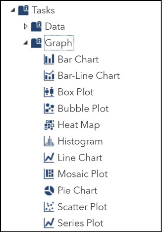
Double-click Bar Chart to get started. This opens the following screen.
Figure 6.2: Requesting a Bar Chart
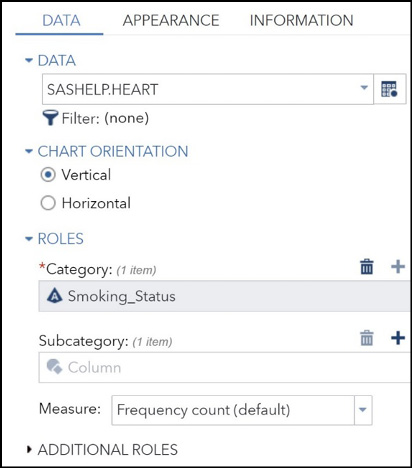
The Heart data set has already been entered and Smoking_Status was chosen as the Category variable. The next step is to modify the appearance. Click the APPEARANCE tab to do this.
Figure 6.3: Bar Chart Appearance
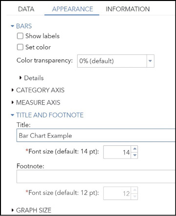
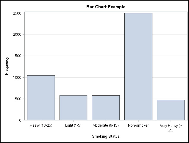
You can enter titles and footnotes for this task and even choose the font size for each one. As you can see in Figure 6.3, you can also customize the bar details (change the bar color, for example), the bar labels, the two axes, the chart legend, and the graph size. You can also decide to accept all the defaults for these options and click the Run icon. You can always go back and modify these options later if you want. The figure below shows the resulting bar chart (accepting all the defaults).
Figure 6.4: Final Bar Chart
Creating a Bar Chart with a Response Variable
The height of each bar in the previous chart represented frequency counts for each category of Smoking_Status. By choosing a response variable, you can create a bar chart where the height of each bar represents a statistic (the mean, for example) for a response variable at each level of smoking status.
Figure 6.5 shows the DATA tab for the Bar Chart task. Here you choose the Heart data set in the SASHELP library. First choose Smoking_Status as your Category variable. Next, use the pull-down list under Measure to select Variable to represent the Y axis. Enter Weight as the variable that you want to plot. Finally, you use the menu of choices for statistics and choose Mean (the default is Sum). Note this task was significantly modified from previous versions of SAS Studio. Thanks to Paul Grant for pointing this out to me. Because of all these choices, the height of each bar will now represent the mean weight for each value of smoking status.
Figure 6.5: Entering a Response Variable
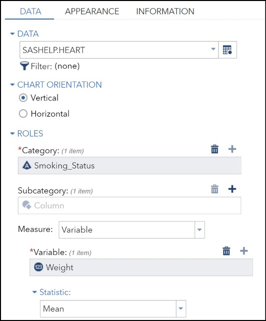
Clicking the Run icon generates the chart shown in Figure 6.6.
Figure 6.6: Bar Chart with a Response Variable
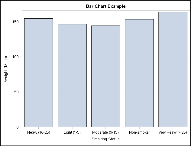
The height of each bar represents the mean weight for each category of smoking status.
You can display more information in the bar chart by including a Subcategory variable in the DATA tab. Figure 6.7 shows that you want the variable Sex as a subgroup variable. At this point, you could choose to create a stacked chart (the male and female frequencies in a single bar with two different colors) or the default chart that shows side-by-side bars for men and women.
Figure 6.7: Adding a Subgroup to a Bar Chart
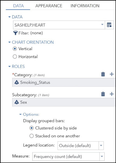
You can change the appearance of the plot by clicking the Appearance tab and make choices. For now, let’s choose all the defaults and run the task. Figure 6.8 shows the resulting bar chart.
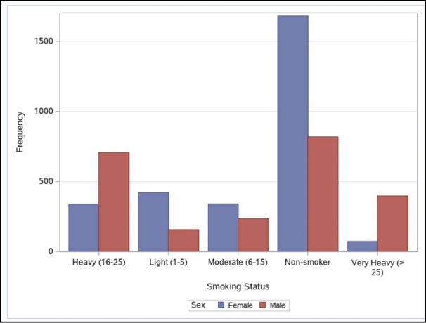
It looks like there were many more female non-smokers in this sample, while in the heavy and very heavy categories, males predominated.
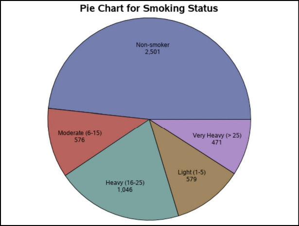
Pie charts represent a popular way to display frequencies. As with bar charts, the size of the slices can also represent a sum or mean of a response variable. Let’s start out by generating a pie chart showing smoking status. Select Pie Chart from the task list.
Figure 6.9: Requesting a Pie Chart
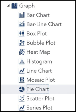
Double-click Pie Chart to get started. This brings up the following screen.
Figure 6.10: Choosing a Variable for the Pie Chart
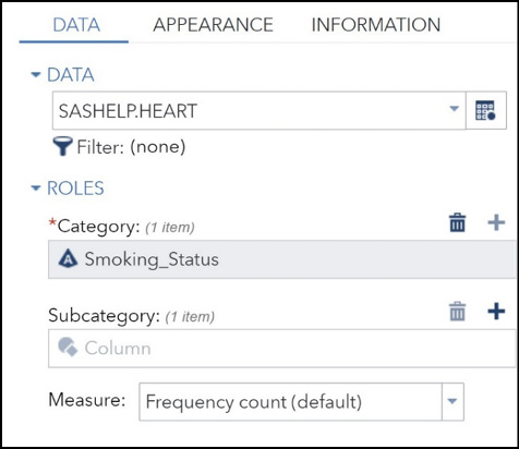
You can use the Appearance tab to modify the appearance of the pie chart. For this example, we will use this tab to add a title and leave all the other choices with default values. A chart with all the default options (except for the title) is shown in Figure 6.11.
A scatter plot shows the relationship between two variables by placing points on a set of X and Y axes. To get started, locate Scatter Plot in the Graph task list.
Figure 6.12: Requesting a Scatter Plot
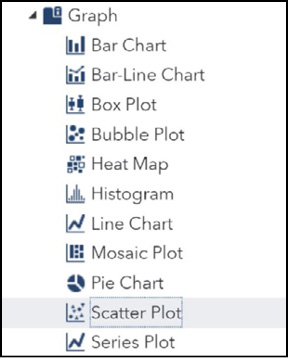
Double-click Scatter Plot to bring up the following screen.
Figure 6.13: Selecting the X, Y, and Grouping Variables
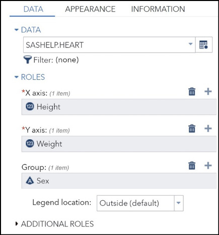
You enter the x- and y-variables as shown. Here you want to see Height on the X axis and Weight on the Y axis. You can also identify a group variable. For this example, you are choosing Sex as a group variable. Click the Run icon to generate the really impressive scatter plot shown in Figure 6.14.
Figure 6.14: Final Scatter Plot
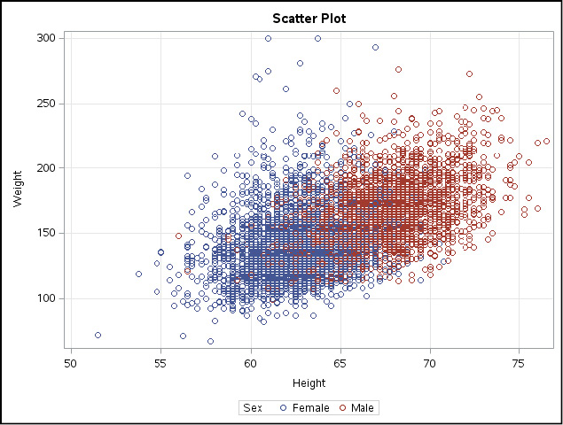
It appears that there is a positive relationship between Height and Weight. Also, the taller and heavier data is male-dominated.
After seeing how to run the charts and graphs demonstrated in this chapter, you should have no trouble running any of the graph tasks included with SAS Studio. This author, for one, is immensely grateful that someone has already done all the behind-the-scenes work to make it so easy to create charts and graphs. Thank you, SAS!