 CHAPTER 1
PORTRAIT TECHNIQUES
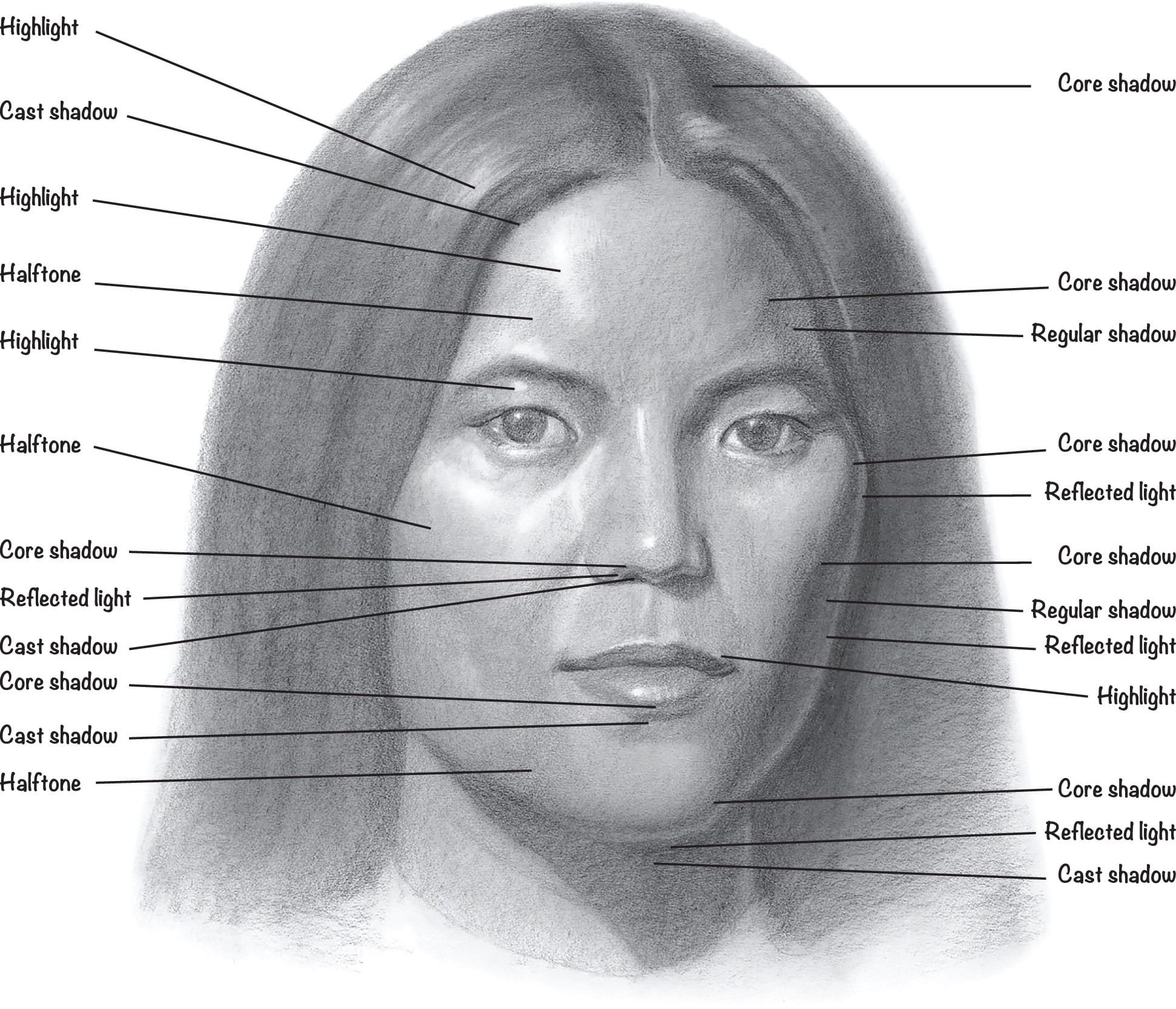
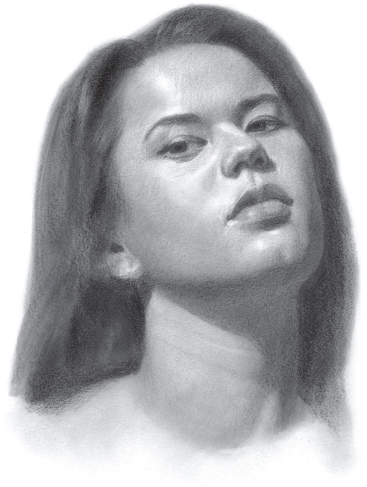
Shadows & Highlights
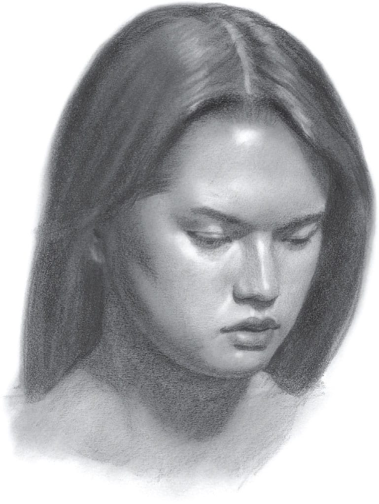
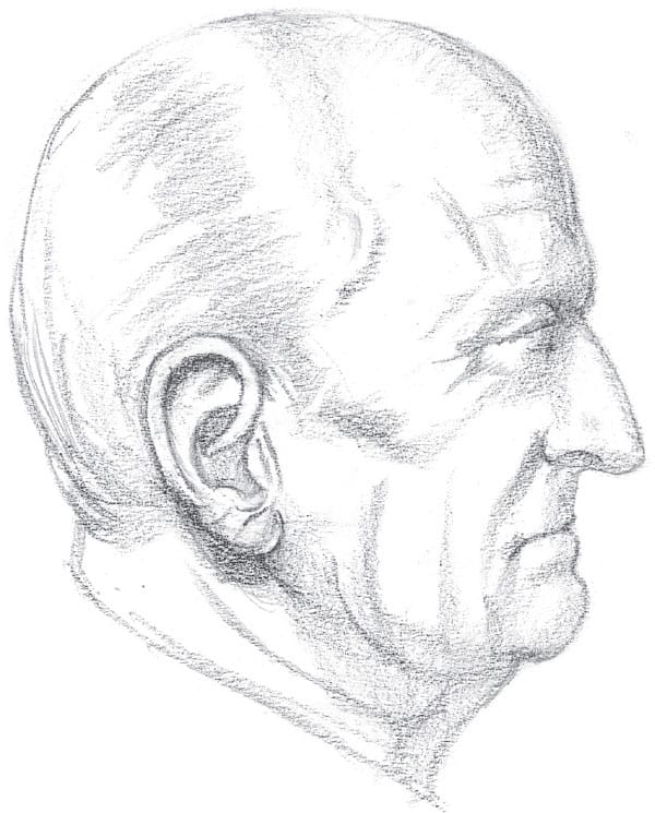
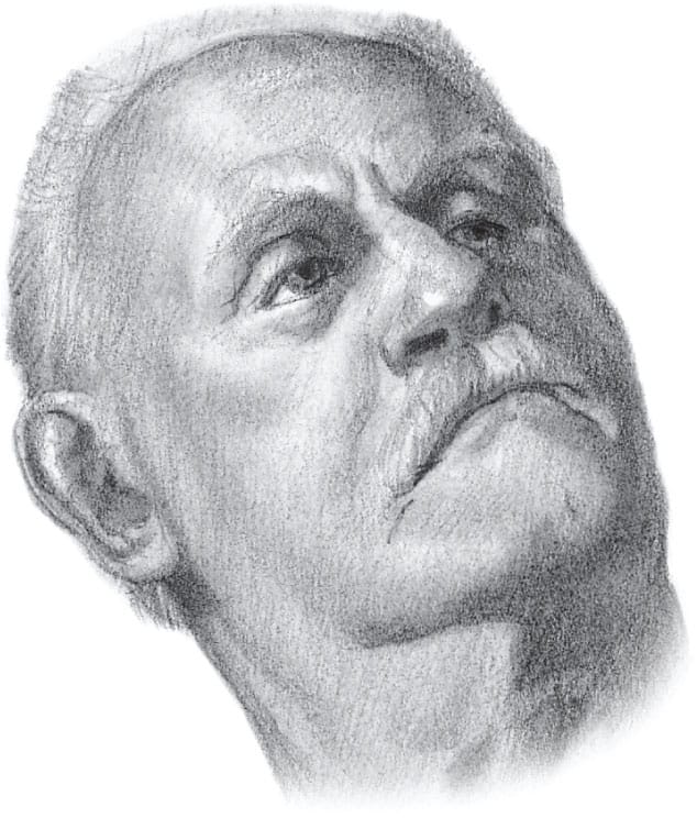
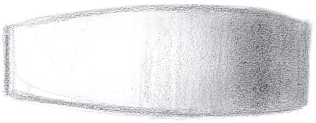
This drawing of the head was deliberately kept in halftone (a middle value of graphite) so you can see the elements of shading more easily, without the darkest darks.
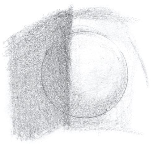
How to Light the Model
Always use one dominant light on your model. It’s okay to have some general light in the room, but several competing lights directed at the model will create forms that are flat or hard to read. Below are two drawings of the same woman done with two different lighting styles. One creates a harsh look with distinct shadows and more contrast (high-contrast side lighting); the other produces a more delicate image (low-contrast front lighting).
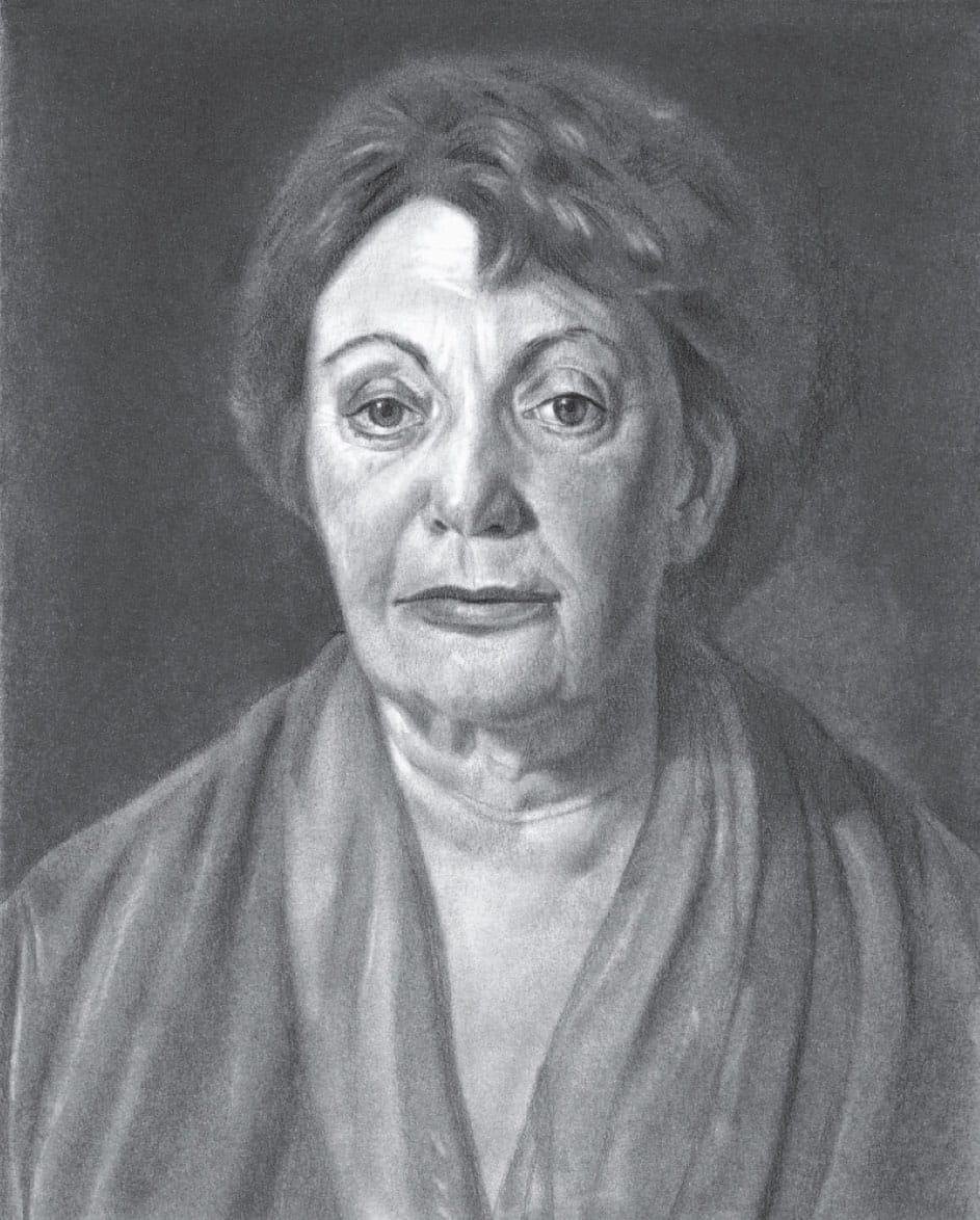
SIDE LIGHTING This portrait was drawn in a dark room with one light positioned to the model’s right. This style makes the model look older and more serious, as the contrasts create harsh shadows, deepening and creating lines on the face and neck. This type of lighting is best for giving a model an air of power.
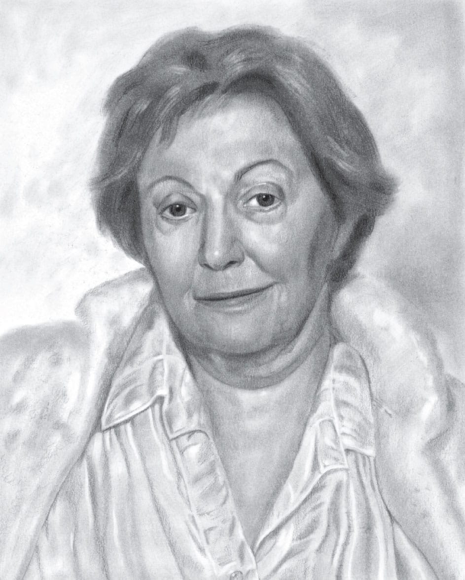
FRONT LIGHTING This method involves using a well-lit room with one light positioned in front of the model. When using this method, position the light as far away as possible to avoid hurting the model’s eyes.
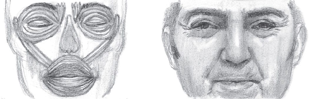
Anatomy of the Head
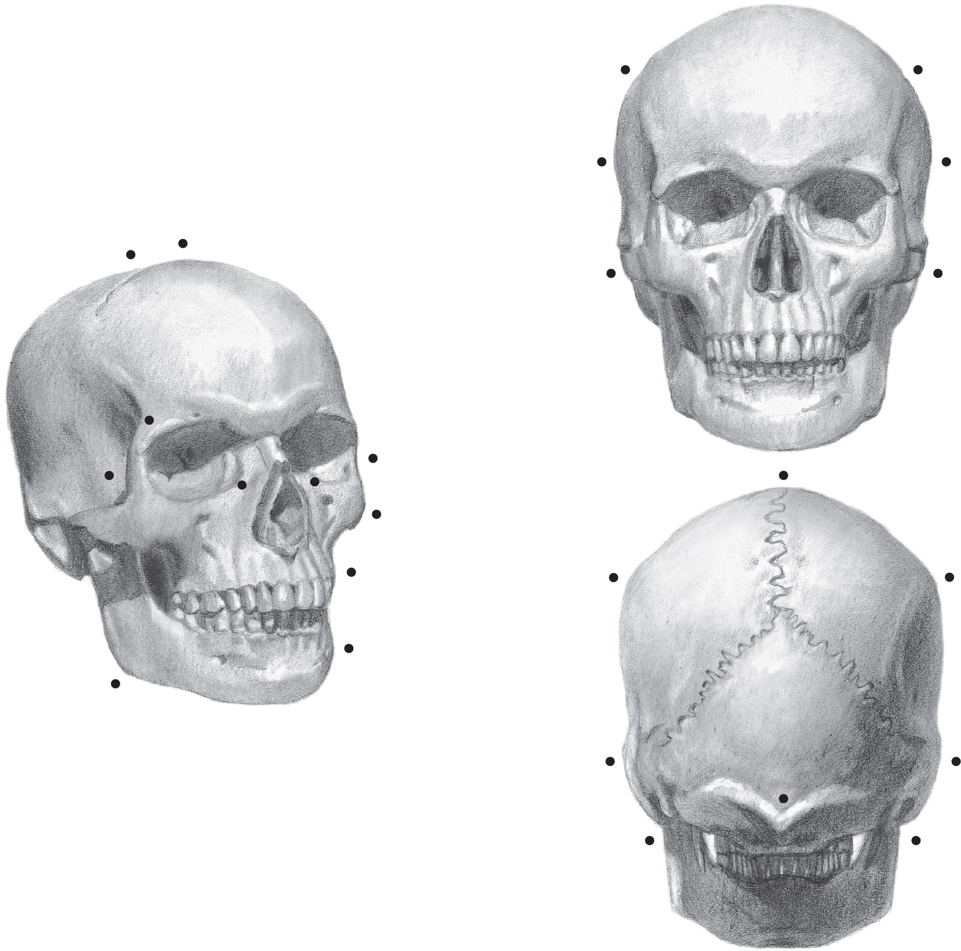
Knowing the anatomy of the head will help you understand the basic forms beneath the skin. Listing the names of the points on the skull isn’t practical for our purpose here. Instead, there is a dot at each point of the skull that you should be aware of when you draw. These points make an impression on the surface, and, if you include them, your drawings will be more accurate.
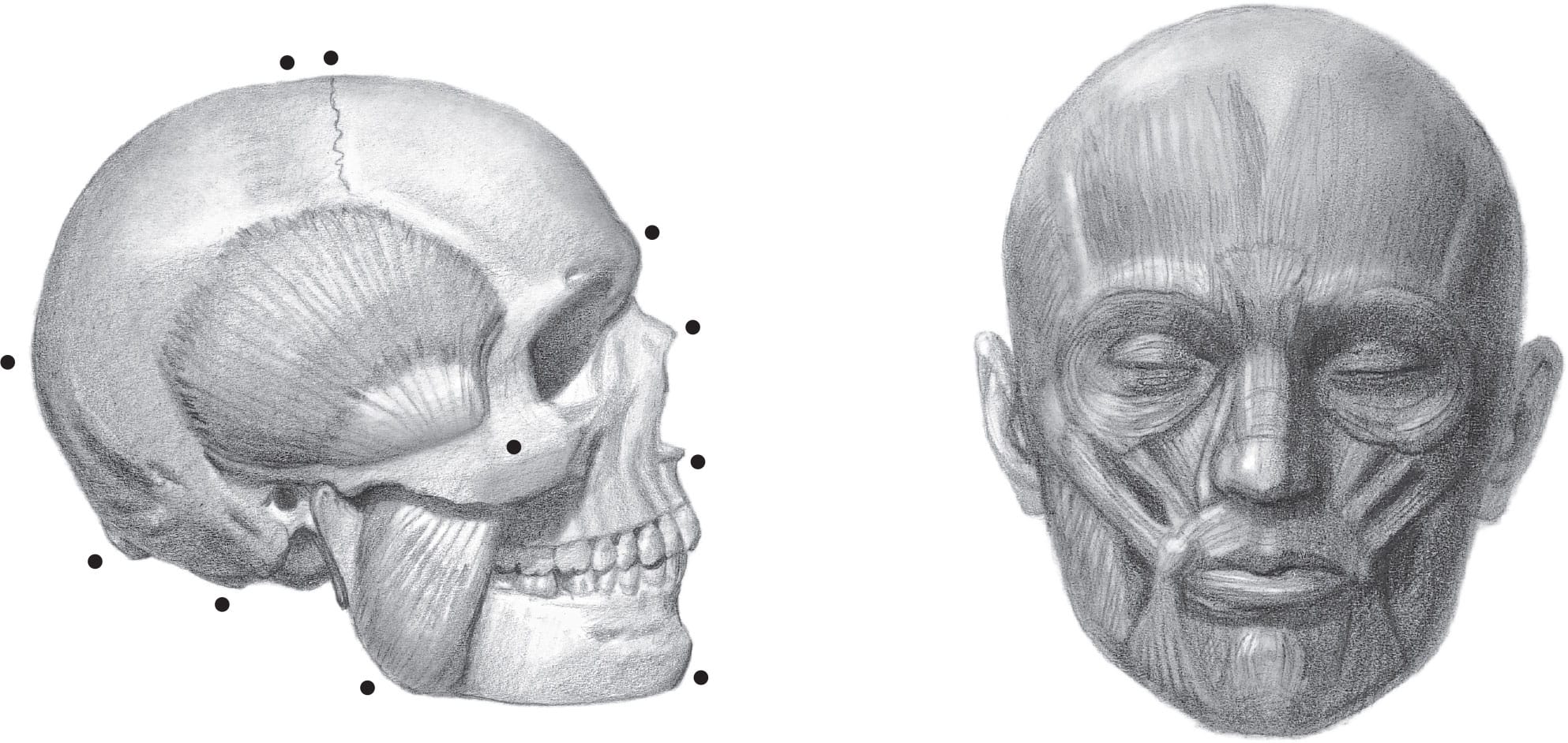
The diagram above includes the temporalis (on the temple) and the masseter (on the jaw) muscles. These muscles allow you to chew by pulling the jawbone. The illustration above right is a general (though not complete) diagram of the facial muscles so you can see the shapes of the muscles that lay over the bone.
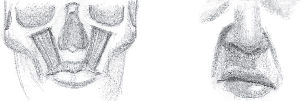
FACIAL MUSCLES & EXPRESSIONS
Below is a list of the most important muscles used in facial expressions. Familiarizing yourself with them will help you understand how the muscles move to affect the shapes and bulges of the skin.
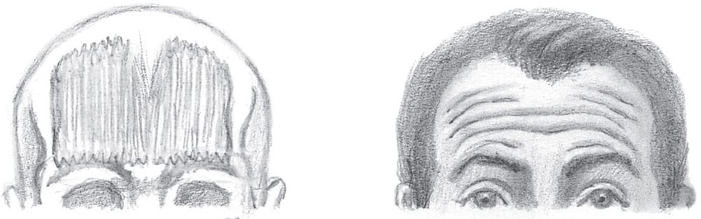
The frontalis contracts to create wrinkles on the forehead. It can contract in the middle alone (indicating sadness) or in the middle and on the sides (indicating surprise).
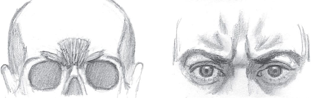
The procerus is in the middle of the brow ridge; the corrugator is on each side, like little wings. The orbiculares oculi (see below) work together with these muscles to create a frown.
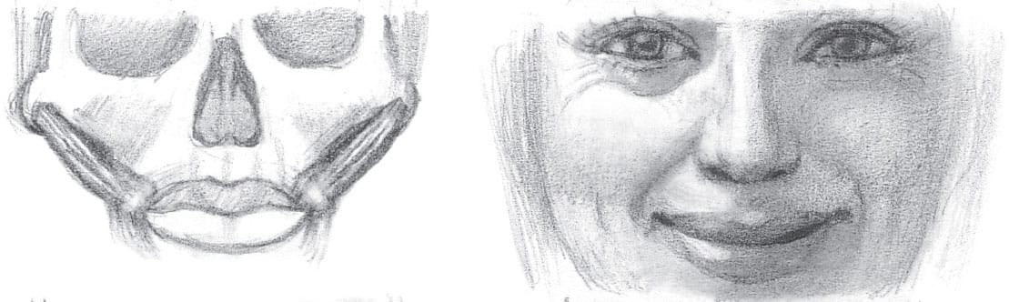
The zygomaticus major is anchored on each cheekbone and inserts into a node at each side of the lips. When they pull, they widen and raise the lips, forcing a cheek bulge under each eye. These are the main muscles for smiling.
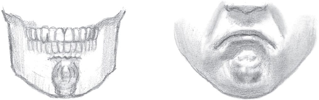
The (eye) and the orbicularis oris (mouth) squeeze and narrow the eyes and mouth. They also close the eyes and mouth, respectively.
Each levator is anchored to the skull and yanks up the side of the lip so you can sneer at other artists’ drawings.
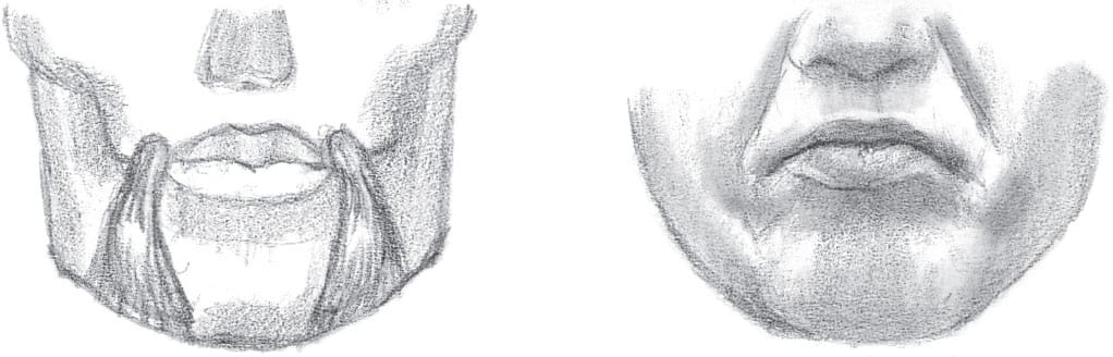
The triangularis muscles are anchored on the jaw and tug at the nodes on the sides of the lips, pulling down the corners of the mouth.
The mentalis is anchored below the teeth and pulls up the flesh of the chin. This creates a pout or the appearance of someone thinking (mental—get it?).
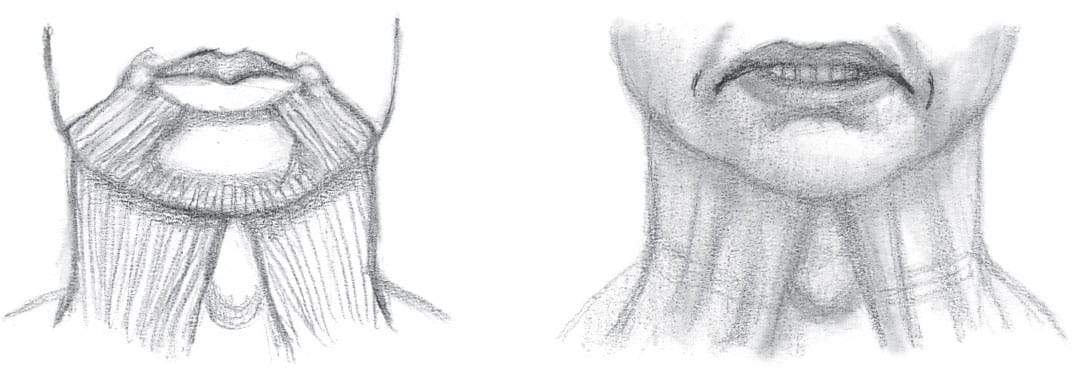
The platysma is anchored to the fascia of the muscles on the chest. It goes up and over the front of the neck to the bottom lip and lip nodes. It tugs hard on the lips for extreme expressions. On the neck, it can contract itself into cords that stand out dramatically.
General Proportions
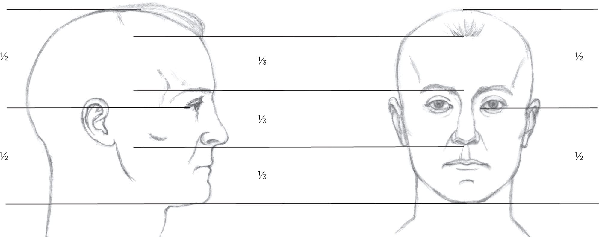
Proportion (the comparative sizes and placement of parts to one another) is key to creating a likeness in your drawing. Although proportions vary among individuals, there are some general guidelines to keep in mind that will help you stay on track. Before you study the diagrams and tips below, memorize these two most important guidelines:
1. The face is usually divided into thirds: one-third from the chin to the base of the nose, one-third from the nose to the brow ridge, and one-third from the brow ridge to the hairline.
2. The midpoint of the head from the crown to the chin aligns with the tear ducts.
The mouth is usually the same width as the distance between the pupils. This particular model’s tear ducts are higher than the midpoint.
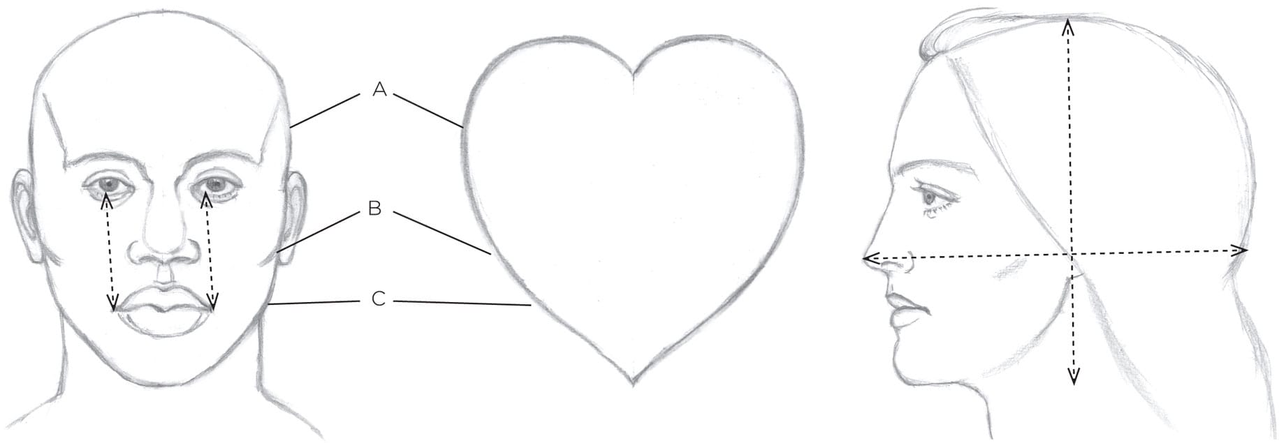
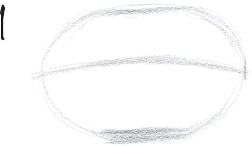
Heads are somewhat heart shaped. The temple (A) is wider than the cheekbone (B), which is wider than the jawline (C).
Generally, the distance between the tip of the nose and back of the head is longer than the distance from the top of the head to the bottom of the head.
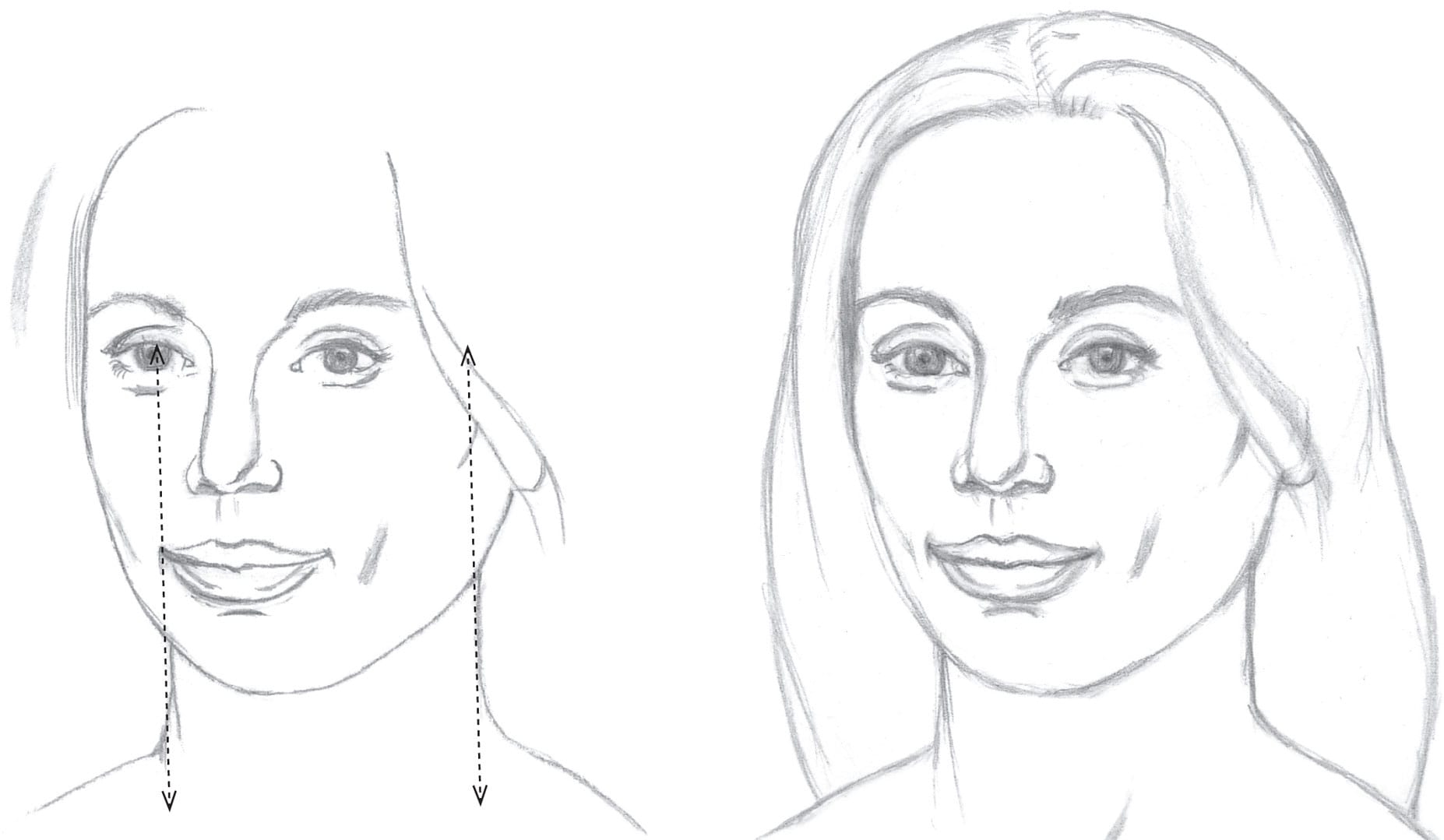
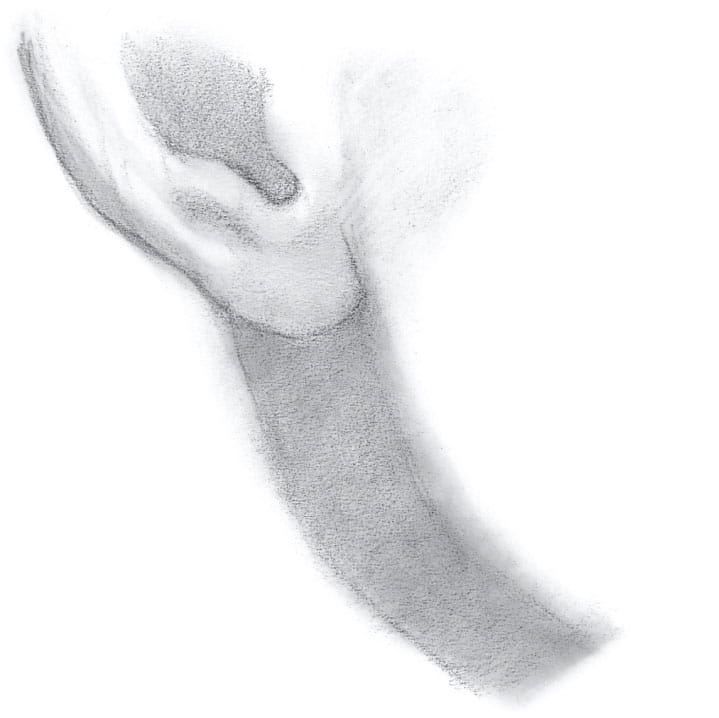
To determine the width of the neck, use the features directly above each side of the neck to serve as guides for placement. To easily see this, hold up your pencil vertically in front of you, lining it up with the side of the model’s neck.
Planes of the Head
It’s helpful to approach the head with a general idea of what can be expected. With practice, you will automatically check for the basic forms and plane changes described below. Memorizing the planes early on will save you time.
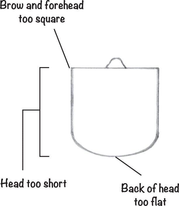
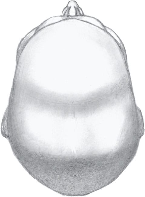
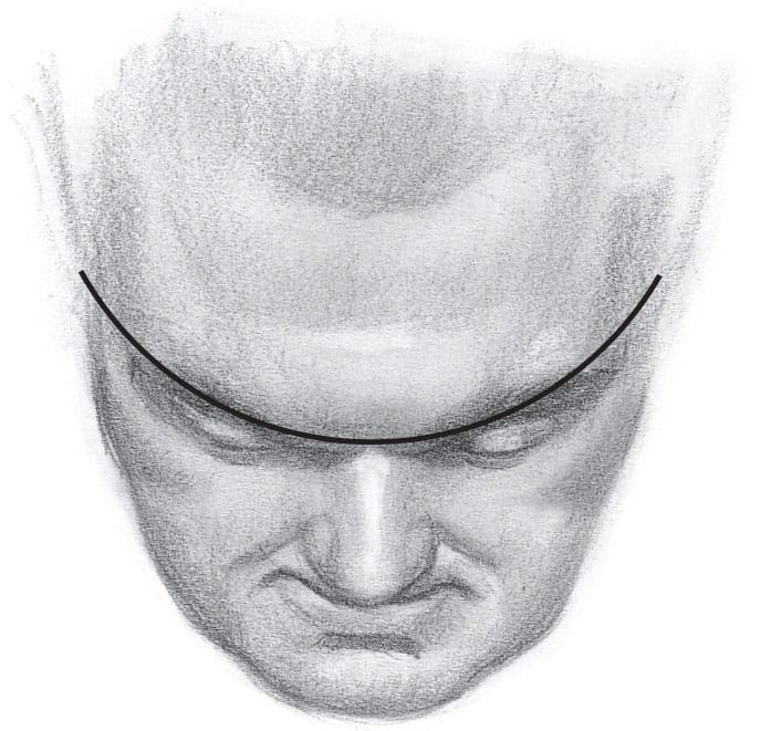
Artists unfamiliar with the top view of the head make errors at the brow, with the shape of the forehead, and in the head’s overall length and width.
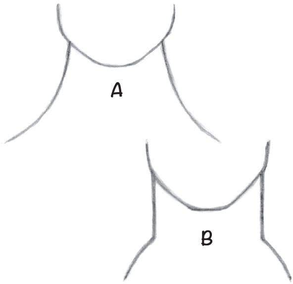
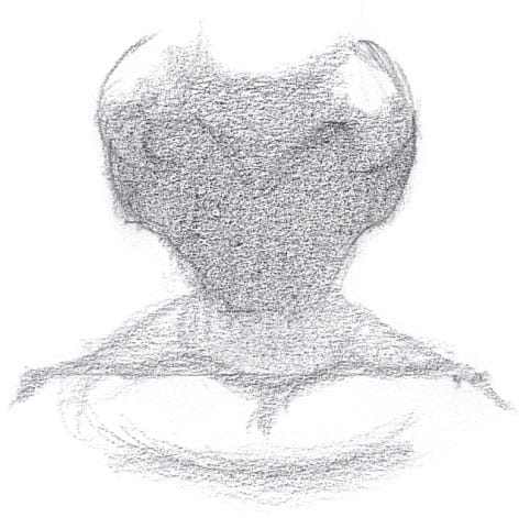
The neck doesn’t narrow at the top, and it isn’t concave at the sides (A). The body’s forms bulge out (B). They can be flat but not concave (except in tiny transitions that are barely visible).

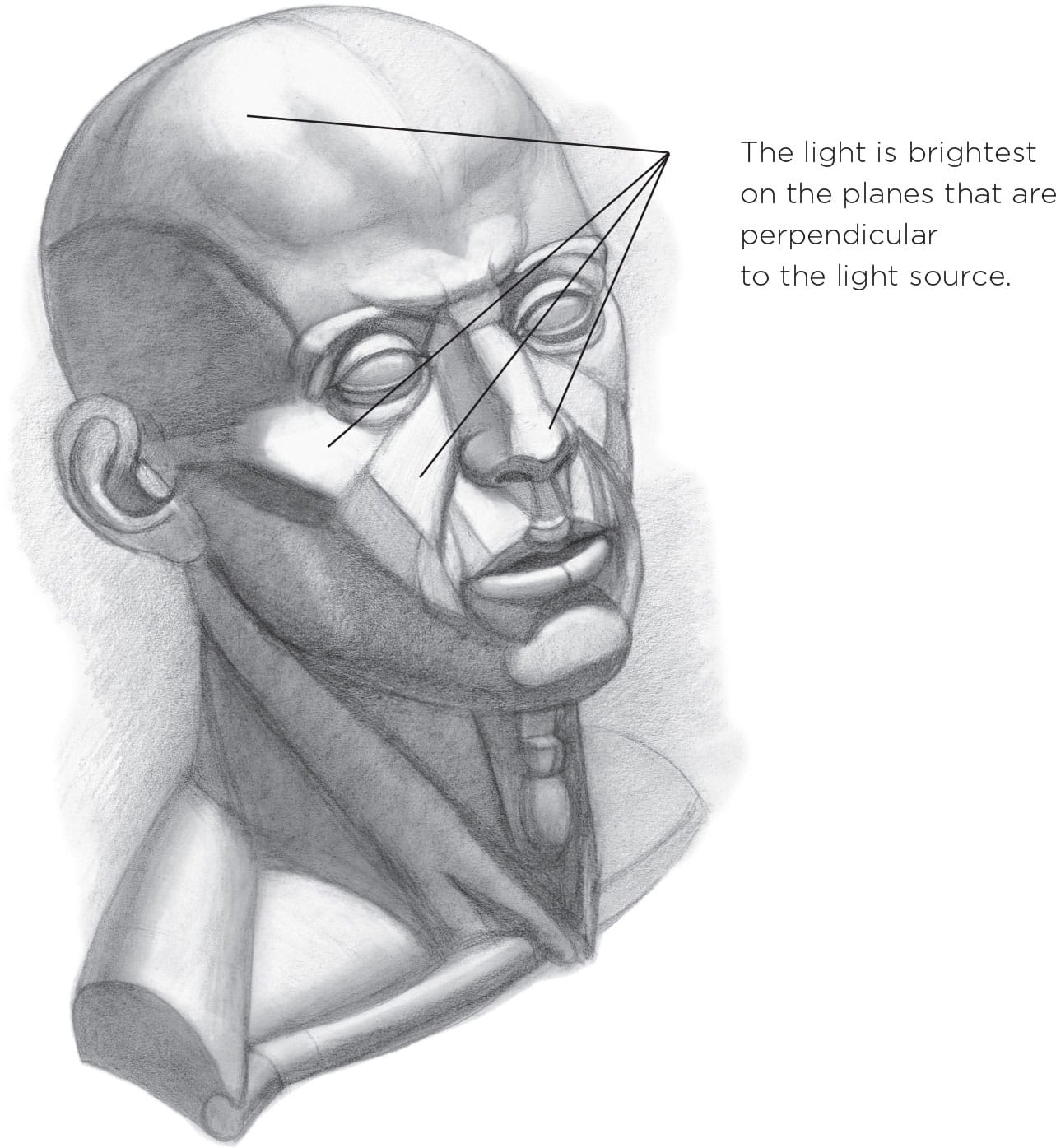
The face wedges toward the nose like this helmet. Notice the exaggerated highlights (A) and reflected light (B) on the metal.
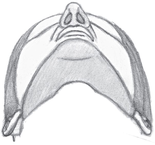
This illustration shows how the face wedges toward the center.
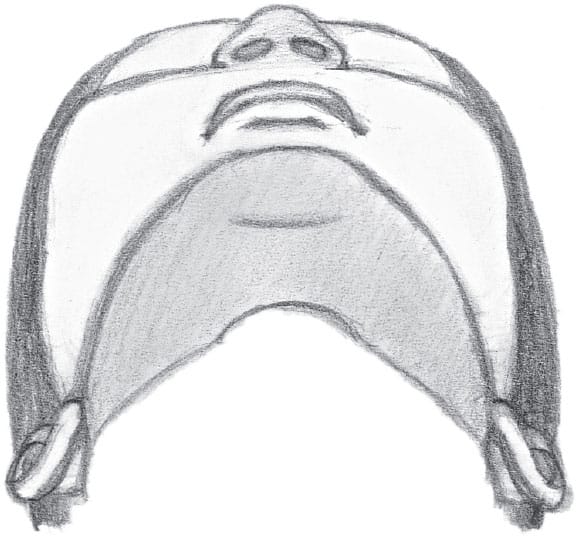
This illustration shows a flatter face and sharper angles at the sides of the head.
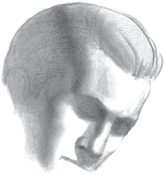
Shifts in Guidelines
When drawing the tilted head, it’s essential to first measure to find the midpoint to see where it has shifted (A). Next draw lines to indicate the new positions of the features (B). A bit of shading is applied to make the horizontal lines easier to judge by.

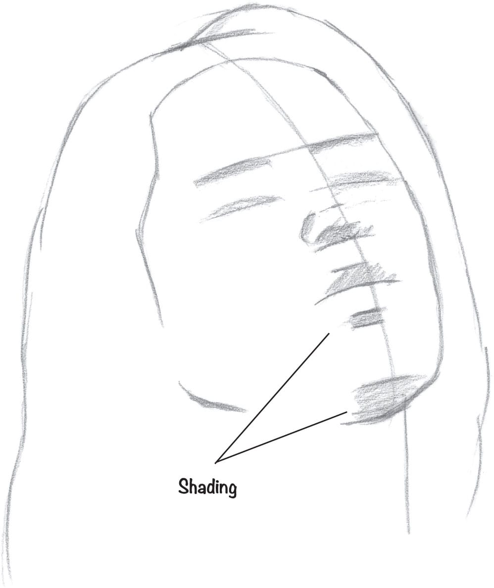
ADJUSTING GUIDELINES As the head tilts, the curvature of the surface of the face becomes more prominent. Keep this in mind while marking your guidelines.
Facial Features
Now that you are acquainted with the basic forms and proportions of the head, let’s examine the individual features that make up the face.
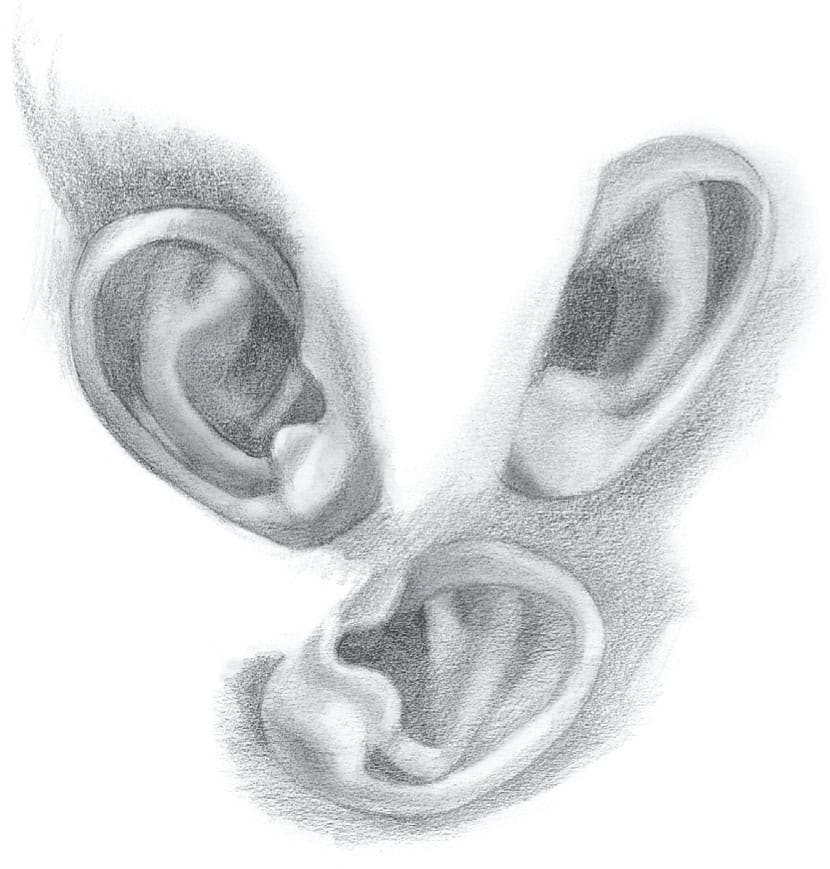
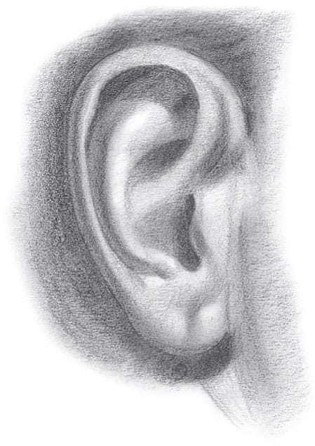
EARS
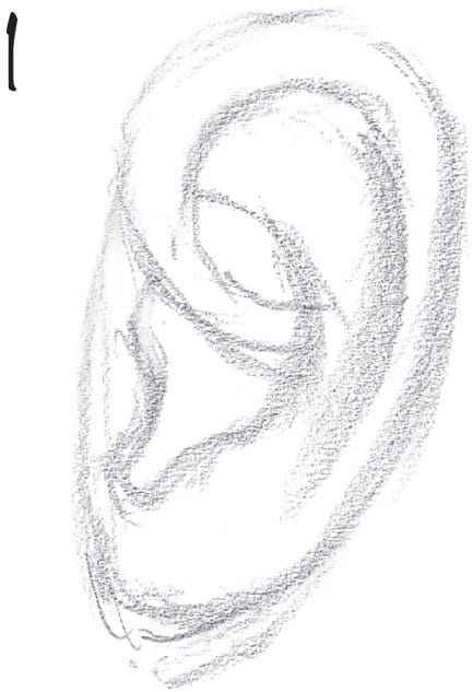
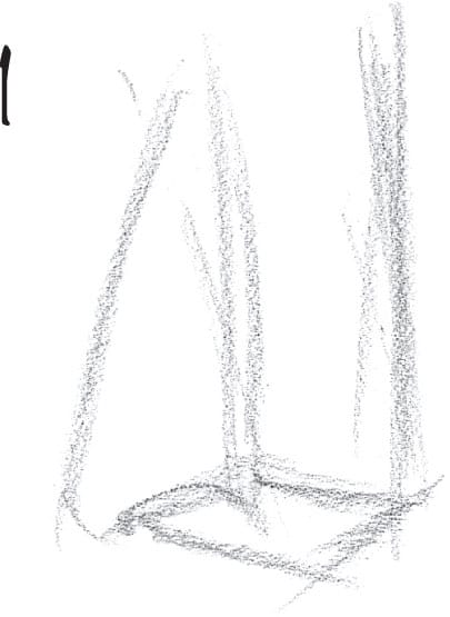
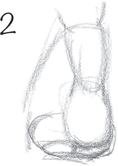
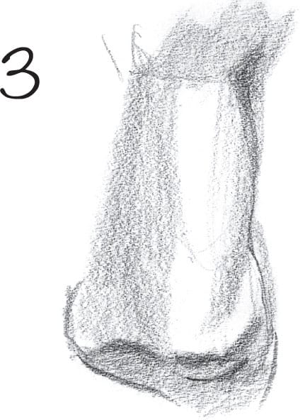
1 Draw a rough lay-in of the ear.
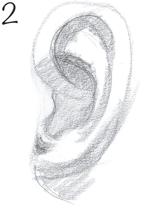
2 Then apply tone to indicate the shadows.
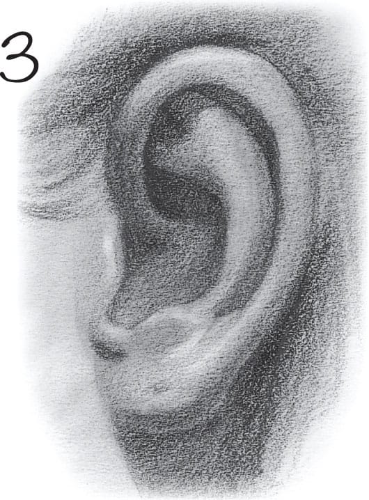
3 Stump and then lift out highlights to polish.
Each form has core and cast shadows and highlights.
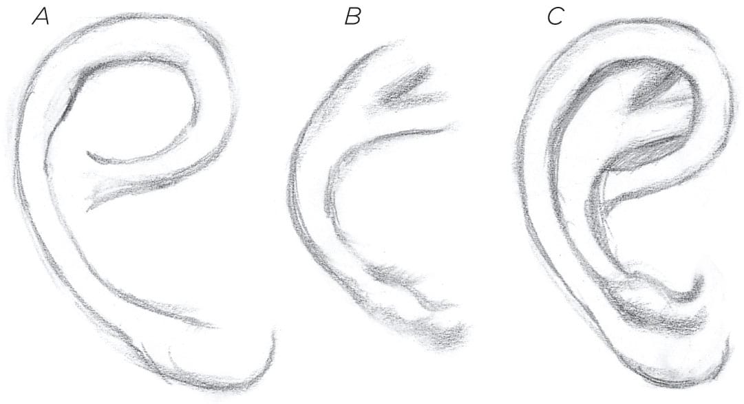
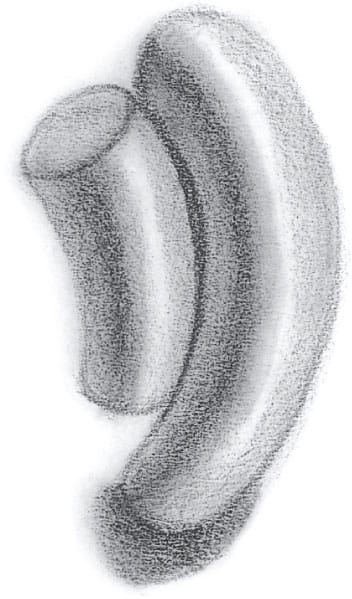
Memorize shapes A and B; combine them to create C. This gives you a basic outline to work with.
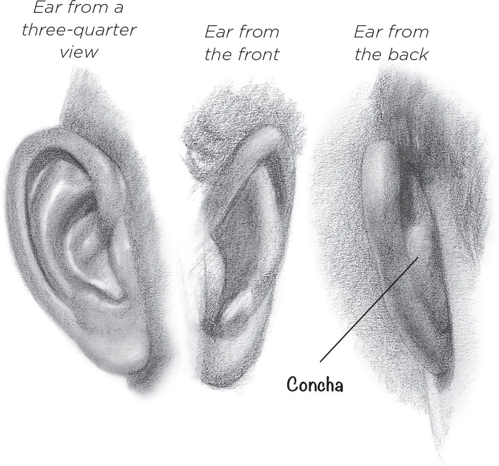
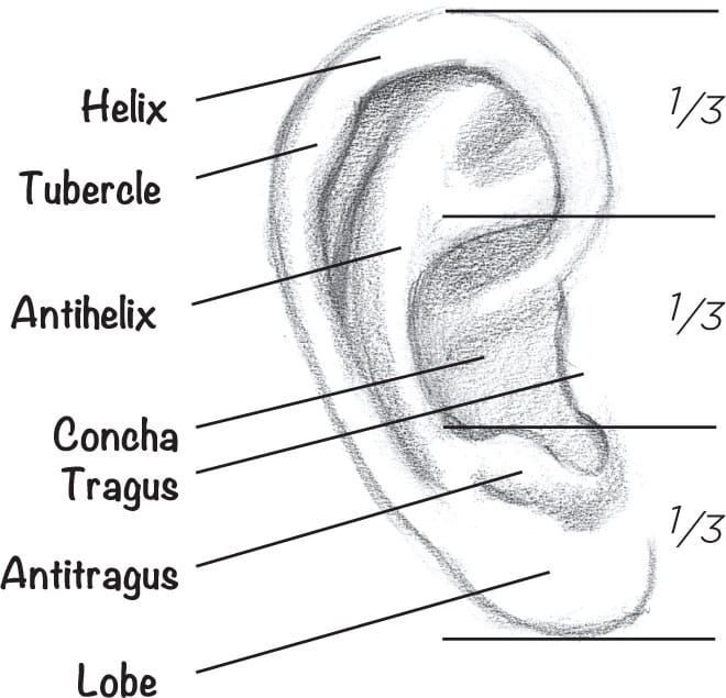
The ear is shaped like a disk that is divided into thirds.
Elderly people usually have much larger ears and noses.
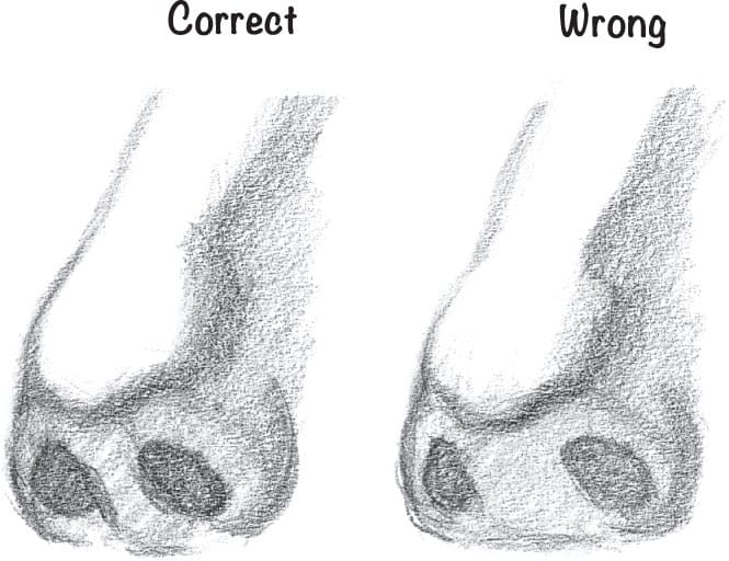
Ear too far back
Ear too far forward
Ear is just right.
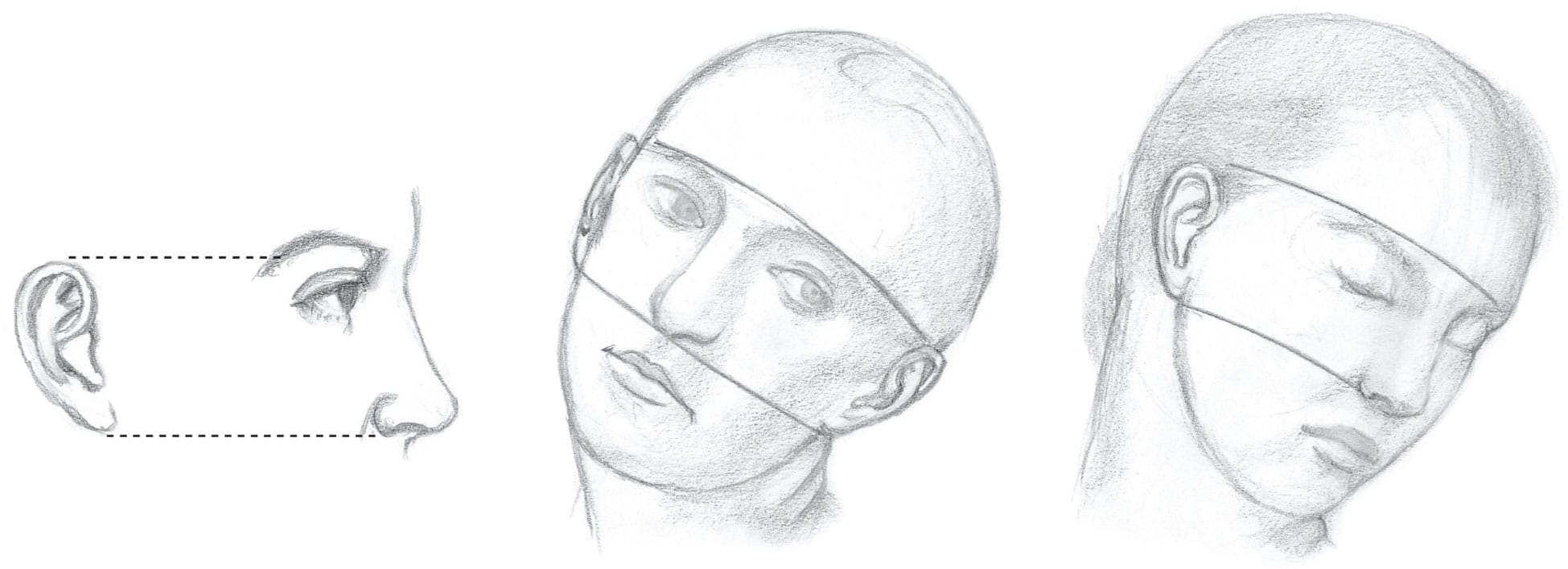
The ear is situated between the brow and the base of the nose. It tends to be more in line with the lower part of the eyebrow, not the arch.
There’s a soft transition of the jaw from the lobe to the neck. The back of the jawline isn’t sharp.
A baby’s ears tend to be rounder and more concave than an adult’s.
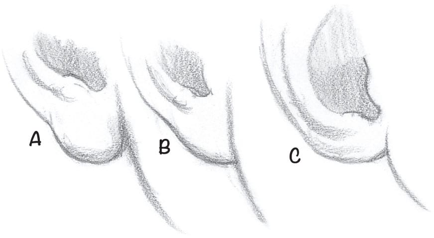
Earlobes can hang (A), be attached (B), and even be underdeveloped (C).

People who are overweight often have lobes that are pushed out from their faces.
Ears have a confounded habit of having extra forms. Notice the doubled helix and two lumps on this lobe.
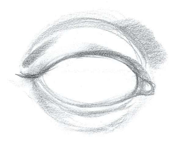
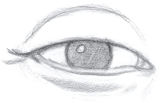
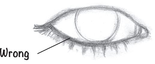
EYES
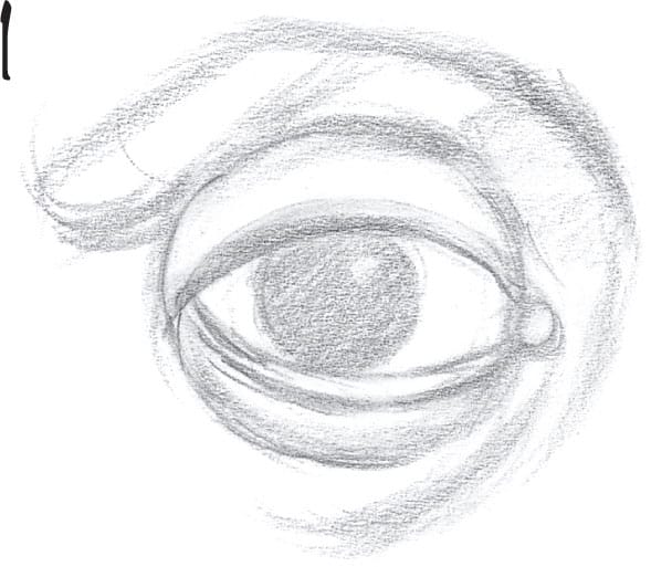
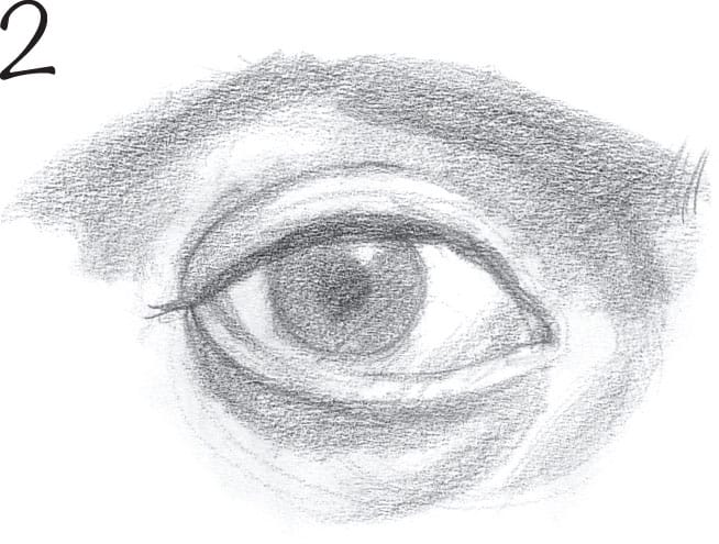
1 Lay in the size, location, and folds of the eye.
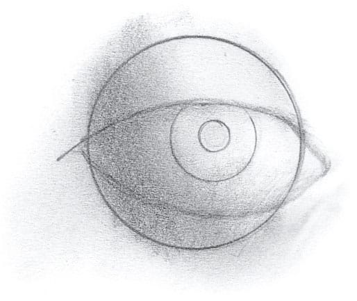
When drawing the eye, always begin by drawing a sphere and wrapping the lids over it.
Showing the top of the iris looks unnatural.
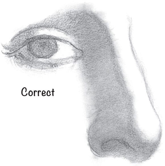
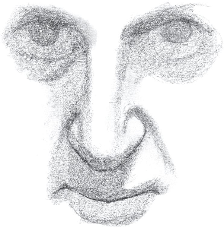
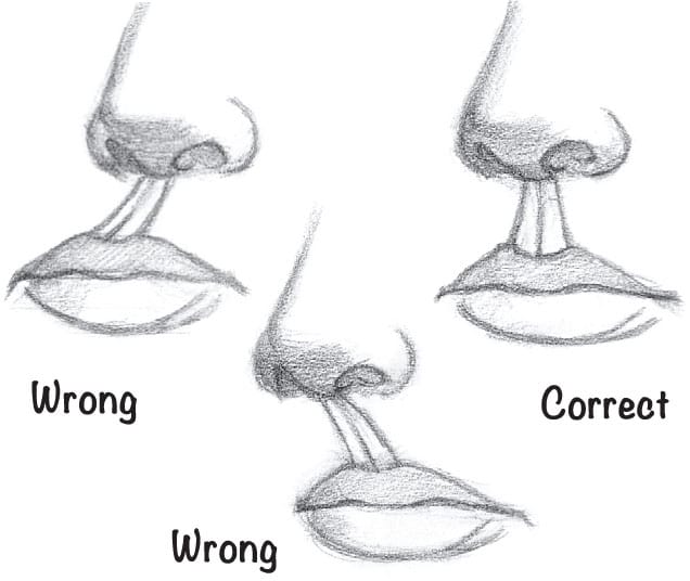
To correctly place the eye in relation to the nose, there must be a side plane between the nose and the eye.
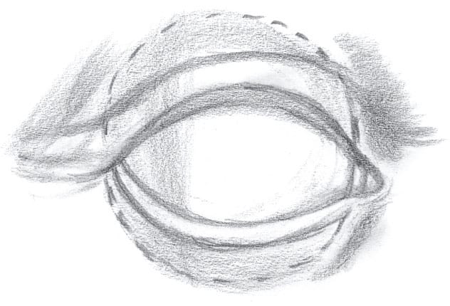
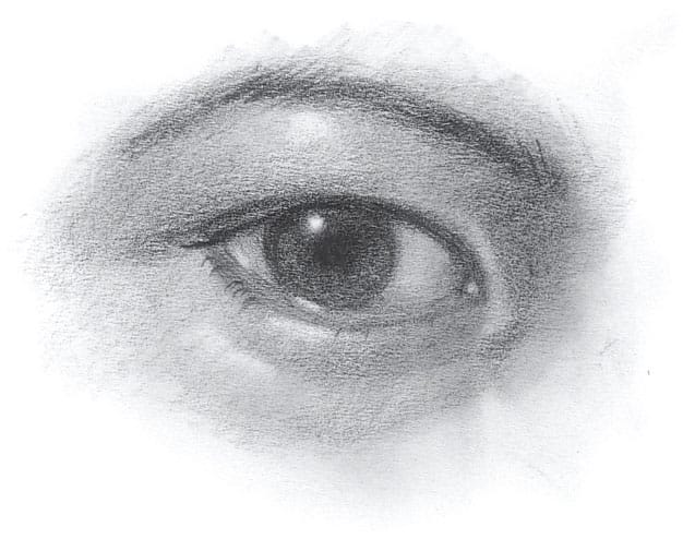
2 Build the volume by adding tone for the form and cast shadows.
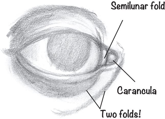
There are two forms in the inner corner of the eye; hence there are two highlights!
The lid should always partially cover the top of the iris.

Don’t make the mistake of letting the eye creep up the side of the nose.
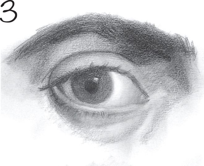
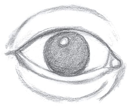
3 Stump, pull out highlights, and give clarity to edges.
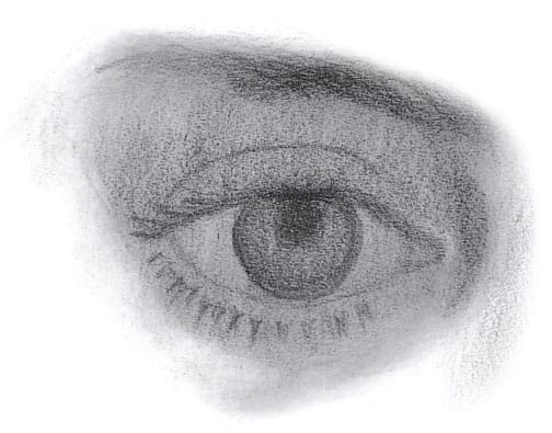
The outer corner of the eye is usually higher than the inner corner. The upper lid overlaps the lower lid at the outer corner.
When a person smiles, even more of the iris is covered (especially at the bottom).
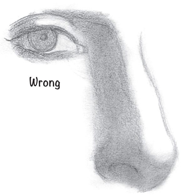
Don’t place the eye at the top of the nose. The eye is to the side of the nose.
The eyebrows start vertically and end horizontally.
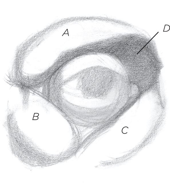
A, B, and C are bulging forms surrounding the eye; D is concave.
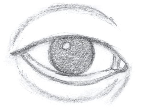
The eye must be shaded as if it were a sphere. There’s shading in the “whites” of the eye. They’re only white where the sphere receives direct light, so shade this area to avoid flatness.
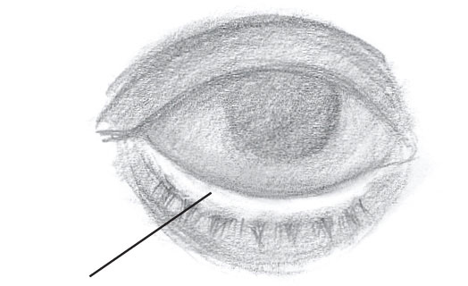
Don’t forget this plane. Any line where the lower id meets the eyeball is subtle.
A big black line and no plane.
The eyebrow is rarely the same tone all the way across because it’s located on both the front and side of the face.
This eye has additional deposits of fat within the eye socket. It also has an extra fold of skin above the inner corner that combines with the upper lid.
If the entire eye socket is in shadow, you should make the “white” of the eye darker.
The eye is on the corner of the face.
There’s a clear diagonal from the brow to the cheek.
From this angle, the outer corners of the eyes are lower than the inner corners.
The eyes are on an arc.
NOSE
1 Check the nose’s vertical angles and size compared with other features.
2 Identify the planes and forms of the nose.
3 Add tone to the nose to represent the core and cast shadows.
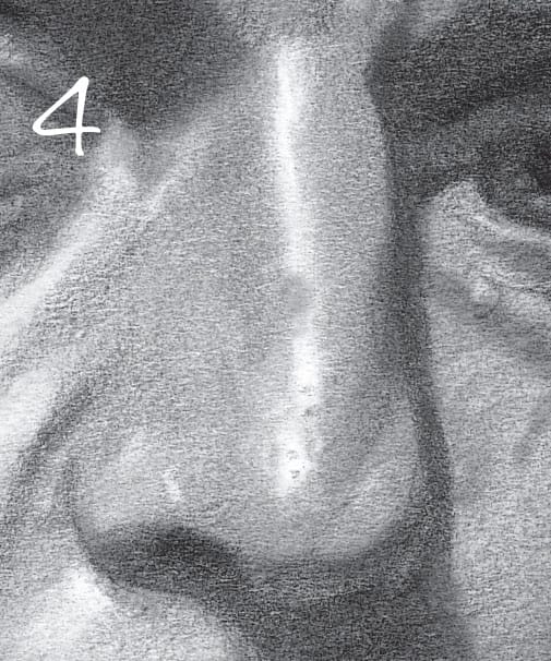
4 Stump and then pull out highlights for a realistic effect.
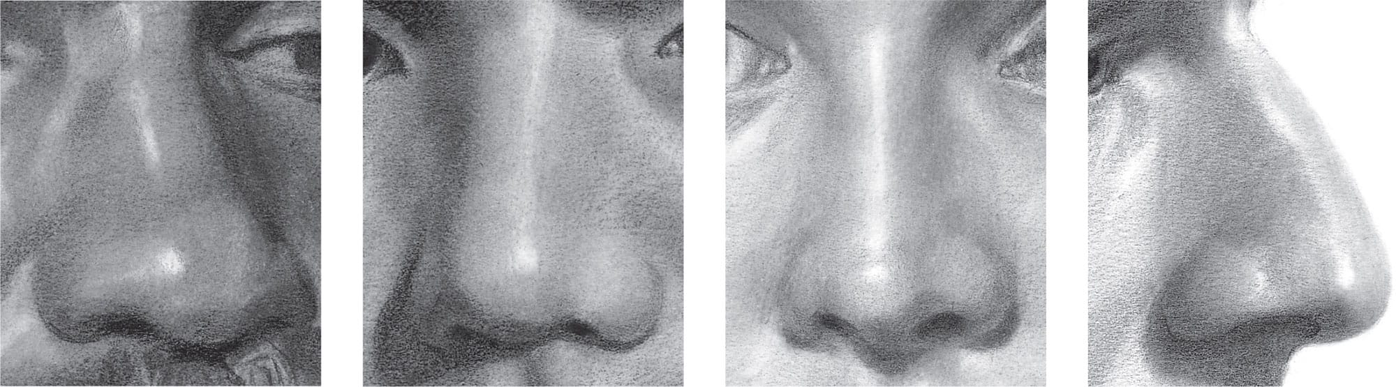
NOSE VARIATIONS Noses come in a wide variety of shapes. Notice the differences among the noses above.
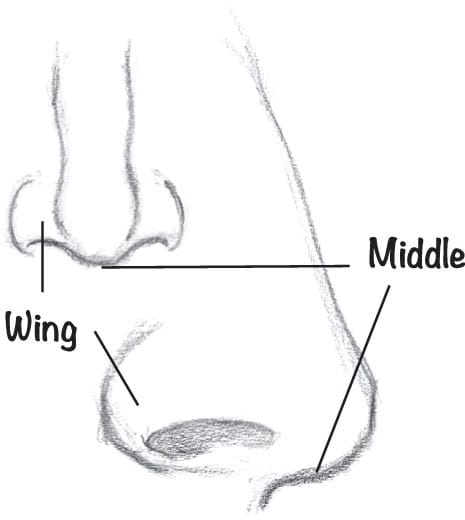
The middle of the nose is usually lower than the wings.
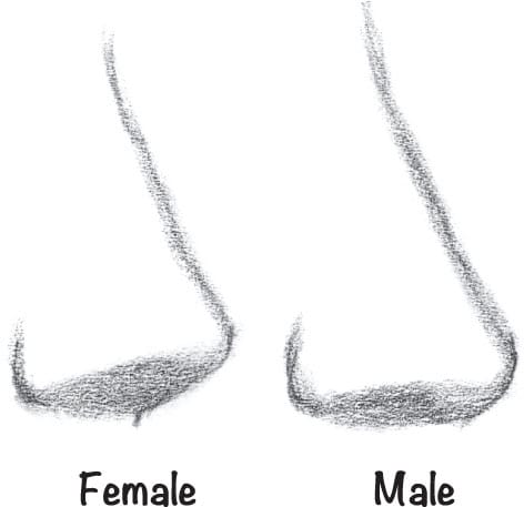
Female noses tend to be smaller and tilted upward a bit when compared with a male’s.
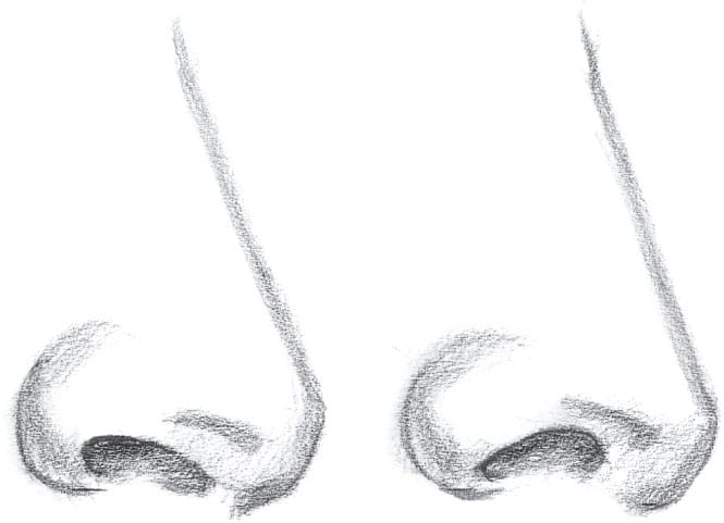
Note how changing the angle of the nostril (the opening) affects the character of the nose.
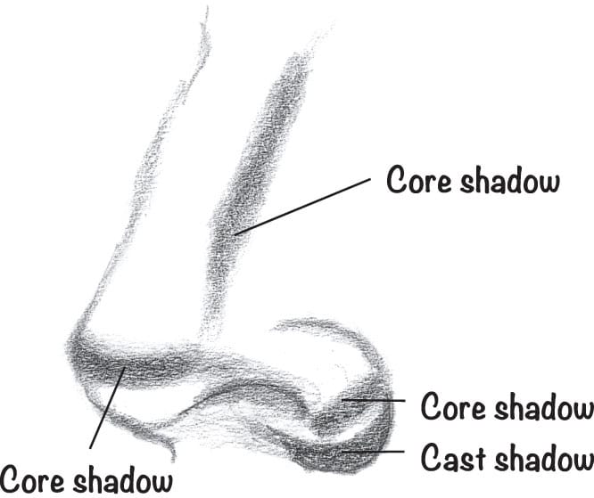
Remember to delineate the core shadows and the cast shadows.
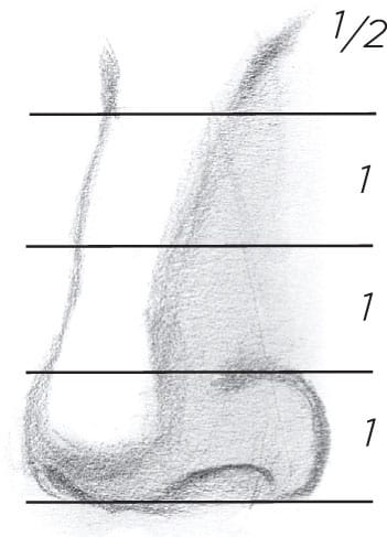
The height of the nose is about 31/2 wings high.
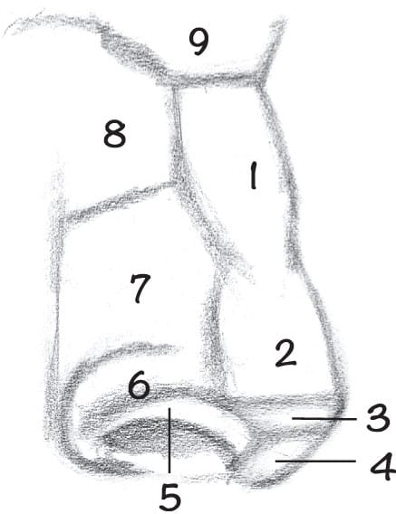
These are the nine typical planes to look for on noses.
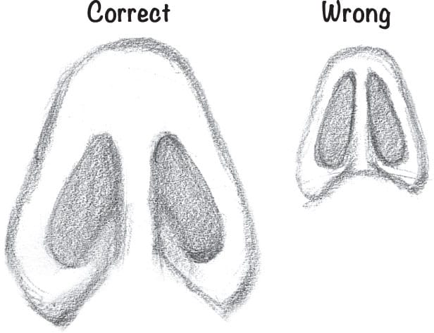
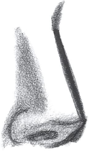
The nostrils don’t extend to the tip.
The space between the nostrils is narrow.
Looking down on the nose
Make simple forms before adding character.
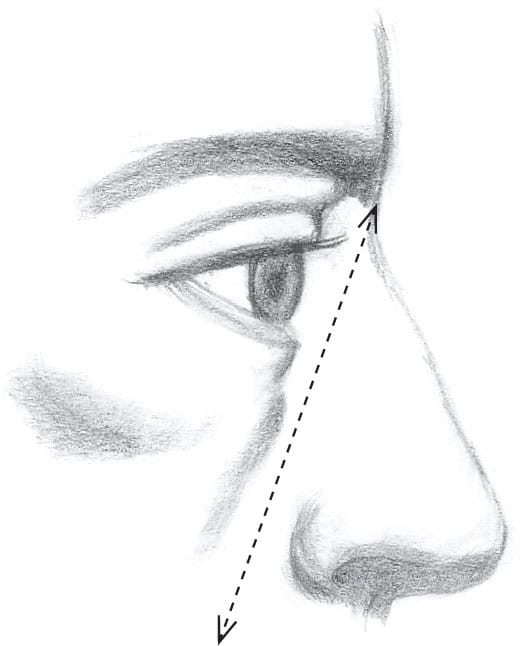
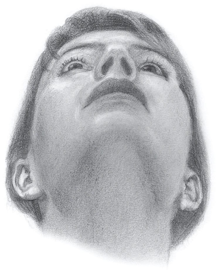
Be ruthless about just how close the tip of the nose is to the eye when your model is looking up! The distance diminishes.
Avoid drawing big, thick, black outlines around the light side of the nose.
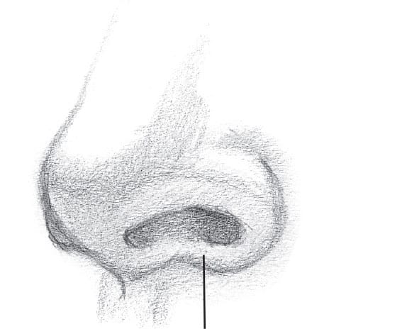
The wing of the nose has a ridge that wraps underneath to the middle of the nose.
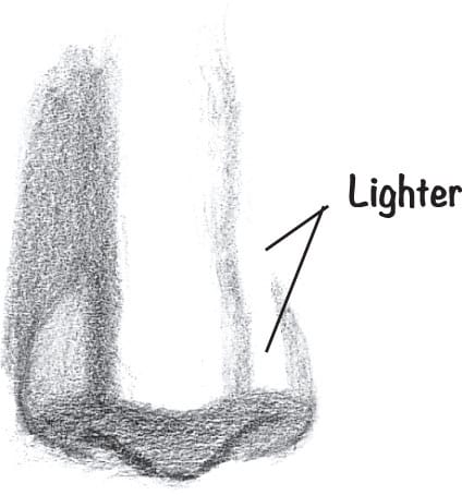
Notice that both nostrils can’t be the same tone and that one side of the nose must be lighter (with side lighting).
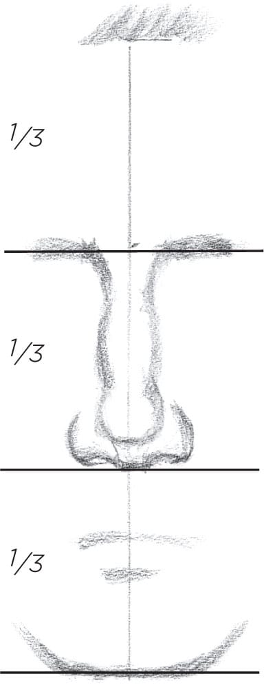
The nose is approximately one-third of the face: one-third chin to nose, one-third nose to brow, one-third brow to hairline.
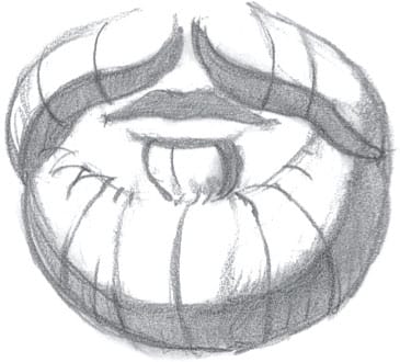
MOUTH
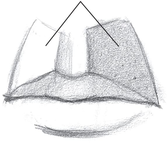
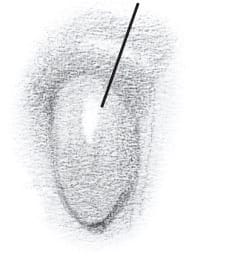
1 Lay in the size, location, and angle of the mouth.
If you light a woman from above, she gets a mustache. Try to avoid this.
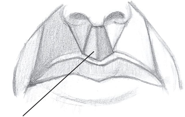
This area is called the “philtrum”.
2 Build the volume and add tone for the core and cast shadows.
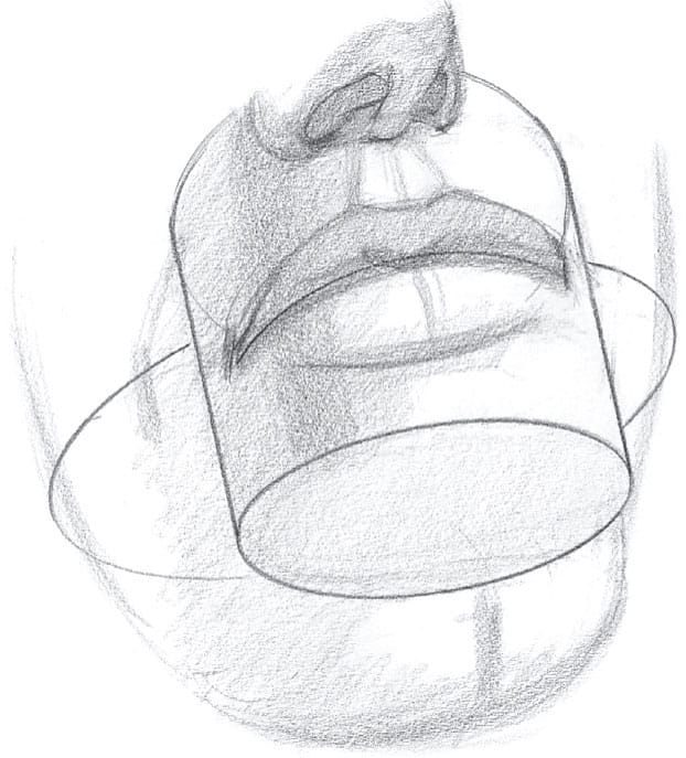
The mouth isn’t flat. It’s stretched over a cylindrical muzzle.
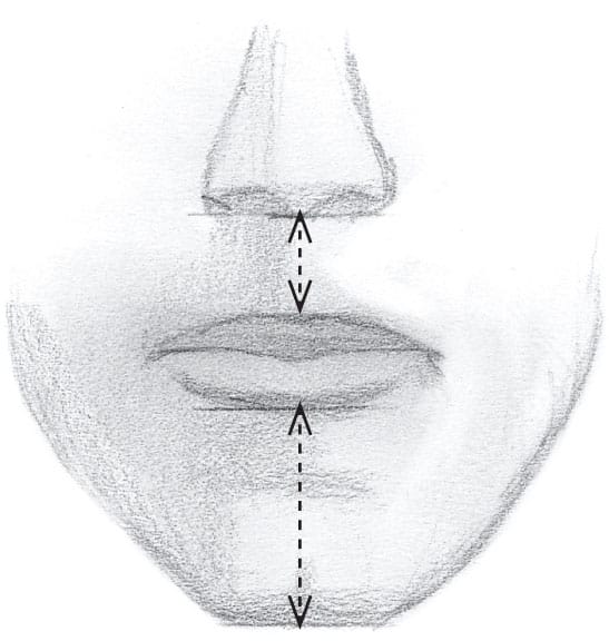
The mouth is usually closer to the nose than it is to the chin.
3 Stump and then pull out highlights for a polished look.
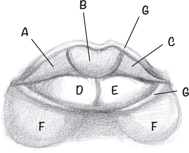
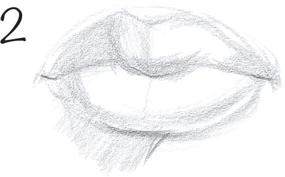
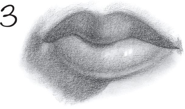
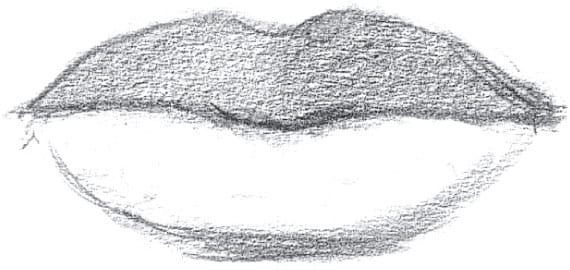
There are three forms for the upper lip (A, B, C); two forms for the lower lips (D, E); and two “pillars” underneath (F). Note the ridges above and below the lips—they often get their own highlights (G).
The middle of the lips is directly below the middle of the nose.
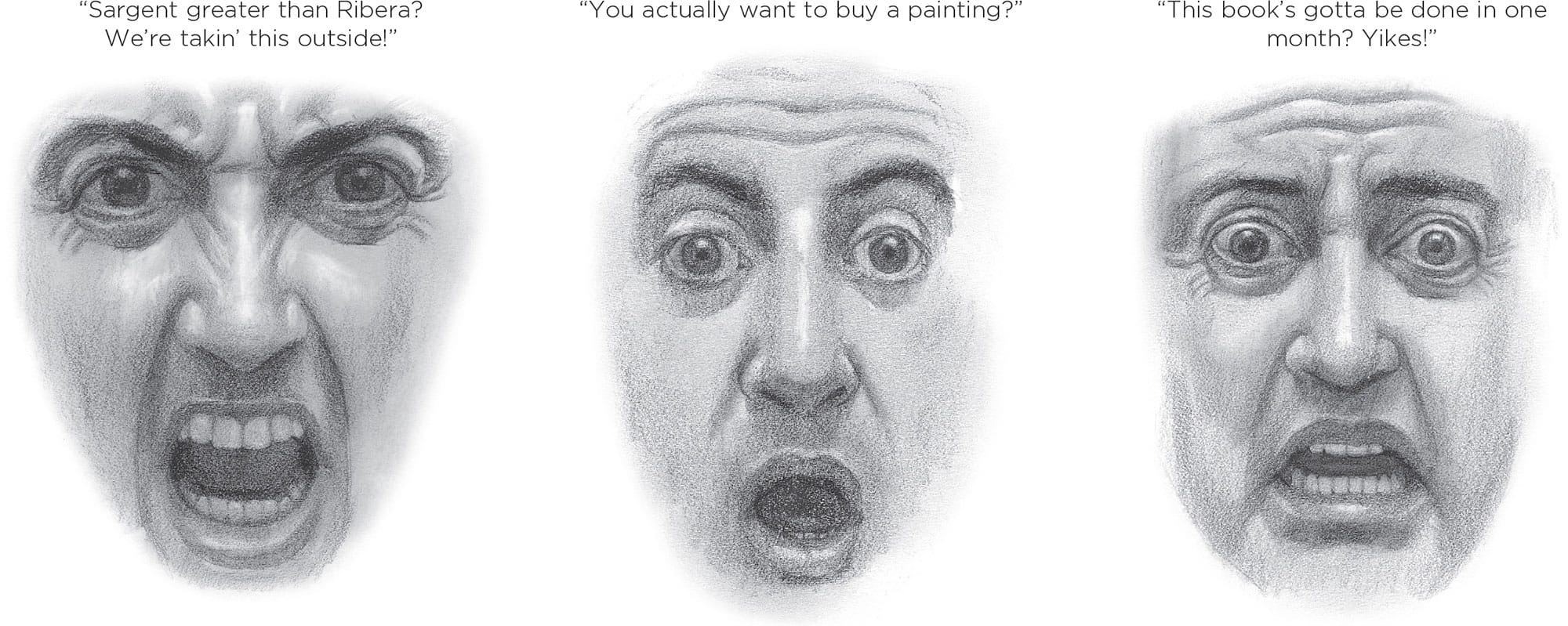
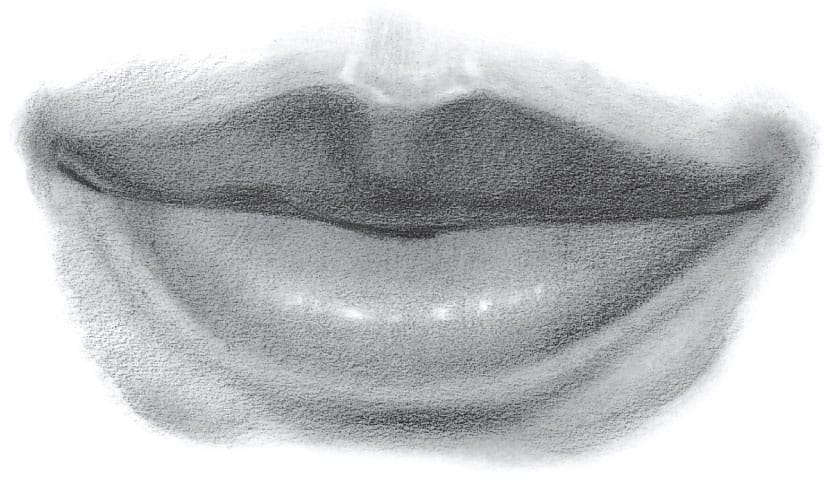
THE MOUTH AND EXPRESSION The mouth assumes predictable shapes for the emotions. Note the square for anger, the small circle for surprise, and the trapezoid for fear. The examples above were drawn with the aid of a mirror—a great tool for checking the veracity of an expression.
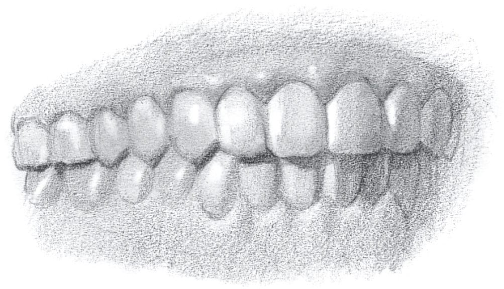
Err on the side of too light when adding lines between teeth.
It’s rare for both sides of the muzzle to be the same shade.
Every tooth has a highlight.
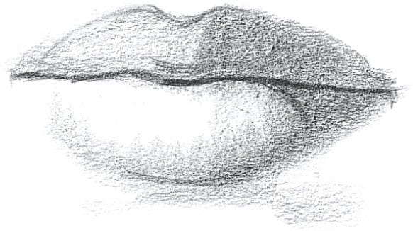
When lit from the side, the lips darken as the forms turn away from the light source. (Notice the sharp-edged shadow cast from the upper lip onto the lower lip on the shadowed side.)
Portraitists often get lazy with the lips. You must accentuate the details. Look at the reflected light on the corners of the upper lip. The reflected light tends to show up under the core shadow, and the line between the lips isn’t a line—it’s a cast shadow.
Curve and shade those teeth back, or the teeth will jut forward at the corners, and you’ll get a toothy grin.
Because the top lip faces down and the bottom lip faces up, they’re rarely the same shade.
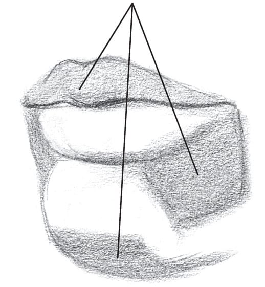
These three planes are usually in shadow.
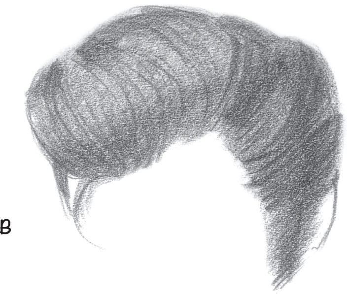
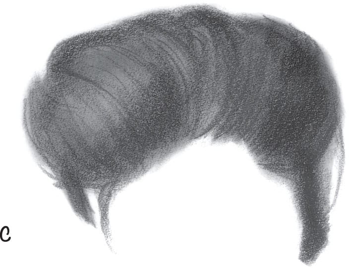
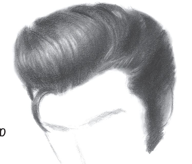
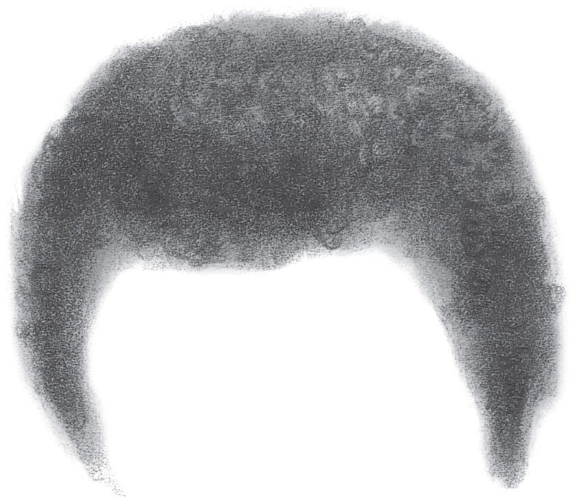
HAIR
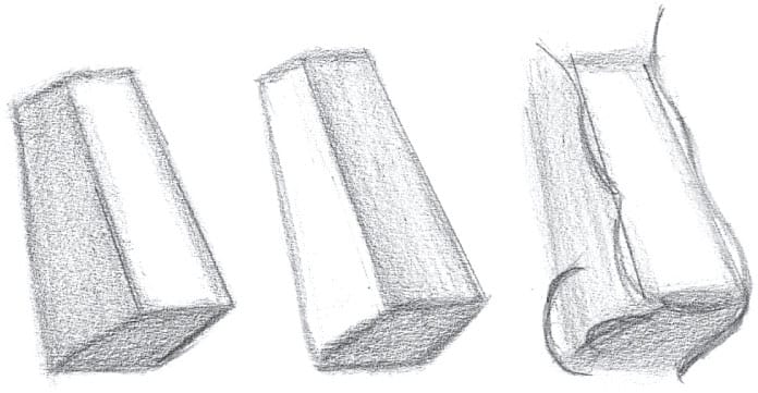
Don’t think of hair as a series of lines or squiggles—instead, treat it as a mass with texture. Following the steps and tips below will help you draw it realistically.
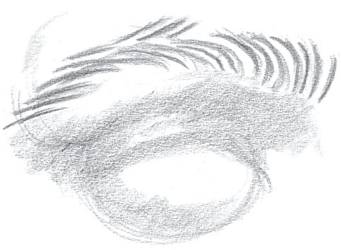
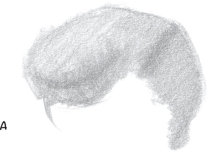
DRAWING HAIR Lay in a pattern of light and dark with core shadows (A). Add striations and details of the forms (B). Stump and rub; then reinforce the striations (C). Form a kneaded eraser into a point and pull out highlights. Erase parallel striations of light to mimic hair (D). The highlights in black hair aren’t white.
CURLY HAIR When encountering curly hair, don’t panic. You don’t have to draw every curl. Just lay down a tone and draw a few curls. Highlight some of them, and deepen some of them. Have fun with it.
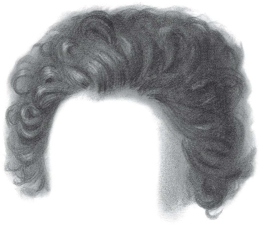
Loose curls
Tight curls
SHADOWS IN HAIR Core shadows aren’t smart enough to stop when they get to the hairline. They keep going through the hair.
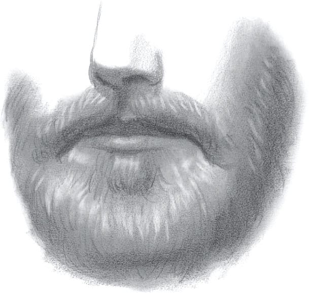
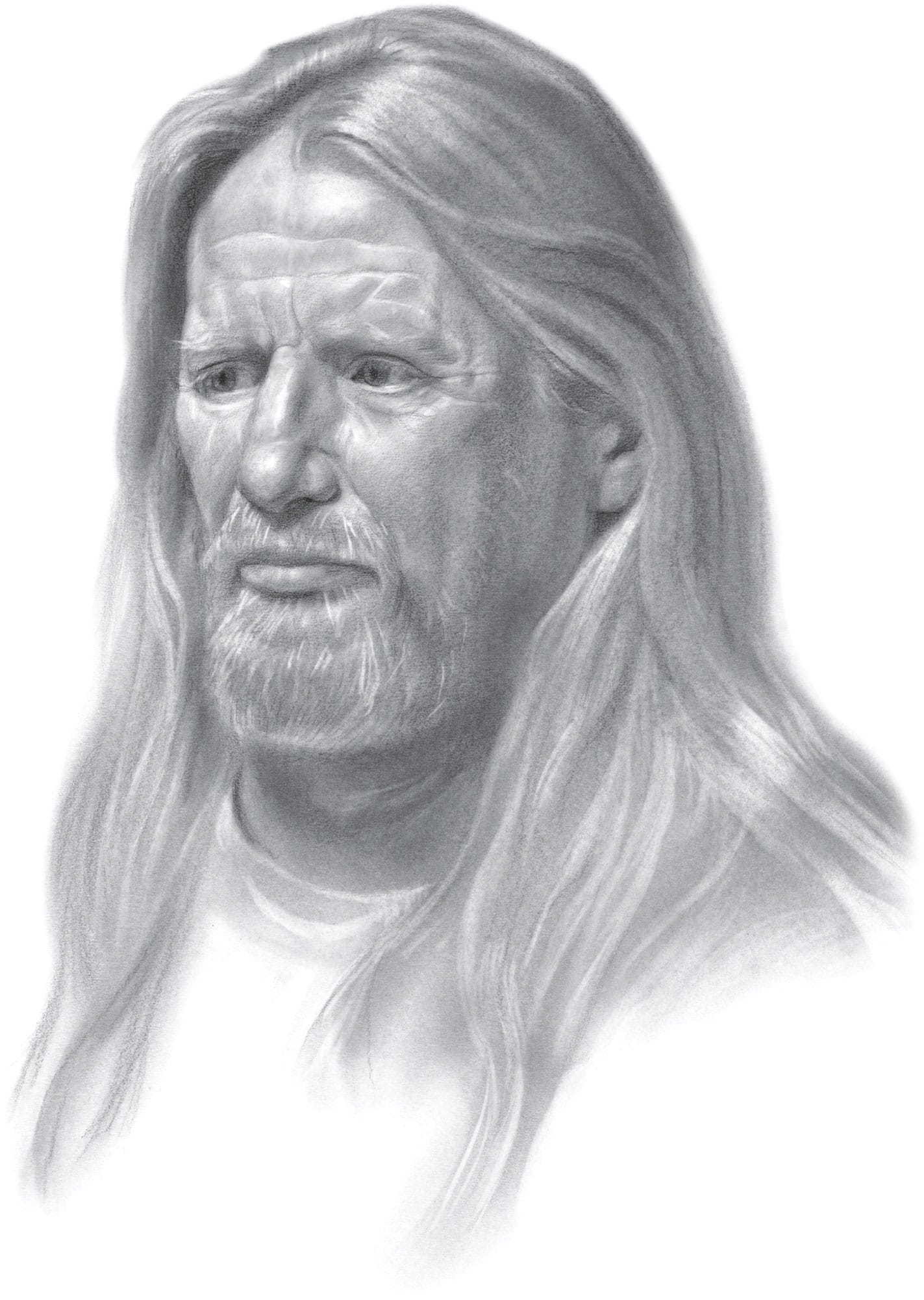
CREATING BEARDS Beards aren’t cotton candy—you must bear in mind a structure as you render the volumes.
DRAWING REALISTIC HAIR Hair should be composed of tones and striations—not bundles of spindly lines.
A COMMON MISTAKE Here’s an example of the “spaghetti hair” method and what you don’t want.