 CHAPTER 6
PASTEL
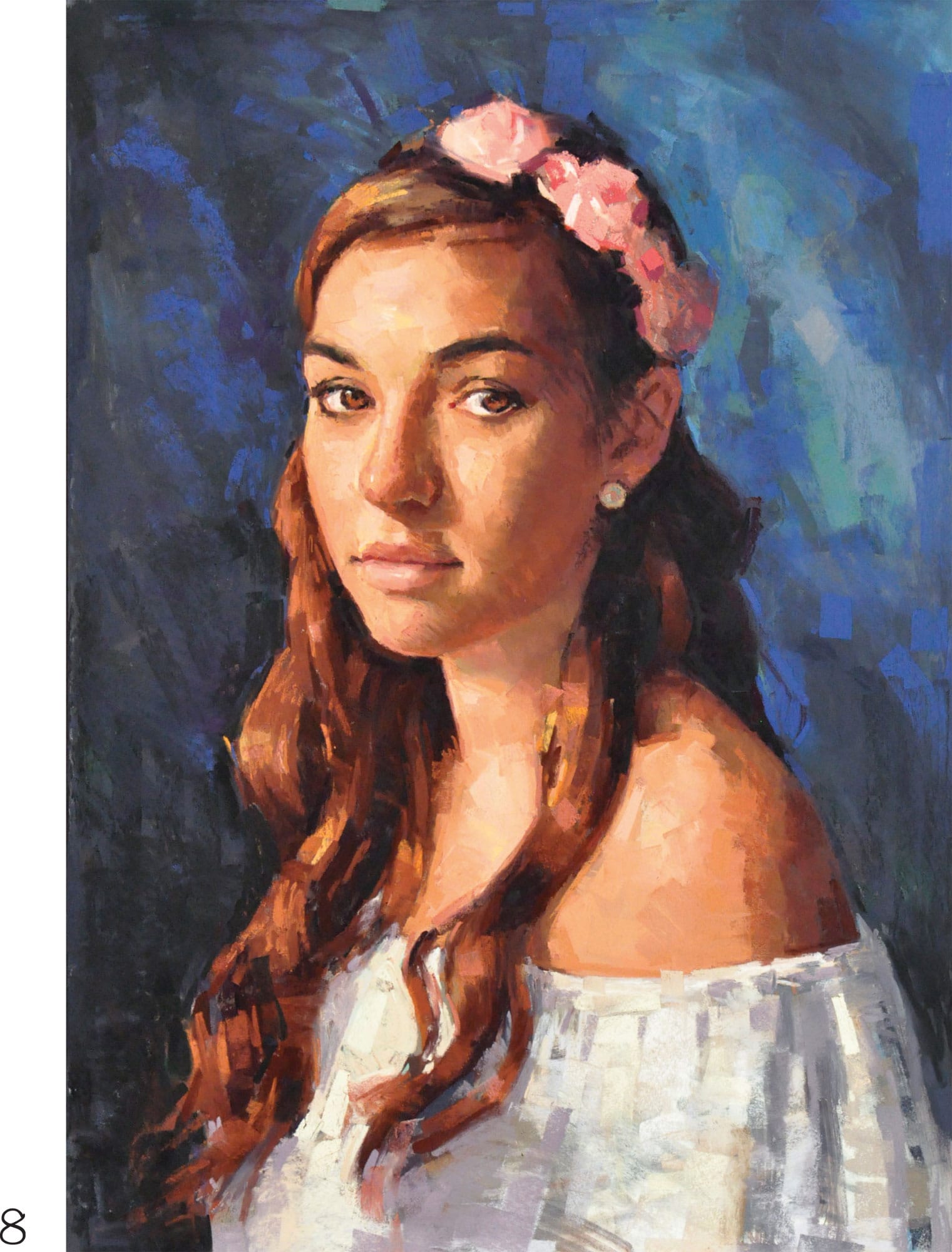
Young Girl
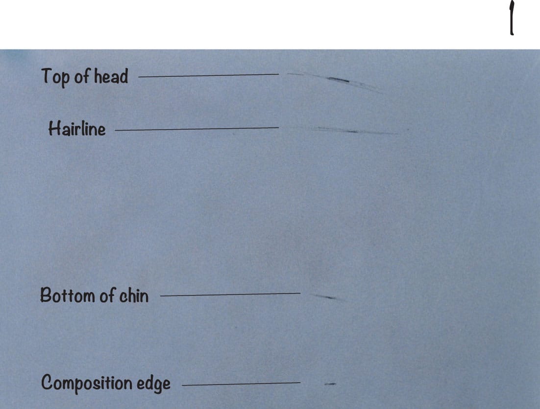
1 The first marks are extremely important as they set the course for both the location and size of the portrait. This lovely blue-gray paper is larger than necessary; you can always crop in later as the portrait develops. Use vine charcoal to make four light marks to indicate the top of the head, the hairline, the bottom of the chin, and the edge of the composition at the bottom. These four marks set the scale and the location of the head in the composition.
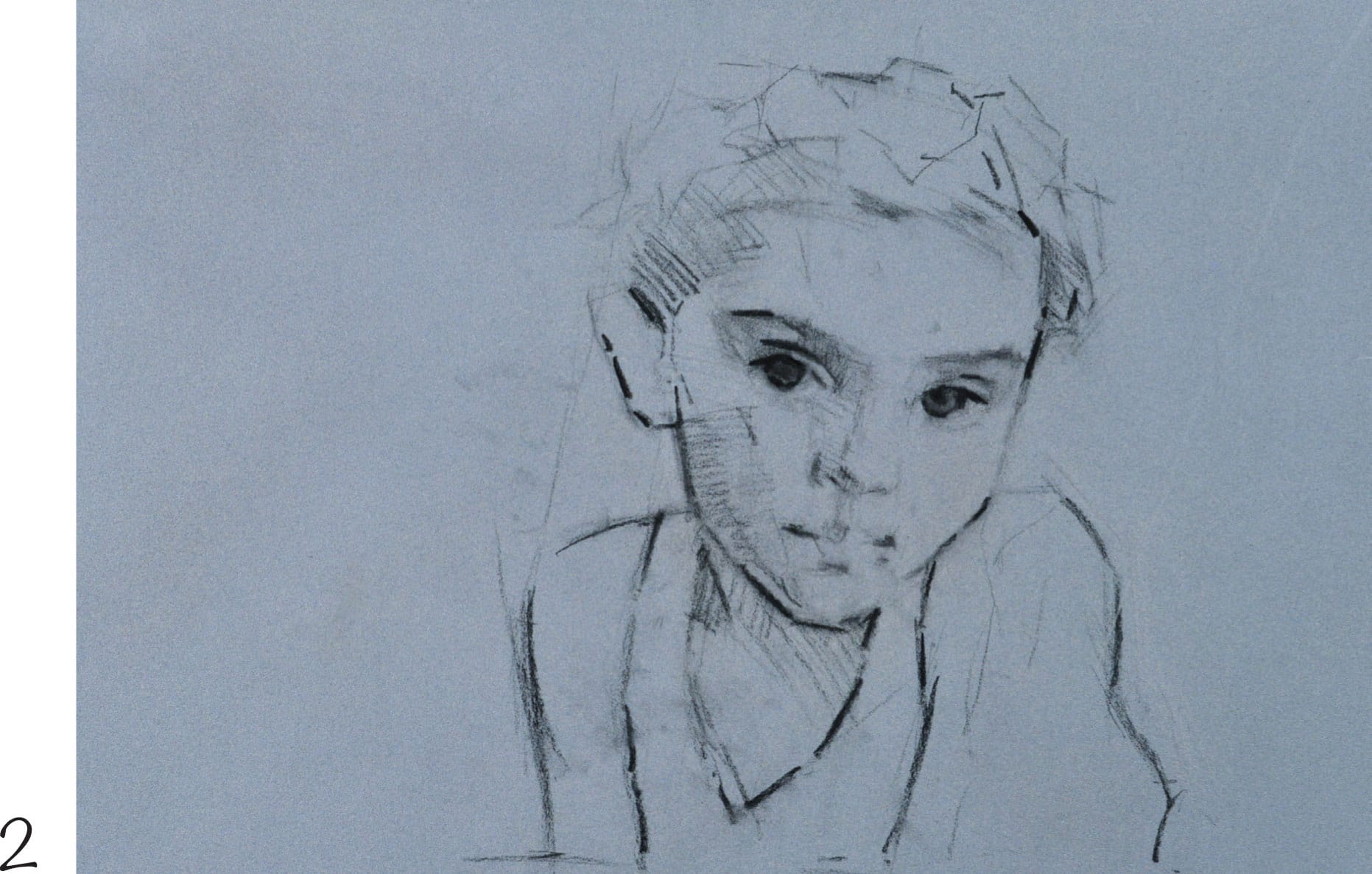
2 Locate the shape of the head and lightly sketch with vine charcoal. Use straight lines to indicate angle changes. Work around the floral headband, capturing the basic shape. Then indicate the angle of the shoulders with a diagonal line. Next work on the facial features. Locate the eyes and state the darks of the eyebrows. Draw the shoulders and torso, relating the shapes to the head above in order to find their locations.
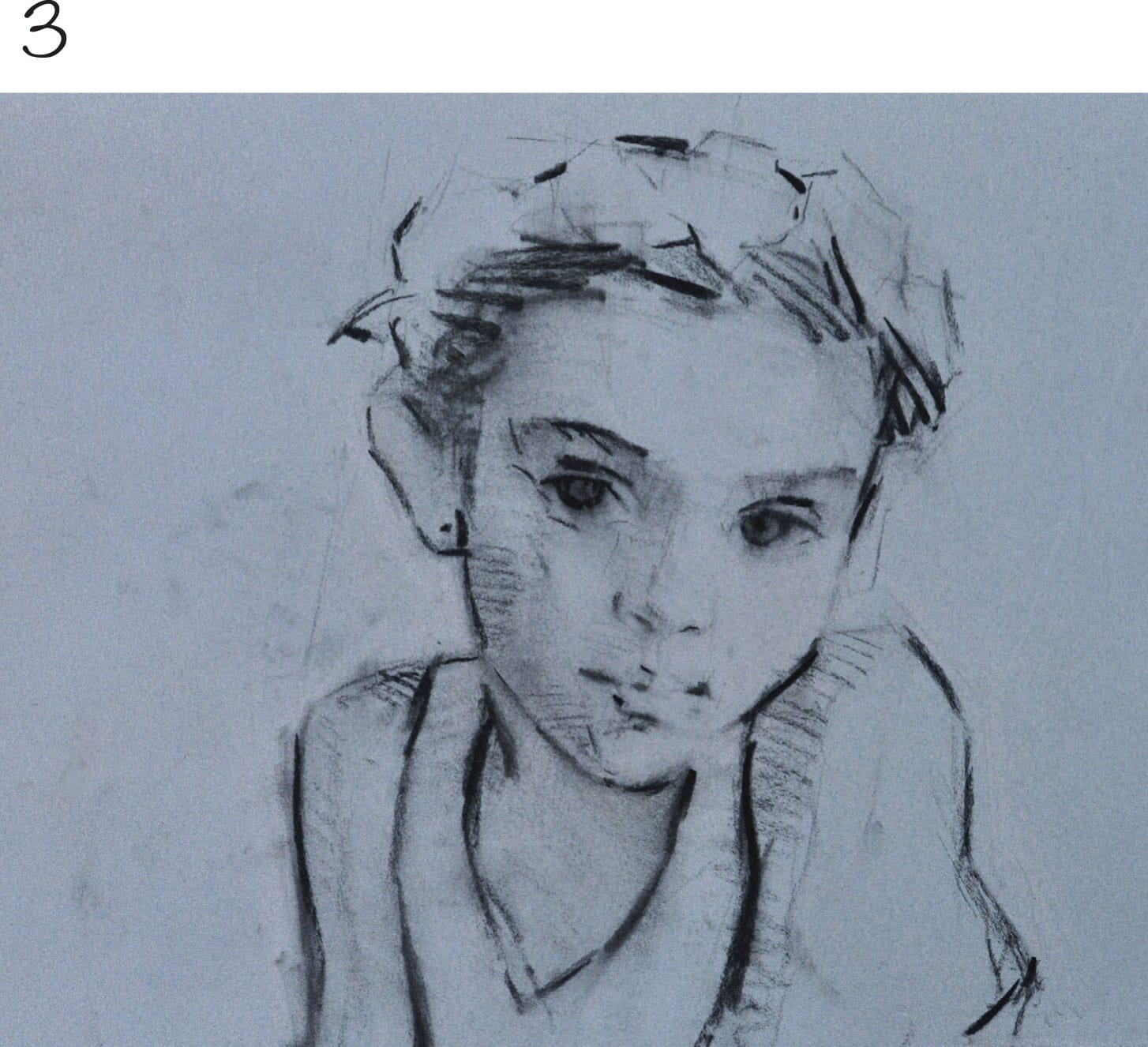
3 Darken the edges and tone in the shadows with vine charcoal. This creates a visual map for the portrait as we begin to paint with pastel. Use a hake brush to lightly wisp over the drawing and release any loose charcoal in preparation for the next stage.
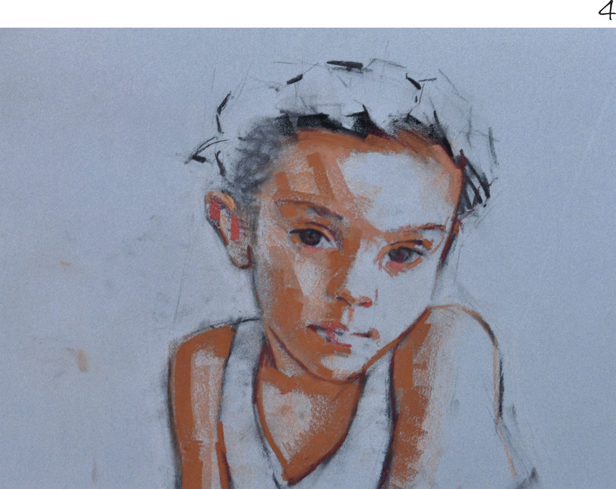
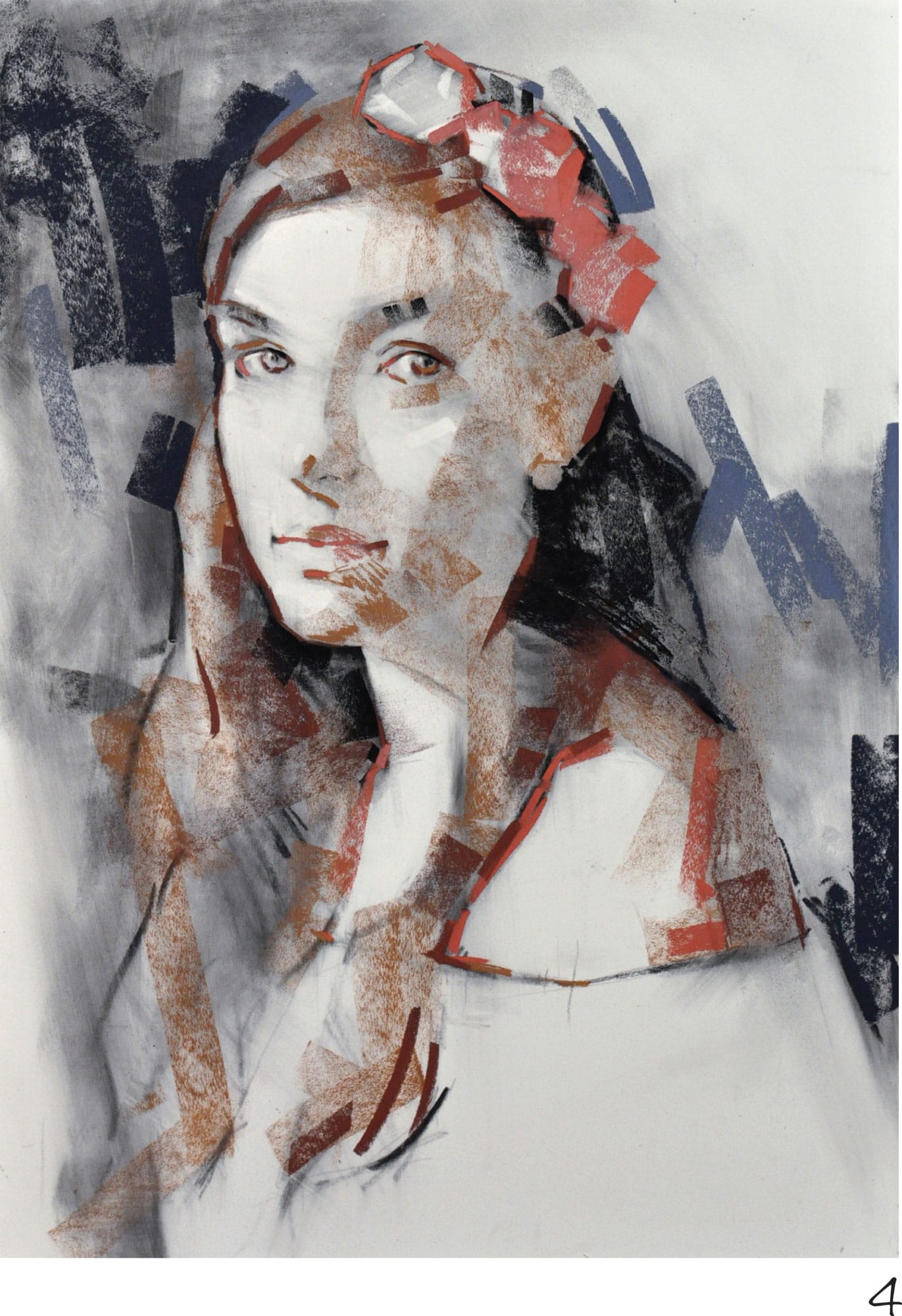
4 Using soft pastel, mass in the shadows with side strokes of umber. Start with a middle-dark value a little darker than the paper to establish the mass; we will go darker later. Next use reddish dark brown to restate some of the drawing over the vine charcoal. These linear strokes of pastel secure the drawing more firmly, as vine charcoal tends to fade easily. Push the darks further by using side strokes of warm sienna soft pastel.
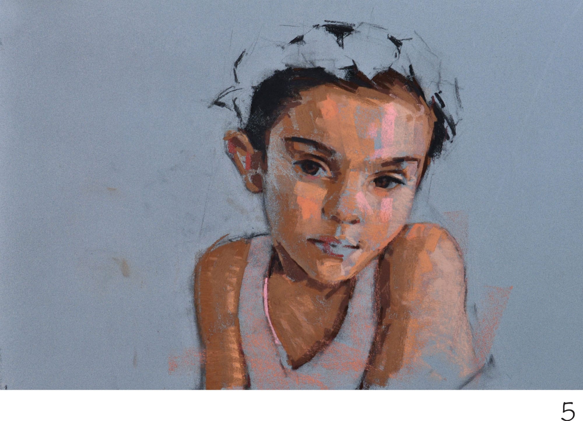
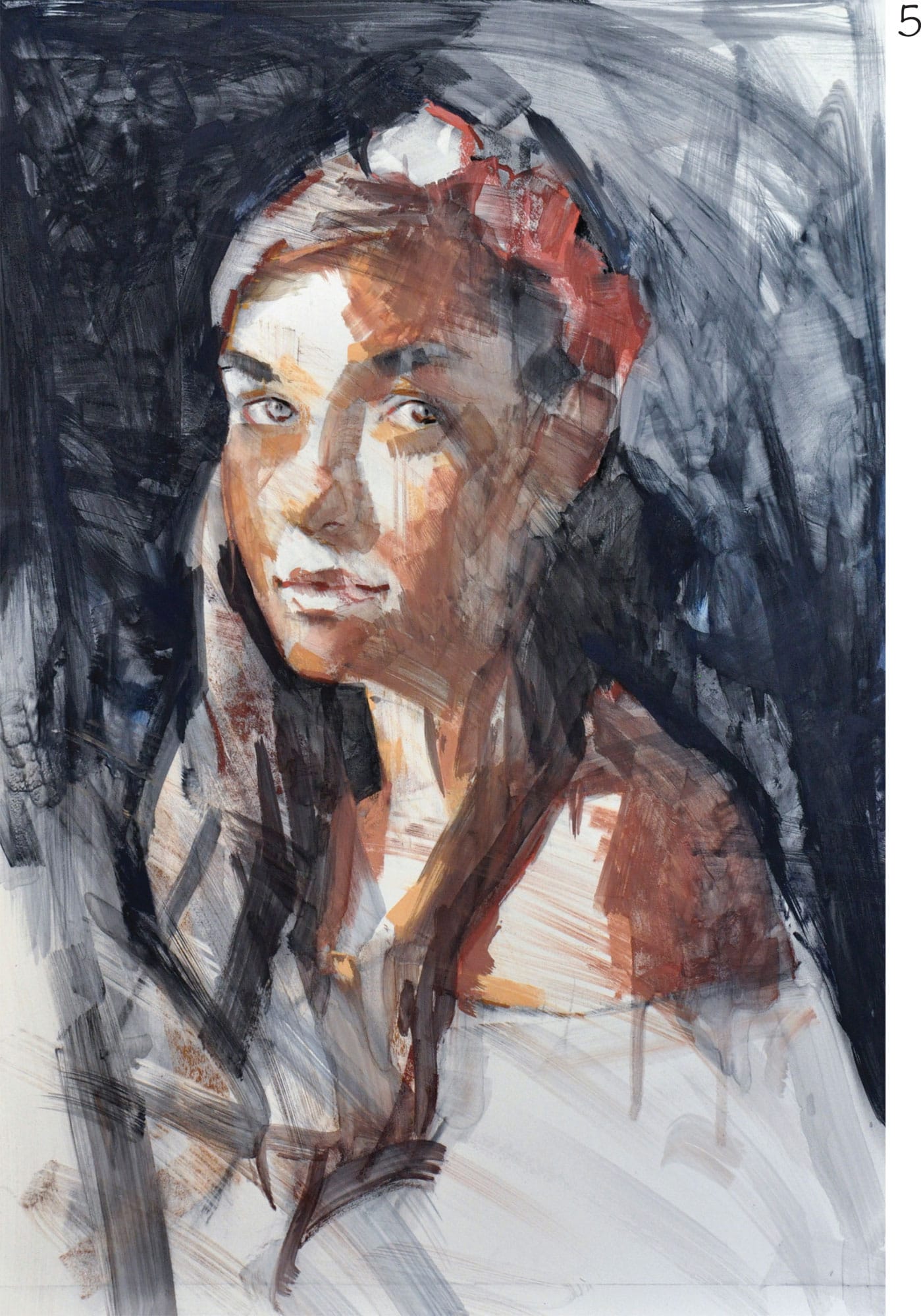
5 It’s time to establish the warmer skin tones on the lighter side of the face and arms. Use side strokes with smaller pieces of soft pastel in these areas, rather than lots of linear strokes. Use a warm peach in the middle of the face and on the arms to transition the light and shadow area. Then use soft black pastel to strengthen the darks in the hair, eyes, and eyebrows, pushing the value to the extreme. Use dark chocolate brown to deepen the shadows by the hair, under the chin, and at the edges of the blouse.
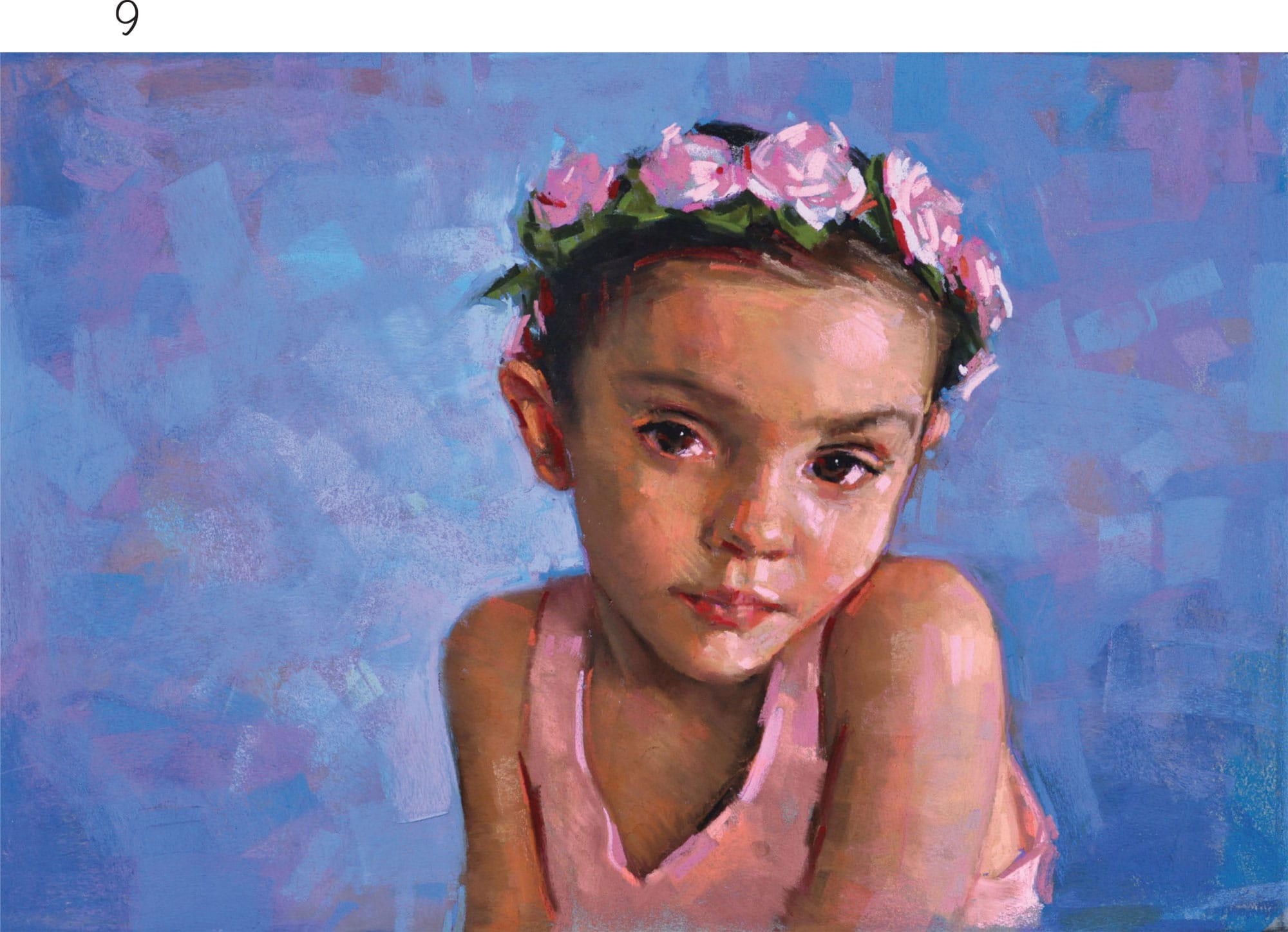
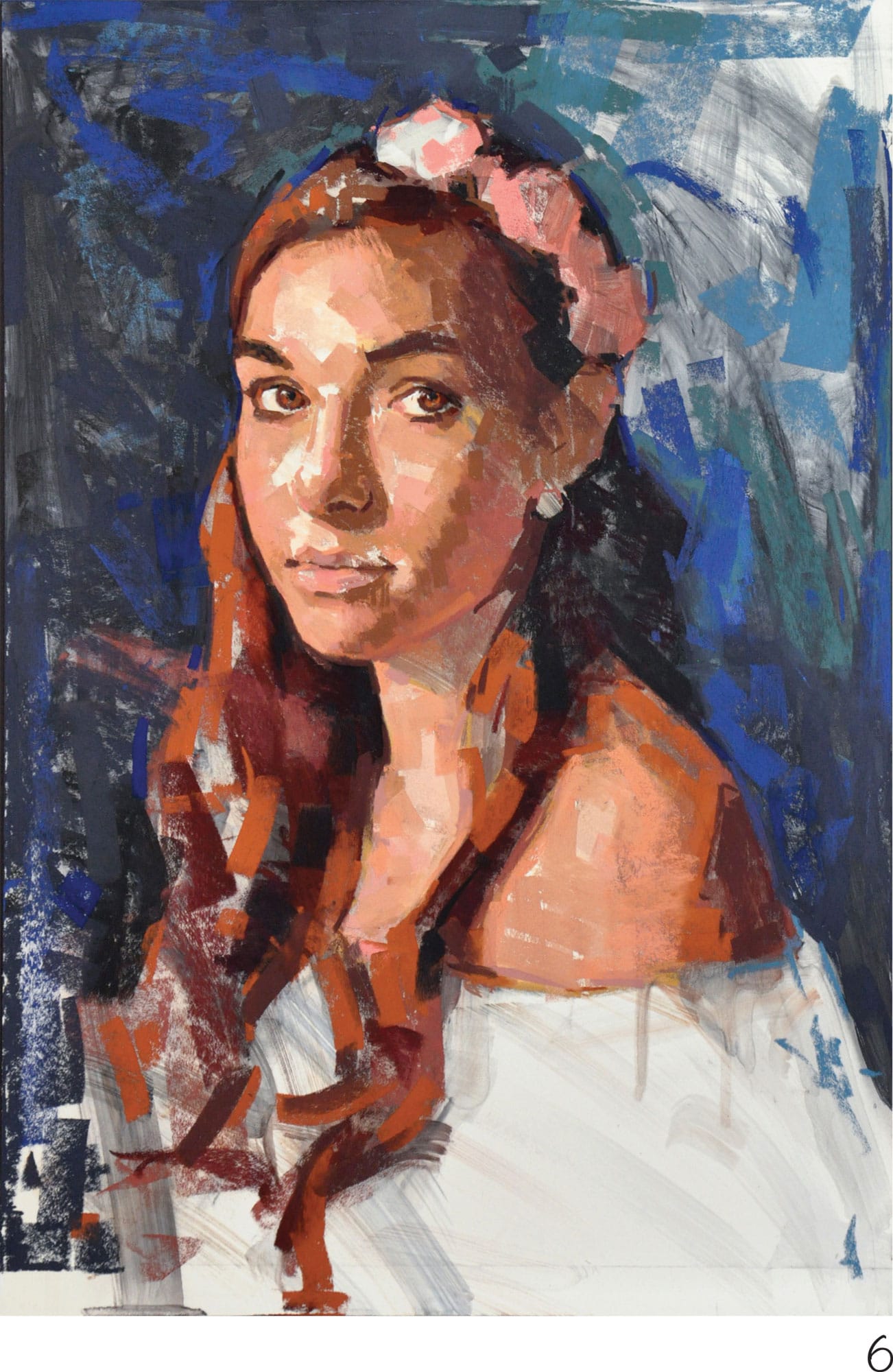
6 Begin the background with large broad multidirectional strokes, creating dynamic energy and excitement. Start with various shades of violet grays. Going back to the girl, begin massing in more color, adding broad strokes of pink to the floral headband to indicate the roses. Use pink and mauve in the midtones of the face and arms. Next use linear strokes of scarlet red in the inside corners of the eyes, around the nostrils, and throughout the lips. Add red accents to the ears and cheeks at the edge of the lit side of the face.
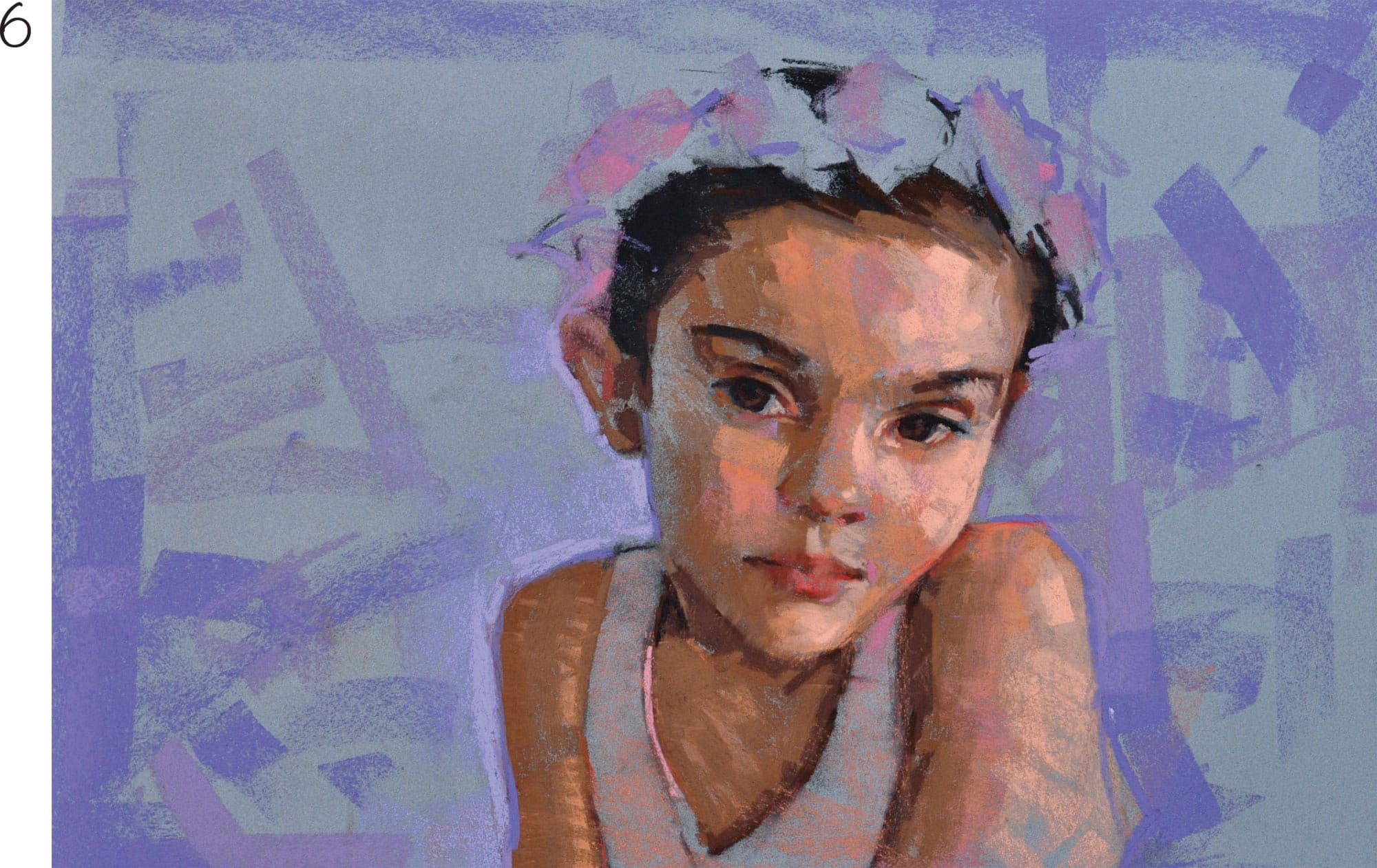
7 Restate the darks with brown along the left edge of the face, the bridge of the nose, around the eye sockets, and the lips. Then add light blue notes into the background on the left side, clarifying the edge of the head and ear. Add light pink to the roses in the hair to begin shaping the flowers. Next add more layers of blue, violet, and purple to the background. Add lush vibrant salmon on the blouse and face to give the portrait more vibrancy and glow.
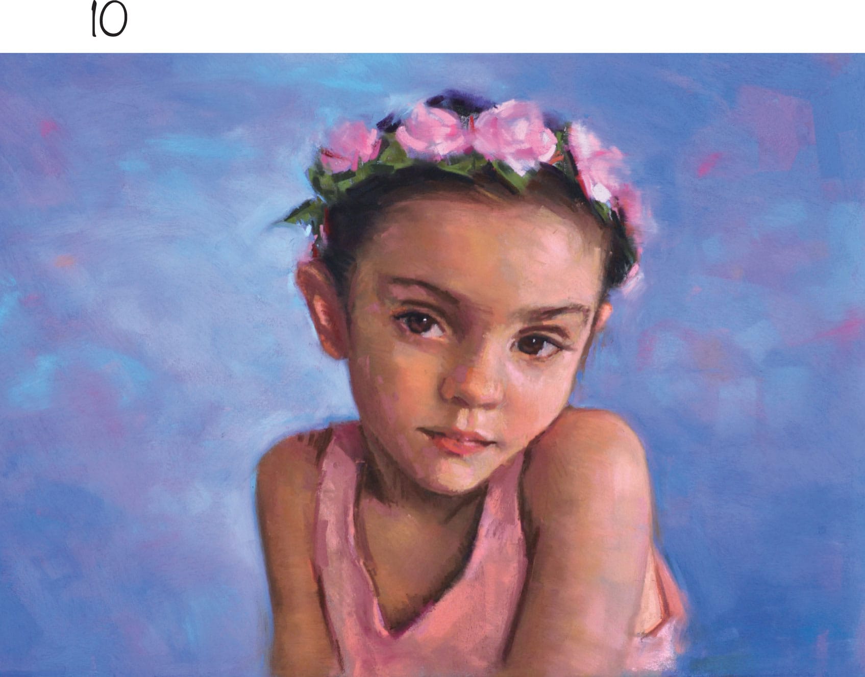
8 Using dark brown and black again, restate the darks in the hair and in the shadow areas of the torso and arms. Use umber browns in the midrange between the hair and face to transition the forehead. Then use both soft and hard pastels to continue developing the midrange in the darks and lights, creating more subtle gradations from dark to light. Don’t be afraid to take risks with color, letting your intuitive side play. Experiment with some teal blue to the left of the head.
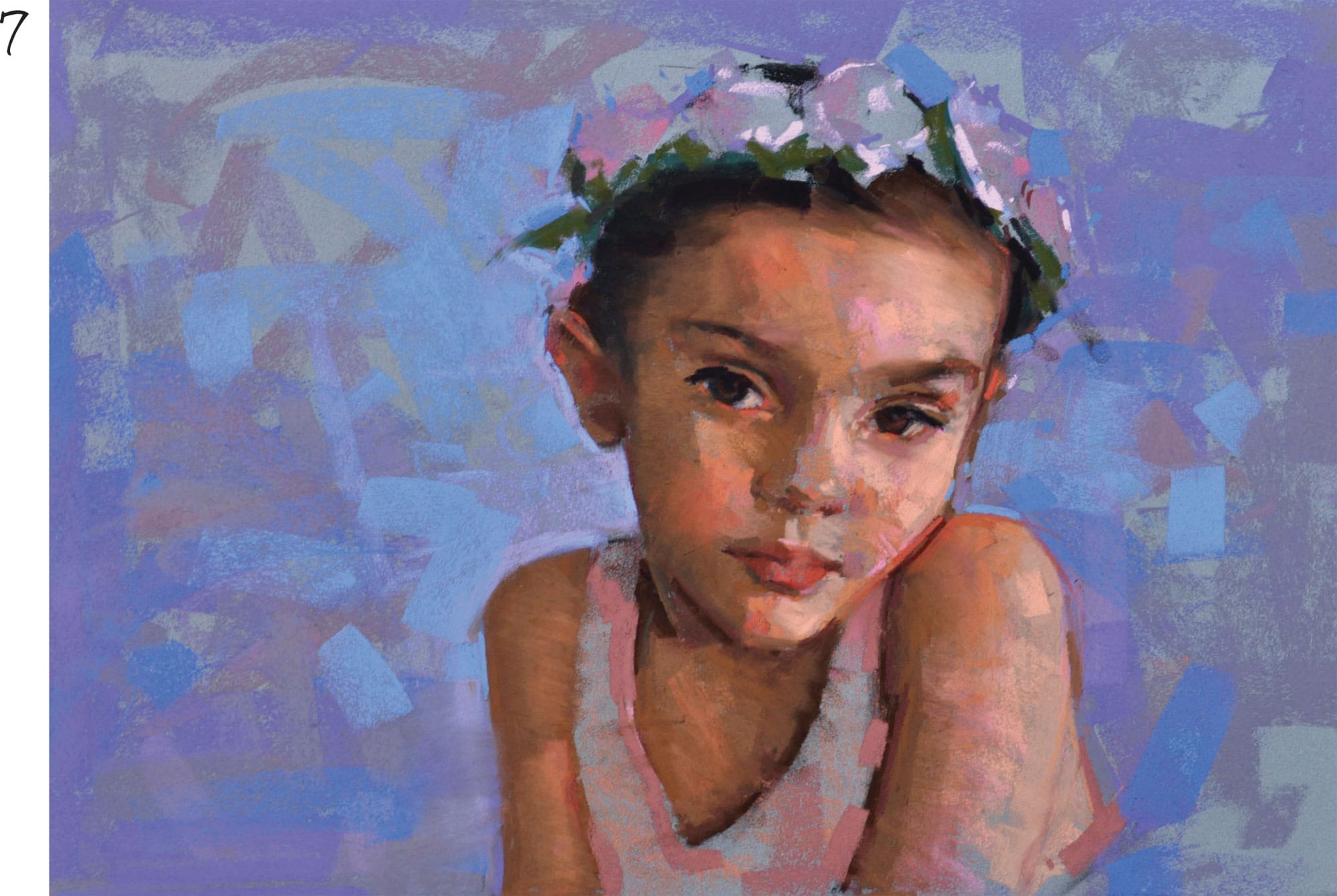
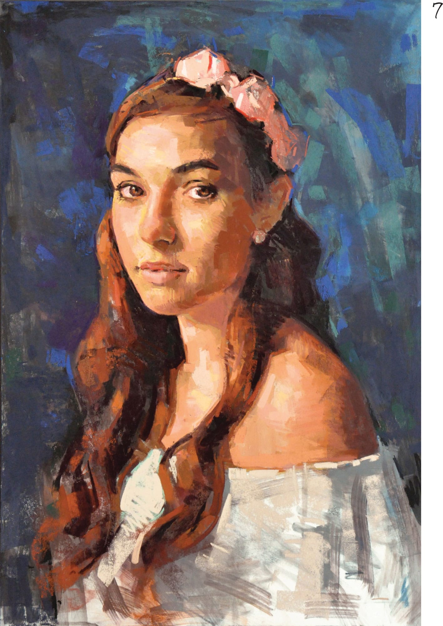
9 Begin to add thicker, bolder strokes of light pink and violet in the roses of the floral headband and throughout the light side of the face. Add some bold strokes of pink in the blouse as well. Then add deep red strokes in the flowers, hair, face, and ears to give a feeling of life. Add a few dashes of orange throughout the face and arms to add visual excitement.
10 After many layers of pastel strokes, it’s time to quiet down the texture of the painting and fuse the edges. Use a paper towel to gently blend the background. Using a soft hake brush, carefully blend the face and arms with light wisps of the brush. You can use your fingers in more sensitive areas of blending.
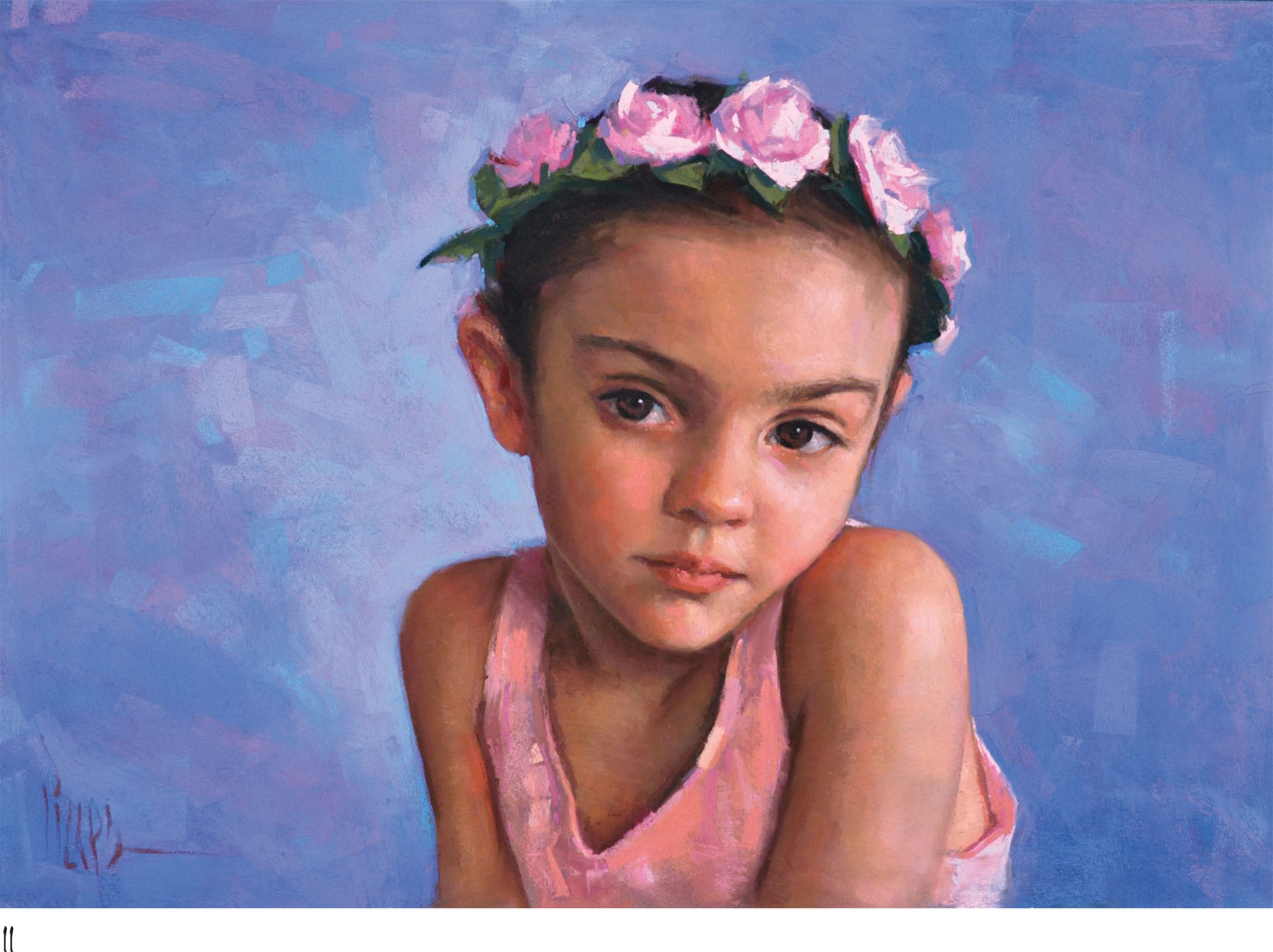
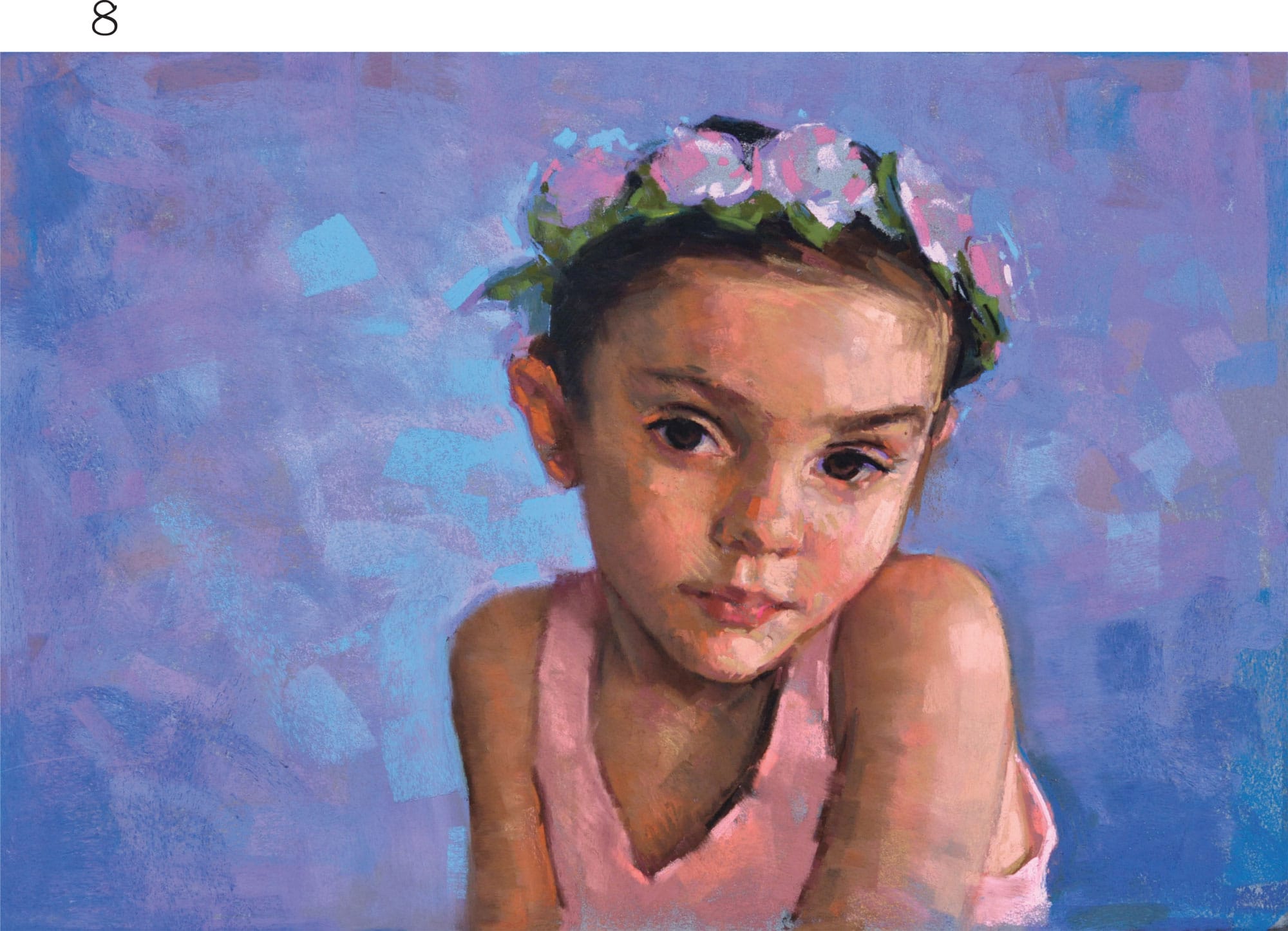
11 The final stage is about moving through the darks, middles, and lights of the painting once more to refine the drawing, clarify the values, enhance color, and adjust edges. Build up the floral headband with fresh marks again, as well as the background. Use more hard pastels in the face at this last stage to execute the smaller details around the features, focusing a lot of attention on the eyes. Place a small crisp highlight in each eye, using a sharpened white hard pastel. Use a black hard pastel for the pupils and the eyelids to really make them stand out.
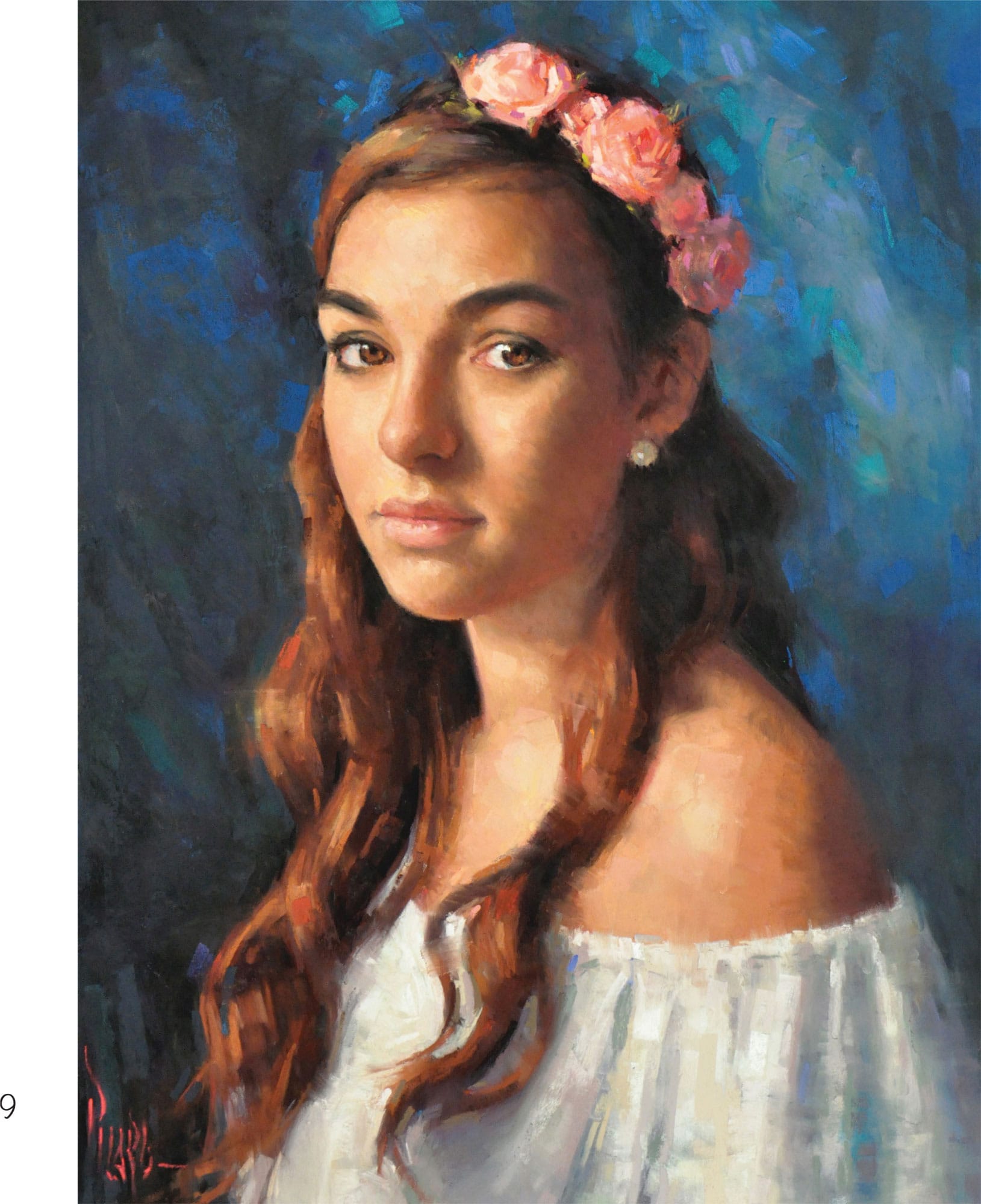
Young Bride
A great painting always begins with the spark of an idea, but it succeeds as a result of thoughtful planning. It’s important to let your inspiration guide you and paint subjects that interest you artistically. For this project, we’ll paint a beautiful Victorian bride.
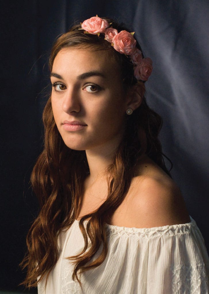
LIGHTING & PHOTO SESSION Lighting is crucial, as it has a significant impact on the mood of the portrait. For this photo the light source is a 24" × 32" softbox—a soft light source that cast 750 watts of tungsten light on the model’s face and torso. The light source is placed on a light stand about 4 to 5 feet away from the model, positioned slightly above and to the left of her face. The off-center position results in a strong, clear pattern of light and shadow across her face and creates lovely catchlights in her eyes. The softbox also produces a soft edge on the model’s face at the turn of the form between light and shadow. This lighting approach is called three-quarter portrait lighting. An additional small 200-watt spotlight just behind and to the right of the model, directed at the background, illuminates and separates the blue drapery from the shadow side of head.
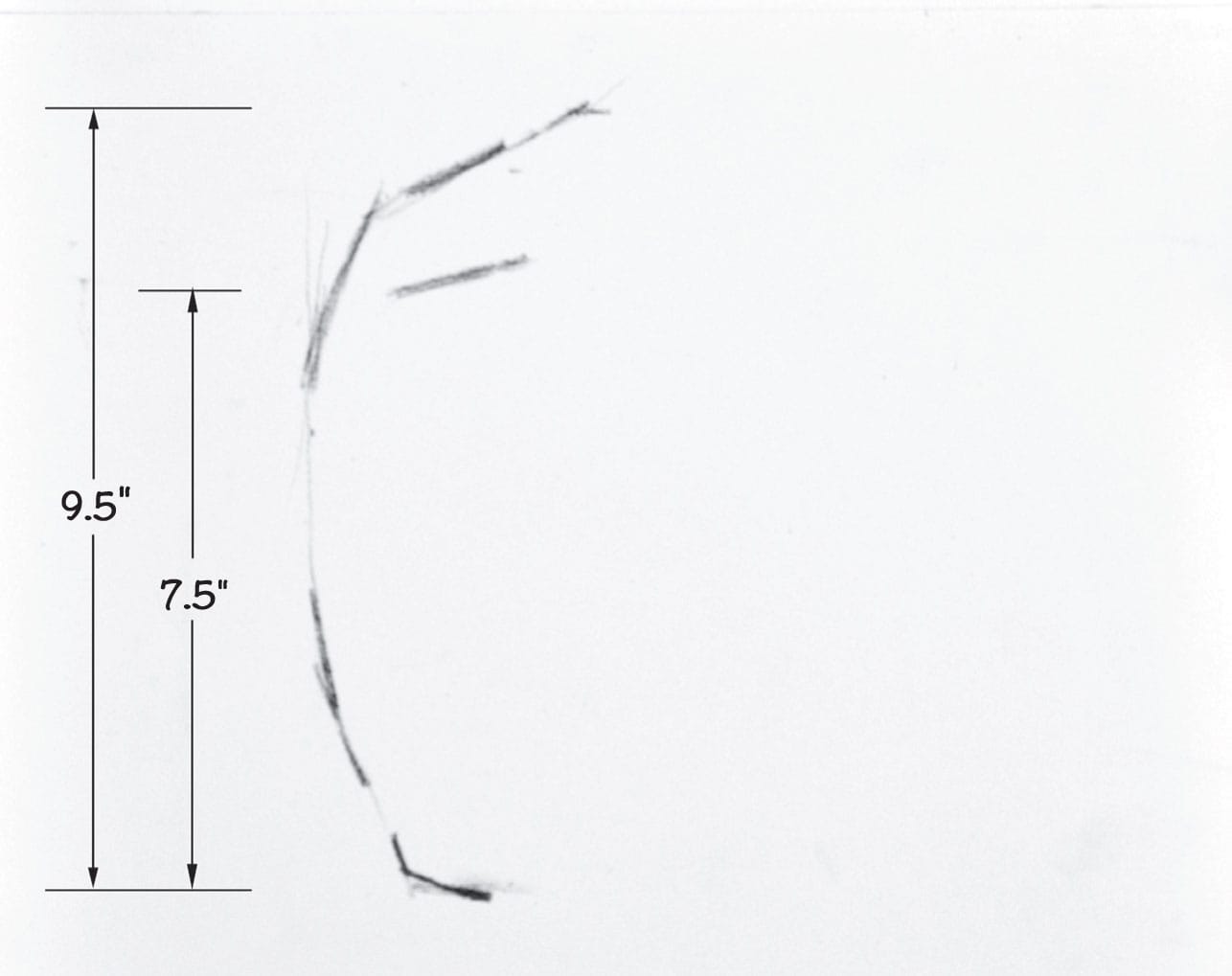
SCALING THE HEAD The head should be life-sized in the final portrait. If it’s too large, it can appear incorrect or garish, particularly if it is a young female head. A simple measurement of the model’s face with a standard ruler will provide the dimensions needed to accurately scale the portrait. In this case, the model’s face is 71/2" from the chin to the hairline and 91/2" from the chin to the top of the head. The dimensions for this portrait will be roughly 16" × 24" with room to adjust if needed.
Create a few sketches to get your hand moving and connecting with the shapes. These sketches, or thumbnails, serve as visual problem-solving tools that help resolve shape, value, and design choices before beginning the painting.
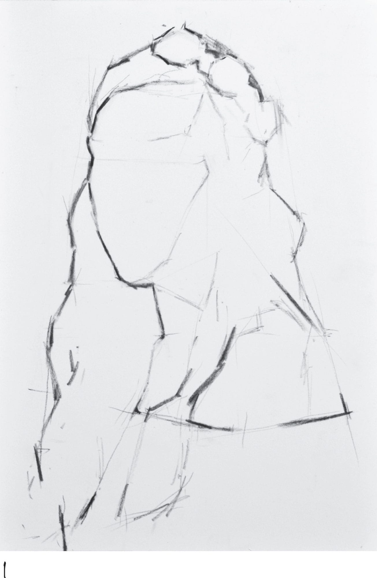
1 Begin with soft willow charcoal, an excellent tool for initial sketching because of its forgiving nature. Start by indicating the bottom of the chin, the hairline, and the top of the head. These important marks set the course for the scale and location of the entire portrait to follow. With the marks in place, sketch the outside edge of the head, the basic shape of the draping hair mass, and the flower crown and blouse. Take time to measure and find the proper locations for each element in relation to the head.
2 Begin toning the shadow masses with willow charcoal. Sketch the smaller shapes of the face, such as the eyes, nose, and mouth, continuing the pattern of shadows cast by the nose and lips. At this stage, keep your focus on simple shapes and avoid drawing details.
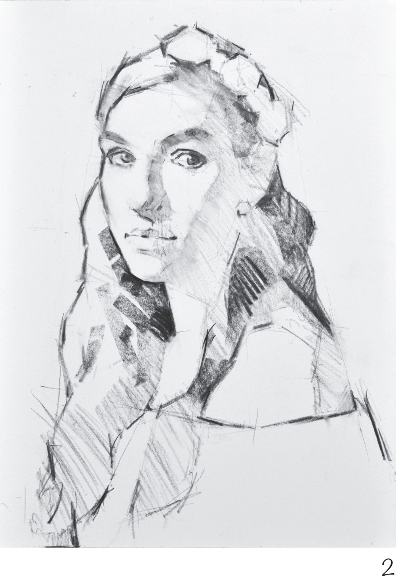
3 For the final sketching stage, mass in the darker tones of the hair and background using the sides of the vine charcoal. Unify and simplify the tone by blending with a hake brush and stumps. Quickly restate a few outside edges and features to clarify the division of shapes, as blending can diffuse them. Finally, use a kneaded eraser to create a few key highlights.
4 When you switch to colored pigment, start by massing in the darks. The model’s hair and skin tone both call for a great deal of brown, burgundy, and reddish ochre. Focus on the shadow shapes of the hair, face, and shoulders, using mostly side strokes of hard and soft pastels applied with a very light touch. Next use broad side strokes to mass in the dark blue and gray of the background.
As you work, keep in mind that every painting stroke is a drawing stroke, because it impacts the form through color temperature, value, and shape.
5 Using a wash stains the pigment into the surface of the sanded paper, which opens up additional paper tooth for subsequent layers. Using a flat watercolor brush and 70-percent denatured alcohol, begin applying alcohol washes over the dry pigment, taking care not to wash the darks into the lightest lights.
6 The washes diffuse and slightly distorted the image, so it’s necessary to restate the drawing. Start by restating the rich, warm darks of the hair and add a bit of striking deep blue and green to the background. Then begin building up the skin tones with middle and light values in ochre, pink, and light umber. Finally, add more saturated midtones to the hair and background to push the color intensity.
7 Revisit the alcohol wash technique to create a soft atmosphere in the background, hair, and foreground blouse. Use the broad sides of paper blending stumps to scumble and burnish the pigment into the paper. Next build up painterly marks in the flower crown, hair, and skin. Work more carefully around the eyes, nose, and mouth to develop the features. Once again, restate the deep darks and midtones of the hair. Now begin placing opaque lights on the blouse and highlights on the face with soft pastel.
8 If you like, crop an inch off the bottom edge of the composition to eliminate excess blouse. Then begin the lengthy process of refining the portrait, blending and softening edges where needed, and making subtle adjustments to color and shape.
9 Notice the subtle development of the unique textures in the flower crown and blouse. Play with unblended, crisp flicks of saturated color above and surrounding the head. This effect lends a dreamy, ethereal quality to the subject while providing visual stimulation between the warm and cool colors.
Boy
Use a linear drawing approach called “angularizing” to locate the outside edge of the head and the division of light and shadow in the portrait. As these shape relationships develop, you can easily check the accuracy of your drawing by observing the “anchor points” where angle changes occur.
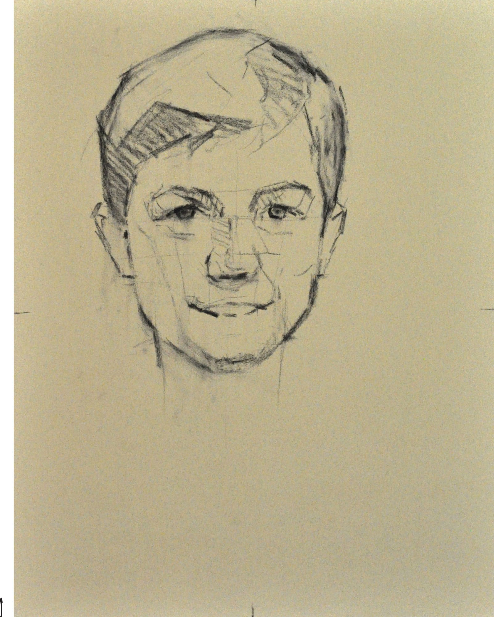
1 Begin with willow or vine charcoal to scale and place the head on light gray pastel card, mounted to Gatorboard. Block out the shape of the head. Using charcoal, loosely add tone to the shadow areas. Try to construct a basic blueprint for all major shapes in the portrait. Notice how the light and shadow shapes have been abstracted into basic masses, much like jigsaw puzzle pieces. Consider the large negative shapes in the background surrounding the head to be certain they fit together correctly.

2 Before adding color, quickly tone in a bit more dark value with soft vine charcoal, and then soften it using a brush or paper towel. This gives the study a more unified look and embeds the charcoal into the paper before applying color. This is the last chance to evaluate the drawing for accuracy, placement, and design before moving on to the next stage. It’s worth taking your time.
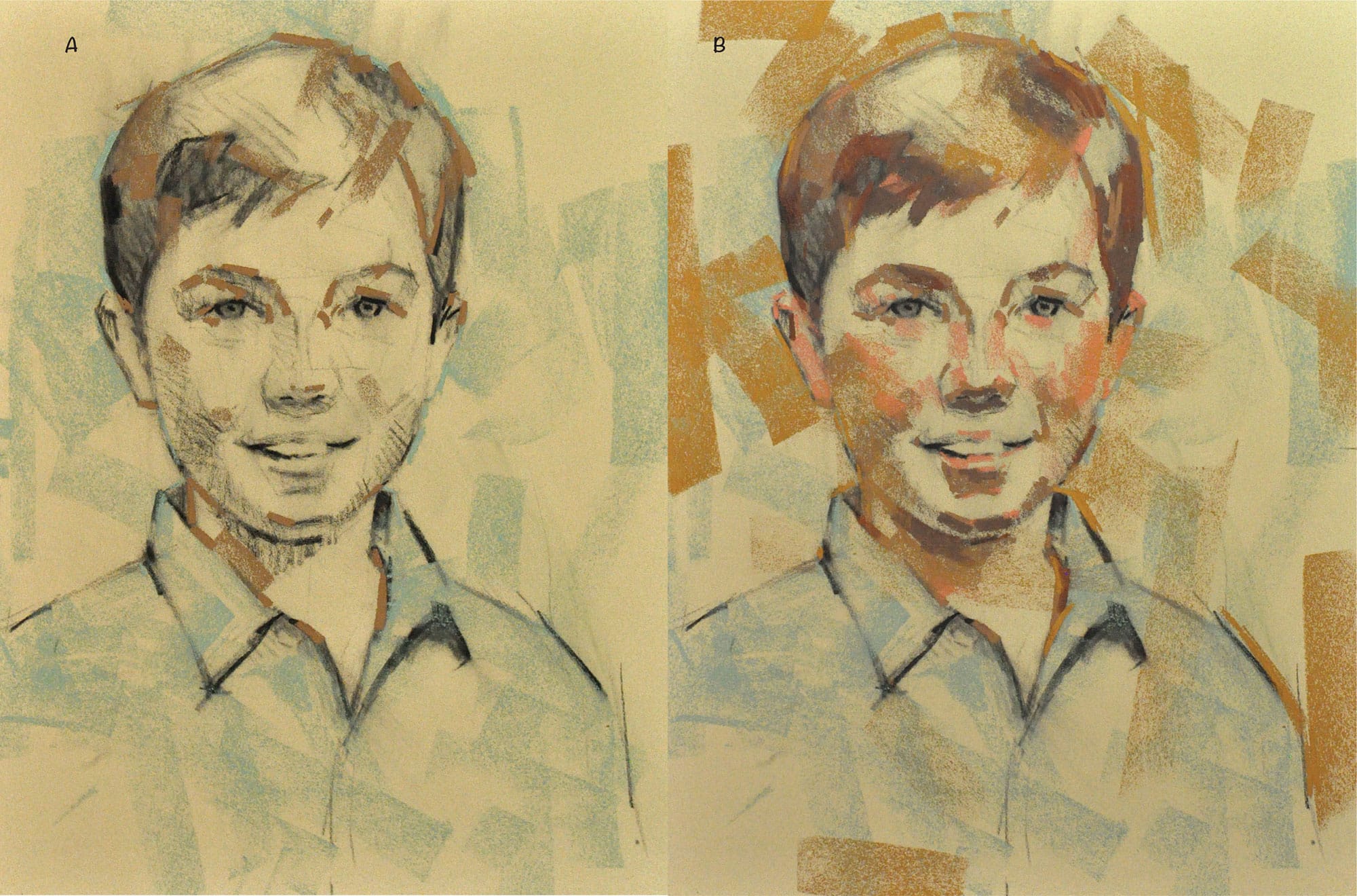
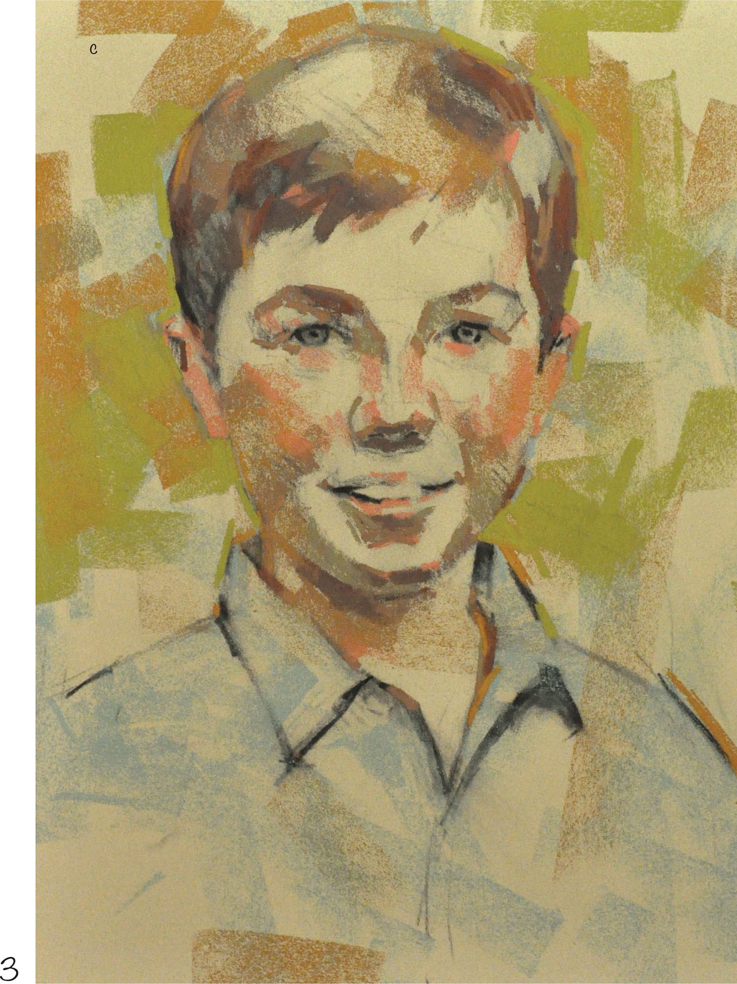
3 The vision for this portrait is to present a vibrant depiction of boyhood, so use bold mark-making to develop the piece. Use a broken color technique by applying bold chops of color in unblended strokes to build up the atmosphere of the work in an impressionistic manner. Begin with a cool gray-green soft pastel to establish atmosphere. Use the full, broad side of the pastel for these large side strokes, moving color around the head and over the shirt to create color harmony (A). Next use an umber soft pastel to divide the dark masses in the hair and face. Moving toward warmer colors in the middle and dark areas, use a flesh color in the cheeks, deep burgundy in the hair, and another warm brown midtone throughout, continuing this choppy, bold painterly approach (B). Switching gears to the background, use a warm greenish-ochre to introduce yellow-green to the palette (C).
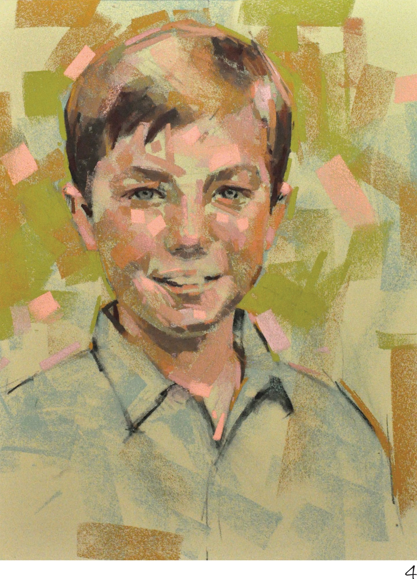
4 Anchor the darkest darks using deep burgundy and black soft pastels in the shadow areas of the hair, face, and neck. Then move to the face to establish more of the flesh tones with the same bold, choppy marks, giving the portrait a playful and confident feel. Use the same mauves and pinkish flesh tints that cover the face and neck in the background as well, to harmonize the palette.
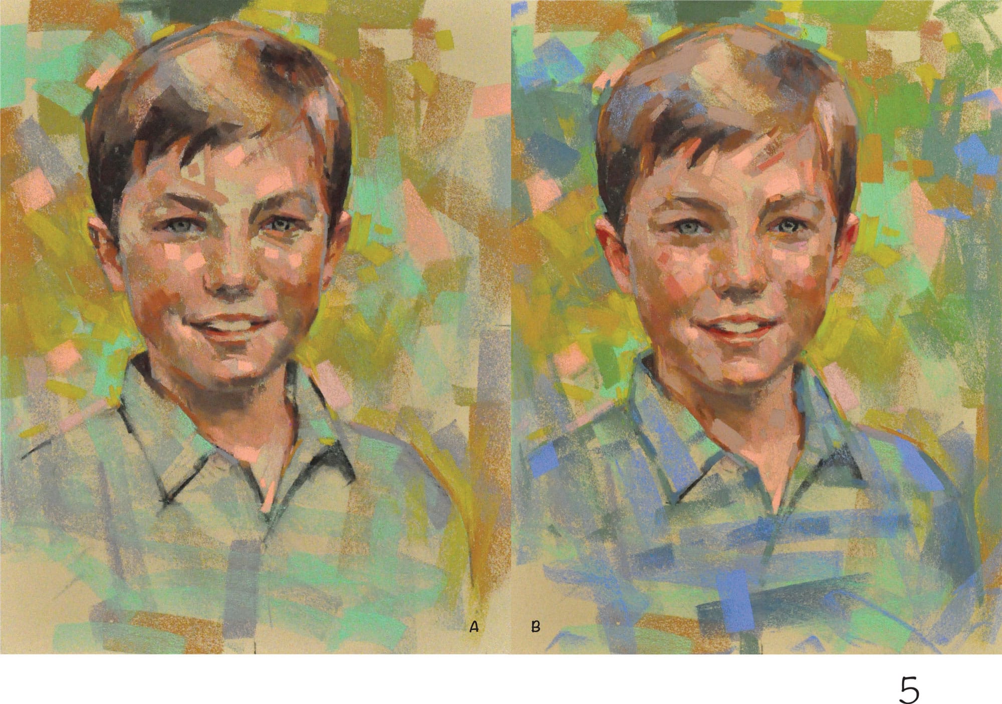
5 Switch to violet-gray and introduce this neutral throughout the shirt, background, face, and hair to give the portrait a cool, airy feel. Barely squint your eyes and allow yourself to instinctively place the color wherever it feels necessary, overlapping edges to open up the atmosphere. Select a cool mint green and use it recklessly throughout the shirt and background (A). Integrating these cool tints with warm passages enhances the atmosphere around the head. Apply subsequent layers of pigment, including yellow ochre, cobalt blue, blue-gray, and moss green in multiple values, with additional flesh tints of warm reds, neutral flesh tones, and cool grays in the face (B).
Using similar colors throughout the whole painting creates color harmony. Try using colors from the face, hair, and shirt in the background. Then find ways to use background colors in the face, hair, and shirt.
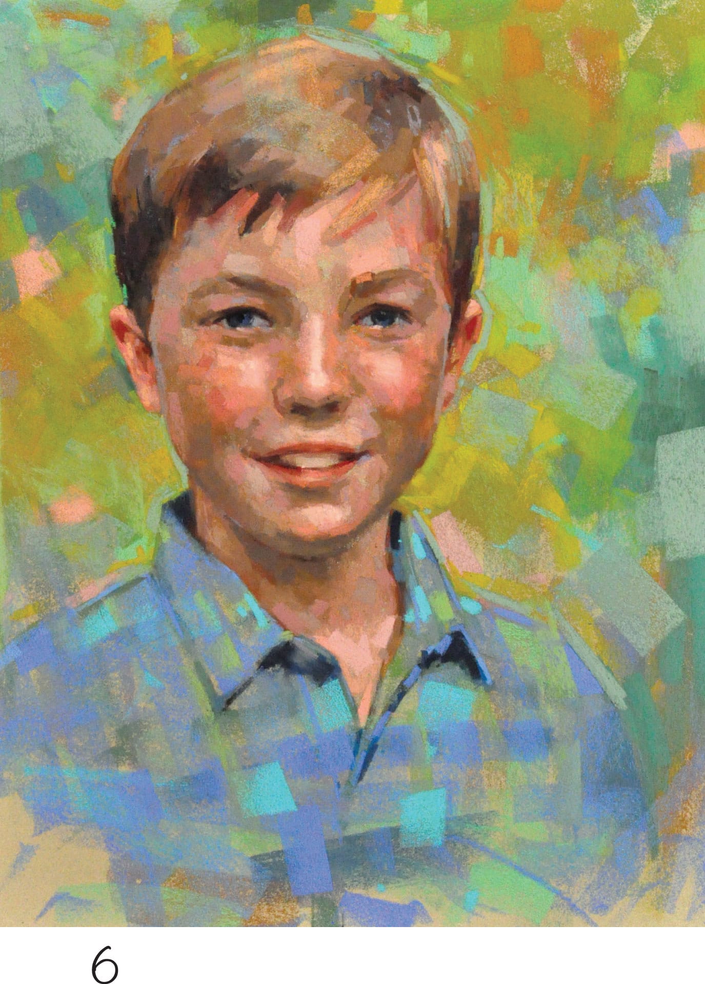
6 The later stages of the painting require a good deal of time to develop additional layers of pigment. Within the flesh tones of the face, carve out the features with a sculptural approach to mark-making, changing the direction of the strokes according to the turn of the form. Add accent colors to the shirt with turquoise blue. All the while, build up beautiful layers of pigment composed of many overlapping strokes of color and textures. This buildup of pigment affords the viewer a very satisfying visual feast.

7 Refine the portrait, paying close attention to the likeness and carefully developing the subtle details of the features. Add more lights to the face to push the value contrast further, and round out the head as a three-dimensional mass. Meanwhile, continue to experiment with bold notes of color and unusual accents, such as cadmium yellow, lavender, chrome green, and teal. It’s amazing how small flicks of color can communicate such life! Develop the suggestion of the shirt pattern by interlocking strokes of blues and greens.
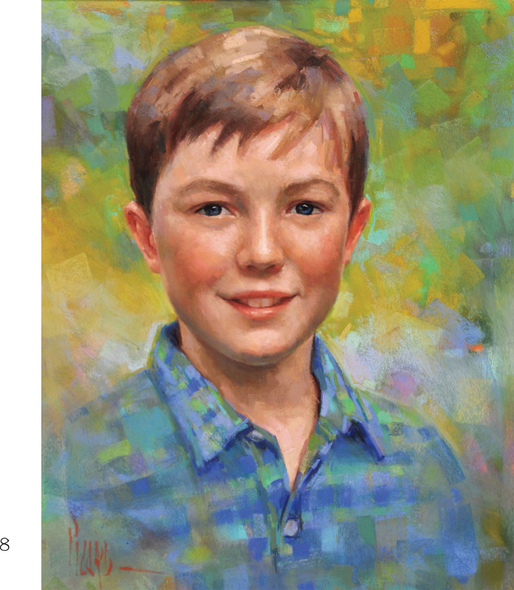
8 When doing a commissioned work, it’s a good idea to give the client the opportunity to present feedback at the final stage of the portrait, and then I make final revisions at their request. In this case, Jack’s mother provided feedback that brought about subtle adjustments to the eyes, lips, teeth, and upper bridge of the nose between the eyebrows. Although minor, these suggestions contributed to a stronger final portrait, and also resulted in a greater sense of satisfaction between the client and artist at the close of our collaboration. The resulting portrait of Jack is a vibrant, expressive, and colorful depiction of boyhood.