CHAPTER 7
Travelogues and Archetypes
Like most of my favorite books, my copy of Donald Schön’s The Reflective Practitioner is well worn and rigorously underlined. I have read Schön’s masterwork on “reflection-in-action” many times over the years, each time leaving myself a trail of inky bread crumbs as I highlight certain sections or scratch a brief (usually cryptic) note to my future self in the margins.
I make it a point to flip through its pages on a regular basis, rereading the underscored portions and finding new passages to underline. Sometimes I go looking for a specific phrase or section, while other times I simply read to rediscover and remember. Without fail, each time I open this book I come away with a new thought to reflect on and apply.
In a recent excursion into The Reflective Practitioner, I was struck by Schön’s observation that “professional practice has at least as much to do with finding the problem as with solving the problem found. . . .” He goes on to write that for most professionals, “well-formed instrumental problems are not given but must be constructed from messy problematic situations.”
Schön is not the first or only writer to emphasize the importance (or difficulty!) of problem discovery, but his description resonates strongly with me. As I wrote my own book, it was a helpful and timely reminder that all the attention we put on problem-solving techniques amounts to nothing if we end up solving the wrong problem. Finding the right problem is therefore a primary objective in almost any professional endeavor and meaningful progress starts by understanding what is meant by the word good.
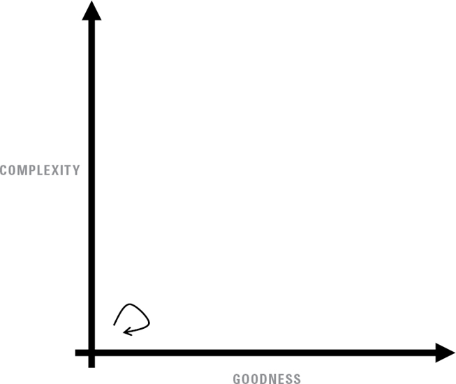
In fact, bad definitions of good are a central problem from which all sorts of other problems emerge. This is why the Simplicity Cycle emphasizes “increasing goodness” as the objective of our efforts and encourages us to spend some time considering what goodness really means, rather than contentedly pursuing simplicity in all situations. If we merely make things simpler, we risk solving the wrong problem.
How, then, can we make sure we have found the right problem and are pursuing the right kind of goodness, particularly when we face a “messy problematic situation”? The discipline of reflective practice is certainly helpful in that situation. So is a map. Put the two together into a “reflective mapping” activity and we’ve really got something.
The Simplicity Cycle provides a framework to do precisely that. It maps out the relationship between a variety of behaviors and outcomes, and invites us to consider the many paths we might follow. In doing so, it makes it easier for us to correctly identify complexity-related problems . . . and then to reflect on them, avoid them, address them, resolve them.
To help foster such reflection, the following pages present a collection of archetypical journeys through the Simplicity Cycle, each accompanied by a short commentary. These mini-travelogues are snapshots from the road, a sharing of thoughts, hints, and tips from one traveler to another. This is not a definitive collection by any means, but instead is a starting point for additional conversations and an example of what reflective mapping and problem finding might look like.
Using the Simplicity Cycle as a framework for recording and comprehending our experiences can lead to helpful insights. Readers may want to create sketches of their own in order to better understand the road behind them and prepare for the road ahead. No fancy equipment is needed, just a pen and paper or perhaps a whiteboard. We begin by laying down a blank Complexity-Goodness field, then think about how our project began and how it proceeded. What steps did we take to make things better? What steps did we take that made things worse? What paths did we follow, and where did these paths lead us?
This can be a communal activity, with a large group or a small one. It can also be an individual exercise. These are not mutually exclusive options, and a team may find it useful to transition between solitary reflection and group reflection. In terms of formality, this can be an idle doodle or a disciplined practice.
As we sketch and reflect, we do well to keep in mind that any given journey is part of a larger cycle. Although we may happily arrive at a finish line and produce something that is very good, the future always holds new horizons and endless opportunities for improvement. These little maps may tell the stories of long trips and triumphant arrivals, but each one is only a chapter in a story with no end.
STUCK ON THE PORCH
The journey of a thousand miles may begin with a single step, but taking that first step can be harder than it sounds. Whether it’s a series of false starts or tentative attempts that are immediately scrapped, we sometimes get stuck on the front porch, unable to head out into the world. Our design is neither complex nor good, because it hasn’t really begun.
In this situation, ideas pop up and are instantly dismissed as unworthy of being included, resulting in a stubbornly persistent blankness on the page before us and a growing pile of balls of crumpled-up paper in the bin beside us. Even worse, ideas refuse to come. The page stays blank and the bin stays empty.
This is different than the doldrums, which occur in the middle of our efforts where we feel bogged down by all the moving and working and trying lots of things that simply don’t work. Getting stuck on the porch happens on day one and prevents us from getting to day two.
True story: this particular section of prose spent an ironically long time stuck on the porch. If you could see my drafting notebook for the preceding pages, you would see a small set of miserably bad ideas that went nowhere and were crossed out as soon as they appeared. What my notebook does not show is the long stretches of time between each cross-out, where I stared blankly at the page and had no words to add, nor does it show the even worse ideas that briefly came to mind but never quite made it to my pen.
Why does this happen? Because we get ahead of ourselves and refuse to tolerate the messy side of the process, where half-baked ideas must come (and go) as we experiment and sift through the chaff. When we expect every word we write to be correct, every line we draw to be smooth, and every piece we add to elegantly complement the whole, there is no space for being wrong. We apply a standard of excellence that has no place at this stage of the journey, a standard that paradoxically prevents the very quality it is supposed to enable.
The solution is to fire your inner editor and give yourself permission to do bad work. Anne Lamott colorfully encourages writers to produce Shitty First Drafts, a practice that is relevant far beyond the literary arena. In a similar vein, G. K. Chesterton argued that a thing worth doing is worth doing badly. And Winston Churchill wrote about the wisdom of grabbing a large paintbrush and boldly, fearlessly splashing color onto a canvas, without concern for whether or not the first pass produces the desired effect.
Easy for them to say, right? Not at all. This was surely a hard-won lesson for each of them. But easy or not, they are all correct, and dismissing their advice because “it’s more complicated than that” is a cop-out and a lame excuse. Our difficulties are no greater than theirs and should not be allowed to prevent us from getting started.
Yes, the first step is scary. Yes, the first step is hard. Yes, the first step is often wrong. That is all irrelevant. What matters is that the first step is essential, and if we don’t take it, then we can’t go anywhere. The first step may not take us in the right direction, but that’s okay. At this initial phase of the journey, direction matters far less than movement. Course corrections can come later, once we have a course to correct.
LUCKY
Sometimes, we jump right off the porch and hit the ground running. Sometimes, the stars align and the muse is generous. Sometimes, we immediately experience what Mihály Csíkszentmihályi refers to as a state of flow, completely absorbed in a challenging activity that activates our creative powers to the fullest. We progress smoothly and directly from one slope and phase to the next, with no hiccups or detours along the way.
Sometimes, we get lucky.
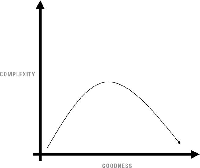
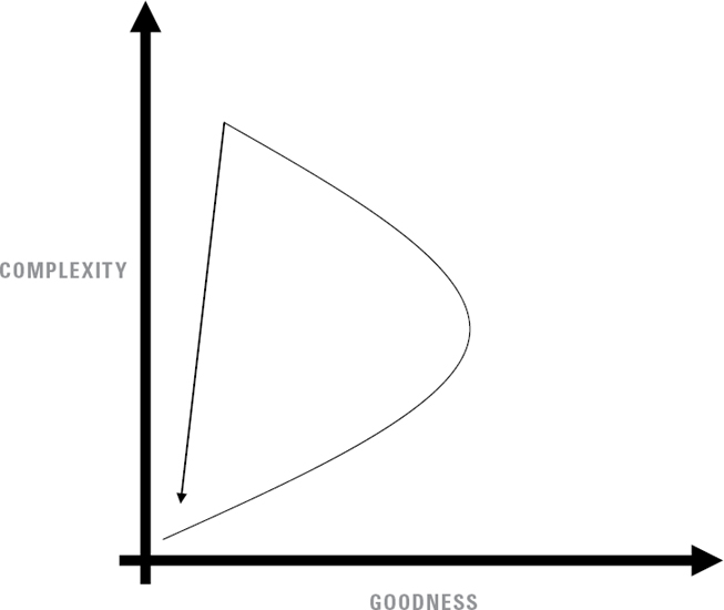
The inventor of the Slinky was a lucky U.S. Navy engineer named Richard James. In 1943, he was experimenting with prototypes of springs designed to hold sensitive instruments securely in place at sea. According to legend, James accidentally knocked one over and watched it tumble in the now-familiar Slinky motion, inspiring him and his wife, Betty, to create a beloved childhood toy that went on to sell more than 300 million pieces.
While the historical details of the Jameses’ story are no doubt more complex than the legend, the overall trajectory of his invention looks much like Figure 26. The resemblance of the final design to the original shipboard version might conceal the effort involved from a superficial investigation (for example, the couple spent two years experimenting to find the best steel gauge and coil size), but to experienced eyes, the Slinky’s final design reveals the results of a determined effort to reduce complexity.
COURSE CORRECTION
But sometimes we are less lucky. Sometimes we end up in a place we never intended.
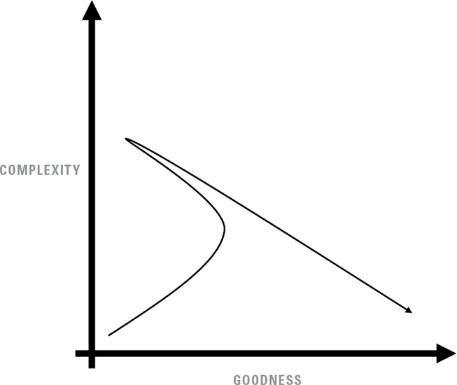
When the complexity of a design overwhelms its goodness, the solution is to make a course correction. Streamline, simplify, integrate, and remove the unnecessary bits.
Frankly, it almost doesn’t matter which bits we remove first. Start anywhere. Remove anything. When a design is in that upper left quadrant, almost any trimming will make the thing better. Keep trimming long enough and we might end up in a very good place indeed.
In an 1890 letter to the Royal Society, Australian aviation pioneer Lawrence Hargrave described his approach to building experimental aircraft models. While initial efforts to build heavier-than-air flying machines in the pre–Wright brothers era were massively complex, Hargrave explained that he had “swept away such a mass of tackle from the machine that its construction becomes a ridiculously simple matter.”
Octave Chanute praised this approach in his 1895 book, Progress in Flying Machines, pointing out that Hargrave “marked a very considerable advance in design by a great simplification of the propelling arrangement” and writing, “It will be noted that the engine is a marvel of simplicity and lightness.” This was a radical departure from the complex designs of the era, an important and influential course correction.
After his breakthrough in simplified engine design, Hargrave began investigating different geometries and shapes for producing lift. In order to keep his efforts focused, he used kites with no engines at all instead of actual airplanes, and eventually produced box kites capable of lifting people into the air. Far from a step backward, these simple kites greatly advanced our understanding of how to overcome gravity and helped define the shape of wings for generations to come.
Chanute summarized Hargrave’s contribution to the development of aviation with these words: “Thus with small, light, simple, and inexpensive models many experiments were made, and great advance realized. . . .” Hargrave showed the way to an important course correction and helped build the foundation from which Orville and Wilbur Wright would rise.
OVERCORRECTION
Did I say “almost any trimming will make the thing better”? Yes. But if we try hard enough, we can certainly do it dumbly and end up heading in the wrong direction after all.
Suppose a well-meaning legal reformer wanted to reduce drug-related offenses but felt that the current system of laws, trials, appeals, and loopholes was too complicated, slow, and expensive. If our good-hearted innovator decides to pursue simplicity at all costs, he or she might be tempted to propose a radically simple solution: mandatory and immediate death sentences for anyone caught selling, holding, or using illegal drugs. This would obviously bring the recidivism rate to zero. There would be no more messy appeals or retrials. Judges and juries would scarcely have to think at all—if the accused is guilty of being in the vicinity of drugs, off with their heads! What could be simpler?
The only problem with such a scheme is that it is horrifyingly terrible and is the exact opposite of justice. While the approach is indeed simple, the failure to distinguish between virtuous and unvirtuous simplicity helps explain why the concept is so very, very wrong.
Remember, the goal is to make the design better, not just simpler. One more time: simplicity isn’t the point. If we overvalue simplicity, we might get distracted and end up overcorrecting, cutting to the bone and reducing complexity long after such reductions cease to be wise or productive. Course corrections are important, but we must be careful not to lose sight of the objective.
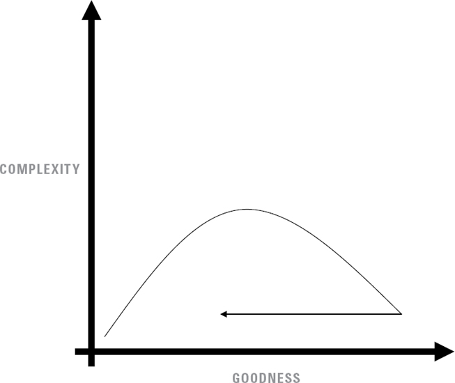
RETURN TO BASECAMP
Complexity can be a mental trap, ensnaring our imagination and restricting our ability to see simpler possibilities. Upon creating a monstrously complicated beast, the prospect of simplifying it may be wholly overwhelming.
Where do we start? Which thread do we pull first?
The beast snaps at our fingers each time we approach, resisting even a modest attempt to trim its beard. Surely it will not submit to a more thorough examination. Surely it will not accept restraint.
The solution may require bolder action than a straightforward course correction. It may require a fresh start.
Scrap it. Go back to the beginning. Start over.
Note that in Figure 28, the significant decrease in complexity diminishes the design’s goodness a bit. It is only a slight decrease, but we have indeed taken a step backward along the Goodness axis and our design is now (slightly) worse than it was before. This slide to the left is okay because our overall posture and position are so much improved. The design is unburdened and so are we, which makes it easier for us to set off in new directions that were previously hidden by excessive complexity. A small step backward prepares us for a big leap forward.
This can be a difficult strategy to adopt, in part because large, complex designs are often the product of many contributors, each of whom feels protective of their particular addition, whatever they might think of the design’s overall effectiveness. These contributors may seek to retain or reintroduce their favorite piece of the design, and if every piece is someone’s favorite, we’ll end up back in the upper left corner again.
Even on a solo project, restarting can be difficult because of our tendency to reapply our first approach on each subsequent attempt, resulting in versions 2.0 and 3.0 that look suspiciously like version 1.0.
Fortunately, with a little discipline and effort, starting over is not as difficult as it looks. In fact, it can even be quite fun. And yes, it’s okay for the new design to retain some elements of the old. The key is to make sure we keep only the most important and impactful pieces.
When Jason Fried and his colleagues at software company 37signals changed the company name to Basecamp in 2014, they weren’t exactly scrapping everything and starting over, but it was pretty close. The new name reflected their decision to reduce the company’s offerings to their single most popular product (a program management app called Basecamp) and to step away from other software tools they had developed over the past fifteen years, with names like Campfire and Highrise.
The Basecamp website explains that the company is “doubling down on simplicity,” a logical extension of their long-standing design philosophy. As 37signals, they had always made a point to “start with no” when considering new features, resisting unnecessary additions and complications to their software. Now they were applying that No to the company itself, returning to an earlier degree of simplicity, where they had fewer products but provided better service.
Did this move really bring them all the way back to the lower left corner of the chart? Maybe, but if so it was only for a brief stay while the company and its customers recalibrated their definition of goodness. For that matter, we might ask whether the company was ever really in that upper left corner. If we compare them to their competitors, the answer is almost certainly no. But if we compare them with their own ideals, the answer just might be yes, and that is the comparison that matters most.
COMPLACENCY
The great English journalist G. K. Chesterton wrote:
If you leave a thing alone you leave it to a torrent of change. If you leave a white post alone it will soon be a black post. If you particularly want it to be white you must be always painting it again. . . . Briefly, if you want the old white post you must have a new white post.
Left alone, a simple design does not become complicated. However, a good design exposed to a torrent of change eventually becomes a bad design. The transition from good to bad does not mean the design itself is any different than it was yesterday. In fact, it hasn’t changed at all . . . and that is the problem. While the design stayed static, the world changed around it and what once looked crisp and white is now rather dingy.
If we want to maintain the old goodness, we must continually pursue new goodness. We cannot rest comfortably on our laurels for long, as if the law of entropy did not apply to us. If we want the post to stay white, we have to continually paint it white. If we want our design to stay good, we have to continually work to make it good.
Clayton Christensen’s concept of disruptive innovation comes into play here. Successful, well-established firms with a track record of delivering good products are particularly vulnerable to the threat of disruption in the form of “technologically straightforward” products that are “often simpler than prior approaches.” These innovations introduce change to the market environment that status quo defenders are unable or unwilling to address. The result is a marked decrease in a static design’s goodness relative to the dynamic world around us.
How can we avoid or resolve the dilemma? Christensen has published several books on the topic and I won’t attempt to summarize his solution in a paragraph or two. Instead, I will simply suggest that the first step toward a solution is to strenuously avoid complacency. The second step is to read his books.
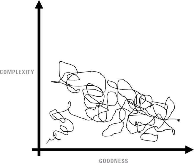
LOOPY
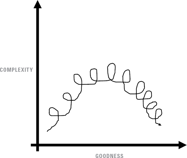
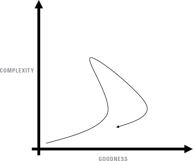
Perhaps a Zen master can proceed through the cycle in a straight line, undistracted and laser-focused on the goal. But the mortals among us are more likely to do something that looks like this.
The loopy path may not be the most efficient way through the cycle . . . but on second thought, maybe it is. Each small loop is a sign of exploration and learning, so this pattern represents a path of change, discovery, and correction. The stories of such loops are seldom told or recorded, because each little circle is a modest excursion that leads to another and is thus quickly forgotten.
By keeping the loops small we constrain the costs involved (financial and mental), but even a series of larger loops may depict genuine progress.
Perhaps this is what a Zen master would do after all.
WANDERING
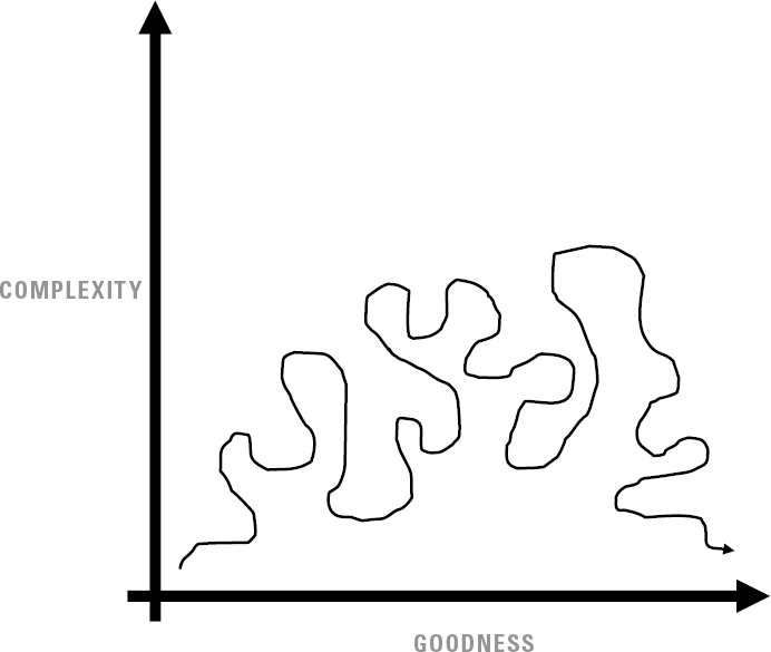
J. R. R. Tolkien wrote, “Not all those who wander are lost.” As we explore new design territory we must sometimes meander in order to find our way.
The experience of design, the journey of design, is seldom linear and predictable. If our path looks something like Figure 31, it might just mean we are staking out undiscovered territory.
That might be the best kind of journey.
GETTING LOST
Tolkien was correct that not all those who wander are lost, but some wander because they truly have no idea who they are, where they are, or where they are going. To be honest, sometimes “they” is “me.”
What can we do when the North Star is hidden, the trail markers are absent, and every street sign is in a language we don’t comprehend?
There are several strategies to resolve this situation. The Boy Scouts tell us that if we get lost in the woods we should stay in one place and wait for rescuers to find us. This is sometimes an option.
Winnie the Pooh offers different advice—if you keep walking past the same sandpit while trying to find your way home, perhaps the solution is to look for the sandpit instead and thus find your way home.
I can’t promise that approach will work for you, but it worked for the bear and his friends.
OPTIMAL RANGE
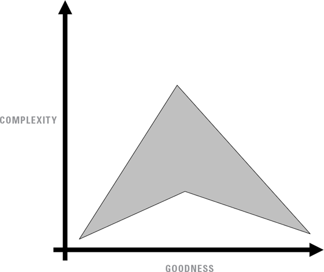
Whether you are looping, wandering, or trying to get home again, one thing to keep in mind is that the thin, straight lines used throughout this book represent a notional path, a stylized tracing of the design process.
Deviations from the straight and narrow are to be expected and might even be desirable. Those little excursions could lead to breakthrough discoveries.
So perhaps we might think in terms of staying within an optimal range rather than staying on a narrow trail. This hopefully reduces any pressure we might feel to accurately calculate our exact position on the chart. As long as we keep to the shaded region and our overall trajectory is pointed in the direction of increased goodness, we’re probably doing just fine. The fact that this loosely resembles a Star Trek logo is just a happy coincidence. I promise.
PROFESSIONAL PROGRESSION
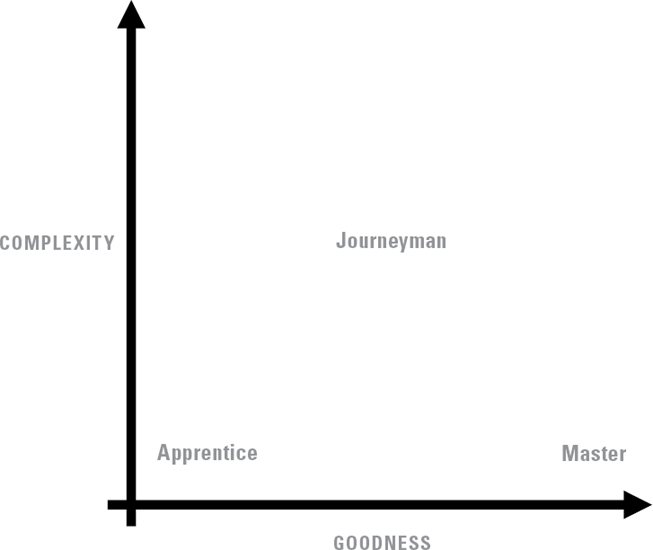
FIGURE 34: PROFESSIONAL PROGRESSION
Across a career or a lifetime, we will set up a series of residences in different regions, moving on to a new destination after learning the lessons of the old place. The transition from apprentice to journeyman to master describes one such progression.
When we begin a new craft, we are an apprentice, laboring in the region of simplicity. An apprentice approaches a trade with little knowledge and even less ability. The apprentice’s task is to gather information, skills, and techniques, expanding their repertoire and capability. When the apprentice looks ahead, he or she sees a mountain of learning to be climbed.
A journeyman’s situation is different. Having studied at the feet of a master, a journeyman now has a full toolbox. It may not contain every tool they will ever use, but the vast majority are indeed present by this time. For journeymen, the most productive learning and most important lessons involve deepening their understanding of when and how to apply their tools, rather than adding new ones. Wisdom also comes from learning when and how to not use a particular tool.
The master works in simplicity, years of experience allowing him to perform each task with an elegant economy of effort. A master’s hands use tools with minimal strain, maximal precision, and grace. And of course a master must simplify the craft enough for an apprentice to understand. This completes the cycle.
IGNORANCE TO WISDOM
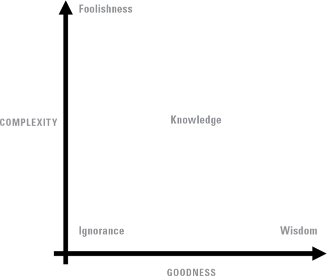
FIGURE 35: IGNORANCE TO WISDOM
Like an apprentice, we often begin in ignorance. Without experience or information, our minds are empty vessels, awaiting fullness.
And so we learn. We explore. We study. We experiment. We accumulate information and it becomes knowledge. This is good.
Until it isn’t. Knowledge isolated from goodness loses its value, as we learn more and more but understand less and less. All the great spiritual teachers, from Solomon to Jesus to Buddha, attest to the way knowledge can descend into foolishness. The problem isn’t with knowledge itself, but with the way we tend to idolize it, cherishing it above its value.
In contrast, wisdom involves seeing the patterns, seeing the connections, integrating information into meaning, and recognizing the limits of knowledge. Wisdom is about reduction, not accumulation. It is about discerning what is good and relevant and not being distracted by ephemera.
Wisdom is about simplicity. The master, too, may be an empty vessel.
REACTIONS TO COMPLEXITY
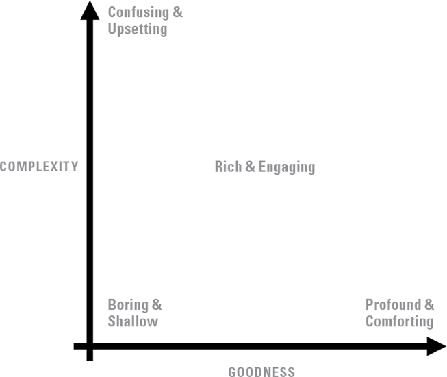
FIGURE 36: REACTIONS TO COMPLEXITY
For all the nice things we’ve said about simplicity, sometimes that’s not what we really want.
In the middle of the chart we will find devices, objects, and experiences with multiple, interconnected layers. For example, a mystery novel with a large cast of characters and frequent plot twists is fun to read precisely because of its complexity. An orchestral performance uses layers and complex themes to engage our hearts and passions. A video game immerses us in a dazzling world, full of complex challenges and surprises.
Yes, we can appreciate simplicity in each of those contexts—a simple mystery, a simple tune, a simple game. But sometimes the most enjoyable instances would never answer to the description “simple.” Sometimes the thing we’re looking for belongs, properly, in the center of this chart, and the complexity contributes significantly to the listener’s/player’s/reader’s engagement and enjoyment.
In creating such rich complexity, the trick is to ensure that each clue, each character, each note, and each instrument contributes to a coherent whole. For a complex creation, it is particularly important to remove the discordant, distractive elements, while retaining the interesting depth.
Of course, the resolution of the story, song, or game occurs in the lower right corner, where the pieces fit together in a neat conclusion. It is perfectly okay to let an audience linger in the middle of the chart for a while, but by the time the show is over, we should make sure they are brought safely out.
MODEL T AND VW BUS
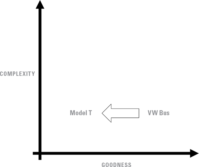
The Model T’s success was largely the result of its simplicity. Henry Ford’s assembly lines reduced the complexity of manufacturing by breaking the experience down into small, manageable steps using interchangeable parts and common standards. The car itself was simple enough for an ordinary person to drive and maintain it.
In the early twentieth century, the Model T would have resided squarely in the lower right corner of our chart. But time presses onward and nudges even the best product to the left, in the direction of decreased goodness.
By the 1960s, the Volkswagen Bus enjoyed a similar status of residing in the lower right corner. It was a wildly popular vehicle, precisely because of its simplicity and reliability (the two are almost always directly related). The old Model T had not become more complex. It just wasn’t as good as it used to be, because the market had changed. Tastes had changed. Technology had changed.
And no, the VW Bus didn’t get to stay in the lower right corner forever. Nothing does.
A FINAL EXAMPLE
’Nuff said.