
Working with layers
Layers are the absolute backbone of Photoshop. Everything to be adjusted on a picture – cloned, repaired, sharpened, added or taken away – is done on a separate layer, either on an adjustment layer (curves, levels and so on) or on what can be referred to as a pixel layer (that being a layer that will take colours in the form of photographic layers, or paint from the foreground colour box).
HOW MANY LAYERS DO I HAVE TO LIMIT MYSELF TO?
The chances of you running out of layers on a single image in Photoshop are pretty slim. Photoshop limits the number of layers that can be added to a picture to 9,999, yes – almost 10,000 layers. So the chances of you getting anywhere near that number are pretty slim. So never let numbers of layers worry you. Typically, most photographs never exceed ten to fifteen layers; speaking personally, the most I’ve ever managed on a complicated composite picture was 300 layers, and that involved about five hours of work.
In this chapter we’re going to cover all aspects of layers, from adjustment layers to pixel layers; and methods of selection of areas within your landscapes to ensure you get results that enhance and improve your landscape photographs, which look natural, yet fit in with your visualization.
The most important thing about working with layers is not to be phased by them. They really aren’t difficult to understand, yet people get so concerned about using them. The benefit is that you leave the original picture sitting at the bottom of the stack – untouched – so the pixels remain unchanged and quality remains high throughout the process.
Exercise 1 – adding pixel layers

Fig. 3.1
Opened file, with empty (transparent) layer added.
Let’s just try a simple example of pixel layers and how they relate to each other on a pile of other layers. This is something many people initially get confused over, but it is really very simple. Figure 3.1 shows an opened file – add a simple pixel layer to it by clicking on the new layer logo, at the bottom of the layers palette – second from right. This adds ‘Layer 1’ above the background layer, and the thumbnail looks like a grey and white chequerboard. This is currently a transparent pixel layer. It contains nothing – and your file size hasn’t increased at all. For those of you who remember them, think of it as an overhead projector, with a single clear acetate laid on top of a projector slide – it adds nothing. If however you wrote on that gel, it would appear on the projection. But, you can move the gel about independently of the slide below and the writing on the gel moves with it. The same can be done on a separate pixel layer. So add a layer, and select the brush tool (B). You will notice that Layer 1, which you have just added, has become the active layer, because the Layer 1 ‘bar’ is coloured (usually blue).
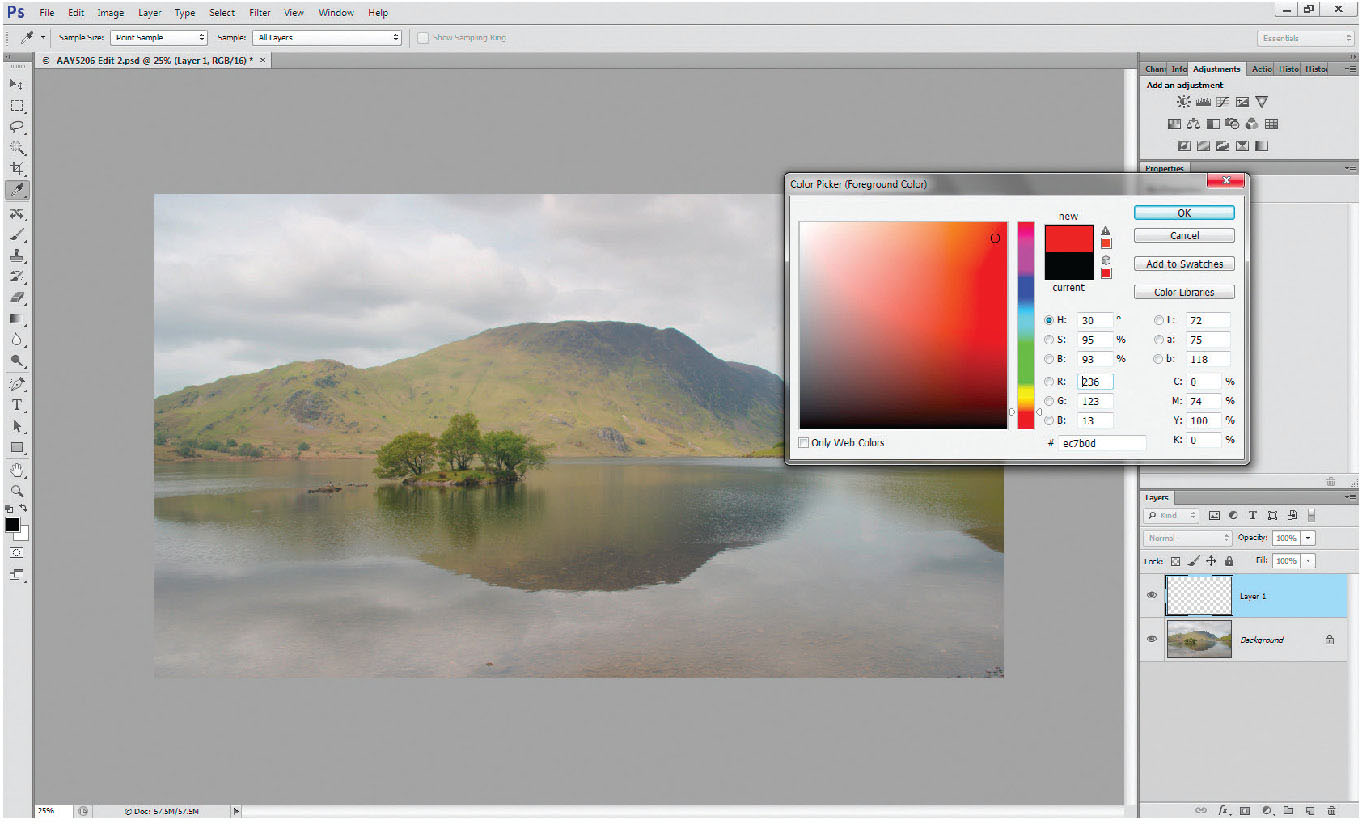
Fig. 3.2
Colour Picker activated by clicking on the foreground colour box.
Select a colour for your brush tool by clicking your cursor on the foreground colour box near the bottom of the tool palette. You will pull up the colour picker – choose any colour, and you will see that the foreground colour box has changed. Paint a stripe across the picture – you can change the size of the brush tip by using the square brackets – the left bracket ([) will make the brush smaller, whereas the right bracket (]) will make the brush larger.
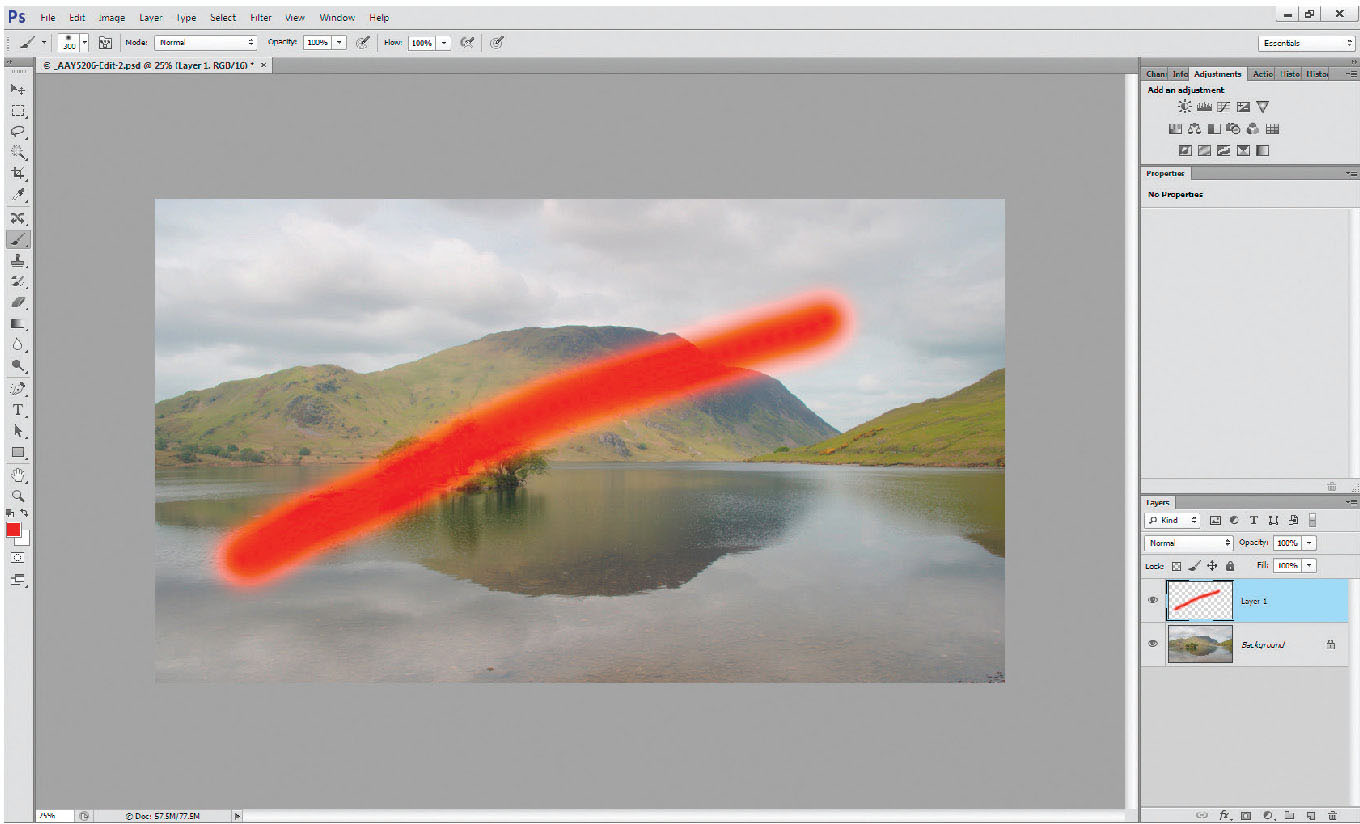
Fig. 3.3
Stripe added by using the brush tool on Layer 1.
Paint a line across the image on the screen – you will see a stripe appear, apparently across the image. Now, on the left of the layer, on the palette, there is a small eye logo (just to the left of the layer thumbnail); click on it, you’ll see the eye vanish, and the paint stripe disappear from the picture. The eye allows you to switch on and off any different layer. To get rid of any layer, simply place the cursor over the layer bar (you will see a hand with a finger raised), left-click the mouse (the hand turns into a gripping hand) and drag the layer to the bin, in the lower right of the layer palette.
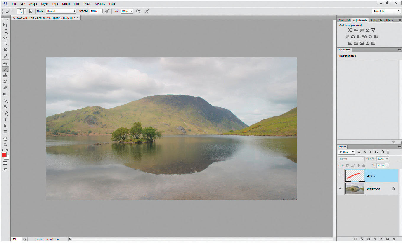
Fig. 3.4
Stripe turned off by clicking on the eye logo on Layer 1 – hiding the layer. The stripe remains as shown on Layer 1, but is no longer visible.
Many people get confused by layer order. It’s actually very straightforward. If you have a number of pixel layers with colour on them – it’s the same as looking at a pile of prints – you’d only see the top print, rather than all those below it, so you only see the top layer. If you switch the layer off, erase part of it, or reduce its opacity, you can see part or all of the layer below.
So with a picture of say three pixel layers, if they were all visible (eyes turned on) and at 100 per cent opacity, the only layer you would be able to see on the main image is the top one, although in the layer palette, all three layers would be visible.
ADJUSTMENT LAYERS
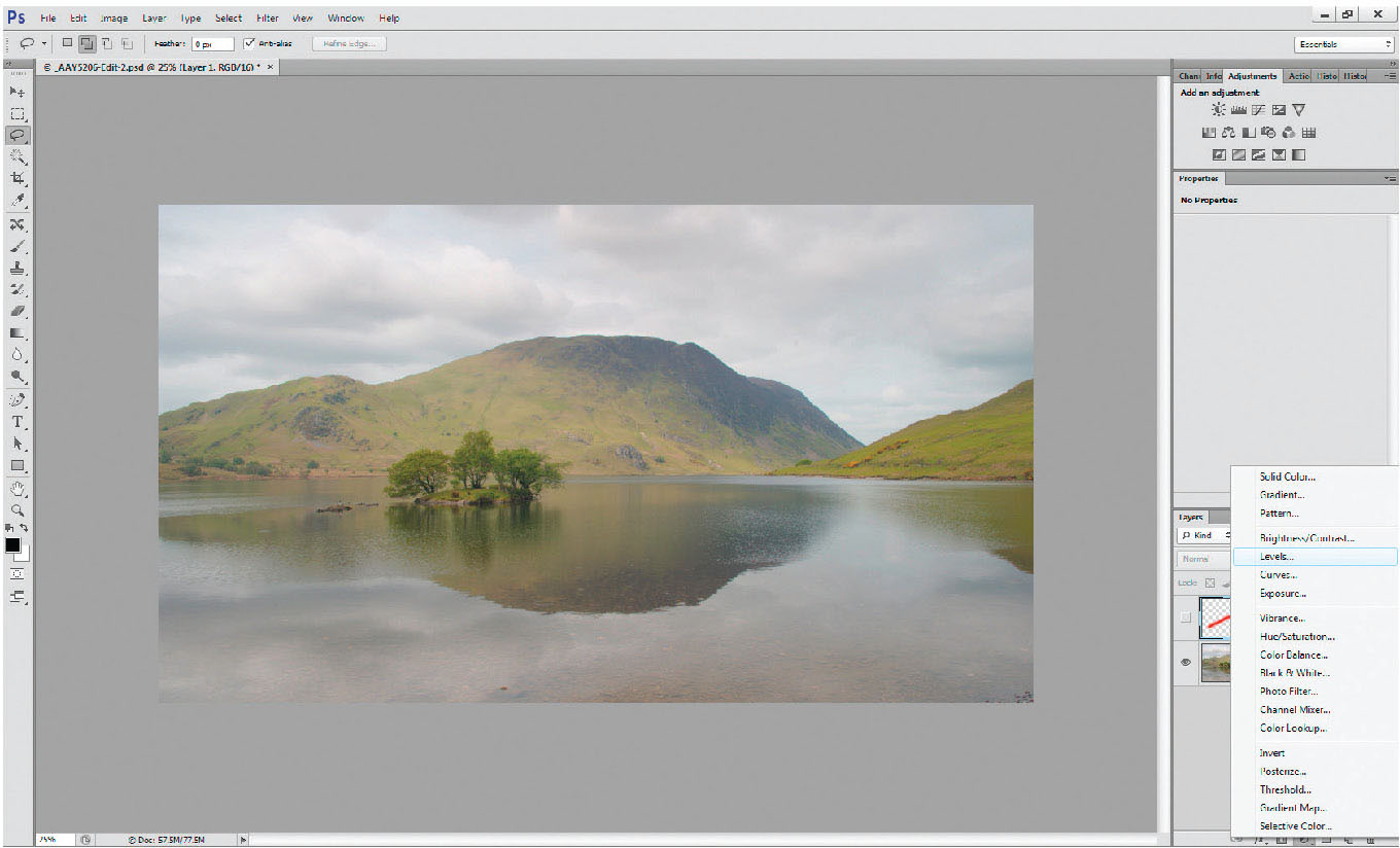
Fig. 3.5
Adjustment layer pop-up menu accessed by clicking on the ‘create new fill or adjustment layer’ icon (black/white divided circle) at the bottom of the layers palette
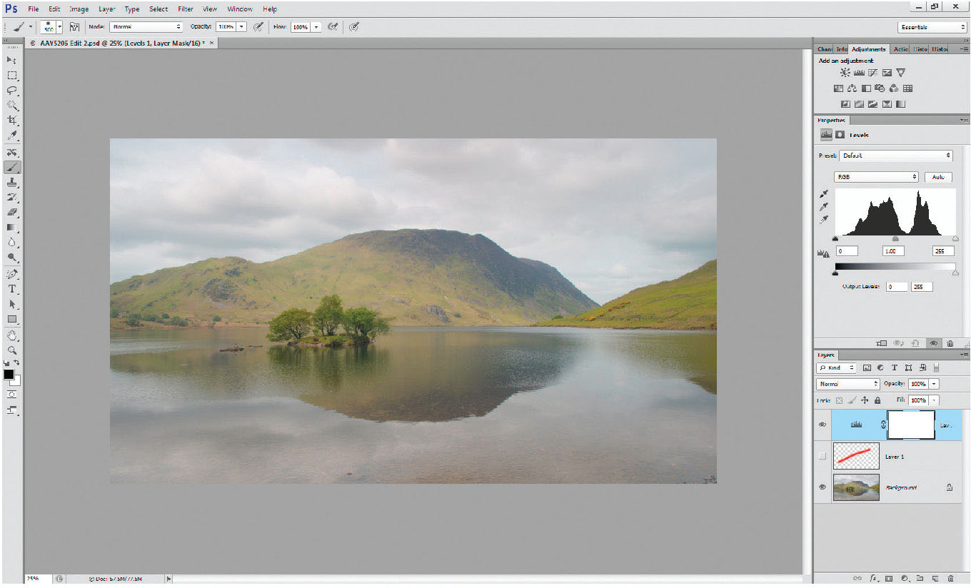
Fig. 3.6
Levels adjustment layer added to layer stack; the adjustment layer is positioned immediately above the layer that was active (blue) when the adjustment layer was selected. Any adjustments will affect all pixel layers below the adjustment layer.
Adjustment layers are the most important part of Photoshop bar none. This is the most important part of the book. Newcomers to Photoshop often make adjustments to the picture via the top drop-down menu Image>Adjustments>Levels/Curves/and so on. The problem with working in this way is that it doesn’t add an adjustment layer, it applies the adjustment directly to the pixel layer, modifying the pixels and preventing later overall or localized changes to the image.
At the bottom of the layers palette, there is an icon to pop up the menu to ‘create new fill or adjustment layers’ (it’s the centre icon – a circle of half black/half white). Click on this and the adjustment layer menu pops up. Choosing any one of these menus (try levels) will add a separate adjustment layer with its associated layer mask.
Newer versions of Photoshop offer an adjustments palette, with the icon of each adjustment layer shown. A simple click on the appropriate icon will create the adjustment layer. The only downside is that you have to remember the picture icon for each layer – use those you remember, use the pop-up menu from the layers palette for others.
The adjustment layer sits immediately above the layer that was active when it was invoked, and will affect all pixel layers below it, unless it is ‘clipped’ to a particular layer. Adjustments can be clipped to the pixel layer (so they only affect that layer), by clicking on the ‘clip to layer’ button at the lower left of the properties palette.
 |
THE MOST USEFUL ADJUSTMENT LAYERS To affect the brightness and contrast of the picture, surprisingly, don’t use the ‘brightness and contrast’ adjustment. It’s OK for a quick fix, but gives you far less control than the levels (brightness) and curves (contrast) adjustment layers. The levels work by making changes to a histogram – identical to the one you can see on the LCD panel on your camera. |
 |
 |
 |
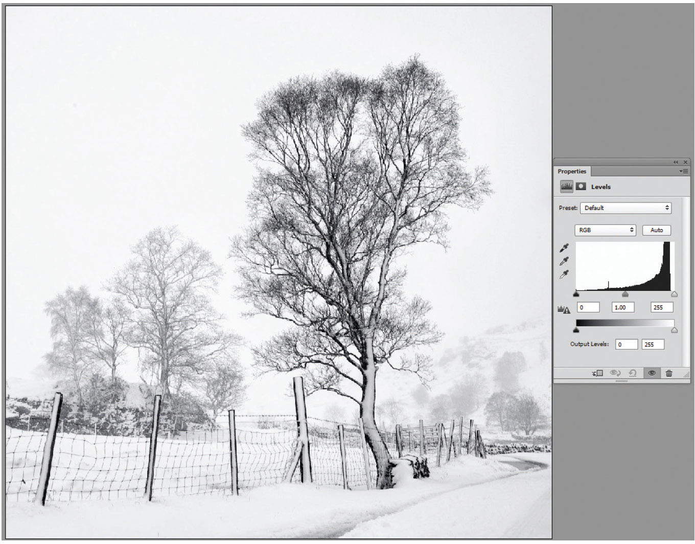
Fig. 3.7
Light-toned histogram showing the greater amount of tones to the right of the axis.

Fig. 3.8
Dark-toned histogram showing almost all the tones between black and mid-grey – the histogram is set almost entirely on the left side of the axis.
The word ‘histogram’ can strike concern into many photographers, thinking it’s something technical and complicated. In effect a histogram is no more than a bar chart showing the quantity of pixels of every tone, from black (left-hand end) to white (right-hand end). A picture of pure black would have a histogram of a single, vertical line at the extreme left end of the axis. Pure white, the same vertical line, but to the right, and mid-grey would be bang in the middle of the chart. There is no such thing as a correct shape for a histogram – it entirely depends on the tones within a picture. For example, a snow scene with a few skeletal trees will have a very right-heavy histogram (Figure 3.7) whereas a night sky with stars will be an overall dark image and the histogram will be correspondingly weighted to the left (Figure 3.8).
Using the levels adjustment layer
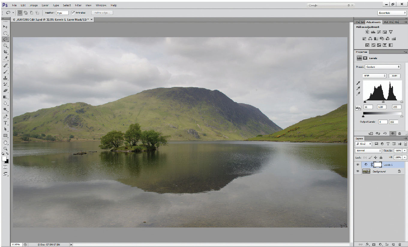
Fig. 3.9
Levels layer added (Levels 1).
Add a levels layer (as described above) to a fairly low-contrast image, like the one here (Figure 3.9). The histogram that you see in the properties window falls short of each end of the available axis, therefore there is no real black, nor any pure white – the photo generally looks flat, and low in contrast. Surprisingly, this is not a bad thing, and gives us a spread of data that we can really work with. My workflow means I almost always start with a basic levels layer.
Starting at the left-hand side of the histogram, grab the small black triangle (known as the shadow slider) with the cursor, and slide it to the right until it reaches the edge of the histogram, but be careful not to go too far, or you will lose all shadow detail. A good way of checking this is as you move the shadow slider, hold down the Alt key. The whole image will go white, until you reach the edge of the histogram, when the clipped areas will show. It’s important not to clip the shadows, so back it off just a little.
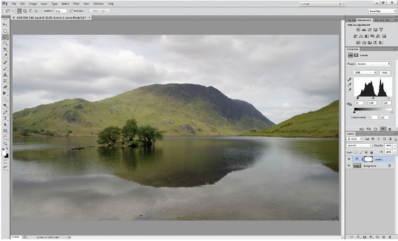
Fig. 3.10
Highlight and shadows sliders adjusted to deepen the shadows and increase the highlights, by pulling the sliders in to the ends of the body of the histogram.
Now do the same with the highlight slider. These adjustments have ensured that we have a range of tones from black through to white across the image, helping to make the picture really come alive.
Curves layers
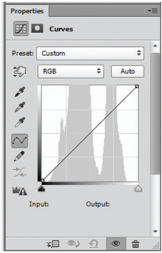
Fig. 3.11
Unadjusted curves layer showing the straight, diagonal ‘curve’ overlaying the histogram of the image.
Fig. 3.12
Curves adjusted to a horizontal line has made the image grey.
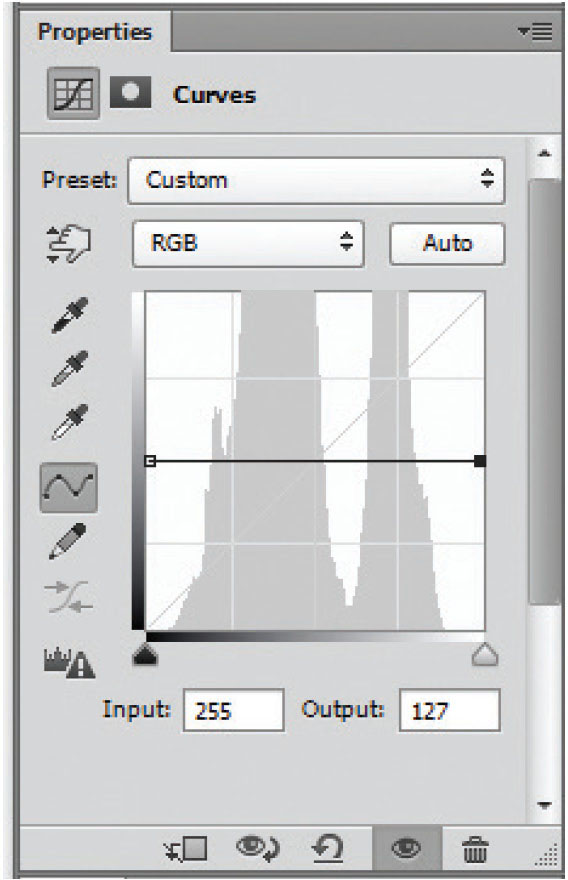
Fig. 3.13
Curves line made horizontal has reduced contrast to nothing.
So many people who move from Elements to Photoshop are reluctant to try curves, because they don’t fully understand them. It’s hardly surprising, as initially we are confronted by a graph with a straight line, not a curve, and an X- and Y-axis that look to be identical. To the uninitiated, ‘input levels’ and ‘output levels’ don’t help much either.
Fig. 3.14
Curves layer at maximum contrast by making the curve as vertical as possible – the vertical line is set close to the centre of the histogram giving roughly equal amounts of black and white within the picture.
Clearly, both these extremes give ridiculous results, but they do serve to illustrate the basics of ‘curves’. The flatter the curve line, the lower the contrast; the steeper, the higher the contrast. Using curves to increase contrast within a photo often needs only small changes to the line – and it can be a single point added to the centre of the line, it does not have to imitate a classic S-curve. Levels and curves are used a lot in working on landscapes, but often only on a part of the image.
SELECTING PARTS OF THE PICTURE TO WORK ON
Different selection tools suit different selection types, and although they are all interchangeable, and can be used in conjunction with each other, everyone develops ways of selecting that suits them.
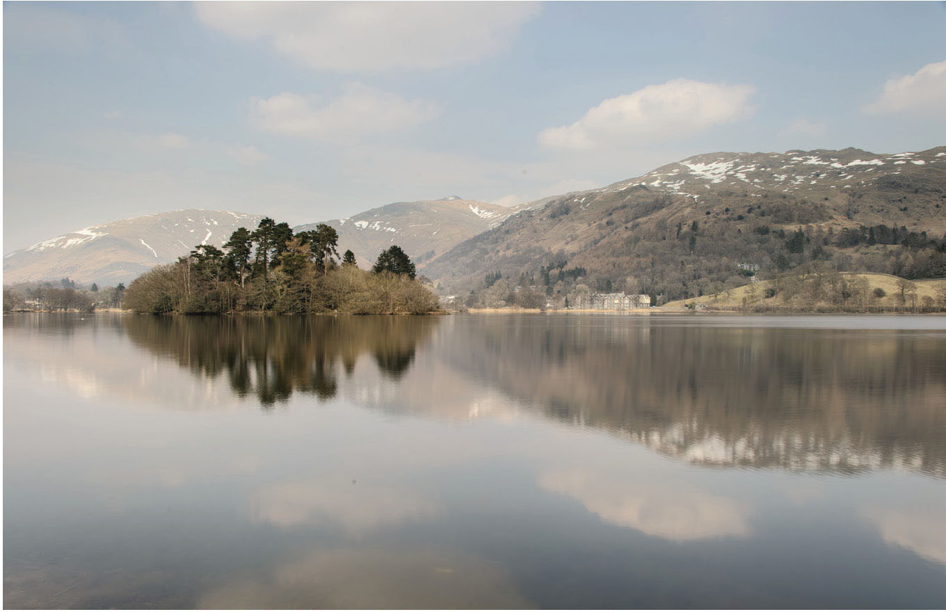
Fig. 3.15
Original, unedited photo of Grasmere, with an overall lack of contrast, particularly in the sky and reflections.
In the photo of Grasmere, the sky, and to some extent, reflections, are very light and could do with some darkening, and contrast enhancement.
There are a number of selection tools within Photoshop that it would be possible to use to select the sky. Some may work better than others:
The magic wand tool (W)
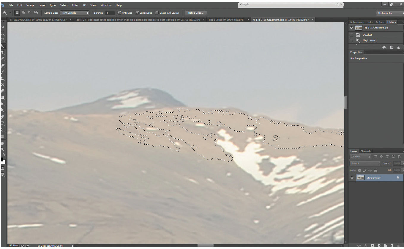
Fig. 3.16
An example in close-up of the selection of the fells with tolerance on the magic wand tool set to 4.

Fig. 3.17
The magic wand tool used to select the sky, using a tolerance of 15, and contiguous selections, building up the selected area until the whole sky is selected.
The wand tool will select pixels in adjacent areas of similar tone. When you select the tool, a tool options bar is displayed at the top of the screen. The four left-hand boxes define the selection method; if the first (plain square) is selected, each click of the wand tool on the picture will start a new selection. The second, each click will add to the previous selection, allowing you to build up the selected area a bit at a time. The third box allows you to subtract from the existing selection, the fourth allows only an intersection of selected areas. These four option boxes are the same across selection tools (marquee tool, lasso tool and wand/quick selection brush tools). The most useful option is to add to the existing selection (second box).
The sample size relates to the area clicked on – in fact for a sky, a larger sample than ‘point sample’ (the default) might work well, but leave it for the moment.
The tolerance box is the key to using the wand tool effectively. The ‘tolerance’ relates to the level of difference of tone that adjacent pixels will still be selected at. At its lowest setting (1) if the adjacent pixels are not within one tone unit (black is 0, white is 255) it will only select the single pixel. If the tolerance is set to 255, the maximum, then wherever you click on the image, all adjacent pixels will fall within the tolerance, and the whole image area will be selected.
Typically, when selecting skies, something between 8 and 15 is suitable, but it isn’t necessary for the whole sky to be selected in a single click. Because you are using the ‘add to selection’ tool option, you can build up the selected area. If you set the tolerance too high, you will run the risk of extending the selected area beyond the sky.
In this example, the sky and the water are similar colours. To restrict the selection to the sky area only, ensure the tick box ‘contiguous’ is checked. Otherwise the wand tool will select over the entire image area.
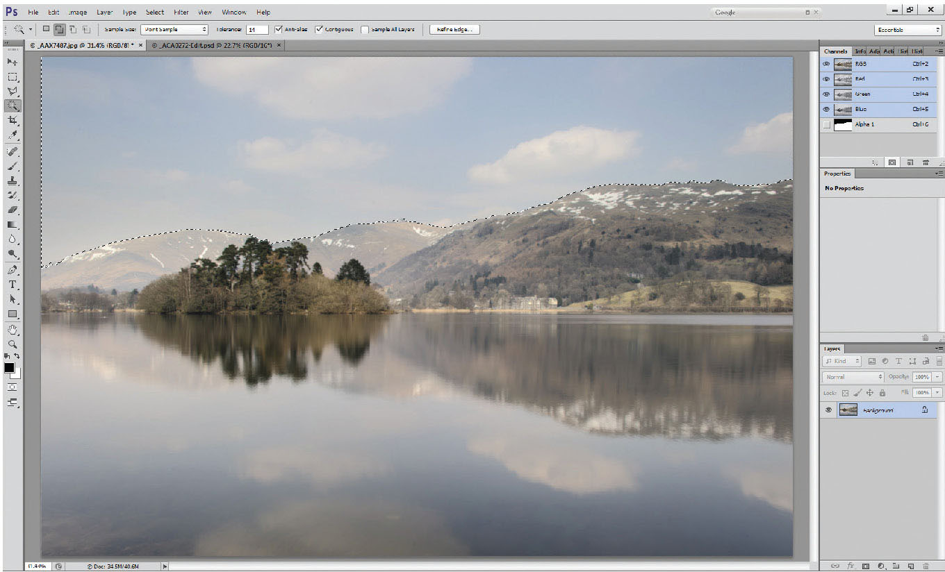
Fig. 3.18
Alpha channels, on the Channels Palette, with the selection saved as a channel (Alpha 1). This will be saved with the file.
Having made a selection (although this one is easy), particularly with the more complex selections, it can be worth saving your selection as a channel. Photoshop allows you to save an alpha mask. Click on your channels palette, at the bottom of which you will see a mask icon (second from left). Click on this, and it will create another layer below the red, green and blue channels, notated Alpha Mask. (Clicking on the text will highlight it and allow you to rename it – particularly useful if you are creating a lot of alpha masks in an image.)
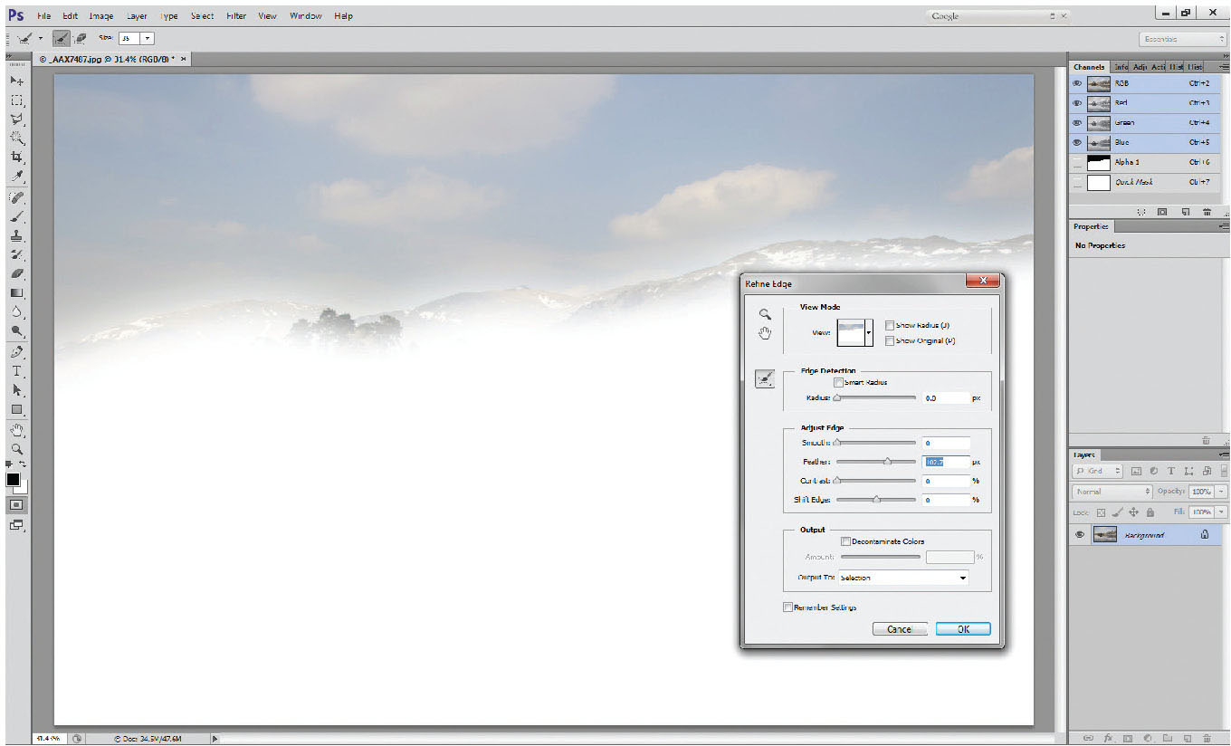
Fig. 3.19
Refine edge tool (now renamed ‘Select and Mask’ in the latest upgrade) used to feather the edge of the selection.
Having saved the channel, add an adjustment layer (try using levels on skies, as it adds less contrast than curves, giving a more natural appearance, but sometimes that bit of extra contrast is needed). In this case, a little extra contrast may benefit, so try a curves layer. Steepen the curves line through the resulting histogram, which increases the contrast in the sky, darkening it slightly as well. Whilst the effect is pleasing, if you zoom in to the junction between the sky and the land, you’ll see that the edge of the selection is very apparent – this is because it had a hard edge on the selection.
To soften the edge of the selection, once you have used the wand tool to select the sky, right-click in the selected area and a drop-down menu appears. Select ‘refine edge’ and increase the feathering on the selection.
NB: the latest Photoshop upgrade has renamed ‘refine edge’ as ‘Select and Mask’.
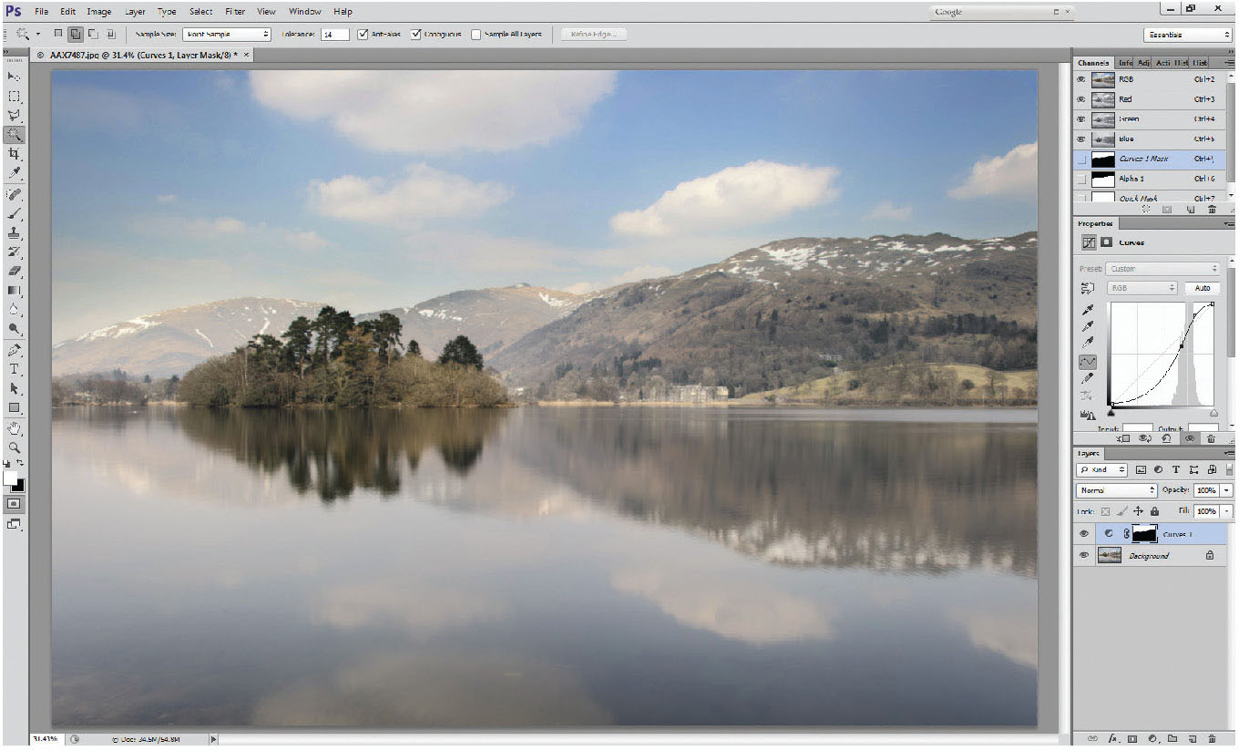
Fig. 3.20
Edge of the selection feathered by 60 pixels, the feathering can be seen on the adjustment layer mask, but the curves adjustment to the sky now has a smooth transition, so the work on the layer is less obvious.
The feathering will only occur at the edge where there are image pixels both sides of the selection line, and not around the perimeter of the image. Below is the same picture – same layer mask, but the edge between the sky and the fells has been feathered by 60 pixels. Often large feathers work better than small – particularly where the sky/land contrast is great, where a small (10 pix) feather will give the junction a strange glow. Experiment with different amounts and see which suits different photographs; often around 150 pixel feathered edges work with great success.
The marquee tool is capable of selecting rectangular, square, elliptical or circular selections – so not appropriate here. Surprisingly good at selecting skies over coastal areas though, where the horizon is perfectly flat, but still using the feathering on the edge of selections.
The lasso tool/polygonal lasso tool/magnetic lasso tool allows you to trace round shapes, and can work pretty well on subjects like this (although the wand tool may be quicker and more accurate in this particular case).
The one selection tool not yet covered is the quick mask tool. Not that many people describe this as a selection tool, rather than as a masking tool, but darkroom printing demonstrated that burning in (darkening) or dodging (lightening) areas of a print worked better and were less obvious if the edge of the area was very soft, so quick, soft-edged selections often – certainly in landscape photography – work well. Also with darkroom printing, burning in the sky by using a sheet of card with a straight edge, but moving it to soften the ‘join’ was common practice, rather than working with a hard, defined edge. Now we use graduated filters in the field for the same effect, but these can easily be applied within Photoshop, either in conjunction with the quick mask, to create a selection, or simply on a layer mask, to affect certain parts of the image.
Quick mask tool (Q)
By its name, it is clear that this is meant to be used as a masking tool; its name derives from darkroom toning practices, where a rubber solution could be applied to the image prior to toning, and peeled off later, leaving an untoned area to contrast with the toned area. Although the QM tool in Photoshop can be used in exactly that way, it can also be used really effectively as a selection tool. It needs one simple change to become one of the quickest, most effective and useful tools in Photoshop.
Start by double-clicking on the quick mask tool (at the bottom of the tools palette).
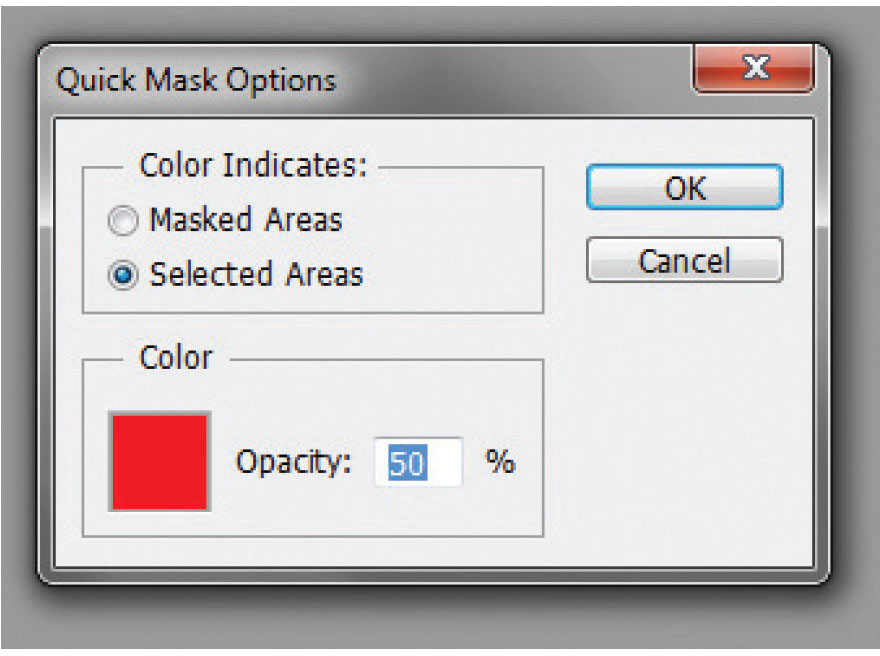
Fig. 3.21
Quick mask options palette, showing the change from the default setting of masked areas, to ‘selected areas’ allowing it to be used as a selection tool.
Fig. 3.22
Normal editing mode.
The default setting of the quick mask tool is ‘masked areas’; click the ‘selected areas’ tick box and it can now be used as a selection tool. This is a once-only change that remains set when you close and reopen Photoshop. The default colour of the quick mask is red, but you can change it to any colour you like. For most landscape work, you may as well leave it as red, as landscapes feature very little bright red. If you tend to photograph bright red subjects, like post boxes, or fire engines – then change the red to something totally different.

Fig. 3.23
Quick mask edit mode.
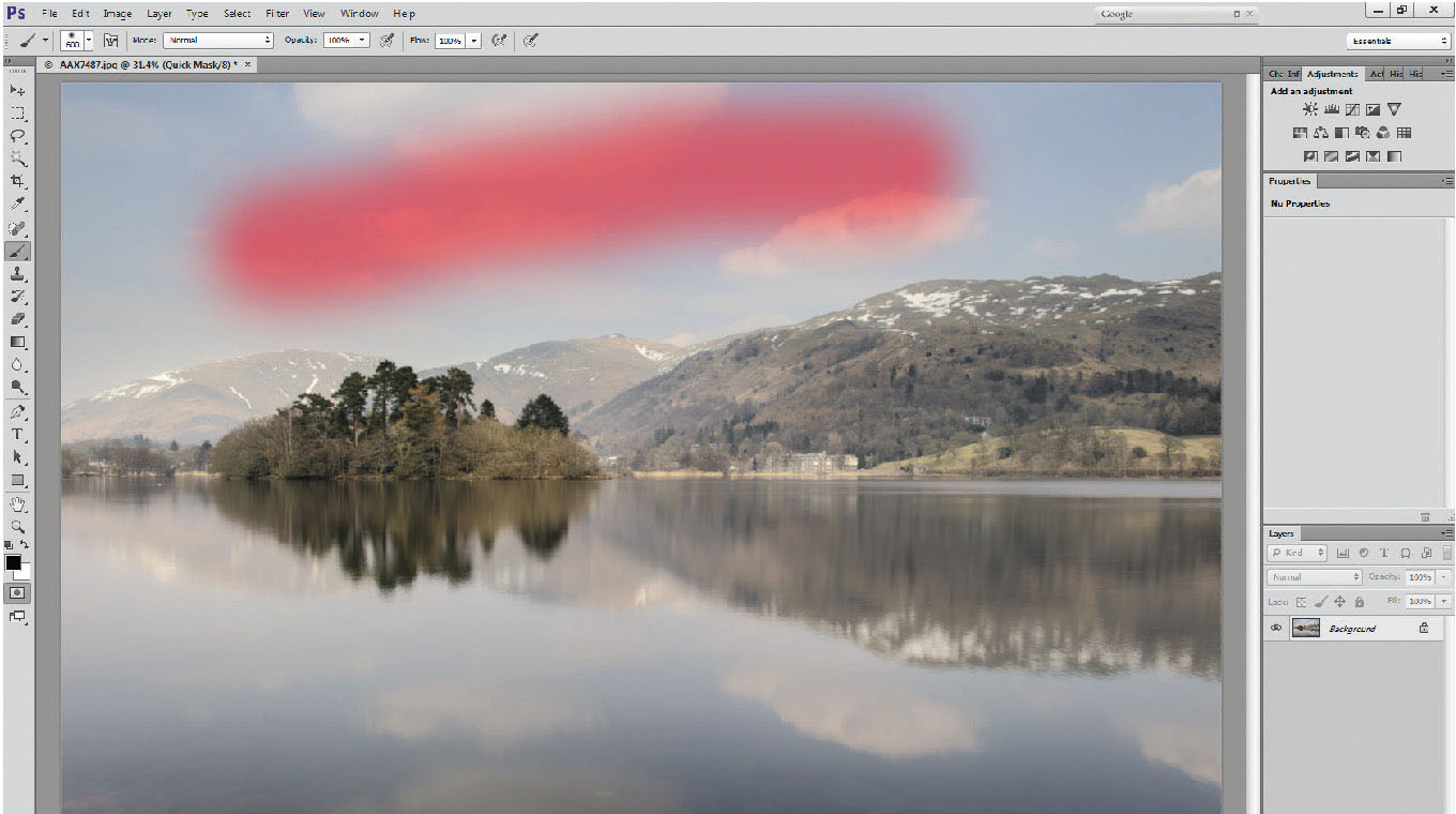
Fig. 3.24
Quick mask showing painted selection of a stripe in the sky.
The quick mask tool (Q) effectively allows you to paint the selected area using a brush or gradient tool, but it can even be used in conjunction with other selection tools.
Using a brush as a selection tool: Enter quick mask mode, either by pressing ‘Q’ on your keyboard, or by clicking on the quick mask icon near the bottom of the toolbar. You’ll know when quick mask is active, as the active layer bar in the layers palette turns to grey, as shown in the two panels; the top image shows the normal settings with the layer bar blue, the lower image shows the layer bar grey, and the picture tab includes the phrase ‘quick mask’.
As a start, enter quick mask (Q), select a brush tool (B) and ensuring that your foreground colour is black, rather than white, paint a stripe across the picture. Despite the fact that your brush is ‘black’ (foreground colour), the line on your picture is translucent red. This is simply because the foreground/background colours on any mask layer show as black and white, which are effectively opaque/clear (or apply/erase).
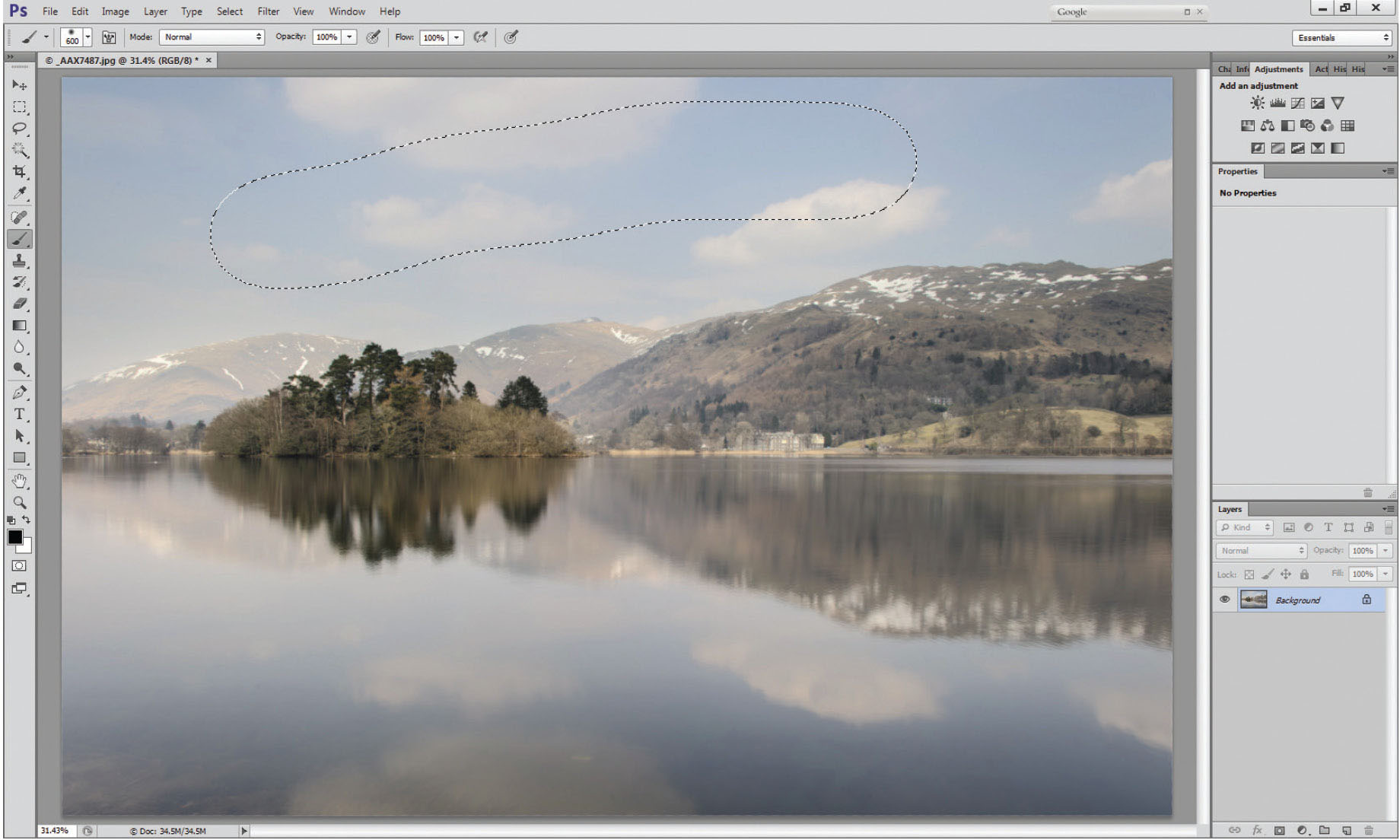
Fig. 3.25
Exit quick mask showing regular selection indicated by marching ants.
If you now exit quick mask (Q toggles the mask on and off) the red stripe now changes to an area surrounded by marching ants – a regular selection.
The brush tool makes an excellent selection tool for smallish areas (the island would be perfect) and the selection often doesn’t have to be particularly accurate – in fact, it usually works better when done really softly and is undefined.
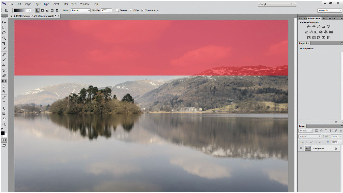
Fig. 3.26
Hard-edged grad (short gradation line) drawn vertically with a very short line to give a horizontal gradient.
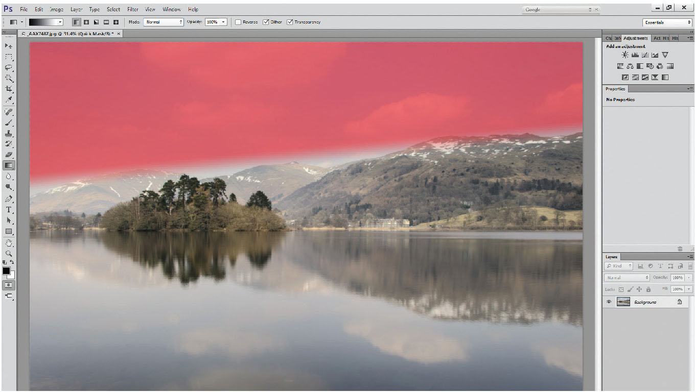
Fig. 3.27
Hard-edged grad (short gradation line) drawn angled to give an angled mask.
For larger areas, such as the sky, start with the gradient tool in quick mask. Using the gradient tool – with practice – is really straightforward. To create a gradient, click on the part of the picture at the point you want the gradation to start (not the area you want the grad to cover) and drag the mouse, which will create a line. This line indicates only the length of the gradation from 100 per cent to 0 per cent/black to white/red to clear on the quick mask. A short line will give a very hard edge to the gradation, a long line will give a very soft edge to it. If you want the top half of the picture to be selected with a hard-ish gradation, start almost halfway down the picture, click, and drag a short line. Do not start at the top of the picture – it is not the area that the selection covers that you are drawing, it is the length of the gradation.
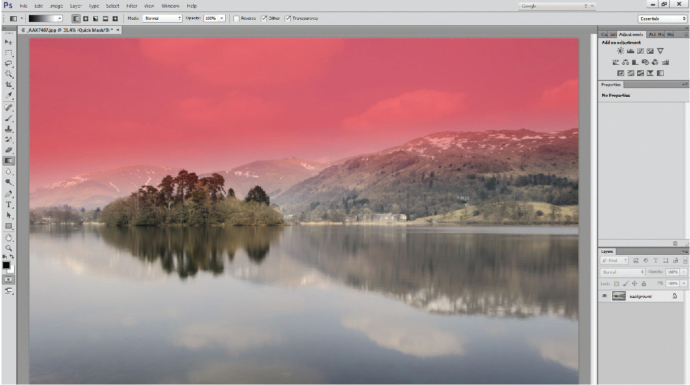
Fig. 3.28
Soft-edged grad (longer gradation line) drawn angled.
This seems to be one of the most difficult concepts to get across, as people on my workshops ask me again and again! Just go into quick mask (Q) and practice! Draw countless gradients across the picture – left to right, right to left, top to bottom, bottom to top, diagonally. (Make sure the blending mode of the gradient tool [G] is set to normal, or you’ll get a surprise.)
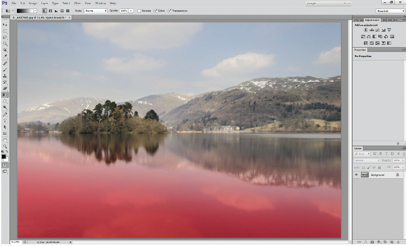
Fig. 3.30
Reversed grad – over the lake, gradient drawn from bottom to top.
It may be boring to look at, but there are a few QM/grad options below. It is so important that you understand this part before moving on.
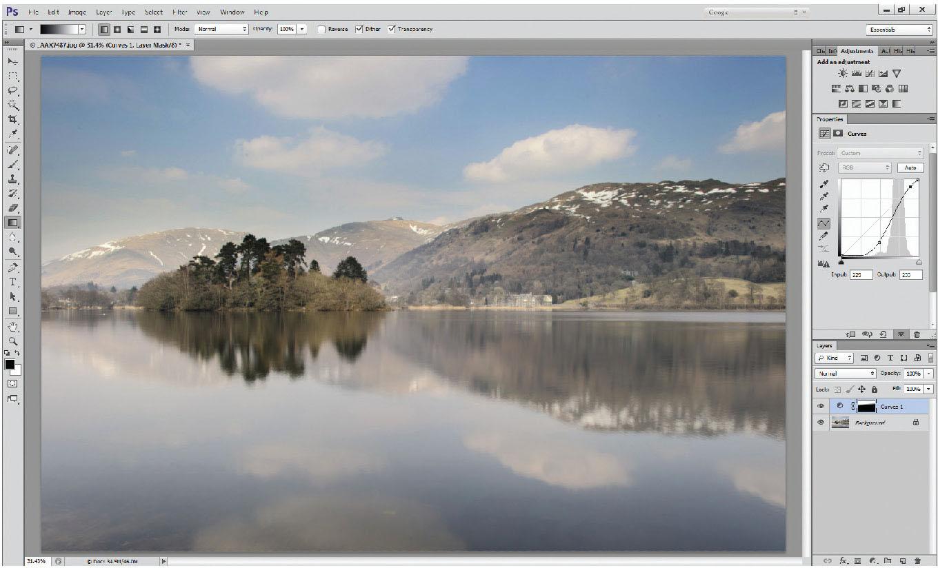
Fig. 3.31
Curves layer applied to graduated selection over the sky to give a similar result to Fig. 3.20, still with a soft edge to the selection.
By using the quick mask tool, and a combination of gradients, and using blending modes to modify the shape of the gradient, which we will deal with further on in the book, and using the brush tool, selections can be built up quickly, and with soft edges, so adjustments don’t look as obvious. If we take the selection from Figures 3.27/3.28 and apply a curves layer to it (Figure 3.31) – as we did with the selection using the magic wand tool – you will see the result is very similar, but the selection has been made in a fraction of the time. The order of work is as follows:
1 |
Add gradient using quick mask and gradient tool |
2 |
Exit quick mask – to turn mask into a selection |
3 |
Add curves layer |
4 |
Make adjustments |
Fig. 3.32
Inverted selection, showing marching ants over the land, not over the sky.
The final part we need to look at in this chapter is how to make selections, and copy them to another layer. The selection part has been amply dealt with above, but in the following photo, should you wish to copy the land and lake onto a separate layer, firstly make the selection. In this case you might find it easier to select the sky, and invert the selection (either Select>Inverse on the top drop-down menus, or Ctrl/Alt/I).

Fig. 3.33
Duplicated part layer – layer 1 is a duplication of the land and lake areas.
The selected layer can then be copied either by right-clicking with the mouse in the selected area and choosing the ‘layer via copy’ option, or by using the shortcut key Ctrl-J, which will duplicate the selected area (Photoshop already has Ctrl-D allocated as a deselect option. If you think ‘Ctrl-J – Juplicates’ it at least works phonetically). You’ll see that Layer 1 now contains a copy of the land and lake, but without the sky.
In this chapter we’ve looked at all the basics you need to work on your photographs. In the next chapter, we’ll look at a number of examples and a logical, repeatable, basic workflow, derived by looking at the photograph, rather than by following a list of contents.
