Local adjustments
In this chapter we look at ways of working on selective parts of the picture, possibly to darken an over-bright sky and make it more dramatic, or to lighten dark patches within an image that don’t quite have enough detail.
USING THE LEVELS ADJUSTMENT LAYER
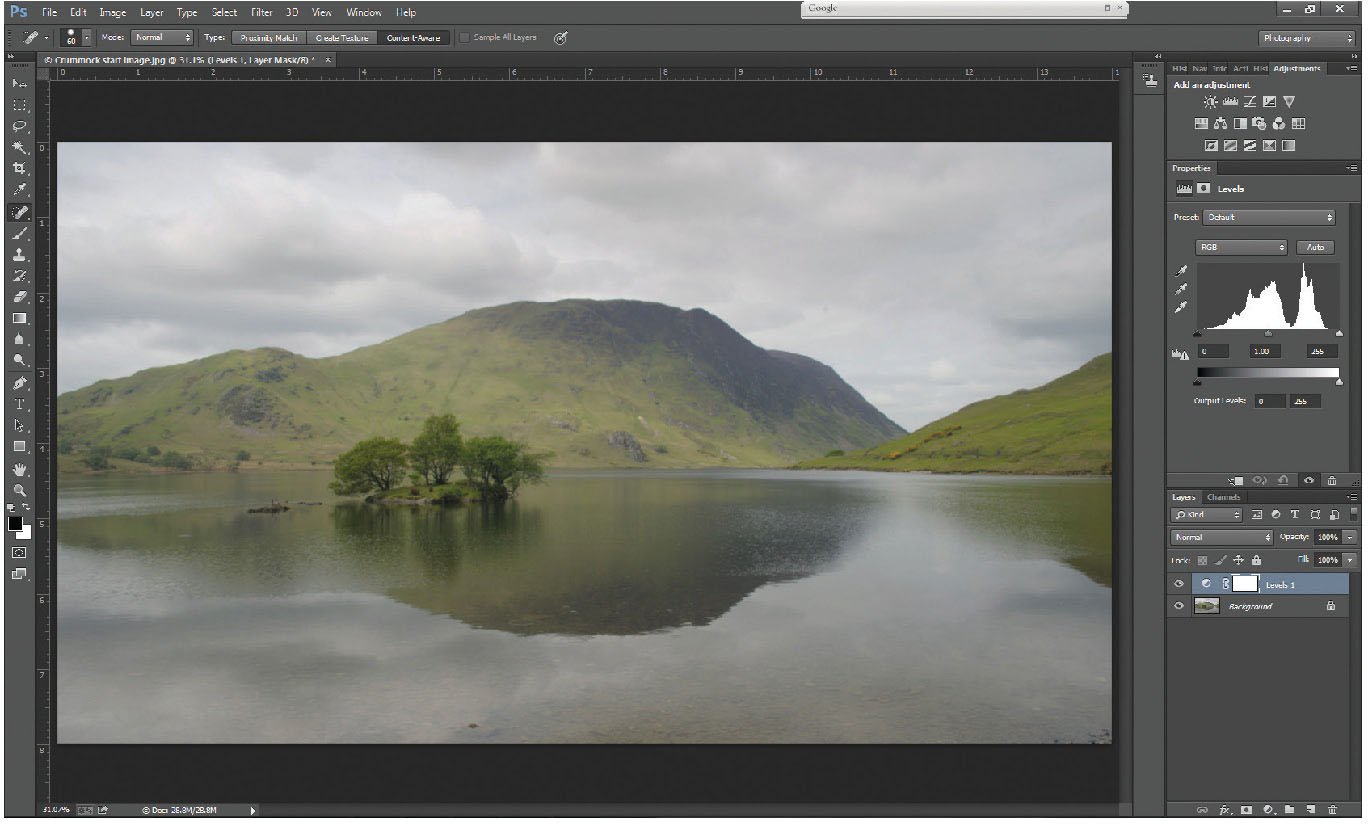
Fig. 5.1
Basic levels layer added above Background layer.
Add a levels layer (as described above) to a fairly low-contrast image, like the one here.
The histogram that you see in the properties window falls short of each end of the available axis, therefore there is no real black, nor any pure white – the photo generally looks flat, and low in contrast. Surprisingly, this is not a bad thing, and gives us a spread of data that we can really work with. A good standard workflow might almost always start with a basic levels layer.
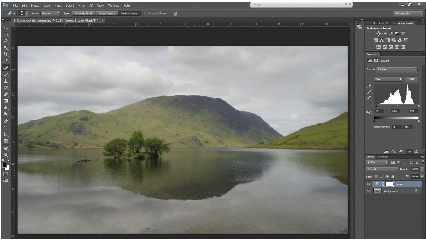
Fig. 5.2
Shadow slider moved into the end of the left side of the histogram.
Starting at the left side of the histogram, grab the small black triangle (known as the shadow slider) with the cursor, and slide it to the right until it reaches the edge of the histogram, but be careful not to go too far, or you will lose all shadow detail. A good way of checking this is – as you move the shadow slider – hold down the Alt key – the whole image will go white, until you reach the edge of the histogram, when the clipped areas will show. It’s important not to clip the shadows – so back it off a little. (Figure 5.2)
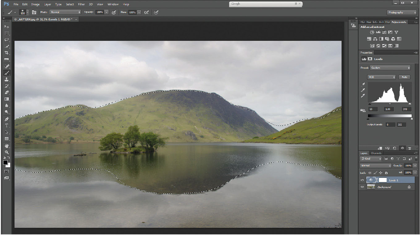
Fig. 5.3
Highlight slider moved into the end of the right side of the histogram.
Now do the same with the highlight slider; in this case, holding down the Alt key makes the screen go black, clipped areas show as white, with clipped channels showing as yellow/green/red and so on. Do be careful to avoid clipped details – you take great care in the field ensuring that detail is kept by careful exposure, don’t mess it up in processing. These adjustments have ensured that you have a range of tones from black through white across the image, rather than a set of dreary greys. (Figure 5.3)
SELECTING WITH QUICK MASK
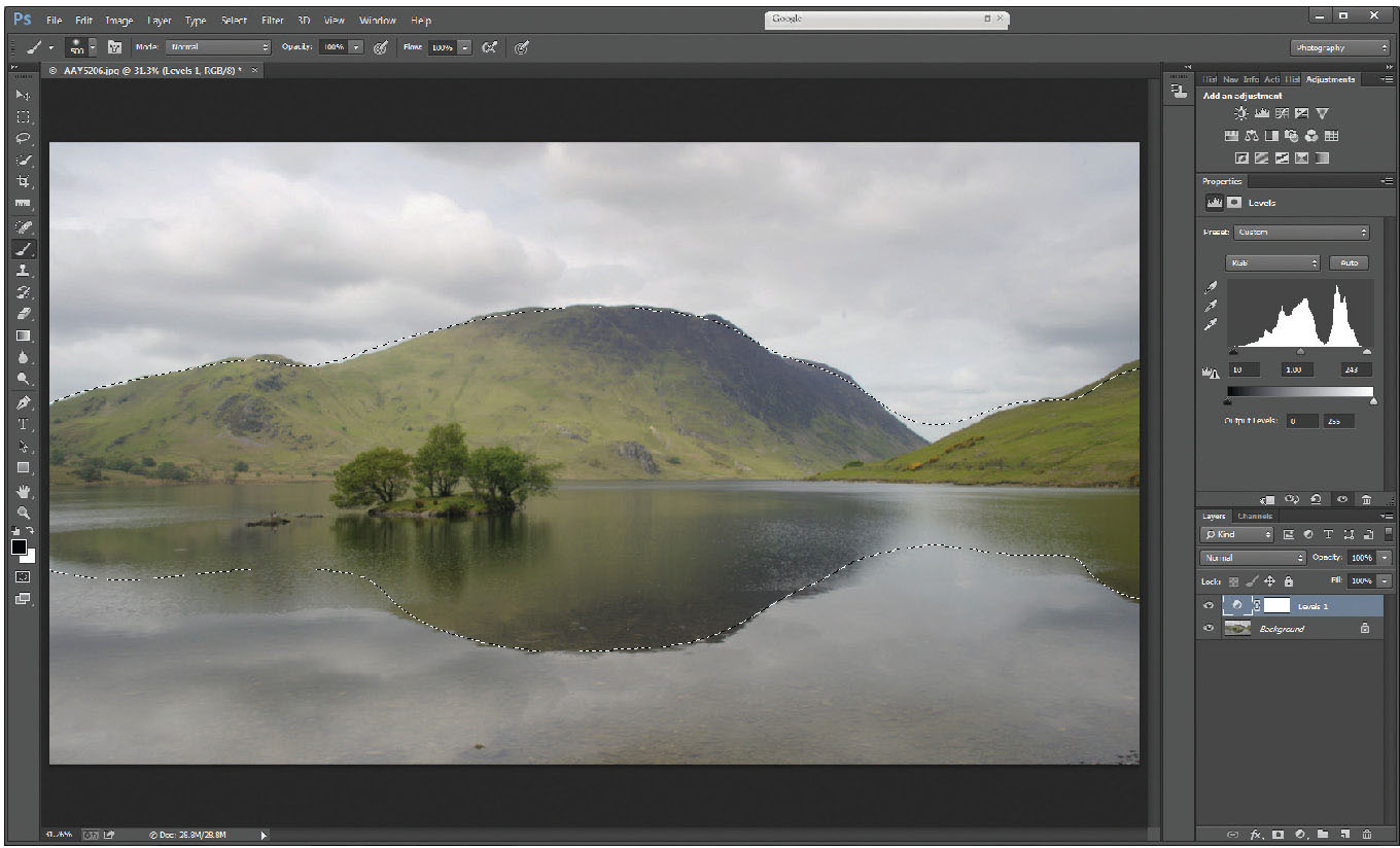
Fig. 5.4
The selection in place over the land – with a soft edge to the selected area.
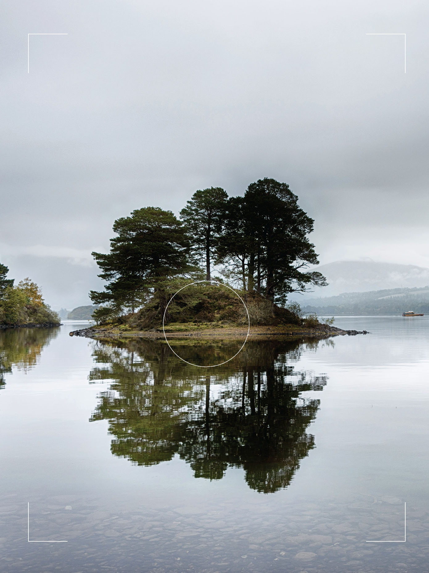
Rather than trying to increase the contrast on the whole picture, treat each area separately, in this instance the sky, the land and the water. As the land itself looks pretty flat and dull, try a selection of the land (and its corresponding reflection) using quick mask (Q) in conjunction with a brush tool. With quick mask selected and using a large, soft brush, with the foreground colour set to black, paint over the land until it has turned red. Exit quick mask (Q) to leave you with a selection.
USING CURVES TO INCREASE CONTRAST
Example 1
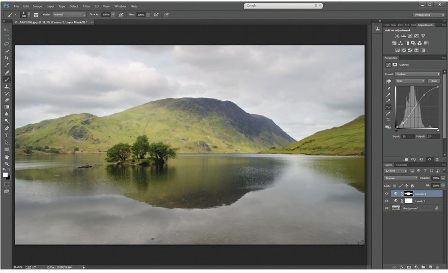
Fig. 5.5
Curves layer 1 added showing the layer mask in place to restrict adjustments to adjust the contrast of the land only.
With this selection in place, add a curves layer, and steepen the ‘curve’ to increase contrast over the unmasked area (the white area [land] on the layer mask). In this instance you might find the slight increase in saturation caused by leaving the blending mode at ‘normal’ benefits this picture.
Whilst the increase of contrast over the land as a whole improves the feel of the picture, the island in the foreground seems to have lost detail within the shadow areas, where the increase in contrast over the whole land area has ‘overcooked’ the island. The benefit of working on separate layers and corresponding layer masks is that this can be further modified.
Selecting a black brush and setting the opacity low (around 20–30 per cent) with a soft edge, will let you paint over the island, gradually building up the density – and by gradually erasing the effect of the curves layer, takes the island back to the lower-contrast original state, whilst still preserving a slight increase in contrast.
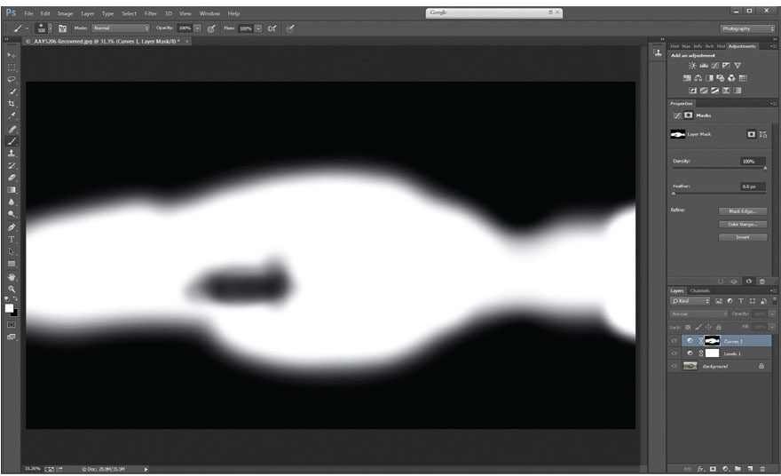
Fig. 5.6
The layer mask, showing the brush applied to the area of the island to prevent too much contrast from affecting the darker shadows within. (Layer masks can be viewed by holding down the Alt key and clicking with the mouse on the mask in the layers palette).
The layer mask (Figure 5.6) shows the brush applied to the area of the island to prevent too much contrast from affecting the darker shadows within. (Layer masks can be viewed by holding down the Alt key and clicking with the mouse on the mask in the layers palette.)
Next, take the sky – again, select simply by using the quick mask and either a gradient tool or the brush tool set to a soft edge and a very large brush. Remember, after you have painted the selection mask, exit quick mask (Q) to give you a marching ant-bounded selection, before adding an adjustment layer.
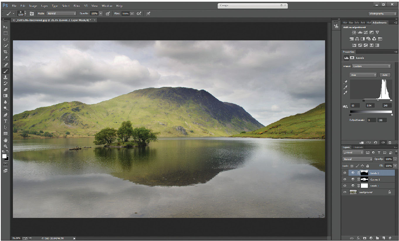
Fig. 5.7
Levels layer added to adjust the sky – the layer mask on the levels 2 layer indicates the area that will be affected by the adjustments.
Add a levels layer, and pull the shadow and highlight sliders up towards the edge of the histogram. This ensures the full range of tones through the sky (Figure 5.7) – make sure not to make it look too artificial, and consider changing the blending mode to luminosity, as the sky will not benefit from increased colour saturation. Remember, Photoshop is there to enhance photos, not to make them look unnatural. In this example, just the levels on the sky has not given quite as much contrast, so the selection from the levels layer can be reselected by positioning the cursor over the layer mask, holding down the Ctrl key and left-clicking the mouse. You will see the marching ants appear on the image corresponding with the clear (white) area of the mask. This is a very useful shortcut when using a range of layers incorporating the same mask on the image.
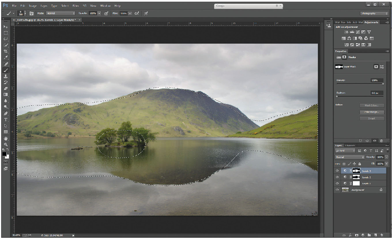
Fig. 5.8
Marching ant selection of the levels layer mask – achieved by holding the Alt key and left-clicking the mouse on the levels 3 layer mask.
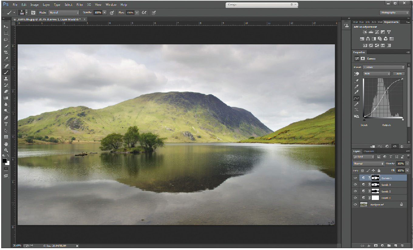
Fig. 5.9
Curves 1 layer created from the selection in the previous picture – curves layer adjusted by increasing the steepness of the curve over the width of the histogram.
In this case – add a curves layer (Figure 5.8) (you will see the layer mask attached is identical to that of the levels layer below), and increase the steepness of the curve through the area of the histogram, by adding two points at the appropriate points on the curve.
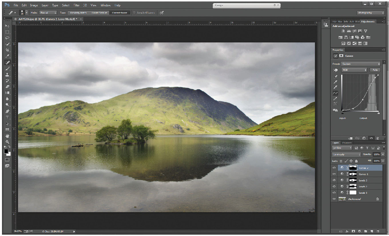
Fig. 5.10
Curves 2 layer.
Finally, the sky still looks paler and less dramatic than its reflection in the lake – select just the sky area, which can be done by Ctrl-clicking on the levels 2 layer, which reselects the sky and the lake; hit Q to re-enter quick mask, and using a white brush of 100 per cent opacity, brush out the lake selection. ‘Q’ will exit quick mask, leaving a marching ants selection over the sky area only. Add another curves layer (curves 2) and by pulling down the left side of the curve, the sky will darken and contrast will increase. Remember: to prevent colour changes, alter the blending mode of this layer to luminosity.
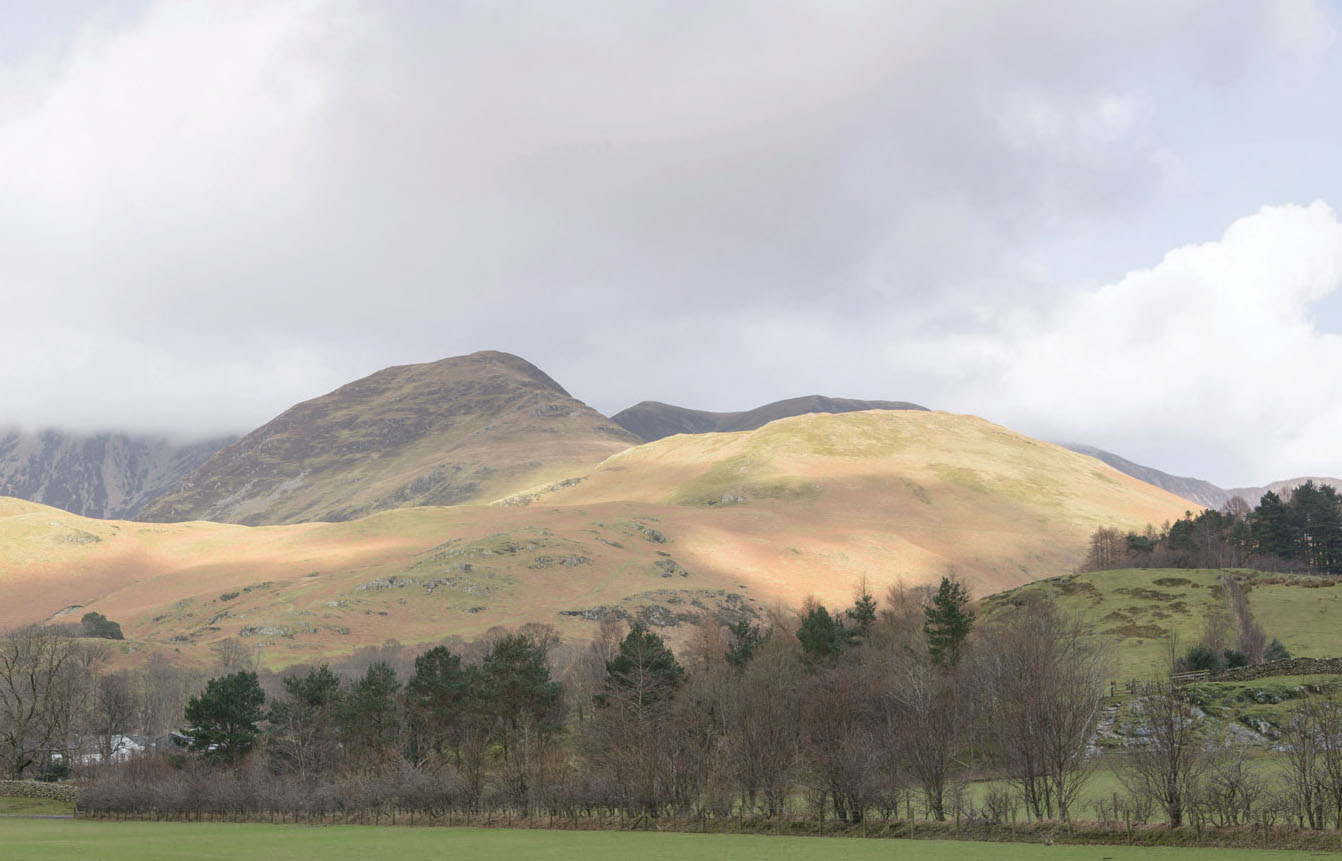
Fig. 5.11
A straight RAW file of the fells above Buttermere.
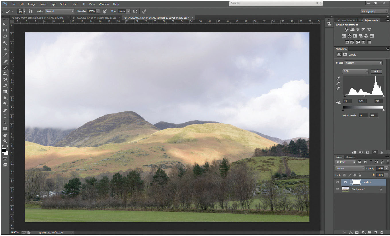
Fig. 5.12
A basic levels adjustment to give a full range of tones through the histogram. Figs 5.13 to 5.19 show the various stages of local adjustments that process the image to completion.
Fig. 5.13
A selection mask over the sky using the gradient tool (G) in conjunction with the quick mask (Q). By changing the blending mode of the gradient tool to multiply, gradients can be added together to form a concave gradient, in this case, over the central fell.
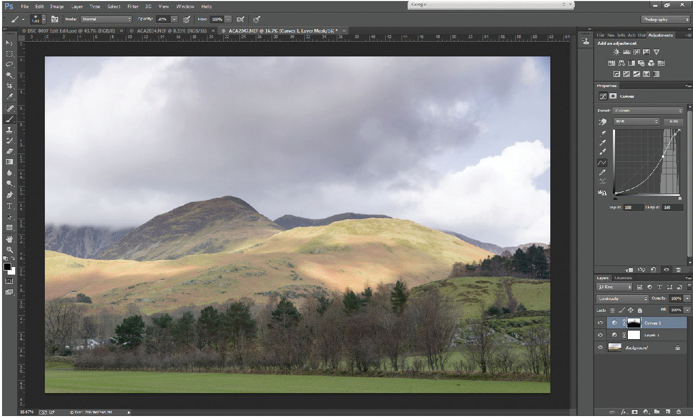
Fig. 5.14
A curves layer of the sky selection, with the curve line steepened through the area of the histogram to increase the contrast of the clouds generally. Adjustment layer blending mode altered from Normal to Luminosity, to avoid any change to the saturation of the colours.

Fig. 5.15
A second curves layer (Curves 2) with a selection made with a very soft brush in Quick mask of the white cloud on the right of the picture. The Curves 3 layer has had the central part of the curve pulled down to darken the mid-tones within bright cloud and bring out the detail. Blending mode to Luminosity.
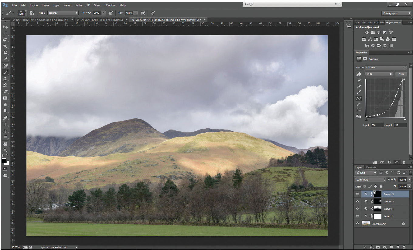
Fig. 5.16
A selection made in the same way as the last, but of the very flat left-hand cloud. Curves 3 adjustment layer created to increase the contrast through the cloud. Blending mode to Luminosity.
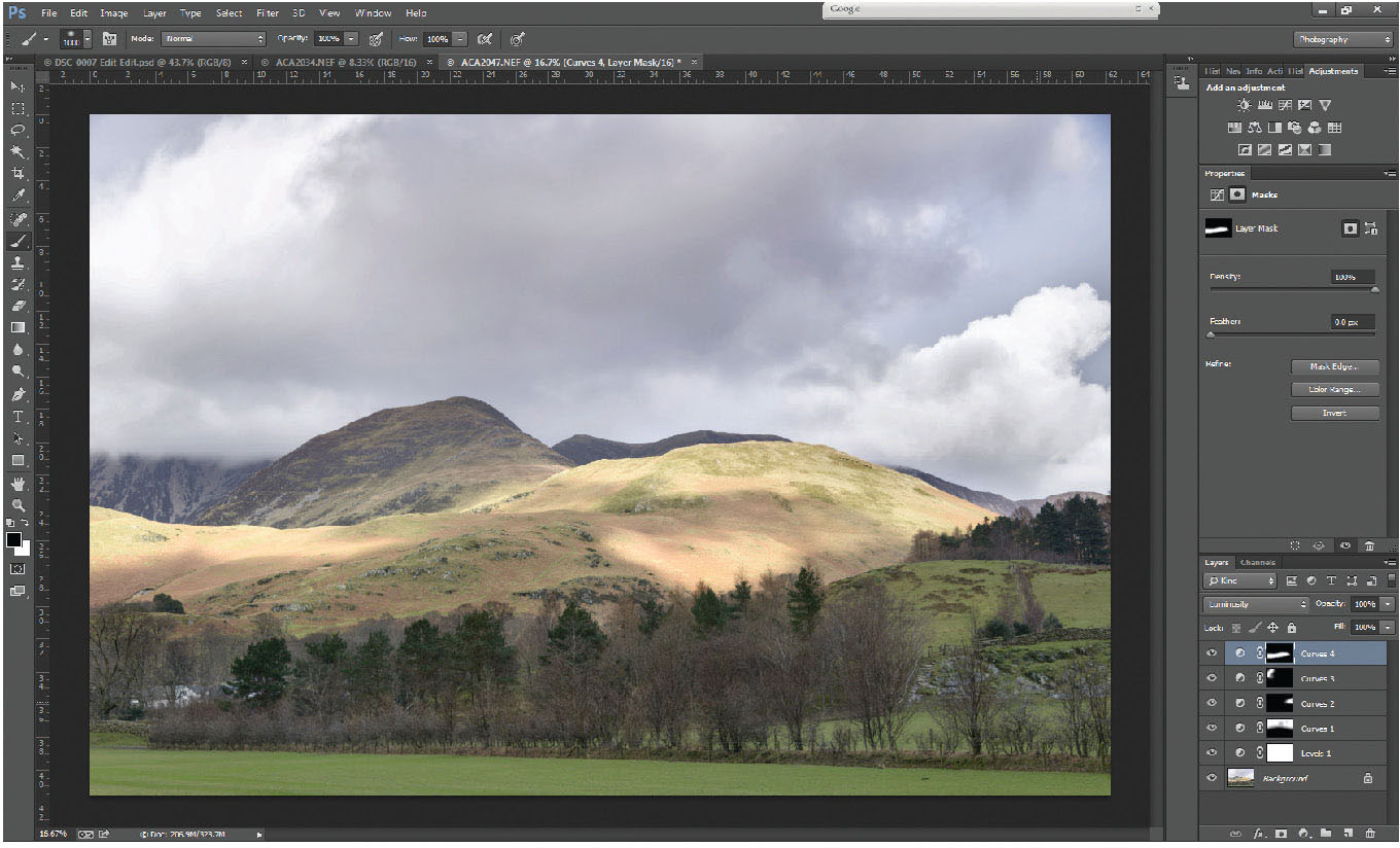
Fig. 5.17
Curves 4 adjustment layer, a selection of the central fells above the dark tree line. This selection was made using a large soft-edged brush (B) in quick mask (Q) to select a swathe through the centre of the picture, then tidied up over areas where it had overlapped into trees by painting over them with a white brush, which takes away from the mask. The selection created a curves layer, to add contrast locally to the hills.
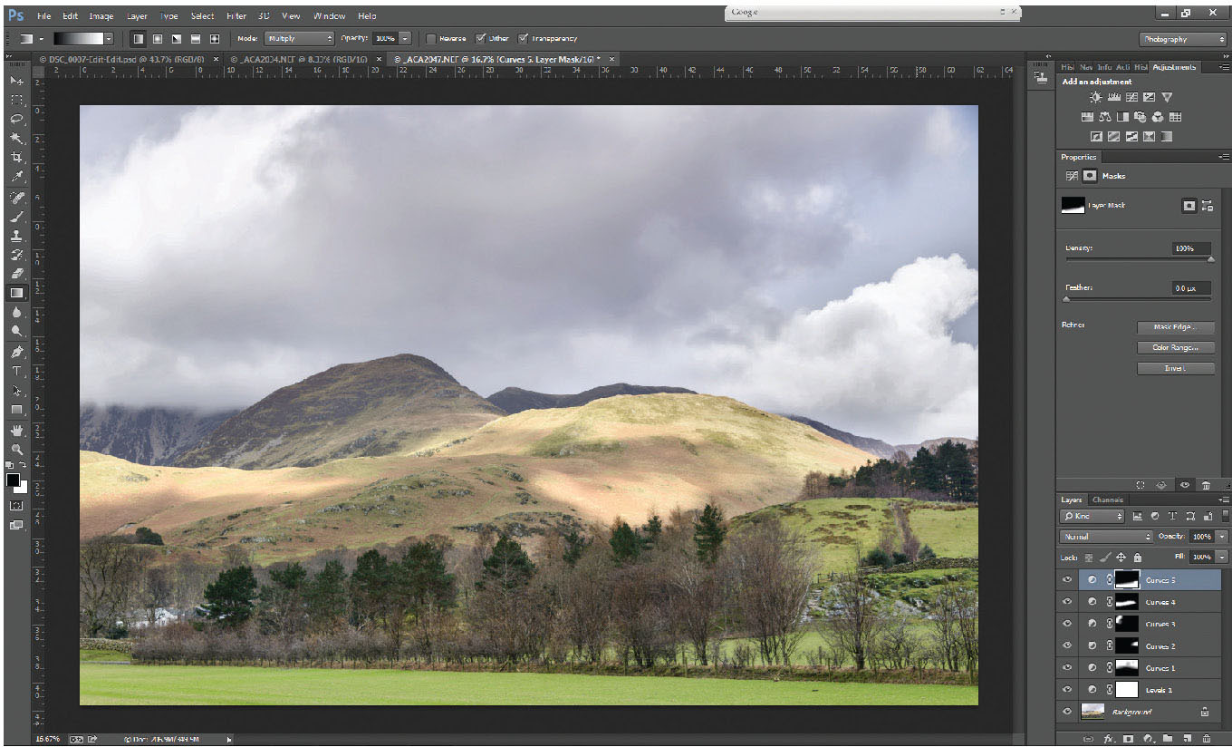
Fig. 5.18
Gradient tool (G) used in quick mask (Q) to select the base of the picture up to the tops of the dark trees. The gradient tool line was drawn at a slight angle to allow the gradient line to follow the trees perfectly. If it doesn’t work at the first attempt, keep going until you are happy with the gradient. (although do ensure the gradient tool’s blending mode is set to Normal, rather than Multiply, as it was earlier, or you will keep adding gradients to each other).
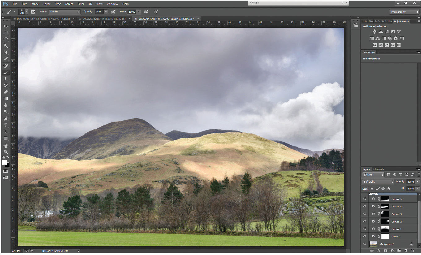
Fig. 5.19
A new layer added to the stack of layers, and the blending mode altered to soft light. Then using a soft-edged brush at a very low opacity, painting on that layer with black colour of 10 – 30% opacity darkens those areas, whereas painting with a white brush of low opacity lightens those areas. Perimeters of the light clouds in the sky have been slightly darkened, whereas a few of the darker foreground trees have been individually lightened.
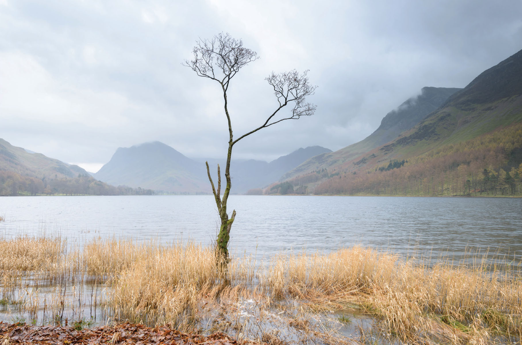
Fig. 5.20
An image of Buttermere processed, but unsharpened. Fig. 5.21 shows a 100% area of the tree. Although the image is in sharp focus, shot with a decent lens and on a tripod, sharpening will just enhance the finest details in the picture.
An area within Photoshop that is so often overused, the term ‘over-sharpened’ is heard so often when looking at printed photographs, almost as much as comments like ‘can a picture be too sharp?’ It is important to realize that the sharpening of a digital image is different to making an ‘unsharp’ picture sharp. It serves to crisp up the image, as digital cameras and sensors blur an image to some degree and therefore need sharpening prior to displaying (whether digitally or as a print).
There are a number of useful sharpening tools within Photoshop; most of the sharpening tools can be found under Filter>Sharpen, although the obvious ones are not the best to use. Sharpen, sharpen more and sharpen edges are old filters designed to work with very small file sizes, and are not suited to today’s large files. The most useful of the sharpening filters are unsharp mask and smart sharpen.
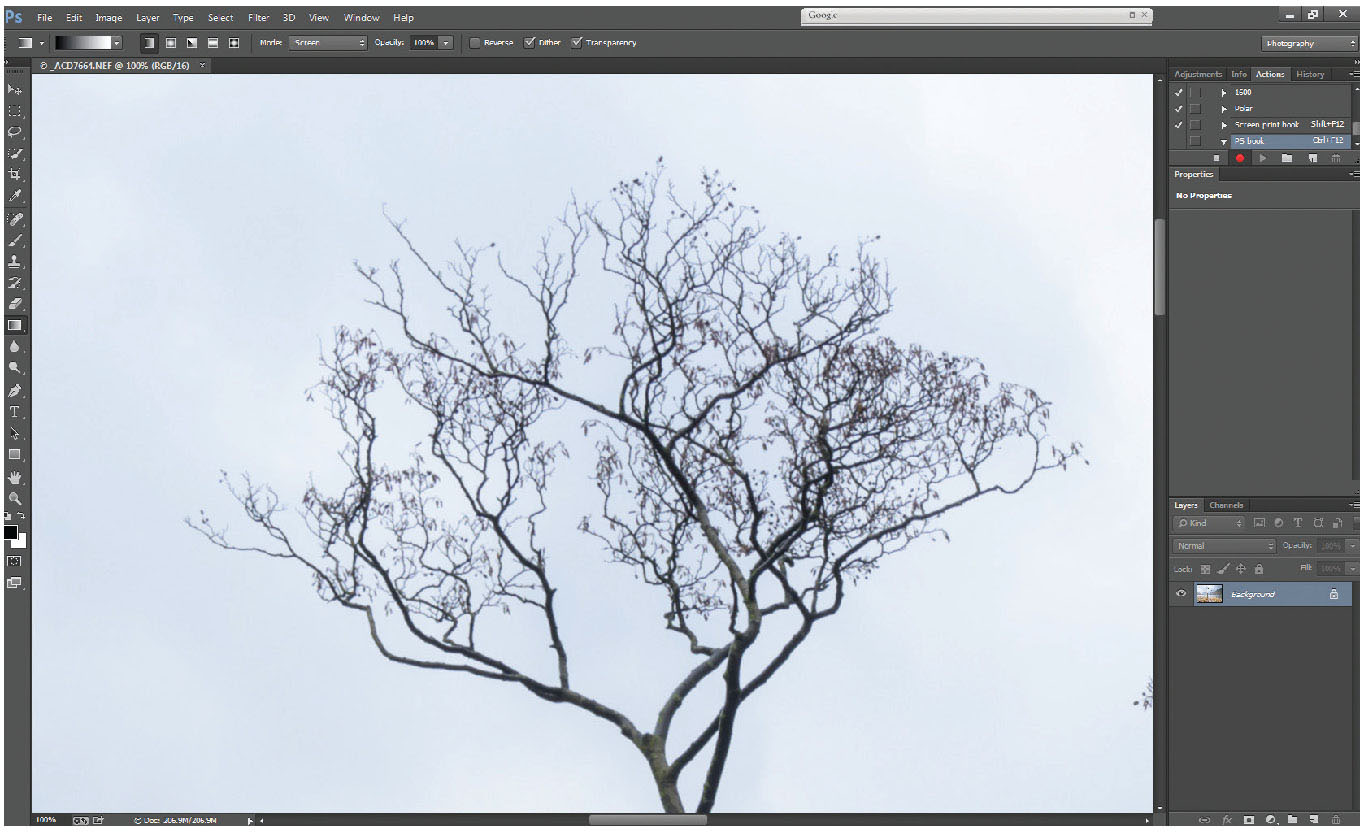
Fig. 5.21
100% (pixel view) area – unsharpened.
For many years the sharpening tool of choice, unsharp mask is a controllable sharpening tool. It is based around three adjustable sliders: amount; radius and threshold. To take them in reverse order:
Threshold
Adjustable from 0 to 255. When the filter is applied, threshold can determine how much of the image is sharpened. It effectively looks at adjacent pixels, and determines the difference in brightness between them and applies (or doesn’t apply) sharpening to them. At a threshold of 0, the sharpening filter will be applied to every pixel; at a threshold of say, 10, if there are 10 or fewer units of brightness difference between adjacent pixels, no sharpening will take place on those pixels, but more than 10 units of brightness difference will be sharpened. This can be useful for areas of smooth tone, where sharpening might not enhance the image; skies, for example, rarely need sharpening. In fact sharpening a sky can create noise in the otherwise smooth tonal areas. If a threshold of 255 is selected, no sharpening will be applied at all. Typically a very low threshold should give the best results.
Radius
Adjustable from 0.0 to 1000.0 pixels. Affects the radius of sharpening around each pixel. High levels look awful – and are the main cause of over-sharpening. Ideal value of radius is 1.0.
Amount
As a percentage, from 1 per cent to 500 per cent. The amount of sharpening depends entirely on the file size; a large file will take more sharpening than a small file. A picture for the web of only 1,200 pixels wide might only need 20–30 per cent sharpening, whereas a 36Gb file from a modern DSLR might require over 100 per cent. The simplest way is to judge it by eye, then back the filter off a bit (as typically we push the filter slightly too far).
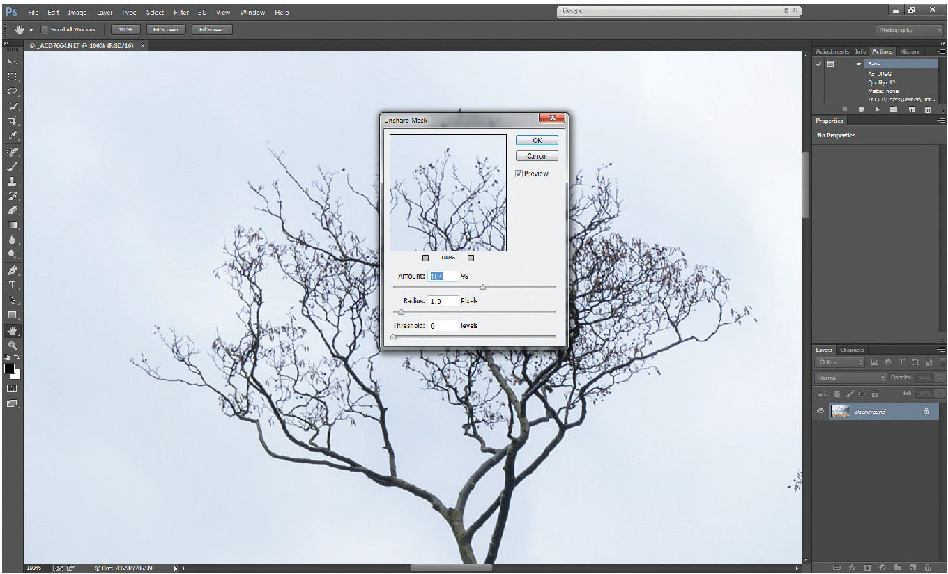
Fig. 5.22
Unsharp mask applied to image with sharpening set to 104%, at a radius of 1.0, and threshold of 0.
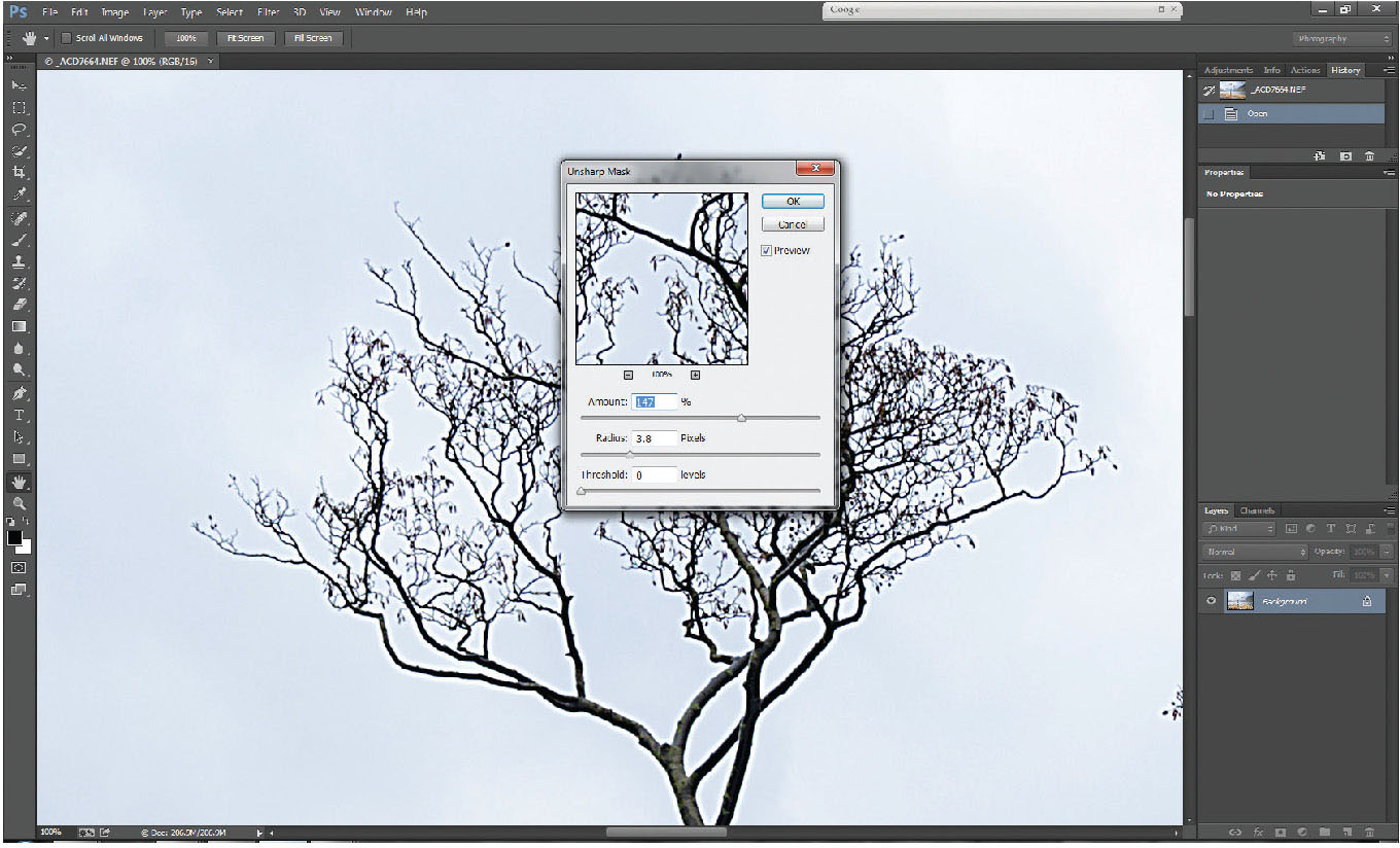
Fig. 5.23
Unsharp mask with excessive radius and amount, showing the glow caused by oversharpening.
Figure 5.22 shows a 100 per cent enlargement of the same image with recommended levels of unsharp mask applied. Figure 5.23 shows unsharp mask with too high an amount, and too great a radius; the oversharpening is clear on the tree branches, which have now developed a glowing line around them.
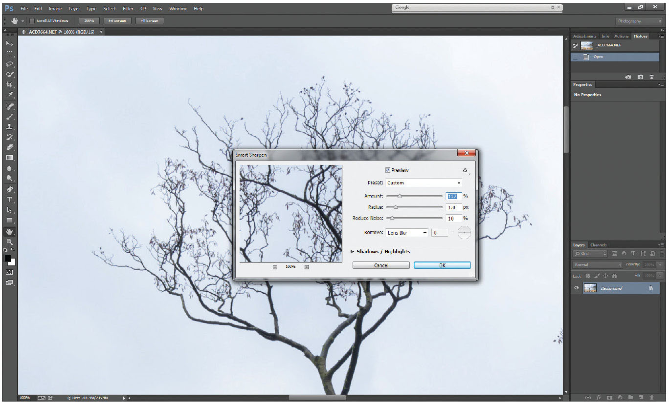
Fig. 5.24
Smart Sharpen filter set to 117%, radius of 1.0 and 10% reduce noise.
A newer addition to Photoshop than unsharp mask is the smart sharpen filter. Oddly, it has dropped threshold, but retains radius. Recommended setting is to keep radius around 1.0. It also offers noise reduction alongside the sharpening filter, which can be useful where high ISOs have been used. Figure 5.24 illustrates a 100 per cent enlargement of the smart sharpen filter.
If your image has a large area of featureless smooth tone (a plain sky, for example), try selecting the area to be sharpened (excluding the sky area), prior to applying the filter. The selection can be very approximate, but excluding the sky from being sharpened can reduce noise if the original has some noise present.
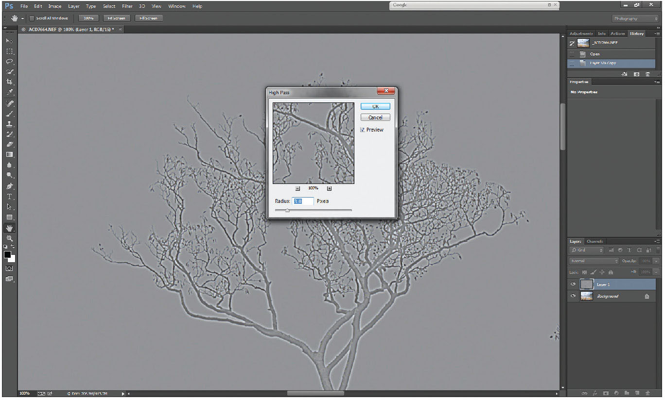
Fig. 5.25
High-pass filter applied to duplicate layer with radius set to 8%.
Outside the Filter>Sharpen section there is another popularly used sharpening technique. Known simply as the high-pass sharpening method, it is a very good, adjustable filter for edge sharpening of areas with fine detail, such as patterns of tree bark, log ends etc. Working on the same picture as before, start by duplicating the background layer (Ctrl-J). Under Filter>Other, there is a filter called high pass. (Figure 5.25)
This filter turns the picture almost totally mid-grey, apart from around edge details, where it forms almost bas-relief style light and dark tones, picking out the edge details of the image. The radius is adjustable from 0 to 1,000 pixels, and again, lower values are more effective. On this image, a value of between 3 and 5 seems to work well against the sky, but at 5.0 there appears to be a strong glow around the bare branches. Applying the filter leaves a predominantly grey layer, looking somewhat odd.
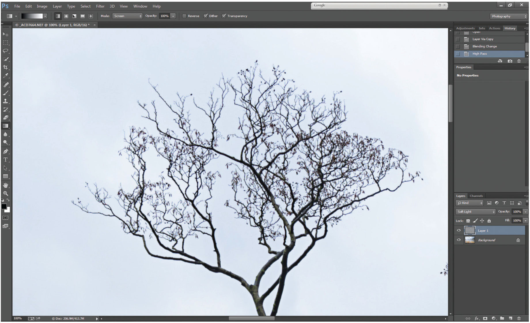
Fig. 5.26
Blending mode of high-pass layer changed to soft light.
From the previous session, where we dealt with darkening and lightening on a soft light background, the same logic applies here. By changing the blending mode of the background copy (the high-pass layer) to soft light, the grey areas become transparent, allowing the light and dark areas to have an effect on edge details through the picture, hence performing a very effective edge-sharpen.
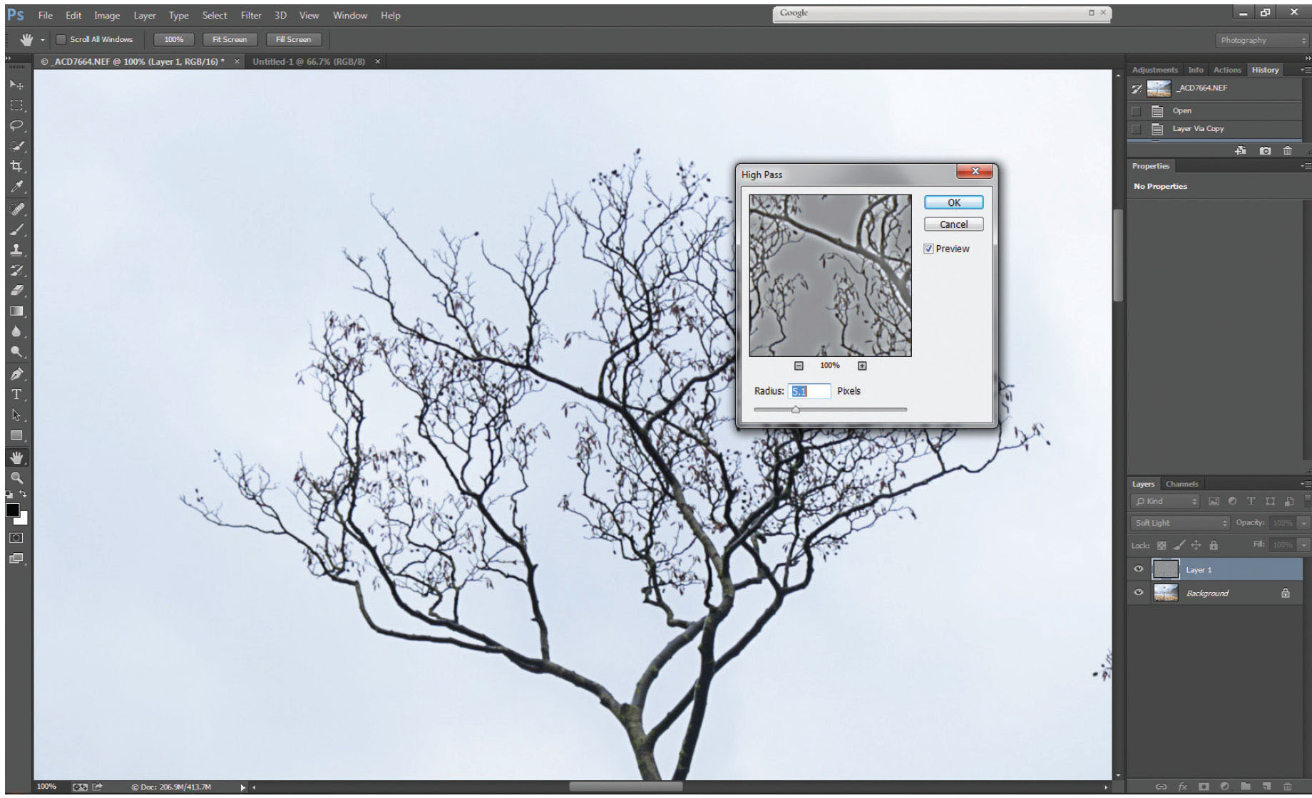
Fig. 5.27
Adjustment to high-pass layer carried out in soft light blending mode, where it is easier to see the sharpening effect.
Once you have tried this technique and understand how it works, try changing the blending mode of the background copy layer before you apply the high-pass filter. This way you will not see the full-screen grey filter, rather you will see the sharpening effect on the whole image, with only the pop-up dialogue box showing the grey high-pass effect. It is a much easier way of judging the strength of the filter on the image.
Whatever you choose, the key to sharpening is, don’t overdo it – if in doubt, back it off a bit. It is common to hear people refer to a picture as ‘over-sharpened’ but remarkably rare to hear anyone call a picture ‘under-sharpened’. So be careful.