17: Concept: Disconnected Tables
So far as you have worked through this book, you have always loaded tables into the data model and then connected them to other tables. This is a fundamental technique with Power BI that allows you to work across multiple tables without using VLOOKUP(). However, you are not required to join tables together in the data model, and indeed there are some instances when it doesn’t make sense to do so. This chapter discusses two techniques that do not involve connecting tables:
- Using What-If analysis
- Using banding
I first learnt to do What-If analysis by manually creating a table of values and then writing a special measure that would “harvest” the value selected by the user so it could be used inside a formula. In Aug 2017 Microsoft released a new feature called What-If that replaces the need to complete this process manually. With this new feature, it is easier than ever to do your own What-If analysis. Let’s look at an example to demonstrate how to use the What-If capability.
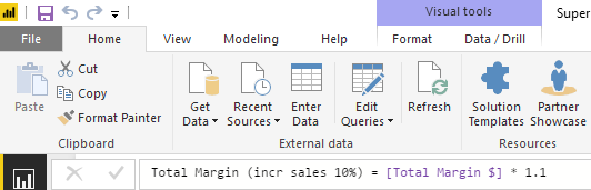
Imagine that in your data, the sales result is directly proportional to the profit result. You have sales data and want to see what impact an increase in sales will have on your total profit. You could write a new measure hard-coded at a 10% increase, as shown below.
And it would look as shown below in a matrix.

But what if you wanted to see what it looks like for a 5% increase in sales, or 15%, or some other percentage? It would not be efficient to create lots of new measures, one for each value. A better approach is to use the What-If analysis capability provided by Power BI.
1. Create a new blank page in your Power BI workbook.
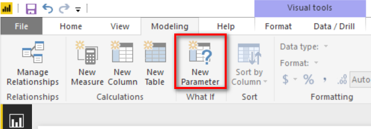
2. Navigate to the Modeling tab and click on New Parameter as shown below.
3. Enter a minimum and maximum value that will be used inside the What-If analysis, along with the increment. As you can see below, I have entered a range of integers from 0 to 15. I have also given my parameter a name “Increase”.
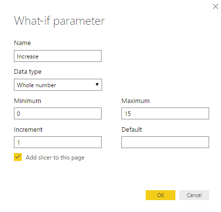
4. Click OK.
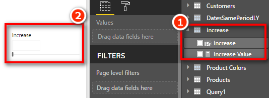
5. Notice that there is a new Table (including a new measure [Increase Value] in Fields list (#1) and also a new Slicer (#2) on the Report.
6. Write the following new measure that utilises the [Increase Value] measure shown above.
Total Margin with Selected Increase =
[Total Margin $] * (100 + [Increase Value])/100
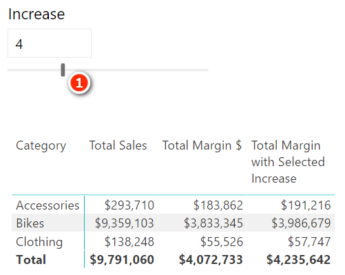
7. Add the above measure in the matrix from before, as shown below. Note I still have a visual level filter on CalendarYear = 2003. You can now use the Slicer (#1) to vary the sales increase and see what impact that increase has on [Total Margin with Selected Increase].
How It Works
When you click the New Parameter button in Power BI, Power BI automatically creates three things. A new table of values, a new measure and a new slicer (optional but created by default).
Select the new table created by the New Parameter button in the Fields list on the right (#1 below). You will see that this new Increase table is a calculated table that uses the formula shown as #2 below.

It is pretty easy to work out the syntax of the function GENERATESERIES() just by looking at the formula. GENERATESERIES() is a new function in Power BI desktop that you can use anytime you want to create a new table of values with a constant increment between values.
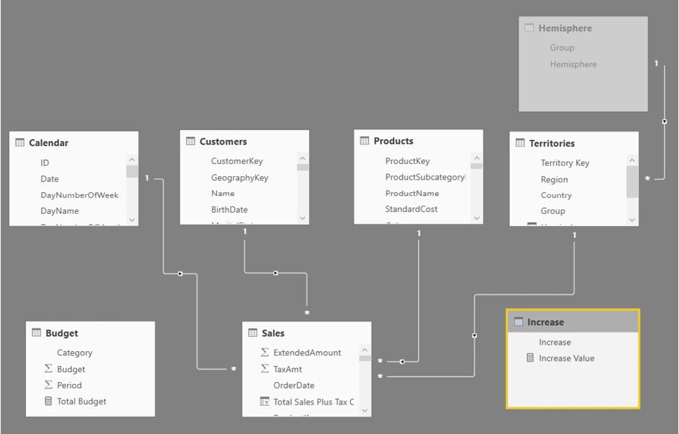
If you switch to Relationships view, you will see the new table. (You may need to select Fit to Screen to be able to see it.) This time the table is not joined to any other table – it is a disconnected table. Just position it somewhere so it is easy to see on the screen, as shown below.
The New Slicer
Switch back to Report view. The new slicer that was automatically created uses the only column in the table Increase[Increase] as the input field. The slicer then allows the user to select a single value to represent the increase in sales required for analysis.
The New Measure
If you now click on the [Increase Value] measure, you will see that the measure formula is as follow:
Increase Value = SELECTEDVALUE(Increase[Increase])
This measure uses the new function SELECTEDVALUE(). You may recall from Chapter 12 that this function returns the single value selected in the filter context, or blank if there is more than 1 value selected. This is the secret sauce of this What-If parameter. The SELECTEDVALUE() function “harvests” the selection from the user in the slicer and then passes that selected value to your formula. By default, if the user hasn’t selected a single value, it returns BLANK(). (However, this can be changed via an optional final parameter.)
Note: The behaviour of slicers tends to change as Microsoft is improving and developing Power BI. At this writing, there are a number of different configuration choices for slicers. Click the drop-down arrow in the top-right corner of the slicer to change the way the slicer is displayed.
Seeing All What-If Variants at Once
As well as using the slicer to see one of the What-If numbers at a time, it is also possible to use the Increase[Increase] Column on Rows in a matrix to see all the single values at once. I have modified the matrix from earlier as shown below. I have removed Product[Category] from Rows and added Increase[Increase] to Rows in its place (#1 below). I also cleared the selection from the slicer on the page to see the full list of values. Lastly, I added some conditional formatting to make the changes in Margin measure more obvious.

Practice Exercise: Harvester Measures
In Chapter 9, you created the following DAX formula:
Total Customers Born Before 1950 =
CALCULATE([Total number of Customers],
Customers[BirthDate] <DATE(1950,1,1))
In the next practice exercise, you will write a measure that allows you to change the “before year” using the What-If feature.
Write the following new DAX formula. Find the solution to this practice exercise in "Appendix A: Answers to Practice Exercises" on page 214.
70. [Total Customers Born Before Selected Year]
Using the technique described above, create a new matrix (on a new page) that allows the user to select from a list of years in a slicer using a new What-If parameter. Change the above measure from being hard coded to 1950 and instead make the year selectable from the slicer.
This is quite a difficult problem and you will have to think back on what you have learnt in previous chapters to make it work. You should try to do it yourself, and if you get stuck, read the start of the worked through solution below, then try to solve the problem again.
Here’s How: Solving Practice Exercise 70
There is a trick to this practice exercise. The original measure you created used a “simple filter” in CALCULATE(). If you replace the “year value” from the first formula with the What-If measure [Year Value], you get the error message shown below.

The problem is that you cannot use measures in a “simple” CALCULATE() formula. If you want to use measures (as you do in this case), you must use the FILTER() function inside CALCULATE(). So instead of writing this:
Customers[BirthDate] < DATE ( [Year Value], 1, 1 )
you need to write a FILTER() function that filters the Customers table to replace the line above.
Go back and give it a go: See if you can write the correct formula by using the FILTER() function. If you still need more help, read on to see the correct formula.
Here is the worked-through solution for Practice Exercise 70:
1. Create a new What-If parameter using values (say 1900 through 2000). Give it a name such as Year. Note the new measure created called [Year Value].
2. Write the following measure and then add it to your matrix:
Total Customers Born Before Selected Year
= CALCULATE (
[Total number of Customers],
FILTER (
Customers,
Customers[BirthDate] < DATE ( [Year Value], 1, 1 )
)
)
You should end up with something that looks as shown below.
Note: I have changed the slicer layout do be a list of values. You can change a slicer from the drop-down arrow in the top-right corner of the slicer.
When you click on a year in the slicer, the [Year Value] measure updates, and the results for [Total Customers Born before Selected Year] update to show the value for year you have selected in the slicer.

The SWITCH() Function Revisited
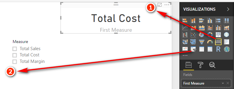
In Chapter 11, I introduced you to the SWITCH() function. One really cool feature of SWITCH() is that you can create a switch measure that allows you to toggle between multiple other measures. Take a look at the image below.

The image on the left has Total Sales selected in the slicer (#1). When Total Sales is selected, the chart updates to show Total Sales (#2). When the user selects a different value in the slicer such as Total Cost (#3), the chart changes to show Total Cost (#4). This toggle effect is really engaging for the report user and can be used to create very complex and useful interactive reports.
Here’s How: Creating a Morphing Switch Measure
You need to create a disconnected table and a harvester measure to be able to complete this technique:
1. On the Home menu, click Enter Data.
2. Enter 3 rows of data as shown below. Call the table DisplayMeasure, then click Load.

3. Navigate to Data view, click the new DisplayMeasure table, go to the Modeling menu and change the sort order of the Measure column so it sorts by Measure ID column instead. Do you remember how? You did it in Chapter 12.
4. Right click on the DisplayMeasure table and add a new measure as follows.
Selected Measure = SELECTEDVALUE(DisplayMeasure[Measure ID])
5. This measure is called a Harvester Measure and it uses the same technique used with What-If earlier in the chapter. It checks to see if there is a single value selected for DisplayMeasure[Measure ID] and if so it returns that value, otherwise it returns BLANK. It “harvests” the selection from the user when used with a slicer.
6. Go back to Report view and create a new page. Place a Card (#1) on the report and add the DisplayMeasure[Measure] column to the Card Fields. Then place a Slicer (#2) on the report and place the DisplayMeasure[Measure] on the Slicer as well.
7. Now when you click on the slicer, the Card will update to show you which measure you have selected. This Card will be the title for the chart that will be added next.
8. Click on the Card, go to the Format pane, and turn off Category Label.
9. Right click on the Sales table and write the following measure.
Measure to Display = SWITCH([Selected Value],
1,[Total Sales],
2,[Total Cost],
3,[Total Margin $]
)
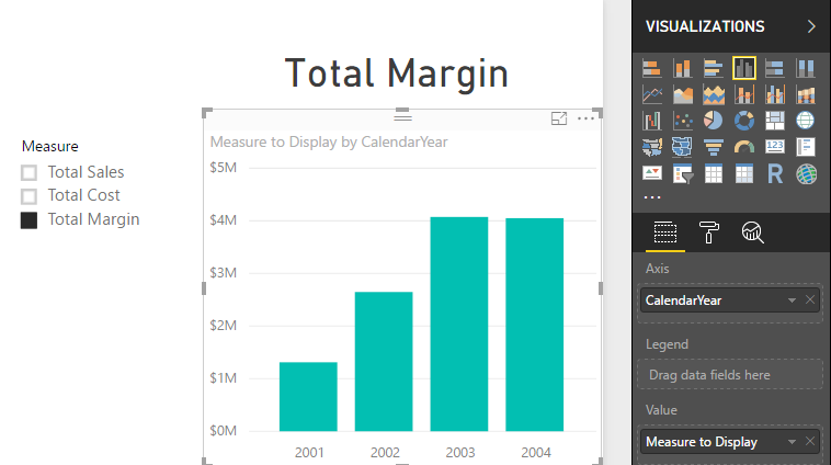
10. Add a new Column Chart to the report (clustered or stacked column chart, both will work). Place Calendar[Year] on the Axis and the new [Measure to Display] measure as the Value as shown below.
11. Go to the Format pane for the chart and turn off the default Title. Also expand the X-Axis section and change the Axis type to Categorical.
When done, you should have an interactive chart that will display the measure selected by the user in the slicer.
Another disconnected table technique is banding; I learnt this technique from Marco Russo and Alberto Ferrari at http://sqlbi.com.
To understand banding, think about the earlier example, in which you created a slicer based on the year the customer was born. A more common and practical need is to be able to analyse customers based on their age group rather than their actual age, like this:
- Under 20
- 20 but less than 30
- 30 to less than 40
- 40 to less than 50
- 50 to less than 60
- 60 and over
It is possible to write a calculated column in the Customers table that creates these age group bands. But it would be a very complex formula, and it would be hard to edit.
Note: For the sake of the exercise, I use January 1, 2003, as the “current date” from which to work out the age of each customer. Of course, in reality, each customer’s age band will change over time, but I have ignored that fact for this example so that the results you see onscreen will be the same as my results shown below. If I used TODAY() in this exercise, my results would be different to yours.
A hard-coded calculated column formula for age group might look like this:
=IF(((date(2003,1,1) - Customers[BirthDate])/365)<20,"Less than 20",IF (((date(2003,1,1) - Customers[BirthDate])/365)<30,"20 to less than 30",IF(((date(2003,1,1) - Customers[BirthDate])/365)<40,"30 to less than 40",IF(((date(2003,1,1) - Customers[BirthDate])/365)<50,"40 to less than 50",IF(((date(2003,1,1) - Customers[BirthDate])/365)<60,"50 to less than 60","Greater than 60")))))
This DAX works, but it is not very user friendly, it is hard to write, and it is even harder to read and maintain. A better approach is to use banding.
The first step in banding is to create a table of data that contains the upper and lower values for each band, as well as a text description. You can type these values directly into Power BI. Follow these steps:
1. Click Enter Data in Power BI.
2. Enter the data into the form as shown below. Make sure you give the table a name and then click Load.

Note: It is important to set up the banding table so there is no crossover of ages between the Low and High ranges. The table above covers all possible ages between 0 and 999, without any duplication. Of course, the 999 value is any arbitrarily large value to catch everyone.
Note: There is no need to join this table to any other table in the data model. In fact, there is no workable way you can do that anyway. Even if there were an age column in the Customers table, you still couldn’t join this table to the age column. This banding table doesn’t contain all the possible ages for customers; it just has the age bands. So if you first create a customer age column and then join the Low column to this new column, the data will only match for customers who are 20, 30, 40, etc. There will be no match for customers with ages that don’t end in a zero (e.g., 21, 22, 23, etc.). So that is not going to work. This table is not joined; hence, it is called a disconnected table.
3. Right-click the Customers table in Data view, select New Column, and enter the following formula:
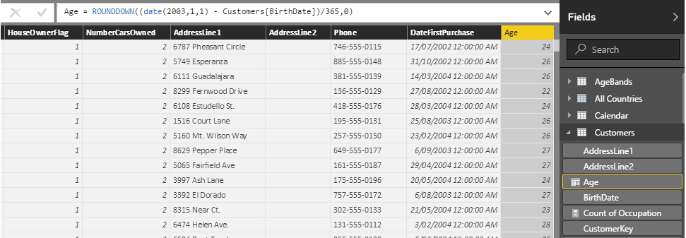
Age =(DATE(2003,1,1) - Customers[BirthDate])/365
Note: Although it is not required to make this banding technique work, you could enhance this formula with some rounding, as follows:
= ROUNDDOWN((date(2003,1,1) - Customers[BirthDate])/365,0)
4. Now you have a new calculated column, as shown above, and you can write some DAX to create the banding column.
5. Right-click the Customers table, select New Column, and enter the following formula:
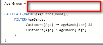
Age Group = CALCULATE(VALUES(AgeBands[Band]),
FILTER(AgeBands,
Customers[Age] >= AgeBands[Low]
&& Customers[Age]
< AgeBands[High]
)
)
6. The key to this formula is the FILTER() function. This function iterates over the AgeBands table and checks each customer’s age against the low and high values for each band. There is only ever one single row in the AgeBands table that matches the age of the customer. The FILTER() function inside CALCULATE() first filters the AgeBands table so that only the one row that matches the age band is left visible. Then CALCULATE() evaluates the expression VALUES(AgeBands[Band]), and because there is only one row visible, VALUES() returns the name of the band as a text value into the column.
Note: There are two main benefits of taking this approach to banding:
- The DAX formula is easier to read and understand. Once you get used to the concept, it is easier to write, too.
- It is easy to make changes in the future. For example, if you want to add another age band to your analysis (e.g., a new “Greater than 70” age band), all you need to do is add another row to your AgeBands table and then click Refresh.
Here’s How: Editing a Table Previously Created with Enter Data
Add a new row to the table, like this:
1. Right-click the AgeBands table in the fields list and select Edit Query.
2. In the Query Editor (shown below), click on the cog next to the Source step.
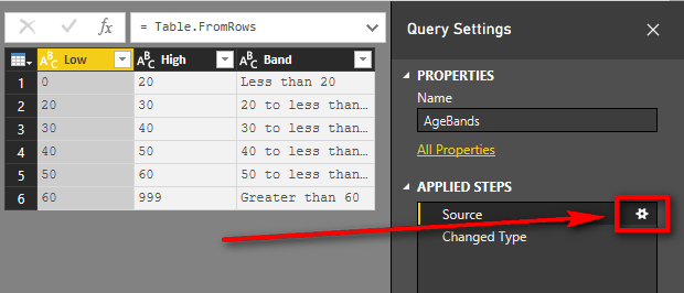
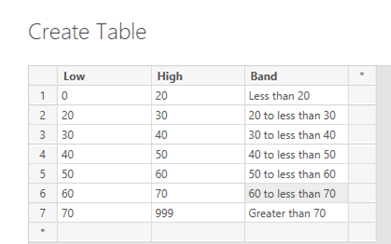
3. Edit the data in the dialog box to add the new bands of data. Your table should look like the one shown below.
4. Click OK.
5. Click Close & Apply on the Query Editor Ribbon and then save the pbix workbook.
Maintaining a banding table like this is much easier than editing a complex nested IF statement.
It’s time to use this new calculated column in a visual. Create a new matrix on a new sheet. Put Customers[Age Group] on Rows and then add a couple of the measures you wrote earlier (in Practice Exercise 15):
[Total Customers That Have Purchased][Total Sales]
You can also add some conditional formatting so that the matrix is easier to read. You should end up with a matrix something like the one shown below.
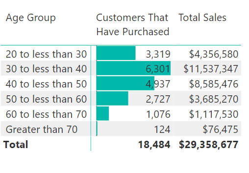
It is easy to see the power of banding. It is unlikely that you will ever want to analyse a business based on sales to customers who are 20, 21, 22, etc. Grouping customers into age brackets is more practical, and this disconnected table banding technique makes it a snap.
In the banding example, you first created an Age calculated column and then created an Age Group calculated column. Breaking the problem into parts like this makes the DAX easier to read, write, and debug. However, you should be aware that it is generally not considered good practice to leave interim calculated columns in a data model as they inefficiently take up extra space (unless you want to use the interim column in your data model as well, of course). What you really should do after you get the final calculated column working as expected is combine all the unwanted interim columns into a single final calculated column, and then delete the unwanted interim columns. This will save space in your workbook which will improve efficiency. Making this change could also make the formula harder to read. To solve this problem, I am going to introduce you to the concept of variables in DAX. Let me first explain the variables syntax and then I will show you how to remove the interim column.
Two keywords in DAX allow you to create and refer to variables in your DAX formulas. The first keyword is VAR (which stands for Variable).
Note In reality VAR is more like a constant than a variable as its value cannot change during evaluation.
VAR is always accompanied by a second keyword, RETURN.
Here is the syntax for VAR:
My Column (or Measure) =
VAR FirstVariableName = <valid DAX expression>
VAR SecondVariableName = <another DAX expression>
Return
<another DAX expression that can reference the variables>
The above generic syntax can be a bit confusing, so let me show you a real example using the formula from above.
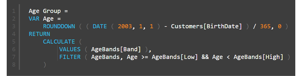
Note how lines 2 and 3 in the formula above set the value of the variable Age to be the value that was previously stored in the original Age calculated column from earlier in this exercise. Once the variable has been set, it is referred to again (twice) in line 7.
Some Important Things to Note
A variable can refer to another variable as shown in line 4 below

A variable can contain a table as well as a value as shown in row 5 below.

Variables are set in the initial filter and row context. It doesn't matter if the filter and/or row context changes after the RETURN keyword, the variables have already been assigned and hence they will not change as a result of any changing filter or row context.
Now you know how the VAR syntax works, let me show you how to remove the interim calculated column and move everything into the final banding column.
Here’s How: Deleting Interim Calculated Columns
Follow these steps to combine the interim column into the final banding calculated column, and then delete the interim column:
1. Navigate to the interim calculated column in the table (Age in this example).
2. Highlight the formula, then Ctrl+C to copy the entire formula from the interim column as shown below.

3. Navigate to the final banding calculated column (Age Group in this example). You can enlarge the formula bar by clicking the drop-down arrow in the top right if needed.
4. Create two new blank lines after the = in the formula (press Shift+Enter). You should now have as shown below
5. Type the keyword VAR (#1 below), paste the Age column code (#2), and then type the RETURN keyword (#3) as shown below.

6. Replace the two instances of the original column names Customers[Age] with the reference to the variable Age as shown below.

7. Delete the interim column Customers[Age].
Note: Of course, if you need the interim column in your table, you should keep it. But if you don’t need it, you should remove it by using the process shown above. There is deeper coverage of the use of variables at my blog: https://exceleratorbi.com.au/using-variables-dax/.