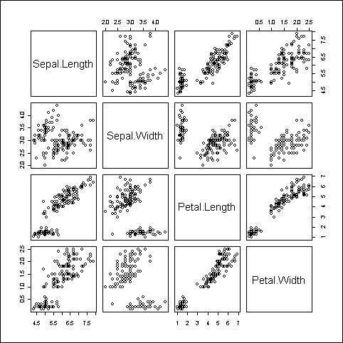
A pairs plot is a matrix of scatter plots and is a very handy visualization to quickly scan the correlations between many variables in a dataset.
We will use the built-in iris dataset, which gives the measurements in centimeters of the sepal length and sepal width, and petal length and petal width variables, respectively, for 50 flowers from each of three species of iris:
pairs(iris[,1:4])

As you can see in the preceding figure, the pairs() command makes a matrix of scatter plots, where all the variables in the specified dataset are plotted against each other. The variable names, displayed in the diagonal running across from the top-left corner to the bottom-right corner, are the key to reading the graph. For example, the scatter plot in the first row and second column shows the relationship between Sepal Length on the y axis and Sepal Width on the x axis.
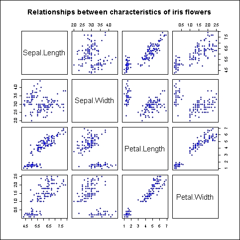
Here's a fun fact: we can produce the preceding graph using the plot() function instead of pairs() in exactly the same manner:
plot(iris[,1:4],
main="Relationships between characteristics of iris flowers",
pch=19,
col="blue",
cex=0.9)

So, if you pass a data frame with more than two variables to the plot() function, it creates a scatter plot matrix by default. We've also added a plot title and modified the plotting symbol style, color, and size using the pch, col, and cex arguments, respectively. We delve into the details of these settings in Chapter 3, Beyond the Basics – Adjusting Key Parameters.