In this recipe, you will learn how to plot data on maps.
In order to plot maps in R, we need to install the maps library. Here's how to do it:
install.packages("maps")When you run the preceding command, you will most likely be prompted by R to choose from a list of locations where you can download the library. For example, if you are based in the UK, you can choose either the UK (Bristol) or UK (London) options.
Once the library is installed, we must load it using the library() command:
library(maps)
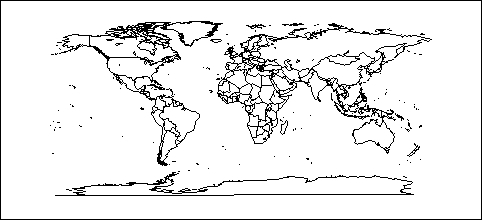
We can make a simple world map with just one command:
map()

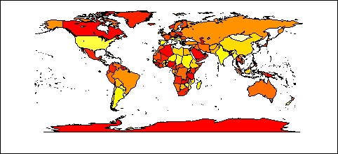
map('world', fill = TRUE,col=heat.colors(10))
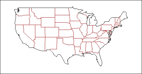
The maps library provides a way to project world data on to a low-resolution map. It is also possible to make detailed maps of the US. For example, we can make a map that shows the state boundaries as follows:
map("state", interior = FALSE)
map("state", boundary = FALSE, col="red", add = TRUE)
The add argument is set to TRUE in the second call to map() to add details to the same map created using the first call. This only works if a map has already been drawn on the current graphic device.
The examples above are just a basic introduction to the idea of geographical visualisation in R. In order to plot any useful data, we need to use a better maps library. GADM (http://gadm.org) is a free spatial database of the location of the world's administrative areas (or administrative boundaries). The site provides map information as native R objects that can be plotted directly with the use of the sp library.
Let's take a look at a quick example. First, we need to install and load the sp library, just like we did with the maps library:
install.packages("sp")
library(sp)
GADM provides data for all the countries across the world. Let's load the data for the UK. We can do so by directly reading the data from the GADM website:
load(url("http://gadm.org/data/rda/GBR_adm1.RData"))The preceding command loads the boundary data for the group of administrative regions forming the UK. It is stored in memory as a data object named gadm. Now, let's plot a map with the loaded data:
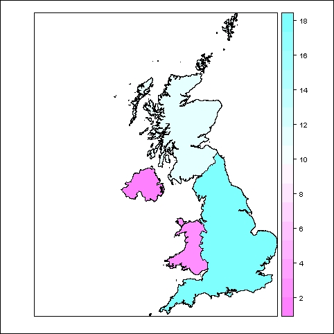
spplot(gadm,"Shape_Area")

The graph shows the different parts of the UK, color coded by their surface areas. We can just as easily display any other data such as population or crime rates.
We will cover more detailed and practical recipes on maps in Chapter 10, Creating Maps.