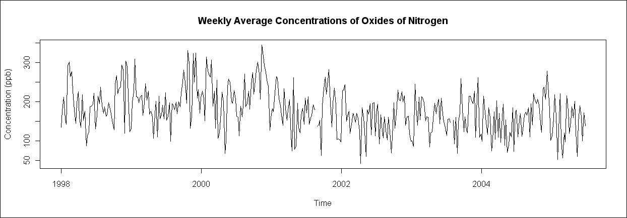
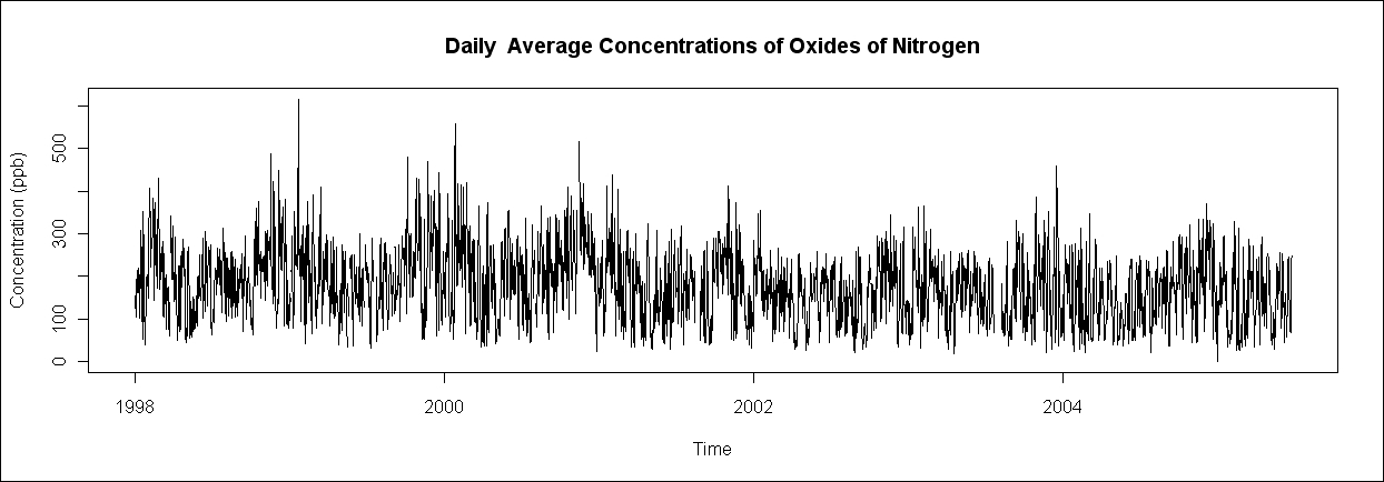
In this recipe, we will learn how we can plot the same time series data by averaging it over different time periods using the aggregate() function.
We will only use the basic R functions for this recipe. Make sure that you load the openair.csv dataset.
air<-read.csv("openair.csv")Let's plot the air pollution time series with weekly and daily averages instead of hourly values:
air$date = as.POSIXct(strptime(air$date, format = "%d/%m/%Y %H:%M", "GMT"))
means <- aggregate(air["nox"], format(air["date"],"%Y-%U"),mean, na.rm = TRUE)
means$date <- seq(air$date[1], air$date[nrow(air)],length = nrow(means))
plot(means$date, means$nox, type = "l")

means <- aggregate(air["nox"], format(air["date"],"%Y-%j"),mean, na.rm = TRUE)
means$date <- seq(air$date[1], air$date[nrow(air)],length = nrow(means))
plot(means$date, means$nox, type = "l",
xlab="Time", ylab="Concentration (ppb)",
main="Daily  Average Concentrations of Oxides of Nitrogen")

The key function in these examples is the aggregate() function. Its first argument is the R object, x, which has to be aggregated and in this case is air["nox"]. The next argument is the list of grouping elements over which x has to be aggregated. This is the part where we specify the time period over which to average the values. In the first example, we set it to format(air["date"],"%Y-%U"), which extracts all the weeks out of the date column using the format() function. The third argument is FUN or the name of the function to apply to the selected values, in our case, mean. Finally, we set na.rm to TRUE, thus telling R to ignore missing values denoted by NA.
Once we have the mean values saved in a data frame, we add a date field to this new vector using the seq() function and then plot the means against the date using plot().
In the second example, we use format(air["date"],"%Y-%j") to calculate daily means.