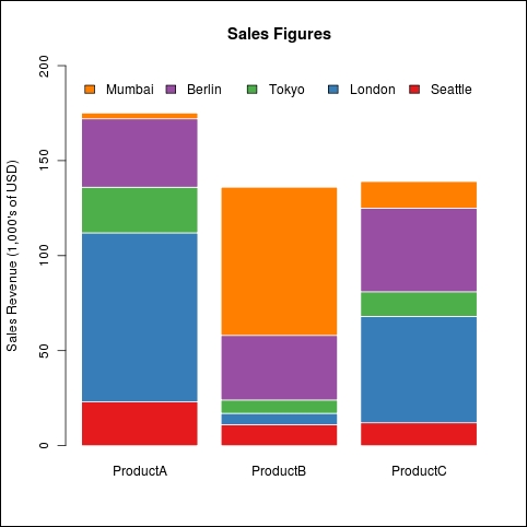
Stacked bar charts are another form of bar chart used to compare values across categories. As the name implies, the bars for each category are stacked on top of each other instead of being placed next to each other.
We will use the same dataset and color scheme as the last recipe, so ensure that you have the RColorBrewer package installed and loaded:
install.packages("RColorBrewer")
library(RColorBrewer)Let's draw a stacked bar chart of sales figures across the five cities:
citysales<-read.csv("citysales.csv")

barplot(as.matrix(citysales[,2:4]),
legend.text=citysales$City,
args.legend=list(bty="n",horiz=TRUE),
col=brewer.pal(5,"Set1"),border="white",
ylim=c(0,200),ylab="Sales Revenue (1,000's of USD)",
main="Sales Figures")
If you compare the code for this example and the last recipe, you will see that the main difference is that we did not use the beside argument. By default, it is set to FALSE, which results in a stacked bar chart. We extended the top y axis limit from 100 to 200.
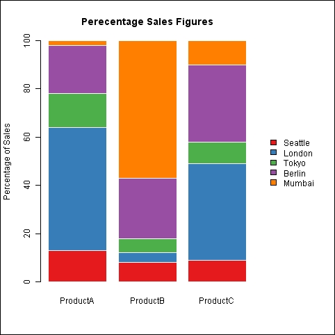
Another common use of stacked charts is to compare the relative proportion of values across categories. Let's use the example dataset, citysalesperc.csv, which contains the percentage values of sales data by city for each of the three products A, B, and C:
citysalesperc<-read.csv("citysalesperc.csv")

par(mar=c(5,4,4,8),xpd=T)

barplot(as.matrix(citysalesperc[,2:4]),
col=brewer.pal(5,"Set1"),border="white",
ylab="Sales Revenue (1,000's of USD)",
main="Percentage Sales Figures")

legend("right",legend=citysalesperc$City,bty="n",
inset=c(-0.3,0),fill=brewer.pal(5,"Set1"))
In the graph, the y axis shows the percentage of sales of a product in a city. It is a good way to quickly visually compare the relative proportion of product sales in cities. The code we used for the main graph is the same as the previous example. One difference is that we drew the legend separately using the legend() command. Note that we drew the legend outside the plot region by setting the x part of the inset to a negative value. We also had to create a larger margin to the right using the mar argument in the par() function and also setting xpd to TRUE to allow the legend to be drawn outside the plot region.