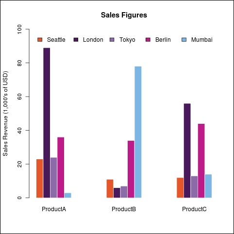
In this recipe, we will learn how to adjust the styling of bars by setting their width, the space between them, colors, and borders.
We will continue using the citysales.csv example dataset in this recipe. Make sure that you have loaded it into R and type in the recipe at the R prompt. You might also want to save the recipe as a script so that you can easily run it again later.
Let's adjust all the arguments at once to make the same graph as in the Creating bar charts with more than one factor variable recipe but with different visual settings:
barplot(as.matrix(citysales[,2:4]), beside=TRUE,
legend.text=citysales$City, args.legend=list(bty="n",horiz=T),
col=c("#E5562A","#491A5B","#8C6CA8","#BD1B8A","#7CB6E4"),
border=FALSE,space=c(0,5),
ylim=c(0,100),ylab="Sales Revenue (1,000's of USD)",
main="Sales Figures")
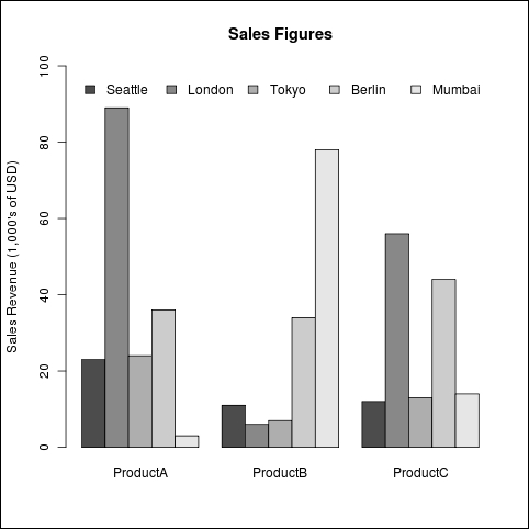
Firstly, we changed the colors of the bars by setting the col argument to a vector of five colors we formed by hand, instead of using a RColorBrewer palette. If we do not set the col argument, R automatically uses shades from the grayscale.
Next, we set the border argument to FALSE. This tells R not to draw borders around each individual bar. By default, black borders are drawn around bars, but they usually don't look very good. So, we set the border to "white" in the earlier recipes of this chapter.
Finally, we set the space argument to c(0,5), a vector of two numbers, to set the space between bars within each category and between the groups of bars, representing each category respectively. We left no space between bars within a category and increased the space between categories.
Adjusting the space between bars automatically adjusts the width of the bars too. There is also a width argument that we can use to set the width when plotting data for a single category, but the width argument is ignored when plotting for multiple categories. So, it's best to use space instead.
The following is an example that shows the previous graph with the default settings for color, spacing, and borders:
barplot(as.matrix(citysales[,2:4]), beside=T,
legend.text=citysales$City,args.legend=list(bty="n",horiz=T),
ylim=c(0,100),ylab="Sales Revenue (1,000's of USD)",
main="Sales Figures")
