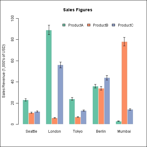
Bar charts with error bars are commonly used in analyzing and reporting results of scientific experiments. In this recipe, we will learn how to add error bars to a bar chart in a similar way to the recipe for scatter plots in Chapter 4, Creating Scatter Plots.
We will continue using the citysales.csv example dataset in this recipe. Make sure that you have loaded it into R and type in the recipe at the R prompt. You might also want to save the recipe as a script so that you can easily run it again later.
One change we will make in this recipe is that we will use the transpose of the citysales dataset (turns rows into columns and columns into rows). So, first let's create the transpose as a new dataset:
sales<-t(as.matrix(citysales[,-1]))
colnames(sales)<-citysales[,1]
Now, let's make a bar plot with 5-percent-error bars that show the sales of the three products across the five cities as categories:
x<-barplot(sales,beside=T,legend.text=rownames(sales),
args.legend=list(bty="n",horiz=T),
col=brewer.pal(3,"Set2"),border="white",ylim=c(0,100),
ylab="Sales Revenue (1,000's of USD)",
main="Sales Figures")

arrows(x0=x,y0=sales*0.95,
x1=x,y1=sales*1.05,
angle=90,
code=3,
length=0.04,
lwd=0.4)

We first created the bar chart with the transposed data so that the sales data is represented as groups of three products for each of the cities. We saved the X coordinates of these bars as a vector x. Then, we used the arrows() function, just as we used it in Chapter 4, Creating Scatter Plots, to make error bars on scatter plots. The first four arguments are the X and Y coordinate pairs of the start and end points of the error bars. The X coordinates, x0 and x1, are both set equal to x and the Y coordinates are sales values 5 percent above and below the original values. The angle and code set the type of arrow and flatten the arrow head relative to the length of the arrow, and length and lwd set the length and line width of the arrows.
The code to draw the error bars can be saved as a function and used with any barplot. This can be especially useful when comparing experimental values with control values, trying to look for a significant effect:
errorbars<-function(x,y,upper,lower=upper,length=0.04,lwd=0.4,...) {
arrows(x0=x,y0=y+upper,
x1=x,y1=y-lower,
angle=90,
code=3,
length=length,
lwd=lwd)
}
Now, error bars can be added to the preceding graph and can be drawn simply by using the following code:
errorbars(x,sales,0.05*sales)
In practice, scaled estimated standard deviation values or other formal estimates of error would be used to draw error bars instead of a blanket percentage error as shown here.