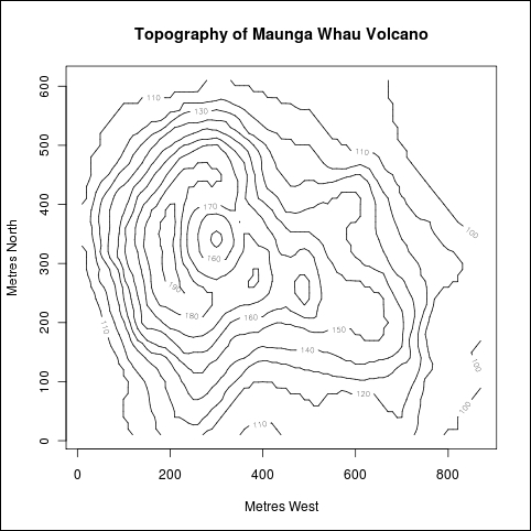
In this recipe, we will learn how to make contour plots to visualize topographical data, such as the terrain near a mountain or a volcano.
We are only using the base graphics functions for this recipe. So, just open up the R prompt and type the following code. We will use the inbuilt volcano dataset, so we need not load anything.
Let's first make a default contour plot with volcano:
contour(x=10*1:nrow(volcano), y=10*1:ncol(volcano), z=volcano,
xlab="Metres West",ylab="Metres North",
main="Topography of Maunga Whau Volcano")

We used the contour() base graphics library function to make the graph.
The x and y arguments specify the locations of the grid at which the height values (z) are specified. The volcano dataset contains topographic information on a 10 x 10 m grid, so we set the x and y grid arguments to 10 times the index numbers of rows and columns, respectively.
The contour data, z, is provided by the volcano dataset in a matrix form.
The graph shows the height of the region in the form of contour lines, which outline all areas with the same height. The height for each contour line is shown in gray.
Now, let's improve the graph by making the y axis labels horizontal and adding some colors to the plot area and contour lines:
par(las=1)

plot(0,0,xlim=c(0,10*nrow(volcano)),ylim=c(0,10*ncol(volcano)),
type="n",xlab="Metres West",
ylab="Metres North",main="Topography of Maunga Whau Volcano")

u<-par("usr")

rect(u[1],u[3],u[2],u[4],col="lightgreen")

contour(x=10*1:nrow(volcano),y=10*1:ncol(volcano),
volcano,col="red",add=TRUE)