Bar charts are the most common data visualization for categorical data. However, we can also produce bar charts for summarized numeric variables over the category of other variables. In this recipe, we will see how to produce a bar chart that summarizes numeric variables over the category of other variables.
To create the bar chart, we will simulate a dataset with three numeric variables and one categorical variable for the purpose of grouping. The three numeric variables will indicate the incubation period of three different diseases—say, disease A, B, and C—in weeks. The categorical variable will indicate four different age groups, for example, 1 indicates age 0-1 year, 2 indicates 1-5 years, 3 indicates 5-10 years, and 4 indicates over 10 years. Here is the code that produces the dataset:
# Set a seed value to make the data reproducible
set.seed(12345)
data_barchart <-data.frame(disA=rnorm(n=100,mean=20,sd=3),
                disB=rnorm(n=100,mean=25,sd=4),
                disC=rnorm(n=100,mean=15,sd=1.5),
                age=sample((c(1,2,3,4)),size=100,replace=T))
Now, we will produce a summarized dataset because we want to compare the mean incubation period across different age groups for each disease:
dis_dat <- round(aggregate(data_barchart[,1:3],list(data_barchart$age),mean),digits=1)
colnames(dis_dat)<-c("age","disA","disB","disC")The lattice barchart command is very similar to the base barplot command, but we can use the formula interface to produce the bar chart. To produce the plot using lattice, we need to load the lattice library. Then, to produce the bar chart to display the mean incubation period for disease A, B, and C for different age groups 1, 2, 3, and 4, we can use the following command:
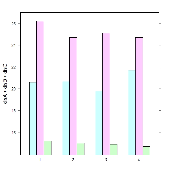
barchart(disA+disB+disC~factor(age),data=dis_dat)

The barchart() command is used to produce a bar chart using the lattice package. The first argument is the formula interface that specifies how many bars need to be produced, and the right-hand side of the formula specifies the grouping of the bars. In this case, we have created a bar chart of the mean incubation period for three different diseases over different age groups. The second argument is the data set. Note that in the first argument, we just need to write the variable names without using any quotation (""). For multiple variables, we just need to write each of the variable names, separated by a plus (+) sign.
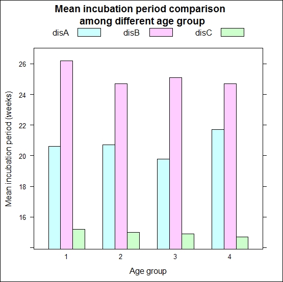
The default implementation does not specify the title of the plot, and it also does not specify the x axis and y axis. More importantly, it does not produce the legend key. Without the legend key, it is difficult to communicate the information contained in the plot. Here is the code that is used to update the initial bar chart:
barchart(
 disA+disB+disC~factor(age),
 data=dis_dat,
 auto.key=list(column=3),
 main="Mean incubation period comparison
 \n among different age group",
 xlab="Age group",
 ylab="Mean incubation period (weeks)"
)
In this new code snippet, auto.key produces the legend key with three columns. The other arguments produce the chart title specified by main, the x axis label specified by xlab, and the y axis label specified by ylab. One important thing in this new code is the use of \n within the text of the chart title; we use this \n control to create a new line when the title is long. This breaks the text into two lines. The following graph shows the bar chart produced from the preceding code snippet. It shows the two line title, legend with three columns, and labels for the x and y axis.
