A histogram is one of the simplest ways to visualize the univariate distribution. Sometimes, we need to produce a histogram for each group in order to compare the distribution in a subgroup of another categorical variable. In this recipe, we will see how we can create a conditional histogram using the lattice functionality.
To visualize a conditional histogram, we need at least one numeric variable and one categorical variable. We have all this information in the dataset that we have simulated in earlier recipes. Here, we will reproduce the same cross-tabulation raw data with the following code:
# Set a seed value to make the data reproducible
set.seed(12345)
cross_tabulation_data <-data.frame(disA=rnorm(n=100,mean=20,sd=3),
                disB=rnorm(n=100,mean=25,sd=4),
                disC=rnorm(n=100,mean=15,sd=1.5),
                age=sample((c(1,2,3,4)),size=100,replace=T),
                sex=sample(c("Male","Female"),size=100,replace=T),
                econ_status=sample(c("Poor","Middle","Rich"),
size=100,replace=T))We want to produce a histogram for each value of the sex variable; for this, take a look at this simple code with the lattice implementation:
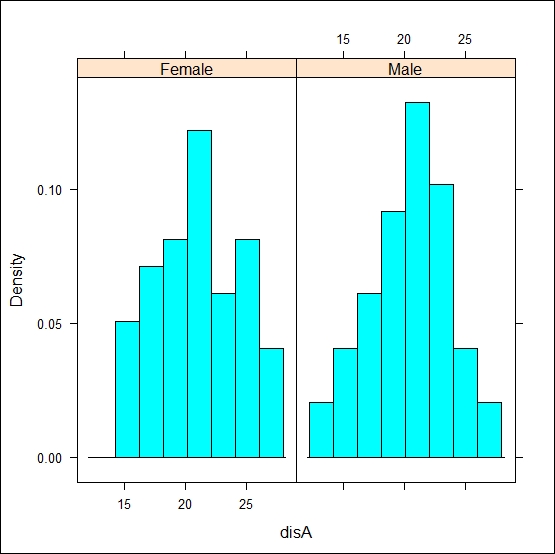
histogram(~disA|sex,data=cross_tabulation_data,type="density")

In the histogram command, the most important part of the formula is the name of the variable just after the ~ symbol. We need to write the name of the variable for which we want to create a histogram just after the ~ symbol. For a conditional histogram, we need to provide the input of that variable after the vertical bar symbol ( | ). The default value for the y axis is the percentage for each of the interval in x-axis, but we can change this as per our need. Here, we have used density for the y axis values, which actually calculated probability density values instead of frequency counts.
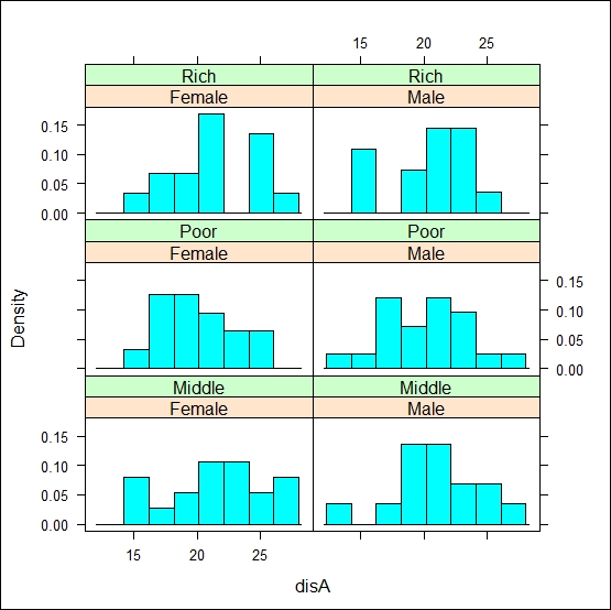
If we want to apply conditions on multiple categorical variables, then we can do this by simply adding the additional variable name using a plus (+) sign, as shown in the following code:
histogram(~disA|sex+econ_status,data=cross_tabulation_data,type="density")

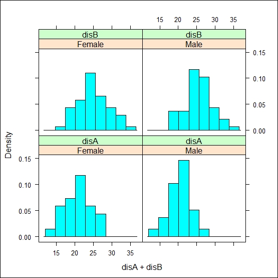
To plot more than one numeric variable, we just need to add the new variable as shown in the following line of code:
histogram(~disA+disB|sex,data=cross_tabulation_data,type="density")

To annotate the histogram, we can use main, xlab, and ylab, as we previously did for bar charts.