Commonly, we compare an empirical distribution with known theoretical distribution. The most popular and most used theoretical distribution is the normal distribution. To compare an empirical distribution with a normal distribution, we use a normal Q-Q plot. In this recipe, we will see how we can compare a distribution of a numeric variable with the theoretical normal distribution through a normal Q-Q plot.
The data for this recipe is generated using the following code:
# Set a seed value to make the data reproducible
set.seed(12345)
qqdata <-data.frame(disA=rnorm(n=100,mean=20,sd=3),
                disB=rnorm(n=100,mean=25,sd=4),
                disC=rnorm(n=100,mean=15,sd=1.5),
                age=sample((c(1,2,3,4)),size=100,replace=T),
                sex=sample(c("Male","Female"),size=100,replace=T),
                econ_status=sample(c("Poor","Middle","Rich"),
size=100,replace=T))We can produce the plot with the following code:
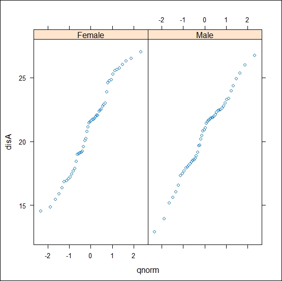
qqmath(~disA|sex,data=qqdata,f.value=ppoints(50),distribution=qnorm)
The preceding code will produce the Q-Q plot for the disA variable for each value in the sex variable (shown in the following figure):

The formula argument is the same as any other function in the lattice environment. A noticeable feature of the qqmath() function is the f.value argument and distribution=; f.value specifies how many quantile points should be used to produce the plot. The default is the number of quantiles that equal the number of actual data points. In our case, we have used 50 quantiles, which means that there will be 50 points that display the distribution in our plot. The distribution argument specifies the theoretical distribution; here, we have used the normal distribution.
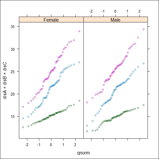
If we want to produce the same plot for multiple numeric variables, then we can simply add the new variable in the formula as ~disA+disB. For example, to produce the same plot for three variables grouped by the sex variable, we can use the following code:
qqmath(~disA+disB+disC|sex,data=qqdata,f.value=ppoints(50))
