In some situations, we need to produce bar charts for more than one numeric variable over the category of other variables. In this recipe, we will learn how we can produce a bar chart with more than one numeric variable.
To produce multiple bar charts, we will use the same ggplotdata source data, but we need some preprocessing to create the input data for the plot. Firstly, we will summarize the source data and calculate the mean for each numeric variable for each unique value of economic status variable:
library(plyr)
bardata <- ddply(ggplotdata,.(econ_status),summarize,meandisA=mean(disA),
meandisB=mean(disB),meandisC=mean(disC),meandisD=mean(disD))
In ggplot2, we need to transform the data in a layout where the variable names will be a value of a certain variable in order to produce multiple bar charts; this is sometimes called tidy data. Tidy data means that each row will contain information related to one variable and one observation. So, we will lay out the data in such a way that each row will contain information on a single variable and single observation. To produce the tidy data, we need to call the reshape library using the following code:
library(reshape)
bardata_tidy <- melt(bardata,id.vars="econ_status")
head(bardata_tidy)
Now, we will use this data to produce multiple bar charts.
The basic code that produces multiple bar charts using ggplot2 is as follows:
ggplot(data= bardata_tidy, aes(x=econ_status, y=value, fill=variable)) + geom_bar(stat="identity",position="dodge")

The task for each argument can be described as follows:
data: This is the input dataset for the plot.aes: This specifies the x- and y-axis variables and the third variable that specifies the values for grouping the plots for multiple bars.geom_bar(): This is the actual bar chart command. There are some arguments within it that control the bar width, position, and even the mapping information.position: This argument specifies the position of each bar—whether it will be side-by-side or one on top of the other like a stacked bar.
With the basic plot, we can add other graph annotations, but we are not discussing the graph annotation here. We will have a separate recipe on graph annotations. If we want to change the layout of the bar plot to horizontal, then we can flip the coordinate system as follows:
# To make horizontal bar chart
ggplot(data= bardata_tidy, aes(x=econ_status, y=value, fill=variable)) + geom_bar(stat="identity",position="dodge")+coord_flip()

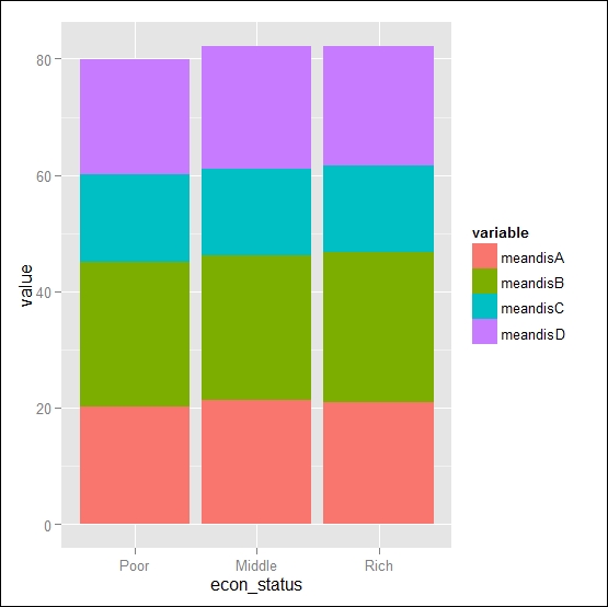
We can also produce a stack bar with the following position argument:
ggplot(data= bardata_tidy, aes(x=econ_status, y=value, fill=variable)) + geom_bar(stat="identity",position="stack")
