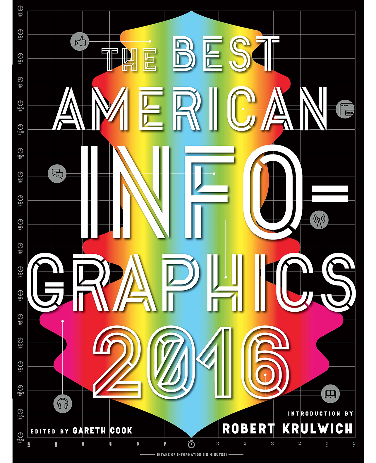


Introduced by Robert Krulwich of Radiolab fame, the year’s most “awesome” (RedOrbit) infographics reveal aspects of our world in often startling ways — from a haunting graphic mapping the journey of 15,790 slave ships over 315 years, to a yearlong series of postcards that records and cements a transatlantic friendship.
The Best American Infographics 2016 covers the realms of social issues, health, sports, arts and culture, and politics — including crisp visual data on the likely Democratic/Republican lean-ings of an array of professions (proving that your urologist is far more likely to be a Repub-lican than your pediatrician). Here once again are the most innovative print and electronic infographics — “the full spectrum of the genre — from authoritative to playful” (Scientific American).

