Appendices
Useful websites
It is easy to be confused by the jargon and technical terms used in the fund industry. The fund industry’s trade association has a particularly useful glossary of fund terms which you can find at: www.theinvestmentassociation.org/all-about-investment/glossary.html
You might also find this explanation of fund yields from the Hargreaves Lansdown (hl.co.uk) website helpful: tinyurl.com/HLfundyields
The websites listed below also have a lot of information about fund terms and industry trends:
Fund prices, ratings and news
- trustnet.co.uk
- morningstar.co.uk
- citywire.co.uk
- iii.co.uk
- hl.co.uk
Industry websites
- theinvestmentassociation.org (open-ended funds)
- theaic.co.uk (investment trusts and VCTs)
News
- bloomberg.co.uk
- ft.com
Useful publications
- Money Observer
- MoneyWeek
- The Times and Sunday Times
- Financial Times
Analysing a fund
Here are some examples of the kind of information that is available to investors when analysing funds, with my comments. The example I have used is the Artemis Income fund, which is mentioned in the text and is a fund that is rated highly by many professional investors and advisors.
The company’s own factsheet


My comments
All funds are required to produce monthly factsheets. They are the obvious starting point for your analysis. Note that there are two sections on the fund’s performance. One (the class R units) goes back to the launch of the fund in June 2000. These are the units that ordinary individual investors can buy. The second (class I units) only goes back to 2008, and shows the performance of the institutional class, only available to professionals or investors with a minimum of £250,000 to invest.
The lower charges for bulk buyers explains why the performance has been better (81.7% over five years versus 75.1% for the retail class). It is also worth pointing out how the price of the accumulation units is significantly higher than that of the distribution (or income) units – 346p vs 206p for the bid price. This underlines how reinvesting the dividend from a fund, rather than taking it as income, will always produce a higher compounded return over time.
While the factsheet says that the fund has an initial charge of 5.25% and an annual management charge of 1.5%, in practice if you buy a fund through a broker, you will rarely have to pay the initial charge and since the rules on fund commissions were changed in 2013 the annual management charge will also be reduced by at least 0.75% provided you own the so-called unbundled units. So if you buy this fund through the HL platform, for example, the ongoing charge figure (OCF), the figure that combines the annual management charge with other costs charged by the fund, is now 0.70%.
Extracts from HL’s research into a fund

My comments
This is an example of the kind of research about this fund that you will find on the HL platform. Other platforms will often have similar analysis, which goes beyond what the fund management company itself provides. The chart on this page, for example, traces the fund manager’s performance not just back to the launch of the fund by Artemis in 2000, but further back in time to include his time with a previous employer, where he ran a similar equity income fund. We also comment on the fund’s investment process and its contrarian investment style.
My comments
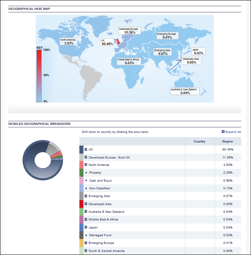
This graphic breaks down the regional balance of the fund’s investments – not much value for a UK fund like this, but more useful with a global fund. It is worth noting that many of the company’s largest investments are multinational companies, such as Shell and HSBC, which trade globally but happen to have their shares listed on the London stock exchange. If you measured where the companies owned by the fund generate their revenues, it would show a very different regional pattern.

My comments
This analysis breaks down the sector and market capitalisation of the stocks that the fund owns. By comparing this to other funds, and with the main market indices, it generates valuable detail about the style of the fund. You can see that nearly 30% of the fund is invested in companies with a market value of more than £50 billion. It also has a large weighting in financial stocks. You can compare this to the makeup of the main London market indices (the FTSE 100 and FTSE All-Share Index) to see whether the fund manager has more in one sector than the market as a whole. Artemis Income is what the industry calls a large-cap fund.
Morningstar’s verdict on this fund
The following is an example of the kind of factsheets about funds which you can obtain from independent analysis companies such as Morningstar. There is a lot of detail, and some of it may take some getting used to. I might draw your intention to the equity style map, which attempts to show how the fund stacks up against two main style measures – the size of the companies the fund invests in (large, medium or small) and the manager’s general investment approach (growth, value or something in between). Being in the top left-hand quadrant indicates that Artemis Income is a large-cap value fund and that it has consistently followed this style over many years. The ‘equity region exposure’ graphic shows the result of the kind of look through geographic analysis I described earlier.


My comments
This page is definitely for those who are data freaks! Note that the risk (meaning the volatility of the fund’s performance) has been below average over all but the most recent periods. Given that the long-run return has been average, the Sharpe ratio – a measure of risk-adjusted return – is positive at 1.30 (quite high by industry standards). The R-squared is an attempt to measure how closely the fund’s holdings have performed compared to the UK market as a whole – broadly speaking, the closer to 100 the figure, the more closely the fund follows its benchmark. What this suggests is that the Artemis Income is a mainstream fund investing in the largest companies in the UK market and a solid performer that has added some value over and above what you might have obtained by buying a UK index tracker fund – but mainly because it has been less volatile rather than because of its exceptional returns. My analysis at HL would be slightly different to this conclusion – which underlines that even detailed statistical analysis will not always lead you to a clear-cut conclusion.
How multi-manager fund managers see Artemis Income
I suggested in the text that it might be useful to cross-check your analysis of a fund by seeing whether it features in the portfolios of the best multi-manager funds. Here is an extract from the most recent published portfolio of the Jupiter Merlin Income fund, one of the most popular multi-manager funds in the UK. You can see that Artemis Income is the third largest pure equity income fund, after Woodford Equity Income, Royal London Equity Income and M&G Global Dividend.

You can also cross-check against the holdings of HL’s Multi-Manager Income & Growth portfolio, where Artemis Income is the second largest holding after Woodford Equity Income. Given what I have already said about this fund, you probably won’t be too surprised by this.

THANKS
FOR READING!
Our readers mean everything to us at Harriman House. As a special thank-you for buying this book let us help you save as much as possible on your next read:
1.
If you’ve never ordered from us before, get £5 off your first order at harriman-house.com with this code: eifne55
Already a customer? Get £5 off an order of £25 or more with this code: 44dmdeii
2.
Get 7 days’ FREE access to hundreds of our books at volow.co – simply head over and sign up.
Thanks again!
from the team at

Codes can only be used once per customer and order. T&Cs apply.