Mechanics of Lettering
From Chris Eliopoulos
In the past, comics were lettered by hand using quill pens and a thing called an Ames guide. It took years to learn and perfect the craft of hand lettering for a professional to get the consistency and skill needed to be good. These days, with the advent of computers, the lengthy learning process of training your hand is no longer needed. All you need now is a credit card, a computer, software and fonts. Th at’s the easy part. Learning how to use them takes more time, maybe not as much as hand lettering, but definitely a while if you want to be good. Since today, most books are lettered on the computer, I’ll stick with those mechanics.
Most comics are lettered in Adobe Illustrator. The other important things are fonts. There a number of places online to buy fonts or download them for free. Artists also make their own fonts using programs such as Fontlab and Fontographer.
THE SCRIPT
The script is usually done in a word processing program, but Adobe Illustrator can open it. Once it’s open, letterers can select all the type and change it to the font and size they like. Usually, at print size, most fonts are good at 6 points with a leading of 6.5 points. (Leading refers to the amount of vertical spacing between two lines of type.) Then they cut and paste individual balloon dialogue for each page.
Setup
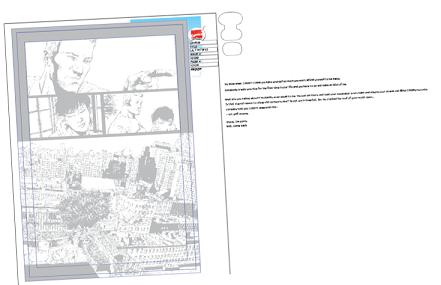
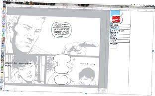
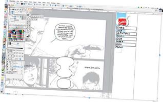
Here is what the letterer’s screen looks like on the computer. The art file is on the left, and the script is on the right.
The Ultimates #8: ©2008 Marvel Characters, Inc. Used with permission.
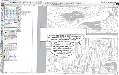
BREAKING TYPE
After all the balloon text is broken up into individual type lines, it’s broken up into smaller lines that look good in a balloon. I usually leave the type flush left and just insert the type tool and hit return at key spots to make sure that when I’m done, there’s a slight bow in the middle. After that, I select all and, using the paragraph palette (or command-shift-c), center the type.
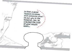
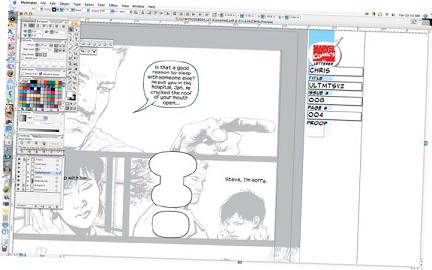
Typebreaks
There should be a slight bow in the middle of a block of text.
The Ultimates #8: ©2008 Marvel Characters, Inc. Used with permission.
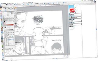
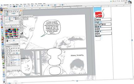
Type Centering
After the typebreaks are inserted, the type can be centered.
The Ultimates #8: ©2008 Marvel Characters, Inc. Used with permission.
THE BALLOONS
Now, the balloons go around the type. To make things simple, I make all balloons with a white fill and a black stroke set at .75 points. Sets of balloons can be pre-made, also, to keep things simple. They’re a little more squat than a pure oval, which I prefer, but the ellipse tool will always work. I choose among my balloons to find one that I think will fit around the text nicely, leaving as little dead space as possible.
Then I use the scale tool to increase or decrease the balloon to go all around the type. It’s important to make sure the balloon shape isn’t too big or too tight around the text. My rule of thumb is to have about a letter’s space from the edge of the type to the line of the balloon.
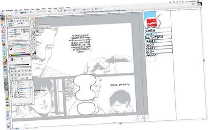
Balloon Shape
Once I choose a balloon, I copy it (click and hold down the option key, drag it where I want and release) and drag it centered, approximately, on the type.
The Ultimates #8: ©2008 Marvel Characters, Inc. Used with permission.
Centering the Balloon
The scale tool allows me to fit the balloon around the type.
The Ultimates #8: ©2008 Marvel Characters, Inc. Used with permission.
Balloon Distance
I keep a letter’s space from the edge of the type to the line of the balloon.
The Ultimates #8: ©2008 Marvel Characters, Inc. Used with permission.
Border Balloons
For balloons that butt up against a border, I ensure that the balloon is more spaced out on that side, make a rectangle along the borderline, select the two objects, and using the pathfinder palette, use minus front.
The Ultimates #8: ©2008 Marvel Characters, Inc. Used with permission.
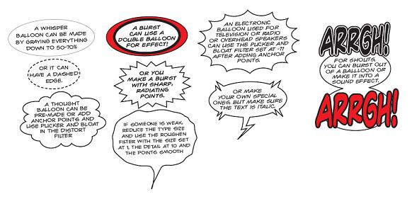
Style
Here are some tricks I use with my balloon styles.
Whispers: Gray everything down to 50 to 70% or use dashed edges.
Thoughts: Premade balloons or made with anchor points and using Pucker and Bloat in the Distort filter.
Bursts: Double balloons or bursts with sharp points.
Weakness : Reduce the type size, use the Roughen filter with the size set at 19, and the points smooth.
Television, radio or speakers: Add anchor points and use the Pucker and Bloat filter set at -11 or make special versions, making sure the text is italic.
Shouts: Burst out of the balloon.
STYLIN’
There are a number of effects you can use to present meaning in context of the story. The rules still apply in distance and spacing.
THE TAILS
Tails can be premade to save time, but I usually do mine for each balloon using the pen tool. Tails should always point at the face of the character that’s talking, generally, and at their mouth, specifically.
Tails
Using the pen tool, I click somewhere inside the balloon and, while still clicking, drag out to another point that aims toward the mouth, then release.
The Ultimates #8: ©2008 Marvel Characters, Inc. Used with permission.
Repeat in Reverse
Repeat the same action from “Tails” in reverse, trying to give at least a letter’s distance from the first point.
The Ultimates #8: ©2008 Marvel Characters, Inc. Used with permission.
Unite
Then select both the balloon and tail and, using the path-finder palette, unite them.
The Ultimates #8: ©2008 Marvel Characters, Inc. Used with permission.

Sound Effects
A sound eff ect can be transformed from its original form in a basic sound eff ect font to a more developed “baboom!” in only a few steps.
INSIDER VOICE
John Byrne on the Case Against Collaboration
There are some good things that can come out of collaboration, but complete vision is usually the better product. Assuming you have someone with the chops to pull it off, that is!
Sound Effects
Creating sound effects looks complex, but it can be really simple. Just type in the word you want to use—like “baboom!”—then convert it to a sound effect font you own and create outlines and ungroup. The skew and scale tools help to vary the size of each letter (it’s good not to vary too much from letter to letter). Then select the sound effect and copy it and paste behind it (command-b). Then increase the point size to the size that works. Pretty simple, eh?