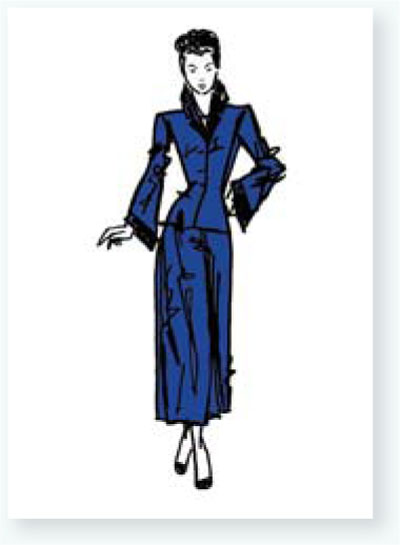
Photo manipulation is the process of transforming or altering a photograph by hand or digitally. The techniques shown in this chapter are retouching techniques, which involve using paint media to change photo imagery.

1 Use fine sandpaper and lightly go over the background around the person in the picture. This will allow the gesso to adhere better in step 2.
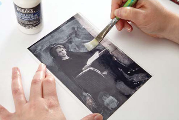
2 Apply clear gesso to the sanded surface to prime it. Let it dry.
Tip: Clear gesso is white when wet but will dry clear. It provides more tooth for the paints and pigments to stick to the surface in the steps that follow.
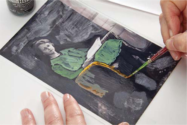
3 Paint a thin layer of acrylic ink over the non-sanded areas of the photograph. Let it dry.
Tip: Using transparent and translucent inks or watering down opaque inks helps to tint the objects in the photograph and allows the photo itself to shine through, achieving more depth.
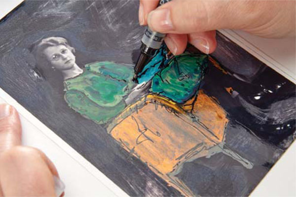
4 Outline some of the tinted areas with a black pen as if sketching.

5 Use one or two similarly colored wax bars in the areas that have been sanded and to which gesso has been applied.
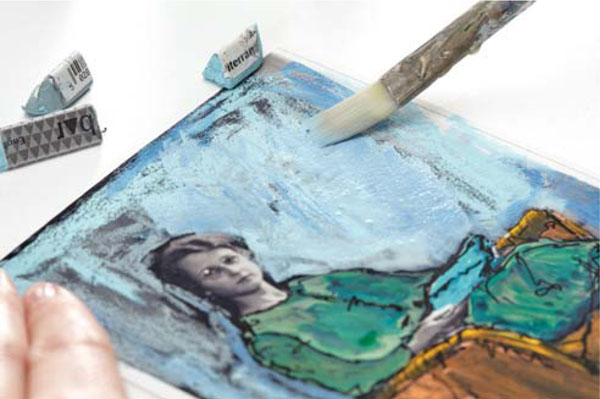
6 Use a wet brush to dissolve the dry wax and blend the colors together. Make sure not to go over the area tinted with the acrylic ink. Let it dry.
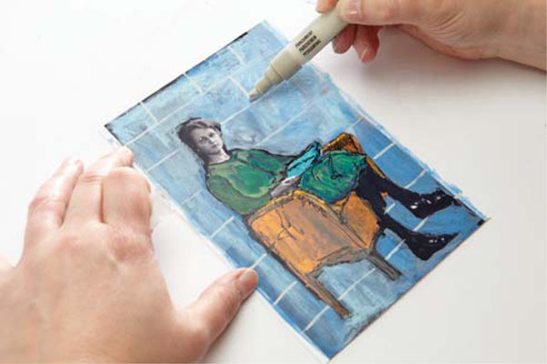
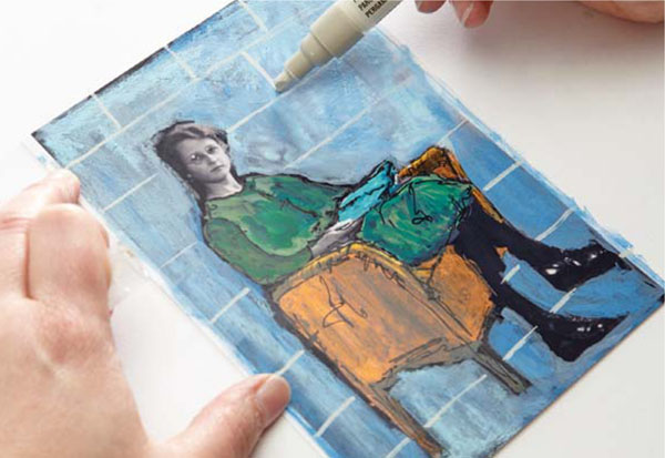
7 Optional: Apply some lines and/or symbols with acrylic markers.
Tip: Make sure to use a fluid marker that pumps acrylic into the nib to avoid clogging the nib of the marker.
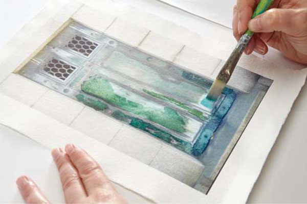
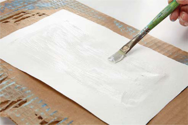
8 Print a photo that can serve as a background—in my artwork it's the door—on watercolor paper or, like I did here, on hemp paper. Let the print dry. It will already look like a painting on the textured paper.
Use a paintbrush to apply watered-down acrylic ink in colors similar to those in the print.
Tip: To prevent the printer from jamming, make sure the paper is at least 60-lb. (125gsm). It might help to feed the paper into the printer manually by gently pushing the paper through the transportation feed.
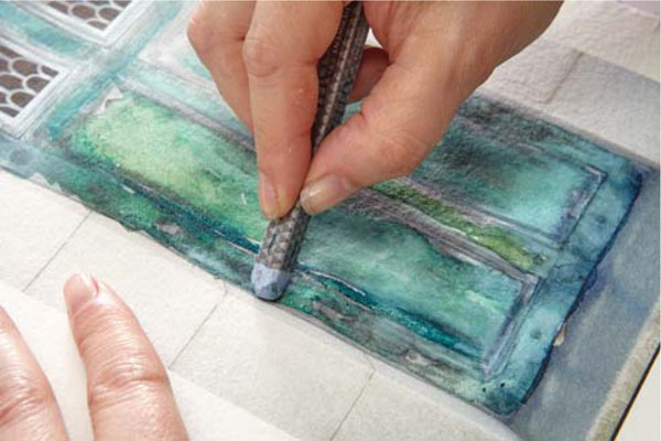
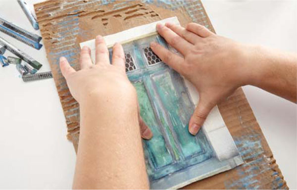
9 Add some color with wax bars while the watered-down ink is still wet to create more texture and an even more painterly look on the background. Let it dry.

10 Take a piece of corrugated cardboard and pull off some areas on the top layer of paper to reveal the corrugated layer beneath.
In my classes I often talk about the impact of color in artwork and use the analogy of colors as friends. By giving each color certain human attributes I create a personal code that I use in my artwork, especially in my art journals. Here are some of my thoughts about colors and how I use them to express certain emotions or convey messages.
In my artwork at the end of this chapter, I used blue and green tones because of the subject matter, my grandmother. My connections with her from the stories told by my great-aunt evoke positive and balanced emotions in me. For the embroidery threads, I chose yellow, brown and gold tones to represent the positive links between me and the grandmother I never met.
Here are some of my thoughts about colors and how I use them to express certain emotions or convey messages.
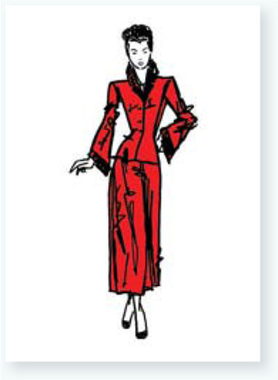
Red is passionate and polarizing. Red can be a drama queen, the life of a party, or sometimes aggressive. Red wants to push to the foreground. It can’t be quiet or in the background for too long. But Red is also warm, passionate and fun to be around! I use Red in small doses for emphasis, to make a bold statement or to express strong emotion.
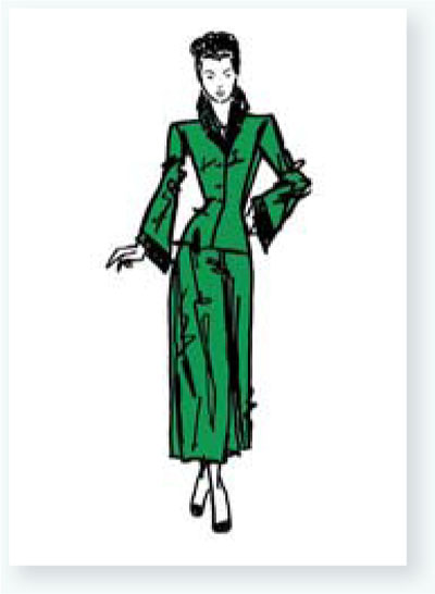
Green is one of my very best friends and most constant partner. It is variable and contradictory at times. Green doesn’t like conflicts and can see both sides of a situation. Green stabilizes and revitalizes. I use Green often to express harmony or to create soothing imagery.

Blue is an old friend of mine. It's a bit passive, calming and refreshing. It's open to everything but also has authority. Blue easily joins my other friends and is never overpowering. Blue sometimes makes me sad but is a good sport. I don't have to explain things to Blue. Blue is not impulsive and doesn’t like to be rushed, as it needs to analyze and think things through. I use Blue to express stability and balance.
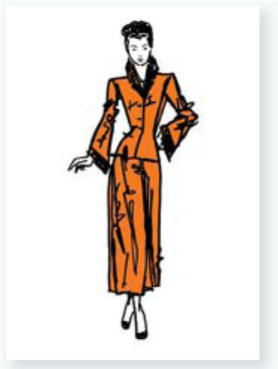
Orange is optimistic and extroverted, but not too overpowering. It’s stimulating and full of vitality. Orange is more balanced than my friend Red but is also full of energy. I use Orange often, as I feel it makes my other friends sing.

Yellow is a new friend of mine. I am still a bit cautious with Yellow, never sure where it's heading or where it will take my other friends. Yellow is light and positive, and makes me feel good when I'm around it. Yet Yellow is filled with contradictions and juxtapositions. Yellow is always full of new ideas and is my outspoken friend. I use Yellow sparingly in my work to express happiness or simply as a spark of color.
Purple is a one-of-a-kind friend like no other. It is passionate but more reserved than Red. Purple boosts fantasy and is a little eccentric, energetic and charismatic. Purple is a magical, independent, creative friend and brings out the best in others. I use Purple when I want to express something special or bring vitality to my artwork.

11 Seal the cardboard by painting it with a thin layer of gel medium. Let it dry; repeat, let it dry.

12 Apply some watered-down white gesso over some areas near the edges. Let it dry.

13 Add color along the edges with wax bars. Use the same colors as in the previous steps. Wet the waxed areas and dissolve the paint.
14 Spread a thin layer of gel medium onto the back of the hemp paper, leaving 1" (25mm) toward the edge untouched.
15 Center and attach the paper to the corrugated cardboard.
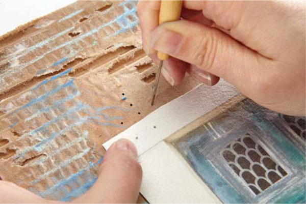
16 To prepare for embroidery: Use an awl to pierce holes where you will be stitching through the hemp paper and corrugated cardboard layers.
Tip: Avoid going through the areas where gel medium was applied; it will gum up the embroidery needle. Clean the awl after use.
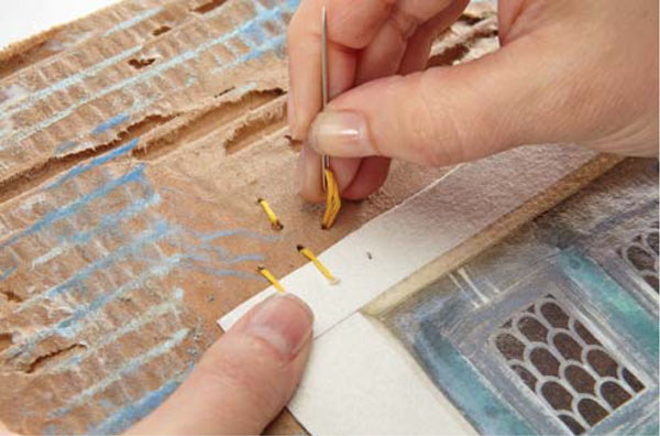
17 Stitch through the prepared holes with embroidery floss threaded into a tapestry needle.
Tip: Tapestry needles have blunt points that won’t scratch the artwork. That’s why the holes for the embroidery were pre-pierced in step 16.

18 Attach the photo of the person with embroidery floss stitching that overlaps the edges of the photos as well as the corrugated board. This will visually tie all elements together.
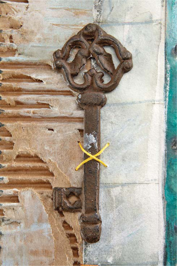
19 Optional: Add a metal key or other low-relief embellishment using heavy gel medium to secure it to the artwork. Let it dry. Tie the key into the composition by adding some decorative stitching, again using the awl to pierce the holes before using needle and floss.
Knowing a bit of color theory is helpful when it's time to emphasize or mute elements in artwork. It can also help to avoid muddy colors when mixing paints.

Organizing color hues in a circle or a so-called color wheel shows the relationships between primary colors, secondary colors and more. It's a great tool for every artist to explore and deepen their understanding of colors. The color wheel above is a very basic example.

Blue, red and yellow are called primary colors. Mixing any other colors together cannot create their pure paint pigments, but they themselves can create a wide array of colors.
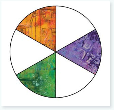
The color wheel above shows the secondary colors, which are created by mixing two primary colors: blue + yellow = green; blue + red = purple; red + yellow = orange.
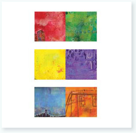
The colors across from of each other on the color wheel are called complementary colors. They create a strong contrast when used next to each other and are a perfect way to emphasize something in your artwork or to create a focal point.

When you mix complementary colors with each other, you create brown and gray tones. This can be done intentionally, but it's also important to keep in mind when working with wet-into-wet techniques, monoprinting or whenever a brownish or muddy color is not the desired end result.
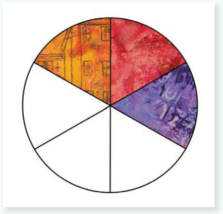
Any three colors next to each other on the color wheel are called analogous colors. They are pleasing to the eye and create harmony in any art palette.
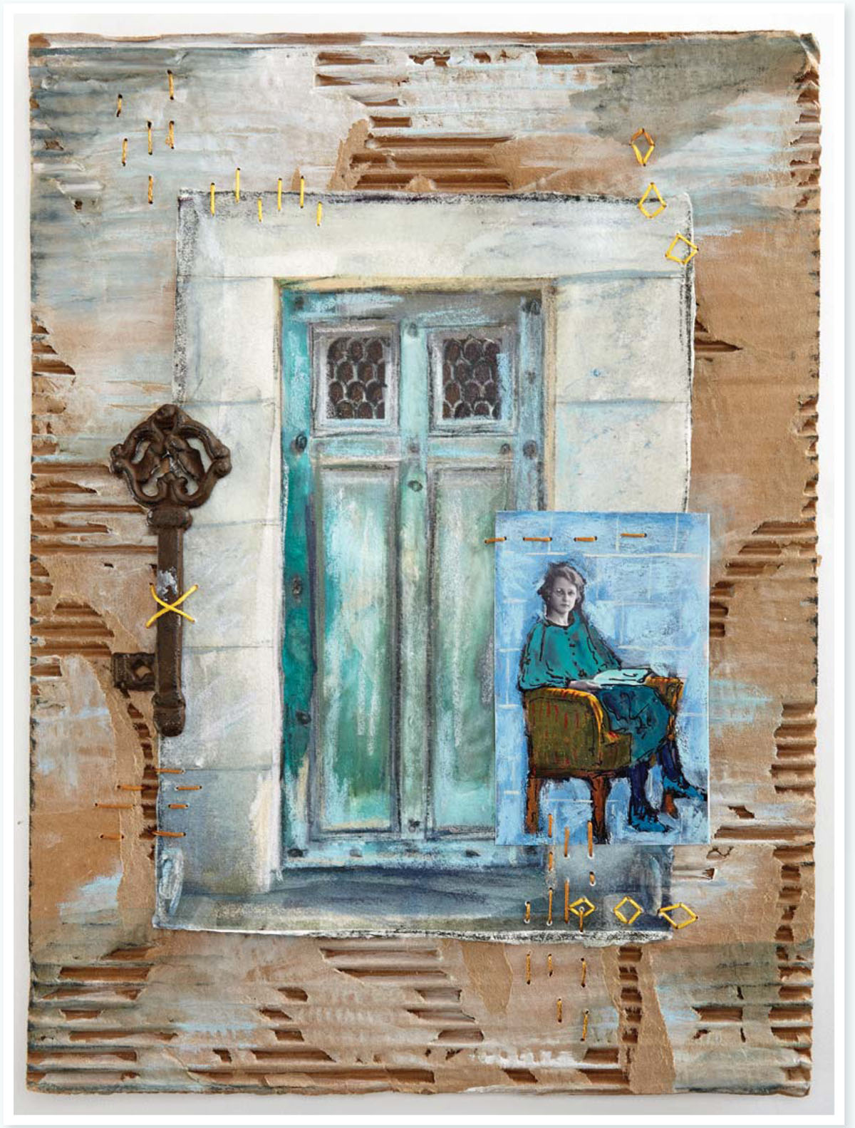
GUARDING ANGEL
Nathalie Kalbach
Cardboard with hemp paper and photo, gesso, acrylic ink, wax bars, marker, embroidery thread and metal key
16" × 12" (41cm × 31cm)
Inspired by my grandmother and family stories. Uses the photo manipulation technique in this chapter.