11
Recipes – Reusability, Routing, and Caching
In the next two chapters, we will complete the majority of the implementation of LemonMart and round out our coverage of the router-first approach. In this chapter, I will reinforce the idea of a decoupled component architecture through the creation of a reusable and routable component that also supports data binding. We use Angular directives to reduce boilerplate code and leverage classes, interfaces, enums, validators, and pipes to maximize code reuse with TypeScript and ES features.
In addition, we will create a multi-step form that architecturally scales well and supports a responsive design. Then, we will differentiate between user controls and components by introducing a lemon rater and a reusable form part that encapsulates the name object.
Make sure to have your lemon-mart-server up and running as you implement the recipes mentioned in this chapter. Refer to Chapter 10, RESTful APIs and Full-Stack Implementation, for more information.
This chapter covers a lot of ground. It is organized in recipe format, so you can quickly refer to a particular implementation when you are working on your projects. I will cover the architecture, design, and major components of the implementations. I will highlight important pieces of code to explain how the solution comes together. Leveraging what you've learned so far, I expect the reader to fill in routine implementation and configuration details. However, you can always refer to the GitHub project if you get stuck.
In this chapter, you will learn about the following topics:
- HTTP PUT requests with caching service responses
- Multi-step responsive forms
- Reusing repeating template behavior with directives
- Scalable form architecture with reusable form parts
- Input masking
- Custom controls with
ControlValueAccessor - Layouts using grid list
The most up-to-date versions of the sample code for the book are on GitHub at the repository linked shortly. The repository contains the final and completed state of the code. You can verify your progress at the end of this chapter by looking at the end-of-chapter snapshot of the code under the projects folder.
To get set up for this chapter, do the following:
- Clone the repo at https://github.com/duluca/lemon-mart.
- Execute
npm installon the root folder to install the dependencies. - The code sample for this chapter is available under the following subfolder:
projects/ch11 - To run the Angular app for this chapter, execute the following command:
npx ng serve ch11 - To run Angular unit tests for this chapter, execute the following command:
npx ng test ch11 --watch=false - To run Angular e2e tests for this chapter, execute the following command:
npx ng e2e ch11 - To build a production-ready Angular app for this chapter, execute the following command:
npx ng build ch11 --prodNote that the
dist/ch11folder at the root of the repository will contain the compiled result.
Beware that the source code in the book or on GitHub may not always match the code generated by the Angular CLI. There may also be slight differences in implementation between the code in the book and what's on GitHub because the ecosystem is ever-evolving. It is natural for the sample code to change over time. Also on GitHub, expect to find corrections, fixes to support newer versions of libraries, or side-by-side implementations of multiple techniques for the reader to observe. The reader is only expected to implement the ideal solution recommended in the book. If you find errors or have questions, please create an issue or submit a pull request on GitHub for the benefit of all readers.
You can read more about updating Angular in Appendix C, Keeping Angular and Tools Evergreen. You can find this appendix online from https://static.packt-cdn.com/downloads/9781838648800_Appendix_C_Keeping_Angular_and_Tools_Evergreen.pdf or at https://expertlysimple.io/stay-evergreen.
Let's start with implementing a user service to retrieve data, so we can build out a form to display and edit profile information. Later, we will refactor this form to abstract out its reusable parts.
Implementing a user service with GET
In order to implement a user profile, we need a service that can perform CRUD operations on IUser. We will be creating a user service that implements the following interface:
export interface IUserService {
  getUser(id: string): Observable<IUser>
  updateUser(id: string, user: IUser): Observable<IUser>
  getUsers(
    pageSize: number,
    searchText: string,
    pagesToSkip: number
  ): Observable<IUsers>
}
Before creating the service, make sure to start the lemon-mart-server and set your application's AuthMode to CustomServer.
In this section, we will implement the getUser and updateUser functions. We will implement getUsers in Chapter 12, Recipes – Master/Detail, Data Tables, and NgRx, to support pagination with a data table.
Start by creating the user service:
- Create a
UserServiceundersrc/app/user/user - Declare the
IUserServiceinterface from the preceding snippet, excluding thegetUsersfunction. - Extend the
UserServiceclass withCacheServiceand implementIUserService. - Inject the
HttpClientin the constructor as shown:src/app/user/user/user.service.ts export interface IUserService { getUser(id: string): Observable<IUser> updateUser(id: string, user: IUser): Observable<IUser> } @Injectable({ providedIn: 'root', }) export class UserService extends CacheService implements IUserService { constructor() { super() } getUser(id: string): Observable<IUser> { throw new Error('Method not implemented.') } updateUser(id: string, user: IUser): Observable<IUser> { throw new Error('Method not implemented.') } } - Implement the
getUserfunction as shown:src/app/user/user/user.service.ts getUser(id: string | null): Observable<IUser> { if (id === null) { return throwError('User id is not set') } return this.httpClient.get<IUser>( `${environment.baseUrl}/v2/user/${id}` ) }
We provide a getUser function that can load any user's profile information. Note that the security for this function is provided in the server implementation with the authenticate middleware. The requestor can either get their own profile or they'll need to be a manager. We use getUser with a resolve guard later in the chapter.
Implementing PUT with caching
Implement updateUser, which accepts an object that implements the IUser interface, so the data can be sent to a PUT endpoint:
src/app/user/user/user.service.ts
  updateUser(id: string, user: IUser): Observable<IUser> {
    if (id === '') {
      return throwError('User id is not set')
    }
    // cache user data in case of errors
    this.setItem('draft-user', Object.assign(user, { _id: id }))
    const updateResponse$ = this.httpClient
      .put<IUser>(`${environment.baseUrl}/v2/user/${id}`, user)
      .pipe(map(User.Build), catchError(transformError))
    updateResponse$.subscribe(
      (res) => {
        this.authService.currentUser$.next(res)
        this.removeItem('draft-user')
      },
      (err) => throwError(err)
    )
    return updateResponse$
  }
Note the use of the cache service with setItem to save user-entered data in case the put call fails. When the call succeeds, we remove the cached data using removeItem. Also note how we hydrate a user coming from the server as a User object with map(User.Build), which calls the constructor of class User.
Hydrate is a common term that refers to populating an object with data from a database or a network request. For example, the User JSON object we pass between components or receive from the server fits the IUser interface, but it is not of the class User type. We serialize objects to JSON using the toJSON method. When we hydrate and then instantiate a new object from JSON, we do the reverse and deserialize the data.
It is important to highlight that you should always stick to interfaces, and not concrete implementations like User, when passing data around. This is the D in SOLID – the Dependency Inversion Principle. Depending on concrete implementations creates a lot of risk, because they change a lot, whereas an abstraction such as IUser will seldom change. After all, you wouldn't solder a lamp directly to the electrical wiring in the wall. Instead, you would first solder the lamp to a plug and then use the plug to get the electricity you need.
With this code completed, UserService can now be used for basic CRUD operations.
Multi-step responsive forms
Overall forms are a different beast than the rest of your application and they require special architectural considerations. I don't recommend over-engineering your form solution with dynamic templates or route-enabled components. By definition, the different parts of a form are tightly coupled. From the perspectives of maintainability and ease of implementation, creating one giant component is a better strategy than using some of the aforementioned strategies and over-engineering.
We will be implementing a multi-step input form to capture user profile information in a single component. I will be covering my recommended technique to split forms up into multiple components later in the chapter in the Reusable form parts and scalability section.
Since the implementation of the form changes dramatically between this section and later in the chapter, you can find the code for the initial version on GitHub at projects/ch11/src/app/user/profile/profile.initial.component.ts and projects/ch11/src/app/user/profile/profile.initial.component.html.
We will also make this multi-step form responsive for mobile devices using media queries:
- Let's start by adding some helper data that will help us display an input form with options:
src/app/user/profile/data.ts export interface IUSState { code: string name: string } export function USStateFilter(value: string): IUSState[] { return USStates.filter((state) => { return ( (state.code.length === 2 && state.code.toLowerCase() === value.toLowerCase()) || state.name.toLowerCase().indexOf(value.toLowerCase()) === 0 ) }) } const USStates = [ { code: 'AK', name: 'Alaska' }, { code: 'AL', name: 'Alabama' }, ... { code: 'WY', name: 'Wyoming' }, ] - Add new validation rules to
common/validations.ts:src/app/common/validations.ts ... export const OptionalTextValidation = [Validators.minLength(2), Validators.maxLength(50)] export const RequiredTextValidation = OptionalTextValidation.concat([Validators.required]) export const OneCharValidation = [Validators.minLength(1), Validators.maxLength(1)] export const USAZipCodeValidation = [ Validators.required, Validators.pattern(/^\d{5}(?:[-\s]\d{4})?$/), ] export const USAPhoneNumberValidation = [ Validators.required, Validators.pattern(/^\D?(\d{3})\D?\D?(\d{3})\D?(\d{4})$/), ] - Now, implement
profile.component.tsas follows:src/app/user/profile/profile.component.ts import { Role } from '../../auth/auth.enum' import { $enum } from 'ts-enum-util' import { IName, IPhone, IUser, PhoneType } from '../user/user' ... @Component({ selector: 'app-profile', templateUrl: './profile.component.html', styleUrls: ['./profile.component.css'], }) export class ProfileComponent implements OnInit { Role = Role PhoneType = PhoneType PhoneTypes = $enum(PhoneType).getKeys() formGroup: FormGroup states$: Observable<IUSState[]> userError = '' currentUserId: string constructor( private formBuilder: FormBuilder, private uiService: UiService, private userService: UserService, private authService: AuthService ) {} ngOnInit() { this.buildForm() this.authService.currentUser$ .pipe( filter((user) => user !== null), tap((user) => { this.currentUserId = user._id this.buildForm(user) }) ) .subscribe() } private get currentUserRole() { return this.authService.authStatus$.value.userRole } buildForm(user?: IUser) {} ... }
Upon load, we request the current user from authService, but this might take a while, so we first build an empty form with this.buildForm() as the first statement. We also store the user's ID in the currentUserId property, which we will need later when implementing the save functionality.
Note that we filter out users that are null or undefined.
Later in this chapter, we will implement a resolve guard to load a user based on their userId provided on a route to increase the reusability of this component.
Form controls and form groups
As you may recall, FormControl objects are the most elemental parts of a form, usually representing a single input field. We can use FormGroup to group together a collection of related FormControl objects, such as the individual first, middle, and last parts of a person's name. FormGroup objects can also group together a mix of FormControl, FormGroup, and FormArray objects, the latter of which allows us to have dynamically repeating elements. FormArray is covered later in the chapter in the Dynamic form arrays section.
Our form has many input fields, so we will use a FormGroup created by this.formBuilder.group to house our various FormControl objects. Additionally, children FormGroup objects will allow us to maintain the correct shape of the data structure.
Since the implementation of the form changes dramatically between this section and later in the chapter, you can find the code for the initial version on GitHub at projects/ch11/src/app/user/profile/profile.initial.component.ts and projects/ch11/src/app/user/profile/profile.initial.component.html.
Start building the buildForm function, as follows:
src/app/user/profile/profile.component.ts
...
  buildForm(user?: IUser) {
    this.formGroup =
    this.formBuilder.group({
      email: [
        {
          value: user?.email || '',
          disabled: this.currentUserRole !== Role.Manager,
        },
        EmailValidation,
      ],
      name: this.formBuilder.group({
        first: [user?.name?.first || '', RequiredTextValidation],
        middle: [user?.name?.middle || '', OneCharValidation],
        last: [user?.name?.last || '', RequiredTextValidation],
      }),
      role: [
        {
          value: user?.role || '',
          disabled: this.currentUserRole !== Role.Manager,
        },
        [Validators.required],
      ],
      dateOfBirth: [user?.dateOfBirth || '', Validators.required],
      address: this.formBuilder.group({
        line1: [user?.address?.line1 || '', RequiredTextValidation],
        line2: [user?.address?.line2 || '', OptionalTextValidation],
        city: [user?.address?.city || '', RequiredTextValidation],
        state: [user?.address?.state || '', RequiredTextValidation],
        zip: [user?.address?.zip || '', USAZipCodeValidation],
      }),
    })
  }
buildForm optionally accepts an IUser to prefill the form, otherwise, all fields are set to their default values. The formGroup property itself is the top-level FormGroup. Various FormControls are added to it, such as email, with validators attached to them as needed. Note how name and address are their own FormGroup objects. This parent-child relationship ensures the proper structure of the form data, when serialized to JSON, which fits the structure of IUser in a manner that the rest of our application and server-side code can utilize.
You will be completing the implementation of the formGroup independently by following the sample code provided for the chapter. I will be going over sections of the code piece by piece over the next few sections to explain certain key capabilities.
Stepper and responsive layout
Angular Material's stepper ships with the MatStepperModule. The stepper allows for form inputs to be broken up into multiple steps so that the user is not overwhelmed with processing dozens of input fields all at once. The user can still track their place in the process and, as a side effect, as the developer, we break up our <form> implementation and enforce validation rules on a step-by-step basis or create optional workflows where certain steps can be skipped or required. As with all Material user controls, the stepper has been designed with a responsive UX in mind. In the next few sections, we will implement three steps covering different form-input techniques in the process:
- Account information
- Input validation
- Responsive layout with media queries
- Calculated properties
- DatePicker
- Contact information
- Typeahead support
- Dynamic form arrays
- Review
- Read-only views
- Saving and clearing data
Let's prep the UserModule for some new Material modules:
As we start adding sub-Material modules, it makes sense to rename our root material.module.ts file to app-material.modules.ts in line with how app-routing.module.ts is named. Going forward, I will be using the latter convention.
- Rename the
src/app/material.modules.tsfile toapp-material.module.ts, and then rename theMaterialModuleclass toAppMaterialModule. - Create a
user-material.module.tsfile containing the following Material modules:MatAutocompleteModule, MatDatepickerModule, MatDividerModule, MatLineModule, MatNativeDateModule, MatRadioModule, MatSelectModule, MatStepperModule, - Ensure
user.module.tscorrectly imports the following:- The new
user-material.module - The baseline
app-material.module - The required
ReactiveFormsModuleandFlexLayoutModule
- The new
- Implement a horizontal stepper with a form containing the first step:
Since the implementation of the form changes dramatically between this section and later in the chapter, you can find the code for the initial version on GitHub at
projects/ch11/src/app/user/profile/profile.initial.component.tsandprojects/ch11/src/app/user/profile/profile.initial.component.html.src/app/user/profile/profile.component.html <mat-toolbar color="accent"> <h5>User Profile</h5> </mat-toolbar> <mat-horizontal-stepper #stepper="matHorizontalStepper"> <mat-step [stepControl]="formGroup"> <form [formGroup]="formGroup"> <ng-template matStepLabel>Account Information</ng-template> <div class="stepContent"> ... </div> </form> </mat-step> </mat-horizontal-stepper> - Now, start implementing the
namerow of theAccount Informationstep in place of the ellipses in the preceding step:src/app/user/profile/profile.component.html <div fxLayout="row" fxLayout.lt-sm="column" [formGroup]="formGroup.get('name')" fxLayoutGap="10px"> <mat-form-field appearance="outline" fxFlex="40%"> <input matInput placeholder="First Name" aria-label="First Name" formControlName="first"> <mat-error *ngIf="formGroup.get('name.first')?.hasError('required')"> First Name is required </mat-error> <mat-error *ngIf="formGroup.get('name.first')?.hasError('minLength')"> Must be at least 2 characters </mat-error> <mat-error *ngIf="formGroup.get('name.first')?.hasError('maxLength')"> Can't exceed 50 characters </mat-error> </mat-form-field> <mat-form-field appearance="outline" fxFlex="20%"> <input matInput placeholder="MI" aria-label="Middle Initial" formControlName="middle"> <mat-error *ngIf="formGroup.get('name.middle')?.invalid"> Only initial </mat-error> </mat-form-field> <mat-form-field appearance="outline" fxFlex="40%"> <input matInput placeholder="Last Name" aria-label="Last Name" formControlName="last"> <mat-error *ngIf="formGroup.get('name.last')?.hasError('required')"> Last Name is required </mat-error> <mat-error *ngIf="formGroup.get('name.last')?.hasError('minLength')"> Must be at least 2 characters </mat-error> <mat-error *ngIf="formGroup.get('name.last')?.hasError('maxLength')"> Can't exceed 50 characters </mat-error> </mat-form-field> </div> - Take care to understand how the stepper and the form configuration work so far. You should see the first row render, pulling in data from lemon-mart-server:

Figure 11.1: Multi-step form – Step 1
Note that adding fxLayout.lt-sm="column" to a row with fxLayout="row" enables a responsive layout of the form, as shown:
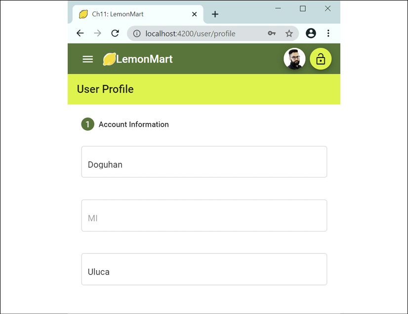
Figure 11.2: Multi-step form on mobile
Before we move on to how to implement the Date of Birth field, let's reevaluate our strategy by implementing error messages.
Reusing repeating template behavior with directives
In the previous section, we implemented a mat-error element for every validation error for every field part of the name object. This quickly adds up to seven elements for three fields. In Chapter 8, Designing Authentication and Authorization, we implemented common/validations.ts to reuse validation rules. We can reuse the behavior we implement within mat-error, or any other div for that matter, using an attribute directive.
Attribute directives
In Chapter 1, Introduction to Angular and Its Concepts, I mentioned that Angular components represent the most basic unit of an Angular app. With components, we define our own HTML elements that can reuse features and functionality represented by a template and some TypeScript code. On the other hand, a directive augments the capabilities of an existing element or component. In a sense, a component is a super directive that augments basic HTML capabilities.
With this view in mind, we can define three kinds of directives:
- Components
- Structural directives
- Attribute directives
Basically, components are directives with templates, and this is the most common type of directive you will use. Structural directives modify the DOM by adding or removing elements, *ngIf and *ngFor being the canonical examples. Finally, attribute directives allow you to define new attributes that you can add to HTML elements or components to add new behavior to them.
Let's implement an attribute directive that can encapsulate field-level error behavior.
Field error attribute directive
Imagine how we could use a directive to reduce repetitive elements to display field errors. Consider the following example using the first name field as an example:
example
<mat-form-field appearance="outline" fxFlex="40%">
  <mat-label>First Name</mat-label>
  <input matInput aria-label="First Name"
         formControlName="first" #name />
  <mat-error [input]="name" [group]="formGroup.get('name')"
    [appFieldError]="ErrorSets.RequiredText">
  </mat-error>
</mat-form-field>
We have the standard layout structure for a material form field, but there's only a single mat-error element. There are three new properties on mat-error:
inputbinds to the HTML input element that was tagged with#nameusing a template reference variable, so that we can tap into the blur event of the input element and be able to read theplaceholder,aria-label, andformControlNameproperties.groupbinds to the parent form group object that contains the form control, so using theformControlNameproperty from input, we can retrieve theformControlobject, while avoiding extra code.appFieldErrorbinds to an array of validation errors that need to be checked against theformControlobject, such asrequired,minlength,maxlength, andinvalid.
Using the preceding information, we can craft a directive that can render one or more lines of error messages inside the mat-error element, effectively replicating the verbose method we used in the previous section.
Let's go ahead and create an attribute directive named FieldErrorDirective:
- Create
FieldErrorDirectiveundersrc/app/user-controls. - Define the directive's selector as a bindable attribute named
appFieldError:src/app/user-controls/field-error/field-error.directive.ts @Directive({ selector: '[appFieldError]', }) - Outside of the directive, define a new type named
ValidationError, which defines the kinds of error conditions we will deal with:src/app/user-controls/field-error/field-error.directive.ts export type ValidationError = 'required' | 'minlength' | 'maxlength' | 'invalid' - Similar to the way we grouped validations, let's define two sets of commonly occurring error conditions, so we don't have to type them out over and over again:
src/app/user-controls/field-error/field-error.directive.ts export const ErrorSets: { [key: string]: ValidationError[] } = { OptionalText: ['minlength', 'maxlength'], RequiredText: ['minlength', 'maxlength', 'required'], } - Next, let's define the
@Inputtargets for the directive:src/app/user-controls/field-error/field-error.directive.ts export class FieldErrorDirective implements OnDestroy, OnChanges { @Input() appFieldError: | ValidationError | ValidationError[] | { error: ValidationError; message: string } | { error: ValidationError; message: string }[] @Input() input: HTMLInputElement | undefined @Input() group: FormGroup @Input() fieldControl: AbstractControl | null @Input() fieldLabel: string | undefinedNote that we already went over the purpose of the top three attributes.
fieldControlandfieldLabelare optional attributes. Ifinputandgroupare specified, the optional attributes can be auto-populated. Since they are class-wide variables, it made sense to expose them, in case the user wants to override the default behavior of the directive. This is an easy win for creating flexible and reusable controls. - Import the element reference in the
constructor, which can be later used by arenderErrorsfunction display error in the inner HTML of themat-errorelement:src/app/user-controls/field-error/field-error.directive.ts private readonly nativeElement: HTMLElement constructor(private el: ElementRef) { this.nativeElement = this.el.nativeElement } renderErrors(errors: string) { this.nativeElement.innerHTML = errors } - Implement a function that can return canned error messages depending on the error type:
src/app/user-controls/field-error/field-error.directive.ts
  getStandardErrorMessage(error: ValidationError): string {
    const label = this.fieldLabel || 'Input'
    switch (error) {
      case 'required':
        return `${label} is required`
      case 'minlength':
        return `${label} must be at least ${
          this.fieldControl?.getError(error)?.requiredLength ?? 2
        } characters`
      case 'maxlength':
        return `${label} can\'t exceed ${
          this.fieldControl?.getError(error)?.requiredLength ?? 50
        } characters`
      case 'invalid':
        return `A valid ${label} is required`
    }
  }
Note that we can extract the required
minlengthormaxlengthamount dynamically from thefieldControl, greatly reducing the number of custom messages we need to generate. - Implement the algorithm that can loop through all the elements in
appFieldErrorand the errors that need to be displayed in an array using thegetStandardErrorMessagemethod:src/app/user-controls/field-error/field-error.directive.ts updateErrorMessage() { const errorsToDisplay: string[] = [] const errors = Array.isArray(this.appFieldError) ? this.appFieldError : [this.appFieldError] errors.forEach( (error: ValidationError | { error: ValidationError; message: string }) => { const errorCode = typeof error === 'object' ? error.error : error const message = typeof error === 'object' ? () => error.message : () => this.getStandardErrorMessage(errorCode) const errorChecker = errorCode === 'invalid' ? () => this.fieldControl?.invalid : () => this.fieldControl?.hasError(errorCode) if (errorChecker()) { errorsToDisplay.push(message()) } } ) this.renderErrors(errorsToDisplay.join('<br>')) }At the end, we can display the error messages using the
renderErrorsmethod.Note the use of function delegates. Since this piece of code will execute hundreds of times a minute, it is important to avoid unnecessary invocations. Function delegates help organize our code better, while deferring the execution of their logic unless absolutely necessary.
- Now, initialize the
fieldControlproperty, which represents aformControl. We will listen to thevalueChangesevents of the control and, if the validation status is invalid, then we execute our customupdateErrorMessagelogic to display error messages:src/app/user-controls/field-error/field-error.directive.ts private controlSubscription: Subscription | undefined ngOnDestroy(): void { this.unsubscribe() } unsubscribe(): void { this.controlSubscription?.unsubscribe() } initFieldControl() { if (this.input && this.group) { const controlName = this.input. getAttribute('formControlName') ?? '' this.fieldControl = this.fieldControl || this.group.get(controlName) if (!this.fieldControl) { throw new Error( `[appFieldError] couldn't bind to control ${controlName}` ) } this.unsubscribe() this.controlSubscription = this.fieldControl?.valueChanges .pipe( filter(() => this.fieldControl?.status === 'INVALID'), tap(() => this.updateErrorMessage()) ) .subscribe() } }Note that, since we're subscribing to
valueChanges, we must also unsubscribe. We unsubscribe once withngOnDestroyand again right before subscribing. This is becauseinitFieldControlmay be called multiple times. If we don't clear the prior subscription, it will result in a memory leak and related performance issues.Additionally, if we can't bind to a
fieldControl, we throw an error message, since this usually points to a coding error. - Finally, we configure all major attributes with the
ngOnChangesevent, which triggers any time an@Inputattribute is updated. This ensures that in the case where form elements could be dynamically added or removed, we will always consider the newest values. We callinitFieldControlto start listening to value changes, we implement anonblurevent handler that triggersupdateErrorMessage()for the HTML input element, and we assign the value offieldLabel:src/app/user-controls/field-error/field-error.directive.ts ngOnChanges(changes: SimpleChanges): void { this.initFieldControl() if (changes.input.firstChange) { if (this.input) { this.input.onblur = () => this.updateErrorMessage() this.fieldLabel = this.fieldLabel || this.input.placeholder || this.input.getAttribute('aria-label') || '' } else { throw new Error( `appFieldError.[input] couldn't bind to any input element` ) } } }Note that if we can't bind to an HTML
inputelement, this usually means that the developer simply forgot to wire things up correctly. In this case, we throw a newErrorobject, which generates a helpful stack trace in the console, so you can pinpoint the location in the template where the error is happening.
This wraps up the implementation of the directive. Now, we need to package the directive in a module named field-error.module.ts:
src/app/user-controls/field-error/field-error.directive.ts
  @NgModule({
  imports: [CommonModule, ReactiveFormsModule],
  declarations: [FieldErrorDirective],
  exports: [FieldErrorDirective],
})
export class FieldErrorModule {}
Now go ahead and use the directive in our existing forms:
- Import the module in
app.module.tsanduser.module.ts. - Update
profile.component.htmlwith the new directive. - Update
login.component.htmlwith the new directive.
Be sure to define ErrorSets as a public property variable in the component class so that you can use it in the template.
Test your forms to ensure that our validation messages are being displayed as expected and that there are no console errors.
Congratulations! You've learned how you can inject new behavior into other elements and components using directives. By doing this, we are able to avoid a lot of repeated code and standardize error messages across our app.
Before moving on, finish implementation of the form by looking at the implementation on GitHub. You can find the code for the form template at projects/ch11/src/app/user/profile/profile.initial.component.html and the component class at projects/ch11/src/app/user/profile/profile.initial.component.ts.
Do not include the app-lemon-rater and app-view-user elements, and remove the mask attribute from the phone number, which we will implement later in the chapter.
Here, you can see the User Profile as it will appear on LemonMart:
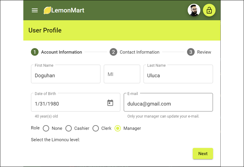
Figure 11.3: Profile component in a mostly completed state
Next, let's continue going over the profile component and see how the Date of Birth field works.
Calculated properties and DatePicker
We can display calculated properties based on user input. For example, to display a person's age based on their date of birth, introduce class properties that calculate the age and display it as follows:
src/app/user/profile/profile.component.ts
now = new Date()
get dateOfBirth() {
  return this.formGroup.get('dateOfBirth')?.value || this.now
}
get age() {
  return this.now.getFullYear() - this.dateOfBirth.getFullYear()
}
To validate a date within the last hundred years, implement a minDate class property:
src/app/user/profile/profile.component.ts
  minDate = new Date(
    this.now.getFullYear() - 100,
    this.now.getMonth(),
    this.now.getDate()
  )
The usage of the calculated properties in the template looks like this:
src/app/user/profile/profile.component.html
<mat-form-field appearance="outline" fxFlex="50%">
  <mat-label>Date of Birth</mat-label>
  <input matInput aria-label="Date of Birth" formControlName="dateOfBirth"
    [min]="minDate" [max]="now" [matDatepicker]="dateOfBirthPicker" #dob />
  <mat-hint *ngIf="formGroup.get('dateOfBirth')?.value">
    {{ age }} year(s) old
  </mat-hint>
  <mat-datepicker-toggle matSuffix [for]="dateOfBirthPicker">
  </mat-datepicker-toggle>
  <mat-datepicker #dateOfBirthPicker></mat-datepicker>
  <mat-error [input]="dob" [group]="formGroup"
    [appFieldError]="{error: 'invalid', message: 'Date must be within the last 100 years'}">
  </mat-error>
</mat-form-field>
Refer to the highlighted [min] and [max] attributes in the preceding snippet for the application of the hundred-year date range.
The DatePicker in action looks as follows:
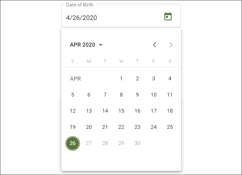
Figure 11.4: Selecting a date with DatePicker
Note that dates beyond April 26, 2020 are grayed out. After the date is selected, the calculated age is displayed as follows:

Figure 11.5: Calculated age property
Now, let's move on to the next step, Contact Information, and see how we can enable a convenient way to display and input the state portion of the address field.
Typeahead support
In buildForm, we set a listener on address.state to support a typeahead filtering drop-down experience:
src/app/user/profile/profile.component.ts
const state = this.formGroup.get('address.state')
if (state != null) {
  this.states$ = state.valueChanges.pipe(
    startWith(''),
    map((value) => USStateFilter(value))
  )
}
On the template, implement mat-autocomplete, bound to the filtered states array with an async pipe:
src/app/user/profile/profile.component.html
...
<mat-form-field appearance="outline" fxFlex="30%">
  <mat-label>State</mat-label>
  <input type="text" aria-label="State" matInput formControlName="state"
    [matAutocomplete]="stateAuto" #state />
  <mat-autocomplete #stateAuto="matAutocomplete">
    <mat-option *ngFor="let state of (states$ | async)" [value]="state.name">
      {{ state.name }}
    </mat-option>
  </mat-autocomplete>
  <mat-error [input]="state" [group]="formGroup.get('address')"
    appFieldError="required">
  </mat-error>
</mat-form-field>
...
Here's how it looks when a user enters the V character:

Figure 11.6: Dropdown with typeahead support
In the next section, let's enable the input of multiple phone numbers.
Dynamic form arrays
Note that phones is an array, potentially allowing for many inputs. We can implement this by building a FormArray with the this.formBuilder.array function. We also define several helper functions to make it easier to build the FormArray:
buildPhoneFormControlhelps to buildFormGroupobjects of individual entries.buildPhoneArraycreates as manyFormGroupobjects as needed or, if the form is empty, it creates an empty entry.addPhoneadds a new emptyFromGroupobject to theFormArray.get phonesArray()is a convenient property to get thephonescontrol from the form.
Let's see how the implementation comes together:
src/app/user/profile/profile.component.ts
...
phones: this.formBuilder.array(this.buildPhoneArray(user?.phones || [])),
...
  private buildPhoneArray(phones: IPhone[]) {
    const groups = []
    if (phones?.length === 0) {
      groups.push(this.buildPhoneFormControl(1))
    } else {
      phones.forEach((p) => {
        groups.push(
          this.buildPhoneFormControl(p.id, p.type, p.digits)
        )
      })
    }
    return groups
      }
private buildPhoneFormControl(
  id: number, type?: string, phoneNumber?: string
) {
    return this.formBuilder.group({
      id: [id],
      type: [type || '', Validators.required],
      digits: [phoneNumber || '', USAPhoneNumberValidation],
  })
}
...
buildPhoneArray supports initialization of a form with a single phone input or filling it with the existing data, working in tandem with buildPhoneFormControl. The latter function comes in handy when a user clicks on an Add button to create a new row for the entry:
src/app/user/profile/profile.component.ts
...
addPhone() { this.phonesArray.push(
this.buildPhoneFormControl(
  this.formGroup.get('phones').value.length + 1)
)
}
get phonesArray(): FormArray {
  return this.formGroup.get('phones') as FormArray
}
...
The phonesArray property getter is a common pattern to make it easier to access certain form properties. However, in this case, it is also necessary because get('phones') must be typecast to FormArray so that we can access the length property on it on the template:
src/app/user/profile/profile.component.html
...
<mat-list formArrayName="phones">
  <h2 mat-subheader>Phone Number(s)
    <button mat-button (click)="addPhone()">
      <mat-icon>add</mat-icon>
      Add Phone
    </button>
  </h2>
  <mat-list-item style="margin-top: 36px;"
    *ngFor="let position of phonesArray.controls; let i = index"
      [formGroupName]="i">
    <mat-form-field appearance="outline" fxFlex="100px">
      <mat-label>Type</mat-label>
      <mat-select formControlName="type">
        <mat-option *ngFor="let type of PhoneTypes"
             [value]="convertTypeToPhoneType(type)">
          {{ type }}
        </mat-option>
      </mat-select>
    </mat-form-field>
    <mat-form-field appearance="outline" fxFlex fxFlexOffset="10px">
      <mat-label>Number</mat-label>
      <input matInput type="text" formControlName="digits"
        aria-label="Phone number" prefix="+1" />
      <mat-error
        *ngIf="phonesArray.controls[i].invalid &&
               phonesArray.controls[i].touched">
        A valid phone number is required
      </mat-error>
    </mat-form-field>
    <button fxFlex="33px" mat-icon-button
      (click)="phonesArray.removeAt(i)">
      <mat-icon>delete</mat-icon>
    </button>
  </mat-list-item>
</mat-list>
...
Note the highlighted convertTypeToPhoneType function, which converts a string to enum PhoneType.
Also highlighted in the preceding code block, note how the remove function is implemented inline in the template, making it easier to read and maintain.
Let's see how the dynamic array should be working:
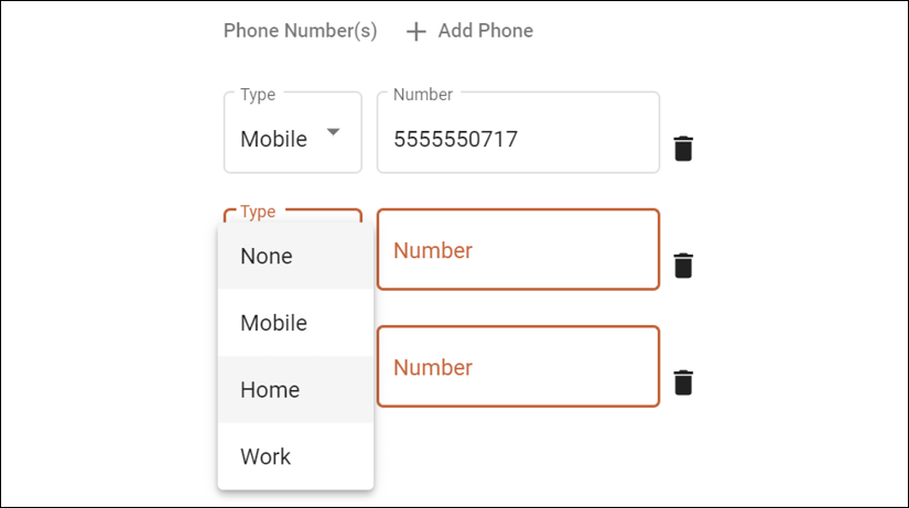
Figure 11.7: Multiple inputs using FormArray
Now that we're done with inputting data, we can move on to the last step of the stepper, Review. However, as was mentioned earlier, the Review step uses the <app-view-user> directive to display its data. Let's build that view first.
Creating shared components
Here's a minimal implementation of the <app-view-user> directive that is a prerequisite for the Review step.
Create a new viewUser component under the user module, as follows:
src/app/user/view-user/view-user.component.ts
import { Component, Input, OnChanges, SimpleChanges } from '@angular/core'
import { Router } from '@angular/router'
import { BehaviorSubject } from 'rxjs'
import { IUser, User } from '../user/user'
@Component({
  selector: 'app-view-user',
  template: `
    <div *ngIf="currentUser$ | async as currentUser">
      <mat-card>
        <mat-card-header>
          <div mat-card-avatar>
            <mat-icon>account_circle</mat-icon>
          </div>
          <mat-card-title>
            {{ currentUser.fullName }}
          </mat-card-title>
          <mat-card-subtitle>
            {{ currentUser.role }}
          </mat-card-subtitle>
        </mat-card-header>
        <mat-card-content>
          <p><span class="mat-input bold">E-mail</span></p>
          <p>{{ currentUser.email }}</p>
          <p><span class="mat-input bold">Date of Birth</span></p>
          <p>{{ currentUser.dateOfBirth | date: 'mediumDate' }}</p>
        </mat-card-content>
        <mat-card-actions *ngIf="editMode">
          <button mat-button mat-raised-button
                  (click)="editUser(currentUser._id)">
            Edit
          </button>
        </mat-card-actions>
      </mat-card>
    </div>
  `,
  styles: [
    `
      .bold {
        font-weight: bold;
      }
    `,
  ],
})
export class ViewUserComponent implements OnChanges {
  @Input() user: IUser
  readonly currentUser$ = new BehaviorSubject(new User())
  get editMode() {
    return !this.user
  }
  constructor(private router: Router) {}
  ngOnChanges(changes: SimpleChanges): void {
    this.currentUser$.next(User.Build(changes.user.currentValue))
  }
  editUser(id: string) {
    this.router.navigate(['/user/profile', id])
  }
}
The preceding component uses input binding with @Input to get user data, compliant with the IUser interface, from an outside component. We implement the ngOnChanges event, which fires whenever the bound data changes. In this event, we hydrate the simple JSON object stored in the user property as an instance of the User class with User.Build.
We then define a read-only BehaviorSubject, named this.currentUser$, so we can asynchronously push updates to it using the next function. This flexibility will come in handy when we later make this component reusable in multiple contexts. Even if we wanted to, we couldn't directly bind to user, because calculated properties such as fullName will only work if the data is hydrated into an instance of the User class.
Now, we are ready to complete the multi-step form.
Reviewing and saving form data
On the last step of the multistep form, users should be able to review and then save the form data. As a good practice, a successful POST request will return the data that was saved back to the browser. We can then reload the form with the information received back from the server:
src/app/user/profile/profile.component.ts
...
  async save(form: FormGroup) {
    this.subs.add(
      this.userService
        .updateUser(this.currentUserId, form.value)
        .subscribe(
          (res: IUser) => {
            this.formGroup.patchValue(res)
            this.uiService.showToast('Updated user')
          },
          (err: string) => (this.userError = err)
      )
    )
  }
...
Note that updateUser returns the saved value of the user. It is possible that the database returns a different version of user than what we had before, so we use formGroup.patchValue to update the data powering the form. The form automatically updates to reflect any changes.
If there are errors when saving the data, they'll be set to userError to be displayed on the form. And before saving the data, we present it in a compact format with the reusable app-view-user component that we can bind the form data to:
src/app/user/profile/profile.component.html
...
<mat-step [stepControl]="formGroup">
  <form [formGroup]="formGroup" (ngSubmit)="save(formGroup)">
    <ng-template matStepLabel>Review</ng-template>
    <div class="stepContent">
      Review and update your user profile.
      <app-view-user [user]="formGroup.getRawValue()"></app-view-user>
    </div>
    <div fxLayout="row" class="margin-top">
      <button mat-button matStepperPrevious>Back</button>
      <div class="flex-spacer"></div>
      <div *ngIf="userError" class="mat-caption error">
        {{ userError }}
      </div>
      <button mat-button color="warn" (click)="stepper.reset()">
        Reset
      </button>
      <button mat-raised-button matStepperNext color="primary"
        type="submit" [disabled]="formGroup.invalid">
        Update
      </button>
    </div>
  </form>
</mat-step>
...
Note that we use formGroup.getRawValue() to extract the JSON of the form data. See how we bind userError to display error messages. Also, the Reset button uses stepper.reset(), which can conveniently reset all the user input.
This is how the final product should appear:
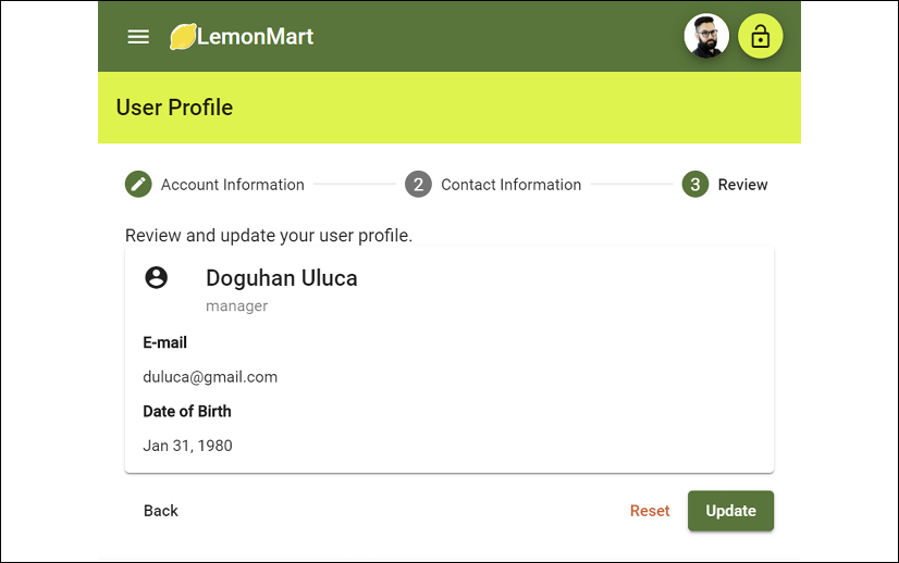
Figure 11.8: Review step
Now that the user profile input is done, we are about halfway to our eventual goal of creating a master/detail view where a Manager can click on a user and view their profile details. We still have a lot more code to add, and along the way, we have fallen into a pattern of adding lots of boilerplate code to load the requisite data for a component.
Next, let's refactor our form to make our code reusable and scalable, so even if our form has dozens of fields, the code is still maintainable and we don't introduce an exponential cost increase to make changes.
Scaling architecture with reusable form parts
As mentioned in the introduction to the Multi-step responsive forms section, forms are tightly coupled beasts that can grow large, and using the wrong architectural pattern to scale your implementation can cause significant issues when implementing new features or maintaining existing ones.
To demonstrate how you can break up your form into multiple parts, we will refactor the form to extract the highlighted section in the following screenshot, the name form group, as its own component. The technique to accomplish this is the same as you'd use when you want to put each step of your form into a separate component:
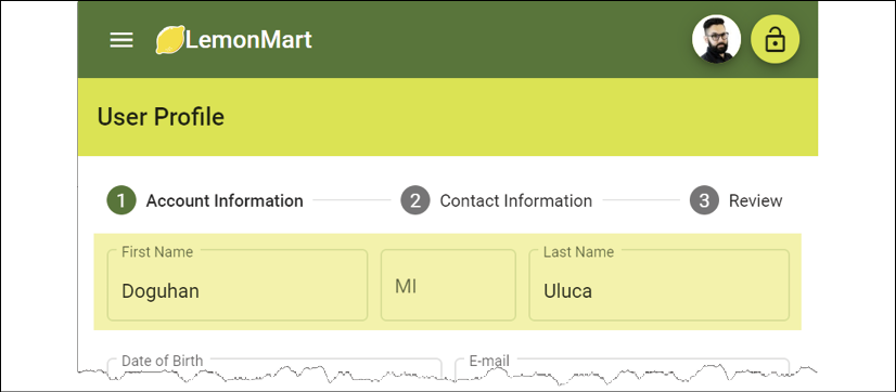
Figure 11.9: User profile's name part highlighted
By making the name form group reusable, you will also learn about how you can reuse the business logic that you build into that form group in other forms. We will extract the name form group logic into a new component named NameInputComponent. In doing so, we also have an opportunity to extract some reusable form functionality to a BaseFormComponent as an abstract class.
There are going to be several components that are working together here, including ProfileComponent, ViewUserComponent, and NameInputComponent. We need all the values in these three components to be up to date as the user enters them.
ProfileComponent will own the master form to which we'll need to register any child form. Once we do this, all the form validation techniques you've learned so far will still apply.
This is a key way to make your form able to scale across many components and continue to be easy to work with, without introducing unnecessary validation overhead. Hence, it is useful to review the different interactions between these objects to solidify your understanding of the asynchronous and decoupled nature of their behavior:

Figure 11.10: Form component interactions
In this section, we bring together a lot of the different concepts that you've learned over the course of the book. Utilize the preceding diagram to understand how the various form components interact with each other.
In the preceding diagram, properties in bold indicate data binding. Underlined function elements indicate event registrations. Arrows show the points of connection between the components.
The workflow begins with the instantiation of ProfileComponent. The OnInit event of the component begins building the formGroup object, while asynchronously loading any potential initialData that may need to be patched into the forms. Refer to the preceding diagram for a visual representation of initialData coming in from a service or cache.
NameInputComponent is used in the ProfileComponent form as <app-name-input>. In order to synchronize initialData with the NameInputComponent, we bind a nameInitialData$ subject using the async pipe, since initialData is coming in asynchronously.
NameInputComponent implements the OnChanges life cycle hook, so whenever nameInitialData$ updates, its value is patched into the NameInputComponent form.
Like ProfileComponent, NameInputComponent also implements the OnInit event to construct its formGroup object. Since this is an asynchronous event, NameInputComponent needs to expose a formReady event that ProfileComponent can subscribe to. Once the formGroup object is ready, we emit the event, and the registerForm function on ProfileComponent triggers. registerForm adds the formGroup object of NameInputComponent as a child element to the parent formGroup on ProfileComponent.
ViewUserComponent is used in the ProfileComponent form as <app-view-user>. When the values in the parent form change, we need <app-view-user> to stay up to date. We bind to the user property on ViewUserComponent, which implements OnChanges to receive updates. Every time there is an update, the User object is hydrated from the IUser object, so that calculated fields such as fullName can continue to work. The updated User is pushed to currentUser$, which is bound to the template with an async.
We will begin by building a BaseFormComponent, which NameInputComponent and ProfileComponent will then implement.
Base form component as an abstract class
We can share common functionality and standardize the implementation of all components that implement a form by implementing a base abstract class. An abstract class cannot be instantiated on its own because it wouldn't make sense to do so, since it will not have a template, making it useless on its own.
Note that BaseFormComponent is just a class and not an Angular component.
BaseFormComponent will standardize the following:
@Input initialData, and disable as binding targets- The
@Output formReadyevent formGroup, theFormGroupto be used in the template'sbuildFormfunction to build theformGroup
With the preceding assumptions, the base class can provide some generic functionality:
patchUpdatedData, which can update the data (partially or fully) in theformGroupwithout having to rebuild it.registerFormandderegisterFormcan register or deregister child forms.deregisterAllFormscan automatically deregister any registered child form.hasChangedcan determine whetherinitialDatahas changed given aSimpleChangeobject provided by thengOnChangeevent handler.patchUpdatedDataIfChangedleverageshasChangedand usespatchUpdatedDatato update the data if, and only if, there has been an update toinitialDataandformGroupis already initialized.
Create a new class, BaseFormComponent, under src/common as follows:
src/app/common/base-form.class.ts
import { EventEmitter, Input, Output, SimpleChange, SimpleChanges }
   from '@angular/core'
import { AbstractControl, FormGroup } from '@angular/forms'
export abstract class BaseFormComponent<TFormData extends object> {
  @Input() initialData: TFormData
  @Input() disable: boolean
  @Output() formReady: EventEmitter<AbstractControl>
  formGroup: FormGroup
  private registeredForms: string[] = []
  constructor() {
    this.formReady = new EventEmitter<AbstractControl>(true)
  }
  abstract buildForm(initialData?: TFormData): FormGroup
  patchUpdatedData(data: object) {
    this.formGroup.patchValue(data, { onlySelf: false })
  }
  patchUpdatedDataIfChanged(changes: SimpleChanges) {
    if (this.formGroup && this.hasChanged(changes.initialData)) {
      this.patchUpdatedData(this.initialData)
    }
  }
  emitFormReady(control: AbstractControl | null = null) {
    this.formReady.emit(control || this.formGroup)
  }
  registerForm(name: string, control: AbstractControl) {
    this.formGroup.setControl(name, control)
    this.registeredForms.push(name)
  }
  deregisterForm(name: string) {
    if (this.formGroup.contains(name)) {
      this.formGroup.removeControl(name)
    }
  }
  protected deregisterAllForms() {
    this.registeredForms.forEach(() => this.deregisterForm(name))
  }
  protected hasChanged(change: SimpleChange): boolean {
    return change?.previousValue !== change?.currentValue
  }
}
Let's implement NameInputComponent using the BaseFormComponent.
Implementing a reusable form part
Start by identifying the name form group in the profile component code and template files:
- The following is the name form group implementation:
src/app/user/profile/profile.component.ts
...
name: this.formBuilder.group({
  first: [user?.name?.first || '', RequiredTextValidation],
  middle: [user?.name?.middle || '', OneCharValidation],
  last: [user?.name?.last || '', RequiredTextValidation],
}),
...
Note that when we move these validation rules to a new component, we still want them to be in effect when determining the overall validation status of the parent form. We achieve this by using the
registerFormfunction we implemented in the previous section. Once our newFormGroupis registered with the existing one, they work exactly the same way before our refactor. - Next is the name form group template:
src/app/user/profile/profile.component.html
...
<div fxLayout="row" fxLayout.lt-sm="column" [formGroup]="formGroup.get('name')" fxLayoutGap="10px">
  <mat-form-field appearance="outline" fxFlex="40%">
    <mat-label>First Name</mat-label>
    <input matInput aria-label="First Name"
           formControlName="first" #name />
    ...
</div>
...
You will be moving most of this code to the new component.
- Create a new
NameInputComponentunder theuserfolder. - Extend the class from
BaseFormComponent. - Inject
FormBuilderin theconstructor:For components with small or limited pieces of functionality, I prefer creating them with an inline template and styling, so it is easier to change the code from one place.
src/app/user/name-input/name-input.component.ts
export class NameInputComponent extends BaseFormComponent<IName> {
  constructor(private formBuilder: FormBuilder) {
    super()
  }
  buildForm(initialData?: IName): FormGroup {
    throw new Error("Method not implemented.");
  }
  ...
}
Remember that the base class already implements
formGroup,initialData,disable, andformReadyproperties, so you don't need to redefine them.Note that we are forced to implement the
buildFormfunction since it was defined as abstract. This is a great way to enforce standards across developers. Also, note that any base function provided can be overridden by the implementing class by simply redefining the function. You'll see this in action when we refactor theProfileComponent. - Implement the
buildFormfunction. - Set the
nameproperty part of theformGroupinProfileComponenttonull:src/app/user/name-input/name-input.component.ts export class NameInputComponent implements OnInit { ... buildForm(initialData?: IName): FormGroup { const name = initialData return this.formBuilder.group({ first: [name?.first : '', RequiredTextValidation], middle: [name?.middle : '', OneCharValidation], last: [name?.last : '', RequiredTextValidation], }) } - Implement the template by bringing over the content from
ProfileComponent:src/app/user/name-input/name-input.component.ts template: ` <form [formGroup]="formGroup"> <div fxLayout="row" fxLayout.lt-sm="column" fxLayoutGap="10px"> ... </div> </form> `, - Implement the
ngOnInitevent handler:src/app/user/name-input/name-input.component.ts ngOnInit() { this.formGroup = this.buildForm(this.initialData) if (this.disable) { this.formGroup.disable() } this.formReady.emit(this.formGroup) }It is critical to get the implementation of the
ngOnInitevent handler right in every implementation ofBaseFormComponent. The preceding example is fairly standard behavior for anychildcomponent you may implement.Note that the implementation in
ProfileComponentwill be a bit different. - Implement the
ngOnChangesevent handler, leveraging the basepatchUpdatedDataIfChangedbehavior:src/app/user/name-input/name-input.component.ts ngOnChanges(changes: SimpleChanges) { this.patchUpdatedDataIfChanged(changes) }Note that in
patchUpdatedDataIfChanged, settingonlySelftofalsewill cause the parent form to also update. If you'd like to optimize this behavior, you may override the function.Now you have a fully implemented
NameInputComponentthat you can integrate intoProfileComponent.To verify your
ProfileComponentcode going forward, refer toprojects/ch11/src/app/user/profile/profile.component.tsandprojects/ch11/src/app/user/profile/profile.component.html.Before you begin using
NameInputComponent, perform the following refactors: - Refactor
ProfileComponentto extendBaseFormComponentand conform to its default values as needed. - Define a readonly
nameInitialData$property with theBehaviorSubject<IName>type and initialize it with empty strings. - Replace the content in
ProfileComponentwith the new<app-name-input>component:src/app/user/profile/profile.component.html <mat-horizontal-stepper #stepper="matHorizontalStepper"> <mat-step [stepControl]="formGroup"> <form [formGroup]="formGroup"> <ng-template matStepLabel>Account Information</ng-template> <div class="stepContent"> <app-name-input [initialData]="nameInitialData$ | async" (formReady)="registerForm('name', $event)"> </app-name-input> </div> ... </ng-template> </form> </mat-step> ... </mat-horizontal-stepper>Note that the base form component function,
registerForm, is leveraged here. - Ensure that your
ngOnInitis implemented correctly:Note that there are some additional refactors present on the updated
ProfileComponent, such as thepatchUserfunction seen in the following snippet. Don't miss these updates when you update your component.src/app/user/profile/profile.component.ts ngOnInit() { this.formGroup = this.buildForm() this.subs.sink = this.authService.currentUser$ .pipe( filter((user) => user != null), tap((user) => this.patchUser(user)) ) .subscribe() }It is important to update the current form's data with
pathUpdatedData, as well asnameInitialData$, when there's an update toinitialData. - Ensure that
ngOnDestroyis implemented correctly:src/app/user/profile/profile.component.ts ngOnDestroy() { this.subs.unsubscribe() this.deregisterAllForms() }
Always remember to unsubscribe from subscriptions, which you can do so easily with the SubSink package. You can also leverage the base class functionality to automatically deregister from all child forms.
Next, let's learn about masking user input to increase the quality of our data.
Input masking
Masking user input is an input UX tool, as well as a data quality one. I'm a fan of the ngx-mask library, which makes it really easy to implement input masking in Angular. We will demonstrate input masking by updating the phone number input field so we can ensure that users input a valid phone number, as shown in the following screenshot:
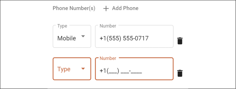
Figure 11.11: Phone number field with input masking
Set up your input masking as follows:
- Install the library via npm with
npm i ngx-mask. - Import the
forRootmodule:src/app/app.module.ts export const options: Partial<IConfig> | (() => Partial<IConfig>) = { showMaskTyped: true, } @NgModule({ imports: [ ... NgxMaskModule.forRoot(options), ] }) - Import the module in the
userfeature module as well:src/app/user/user.module.ts @NgModule({ imports: [ ... NgxMaskModule.forChild(), ] }) - Update the
numberfield inProfileComponentas follows:src/app/user/profile/profile.component.html <mat-form-field appearance="outline" fxFlex fxFlexOffset="10px"> <mat-label>Number</mat-label> <input matInput type="text" formControlName="number" prefix="+1" mask="(000) 000-0000" [showMaskTyped]="true" /> <mat-error *ngIf="this.phonesArray.controls[i].invalid"> A valid phone number is required </mat-error> </mat-form-field>
And it's that simple. You can learn more about the module and its capabilities on GitHub at https://github.com/JsDaddy/ngx-mask.
Custom controls with ControlValueAccessor
So far, we've learned about forms using standard form controls and input controls provided by Angular Material. However, it is possible for you to create custom user controls. If you implement the ControlValueAccessor interface, then your custom controls will play nicely with forms and the ControlValueAccessor interface's validation engine.
We will be creating the custom rater control shown in the following screenshot, and will place it as a control on the first step of ProfileComponent:

Figure 11.12: The lemon rater user control
User controls are inherently highly reusable, tightly coupled, and customized components to enable rich user interactions. Let's implement one.
Implementing a custom rating control
The lemon rater will highlight the number of lemons selected dynamically as the user interacts with the control in real time. As such, creating a high-quality custom control is an expensive endeavor.
The Lemon Rater is a modified version of Jennifer Wadella's Galaxy Rating App sample found at https://github.com/tehfedaykin/galaxy-rating-app. I highly recommend that you watch Jennifer's Ng-Conf 2019 talk on ControlValueAccessor, linked in the Further reading section.
Set up your custom rating control as follows:
- Generate a new component called
LemonRaterunder theuser-controlsfolder. - Create a
LemonRaterModulein the same folder. - Declare and export the component.
- In
LemonRater, implement theControlValueAccessinterface:src/app/user-controls/lemon-rater/lemon-rater.component.ts export class LemonRaterComponent implements ControlValueAccessor { disabled = false private internalValue: number get value() { return this.internalValue } onChanged: any = () => {} onTouched: any = () => {} writeValue(obj: any): void { this.internalValue = obj } registerOnChange(fn: any): void { this.onChanged = fn } registerOnTouched(fn: any): void { this.onTouched = fn } setDisabledState?(isDisabled: boolean): void { this.disabled = isDisabled } } - Add the
NG_VALUE_ACCESSORprovider with themultiproperty set totrue. This will register our component with the form's change events, so form values can be updated when the user interacts with the rater:src/app/user-controls/lemon-rater/lemon-rater.component.ts @Component({ selector: 'app-lemon-rater', templateUrl: 'lemon-rater.component.html', styleUrls: ['lemon-rater.component.css'], providers: [ { provide: NG_VALUE_ACCESSOR, useExisting: forwardRef(() => LemonRaterComponent), multi: true, }, ], - Implement a custom rating scheme with a function to allow for setting the selected rating based on user input:
src/app/user-controls/lemon-rater/lemon-rater.component.ts
export class LemonRaterComponent implements ControlValueAccessor {
  @ViewChild('displayText', { static: false }) displayTextRef: ElementRef

  ratings = Object.freeze([
    {
      value: 1,
      text: 'no zest',
    },
    {
      value: 2,
      text: 'neither a lemon or a lime ',
    },
    {
      value: 3,
      text: 'a true lemon',
    },
])
  setRating(lemon: any) {
    if (!this.disabled) {
      this.internalValue = lemon.value
      this.ratingText = lemon.text
      this.onChanged(lemon.value)
      this.onTouched()
    }
  }
  setDisplayText() {
    this.setSelectedText(this.internalValue)
  }
  private setSelectedText(value: number) {
    this.displayTextRef.nativeElement.textContent =
      this.getSelectedText(value)
  }
  private getSelectedText(value: number) {
    let text = ''
    if (value) {
      text = this.ratings
        .find((i) => i.value === value)?.text || ''
    }
    return text
  }
}
Note that by using
@ViewChild, we're getting the HTML element named#displayText(highlighted in the following template). UsingsetSelectText, we replace thetextContentof the element. - Implement the template, referring to the sample code for the contents of the
svgtag:src/app/user-controls/lemon-rater/lemon-rater.component.html <i #displayText></i> <div class="lemons" [ngClass]="{'disabled': disabled}"> <ng-container *ngFor="let lemon of ratings"> <svg width="24px" height="24px" viewBox="0 0 513 513" [attr.title]="lemon.text" class="lemon rating" [ngClass]="{'selected': lemon.value <= value}" (mouseover)= "displayText.textContent = !disabled ? lemon.text : ''" (mouseout)="setDisplayText()" (click)="setRating(lemon)" > ... </svg> </ng-container> </div>The three most important attributes in the template are
mouseover,mouseout, andclick.mouseoverdisplays the text for the rating that the user is currently hovering over,mouseoutresets the display text to the selected value, andclickcalls thesetRatingmethod we implemented to record the user's selection. However, the control can have even richer user interactivity by highlighting the number of lemons when the user hovers over a rating or selects it. We will accomplish this via some CSS magic. - Implement the
cssfor the user control:src/app/user-controls/lemon-rater/lemon-rater.component.css .lemons { cursor: pointer; } .lemons:hover .lemon #fill-area { fill: #ffe200 !important; } .lemons.disabled:hover { cursor: not-allowed; } .lemons.disabled:hover .lemon #fill-area { fill: #d8d8d8 !important; } .lemons .lemon { float: left; margin: 0px 5px; } .lemons .lemon #fill-area { fill: #d8d8d8; } .lemons .lemon:hover~.lemon #fill-area { fill: #d8d8d8 !important; } .lemons .lemon.selected #fill-area { fill: #ffe200 !important; } .lemons .dad.heart #ada { fill: #6a0dad !important; }
The most interesting bit is with .lemons .lemon:hover~.lemon #fill-area. Note that the operator ~ or the general sibling combinator is used to select a range of elements so that a dynamic number of lemons will be highlighted as the user hovers over them.
#fill-area refers to a <path> defined within the lemon svg, which allows for the lemon's color to be adjusted dynamically. I had to manually inject this ID field into the svg file.
Now, let's see how you can use this new user control in a form.
Using custom controls in forms
We will use the lemon rater in the profile component to record the Limoncu level of the employee.
Limoncu, meaning a person who grows or sells lemons in Turkish, is Lemon Mart's proprietary employee engagement and performance measurement system.
Let's integrate the lemon rater:
- Start by importing the
LemonRaterModuleinUserModule. - Ensure that the level form control is initialized in
buildForm:src/app/user/profile/profile.component.ts buildForm(initialData?: IUser): FormGroup { ... level: [user?.level || 0, Validators.required], ... } - Insert the lemon rater as the last element of the first
mat-step, inside theformelement:src/app/user/profile/profile.component.html <div fxLayout="row" fxLayout.lt-sm="column" class="margin-top" fxLayoutGap="10px"> <mat-label class="mat-body-1">Select the Limoncu level: <app-lemon-rater formControlName="level"> </app-lemon-rater> </mat-label> </div>
We simply integrate with the custom control by implementing formControlName as you would with any other control.
Congratulations! You should have a working custom control that is integrated with your form.
Layouts using grid list
The Angular Flex Layout library is great for laying out content using CSS Flexbox. Angular Material provides another mechanism to lay out content by using CSS Grid with its Grid List functionality. A good way to demonstrate this functionality is by implementing a helpful list for fake login information in the LoginComponent, demonstrated here:
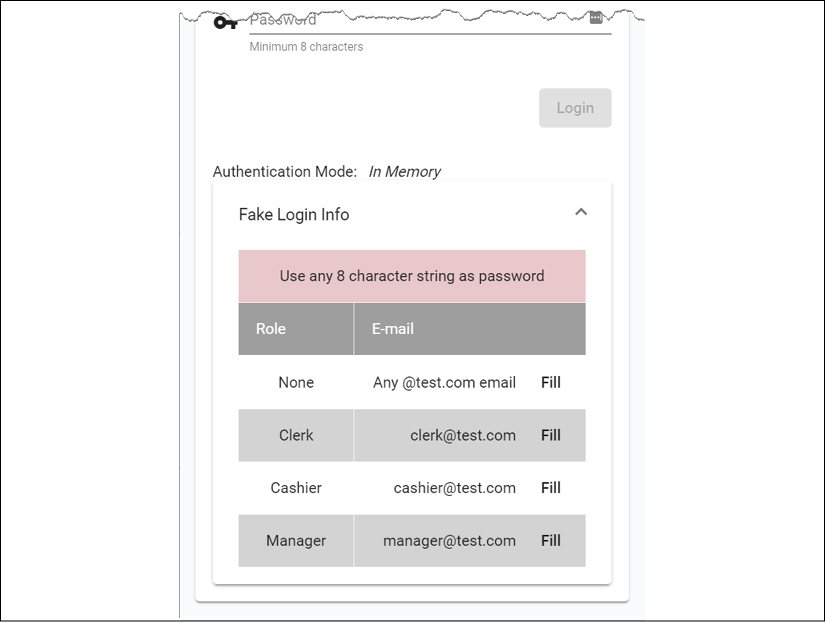
Figure 11.13: Login helper with the grid list
Implement your list as follows:
- Start by defining a
rolesproperty that is an array of all the roles:src/app/login/login.component.ts roles = Object.keys(Role) - Import
MatExpansionModuleandMatGridListModuleintoAppMaterialModule: - Implement a new
mat-card-contentbelow the existing one:src/app/login/login.component.html <div fxLayout="row" fxLayoutAlign="center"> <mat-card fxFlex="400px"> <mat-card-header> <mat-card-title> <div class="mat-headline">Hello, Limoncu!</div> </mat-card-title> </mat-card-header> <mat-card-content> ... </mat-card-content> <mat-card-content> </mat-card-content> </mat-card> </div> - Inside the new
mat-card-content, put in a label to display the authentication mode:src/app/login/login.component.html <div fxLayout="row" fxLayoutAlign="start center" fxLayoutGap="10px"> <span>Authentication Mode: </span><i>{{ authMode }}</i> </div> - Beneath the label, implement an expansion list:
src/app/login/login.component.html <mat-accordion> <mat-expansion-panel> <mat-expansion-panel-header> <mat-panel-title> Fake Login Info </mat-panel-title> </mat-expansion-panel-header> ... </mat-expansion-panel> </mat-accordion> - After
mat-expansion-panel-header, in the area marked with ellipses in the preceding step, implement a table of roles and email addresses, along with some hint text regarding password length usingmat-grid-list, shown in the following code block:src/app/login/login.component.html <mat-grid-list cols="3" rowHeight="48px" role="list"> <mat-grid-tile [colspan]="3" role="listitem" style="background: pink"> Use any 8 character string as password </mat-grid-tile> <mat-grid-tile> <mat-grid-tile-header>Role</mat-grid-tile-header> </mat-grid-tile> <mat-grid-tile [colspan]="2"> <mat-grid-tile-header>E-mail</mat-grid-tile-header> </mat-grid-tile> <div *ngFor="let role of roles; odd as oddRow"> <mat-grid-tile role="listitem" [style.background]="oddRow ? 'lightGray': 'white'"> {{role}} </mat-grid-tile> <mat-grid-tile [colspan]="2" role="listitem" [style.background]="oddRow ? 'lightGray': 'white'"> <div fxFlex fxLayoutAlign="end center"> <div *ngIf="role.toLowerCase() === 'none'; else otherRoles" > Any @test.com email </div> <ng-template #otherRoles> {{role.toLowerCase()}}@test.com </ng-template> <button mat-button (click)=" this.loginForm.patchValue( { email: role.toLowerCase() + '@test.com', password: 'whatever' } )"> Fill </button> </div> </mat-grid-tile> </div> </mat-grid-list>
We use colspan to control the width of each row and cell. We leverage fxLayoutAlign to right-align the contents of the E-mail column. We use *ngIf; else to selectively display content. Finally, a Fill button helps us to populate the login form with fake login information.
In your application, you can use an expansion panel to communicate password complexity requirements to your users.
You can read more about expansion panels at https://material.angular.io/components/expansion and Grid List at https://material.angular.io/components/grid-list/overview.
Restoring cached data
At the beginning of the chapter, when implementing the updateUser method in UserService, we cached the user object in case of any errors that may wipe out user-provided data:
src/app/user/user/user.service.ts
updateUser(id: string, user: IUser): Observable<IUser> {
  ...
  this.setItem('draft-user', user)
  ...
}
Consider a scenario where the user may be temporarily offline when they attempt to save their data. In this case, our updateUser function will save the data.
Let's see how we can restore this data in ProfileComponent when loading the user profile:
- Start by adding functions named
loadFromCacheandclearCacheto theProfileComponentclass:src/app/user/profile.component.ts private loadFromCache(): Observable<User | null> { let user = null try { const draftUser = localStorage.getItem('draft-user') if (draftUser != null) { user = User.Build(JSON.parse(draftUser)) } if (user) { this.uiService.showToast('Loaded data from cache') } } catch (err) { localStorage.removeItem('draft-user') } return of(user) } clearCache() { localStorage.removeItem('draft-user') }After loading the data, we parse the data into a JSON object, using
JSON.parse, and then hydrate theUserobject withUser.Build. - Update the template to call the
clearCachefunction, so when the user resets the form, we also clear the cache:src/app/user/profile.component.html <button mat-button color="warn" (click)="stepper.reset(); clearCache()"> Reset </button> - Update
ngOnInitto conditionally load data from cache or the latestcurrentUser$fromauthService:src/app/user/profile.component.ts ngOnInit() { this.formGroup = this.buildForm() this.subs.sink = combineLatest([ this.loadFromCache(), this.authService.currentUser$, ]) .pipe( filter( ([cachedUser, me]) => cachedUser != null || me != null ), tap( ([cachedUser, me]) => this.patchUser(cachedUser || me) ) ) .subscribe() }
We leverage the combineLatest operator to combine the outputs of loadFromCache and currentUser$. We check to see that one of the streams is returning a non-null value. If a cached user exists, it takes precedence over the value received from currentUser$.
You can test your cache by setting the network status of your browser to be offline, as shown:

Figure 11.14: Offline network status
Set the network status of your browser to offline as follows:
- In Chrome DevTools, navigate to the Network tab.
- Select Offline in the dropdown marked as 2 in the preceding screenshot.
- Make a change to your form, such as the name, and hit Update.
- You'll see an error reading An unknown error has occurred displayed at the bottom of the form.
- In the Network tab, you'll see that your PUT request has failed.
- Now, refresh your browser window and observe that the new name you entered is still present.
Refer to the following screenshot, which shows the toast notification you get after loading data from the cache:
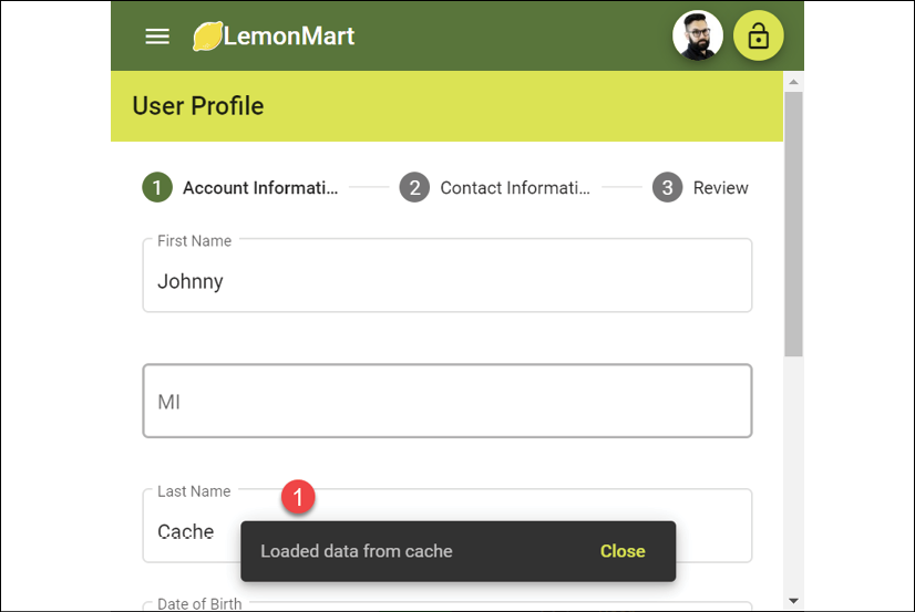
Figure 11.15: Data loaded from cache
Implementing a great UX around caching is incredibly challenging. I provided a rudimentary method to show what is possible. However, there are many edge cases that can impact how caching in your application works.
In my case, the cache stubbornly sticks around until we successfully save the data to the server. This may be frustrating for some users.
Congratulations! You've successfully implemented a sophisticated form to capture data from your users!
Exercise
Further enhance the login component to add a login helper for AuthMode.CustomServer.
Summary
In this chapter, we covered forms, directives, and user control-related functionality for LemonMart. We created reusable components that can be embedded within another component using data binding. We showed that you can use PUT to send data to the server and cache data input by the user. We also created a multistep input form that is responsive to changing screen sizes. We removed the boilerplate code from our components by leveraging reusable form parts, a base form class to house common functionality, and an attribute directive to encapsulate field-level error behavior and messages.
We created dynamic form elements with a date picker, typeahead support, and form arrays. We implemented interactive controls with input masking and the lemon rater. Using the ControlValueAccessor interface, we integrated the lemon rater seamlessly with our form. We showed that we can scale the size and complexity of our forms linearly by extracting the name as its own form section. Additionally, we covered building layouts using grid list.
In the next chapter, we will further enhance our components so that we can orchestrate them using the router. We will also implement a master/detail view and a data table, and explore NgRx as an alternative to using RxJS/BehaviorSubject.
Further reading
- Reactive forms, 2020, available at https://angular.io/guide/reactive-forms
- Attribute directives, 2020, available at https://angular.io/guide/attribute-directives
- rxweb: Good way to show the error messages in Angular Reactive Forms, Ajay Ojha, 2019, available at https://medium.com/@oojhaajay/rxweb-good-way-to-show-the-error-messages-in-angular-reactive-forms-c27429f51278
- The Control Value Accessor, Jennifer Wadella, 2019, available at https://www.youtube.com/watch?v=kVbLSN0AW-Y
- CSS Combinators, 2020, available at https://developer.mozilla.org/en-US/docs/Web/CSS/CSS_Selectors#Combinators
Questions
Answer the following questions as best as you can to ensure that you've understood the key concepts from this chapter without Googling. Do you need help answering the questions? See Appendix D, Self-Assessment Answers online at https://static.packt-cdn.com/downloads/9781838648800_Appendix_D_Self-Assessment_Answers.pdf or visit https://expertlysimple.io/angular-self-assessment.
- What is the difference between a component and a user control?
- What is an attribute directive?
- What is the purpose of the
ControlValueAccessorinterface? - What are serialization, deserialization, and hydration?
- What does it mean to patch values on a form?
- How do you associate two independent
FormGroupobjects with each other?