CHAPTER 4
Applying the Multimedia Principle
Use Words and Graphics Rather Than Words Alone
CHAPTER SUMMARY
People learn better from words and pictures than from pictures alone. This is the multimedia principle, which has been at the heart of research on multimedia learning and instruction for the past twenty-five years. The fruits of this research effort are exemplified in Multimedia Learning: Second Edition (Mayer, 2009) and The Cambridge Handbook of Multimedia Learning: Second Edition (Mayer, 2014), which Merrill (2015) states is “the world’s most comprehensive statement of and summary of research on principles of instruction” because “virtually all instruction has become multimedia” (p. 49). In the past decade we have seen growing consensus for the multimedia principle as one of the most recognized principles of instruction (Butcher, 2014; Halpern, Graesser, & Hackel, 2007; O’Neil, 2005; Pashler, Bain, Bottage, Graesser, Koedinger, McDaniel, & Metcalfe, 2007).
This chapter provides updated evidence concerning the multimedia principle and explores its boundary conditions. In particular, we provide evidence concerning (a) whether the multimedia principle depends on the experience level of the learners and (b) whether the multimedia principle depends on the graphics being static (illustrations or photos) or dynamic (animations or video).
Do Visuals Make a Difference?
In training, it is customary to use words—either in printed or spoken form—as the main vehicle for conveying information. Words are quick and inexpensive to produce. The question is whether there is any return on investment for supplementing words with pictures—either static graphics such as drawings or photos, or dynamic graphics such as animation or video. In particular, do people learn more deeply from words and graphics than from words alone? This is the issue we want to explore with you in this chapter.
Multimedia Principle: Include Both Words and Graphics
Based on cognitive theory and research evidence, we recommend that e-learning courses include words and graphics rather than words alone. By words, we mean printed text (that is, words printed on the screen that people read) or spoken text (that is, words presented as speech that people listen to through earphones, speakers, or telephone). By graphics we mean static illustrations such as drawings, charts, graphs, maps, or photos, and dynamic graphics such as animation or video. We use the term multimedia presentation to refer to any presentation that contains both words and graphics. For example, if you are given an instructional message that is presented in words alone, such as shown in Figure 4.1, we recommend you convert it into a multimedia presentation consisting of words and pictures, such as shown in Figure 4.2.

Figure 4.2 A Revision of Figure 4.1 with Visuals and Words.
Pictures should not be an afterthought. Instead of selecting pictures after the words are written, instructional designers should consider how words and pictures work together to create meaning for the learner. Therefore, visuals as well as words should be planned together as the job analysis is conducted and the course is designed.
Why Use Words and Graphics?
The rationale for our recommendation is that people are more likely to understand material when they can engage in active learning—that is, when they engage in relevant cognitive processing such as attending to the relevant material in the lesson, mentally organizing the material into a coherent cognitive representation, and mentally integrating the material with their existing knowledge. Multimedia presentations can encourage learners to engage in active learning by mentally representing the material in words and in pictures and by mentally making connections between the pictorial and verbal representations. When learners mentally connect words and pictures, they are engaged in meaningful learning that is more likely to support understanding, as measured by transfer tests. In contrast, presenting words alone may encourage learners—especially those with less experience or expertise—to engage in shallow learning, such as not connecting the words with other knowledge.
There are many examples of e-learning environments that contain window after window of text and more text. Simply presenting information is not all there is to instruction, because the instructor’s job is also to help guide the learner’s cognitive processing during learning. Incorporating graphics with words is a potentially valuable approach, but not all graphics are equally useful. For example, Figure 4.3 from a military course on ammunition presents scrolling text and a picture of a general as a decorative element. The graphic depicting the general does not support the text, but rather simply serves to decorate screen space.

Figure 4.3 A Decorative Graphic That Does Not Improve Learning.
Select Graphics That Support Learning
Instead of presenting words alone, we recommend presenting words and graphics. However, graphics differ in their instructional usefulness. For example, let’s consider several possible functions of graphics:
- Decorative graphics serve to decorate the page without enhancing the message of the lesson, such as a photo or a video of a person riding a bicycle in a lesson on how bicycle tire pumps work.
- Representational graphics portray a single element, such as a photo of the bicycle tire pump along with a caption, “bicycle tire pump.”
- Relational graphics portray a quantitative relationship among two or more variables, such as a line graph showing the relation between years of age on the x-axis and probability of being in a bicycle accident on the y-axis.
- Organizational graphics depict the relationships among elements, such as a diagram of a bicycle tire pump with each part labeled or a matrix giving a definition and example of each of three different kinds of pumps.
- Transformational graphics depict changes in an object over time, such as a video showing how to fix a flat tire or a series of annotated frames showing stages of how a bicycle tire pump works.
- Interpretive graphics illustrate invisible relationships, such as an animation of the bicycle pump that includes small dots to show the flow of air into and out of the pump.
Based on this analysis, we recommend that you minimize graphics that decorate the page (called decorative graphics) or simply represent a single object (called representational graphics), and that you incorporate graphics that help the learner understand the material (called transformational and interpretive graphics) or organize the material (called organizational graphics). For example, Table 4.1 is an organizational graphic that gives the name, definition, and example of six functions of graphics in the form of a matrix. When the text describes a quantitative relationship, then a relational graphic is warranted; and when the text describes changes over time, then a transformational graphic is warranted.
Table 4.1 An Organizational Graphic of Graphic Types.
| Graphic Type | Description | Examples |
| Decorative | Visuals added for aesthetic appeal or for humor |
|
| Representational | Visuals that illustrate the appearance of an aobject |
|
| Organizational | Visuals that show qualitative relationships among content |
|
| Relational | Visuals that summarize quantitative relationships |
|
| Transformational | Visuals that illustrate changes in time or over space |
|
| Interpretive | Visuals that make intangible phenomena visible and concrete |
|
Adapted from Clark and Lyons, 2011.
In Chapter 2, we summarized the dual channels principle that learners have separate channels for processing verbal material and pictorial material. We see that the job of an instructional professional is not just to present information—such as presenting text that contains everything the learner needs to know—but rather to leverage both channels in ways that enable learners to make sense out of the material.
In Chapter 1, we distinguished between behavioral and psychological engagement. Relevant visuals are one powerful method to support psychological engagement in the absence of behavioral activity. Providing relevant graphics with text is a proven method of fostering deeper cognitive processing in learners. In short, learning is facilitated when the graphics and text work together to communicate the instructional message.
Some Ways to Use Graphics to Promote Learning
Helping you determine how to create the best types of graphics to meet your instructional goals requires a book in itself. In fact, just such a book is Graphics for Learning: Second Edition by Ruth Colvin Clark and Chopeta Lyons. Here we offer three examples of ways to use graphics that serve instructional rather than decorative roles, including (1) providing topical organizers, (2) illustrating relationships, and (3) serving as lesson interfaces.
Graphics as Topic Organizers
Graphics such as topic maps can serve an organizational function by showing relationships among topics in a lesson. For example, Figure 4.4 shows a screen with a series of coaching topics mapped in the left-hand bar, including where to coach, when to coach, how long to coach, and so on. When the mouse is placed over each of the topics in the graphic organizer, a different illustration appears on the right side of the screen. In Figure 4.4, the topic of formal and informal coaching sessions is explained with text and photographs.

Figure 4.4 An Organizational Graphic on Coaching Topics.
Graphics to Show Relationships
Graphics in the form of dynamic and static graphs can make invisible phenomena visible and show relationships. Imagine an e-learning lesson to teach fast-food workers safe cooking and food-handling practices. An animated line graph with numbers on the vertical axis and time on the horizontal axis illustrates changes in bacterial growth in food cooked at different temperatures or handled in safe and unsafe ways. The lesson includes an interactive simulation in which the learner adjusts the cooking temperature and sees the impact on a dynamic line graph called a “germ meter.” In Figure 4.5, a geographic map from the U.S. Census Bureau uses color coding to show population shifts from the previous census. Clicking on a specific county brings up a table showing population changes by ethnic group.
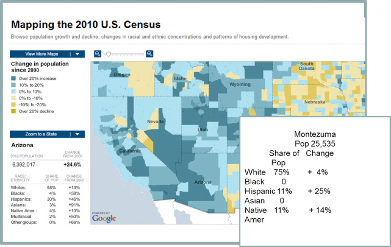
Figure 4.5 Use of Color and Tables to Illustrate Quantitative Relationships.
Graphics as Lesson Interfaces
Finally, courses designed using a guided discovery approach often use a graphical interface as a backdrop to present case studies. For example. in Figure 1.5 (page 17) we showed an interface for a troubleshooting course for automotive technicians. The virtual shop includes most of the testing tools available in a normal shop, allowing the learner to run and interpret tests to diagnose and repair an automotive failure.
Psychological Reasons for the Multimedia Principle
Perhaps the single greatest human invention is language, first in spoken form, then written form, then printed form, and more recently in electronic form. Words allow us to communicate effectively, and printed words in electronic form and spoken words recorded in electronic form allow us to communicate effectively across miles and years using computer technology. Therefore, it makes sense to use words when we provide training or instruction. For thousands of years, the main format for education has been words—both spoken and printed—and the same formats can be adapted for e-learning through on-screen text and recorded or synthesized speech, respectively.
Some e-learning designers may say that words are the most efficient and effective way of producing e-learning because words can convey a lot of information and are easier to produce than graphics. This line of thinking is based on the information acquisition view in which teaching consists of presenting information and learning consists of acquiring information, as summarized in the middle of Table 2.1 (page 34). Information can be delivered in many forms—such as printed words, spoken words, illustrations, photos, graphs, animation, video, and narration. Over the years, it has become clear that words are an efficient and effective method for presenting information so, based on this view, in most situations, instruction should involve simply presenting words. According to the information acquisition view, the format of the information (for example, words versus pictures) does not matter, as long as the information is delivered to the learner.
In our opinion, the information acquisition view is based on an inadequate conception of how people learn. Instead, we favor a knowledge construction view in which learning is seen as a process of active sense-making and teaching is seen as an attempt to foster appropriate cognitive processing in the learner, as summarized in the bottom of Table 2.1 (page 34). According to the knowledge construction metaphor, it is not good enough to deliver information to the learner; instructors must also guide the learner’s cognitive processing, thereby enabling and encouraging learners to actively process the information. An important part of active processing is to mentally construct pictorial and verbal representations of the material and to mentally connect them, as described in Chapter 2. According to cognitive theory, generative learning—that is, deeper learning aimed at meaning making—occurs when learners mentally construct connections between words and graphics. This goal is more likely to be achieved with multimedia lessons containing both words and corresponding pictures that work together to explain the same to-be-learned content. Adding relevant graphics to words can be a powerful way to help learners engage in active learning.
Evidence for Using Words and Pictures
There is consistent evidence that people learn more deeply from words and pictures than from words alone, at least for some simple instructional situations. Mayer (2009) reports that, across eleven different studies, researchers compared the test performance of students who learned from either animation and narration versus narration alone or from text and illustrations versus text alone (Mayer, 1989aa; Mayer & Anderson, 1991, 1992; Mayer, Bove, Bryman, Mars, & Tapangco, 1996; Mayer & Gallini, 1990; Moreno & Mayer, 1999a, 2002a). The lessons taught scientific and mechanical processes, including how lightning works, how a car’s braking system works, how pumps work, and how electrical generators work. For example, in one study students read an accurate verbal description of how a bicycle pump works (as shown in Figure 4.6), while others read the same verbal description and viewed a diagram depicting the same steps (as shown in Figure 4.7).
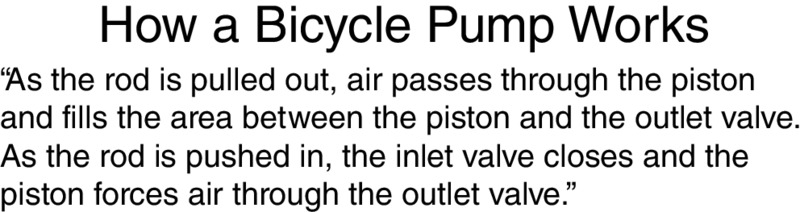
Figure 4.6 How a Bicycle Pump Works Explained with Words Alone. .
From Mayer, 2009

Figure 4.7 How a Bicycle Pump Works Explained with Words and Graphics.
Adapted from Mayer, 2009.
In all eleven comparisons, students who received a multimedia lesson consisting of words and pictures performed better on a subsequent transfer test than students who received the same information in words alone. Across the eleven studies, people who learned from words and graphics produced between 55 percent to 121 percent more correct solutions to transfer problems than people who learned from words alone. Across all studies, a median percentage gain of 89 percent was achieved with a median effect size greater than 1. Recall from our discussion in Chapter 3 that effect sizes over .5 indicate practical significance and an effect size of 1 is considered large. Figure 4.8 shows a result from one of these experiments.
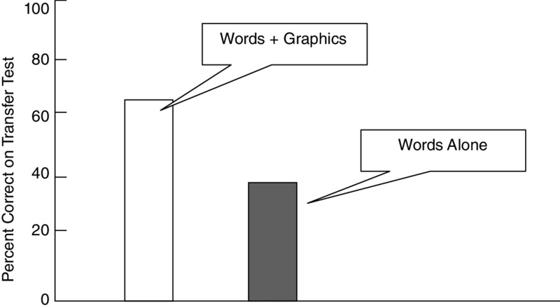
Figure 4.8 Learning Is Better from Words Plus Graphics Than from Words Alone. .
Adapted from Mayer, 2009
Similarly, Butcher (2006) found that people developed a deeper understanding of how the human heart works from text with simple illustrations than from text alone, and Cuevas, Fiore, and Oser (2002) found that students learned more deeply from an online lesson on the principles of flight when relevant diagrams were included. More recently, Yue, Bjork, and Bjork (2013) asked students to learn about the life cycle of stars from an audio podcast or from the same narration presented in sync with a series of pictorial slides. Consistent with the multimedia principle, students learned better from narrated slides than from narration alone.
We call this finding the multimedia principle—people learn more deeply from words and graphics than from words alone. In a recent review, Butcher (2014, p. 175) concluded: “The research literature supports the general prescription that effective learning materials should combine visual and verbal materials in targeting to-be-learned concepts.” The multimedia effect is the starting point for our discussion of best instructional methods for e-learning because it establishes the potential for multimedia lessons to improve human learning.
In recent years, the multimedia principle has been recognized as one of the most well-established principles of learning that can be applied to education. For example, in their review of “25 learning principles” commissioned by the Association of Psychological Science, Halpern, Graesser, and Hakel (2007) listed the “dual code and multimedia effects” as the third principle on their list: “Information is encoded and remembered better when it is delivered in multiple modes . . . than when delivered in only a single mode. . . .” In a practical guide on “organizing instruction and study to improve student learning” commissioned by the Institute of Education Sciences, Pashler, Bain, Bottage, Graesser, Koedinger, McDaniel, and Metcalfe (2007) offered “combine graphics with verbal descriptions” as their third of seven recommendations. In short, there is consensus among learning scientists that the multimedia principle has promise for instructional design.
The multimedia principle can also apply to the design of what we defined previously as organizational visuals, that is, charts that summarize the text in spatial form such as a hierarchy, matrix, or flow chart. For example, Stull and Mayer (2007) found that adding graphic organizers to the margins of a biology text resulted in improved test performance. In a related study, students learned better from a science text if it was accompanied by a causal diagram that summarized the main relationships from the text (McCrudden, Schraw, & Lehman, 2009; McCrudden, Schraw, Lehman, & Poliquin, 2007).
Finally, the multimedia principle applies to video examples, in which students learned better from reading a lesson on teaching techniques followed by viewing video examples rather than reading a lesson followed by reading text-based descriptions of examples (Moreno & Ortegano-Layne, 2008).
Learners Often Misjudge the Value of Graphics
Of course, not all graphics are equally effective, and students may misjudge the value of illustrations. Consistent with the multimedia principle, Sung and Mayer (2012a) found that college students learned more from an online multimedia lesson on distance learning than from text alone when the multimedia lesson contained instructive illustrations (that is, illustrations directly related to the instructional goal). However, students did not learn better when the added illustrations were decorative (that is, neutral illustrations that were not related to the instructional goal) or seductive (highly interesting illustrations that were not related to the instructional goal), although they reported liking the lesson much better when it contained any kind of illustration.
Jaeger and Wiley (2014) also reported that students tended to misjudge how much they were learning when a multimedia lesson contained decorative illustrations, but were more accurate in their judgments of learning for multimedia lessons with instructive illustrations or no illustrations at all. Glaser and Schwan (2015) found that students learned more from multimedia instruction when the text explicitly referred to the illustration, suggesting that learners may need some guidance in how to process illustrations. Overall, students appear to have difficulty in distinguishing illustrations that help them learn from those that do not help. For this reason, we recommend using only highly relevant, instructional illustrations and even pointing out in the text what to look for in the illustrations.
In the remainder of this section, we consider two additional research questions, concerning for whom the multimedia principle works (novices versus experts) and where the multimedia principle works (static illustrations versus animations).
The Multimedia Principle Works Best for Novices
Does the multimedia principle apply equally to all learners? There is evidence that our recommendation to use words and graphics is particularly important for learners who have low knowledge of the domain (whom we can call novices) rather than learners who have high knowledge of the domain (whom we can call experts). For example, in a series of three experiments involving lessons on brakes, pumps, and generators, Mayer and Gallini (1990) reported novices learned better from text and illustrations (such as shown in Figure 4.7) than from words alone (such as shown in Figure 4.6), but experts learned equally well from both conditions. Apparently, the more experienced learners were able to create their own mental images as they read the text about how the pump works, for example, whereas the less experienced learners needed help in relating the text to a useful pictorial representation.
In a related study, Ollershaw, Aidman, and Kidd (1997) presented text lessons on how pumps work to learners who had low or high knowledge of the domain. Low-knowledge learners benefited greatly when animation was added to the text, whereas high-knowledge learners did not. These and related results (Kalyuga, Chandler, & Sweller, 1998, 2000) led Kalyuga and colleagues (Kalyuga, 2014; Kalyuga, Ayres, Chandler, & Sweller, 2003) to propose the expertise reversal effect—the idea that instructional supports that help low-knowledge learners may not help (and may even hurt) high-knowledge learners. Overall, we recommend that you be sensitive to the level of prior knowledge of your learners, so that you can provide needed supports—such as multimedia instruction—to low-knowledge learners. If you are working on a course for a less advanced group of learners—beginning trainees, for example—you should be especially careful to supplement text-based instruction with coordinated graphics. If you have a more advanced group of learners, such as medical residents or engineers, experienced in the topic you are presenting, they may be able to learn well mainly from text or even mainly from graphics.
Should You Change Static Illustrations into Animations?
If it is important to add graphics to words, is it better to use animations or static illustrations? Animations are currently very popular additions to many e-learning lessons. At first glance, you might think that animations are best because they are an active medium, which can depict changes and movement. Similarly, you might think that static illustrations are a poorer choice because they are a passive medium, which cannot depict changes and movement in as much detail as animations can. In spite of these impressions, a number of research studies have failed to find that animations are more effective than a series of static frames depicting the same material (Betrancourt, 2005; Hegarty, Kriz, & Cate, 2003; Mayer, Hegarty, Mayer, & Campbell, 2005; Tversky, Morrison, & Betrancourt, 2002).
Let’s consider two ways to use multimedia to explain how lightning storms develop—a paper-based lesson of a series of static illustrations with printed text (as shown in Figure 4.9) or a computer-based lesson of narrated animations in which the words are spoken and the transitions between frames are animated. On a transfer test, students in the paper group performed 32 percent better than students in the computer group, yielding an effect size of .55 (Mayer, Hegarty, Mayer, & Campbell, 2005). In four such comparisons—involving lessons on lightning, ocean waves, hydraulic brakes, and toilet tanks—the illustrations-and-text group always performed better than the animation-and-narration group, yielding a median effect size of .57. Presumably, the so-called passive medium of illustrations and text actually allowed for active processing because the learners had to mentally animate the changes from one frame to the next, and learners were able to control the order and pace of their processing. In contrast, the so-called active medium of animations and narration may foster passive learning because the learner did not have to mentally animate and could not control the pace and order of the presentation. In addition, animation may impose extraneous cognitive load because the images are so rich in detail and are so transitory that they must be held in memory. In contrast, a series of static frames does not impose extra cognitive load because the learner can always review a previous frame.
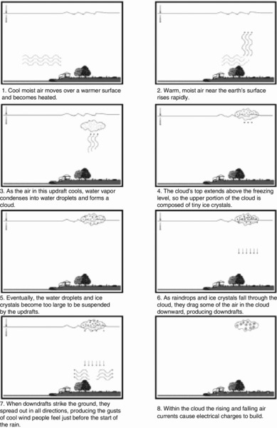
Figure 4.9 A Series of Static Visuals to Teach How Lightning Forms. .
From Mayer, Hegarty, Mayer, and Campbell, 2005
Use Animations to Illustrate Procedures
In spite of these results, there may be some content that is particularly suited to animation or video rather than static frames of illustrations or photos, such as descriptions of how to perform a motor skill. There is some evidence that animations (or video) may be particularly helpful for tasks that require complicated manual skills. For example, animation was more effective than static diagrams in helping students learn to make paper flowers and hats through paper folding (ChanLin, 1998; Wong, Marcus, Ayres, Smith, Cooper, Paas, & Sweller, 2009), learn to tie knots and complete puzzle rings (Ayres, Marcus, Chan, & Qian, 2009; Marcus, Cleary, Wong, & Ayres, 2013), and learn to perform an assembly task (Watson, Butterfield, Curran, & Craig, 2010). In contrast, studies in which static diagrams are better or just as effective as animations tend to involve explanations of how a complex system works, such as a braking system or how ocean waves work. In other words, it appears that static visuals might be most effective to promote understanding of conceptual information, whereas animated visuals may be more effective to teach hands-on procedures. Similarly, in a review of research, Hoffler and Leutner (2007) found that animation was more effective than static illustrations when the content involved procedural-motor skills rather than when the content involved conceptual understanding or factual retention. This point is repeated in a more recent review comparing static and dynamic graphics (Lowe & Schnotz, 2015), along with recommendations to use animation only when it can serve a useful purpose.
Use Animations as Interpretive Graphics
Additionally, animations can serve an interpretive function when designed with special effects that reveal relationships not otherwise visible. Hegarty (2004) suggests that “dynamic displays can distort reality in various ways such as slowing down some processes and speeding up others, showing an object or phenomenon from different or changing viewpoints, augmenting the display with cues to draw viewers’ attention to the most relevant parts, or having moving objects leave a trace or wake” (p. 345). A time-lapse video of seed germination or a slow motion video of hummingbirds in flight are two examples of how special effects can make phenomena visible.
Add Visual Cueing to Animations
In some situations, animations can be cognitively demanding and learners may not know where to look or how to put the information together. In these situations, the effectiveness of animations can be improved through the use of visual cueing, such as changes in color, arrows, or circling. For example, test performance was improved when visual cueing was added to multimedia animations on the human circulatory system (de Koning, Tabbers, Rikers, & Paas, 2007, 2011a, 2011b), piano mechanisms (Boucheix, Lowe, Putri, & Groff, 2013), and scientific processes (Lin & Atkinson, 2011). In a review, de Koning, Tabbers, Rikers, and Paas (2009) suggest that some types of visual cueing can be used to direct attention whereas other can show relations and organization.
Animations: The Bottom Line
Animations can cost more to develop than static diagrams, so it makes sense to use a series of static frames as your default graphic. Overall, our recommendation is to use static illustrations unless there is a compelling instructional rationale for animation. In particular, when you have an explanative illustration, we recommend presenting a series of static frames to depict the various states of the system rather than a lock-step animation.
What We Don’t Know About Visuals
We have good evidence that relevant visuals promote learning. Now it’s time to find out more about what types of visuals are most effective for different learners and instructional goals. Some of the unresolved issues around graphics include:
- What are the long-term effects of graphics? Most of our research data measures learning immediately after taking the lesson. We need more information on the effectiveness of visuals for longer-term learning.
- What is the return on investment of graphics? Explanatory visuals can be time-consuming to produce and require an investment in graphic design resources. What are the cost benefits for creating customized visuals to illustrate technical content?
Chapter Reflection
- Contemporary authoring systems and graphic resources such as clip art and stock photos make applying the multimedia principle easier than in the past. In your experience, have graphics been used effectively in e-learning? Why or why not?
- Suppose you are asked to develop an e-lesson with a limited budget. What factors would you consider in determining what proportion of your budget to use for graphics?
- Describe three instructional goals not included in this chapter that might benefit from animations rather than static visuals. For each description indicate what kind of cueing you might include.
COMING NEXT
In this chapter we have seen that learning is improved by the use of relevant graphics combined with words to present instructional content. In the next chapter, we will build on this principle by examining the contiguity principle that addresses the best ways to position graphics and related text on the screen.
Suggested Readings
- Butcher, K.R. (2006). Learning from text with diagrams: Promoting mental model development and inference generation. Journal of Educational Psychology, 98, 182–197. Reports a key study on the multimedia principle.
- Butcher, K.R. (2014). The multimedia principle. In R.E.Mayer (Ed.), The Cambridge handbook of multimedia learning (2nd ed., pp. 174–205). New York: Cambridge University Press. Provides an up-to-date review of the evidence for the multimedia principle.
- Clark, R.C., & Lyons, C. (2011). Graphics for learning (2nd ed.). San Francisco: Pfeiffer. Summarizes research and practice on incorporating graphics into multimedia instruction.
- Mayer, R.E. (1989a). Systematic thinking fostered by illustrations in scientific text. Journal of Educational Psychology, 81, 240–246. Reports a classic study on the multimedia principle.
- Mayer, R. E. (2009). Multimedia learning (2nd ed.). New York: Cambridge University Press. Provides theory and evidence supporting the multimedia principle.
PCHAPTER OUTLINE
- Principle 1: Place Printed Words Near Corresponding Graphics
- Violations of Contiguity Principle 1
- Separation of Text and Graphics on Scrolling Screens
- Separation of Feedback from Questions or Responses
- Separating Content with Linked Windows
- Presenting Exercise Directions Separate from the Exercise
- Displaying Captions at the Bottom of Screens
- Using a Legend to Indicate the Parts of a Graphic
- Displaying Running Text in a Separate Window with Animations or Video
- Psychological Reasons for Contiguity Principle 1
- Evidence for Contiguity Principle 1
- Principle 2: Synchronize Spoken Words with Corresponding Graphics
- Violations of Contiguity Principle 2
- Separation of Graphics and Narration Through Icons
- Separation of Graphics and Narration in a Continuous Presentation
- Psychological Reasons for Contiguity Principle 2
- Evidence for Contiguity Principle 2
- What We Don’t Know About Contiguity