A line chart shows the relationship between two variables; it is similar to a scatter plot, but the points are connected by line segments. One difference between the usage of a scatter plot and a line chart is that, typically, it's more meaningful to use the line chart if the variable being plotted on the x-axis has a one-to-one relationship with the variable being plotted on the y-axis. A line chart should be used when you have enough data points, so that a smooth line is meaningful to see a functional dependence:
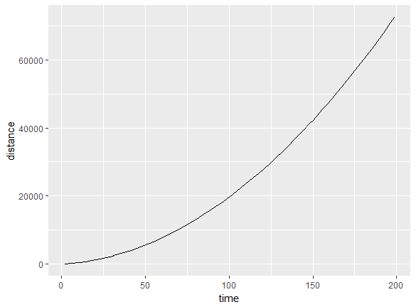
We could have also used a line chart for the previous plot. The advantage of using a line chart is that the discrete nature goes away and you can see trends more easily, while the functional form is more effectively visualized.
If there is more than one y value for a given x, the data needs to be grouped by the x value; then, one can show the features of interest from the grouped data, such as the mean, median, maximum, minimum, and so on. We will use grouping in the next section.