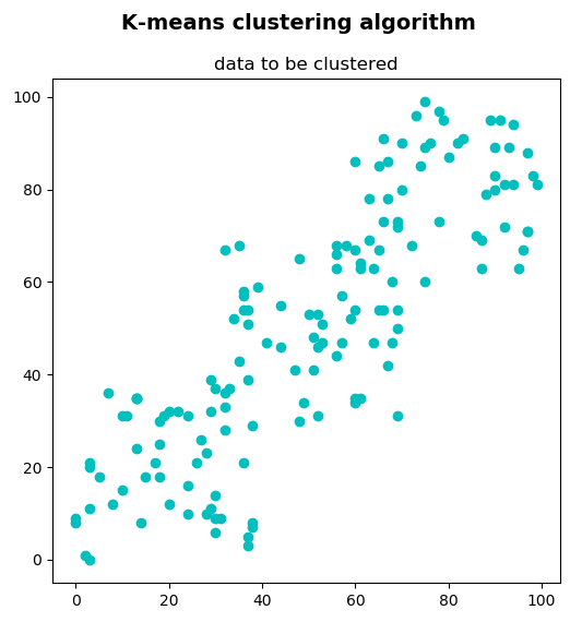
In this example, we are going to cluster a set of 2D points using the k-means clustering algorithm. This set of 2D points can be seen as a collection of objects, which has been described using two features. This set of 2D points can be created and visualized with the k_means_clustering_data_visualization.py script.
The output of this script can be seen in the next screenshot:

This set of 2D points consists of 150 points, created in this way:
data = np.float32(np.vstack(
    (np.random.randint(0, 40, (50, 2)), np.random.randint(30, 70, (50, 2)), np.random.randint(60, 100, (50, 2)))))
This will represent the data for clustering. As previously mentioned, it should be of np.float32 type and each feature should be placed in a single column.
In this case, there are two features corresponding to the (x, y) coordinates for each point. These coordinates can represent, for example, the height and weight for each of the 150 people, or the number of bedrooms and size for each of the 150 houses. In the first case, the k-means clustering algorithm will decide the size of the T-shirt (for example, small, medium, or large if K=3), while in the second case, the k-means clustering algorithm will decide the price of the house (for example, cheap, average, expensive, or very expensive if K = 4). In summary, data will be the input for our clustering algorithm.
In the next scripts, we will see how it can be clustered using different values of K and its corresponding visualization. To do so, we have coded three scripts:
- k_means_clustering_k_2.py: In this script, data has been clustered into two groups (K = 2).
- k_means_clustering_k_3.py: In this script, data has been clustered into three groups (K = 3).
- k_means_clustering_k_4.py: In this script, data has been clustered into four groups (K = 4).
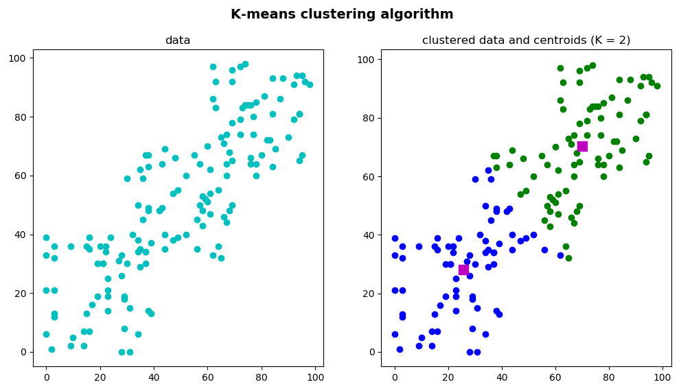
In the k_means_clustering_k_2.py script, data has been clustered into 2 clusters. The first step is to define the algorithm-termination criteria. In this case, the maximum number of iterations is set to 20 (max_iterm = 20) and epsilon is set to 1.0 (epsilon = 1.0):
criteria = (cv2.TERM_CRITERIA_EPS + cv2.TERM_CRITERIA_MAX_ITER, 20, 1.0)
The next step is to apply the k-means algorithm using the cv2.kmeans() function:
ret, label, center = cv2.kmeans(data, 2, None, criteria, 10, cv2.KMEANS_RANDOM_CENTERS)
At this point, we can separate the data using the label output, which stores the cluster indices for each sample. Therefore, we can split the data into different clusters depending on their labels:
A = data[label.ravel() == 0]
B = data[label.ravel() == 1]
The final step is to plot both A and B as well as the original data without being clustered for a better understanding of the clustering procedure:
# Create the dimensions of the figure and set title:
fig = plt.figure(figsize=(12, 6))
plt.suptitle("K-means clustering algorithm", fontsize=14, fontweight='bold')
fig.patch.set_facecolor('silver')

# Plot the 'original' data:
ax = plt.subplot(1, 2, 1)
plt.scatter(data[:, 0], data[:, 1], c='c')
plt.title("data")

# Plot the 'clustered' data and the centroids
ax = plt.subplot(1, 2, 2)
plt.scatter(A[:, 0], A[:, 1], c='b')
plt.scatter(B[:, 0], B[:, 1], c='g')
plt.scatter(center[:, 0], center[:, 1], s=100, c='m', marker='s')
plt.title("clustered data and centroids (K = 2)")

# Show the Figure:
plt.show()
The output of this script can be seen in the next screenshot:

You can see that we have also plotted center, which is an array that contains the center for each cluster.
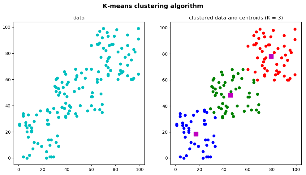
In the k_means_clustering_k_3.py script, the same procedure is applied to cluster the data, but we have decided to group the data into 3 clusters (K = 3). Therefore, when calling the cv2.kmeans() function, the K parameter is set to 3:
ret, label, center = cv2.kmeans(data, 3, None, criteria, 10, cv2.KMEANS_RANDOM_CENTERS)
Additionally, when separating data using the label output, three groups are obtained:
A = data[label.ravel() == 0]
B = data[label.ravel() == 1]
C = data[label.ravel() == 2]
The final step is to show A, B, and C, as well as the centroids and the original data:
# Create the dimensions of the figure and set title:
fig = plt.figure(figsize=(12, 6))
plt.suptitle("K-means clustering algorithm", fontsize=14, fontweight='bold')
fig.patch.set_facecolor('silver')

# Plot the 'original' data:
ax = plt.subplot(1, 2, 1)
plt.scatter(data[:, 0], data[:, 1], c='c')
plt.title("data")

# Plot the 'clustered' data and the centroids
ax = plt.subplot(1, 2, 2)
plt.scatter(A[:, 0], A[:, 1], c='b')
plt.scatter(B[:, 0], B[:, 1], c='g')
plt.scatter(C[:, 0], C[:, 1], c='r')
plt.scatter(center[:, 0], center[:, 1], s=100, c='m', marker='s')
plt.title("clustered data and centroids (K = 3)")

# Show the Figure:
plt.show()
In the previous snippet, we plot both the original data and the 'clustered' data and the centroids in the same figure. The output of this script can be seen in the next screenshot:

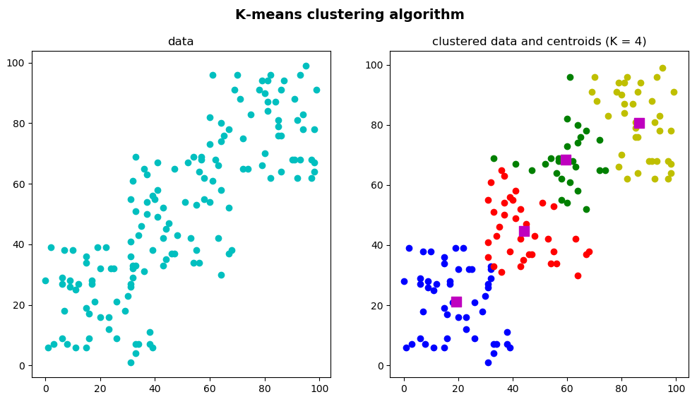
For the sake of completeness, we have also coded the k_means_clustering_k_4.py script, whose output can be seen in the next screenshot:

As can be seen, the number of clusters is set to 4 (K = 4).