Continuing with what we learned in the last chapter, in this chapter, we will take a closer look at how GUIs can be made for iOS. We will go through the central concepts of UI and start looking at how we can bridge the gap between UI and the code we write using the Swift programming language.
We will finish the chapter by making a small application that will be able to handle user input and, based on that, change the colors of the background. To make it even more cool, we will change the colors using animation. In other words, we will be doing the following things:
- Looking at the fundamental concepts of UI, such as view hierarchy, frames, bounds, and Auto Layout
- Looking at the view life cycle that will make it easier for developers to know the state of the app
- Making a small application where we will tie our UI with some code that we will write to change the background color of our application
In Chapter 11, Simon Says, we created a simple UI with four subviews, each representing a color in the Simon Says memory game. Toward the end of the chapter, we tried to run our application on a device with a different screen size and noted how our UI elements did not scale and the interface ended up looking different from how we wanted it to look. In this section, we will dive deeper into how GUI works in order to come up with a better strategy to lay out our UI.
A UI in iOS is built using something we refer to as views. A view represents an element, such as an icon, menu, text field, or a button. A view can have multiple child views or subviews and a view can have one parent view. Let's illustrate this with a simple example:
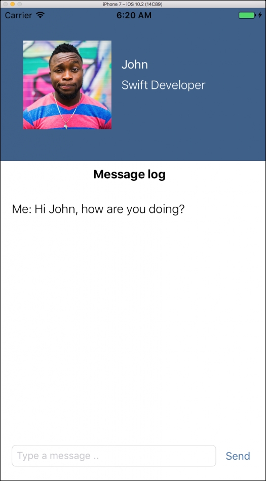
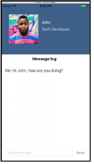
This UI is supposed to look like a chat interface, where the user of the app is able to write messages back and forth with John. Let's go through the different UI elements:
- Profile section, which is the blue area at the top
- Profile image
- Profile name
- Profile occupation
- Message section, which is the white area that takes up most of the view
- Message log headline
- A label showing the last written message
- Text field to write messages
- Button to submit messages
When you look at the UI and argue how the different elements are placed or laid out in the app, it is reasonable to say that the profile section (the blue area) contains other UI elements, such as the profile picture, profile name, and occupation. If we imagine the UI being in a 3D space, we can see that those elements are placed on top of the blue area. We can also say that the Message log title and the last written chat message (Me: Hi John, how are you doing?) has the same parent view and neither contains any other views.
This is very similar to how we describe view hierarchies in iOS-when we lay out the views in the UI of an iOS app, we do it using view hierarchies. This means that each view (for instance, an image or a label) has one parent view, but can potentially have multiple child or subviews, with the exception of the view that we can refer to as the main view. The main view is the view that defines the bounds of our application, which means that it defines the size of our application. This will vary depending on which Apple device we target when we write our iOS application. The main view will not have any parent view as it is the lowest or the first view in the hierarchy.
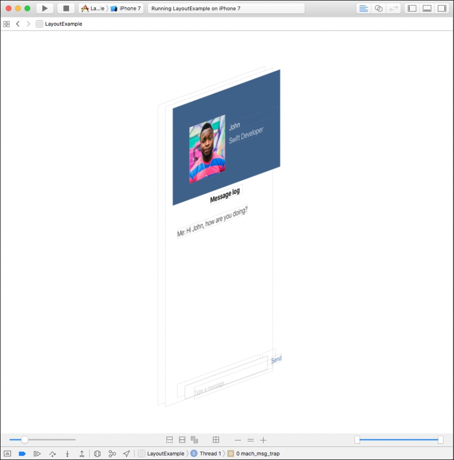
All the other views will have one parent view (we say that it is placed inside the parent view) and can have none or multiple subviews. Xcode has a feature to debug the view hierarchy, which will give us this representation of our user interface:
If you want to use this tool for one of your applications, you will then have to open Interface Builder, for example, by opening a .storyboard file. Then while your application is running, a bar at the bottom of Interface Builder will appear. Clicking on the two rectangles with the name Debug View Hierarchy will open up the tool.
Using this tool, we can see how elements are placed in a 3D space where views are contained (placed on top of) on other views. If we look at our list of UI elements, we can now write this in a slightly different way according to the preceding screenshot:
- Main view
- Profile section, which is the blue area at the top
- Profile image
- Profile name
- Profile occupation
- Message section, which is the white area that takes up most of the view
- Message log headline
- A label showing the last written message
- Text field to write messages
- Button to submit messages
- Profile section, which is the blue area at the top
This means that we have a main view that does not have any parent and that has multiple subviews. These subviews include the profile section that also has its own subviews, such as the profile image. The main view also has other subviews, such as the message log title and the last written chat message. The text field and button at the bottom look like they have multiple views, but this is due to some technical details that are not important at this point.
We have now seen how elements are placed in a UI using a hierarchy of views. The next step is to look at how elements are placed in the 2D space, that is, how do we size views and how do we place them according to the bounds of the main view.
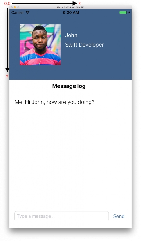
We lay out views in iOS using a coordinate system. The coordinate system has its origin in the top-left corner of the screen and we refer to this point as 0,0. The horizontal axis of the coordinate system is labelled with X and the vertical axis of the coordinate system is labelled with Y. This means that (X, Y) = (5, 10) refers to a point on the screen found by counting 5 points from the left of the screen toward right and by counting 10 points from the top of the screen toward the bottom:
A size refers to the amount of points a view should take up on the screen. A size is defined as having a width and a height. The combination of a view's location (using a point in the coordination system) and the size of a view gives us the view's frame. We say that a view's frame describes a view's location and size in relation to its parent's view coordinate system. In the preceding example interface, we lay out the profile section (the blue area) according to the main view (the bounds of the screen with a white background). The profile picture, however, is laid out according to the profile section. This means that if we change the position of the profile section, all its subviews will follow, which also seems intuitive if we think of the profile section containing its subviews.
Note
We refer to locations and sizes in our coordinate system in points instead of pixels. As the pixel density of iOS device screens increases, it becomes harder to align interfaces across devices with different pixel density. A view placed in our interface and defined in pixels will look smaller and smaller if run on devices with higher and higher pixel density. To avoid having to deal with resizing, we use points instead and let the iOS do it for us.
Bounds, on the other hand, refers to the location and size of a view in relation to its own coordination system (opposed to its parent coordination system). We've already referred to the bounds of the screen as being the canvas for where we can draw and lay out views for our UI. This means that the bounds of our profile section describe the canvas for where any subview is able to lay out views. This means that when we add a profile picture as a subview to the profile section, the bounds of the profile section define how we can position our profile picture.
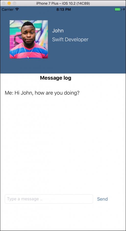
In the early days of iOS programming, laying out UI using frames and bounds was easy and commonly used by programmers. Laying out views using frames and bounds is somewhat intuitive and it is fairly easy to use Xcode's visual tools to drag and drop UI elements into a view. However, with the rise of additional iOS devices with different screen sizes, the approach of using frames and bounds became difficult. As the screen dimension could now be very different depending on if it was an iPhone 7 or an iPad that was running the application, one had to do a lot of view calculations in order to scale a view. Let's illustrate this example by looking at the UI we created earlier. This is how it looked on an iPhone 7:
Let's see how this view looks on an iPhone 7 Plus:
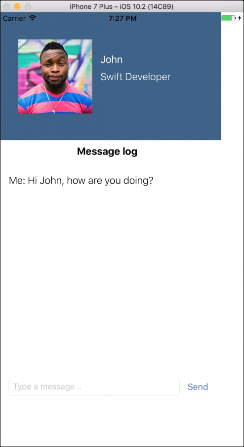
What just happened? We took the same view that looked fine on the iPhone 7 and tried to run it on an iPhone 7 Plus that has a bigger screen and, for some reason, the interface now looks odd. There is some extra white space on the right and at the bottom of the screen, which was not the case on the iPhone 7.
It is not by coincidence that the origin of the screen's coordinate system is at the top-left corner of the screen and the white space that appears after running the app (on an iPhone 7 Plus) is visible on the right side and at the bottom of the screen. This example points exactly to the limitation of laying out views using frames and bounds, that is, one needs to calculate where to position views if the screen size or rotation changes. In this example, we placed the profile section at the top-left corner of the main view and gave it a fixed height and width that aligned it with the bounds of the iPhone 7. When we lay out the same view on a different screen size, for example, the iPhone 7 Plus, the view will look different.
This is why Apple introduced Auto Layout. It lets us design interfaces in a relative manner, which makes it more flexible and generic, as opposed to being fixed. Basically, the way Auto Layout works in is that you set up a set of constraints. Then, when the application is running, the device will try to satisfy these constraints whether the orientation of the device changes or the same application is being run on another device with a different screen size. Here are a couple of examples of constraints that can be made using Auto Layout:
- Distance from a view's edge (being top, bottom, left, or right) to another view's edge
- The width/height of a view in relation to the width/height of another view
- Center a view horizontally/vertically inside its parent view
Let's consider the top part of our interface, the profile section:
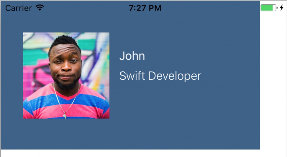
We clearly have a problem with the width of our profile section now that the width of the screen size has increased (going from iPhone 7 to iPhone 7 Plus). Instead of setting a fixed size of the profile section, let's try to express it in a relative manner. We can say that we want our profile section (the blue area) to have 0 points of distance from the left and right edge to its parent view (the main view). This will mean that even though the width of the screen changes, the profile section will always just align with the right and left edges of the screen. In other words, it will fill up the horizontal space. How do we express the height in a relative manner? One approach can be to use the same technique as we just did with the width, but then introducing x points of spacing from the bottom of our profile section to the bottom of the screen; this means that if the height of the screen grows, the profile section also grows in height and vice versa; however, the tricky part is to define this value for the number of points we need for spacing. Another approach can be to have the height of the profile section proportional to the height of the screen.
This will make the relationship between the profile section and the screen more flexible in the sense that we directly express the proportional size relationship without having to know anything about the expected height. Adding these two constraints will make our interface look a little better:
Right now, the profile section's height will be 30% of the height of the screen size. This means that as the height of the device changes, the profile section's height will proportionally follow. The next step will be to ensure that the profile picture, name, and occupation will align correctly inside the profile section even though the size of the profile section will change. However, for introducing Auto Layout and the general principle of wanting to express the layout in a relative manner, this is fine for now.