DIRECTORY OF TRADING PATTERNS AND DATABANK
CONTENTS
- Dow Jones Industrials Market Probability Calendar 2016
- Recent Dow Jones Industrials Market Probability Calendar 2016
- S&P 500 Market Probability Calendar 2016
- Recent S&P 500 Market Probability Calendar 2016
- NASDAQ Market Probability Calendar 2016
- Recent NASDAQ Market Probability Calendar 2016
- Russell 1000 Index Market Probability Calendar 2016
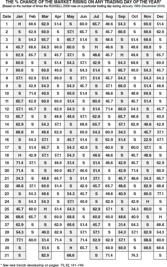
- Russell 2000 Index Market Probability Calendar 2016
- Decennial Cycle: A Market Phenomenon
- Presidential Election/Stock Market Cycle: The 182-Year Saga Continues
- Dow Jones Industrials Bull and Bear Markets Since 1900
- Standard & Poor's 500 Bull and Bear Markets Since 1929/NASDAQ Composite Since 1971
- Dow Jones Industrials 10-Year Daily Point Changes: January and February
- Dow Jones Industrials 10-Year Daily Point Changes: March and April
- Dow Jones Industrials 10-Year Daily Point Changes: May and June
- Dow Jones Industrials 10-Year Daily Point Changes: July and August
- Dow Jones Industrials 10-Year Daily Point Changes: September and October
- Dow Jones Industrials 10-Year Daily Point Changes: November and December
- A Typical Day in the Market
- Through the Week on a Half-Hourly Basis
- Tuesday Most Profitable Day of Week
- NASDAQ Strongest Last 3 Days of Week
- S&P Daily Performance Each Year Since 1952
- NASDAQ Daily Performance Each Year Since 1971
- Monthly Cash Inflows into S&P Stocks
- Monthly Cash Inflows into NASDAQ Stocks
- November, December, and January: Year's Best Three-Month Span
- November Through June: NASDAQ's Eight-Month Run
- Dow Jones Industrials Annual Highs, Lows, and Closes Since 1901
- S&P 500 Annual Highs, Lows, and Closes Since 1930
- NASDAQ, Russell 1000 and 2000 Annual Highs, Lows, and Closes Since 1971
- Dow Jones Industrials Monthly Percent Changes Since 1950
- Dow Jones Industrials Monthly Point Changes Since 1950
- Dow Jones Industrials Monthly Closing Prices Since 1950
- Standard & Poor's 500 Monthly Percent Changes Since 1950
- Standard & Poor's 500 Monthly Closing Prices Since 1950
- NASDAQ Composite Monthly Percent Changes Since 1971
- NASDAQ Composite Monthly Closing Prices Since 1971
- Russell 1000 Monthly Percent Changes and Closing Prices Since 1979
- Russell 2000 Monthly Percent Changes and Closing Prices Since 1979
- 10 Best Days by Percent and Point
- 10 Worst Days by Percent and Point
- 10 Best Weeks by Percent and Point
- 10 Worst Weeks by Percent and Point
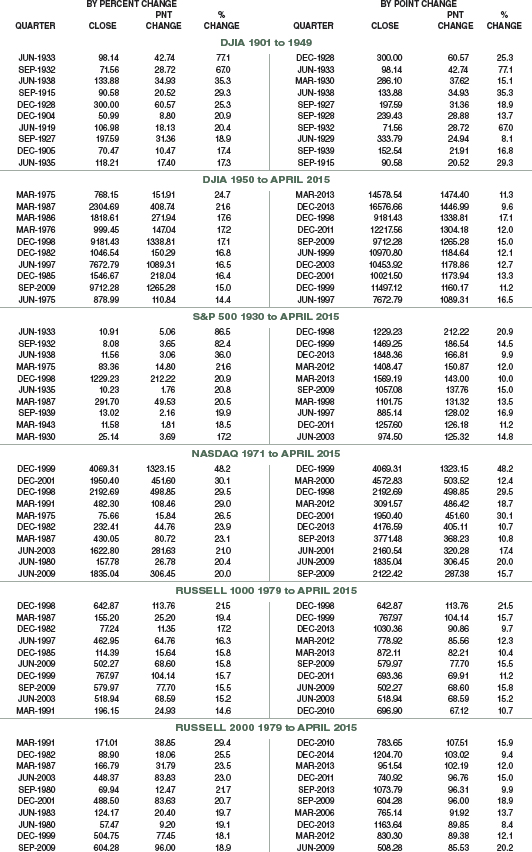
- 10 Best Months by Percent and Point
- 10 Worst Months by Percent and Point
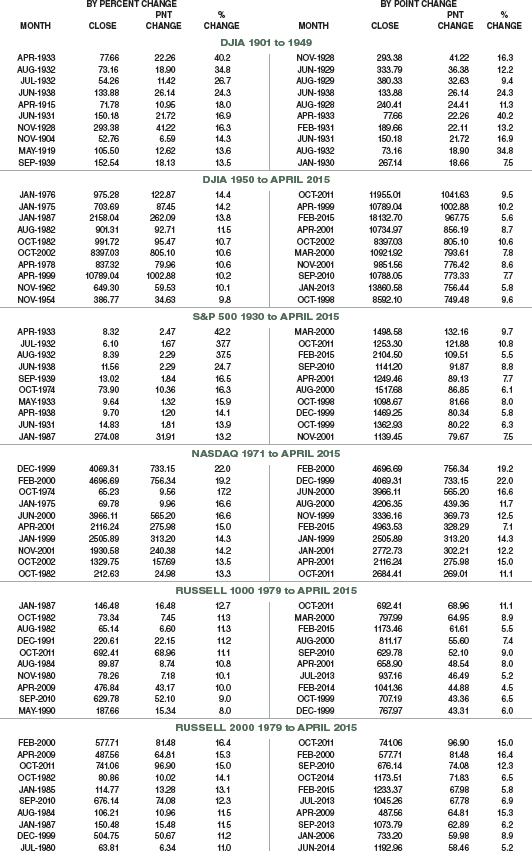
- 10 Best Quarters by Percent and Point
- 10 Worst Quarters by Percent and Point
- 10 Best Years by Percent and Point
- 10 Worst Years by Percent and Point
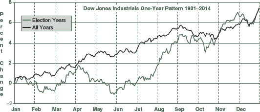
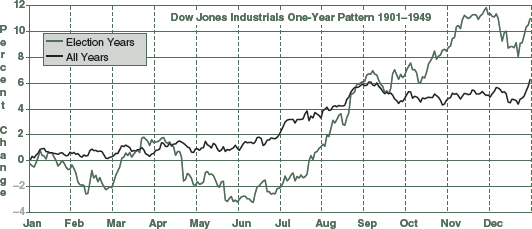
- Dow Jones Industrials One-Year Seasonal Pattern Charts Since 1901
- S&P 500 One-Year Seasonal Pattern Charts Since 1930
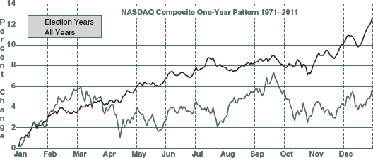
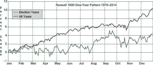
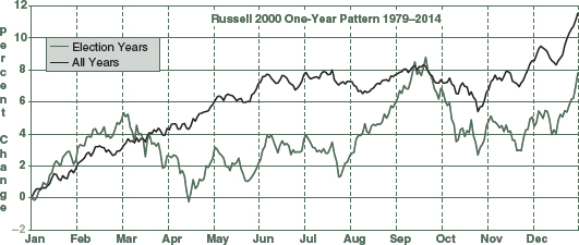
- NASDAQ, Russell 1000 & 2000 One-Year Seasonal Pattern Charts Since 1971
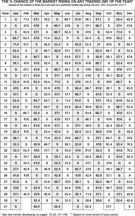
DOW JONES INDUSTRIALS MARKET PROBABILITY CALENDAR 2016

RECENT DOW JONES INDUSTRIALS MARKET PROBABILITY CALENDAR 2016
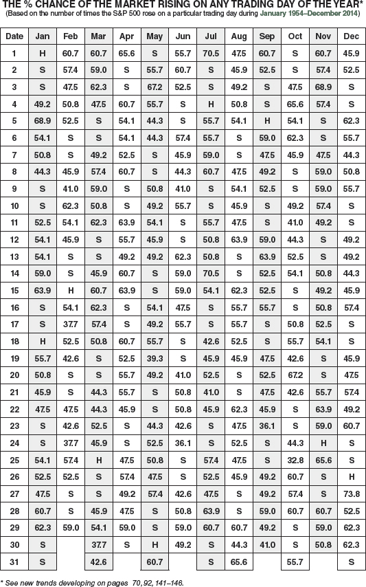
S&P 500 MARKET PROBABILITY CALENDAR 2016
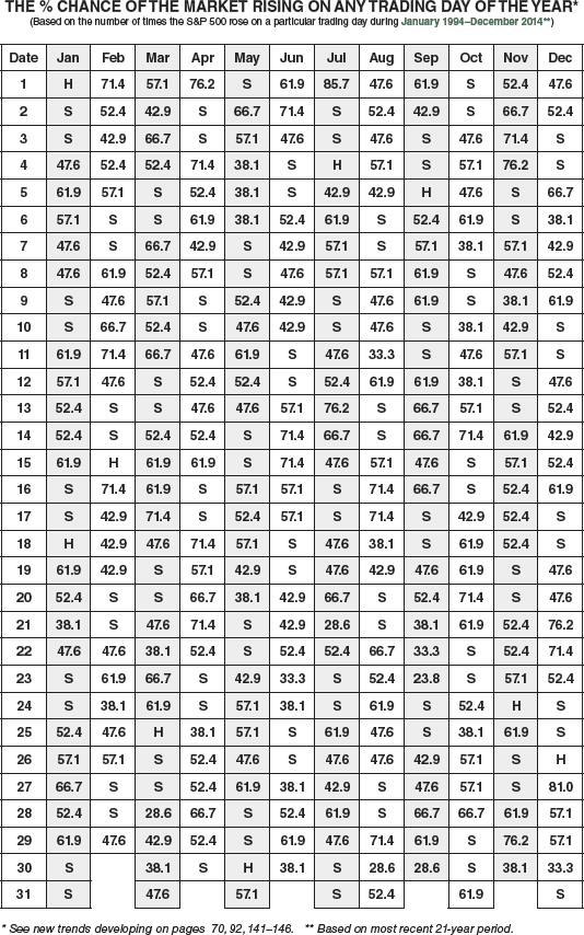
RECENT S&P 500 MARKET PROBABILITY CALENDAR 2016
NASDAQ COMPOSITE MARKET PROBABILITY CALENDAR 2016

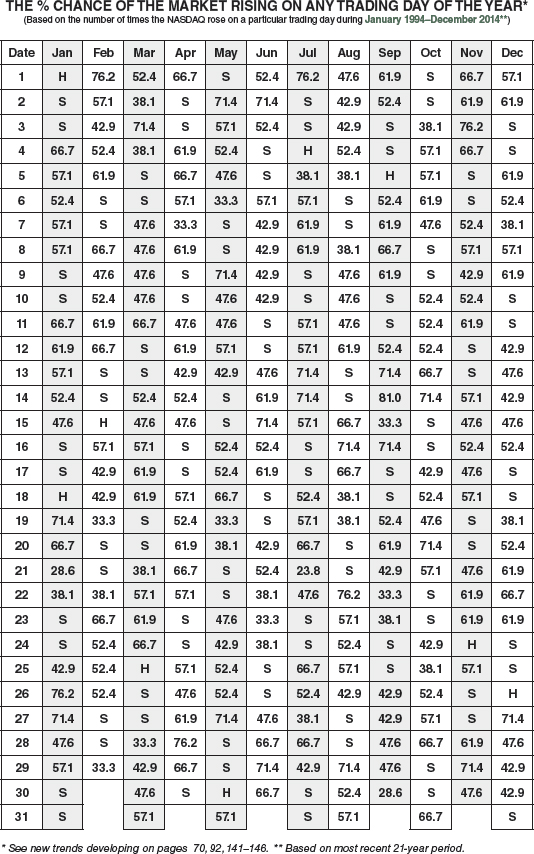
RECENT NASDAQ COMPOSITE MARKET PROBABILITY CALENDAR 2016
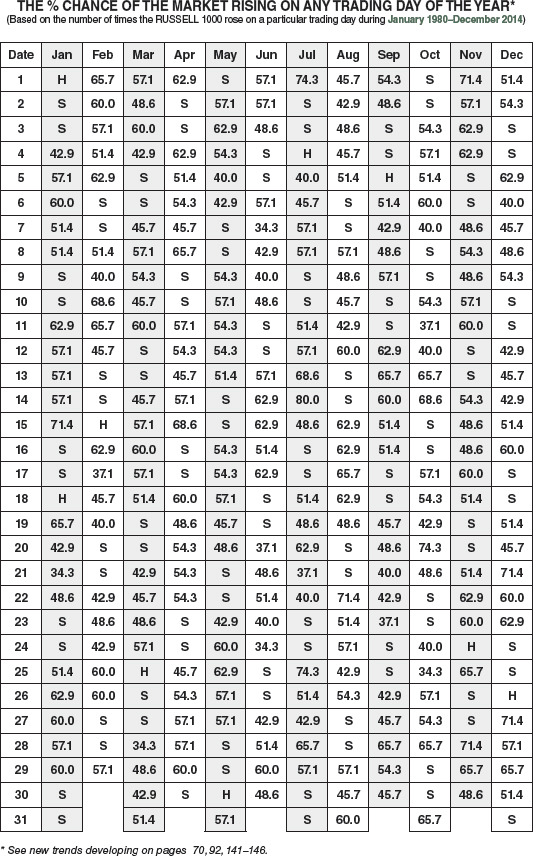
RUSSELL 1000 INDEX MARKET PROBABILITY CALENDAR 2016
RUSSELL 2000 INDEX MARKET PROBABILITY CALENDAR 2016
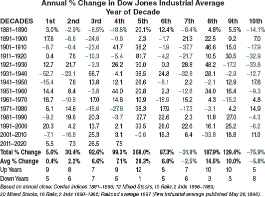
DECENNIAL CYCLE: A MARKET PHENOMENON
By arranging each year's market gain or loss so that the first and succeeding years of each decade fall into the same column, certain interesting patterns emerge—strong fifth and eighth years; weak first, seventh, and zero years.
This fascinating phenomenon was first presented by Edgar Lawrence Smith in Common Stocks and Business Cycles (William-Frederick Press, 1959). Anthony Gaubis co-pioneered the decennial pattern with Smith.
When Smith first cut graphs of market prices into 10-year segments and placed them above one another, he observed that each decade tended to have three bull market cycles and that the longest and strongest bull markets seem to favor the middle years of a decade.
Don't place too much emphasis on the decennial cycle nowadays, other than the extraordinary fifth and zero years, as the stock market is more influenced by the quadrennial presidential election cycle, shown on page 130. Also, the last half-century, which has been the most prosperous in U.S. history, has distributed the returns among most years of the decade. Interestingly, NASDAQ suffered its worst bear market ever in a zero year.
Sixth years of decades are generally bullish, up eight of the last thirteen, but are only fifth-best by average percent change. 2016 is an election year, the second-best year of the 4-year cycle, so odds are favorable for a solid advance, especially if 2015 ends with sub-par gains.
THE 10-YEAR STOCK MARKET CYCLE
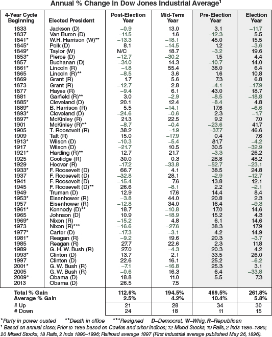
PRESIDENTIAL ELECTION/STOCK MARKET CYCLE: THE 182-YEAR SAGA CONTINUES
It is no mere coincidence that the last two years (pre-election year and election year) of the 45 administrations since 1833 produced a total net market gain of 731.3%, dwarfing the 299.6% gain of the first two years of these administrations.
Presidential elections every four years have a profound impact on the economy and the stock market. Wars, recessions, and bear markets tend to start or occur in the first half of the term; prosperous times and bull markets, in the latter half. After nine straight annual Dow gains during the millennial bull, the four-year election cycle reasserted its overarching domination of market behavior until 2008. Recovery from the worst recession since the Great Depression has produced six straight annual gains.
STOCK MARKET ACTION SINCE 1833
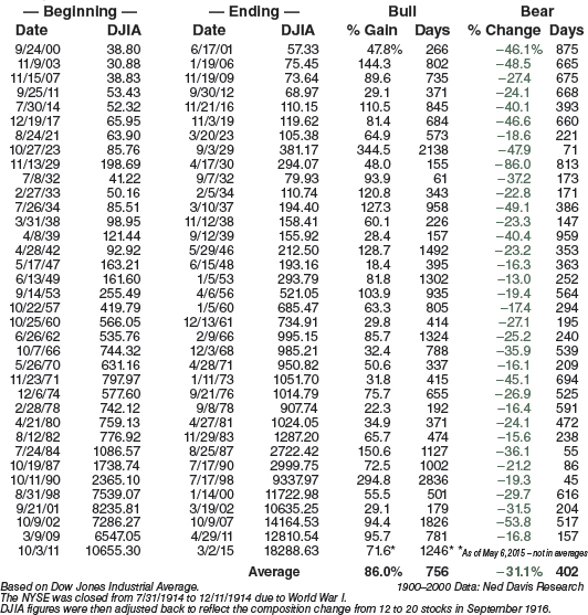
DOW JONES INDUSTRIALS BULL and BEAR MARKETS SINCE 1900
Bear markets begin at the end of one bull market and end at the start of the next bull market (7/17/90 to 10/11/90 as an example). The high at Dow 3978.36 on 1/31/94, was followed by a 9.7 percent correction. A 10.3 percent correction occurred between the 5/22/96 closing high of 5778 and the intraday low on 7/16/96. The longest bull market on record ended on 7/17/98, and the shortest bear market on record ended on 8/31/98, when the new bull market began. The greatest bull super cycle in history that began 8/12/82 ended in 2000 after the Dow gained 1409% and NASDAQ climbed 3072%. The Dow gained only 497% in the eight-year super bull from 1921 to the top in 1929. NASDAQ suffered its worst loss ever from the 2000 top to the 2002 bottom, down 77.9%, nearly as much as the 89.2% drop in the Dow from the 1929 top to the 1932 bottom. The third-longest Dow bull since 1900 that began 10/9/02 ended on its fifth anniversary. The ensuing bear market was the second worst bear market since 1900, slashing the Dow 53.8%. European debt concerns in 2011 triggered a 16.8% Dow slide, ending the recovery bull shortly after its second anniversary. At press time, the current bull market was alive and well, making new all-time Dow highs. (See page 132 for S&P 500 and NASDAQ bulls and bears.)
DOW JONES INDUSTRIALS BULL AND BEAR MARKETS SINCE 1900
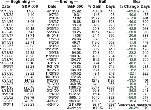
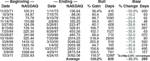
STANDARD & POOR'S 500 BULL and BEAR MARKETS SINCE 1929 NASDAQ COMPOSITE SINCE 1971
A constant debate of the definition and timing of bull and bear markets permeates Wall Street like the bell that signals the open and close of every trading day. We have relied on the Ned Davis Research parameters for years to track bulls and bears on the Dow (see page 131). Standard & Poor's 500 index has been a stalwart indicator for decades and at times marched to a different beat than the Dow. The moves of the S&P 500 and NASDAQ have been correlated to the bull and bear dates on page 131. Many dates line up for the three indices, but you will notice quite a lag or lead on several occasions, including NASDAQ's independent cadence from 1975 to 1980.
STANDARD & POOR'S 500 BULL AND BEAR MARKETS
NASDAQ COMPOSITE BULL AND BEAR MARKETS
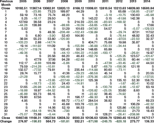
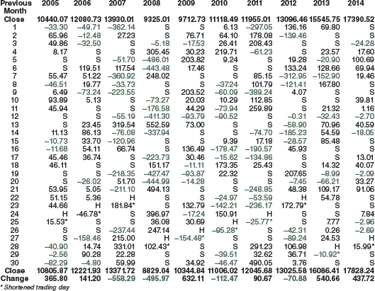
JANUARY DAILY POINT CHANGES DOW JONES INDUSTRIALS

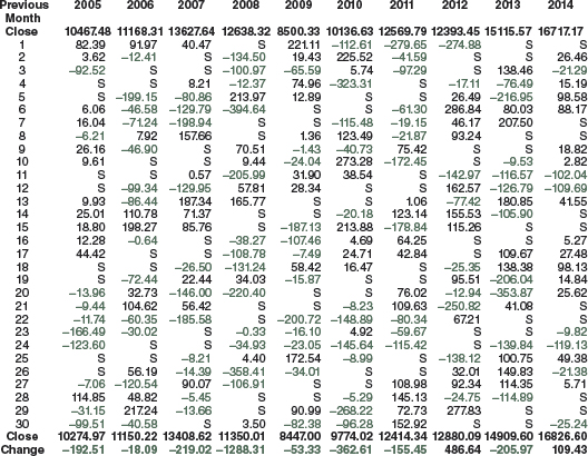
FEBRUARY DAILY POINT CHANGES DOW JONES INDUSTRIALS

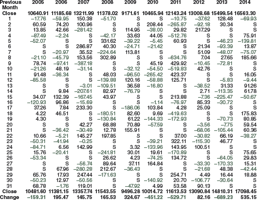
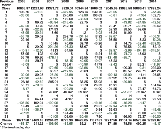
MARCH DAILY POINT CHANGES DOW JONES INDUSTRIALS
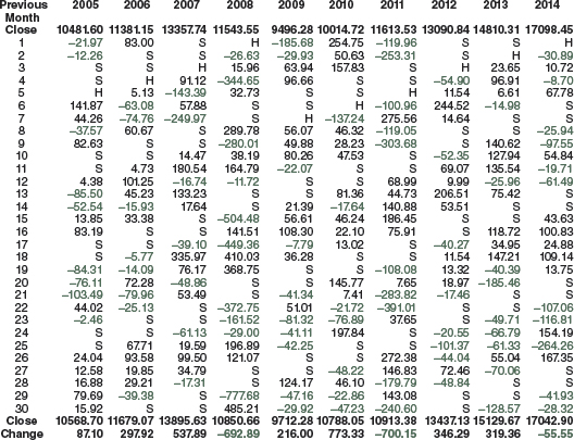
APRIL DAILY POINT CHANGES DOW JONES INDUSTRIALS
MAY DAILY POINT CHANGES DOW JONES INDUSTRIALS
JUNE DAILY POINT CHANGES DOW JONES INDUSTRIALS
JULY DAILY POINT CHANGES DOW JONES INDUSTRIALS

AUGUST DAILY POINT CHANGES DOW JONES INDUSTRIALS
SEPTEMBER DAILY POINT CHANGES DOW JONES INDUSTRIALS
OCTOBER DAILY POINT CHANGES DOW JONES INDUSTRIALS

NOVEMBER DAILY POINT CHANGES DOW JONES INDUSTRIALS
DECEMBER DAILY POINT CHANGES DOW JONES INDUSTRIALS
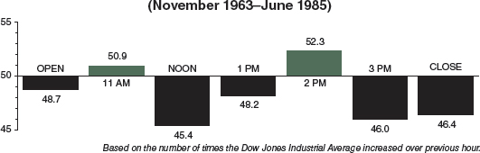
A TYPICAL DAY IN THE MARKET
Half-hourly data became available for the Dow Jones Industrial Average starting in January 1987. The NYSE switched 10:00 a.m. openings to 9:30 a.m. in October 1985. Below is the comparison between half-hourly performance from January 1987 to May 1, 2015, and hourly performance from November 1963 to June 1985. Stronger openings and closings in a more bullish climate are evident. Morning and afternoon weaknesses appear an hour earlier.
MARKET % PERFORMANCE EACH HALF-HOUR OF THE DAY
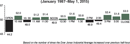
MARKET % PERFORMANCE EACH HALF-HOUR OF THE DAY
On the next page, half-hourly movements since January 1987 are separated by day of the week. From 1953 to 1989, Monday was the worst day of the week, especially during long bear markets, but times changed. Monday reversed positions and became the best day of the week and on the plus side eleven years in a row from 1990 to 2000.
During the last 14 years (2001–May 1, 2015) Monday and Friday are net losers. Tuesday through Thursday are solid gainers, Tuesday the best (page 70). On all days, stocks do tend to firm up near the close with weakness in the early morning and from 2 to 2:30 frequently.
THROUGH THE WEEK ON A HALF-HOURLY BASIS
From the chart showing the percentage of times the Dow Jones Industrial Average rose over the preceding half-hour (January 1987 to May 1, 2015*), the typical week unfolds.
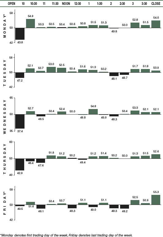
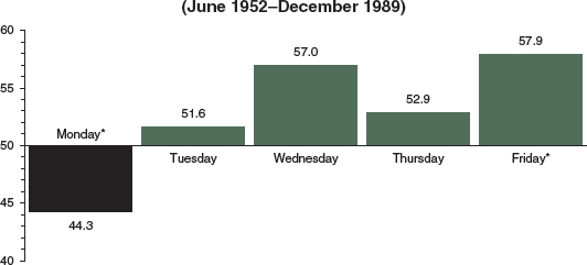
TUESDAY MOST PROFITABLE DAY OF WEEK
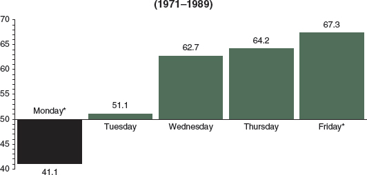
Between 1952 and 1989, Monday was the worst trading day of the week. The first trading day of the week (including Tuesday, when Monday is a holiday) rose only 44.3% of the time, while the other trading days closed higher 54.8% of the time. (NYSE Saturday trading was discontinued June 1952.)
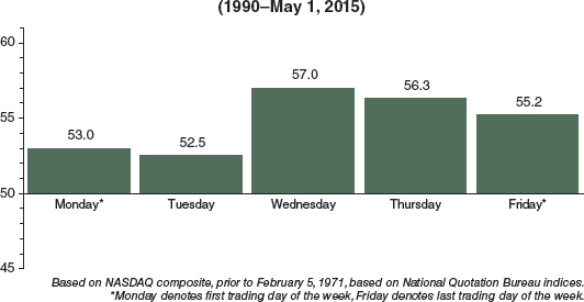
MARKET % PERFORMANCE EACH DAY OF THE WEEK
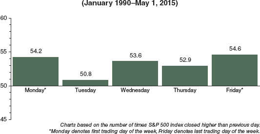
A dramatic reversal occurred in 1990—Monday became the most powerful day of the week. However, during the last 14 and a third years, Tuesday has produced the most gains. Since the top in 2000, traders have not been inclined to stay long over the weekend nor buy up equities at the outset of the week. This is not uncommon during uncertain market times. Monday was the worst day during the 2007–2009 bear, and only Tuesday was a net gainer. Since the March 2009 bottom, Tuesday and Thursday are best. See pages 70 and 143.
MARKET % PERFORMANCE EACH DAY OF THE WEEK
NASDAQ STRONGEST LAST 3 DAYS OF WEEK
Despite 20 years less data, daily trading patterns on NASDAQ through 1989 appear to be fairly similar to the S&P on page 141, except for more bullishness on Thursdays. During the mostly flat markets of the 1970s and early 1980s, it would appear that apprehensive investors decided to throw in the towel over weekends and sell on Mondays and Tuesdays.
NASDAQ % PERFORMANCE EACH DAY OF THE WEEK
Notice the vast difference in the daily trading pattern between NASDAQ and S&P from January 1, 1990, to recent times. The reason for so much more bullishness is that NASDAQ moved up 1010%, over three times as much during the 1990 to 2000 period. The gain for the S&P was 332% and for the Dow Jones industrials, 326%. NASDAQ's weekly patterns are beginning to move in step with the rest of the market. Notice the similarities to the S&P since 2001 on pages 143 and 144—Monday and Friday weakness, midweek strength.
NASDAQ % PERFORMANCE EACH DAY OF THE WEEK
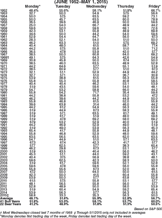
S&P DAILY PERFORMANCE EACH YEAR SINCE 1952
To determine if market trend alters performance of different days of the week, we separated 22 bear years—1953, '56, '57, '60, '62, '66, '69, '70, '73, '74, '77, '78, '81, '84, '87, '90, '94, 2000, 2001, 2002, 2008, and 2011—from 41 bull market years. While Tuesday and Thursday did not vary much between bull and bear years, Mondays and Fridays were sharply affected. There was a swing of 10.6 percentage points in Monday's and 9.5 in Friday's performance. Tuesday is the best day of the week based upon total points gained. See page 70.
PERCENTAGE OF TIMES MARKET CLOSED HIGHER THAN PREVIOUS DAY
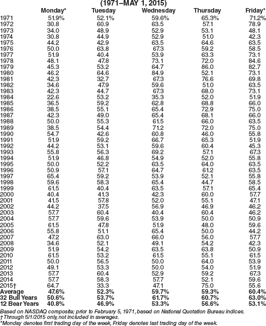
NASDAQ DAILY PERFORMANCE EACH YEAR SINCE 1971
After dropping a hefty 77.9% from its 2000 high (versus −37.8% on the Dow and –49.1% on the S&P 500), NASDAQ tech stocks still outpace the blue chips and big caps—but not by nearly as much as they did. From January 1, 1971 through May 1, 2015, NASDAQ, moved up an impressive 5486%. The Dow (up 2048%) and the S&P (up 2188%) gained less than half as much.
Monday's performance on NASDAQ was lackluster during the three-year bear market of 2000–2002. As NASDAQ rebounded (up 50% in 2003), strength returned to Monday during 2003–2006. During the bear market from late 2007 to early 2009, weakness was most consistent on Monday and Friday.
PERCENTAGE OF TIMES NASDAQ CLOSED HIGHER THAN PREVIOUS DAY
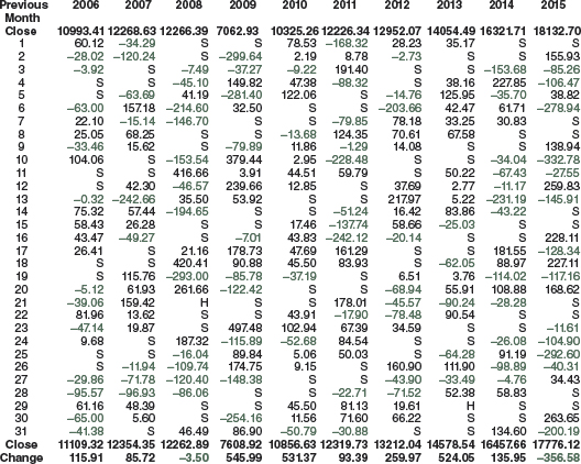
MONTHLY CASH INFLOWS INTO S&P STOCKS
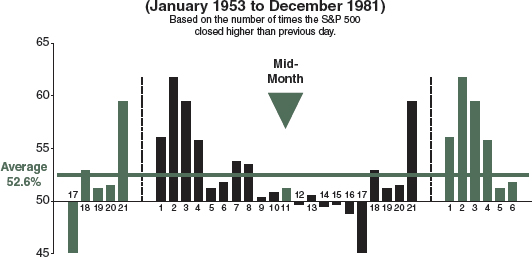
For many years, the last trading day of the month, plus the first four of the following month, were the best market days of the month. This pattern is quite clear in the first chart, showing these five consecutive trading days towering above the other 16 trading days of the average month in the 1953–1981 period. The rationale was that individuals and institutions tended to operate similarly, causing a massive flow of cash into stocks near beginnings of months.
MARKET % PERFORMANCE EACH DAY OF THE MONTH
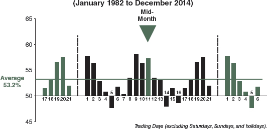
Clearly, “front-running” traders took advantage of this phenomenon, drastically altering the previous pattern. The second chart from 1982 onward shows the trading shift caused by these “anticipators” to the last three trading days of the month, plus the first two. Another astonishing development shows the ninth, tenth, and eleventh trading days rising strongly as well. Growth of 401(k) retirement plans, IRAs, and similar plans (participants' salaries are usually paid twice monthly) is responsible for this mid-month bulge. First trading days of the month have produced the greatest gains in recent years (see page 86).
MARKET % PERFORMANCE EACH DAY OF THE MONTH
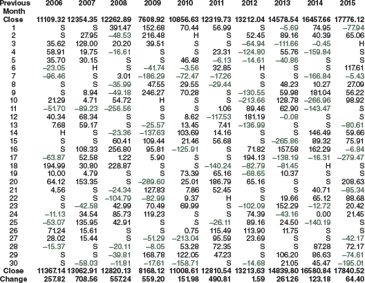
MONTHLY CASH INFLOWS INTO NASDAQ STOCKS
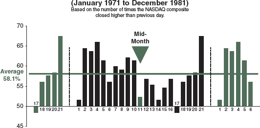
NASDAQ stocks moved up 58.1% of the time through 1981 compared to 52.6% for the S&P on page 145. Ends and beginnings of the month are fairly similar, specifically the last plus the first four trading days. But notice how investors piled into NASDAQ stocks until mid-month. NASDAQ rose 118.6% from January 1, 1971, to December 31, 1981, compared to 33.0% for the S&P.
NASDAQ % PERFORMANCE EACH DAY OF THE MONTH
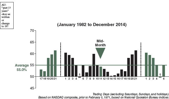
After the air was let out of the tech market 2000–2002, S&P's 1580% gain over the last 33 years is more evenly matched with NASDAQ's 2318% gain. Last three, first four, and middle ninth and tenth days rose the most. Where the S&P has three days of the month that go down more often than up, NASDAQ has none. NASDAQ exhibits the most strength on the last trading day of the month; however, over the past 17 years, last days have weakened considerably, down more often than not.
NASDAQ % PERFORMANCE EACH DAY OF THE MONTH
NOVEMBER, DECEMBER, AND JANUARY: YEAR'S BEST THREE-MONTH SPAN
The most important observation to be made from a chart showing the average monthly percent change in market prices since 1950 is that institutions (mutual funds, pension funds, banks, etc.) determine the trading patterns in today's market.
The “investment calendar” reflects the annual, semi-annual, and quarterly operations of institutions during January, April, and July. October, besides being the last campaign month before elections, is also the time when most bear markets seem to end, as in 1946, 1957, 1960, 1966, 1974, 1987, 1990, 1998, and 2002. (August and September tend to combine to make the worst consecutive two-month period.)
S&P 500 MONTHLY % PERFORMANCE
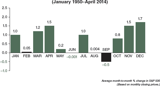
Unusual year-end strength comes from corporate and private pension funds, producing a 4.2% gain on average between November 1 and January 31. In 2007–2008, these three months were all down for the fourth time since 1930; previously in 1931–1932, 1940–1941, and 1969–1970, also bear markets. September's dismal performance makes it the worst month of the year. However, in the last 11 years, it has been up 8 times after being down five in a row 1999–2003.
In election years since 1952, the best three months are June +1.4% (13–3), November +1.3% (9–7), and December +1.2% (13–3). January, February, March, April, July, and August are winners, while May, September, and October are losers. October is the worst, –0.7% (7–9).
See page 50 for monthly performance tables for the S&P 500 and the Dow Jones industrials. See pages 52, 54, and 62 for unique switching strategies.
On page 66, you can see how the first month of the first three quarters far outperforms the second and the third months since 1950, and note the improvement in May's and October's performance since 1991.
NOVEMBER THROUGH JUNE: NASDAQ'S EIGHT-MONTH RUN
The two-and-a-half-year plunge of 77.9% in NASDAQ stocks, between March 10, 2000, and October 9, 2002, brought several horrendous monthly losses (the two greatest were November 2000, −22.9%, and February 2001, −22.4%), which trimmed average monthly performance over the 44⅓-year period. Ample Octobers in 12 of the last 17 years, including three huge turnarounds in 2001 (+12.8%), 2002 (+13.5%), and 2011 (+11.1%) have put bear-killing October in the number one spot since 1998. January's 2.7% average gain is still awesome, and more than twice S&P's 1.2% January average since 1971.
NASDAQ MONTHLY PERFORMANCE
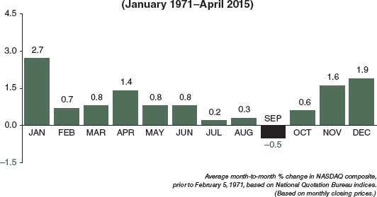
Bear in mind, when comparing NASDAQ to the S&P on page 147, that there are 22 fewer years of data here. During this 44⅓-year (1971–April 2015) period, NASDAQ gained 5414%, while the S&P and the Dow rose only 2163% and 2027%, respectively. On page 58, you can see a statistical monthly comparison between NASDAQ and the Dow.
Year-end strength is even more pronounced in NASDAQ, producing a 6.2% gain on average between November 1 and January 31—nearly 1.5 times greater than that of the S&P 500 on page 147. September is the worst month of the year for the over-the-counter index as well, posting an average loss of –0.5%. These extremes underscore NASDAQ's higher volatility—and moves of greater magnitude.
In election years since 1972, the best three months are August +2.9% (7−4), February +2.8% (7−4), and January +2.6% (8−3). June and December also produce average gains. March, April, May, July, September, October, and November are all net losers. October is the worst, averaging −2.1% (4−7).
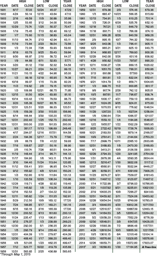
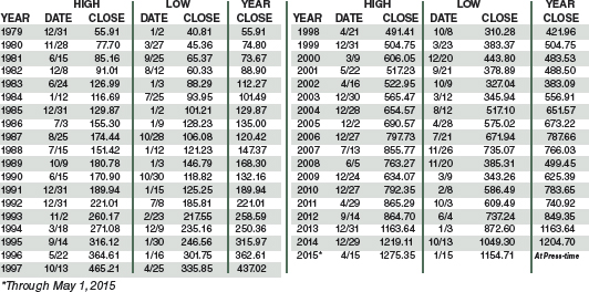
DOW JONES INDUSTRIALS ANNUAL HIGHS, LOWS, & CLOSES SINCE 1901
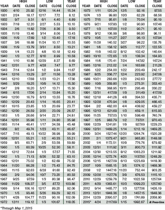
S&P 500 ANNUAL HIGHS, LOWS, & CLOSES SINCE 1930
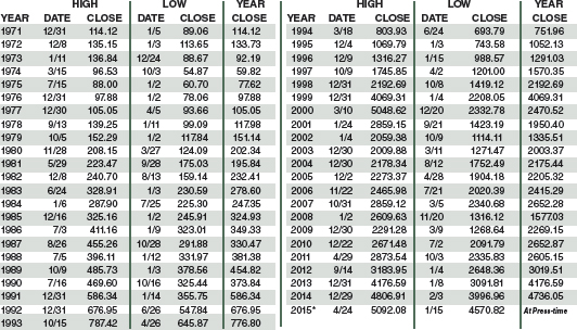
NASDAQ ANNUAL HIGHS, LOWS, & CLOSES SINCE 1971
RUSSELL 1000 ANNUAL HIGHS, LOWS, & CLOSES SINCE 1979
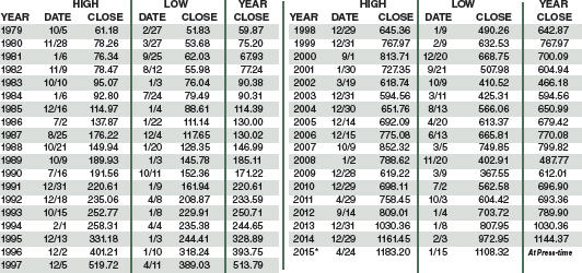
RUSSELL 2000 ANNUAL HIGHS, LOWS, & CLOSES SINCE 1979
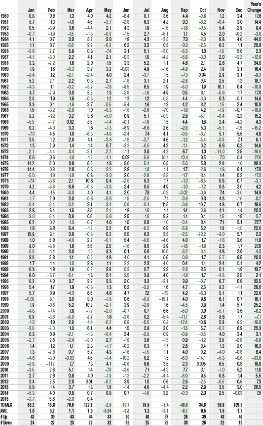
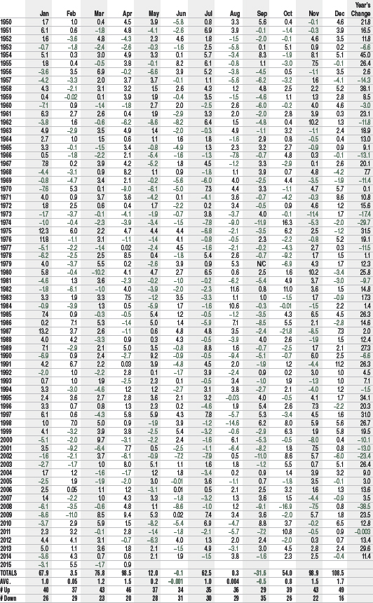
DOW JONES INDUSTRIALS MONTHLY PERCENT CHANGES SINCE 1950
DOW JONES INDUSTRIALS MONTHLY POINT CHANGES SINCE 1950
DOW JONES INDUSTRIALS MONTHLY CLOSING PRICES SINCE 1950

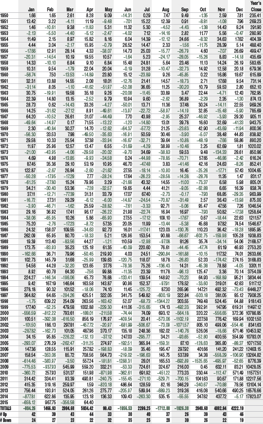
STANDARD & POOR'S 500 MONTHLY PERCENT CHANGES SINCE 1950
STANDARD & POOR'S 500 MONTHLY CLOSING PRICES SINCE 1950

NASDAQ COMPOSITE MONTHLY PERCENT CHANGES SINCE 1971

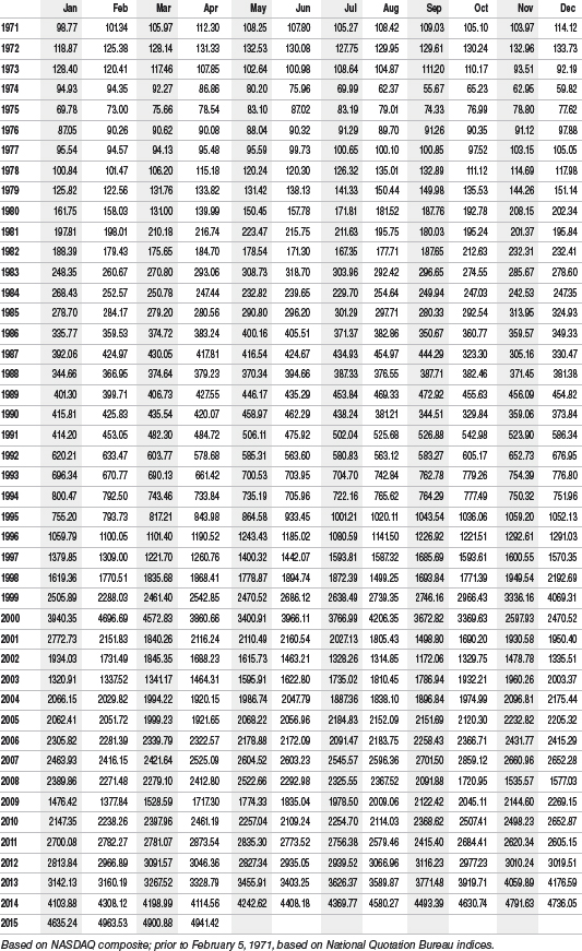
NASDAQ COMPOSITE MONTHLY CLOSING PRICES SINCE 1971
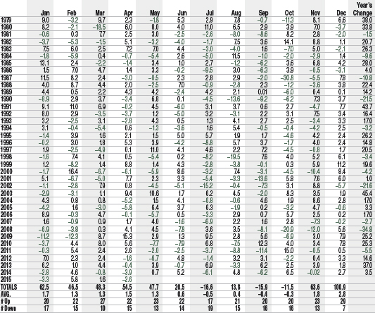
RUSSELL 1000 INDEX MONTHLY PERCENT CHANGES SINCE 1979

RUSSELL 1000 INDEX MONTHLY CLOSING PRICES SINCE 1979
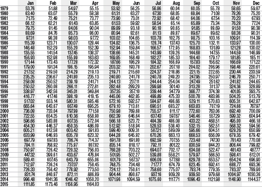
RUSSELL 2000 INDEX MONTHLY PERCENT CHANGES SINCE 1979
RUSSELL 2000 INDEX MONTHLY CLOSING PRICES SINCE 1979


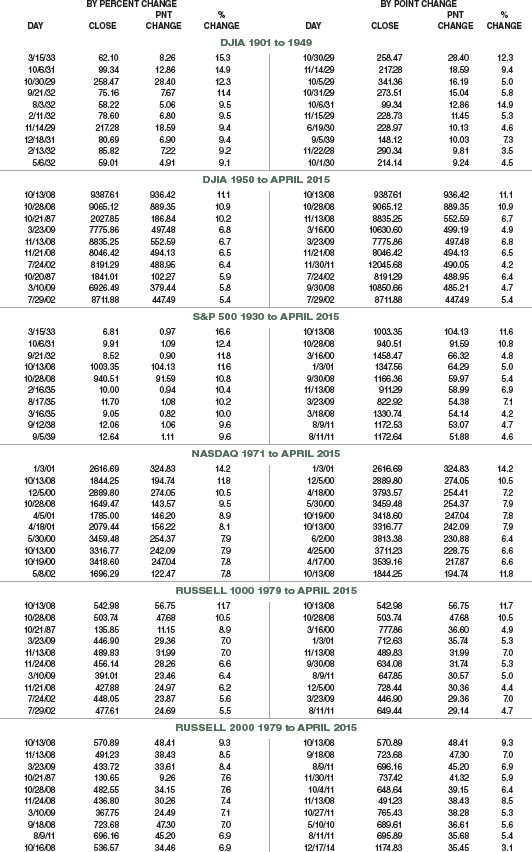
10 BEST DAYS BY PERCENT AND POINT
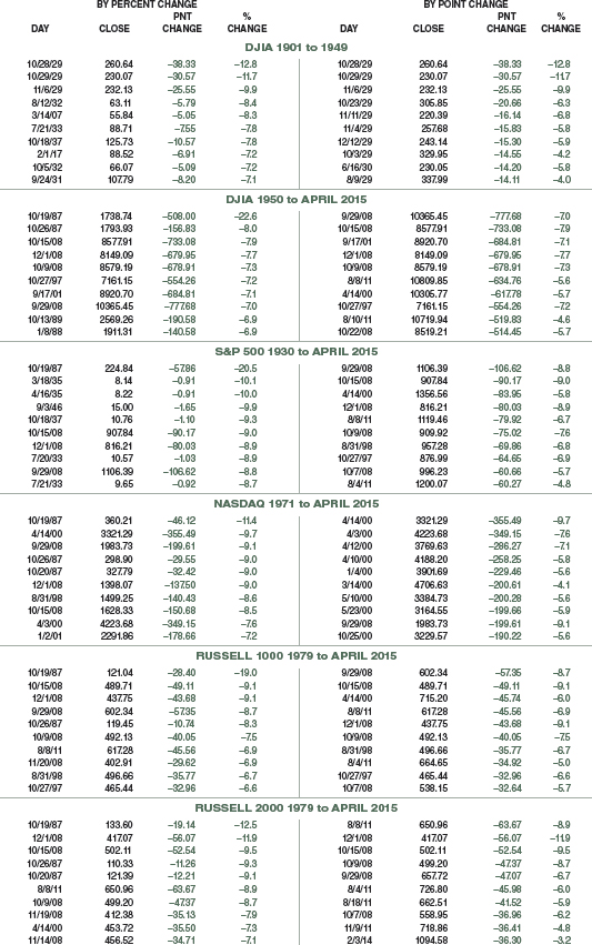
10 WORST DAYS BY PERCENT AND POINT
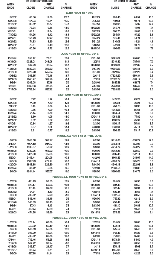
10 BEST WEEKS BY PERCENT AND POINT
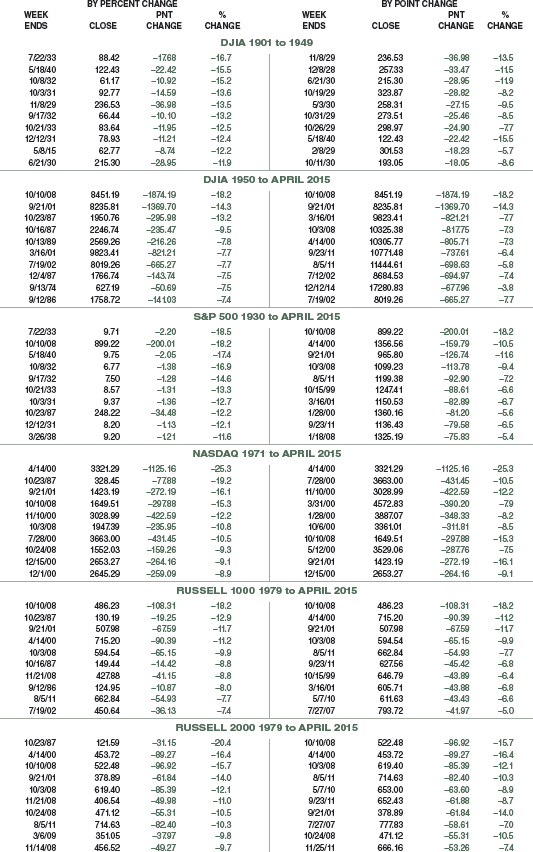
10 WORST WEEKS BY PERCENT AND POINT
10 BEST MONTHS BY PERCENT AND POINT
10 WORST MONTHS BY PERCENT AND POINT

10 BEST QUARTERS BY PERCENT AND POINT
10 WORST QUARTERS BY PERCENT AND POINT

10 BEST YEARS BY PERCENT AND POINT

10 WORST YEARS BY PERCENT AND POINT

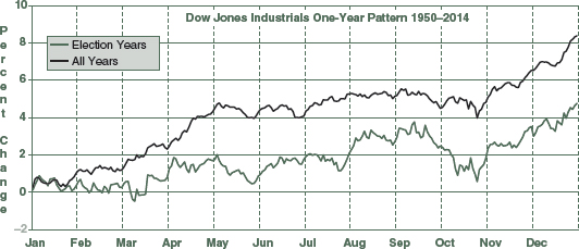
DOW JONES INDUSTRIALS ONE-YEAR SEASONAL PATTERN CHARTS SINCE 1901
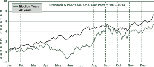
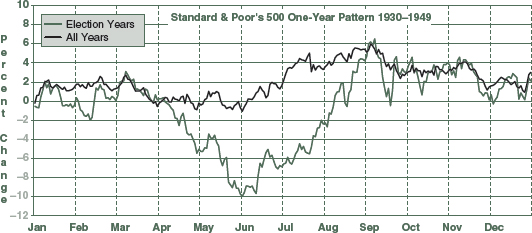
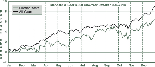
S&P 500 ONE-YEAR SEASONAL PATTERN CHARTS SINCE 1930
NASDAQ, RUSSELL 1000 & 2000 ONE-YEAR SEASONAL PATTERN CHARTS SINCE 1971