3
No Rococo Palace for Buster Keaton:
Architectures of Americanism
Almost everyone evinced immediate interest in America, not, however in its art but in its machines. The two names heard most often in this connection were Ford and Edison.
‘Ah, America, wonderful machinery, wonderful factories, wonderful buildings, give us time – we’ll have as much and more.’
One lady put it even more emphatically – ‘we’ll have it much better’.
In view of the critical condition in agriculture, industry, and housing, such a statement would seem wildly optimistic. But it was this wild optimism that brought the country out of its crisis.
Louis Lozowick on Moscow in 19241
You can be walking down the street in Chicago today, in 1923, but I can make you bow to the late comrade Volodarsky, who in 1918 is walking along a street in Petrograd, and he will return your bow.
Dziga Vertov, ‘Kinoks: A Revolution’, in LEF, Vol. 32
In many of the films of this period, the transformation of the built environment itself is the object for comedy. Buster Keaton’s One Week, for instance, is a 20-minute work on the subject of prefabricated housing. Buster is getting married to a young bathing beauty, and, being a blue-collar sort, is not able to move into an existing property. An exciting alternative is provided by a character who turns out to have been a former suitor of his fiancée, who sells him a build-your-own-house kit which he has, however, mislabelled. So, when Buster clips together this house, on the plot which he has been provided with, it looks freakish, geometrically improbable: all the existing components of a house are there – a roof, a window, walls, doors – but all in the wrong order, at weird angles. This is still a house, but it’s a house through a hall of mirrors, and the comforting security of hearth and home has been exploded.
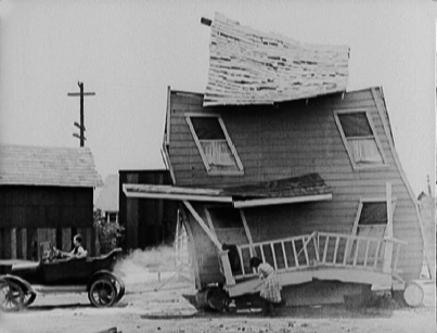
Buster Keaton drives his house away in One Week
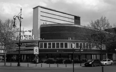
No Rococo Palace – the former Universum Cinema, Berlin
Across the Taylorist working tempo of the One Week of the title, a series of mechanical problems gradually beset the house, but the main problem it faces is through the piece of land where it has been erected, which proves to be at the junction of both a railway line and a main road, which proceed to pummel the house into ever more extraordinary shapes. In response, the house spins around, is moved from A to B, and Keaton himself tries to tie it to a car so that he can transport it to a less dangerous place. Most famously, the non-load-bearing wall of the house collapses onto Buster himself, miraculously leaving him unscathed.3 This film is an early cinematic response to a particular American innovation – the prefabricated home, which can be erected by a non-professional, and placed essentially wherever one wants, or wherever there is a piece of land one can afford, not needing to follow any street lines or enclosed by any class-based districts.
In fact, it’s a parody of a film produced promoting house kits, from the cinematic arm of the Ford Motor Company. The film brings together architecture, technology, motorisation and slapstick. Given the interest of Constructivist circles in Buster Keaton, it is worth investigating whether or not an architecture which could reflect all of these things was ever developed, or ever could be. In 1926, the Weimar architect Erich Mendelsohn declared of his Universum Cinema that there ought to be ‘no rococo palace for Buster Keaton’. His solution for housing these fast, unsentimental, high-tech films was a smooth sweep of a building, animating a road junction on Berlin’s main commercial street. It is a design rather lacking in pratfalls. Other architects in the 1920s, however, proposed skyscrapers that collapsed and rebuilt themselves, towers for the Comintern that resembled helter-skelters, and did so in a context where the notion of mechanical efficiency had become in itself a farcical dream.
Practical Utopianism
The 1920s are misread as a ‘utopian’ period. The totally state-controlled economy of War Communism was dropped in favour of an encouragement of rural capitalism and international trade. Our protagonists here, the artists, film-makers and designers, enjoyed much higher public funding both in the preceding revolutionary period and under Stalinism. Under NEP, to a large degree they had to fend for themselves, much as artists would under capitalism. Industry, though it recovered to the level achieved by the Tsarist Empire, was frequently unmechanised and based on heavy manual labour, particularly in the construction industry, which was largely even pre-Victorian in its technologies. Even here, the adoption of Taylorism as an aim by Soviet industry was in sharp contrast to the world of liberated labour anticipated by the labour movement in 1917. However, the abandonment of revolutionary romanticism instantly produced a surplus in the promise that achievement of a seamless, Americanised modernity was possible.
This, again, is something the unsympathetic critic René Fülöp-Miller was right to notice, even in Lenin’s own pronouncements. ‘The utterances of the revolutionary,’ he writes,
have a similar ring: ‘investigate immediately why the Collegium of the Central Naptha Syndicate have assigned to the workers ten and not thirty arshin per head.’ ‘Thorough study of the scientific organisation of labour necessary.’ ‘Care must be taken to make the composition of bills laid before the Ministerial Council clearer and plainer.’ ‘Investigate how wind-motors could be utilised for lighting the villages with electricity.’ This is how Lenin’s great utterances look; in these sentences lies the secret of the mysterious way in which Utopias can be created by means of purely practical transactions.4
This is very astute. In part, they sound utopian because of the parlous, bitterly impoverished material state of Soviet territory in the early 1920s, where such efficient, precise rhetoric sounds amazing; also, because they promise that the problems can be solved, and moreover, the technological rhetoric takes on an almost incantational, poetic tone. As Buck-Morss points out, it’s telling that in the Soviet Union of the early 1920s, Taylorism’s most fervent advocate, Alexei Gastev, was a former metalworker and poet rather than a bureaucrat.5
Fülöp-Miller defines a territory of almost riotous levels of combined and uneven development, where Russia’s existing tension between ‘east’ and ‘west’ is exacerbated and accelerated. He sees this, even, as something quintessential to the territory:
In the Moscow streets, by the side of a house that recalls the Middle Ages, you have an American sky-scraper, and this curious pair of twins, which couples the Asiatic past with the latest achievements of technology, not only gives the streets a characteristic note, it also represents that feature which recurs in all manifestations of Russian life.6
Today, ‘Oblomov and the “Time-League” are found side by side.’7 Rationalisation in America is, as we have seen, merely a means to an end. He cites Rathenau and Ford on their reluctance at their own creation, then finds that:
in Russia, there is scarcely any industry: the factory proletariat sinks into insignificance compared with the great masses of the peasantry; in the country, soil is worked with the same primitive tools; everywhere, so far as agricultural and industrial technique is concerned, Asiatic methods of works and organisation prevail. But it is just here that there is continuous talk about ‘American mechanisation’, which is regarded as the loftiest expression of human perfection. We can understand how, for the Bolsheviks, industrialised America became the promised land [. . .] they began to dream of Chicago and direct their efforts towards making Russia a new and more splendid America.8
Indeed – and Chicago is the reference that comes up again and again in contemporary accounts, both from observers and those who are deeply involved.
The American novelist Theodore Dreiser, in his travels through the USSR, finds this reaching an almost ludicrous extent. He sees it, at first, in the new forms of Moscow architecture:
while the old palaces and buildings are stained and worn, there are newer things which speak of a brighter day. For the new, if gray and somewhat hygienic, Central Post and Telegraph Building is long and high and wide and suggests in all its features the latest details of a Chicago commercial structure (not a skyscraper), and probably is borrowed in spirit from the Great Lake city which Russia so admires;9
something also found in ‘the mighty pile that houses Izvestia, the official government’s newspaper mouthpiece – the great factory in which the world’s news is doctored and sent out sufficiently communised for local consumption.’ He continues from here to note that ‘if there is one would-be Chicago in Russia, there are nine! Chita, Kharkov, Stalin, Novo-Sibirsk, Baku, Vladikafkaz, Perm, a long company’.10 Chicago, of course, is where the skyscraper first emerges in the 1880s, and whose ‘Chicago school’ was enormously important for the development of a modern architecture. But at this distance, it could only be a matter for fantasy. For someone like Fülöp-Miller, this is a specifically Russian fantasy, but here we will argue something quite different, that it is something specifically socialist – the attempt to use the technologies of an advanced capitalism to produce things that a profit-driven system by itself could never do.
The sheer intensity and unity of this dreaming, and its spread from political and industrial policy to avant-garde and popular culture, necessitates the use of Benjamin’s concept of ‘the collective dream’. This chapter will constantly keep in mind the dual nature of this collective dream – and finds that one of its most essential conduits is the advertisement. The urban landscape created by capitalism, from the early nineteenth century onwards, is based on images which make direct appeals to the unconscious. These images are most famously associated with advertising, and Soviet advertising and its close relation, official propaganda,11 will be discussed here as well as film and architectural design. While the dream may promise utopia, its purpose is to keep the dreamers asleep. The dream itself can’t offer the possibility of their rousing themselves. So while the culture of abundance and advertisement can provide dream images of utopia in the everyday, something which will be discussed here with reference to skyscraper motifs in the advertising of the New Economic Policy, it does not, contrary to the American boosterism of the time, do so by itself.12
The Tower Has Been Bolshevised
Come
to us
Tower
Here – you
Are far much more needed
Steel-shining
Smoke piercing
We’d greet you
Vladimir Mayakovsky, ‘Paris’ (1923)13
In Alexei Gastev’s cycle of poems Poetry of the Factory Floor can be found one called ‘The Tower’, which personifies the workers’ movement in the vagaries of a vast, endless tower – the suffering undergone in its construction, the bleakness when it was first thought ‘finished’ (i.e. with the failure of the 1905 Revolution), and its eventual magnificence under socialism, in which it becomes the form of an entire society.
Pierce the heights with your spire
You, our audacious tower-world!14
The tower here is a lattice-work, iron construction, which would in the American context be covered in masonry and ornament. Its bareness, rather, implies the iron construction which, at the time, was usually hidden in capitalist aesthetics. That bareness does not exclude, but encourages fantasy, for its presentation of the startlingly new, the signs of labour and prefabrication, a nakedness of technology.
A Soviet government poster of 1929 depicts a familiar opposition between socialist politics and the skyscraper, not to mention jazz. On one side figures in bright, artificial colours dance contortedly in front of the jagged, stepped silhouette of a skyscraper. The women’s skirts are short, and they look intoxicated, as much as their garb is designed to intoxicate. One of them has strutted towards the poster’s foreground. And facing this parade of seductive jazz-age Americana is a single female figure with a red headscarf. Holding her arm up, she points towards the poster’s caption – ‘STOP!’ Although we are in little doubt that the figures being halted are ideologically dubious, with their drunken clinging to lampposts and so forth, their depiction has a hint of the cubo-futurist – the street-lights and the skyscraper are abstracted in a manner similar to the government’s ROSTA series of public information posters by avant-garde artists. Officially, the poster warns against prostitution, and it features at the corner, as its ideological content, a poem by the proto-Socialist Realist Demyan Bedny to this effect.

Stop!
However, the poster’s clearest message seems to be something quite different – a poster against Americanism itself, directed against a landscape of short-skirted flappers, jazz, neon lights and skyscrapers. That this poster was produced at all shows how important America was for the Soviet Union. In a situation of Stalinist autarky there would be no need to implore the workers to resist the blandishments of a culture industry of which they were forcibly oblivious. This poster is a product of the ending of the New Economic Policy – the mixed economy, the temporary compromise with the market that lasted for most of the scope of our study. It tries to close the gates on a decade where there had been a proliferation of jazz, slapstick comedy, adventure films, romantic melodrama and an iconography of extraordinary technological advancement.
Meanwhile, the influence of the New York zoning code on the fantasies of Soviet paper architects (or poster designers) is readily apparent. This 1916 ordnance proscribed, for the purposes of the penetration of light into New York’s congested streets, a stepping system, which inadvertently gave the effect, dramatised stunningly in the drawings of Hugh Ferriss,15 of vaulting skywards to a fine point. In this it not only continues the ‘scraping’ form ushered in by the Eiffel Tower and other engineering structures, but also, entirely accidentally, evokes a certain atavism – the prehistoric, the pyramidal and pharoanic, just as with the grain silo. The iron pyramid is not, however, an exclusively Americanist archetype – it partly comes from the more recent past, and from French rather than American industrial experiment.
The USSR’s earliest, and most famous plan for a skyscraper, Vladimir Tatlin’s Monument to the Third International, is somewhat less Americanist in its forms than its immediate successors – the bare steel skeleton evokes the forms of Eiffel (or indeed his Soviet equivalent, Vladimir Shukhov) rather than Louis Sullivan, although even here there are two Americanist precedents: Coney Island and its spiralling, conical helter-skelters, and the bare steel skeleton of the neo-Gothic skyscraper before its ornament is applied. The elements of primal, Millennarian revolutionary romanticism, reaching back as far as the Samarra El Malwiyya Mosque and Athanasius Kircher’s Tower of Babel, combined with the comic aesthetics of the amusement park, are fused inexorably in the tower. This is picked up by Norbert Lynton in his study Tatlin’s Tower. The tower, for Lynton, is the greatest monument to ‘God Building’, to the attempt to create a ‘religion of socialism’, scraping the clouds in order to ‘storm heaven’, but it is also an object of levity, an intentionally funny building. ‘The Tower resembles a helter-skelter, set up on a fairground for people to climb up internally in order to come sliding down an external spiral. Its vast form, at the heart of Petrograd, would counter the city’s authoritarian character’16 – unlike the Eiffel Tower, it is an utterly decentralised structure.
Yet while it is anti-authoritarian, it is still almost mystical. Lynton quotes a letter from Tatlin to Punin of 1919, where he writes of the work in progress ‘as a unity of architecture, painting and sculpture’, where ‘the temple represents the Earth, which returns its dead, and Heaven [. . .] which is being populated by resurrected generations.’ Lynton glosses that ‘an epoch of human collaboration will come with the advance of science and social understanding, and hence also major technological discoveries, especially in the area of celestial mechanics, celestial physics and other celestial sciences’, so that for Tatlin,
a sturdy structure could be erected – a Temple of the Worlds – which would exist without props or supports, and would move in infinite space. Such a temple would emancipate all the world from bondage to gravity and from subservience to the blind forces of gravitation, transforming thereby these worlds into a tool for the expression of the mutual feelings and of mutual love of all the generations of mankind. Mankind must become ‘sky-mechanics and sky-physicists’; Earth will become a spaceship and mankind its crew.17
This captures the sheer density of the dreaming embodied within the Monument to the Third International, the overspill of utopian surplus from something which, in design terms, essentially fuses the Eiffel Tower and Luna Park.
This is predicated on taking to a logical conclusion, or rather on wresting away from it and transforming, one of capitalism’s formal accidents. In Sigizmund Krzhizhanovsky’s 1927 short story ‘The Bookmark’, a jobbing Moscow storyteller suddenly begins to tell a tale called ‘The Tower Gone Mad’, where the Parisian proto-skyscraper leaves its circumscribed bourgeois environs, and becomes international. ‘The gigantic four-footed Eiffel Tower, its steel head high over the human hubbubs of Paris, was fed up, you see, fed up with having to listen to that hurly-burly street-entangled life strewn with clangs, lights, and clamour.’18 It comes to life because it has been plugged into the new telecommunications networks.
As for the muddleheaded creatures swarming at its feet, they had equipped the inside of its pointed crown poking through the clouds with global vibrations and radio signals. The space inside the Tower’s needle-like brain now began to vibrate, began to seep down through its muscular steel interlacements into the ground, whereupon the tower wrenched its iron soles free of the foundation, rocked back, and lunged off.19
And to where? ‘You and I know, of course, who was calling the lost tower, and from where. And now it knows where to go: due east. The revolutionary will join the revolutionaries. From capital to capital the wires hum with fright. “The tower has been Bolshevised!”’ Krzhizhanovsky continues: ‘“Stop the tower!” [. . .] ranged cannons again try to bar the fugitive’s way: once more, the clanking colossus, battered by blows of steel against steel, breaks into its savage and terrible hymn.’ The Tower’s attempt to enter the service of Communism ends in tragic failure, however, as it is besieged and near-destroyed:
along the way, at the point where three mountainous borders meet, the tower encounters a waste of water: the stillness and depth of Lake Constance. Passing over that blue mirror, the vanquished giant catches sight of its reflection, inverted and sun-shot, with its spire pointing down. The sonorous steel shivers with disgust and, in a last paroxysm of rage, severs the invisible traces. Then it lifts its leaden paws, stands erect and plunges (can you imagine?) crown-first from the Alpine ledges. Comes the clatter of tumbling rocks and crags torn away, then, echoing from gorge to gorge, the plash of crushed waters: towering above the overflowing lake are the rigid limbs of the steel suicide.20
Krzhizhanovsky’s allegory is very closely akin to the Monument to the Third International – a claim that the astounding high-tech object ‘wants’ to become Communist, but that the capitalist world will encircle and destroy it, much as it had the Bolshevik experiment.
The meanings of the tower need not be so exalted as this. An under-remarked upon element of the Monument to the Third International is that its socialist, technologist, avant-garde synthesis is explicitly in the service of the project for a new everyday life. ‘The Work Ahead of Us’, the accompanying manifesto for the tower’s 1921 presentation to the Congress of Soviets, penned by Tatlin and his collective, is quite clear about this.
The fruits of this work are samples of something new which stimulate us to inventions in the work of creating a new world, and which call upon us to take control of the (physical) forms of the new way of life.21
This is perhaps the first call from the Russian avant-garde for the Novyi Byt – literally, new everyday life, that would have to accompany the annulment of capitalism, and it is significant that it comes as part of a justification for a skyscraper fundamentally unbuildable – pending the world revolution.
Advertising Construction
The world in which everything seemed to be arranged so beautifully has collapsed. And we want to be the newcomers. We shall lift the curtain from the cities, the streets, the workshops, the bazaars. We shall immediately set our factory of art humming.
Alexei Gastev, Declaration of the Kharkov Art Soviet, 191922
The advertisement is the ruse by which the dream forces itself on industry.
Walter Benjamin, ‘Exhibitions, Advertising, Grandville’23
The immediate successors of Tatlin’s skyscrapers for a new everyday life are those of what is rather deceptively known as the Rationalist movement. This was centred on the researches and teaching of a few architects in the state-sponsored Constructivist debating society INKhUK, and in the VKhUTEMAS school – specifically, the work of Nikolai Ladovsky, Vladimir Krinsky and others who eventually comprised the ASNOVA architects’ group. These architects’ ‘rationalism’ lay for the most part on an application of what they called ‘psychotechnics’ – a variant of industrial psychology. This reminds us that, even in the most intellectually sophisticated circles in the early Soviet Union, Pavlov had precedence over Freud, although the latter was not ignored. The paradigm for this is perhaps Trotsky’s discussion of the two as opposed psychological thinkers, pondering their relevance for a Marxist approach to the subject, in Problems of Everyday Life. Although, unlike in Stalinism, Freud is taken seriously, his reliance on myth and atavism is seen as less materialist than Pavlov’s (decidedly industrial) focus on stimulus-response.24 However, what the Rationalists do with this is far more based in a certain romanticism and fantasy than on a straightforward instrumentalism. Essentially, a building becomes evaluated for the particular psychological effect it has on the user – and the building in question, once again, is the skyscraper.
The Rationalists’ sporadic communiqués and competition entries return obsessively to the skyscraper. The earliest sketches, by Ladovsky from 1919–20, are for expressionist communal towers, which rather than rising centrally in the New York fashion, have a curious variant on this – leaning backwards, and with each unit differentiated in ostentatiously irregular style.25 The repetition, the filing cabinet element of the skyscraper, is abandoned in favour of jaggedness and articulation. This short-lived expressionist version is quickly superseded by rectilinearity, and from the start it can be seen that the system they advocate is one derived, even at an oblique remove, from American industrial psychology. From their one publication, ASNOVA Izvestiia (1926), we find that:
the first to have recourse to (psychotechnology) were representatives of the vast industrial and commercial companies of America, for the selection of employees, then business people used it in the advertising field, and then teachers used it in selecting and determining the capabilities of their students.26
Ladovsky quotes Hugo Münsterberg, ‘who works year by year in his Harvard laboratory’, that psychotechnics can both fuse this rationalised approach and the possibility that the ‘genius’ may create with ‘unconscious means’.27
Note there the rather uncritical list of bureaucrats and marketing men that make use of this science.28 At worst, the employment of the ‘rationalist’ psychotechnical method merely translates this into the nascent bureaucracies of the Soviet Union. Another early Rationalist dream-project was a stepped skyscraper design for Vesenkha, the Soviet industrial commission. In this, it sticks to the distinction made by Charles Jencks between a tower – which can include (usually low-income) housing, or serve as a functional structure (television towers, or Shukhov’s radio tower) – and a skyscraper, a more-or-less prestigious vitrine for the making of money or for administration. It is an office block, so if Jencks’ distinction holds, then the Soviet skyscraper is a mere aestheticised version of its American predecessor, and there is, in a version of the later Socialist Realist formula, a structure that is ‘socialist in form, capitalist in content’. As imaginary form, the products of Ladovsky’s psychotechnical laboratory are far more exemplary as imagery of an advanced technology. The Vesenkha tower fuses a series of cubic forms into a elongated, almost weapon -like Wolkenkratzer, which in the perspective is seen from above (where Hood’s Chicago Tribune building, for instance, is seen from the ground), suggesting either a demiurgic presence or, more likely given the essentially science fictional nature of the design, some sort of flying vehicle as its vantage point.
This is, then, as far away from Byt as possible, but perhaps also from a transformed Byt – this might just be another object of awed contemplation, irrespective of the cleaner lines.29 Nonetheless, Ladovsky consistently related both the fixation on the skyscraper, and the use of a methodology based on perception rather than function, to the political context. Catherine Cooke quotes the Rationalists on how the ‘architectural [. . .] spatial system evokes a particular attitude in the ordinary person’, something that promises the possibility of a far from liberatory model of psychotechnics. Ladovsky writes: ‘The Soviet state, which has put the principle of planning and control at the cornerstone of all its activity, should also utilise architecture as a means of organising the psychology of the masses’30 – something which she emphasises was the consequence of the nationalisation of land. The psychotechnical appeal would seem to be more to the bureaucracy than the workers that supposedly controlled the state, but even here, the intent is that architecture be tendentious and instrumental in its aims.
What makes the skyscraper problematic in the creation of a Novyi Byt is its role, in sum, as advertising itself. The building is always a vast advertisement, for Chrysler, Woolworth or the Chicago Tribune, as we’ve already discussed, serving the purposes of dazzlement and dream. The centrality of the advertisement for the avant-garde should not be in any way surprising. In one of its most uncompromising statements, George Grosz and John Heartfield note that:
if he does not want to be an idler, an antiquated dud, the contemporary artist can only choose between technology and propaganda in the class struggle. In either case, he must relinquish ‘pure art’. Either by enrolling as an architect, an engineer or an advertising artist in the – unfortunately still highly feudalistically organised – army which develops the industrial forces and exploits the world, or by joining the ranks of the oppressed who are struggling for their fair share in the world’s value, for a meaningful social organisation of life, as a recorder and critic reflecting the face of our time, as a propagandist and defender of the revolutionary idea and its supporters.31
Except the two were not always mutually exclusive – a figure like Heartfield, or Rodchenko, frequently shifted between the two.
The advertisement can promise utopia, and can, in providing a dreamlike index of impossible forms, provide indicators for its possible realisation – and as a piece of ephemera, as street furniture of little other than speculative value (except to the future collector) it is totally central to the avant-garde’s concept of both a new thing-world, and the transcending of the old. It is curious how often advertising has been ignored in the study of the early Soviet Union, particularly considering the widespread popularity of the NEP/First Five Year Plan-era Soviet poster, to the point where their parodying of contemporary advertising has been a cliché ever since the 1980s. The major exception to this is Christina Kiaer’s book Imagine No Possessions,32 which concentrates on the ‘advertising construction’ of Mayakovsky and Rodchenko for the state-run Mosselprom store in the mid-1920s, reading it in terms both of the commodity theories of their comrade Boris Arvatov and Kleinian psychoanalysis. In order not to repeat her work, we’ll look instead at how the street, everyday urbanity, is depicted and transfigured in the advertising and street furniture of the period, wherein a fantasy of America takes the form of a particular way of seeing everyday Moscow. This also hinges on Mosselprom, specifically on its building, perhaps one of the most definitive examples of what Adolf Behne called Reklamarchitektur.
Mosselprom Building, Moscow (2011 photograph)
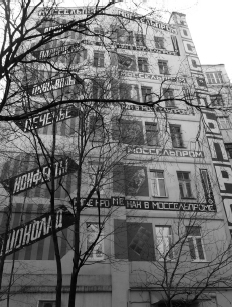
Mayakovsky and Rodchenko decorations on the Mosselprom Building (2011 photograph)
The Mosselprom building is in a sense a built example of the montage tower envisaged by Vladmir Krinsky. It is not something rising out of the city ex nihilo, but a reconstruction and re-imagining of an existing part of the cityscape. The concrete-framed building is usually credited to a relatively young Vkhutemas graduate, David Kogan. Richard Pare writes that: ‘this building was developed from an existing apartment block as the headquarters of the Moscow Association of Establishments for Processing Products of the Agricultural Industry; at the time it was one of the tallest structures in Moscow’.33 The alterations centre on two areas. First, the rear is given over to a display of advertisements by Rodchenko for various consumer goods – chocolates, drinks; and second, the building’s corner had added a few extra storeys to the point where it would have been regarded as skyscraping perhaps in Louis Sullivan’s time, if certainly not in the 1920s.
This deficiency is covered by re-imagining. The building is always depicted, in the ephemera/iconography of the time, from a corner, again a miming of the quirks of the New York zoning code – this time, the Flatiron building’s geometrically improbable thrust towards the road. Formally, this can then be depicted in varying ways depending on the particular desired effect. A package for Extra cigarettes features it with a central clock, smoothing it into a more Americanist, art deco form and (in the manner of the aforementioned technology companies advertisement) infusing the surrounding cityscape which now becomes a series of tall, brightly-lit blocks.34 Rodchenko’s more famous poster abstracts it, emphasising the frame. But this structural emphasis is undercut by the work Rodchenko did on the building itself, covering it in advertising in Grotesk typography, accentuating the bright colours and the lack of naturalism – while in American skyscraper design the opulence of the materials would be of the essence, here the building is a mere canvas for the application of slogans, a principle easily extended from the sphere of the commodity to the party-political.
An early Mayakovsky poem, ‘To Shop Signs’ is an embryonic instance of this infatuation with the advertisement. In it, the Taylorist poet Gastev’s observation that Futurism is an essentially consumerist aesthetic system35 is partly confirmed – what interests isn’t so much the commodities themselves but the web of images and signs that are woven around them, which seem to generate abundance all by themselves.
Read those iron books!
To the flute of the gilded letter
Will sprout glamorous beetroot
And smoked sardines and salmon.36
This preoccupation with what is added to the building, the extraneous parts added to it to bring it into the commodity-city, continues in the aesthetics of Soviet modernist architecture. It is customary to consider the architecture of the 1920s as a species of pure aesthetic object, an approach that was certainly favoured by its most influential practitioners (Mies van der Rohe and Le Corbusier). As Kestutis Paul Zygas’ Form Follows Form: Source Imagery of Constructivist Architecture, 1917–1925 extensively demonstrates, such an approach is totally alien to Constructivism, at least until it comes under extensive Corbusian influence. On the contrary, we have an obsession with street furniture, what Zygas calls a ‘component fixation’, dragged into the building itself – clocks, signs, slogans, a particular fondness for futuristic typography, very few of which can be found in their Western contemporaries. Zygas lists (and shows specific images of) the following typical ‘components’: ‘fixtures retrieved from the modern cityscape: giant clocks, searchlights, advertising signs, propaganda posters.’37 There is a particular device which is frequently used, even in more conservative projects, which is to place a radio mast at the top of the building, and use the wires and pylons as an integral part of the design – actualising the ‘radio-city’ promised by advertisers and avant-gardists alike. However, equally important was the straightforward use of typographical self-promotion.
Demystified Display Cases
For reasons either of historical happenstance or convenience, many of the structures planned were for organisations trading with the West, providing an alibi for the use of Roman script. Accordingly, a design like the Vesnin brothers’ ARCOS building, for the English-Russian trading organisation, delights in cosmopolitan, multilingual declarations – ARCOS limited at the top, lower down HOTEL-RESTAURANT, E WYSS, and in one corner, JARY FRERES MOTEURS. There is only one small area of Cyrillic type in the entire scheme. This goes way past the necessity of acclimatising any foreign delegations, and instead typographically pulls the Moscow street Westwards. This is even more prominent in another Vesnin brothers design, this time for the Central Telegraph Building, designed around the same time. Here, as Zygas points out, a particularly rich panoply of street furniture is affixed to the blueprint, from a prominent clock to large and poster-like lettering and slogans. In the Constructivist journal Sovremennaia Arkhitektura the Vesnins explained how the construction and arrangement of the building conformed with the norms of NOT – the scientific management movement headed by Alexei Gastev, dedicated to spreading Taylorism in the Soviet economy.38 Another particularly fine example is Moisei Ginzburg’s design for an Orgmetall headquarters – above the jutting glass volumes is, in the semi-Gothic script of the Chicago newspaper, the words ‘Go After Them!’ (where exactly this slogan derives from is unclear). This fetish is combined with a form that was in the process of being discarded in the USA.
All of these schemes, using exposed frames and/or an extensive use of glass, recall the ‘daylight factories’ of the 1900s, which were at that point being phased out in favour of Albert Kahn’s more carceral containers for production lines. What makes this particularly extraordinary is the reversal of the schema whereby the architect blandly accepts what the streetscape of capital will do to the work, planning and drafting an eternal object (and then abdicating responsibility for what happens next). Rather, the ephemera is featured into the plan, the draft itself, for the drama, dynamism and noise that it provides. Whether this entirely accords with a society in which, in Gastev’s terms, the consumer is less privileged than the producer, is an interesting question. Is this just a Futurist evocation of the hectic beauty of capital’s urban bustle (especially romantic in a mainly rural context), or a reconception of the capitalist city’s devices for an entirely different purpose? One way into this question is via the Gastev quote that begins this section, in which the veil of the city is lifted, in which its forms are seen naked, and in which those previously excluded are suddenly given free rein.39
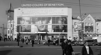
Mostorg Department Store in its current incarnation
This is certainly what is promised by the application of the ‘daylight factory’ approach to consumerism. The most frequently cited built version of this is the Mostorg department store in Moscow, again a design of the Vesnin brothers (this time constructed in 1927) which is a structure made up of two things. First, a huge display of futurist lettering, in which Mostorg Univermag (note also how the typically Soviet linguistic compression-neologism is mirrored by the building’s compaction) is written in a metallic, attenuated form; second, an enormous plate glass window. Accounts of this, such as Richard Pare’s, have focused on how this consumerist vitrine, suddenly opened up to the workers (never previously considered as potential consumers) has a politicised, emancipatory intent. Everything is on display, as much here as in one of the curtain-walled American stores built ten years earlier, though minus any filigree accoutrement.40
Here are the goods, come and take what you need. The gamble of this Constructivist approach to the part-capitalism of NEP is that this sort of sachlichkeit (precision) can appeal over and above the irrationalist promises of advertising and its atavistic appeals to myth and instinct. Key in the Constructivist embrace of advertising is that is on their own terms, using the most abstracted forms it provides. It is noteworthy that, for all the components, props and propaganda affixed to the Constructivist building (built and unbuilt) there is no figurative sculpture, or for that matter figurative imagery of any sort, until such things begin to be imposed by Stalinist fiat at the turn of the 1930s.41
This isn’t to suggest a hard-and-fast distinction between non-figurative advertising, favoured by the avant-garde, and political propaganda, which would incorrectly read them as liberals loath to participate in politics. There is a motif of what, with an appropriate hint of the utopian (in the Blochian, fairy-tale sense) was called ‘writing with light’ in the Constructivist streetscape, and this would be picked up – to their approval – by the organisers of official events and festivities, at least until the display of military power became the favoured mode. This is partly a take-up of one of the most impressive features of Erich Mendelsohn’s photo-essay Amerika. This book was regarded with such significance by the Soviet avant-garde that it was reviewed twice in Sovremennaia Arkhitektura. This is a (re)discovery of the American cityscape that we will discuss elsewhere, but it is useful for our purposes here in how it uses light as a way of making strange – specifically, making abstract – the otherwise irrationalist, over-ornamented, tacky city.
The most famous image takes a row of speeding cars, a neon-sign and the lights in an office block and makes out of them an abstract play of lights and planes. This truly creates a phantasmatic space, although not a reactionary phantasmagoria in the sense of a Wrigley palace or the Woolworth building. Rather, the everyday act of walking through the city becomes electrically charged, it is seen anew. In 1927 Novyi LEF featured two photographs, in an article titled ‘Contemporary Everyday Photography’, by R. Karmen.42 These were of the 10th anniversary celebrations of the October Revolution, and take Mendelsohn’s principle to an extreme whereby, with blurring and mirroring, the street is suffused with lit words – Lenin, October, etc. – all of which are not, so is the implication of the article’s title, something to be saved for the annual ritual, but an everyday experience – in which Mayakovsky’s iron books come loose from their moorings on the shop frontage and float freely around the city.43
The city of commodities can be represented as a city literally built out of commodities, in another dream-image that suggests both utopia and myth. It’s an under-remarked upon fact that when Hannes Meyer took over the directorship of the Dessau Bauhaus, he introduced into it a department of advertising. In fact, during the reign of this director, usually painted as an intractable Marxist implacably hostile to the status quo, the Bauhaus first turned a profit. Later on we will have occasion to look at how Meyer’s Bauhaus embraced its own contradictions. For the moment though, we shall concentrate on an extraordinary project of his from the earlier 1920s, when he worked closely with El Lissitzky and Mart Stam in the ABC Group – the series known as the ‘Co-op Vitrines’.
Here Meyer placed under glass a series of objects produced by Germany’s co-operative stores – like the ‘socialist’ elements of NEP, a collectivist element in a mixed economy. The contents of the boxes weren’t quite as important as the packages themselves, and the declarations they made about their contents. The arrangements vary, but there is one common factor – the packages become cities. Laid down in rows they appear as streets, piled up they become houses and skyscrapers. The commodity city is turned inside out. The goods under glass, that emblematic form of capitalist urbanism, even in the Vesnin brothers’ rationalised, socialist version, become the model for an entire, depopulated city. The commodities don’t necessarily have more life than the city’s inhabitants, in Marx’s terms – rather, their deadness (combined with their garish, communicative and standardised power) is represented in a city of packaged tombstones.44
This image is, in a distinctly apposite symmetry, a feature of NEP advertising. A 1925 advertisement, which doesn’t appear to be for Mostorg, Mosselprom or one of the more ideologically driven consumerist endeavours, imagines a city made of Ukrainian soap.45 This might be fairly banal if it were merely piles of unwrapped bars of soap. Instead, the repetition of these soap skyscrapers, which are stepped in true New York style, is reinforced and exacerbated by the recurrence of the pattern of folding, the printed image on the wrapper, the lettering. What appears to be a shadowy crowd has gathered to genuflect in front of the soap-city, dwarfed by the pile-up of commodities. Naturally on one level this is utopian wish fulfilment of the same ilk as that of the futuristic city brought into being by the Mosselprom building and the Shabolovka Tower, but it is also a reminder of the dream of commodity abundance, particularly sharp, no doubt, in a society emerging from seven years of war. This abundance creates a city, in this image, one both standardised and fantastical.
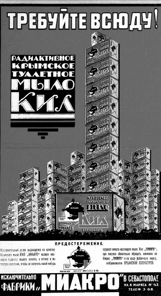
Skyscrapers of soap
The High-Velocity Billboard
The Soviet sky-city as a romantic, dramatic scene for an entirely modernist ‘performance of everyday life’ (in Alexei Gan’s phrase) is prefigured in the film posters of Vladimir and Georgy Stenberg. These have often been dismissed as a backtracking from their former position as prominent members of Obmokhu, the early Constructivist group, where their designs were seen as potential industrial prototypes. Their return as designers to the figurative, and to painting (the collages on their posters were very seldom actually a result of photomontage) has been categorised as emblematic of a general Constructivist retreat from production into representation.46 Nonetheless, these posters may not participate in the production of industrial objects, but they do serve as a mass-produced indicator of the political aesthetics of NEP in relation to the USA and to the built environment. What happens in these posters is frequently a making-avant-garde or making-Constructivist the American environment (as cinematic construct) and a making-American of the Soviet urban context. One of the two posters they designed for Vertov’s Man with a Movie Camera (1929) shows this process in the latter case.47 A well-known image, it shows, from below, at the kind of sharp low-angle seen in Mendelsohn’s Amerika photos and in Rodchenko, a towering skyscraper landscape, in which the abstracted towers (each a different but equally garish and jarring colour) frame a disembodied female figure who is literally pulled apart, in a grisly mimesis of Vertov’s cutting techniques. First of all, these skyscrapers show a clear knowledge, not only in the setbacks of the New York zoning code, but also of specific recent skyscrapers. One resembles Walker & Gillette’s Fuller building, another Howells and Raymond Hood’s Daily News building, both of which were already significantly more stripped and abstract than the neo-Gothic of the early 1920s.
What, though, is the reasoning behind depicting this Soviet city-portrait, centred on Moscow and Odessa, as a New York cityscape? Partly this is no doubt for publicity purposes, to excite and attract an America-infatuated audience, but partly it is also a non-literal representation of Vertov’s intent to make strange the environments in question by depicting them as fully Americanised, rather than on-the-way-to, aspiring to ‘catch up and surpass’. What this does to the person walking the streets, or the spectator (as represented by the central dismembered figure, who with her high heels and bob is already Americanised in the sense of the girls of the ‘STOP!’ poster), is violent and literally shattering, throwing them into component parts that might not necessarily fit together in the same way again. The sky-city as depicted by the Stenbergs would seem then to have a sexually sadistic undertow, were it not for the fact that the figure mimes their own immersion in the wildness and brutality of an (imaginary and documented) Americanised everyday life. Skyscrapers (always drawing from the ‘art deco’ minimalism of the late 1920s, with their stripped spandrels providing a vertical equivalent to the Constructivist/Corbusian ribbon-window) are seemingly at random put into other wholly Soviet pictorial contexts, where they would seem bizarre and inappropriate.
In two posters for the documentary SEP, with the unpromising synopsis ‘about a training course (SEP) for army personnel, provided by the Soviet Army’s film department’, there is, jutting out of the corner of compositions bursting with latent violence and action (tanks, a girl with a gun), a truncated strip of a Daily News building-style tower.48 On the other hand, when ‘America’ itself is the matter for the poster, as in their series of posters for Richard Talmadge, the towers are abstracted even further. In the image for Daddy’s Boy,49 a suited, trilbyed figure leaps out of one skyscraper window into a street lined with them, all of which seem far closer to Gropius or the Vesnin brothers than to the actual landscape of New York. Both are insufficient in the Stenbergs’ graphic work: the Soviet Union is too full of remnants of the pre-revolutionary era to be depicted as it is, while the USA is for the most part too pre-revolutionary in its aesthetics to be represented literally. What is imagined here is a dynamic amalgam of the two into a kinetic, heavily sexualised fantasy, one in which dismemberment or hanging from a tall building are the matter of the everyday.
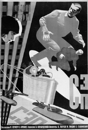
Stenberg Brothers’ poster for sep
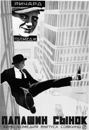
Stenberg Brothers’ poster for Daddy’s Boy
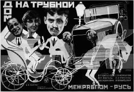
Prusakov’s poster for Boris Barnet’s House on Trubnaya
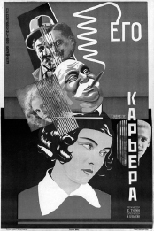
Prusakov’s poster for His Career
An equally radical transformation of the environment and the human body can be found in particularly farcical form in the work of the more obscure poster designer Nikolai Prusakov, like the Stenbergs a former abstract artist in Obmokhu. In these, the mechanised city of the Stenberg posters is internalised in the bodies of the films’ characters, in a manner which combines caricature, slapstick, montage and sexual tension. Prusakov used some techniques that were familiar from popular caricature, such as oversized, prominent heads on rudimentary bodies; other parts of Prusakov’s style come from Constructivism and Dada, and throughout, his posters are distinctively comic. The 1928 poster for Boris Barnet’s The House on Trubnaya – like The Girl with the Hatbox, a satirical comedy on the new stupidities – is a case in point. Riding on a horse and cart are the film’s three protagonists. Film stills of their monochrome heads are montaged onto bodies made up of vertical lines, as if from graph paper, which are then coloured in bright, artificial yellows and reds. Their cart, progressing down an abstracted historic street, is carried by a horse whose body is also transforming into a stylised graph as he leaps forward into the path of a Model T Ford. In the poster for Victor Turin’s film His Career, from the same year, a drama is represented by a Malevich-like montage made up of the opposed forms of various heads – a bloated cigar-smoking capitalist, a blonde starlet, two bourgeois-looking men – plunged into the painted female protagonist, as if they are plunged into her mind. In the poster for A Glass Eye (again, 1928), Prusakov staged a confrontation between what seems to be a scene from the ‘high-society film’ – an embracing couple, the man in a chic checked suit, the woman in a nightgown. The scale of the characters is made completely farcical, as the woman in the nightie holds aloft her diminutive partner. Meanwhile, a moustachioed, monocled man looks on. His body is a film camera.
These images are among the most violent and extraordinary of the NEP period. In most cases (though not all), they are considerably more radical than the films they advertise. Their blaring colours and disjointed montages were, perhaps, made more acceptable as advertisements because the figures are often quite conventionally glamorous; rather than the heavy male and female workers you can find on the contemporary political posters of Gustav Klutsis or Valentina Kulagina, the people appearing here look like stars, the men suave, the women vampish. In the process, they make even more sharply apparent the transformations in gender relations then current in Soviet cities, full of sexual tension and the overt suggestion of sexual exploitation. Bodies themselves are fragmented, cut up, mechanised and transformed in their scale. What is especially important is that as posters, these were objects in urban space, part of (urban) everyday life, on which they provided a commentary as dreamlike and unnerving as any of the films of the avant-garde; and unlike them, they are not interested in providing a proletarian ‘positive’ to counter the NEP negatives they satirise.
Comrade van Winkle
Many of the Soviet films of this period use – or, more often, distort – the actually constructed modernist architecture of the 1920s as the object for satire or utopian dreaming, or in many cases, both. Most examples that do attempt this use probably the largest Soviet building project of the 1920s, the Derzhprom or Gosprom building in the then-Ukrainian capital, Kharkov. The building’s sheer scale and advanced technology made it an obvious propaganda coup, appearing in a special 1933 issue of the fellow-travelling brochure Soviet Travel and in innumerable guidebooks and propaganda tracts.50 The building enters mass-produced dream life in the films of the time in a quite literal sense. Frederick Ermler’s 1929 Fragment of Empire used it in a Rip van Winkle, Sleeper Awakes tale of an overall -clad, bearded worker awaking from a 12-year sleep to the incomprehensible post-revolutionary world, one which is completely illegible and disorienting. Although the film was set in St Petersburg, the complex was used to symbolise the sheer spatial strangeness to the Tsarist observer of the environment produced by Communism and Constructivism; assuming, perhaps, that the audience across the Soviet expanse would not be too familiar with either city. The building is placeless, able to be geographically indeterminate, a shifting signifier of a baffling future. The sense of something that had suddenly, jarringly appeared while the observer was sleeping actually fits perfectly with Gosprom’s status in Soviet urbanism – supposedly emblematic, but in actual fact entirely unparalleled, and in no way representative of the majority of building activity, even in urban centres. So it essentially takes the form of a built promise – the claim that it shows that the new world is being or has been constructed combined with a certain eschatological hope that eventually, even neoclassical St Petersburg will resemble it. Meanwhile in another film of the same year, this complex similarly exists in a fantasy geography.

Muzhik meets Constructivism: Fragment of Empire
In Eisenstein’s The General Line, the building features in an episode wherein the film’s heroine Marfa goes to the city to demand a new tractor for her embattled attempt at a collective farm. Eisenstein includes it first in a montage of urban industry – huge Grotesk letters proclaim ‘FROM THE PALACE OF INDUSTRY …’, yet at least one of the buildings seen alongside it – the MOGES power station by Ivan Zholtovsky – is actually in Moscow. The imaginary geography leads to a bizarre scene of blending later on. Eduard Tisse’s camera hurtles down one of the building’s towers, intercut with the same camera motion depicting Boris Velikovsky’s Gostorg building in Moscow, an almost imperceptible transition; and then Marfa walks out of the revolving doors of the Kharkov building. Eisenstein’s interest in architecture is well documented, but his use of these buildings has escaped attention in comparison with, say, the architectural space of Ivan the Terrible. The Constructivist architectural spaces of The General Line play a complicated dialectical game between the constructed and the imaginary. Some attention has been paid to Andrei Burov’s Corbusian mock-up factory farm, an imaginary vision of efficient agriculture and the gleamingly purist war of nature, filmed with lush attention to detail as it goes about its entirely hypothetical production of eggs, meat and so forth.51 The Kharkov complex is unsubtly used as the symbolic heart of the Stalinist bureaucracy. Within it are ageing administrators morphing into portraits of Lenin, pretentiously ornate signatures, and incredible, industrial machinery (when filmed up close) which turns out to be mere stenographic equipment. There is an explicit political critique here. The modernism of Byt, the daily struggle of the endless, un-electrified countryside is only Marfa’s dream, a Constructivist fantasy extending to the unconscious of a sleeping peasant (regardless of the intertitles proclamation that ‘this isn’t a dream!’).
Augmented skyscrapers in The General Line
The modernism of the bureaucracy meanwhile is a constructed, grandiose (in scale if not in ornament) micro-city, and inside it are malingering, obstructive bureaucrats. However, this is undercut by the awe-inducing technique as the building is first shown, fast-cut and then viewed panoramically to depict its enormous scale – when, with a typical gesture of historical disinterest, Eisenstein manipulates the shot in order to make the towers look approximately five storeys taller, more like a ‘real’ skyscraper.52 The complex is both the centre of all that is sclerotic and obstructive in the Soviet apparatus, and emblematic of its futuristic appeal. However, for the most part, the environments which the protagonists of 1920s Soviet films walk through are those bequeathed by the pre-revolutionary era, albeit transformed in their content through the new forms of life thrown up by the October Revolution. This would soon change.