Sometimes you just need to get to the heart of the matter.


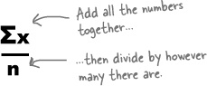
It’s likely that you’ve been asked to work out averages before. One way to find the average of a bunch of numbers is to add all the numbers together, and then divide by how many numbers there are.
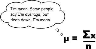
In statistics, this is called the mean.

Because there’s more than one sort of average.
We’ll be looking at other types of averages, besides the mean, later in this chapter.
If you want to really excel with statistics, you’ll need to become comfortable with some common stats notation. It may look a little strange at first, but you’ll soon get used to it.

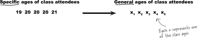
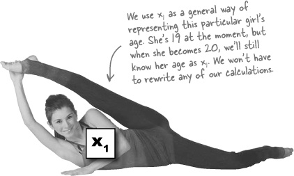
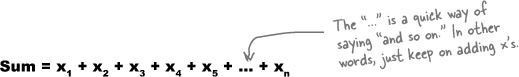
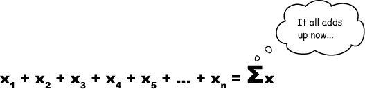
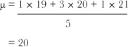
Statisticians use letters to represent unknown numbers. But what if we don’t know how many numbers we might have to add together? Not a problem—we’ll just call the number of values n. If we didn’t know how many people were in the Power Workout class, we’d just say that there were n of them, and write the sum of all the ages as:

Now that we know some handy math shortcuts, let’s see how we can apply this to the mean.


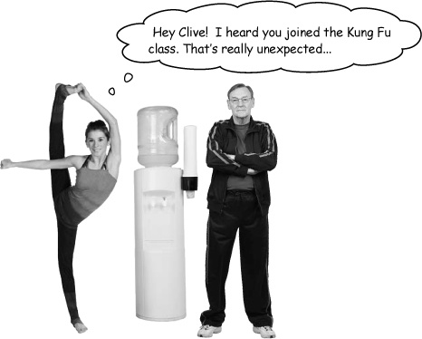
Sketch the histograms for the Kung Fu and Power Workout classes. (If you need a refresher on histograms, flip back to Chapter 1.) How do the shapes of the distributions compare? Why was Clive sent to the wrong class?
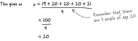
Power Workout Classmate Ages
Age | 19 | 20 | 21 |
Frequency | 1 | 3 | 1 |
Kung Fu Classmate Ages
Age | 19 | 20 | 21 | 145 | 147 |
Frequency | 3 | 6 | 3 | 1 | 1 |
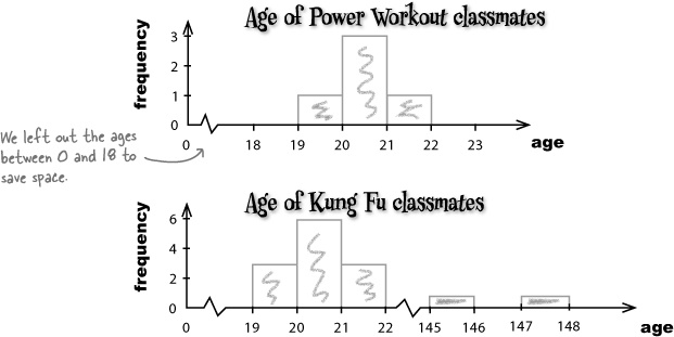
Did you see the difference in the shape of the charts for the Power Workout and Kung Fu classes? The ages of the Power Workout class form a smooth, symmetrical shape. It’s easy to see what a typical age is for people in the class.
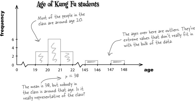
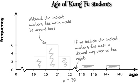
If you look at the data and chart of the Kung Fu class, it’s easy to see that most of the people in the class are around 20 years old. In fact, this would be the mean if the ancient masters weren’t in the class.
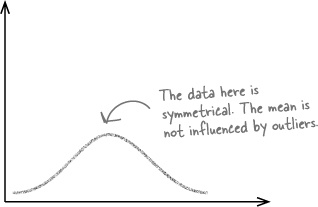
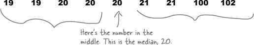
If the mean becomes misleading because of skewed data and outliers, then we need some other way of saying what a typical value is. We can do this by, quite literally, taking the middle value. This is a different sort of average, and it’s called the median.
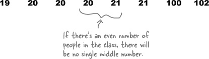
What if there had been an even number of people in the class?
BE the data Solution
Your job is to play like you’re the data, and say what the median is for each set, whether the data is skewed, and whether the mean is higher or lower than the median. Give reasons why.
Values | 1 | 2 | 3 | 4 | 5 | 6 | 7 | 8 |
Frequency | 4 | 6 | 4 | 4 | 3 | 2 | 1 | 1 |
Values | 1 | 4 | 6 | 8 | 9 | 10 | 11 | 12 |
Frequency | 1 | 1 | 2 | 3 | 4 | 4 | 5 | 5 |

Your work on averages is really paying off. More and more people are turning up for classes at the Health Club, and the staff is finding it much easier to find classes to suit the customers.
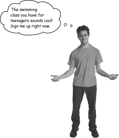
This teenager is after a swimming class where he can make new friends his own age.


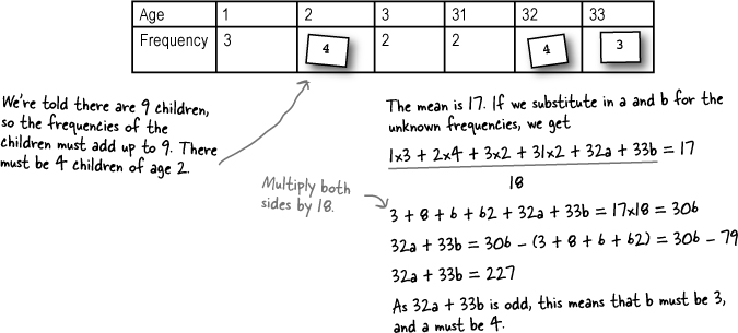
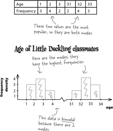
Age | 1 | 2 | 3 | 31 | 32 | 33 |
Frequency | 3 | 2 | 2 |
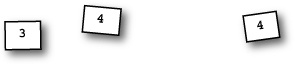
Here are the ages of people who go to the Little Ducklings class, but some of the frequencies have fallen off. Your task is to put them in the right slot in the frequency table. Nine children and their parents go to the class, and the mean and median are both 17.

Let’s take a closer look at what’s going on.
Here are the ages of people who go to the Little Ducklings class.
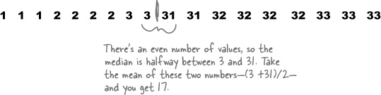
The mean and median for the class are both 17, even though there are no 17-year-olds in the class!
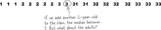
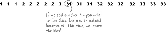
Whichever value we choose for the average age, it seems misleading.
In addition to the mean and median, there’s a third type of average called the mode. The mode of a set of data is the most popular value, the value with the highest frequency. Unlike the mean and median, the mode absolutely has to be a value in the data set, and it’s the most frequent value.


Your efforts at the Health Club are proving to be a huge success, and demand for classes is high.

Vital Statistics: Mode
The mode has to be in the data set. It’s the only average that works with categorical data.
Exercise Solution
Complete the table below. For each type of average we’ve encountered in the chapter, write down how to calculate it, and then give the circumstances in which you should use each one. Try your hardest to fill this out without looking back through the chapter.
Average | How to calculate | When to use it |
|---|---|---|
Mean (μ) |
| When the data is fairly symmetric and shows just the one trend. |
Median | Line up all the values in ascending order. If there are an odd number of values, the median is the one in the middle. If there are an even number of values, add the two middle ones together, and divide by two. | When the data is skewed because of outliers. |
Mode | Choose the value(s) with the highest frequency. If the data is showing two clusters of data, report a mode for each group. | When you’re working with categorical data. When the data shows two or more clusters of data. |

Sharpen your pencil Solution
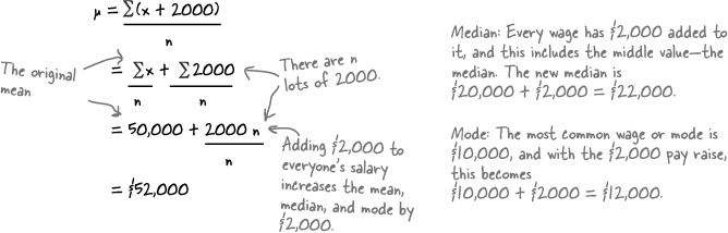
The generous CEO of Starbuzz Coffee wants to give all his employees a pay rise. He’s not sure whether to give everyone a straight $2,000 raise, or whether to increase salaries by 10%. The mean salary is $50,000, the median is $20,000, and the mode is $10,000.
What happens to the mean, median, and mode if everyone at Starbuzz is given a $2,000 pay raise?
Mean: If x represents the original wages, and n the number of employees,
What happens to the mean, median, and mode if everyone at Starbuzz is given a 10% pay raise instead?
This time, all of the wages are multiplied by 1.1 (which is 100% + 10%).