
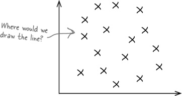
Have you ever wondered how two things are connected?
So far we’ve looked at statistics that tell you about just one variable—like men’s height, points scored by basketball players, or how long gumball flavor lasts—but there are other statistics that tell you about the connection between variables. Seeing how things are connected can give you a lot of information about the real world, information that you can use to your advantage. Stay with us while we show you the key to spotting connections: correlation and regression.
Concerts are best when they’re in the open air—at least that’s what these groovy guys think. They have a thriving business organizing open-air concerts, and ticket sales for the summer look promising.
Today’s concert looks like it will be one of their best ones ever. The band has just started rehearsing, but there’s a cloud on the horizon...


Before too long the sky’s overcast, temperatures are dipping, and it looks like rain. Even worse, ticket sales are hit. The guys are in trouble, and they can’t afford for this to happen again.
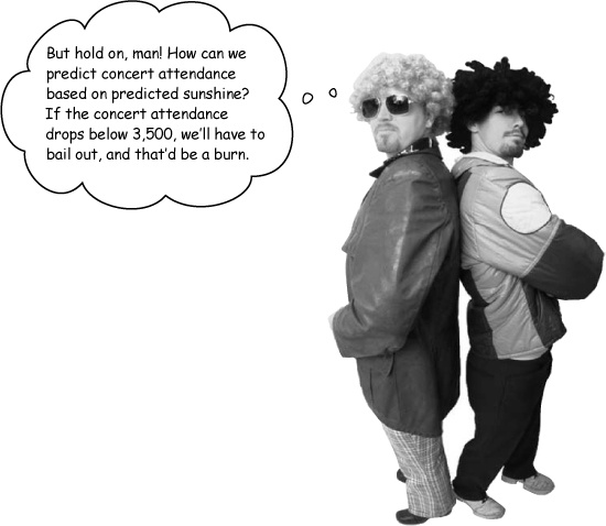
What the guys want is to be able to predict what concert attendance will be given predicted hours of sunshine. That way, they’ll be able to gauge the impact an overcast day is likely to have on attendance. If it looks like attendance will fall below 3,500 people, the point where ticket sales won’t cover expenses, then they’ll cancel the concert
They need your help.
Here’s sample data showing the predicted hours of sunshine and concert attendance for different events. How can we use this to estimate ticket sales based on the predicted hours of sunshine for the day?
Sunshine (hours) | 1.9 | 2.5 | 3.2 | 3.8 | 4.7 | 5.5 | 5.9 | 7.2 |
Concert attendance (100’s) | 22 | 33 | 30 | 42 | 38 | 49 | 42 | 55 |

Most of the time, that’s exactly the sort of thing we’d need to do to predict likely outcomes.
The problem this time is, what would we find the mean and standard deviation of? Would we use the concert attendance as the basis for our calculations, or would we use the hours of sunshine? Neither one of them gives us all the information that we need. Instead of considering just one set of data, we need to look at both.
So far we’ve looked at independent random variables, but not ones that are dependent. We can assume that if the weather is poor, the probability of high attendance at an open air concert will be lower than if the weather is sunny. But how do we model this connection, and how do we use this to predict attendance based on hours of sunshine?
It all comes down to the type of data.
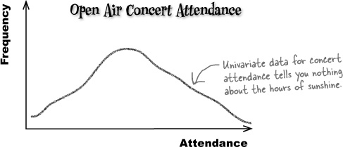
Up until now, the sort of data we’ve been dealing with has been univariate.
Univariate data concerns the frequency or probability of a single variable. As an example, univariate data could describe the winnings at a casino or the weights of brides in Statsville. In each case, just one thing is being described.
What univariate data can’t do is show you connections between sets of data. For example, if you had univariate data describing the attendance figures at an open air concert, it wouldn’t tell you anything about the predicted hours of sunshine on that day. It would just give you figures for concert attendance.
So what if we do need to know what the connection is between variables? While univariate data can’t give us this information, there’s another type of data that can—bivariate data.
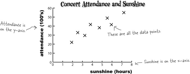
Bivariate data gives you the value of two variables for each observation, not just one. As an example, it can give you both the predicted hours of sunshine and the concert attendance for a single event or observation, like this.
Sunshine (hours) | 1.9 | 2.5 | 3.2 | 3.8 | 4.7 | 5.5 | 5.9 | 7.2 |
Concert attendance (100’s) | 22 | 33 | 30 | 42 | 38 | 49 | 42 | 55 |
If one of the variables has been controlled in some way or is used to explain the other, it is called the independent or explanatory variable. The other variable is called the dependent or response variable. In our example, we want to use sunshine to predict attendance, so sunshine is the independent variable, and attendance is the dependent.
Just as with univariate data, you can draw charts for bivariate data to help you see patterns. Instead of plotting a value against its frequency or probability, you plot one variable on the x-axis and the other variable against it on the y-axis. This helps you to visualize the connection between the two variables.
This sort of chart is called a scatter diagram or scatter plot, and drawing one of these is a lot like drawing any other sort of chart.
Start off by drawing two axes, one vertical and one horizontal. Use the x-axis for one variable and the y-axis for the other. The independent variable normally goes along the x-axis, leaving the dependent variable to go on the y-axis. Once you’ve drawn your axes, you then take the values for each observation and plot them on the scatter plot.
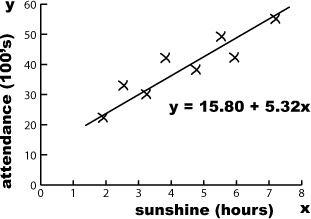
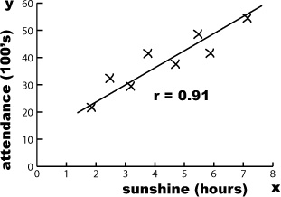
Here’s a scatter plot showing the number of hours of sunshine and concert attendance figures for particular events or observations. As the predicted number of hours sunshine is the independent variable, we’ve plotted it on the x-axis. The concert attendance is the dependent variable, so that’s on the y-axis.
x (sunshine) | 1.9 | 2.5 | 3.2 | 3.8 | 4.7 | 5.5 | 5.9 | 7.2 |
y (attendance) | 22 | 33 | 30 | 42 | 38 | 49 | 42 | 55 |
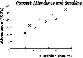
Can you see how the scatter diagram helps you visualize patterns in the data? Can you see how this might help us to define the connection between open air concert attendance and predicted number of hours sunshine for the day?
Sharpen your pencil
We know we haven’t shown you how to analyze bivariate data yet, but see how far you get in analyzing the scatter diagram for the concert organizers.
What sort of patterns do you see in the chart? How can you relate this to the underlying data? What do you expect open air concert attendance to be like if it’s sunny? What about if it’s overcast?
Sharpen your pencil Solution
We know we haven’t shown you how to analyze bivariate data yet, but see how you get on with analyzing the scatter diagram for the concert organizers.
What sort of patterns do you see in the chart? How can you relate this to the underlying data? What do you expect open air concert attendance to be like if it’s sunny? What about if it’s overcast?

First of all, the chart shows that the data points are clustered around a straight line on the chart, and this line slopes upwards. It looks like, if the predicted number of hours of sunshine in a day is relatively low, then the concert attendance is low too. If the number of hours sunshine is high, then we can expect concert attendance to be high too. This basically means that the sunnier the weather, the more people you can expect to go to the open air concert.
One thing that’s important to note is that we can only be confident about saying this within the range of the data. We have no data to say what the pattern is like if the number of hours of sunshine is below 2 hours or above 7.5 hours.
As you can see, scatter diagrams are useful because they show the actual pattern of the data. They enable you to more clearly visualize what connection there is between two variables, if indeed there’s any connection at all.
The scatter diagram for the concert data shows a distinct pattern—the data points are clustered along a straight line. We call this a correlation.
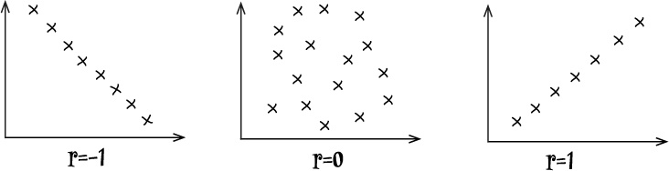
Linear Correlations Up Close
Scatter diagrams show the correlation between pairs of values.
Correlations are mathematical relationships between variables. You can identify correlations on a scatter diagram by the distinct patterns they form. The correlation is said to be linear if the scatter diagram shows the points lying in an approximately straight line.
Let’s take a look at a few common types of correlation between two variables:
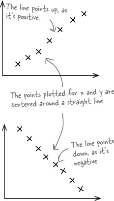
Positive linear correlation
Positive linear correlation is when low values on the x-axis correspond to low values on the y-axis, and higher values of x correspond to higher values of y. In other words, y tends to increase as x increases.
Negative linear correlation
Negative linear correlation is when low values on the x-axis correspond to high values on the y-axis, and higher values of x correspond to lower values of y. In other words, y tends to decrease as x increases.
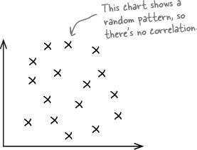
No correlation
If the values of x and y form a random pattern, then we say there’s no correlation.
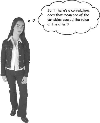
A correlation between two variables doesn’t necessarily mean that one caused the other or that they’re actually related in real life.
A correlation between two variables means that there’s some sort of mathematical relationship between the two. This means that when we plot the values on a chart, we can see a pattern and make predictions about what the missing values might be. What we don’t know is whether there’s an actual relationship between the two variables, and we certainly don’t know whether one caused the other, or if there’s some other factor at work.
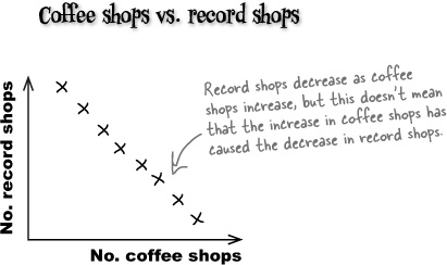
As an example, suppose you gather data and find that over time, the number of coffee shops in a particular town increases, while the number of record shops decreases. While this may be true, we can’t say that there is a real-life relationship between the number of coffee shops and the number of record shops. In other words, we can’t say that the increase in coffee shops caused the decline in the record shops. What we can say is that as the number of coffee shops increases, the number of record shops decreases.

So far we’ve looked at what bivariate data is, and how scatter diagrams can show whether there’s a mathematical relationship between the two variables. What we haven’t looked at yet is how we can use this to make predictions.
What we need to do next is see how we can use the data to make predictions for concert attendance, based on predicted hours of sunshine.
So far you’ve seen how scatter diagrams can help you see whether there’s a correlation between values, by showing you if there’s some sort of pattern. But how can you use this to predict concert attendance, based on the predicted amount of sunshine? How would you use your existing scatter diagram to predict the concert attendance if you know how many hours of sunshine are expected for the day?
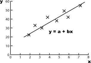
One way of doing this is to draw a straight line through the points on the scatter diagram, making it fit the points as closely as possible. You won’t be able to get the straight line to go through every point, but if there’s a linear correlation, you should be able to make sure every point is reasonably close to the line you draw. Doing this means that you can read off an estimate for the concert attendance based on the predicted amount of sunshine.

The line that best fits the data points is called the line of best fit.
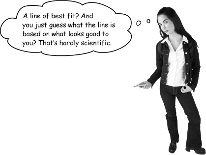
Drawing the line in this way is just a best guess.
The trouble with drawing a line in this way is that it’s an estimate, so any predictions you make on the basis of it can be suspect. You have no precise way of measuring whether it’s really the best fitting line. It’s subjective, and the quality of the line’s fit depends on your judgment.
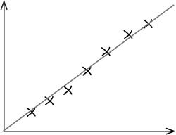
Imagine if you asked three different people to draw what each of them think is the line of best fit for the open air concert data. It’s quite likely that each person would come up with a slightly different line of best fit, like this:
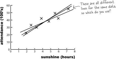
All three lines could conceivably be a line of best fit for the data, but what we can’t tell is which one’s really best.
What we really need is some alternative to drawing the line of best fit by eye. Instead of guessing what the line should be, it will be more reliable if we had a mathematical or statistical way of using the data we have available to find the line that fits best.
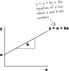
The equation for a straight line takes the form y = a + bx, where a is the point where the line crosses the y-axis, and b is the slope of the line. This means that we can write the line of best fit in the form y = a + bx.
In our case, we’re using x to represent the predicted number of hours of sunshine, and y to represent the corresponding open air concert figures. If we can use the concert attendance data to somehow find the most suitable values of a and b, we’ll have a reliable way to find the equation of the line, and a more reliable way of predicting concert attendance based on predicted hour of sunshine.
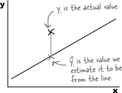
Let’s take a look at what we need from the line of best fit, y = a + bx.
The best fitting line is the one that most accurately predicts the true values of all the points. This means that for each known value of x, we need each of the y variables in the data set to be as close as possible to what we’d estimate them to be using the line of best fit. In other words, given a certain number of hours sunshine, we want our estimates for open air concert attendance to be as close as possible to the actual values.
The line of best fit is the line y = a + bx that minimizes the distances between the actual observations of y and what we estimate those values of y to be for each corresponding value of x.
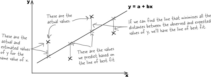
Let’s represent each of the y values in our data set using yi, and its estimate using the line of best fit as  . This is the same notation that we used for point estimators in previous chapters, as the ^ symbol indicates estimates.
We want to minimize the total distance between each actual value of y and our estimate of it based on the line of best fit. In other words, we need to minimize the total differences between yi and . We could try doing this by minimizing

but the problem with this is that all of the distances will actually cancel each other out. We need to take a slightly different approach, and it’s one that we’ve seen before.
Can you remember when we first derived the variance? We wanted to look at the total distance between sets of values and the mean, but the total distances cancelled each other out. To get around this, we added together all the distances squared instead to ensure that all values were positive.
We have a similar situation here. Instead of looking at the total distance between the actual and expected points, we need to add together the distances squared. That way, we make sure that all the values are positive.
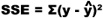
The total sum of the distances squared is called the sum of squared errors, or SSE. It’s given by:

In other words, we take each value of y, subtract the predicted value of y from the line of best fit, square it, and then add all the results together.
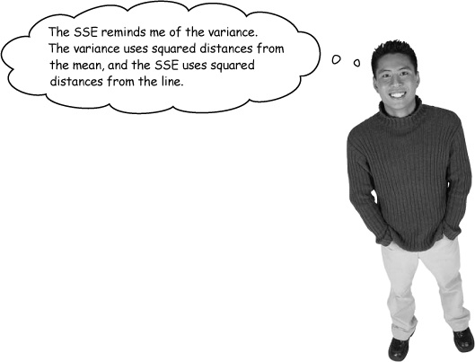
The variance and SSE are calculated in similar ways.
The SSE isn’t the variance, but it does deal with the distance squared between two particular points. It gives the total of the distances squared between the actual value of y and what we predict the value of y to be, based on the line of best fit.
What we need to do now is use the data to find the values of a and b that minimize the SSE, based on the line y = a + bx.
We’ve said that we want to minimize the sum of squared errors,  , where y = a + bx. By doing this, we’ll be able to find optimal values for a and b, and that will give us the equation for the line of best fit.
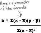
The value of b for the line y = a + bx gives us the slope, or steepness, of the line. In other words, b is the slope for the line of best fit.
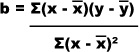
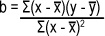
We’re not going to show you the proof for this, but the value of b that minimizes the SSE is given by
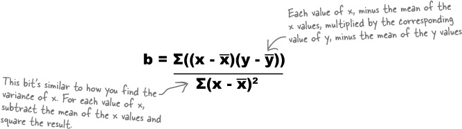

The calculation looks tricky at first, but it’s not that difficult with practice.
First of all, find x̄ and ȳ, the means of the x and y values for the data that you have. Once you’ve done that, calculate (x – x̄) multiplied by (y – ȳ) for every observation in your data set, and add the results together. Finally, divide the whole lot by Σ(x – x̄)2. This last part of the equation is very similar to how you calculate the variance of a sample. The only difference is that you don’t divide by (n – 1). You can also get software packages that work all of this out for you.
Let’s take a look at how you use this in practice.
Let’s see if we can use this to find the slope of the line y = a + bx for the concert data. First of all, here’s a reminder of the data:
x (sunshine) | 1.9 | 2.5 | 3.2 | 3.8 | 4.7 | 5.5 | 5.9 | 7.2 |
y (attendance) | 22 | 33 | 30 | 42 | 38 | 49 | 42 | 55 |
Let’s start by finding the values of x̄ and ȳ, the sample means of the x and y values. We calculate these in exactly the same way as before, so
x̄ | = (1.9 + 2.5 + 3.2 + 3.8 + 4.7 + 5.5 + 5.9 + 7.2)/8 |
= 34.7/8 | |
= 4.3375 |
ȳ | = (22 + 33 + 30 + 42 + 38 + 49 + 42 + 55)/8 |
= 311/8 | |
= 38.875 |
Now that we’ve found x̄ and ȳ, we can use them to help us find the value of b using the formula on the opposite page.
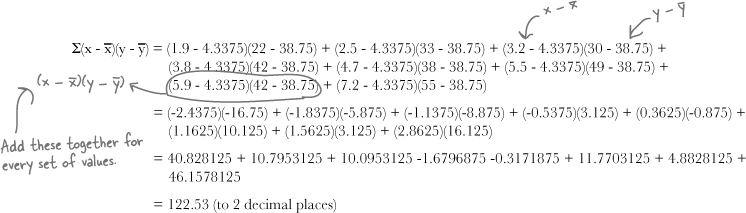
The first part of the formula is Σ(x – x̄)(y – ȳ). To find this, we take the x and y values for each observation, subtract x̄ from the x value, subtract ȳ from the y value, and then multiply the two together. Once we’ve done this for every observation, we then add the whole lot up together.
Here’s a reminder of the data for concert attendance and predicted hours of sunshine:
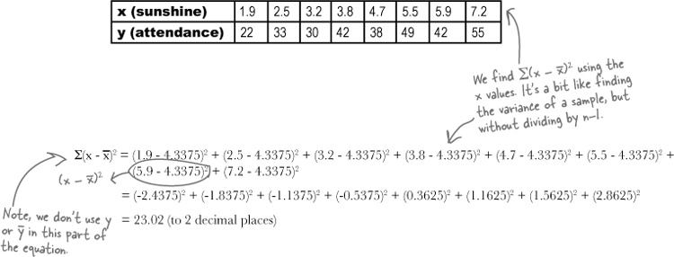
We’re part of the way through calculating the value of b, where y = a + bx. We’ve found that x̄ = 4.3375, ȳ = 38.875, and Σ(x – x̄)(y – ȳ) = 122.53. The final thing we have left to find is Σ(x – x̄)2. Let’s give it a go
We find the value of b by dividing Σ(x – x̄)(y – ȳ) by Σ(x – x̄)2. This gives us
b | = 122.53/23.02 |
= 5.32 |
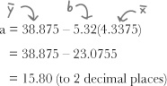
In other words, the line of best fit for the data is y = a + 5.32x. But what’s a?
So far we’ve found what the optimal value of b is for the line of best fit y = a + bx. What we don’t know yet is the value of a.

The line needs to go through point (x̄, ȳ).
It’s good for the line of best fit to go through the the point (x̄, ȳ), the means of x and y. We can make sure this happens by substituting x̄ and ȳ into the equation for the line y = a + bx. This gives us
ȳ = a + bx̄
or
a = ȳ – bx̄
We’ve already found values for x̄, ȳ, and b. Substituting in these values gives us
Relax
If you’re taking a statistics exam, it’s likely you’ll be given this formula.
This means that you’re unlikely to have to memorize it, you just need to know how to use it.
This means that the line of best fit is given by
y = 15.80 + 5.32x
Least Squares Regression Up Close
The mathematical method we’ve been using to find the line of best fit is called least squares regression.
Least squares regression is a mathematical way of fitting a line of best fit to a set of bivariate data. It’s a way of fitting a line y = a + bx to a set of values so that the sum of squared errors is minimized—in other words, so that the distance between the actual values and their estimates are minimized. The sum of squared errors is given by
To perform least squares regression on a set of data, you need to find the values of a and b that best fit the data points to the line y = a + bx and minimizes the SSE. You can do this using:
and
a = ȳ – bx̄
Once you’ve found the line of best fit, y = a + bx, you can use it to predict the value of y, given a value b. To do this, just substitute your x value into the equation y = a + bx.
The line y = a + bx is called the regression line.
Watch it!
When you’re predicting values of y for a particular value of x, be wary of predicting values that fall outside the area you have data points for.
Linear regression is just an estimate based on the information you have, and it shows the relationship between the data points you know about. This doesn’t mean that it applies well beyond the limits of the data
So far you’ve used linear regression to model the connection between predicted hours of sunshine and concert attendance. Once you know what the predicted amount of sunshine is, you can predict concert attendance using y = a + bx.
Being able to predict attendance means you’ll be able to really help the concert organizers know what they can expect ticket sales to be, and also what sort of profit they can reasonably expect to make from each event.

It’s the line of best fit, but we don’t know how accurate it is.
The line y = a + bx is the best line we could have come up with, but how accurately does it model the connection between the amount of sunshine and the concert attendance? There’s one thing left to consider, the strength of correlation of the regression line.
What would be really useful is if we could come up with some way of indicating how far the points are dispersed away from the line, as that will give an indication of how accurate we can expect our predictions to be based on what we already know.
Let’s look at a few examples.
The line of best fit of a set of data is the best line we can come up with to model the mathematical relationship between two variables.
Even though it’s the line that fits the data best, it’s unlikely that the line will fit precisely through every single point. Let’s look at some different sets of data to see how closely the line fits the data.
For this set of data, the linear correlation is an accurate fit of the data. The regression line isn’t 100% perfect, but it’s very close. It’s likely that any predictions made on the basis of it will be accurate.
For this set of data, there is no linear correlation. It’s possible to calculate a regression line using least squares regression, but any predictions made are unlikely to be accurate.
Can you see what the problem is?
Both sets of data have a regression line, but the actual fit of the data varies quite a lot. For the first set of data, the correlation is very tight, but for the second, the points are scattered too widely for the regression line to be useful.
Least squares estimates can be used to predict values, which means they would be helpful if there was some way of indicating how tightly the data points fit the line, and how accurate we can expect any predictions to be as a result.
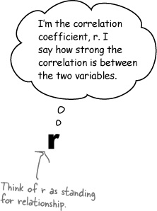
There’s a way of calculating the fit of the line, called the correlation coefficient.
The correlation coefficient is a number between –1 and 1 that describes the scatter of data points away from the line of best fit. It’s a way of gauging how well the regression line fits the data. It’s normally represented by the letter r.
If r is –1, the data is a perfect negative linear correlation, with all of the data point in a straight line. If r is 1, the data is a perfect positive linear correlation. If r is 0, then there is no correlation.
Usually r is somewhere between these values, as –1, 0, and 1 are all extreme.
If r is negative, then there’s a negative linear correlation between the two variables. The closer r gets to –1, the stronger the correlation, and the closer the points are to the line.
If r is positive, then there’s a positive linear correlation between the variables. The closer r gets to 1, the stronger the correlation.
In general, as r gets closer to 0, the linear correlation gets weaker. This means that the regression line won’t be able to predict y values as accurately as when r is close to 1 or –1. The pattern might be random, or the relationship between the variables might not be linear.
If we can calculate r for the concert data, we’ll have an idea of how accurately we can predict concert attendance based on the predicted hours of sunshine. So how do we calculate r? Turn the page and we’ll show you how.
So how do we calculate the correlation coefficient, r?
We’re not going to show you the proof for this, but the correlation coefficient r is given by
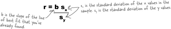
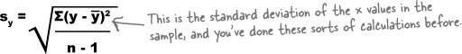
where sx is the standard deviation of the x values in the sample, and sy is the standard deviation of the y values.

We’ve already done most of the hard work.
Since we’ve already calculated b, all we have left to find is sx and sy. What’s more, we’re already most of the way towards finding sx.
When we calculated b, we needed to find the value of Σ(x – x̄)2. If we divide this by n – 1, this actually gives us the sample variance of the x values. If we then take the square root, we’ll have sx. In other words,

The only remaining piece of the equation we have to find is sy, the standard deviation of the y values in the sample. We calculate this in a similar way to finding sx.
Let’s try finding what r is for the concert attendance data.
Let’s use the formula to find the value of r for the concert data. First of all, here’s a reminder of the data:
x (sunshine) | 1.9 | 2.5 | 3.2 | 3.8 | 4.7 | 5.5 | 5.9 | 7.2 |
y (attendance) | 22 | 33 | 30 | 42 | 38 | 49 | 42 | 55 |
To find r, we need to know the values of b, sx, and sy so that we can use them in the formula on the opposite page. So far we’ve found that
b = 5.32
but what about sx and sy?
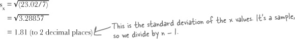
Let’s start with sx. We found earlier that Σ(x – x̄)2 = 23.02, and we know that the sample size is 8. This means that if we divide 23.02 by 7, we’ll have the sample variance of x. To find sx, we take the square root.
The only piece of the formula we have left to find is sy. We already know that ȳ = 38.875, as we found it earlier on, so this means that
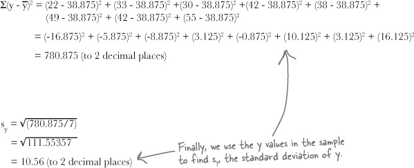
We can now use this to find sy, by dividing by n – 1 and taking the square root.
All we need to do now is use b, sx, and sy to find the value of the correlation coefficient r.
Now that we’ve found that b = 5.32, sx = 1.81, and sy = 10.56, we can put them together to find r.
r | = bsx/sy |
= 5.32 x 1.81/10.56 | |
= 0.91 (to 2 decimal places) |
As r is very close to 1, this means that there’s strong positive correlation between open air concert attendance and hours of predicted sunshine. In other words, based on the data that we have, we can expect the line of best fit, y = 15.80 + 5.32x, to give a reasonably good estimate of the expected concert attendance based on the predicted hours of sunshine.
The concert organizers are amazed at the work you’ve done with their concert data. They now have a way of predicting what attendance will be like at their concerts based on the weather reports, which means they have a way of maximizing their profits.

Long Exercise Solution
The evil Swindler has been collecting data on the effect radiation exposure has on Captain Amazing’s super powers. Here is the number of minutes of exposure to radiation, paired with the number of tons Captain Amazing is able to lift:
Radiation exposure (minutes) | 4 | 4.5 | 5 | 5.5 | 6 | 6.5 | 7 |
Weight (tons) | 12 | 10 | 8 | 9.5 | 8 | 9 | 6 |
Your job is to use least squares regression to find the line of best fit, and then find the correlation coefficient to describe the strength of the relationship between your line and the data. Sketch the scatter diagram too.
If Swindler exposes Captain Amazing to radiation for 5 minutes, what weight do you expect Captain Amazing to be able to lift?
Let’s use x to represent minutes of radiation exposure and y to represent weight in tons. We need to find the regression line y = a + bx, so let’s start by calculating x̄ and ȳ.
x̄ | = (4 + 4.5 + 5 + 5.5 + 6 + 6.5 + 7)/7 |
= 38.5/7 | |
= 5.5 | |
ȳ | = (12 + 10 + 8 + 9.5 + 8 + 9 + 6)/7 |
= 62.5/7 | |
= 8.9 (to 2 decimal places) |
Next, let’s calculate Σ(x – x̄)(y – ȳ) and Σ(x – x̄)2, and then b.
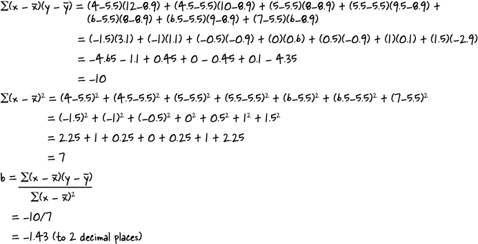
Now that we’ve found b, let’s use it to find a.
a | = ȳ – bx̄ |
= 8.9 + 1.43 x 5.5 | |
= 8.9 + 7.86 | |
= 16.76 |
This means that the line of best fit is given by y = 16.76 –1.43x
The correlation coefficient, r, is given by r = bsx/sy where sx and sy are the standard deviations of the x and y variables. We’ve found b, so we need to find sx and sy.
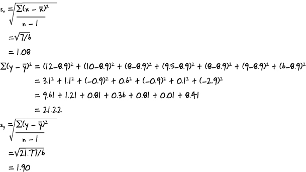
Putting this together gives us
r | = bsx/sy |
= –1.43 x 1.08/1.9 | |
= –0.81 (to 2 decimal places) |
If x = 5, then we find y by calculating
y | = 16.76 – 1.43x |
= 16.76 – 1.43 x 5 | |
= 9.61 |
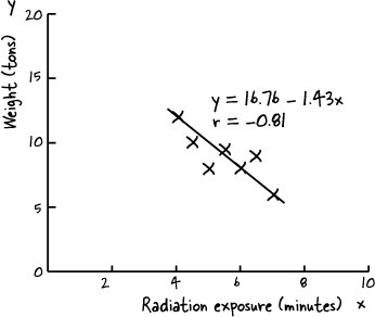
In other words, after 5 minutes of exposure to radiation, we’d expect Captain Amazing to be able lift 9.61 tons.
Bullet Points
Univariate data deals with just one variable. Bivariate data deals with two variables.
A scatter diagram shows you patterns in bivariate data.
Correlations are mathematical relationships between variables. It does not mean that one variable causes the other. A linear correlation is one that follows a straight line.
Positive linear correlation is when low x values correspond to low y values, and high x values correspond to high y values. Negative linear correlation is when low x values correspond to high y values, and high x values correspond to low y values. If the values of x and y form a random pattern, then there’s no correlation.
The line that best fits the data points is called the line of best fit.
Linear regression is a mathematical way of finding the line of best fit, y = a + bx.
The sum of squared errors, or SSE, is given by ∑(y – ŷ)2.
The slope of the line y = a + bx is
The value of a is given by
a = ȳ – bx̄
The correlation coefficient, r, is a number between –1 and 1 that describes the scatter of data away from the line of best fit. If r = –1, there is perfect negative linear correlation. If r = 1, there is perfect positive linear correlation. If r = 0, there is no correlation. You find r by calculating


We’re sad to see you leave, but there’s nothing like taking what you’ve learned and putting it to use. There are still a few more gems for you in the back of the book, some handy probability tables, and an index to read though, and then it’s time to take all these new ideas and put them into practice. We’re dying to hear how things go, so drop us a line at the Head First Labs web site, www.headfirstlabs.com, and let us know how Statistics is paying off for YOU!