Chapter Three
Lightness, Brightness, Contrast, and Constancy
It would be dull to live in a gray world, but we would actually get along just fine 99% of the time. Technically, we can divide color space into one luminance (gray scale) dimension and two chromatic dimensions. It is the luminance dimension that is most basic to perception. Understanding it can help us answer practical questions: How do we map data to a gray scale? How much information can we display per unit area? How much data can we display per unit time? Can gray scales be misleading? (The answer is “yes.”)
To understand the applications of gray scales we need to address other, more fundamental questions: How bright is a patch of light? What is white? What is black? What is a middle gray? These are simple-sounding questions, but the answers are complex and lead us to many of the basic mechanisms of perception. The fact that we have light-sensing receptors in our eyes might seem like a good starting point, but individual receptor signals tell us very little. The nerves that transmit information from the eyes to the brain transmit nothing about the amount of light falling on the retina. Instead, they signal the relative amount of light: how a particular patch of light differs from a neighboring patch, or how a particular patch of light has changed in the past instant. Neurons processing visual information in the early stages of the retina and primary visual cortex do not behave like light meters; they act as change meters.
The signaling of differences is not special to lightness and brightness; it is a general property of many early sensory systems, and we will come across it again and again throughout this book. The implications are fundamental to the way we perceive information. The fact that differences, not absolute values, are transmitted to the brain accounts for contrast illusions that can cause substantial errors in the way data is “read” from a visualization. The signaling of differences also means that the perception of lightness is nonlinear, and this has implications for the gray-scale coding of information. But, to belabor the occasional inaccuracies of perception does not do justice to millions of years of evolution. The fact that the early stages of vision are nonlinear does not mean that all perception is inaccurate. On the contrary, we can usually make quite sophisticated judgments about the lightness of surfaces in our environments. This chapter shows how simple, early visual mechanisms can help our brains do sophisticated things, such as perceive the surface colors of objects correctly no matter what the illumination level.
This chapter is also the first part of a presentation of color vision. Luminance can be regarded as but one of three color dimensions, albeit the most important one. Discussing this dimension in isolation gives us an opportunity to examine many of the basic concepts of color with a simpler model. (This is expanded in Chapter 4 into a full three-color-channel model.) We start by introducing properties of neurons including the concept of the visual receptive field, together with a number of display distortion effects that can be explained by simple neural models. The bulk of this chapter is taken up with a discussion of the concepts of luminance, lightness, and brightness and the implications of these for data display.
The practical lessons of this chapter are related to the way data values can be mapped to gray values using gray-scale coding. The kinds of perceptual errors that can occur owing to simultaneous contrast are discussed at length. More fundamentally, the reasons why the visual system makes these errors provide a general lesson. The nervous system works by computing difference signals at almost every level. The lesson is that visualization is not good for representing precise absolute numerical values, but rather for displaying patterns of differences or changes over time, to which the eye and brain are extremely sensitive.
Neurons, Receptive Fields, and Brightness Illusions
Neurons are the basic circuits of information processing in the brain. In some respects, they are like transistors, only much more complex. Like the digital circuits of a computer, neurons respond with discrete pulses of electricity. But, unlike transistors, neurons are connected to hundreds and sometimes thousands of other neurons. Much of our knowledge about the behavior of neurons comes from single-cell recording techniques where a tiny microelectrode is inserted into a cell in the brain of a live animal and the cell’s electrical activity is monitored as various patterns are displayed in front of its eyes. This research revealed that most neurons are constantly active, emitting pulses of electricity through connections with other cells. Depending on the visual pattern shown to the animal, the rate of firing can be increased or decreased as the neuron is excited or inhibited. Neuroscientists often set up amplifiers and loudspeakers in their laboratories so that they can hear the activity of cells that are being probed. The sound is like the clicking of a Geiger counter, becoming rapid when the cell is excited and slowing when it is inhibited.
There is considerable neural processing of information in the eye itself. Several layers of cells in the eye culminate in retinal ganglion cells. These ganglion cells send information through the optic nerve via a way station, called the lateral geniculate nucleus, on to the primary visual processing areas at the back of the brain, as shown in Figure 3.1.
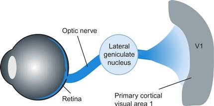
Figure 3.1 Signals from the retina are transmitted along the optic nerve to the lateral geniculate nucleus. From there, they are distributed to a number of areas, but mostly to visual area 1 of the cortex, located at the back of the head.
The receptive field of a cell is the visual area over which a cell responds to light. This means that patterns of light falling on the retina influence the way the neuron responds, even though it may be many synapses removed from receptors. Retinal ganglion cells are organized with circular receptive fields, and they can be either on-center or off-center. The activity of an on-center cell is illustrated in Figure 3.2. When this kind of cell is stimulated in the center of its receptive field, it emits pulses at a greater rate. When the cell is stimulated outside of the center of its field, it emits pulses at a lower than normal rate and is said to be inhibited. Figure 3.2 also shows the output of an array of such neurons being stimulated by a bright edge. The output of this system is an enhanced response on the bright side of the edge and a depressed response on the dark side of the edge, with an intermediate response to the uniform areas on either side. The cell fires more on the bright side because there is less light in the inhibitory region; it is less inhibited.
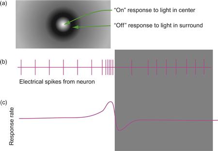
Figure 3.2 (a) The receptive field structure of an on-center simple lateral geniculate cell. (b) As the cell passes over from a light region to a dark region, the rate of neural firing increases just to the bright side of the edge and decreases on the dark side. (c) A smoothed plot of the cell activity level.
A widely used mathematical description of the concentric receptive field is the difference of Gaussians model (often called the DoG function):
 3.1
3.1
In this model, the firing rate of the cell is the difference between two Gaussians. One Gaussian represents the center and the other represents the surround, as illustrated in Figure 3.3. The variable x represents the distance from the center of the field, w1 defines the width of the center, and w2 defines the width of the surround. The amount of excitation or inhibition is given by the amplitude parameters α1 and α2. The DoG function and the concentric receptive field are an example of lateral inhibition in action. Stimulation of receptors at the edge of the field laterally inhibit the response at the center.

Figure 3.3 Difference of Gaussians (DoG) model of a receptive field.
We can easily calculate how a DoG type of receptor responds to various patterns. We can either think of the pattern passing over the receptive field of the cell or think of the output of a whole array of DoG cells arranged in a line across the pattern. When we use a computer to simulate either operation, we discover that the DoG receptive field can be used to explain a variety of brightness contrast effects.
In the Hermann grid illusion, shown in Figure 3.4, black spots appear at the intersections of the bright lines. The explanation is that there is more inhibition at the spaces between two squares, so they seem brighter than the regions at the intersections.
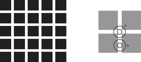
Figure 3.4 Hermann grid illusion. The black spots that are seen at the intersections of the lines are thought to result from the fact that there is less inhibition when a receptive field is at position (a) than at position (b).
Simultaneous Brightness Contrast
The term simultaneous brightness contrast is used to explain the general effect whereby a gray patch placed on a dark background looks lighter than the same gray patch on a light background. Figure 3.5 illustrates this effect and the way it is predicted by the DoG model of concentric opponent receptive fields.
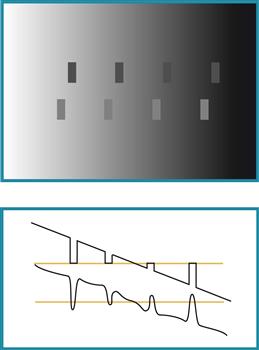
Figure 3.5 Illustration of simultaneous brightness contrast. The upper row contains rectangles of an identical gray. The lower rectangles are a lighter gray, also identical. The graph below illustrates the effect of a DoG filter applied to this pattern.
Mach Bands
Figure 3.6 demonstrates a Mach band effect. At the point where a uniform area meets a luminance ramp, a bright band is seen. In general, Mach bands appear where there is an abrupt change in the first derivative of a brightness profile. The lower plot on the right shows how this is simulated by a DoG model.
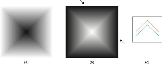
Figure 3.6 Illustration of Mach banding. (a, b) Dark and bright Mach bands are evident at the boundaries between the internal triangles. (c) The red curve shows the actual brightness profile between the two arrows. The blue curve shows how the application of a DoG filter models the bright bands that are seen.
The Chevreul Illusion
When a sequence of gray bands is generated as shown in Figure 3.7, the bands appear darker at one edge than the other, even though they are uniform. The diagram to the right in Figure 3.7 shows that this visual illusion can be simulated by the application of a DoG model of the neural receptive field.
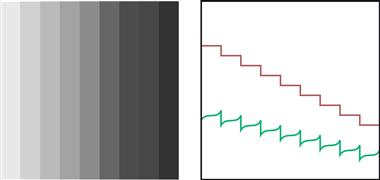
Figure 3.7 The Chevreul illusion. The measured lightness pattern is shown by the staircase pattern on the right. What is perceived can be closely approximated by a DoG model. The lower plot on the right shows the application of a DoG filter to the staircase pattern shown above.
Simultaneous Contrast and Errors in Reading Maps
Simultaneous contrast effects can result in large errors of judgment when reading quantitative (value) information displayed using a gray scale (Cleveland & McGill, 1983); for example, Figure 3.8 shows a gravity map of part of the North Atlantic Ocean where the local strength of the gravitational field is encoded in shades of gray. In an experiment to measure the effects of contrast on data encoded in this way, we found substantial errors averaging 20% of the entire scale (Ware, 1988). The contrast in this case comes from the background of the gray scale itself and the regions surrounding any designated sampling point. Better schemes for displaying scalar maps using color in addition to lightness scaling are discussed in Chapter 4.
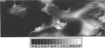
Figure 3.8 A gravity map of the North Atlantic Ocean. Large errors occur when gray-scale maps are read using a key. From Ware (1988). Reproduced with permission.
[G3.1] Avoid using gray scale as a method for representing more than a few (two to four) numerical values.
Contrast Effects and Artifacts in Computer Graphics
One of the consequences of Mach bands, and of contrast effects in general, is that they tend to highlight the deficiencies in the common shading algorithms used in computer graphics. Smooth surfaces are often displayed using polygons, both for simplicity and to speed the computer graphics rendering process, the fewer the polygons the faster the object can be drawn. This leads to visual artifacts because of the way the visual system enhances the boundaries at the edges of polygons. Figure 3.9 shows three different shading methods applied to a sphere that has been constructed from four-sided polygons.

Figure 3.9 Three different shading methods used in computer graphics. Flat shading on the left is subject to the Chevreul illusion. Gouraud shading in the center results in Mach banding. Phong shading, on the right, produces something that looks smooth even though it is based on the same number of facets.
Uniform shading. The light reflected from each polygonal facet is computed by taking into account the incident illumination and the orientation of the surface with respect to the light. The entire facet is then filled uniformly with the resulting color. Scanning across an object modeled in this way reveals stepwise changes in color. The steps are exaggerated, producing the Chevreul illusion.
Gouraud shading. A shading value is calculated not for the facets but for the edges between the facets. This is done by averaging the surface normals at the boundaries where facets meet. As each facet is painted during the rendering process, the color is linearly interpolated between the facet boundaries. Scanning across the object, we see linear changes in color across polygons, with abrupt transitions in gradient where the facets meet. Mach banding occurs at these facet boundaries, enhancing the discontinuities.
Phong shading. As with Gouraud shading, surface normals are calculated at the facet boundaries; however, in this case, the surface normal is interpolated between the edges. The result is smooth changes in lightness with no appreciable Mach banding.
Edge Enhancement
Lateral inhibition can be considered the first stage of an edge detection process that signals the positions and contrasts of edges in the environment. One of the consequences is that pseudoedges can be created; two areas that physically have the same lightness can be made to look different by having an edge between them that shades off gradually to the two sides (Figure 3.10). The brain does perceptual interpolation so that the entire central region appears lighter than surrounding regions. This is called the Cornsweet effect, after the researcher who first described it (Cornsweet, 1970).
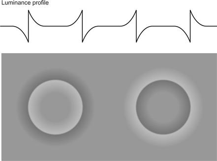
Figure 3.10 The Cornsweet effect. The curve above shows a horizontal luminance profile across the image below. The areas in the centers of the circles tend to look lighter than the surrounding area, even though they are actually the same shade. This provides evidence that the brain constructs surface color based largely on edge contrast information.
Cornsweet style contours have a clear inside and outside, unlike regular lines. In some visualizations, what is inside and outside a bounded region can become unclear, especially if the boundary is convoluted. Figure 3.11 demonstrates that Cornsweet contours can solve the problem. Alternative methods for defining complex regions are color or texture fills.

Figure 3.11 It is difficult to see if the X is inside or outside of the bounded region. Using a Cornsweet contour makes it possible to see the solution much more rapidly.
[G3.2] Consider using Cornsweet contours instead of simple lines to define convoluted bounded regions.
The enhancement of edges is also an important part of some artists’ techniques. It is a way to make objects more clearly distinct, given the limited dynamic range of paint. The example given in Figure 3.12 is from Seurat’s painting of bathers. The same idea can be used in visualization to make areas of interest stand out. Figure 3.13(b) is a representation of a node–link diagram where the background has been adjusted to make critical subgraphs more distinct. This method is sometimes called haloing.

Figure 3.12 Seurat deliberately enhanced edge contrast to make his figures stand out.
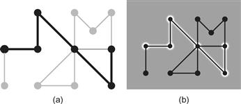
Figure 3.13 Two methods for highlighting a node–link diagram. (a) The contrast is reduced for the less important parts of the network. (b) The background contrast is increased using haloing to emphasize important parts.
[G3.3] Consider using adjustments in luminance contrast as a highlighting method. It can be applied by reducing the contrast of unimportant items or by locally adjusting the background to increase the luminance contrast of critical areas.
It is worth emphasizing that it is not the amount of light that leads to visual distinctness, but the amount of luminance contrast that occurs with the background. Black on white is as distinctive as white on black.
Luminance, Brightness, Lightness, and Gamma
Contrast effects may cause annoying problems in the presentation of data, but a deeper analysis shows that they can also be used to reveal the mechanisms underlying normal perception. How the contrast mechanism works to enable us to perceive our environment accurately, under all but unusual circumstances, is the main subject of the discussion that follows. The severe illusory contrast effects in computer displays are mostly a consequence of the impoverished nature of those displays, not of any inadequacy of the visual system.
It should now be evident that the perceived brightness of a particular patch of light has almost nothing to do with the amount of light coming from that patch as we might measure it with a photometer. Thus, what might seem like a simple question—“How bright is that patch of light?”—is not at all straightforward. To understand some of the issues involved we start with an ecological perspective, then consider perceptual mechanisms, and finally discuss applications in visualization.
Constancies
In order to survive, we need to be able to manipulate objects in the environment and determine their properties. Generally, information about the quantity of illumination is of very little use to us. Illumination is a prerequisite for sight, but otherwise we do not need to know whether the light we are seeing by is dim because it is late on a cloudy day or brilliant because of the noonday sun. What we do need to know about are objects—food, tools, plants, animals, other people, and so on—and we can find out a lot about objects from their surface properties. In particular, we can obtain knowledge of the spectral reflectance characteristics of objects—what we call their color and lightness. The human vision system evolved to extract information about surface properties of objects, often at the expense of losing information about the quality and quantity of light entering the eye. This phenomenon, the fact that we experience colored surfaces and not colored light, is called color constancy. When we are talking about the apparent overall reflectance of a surface, it is called lightness constancy. Three terms are commonly used to describe the general concept of quantity of light: luminance, brightness, and lightness. The following brief definitions precede more extensive descriptions:
Luminance is the easiest to define; it refers to the measured amount of light coming from some region of space. It is measured in units such as candelas per square meter. Of the three terms, only luminance refers to something that can be physically measured. The other two terms refer to psychological variables.
Brightness generally refers to the perceived amount of light coming from a source. In the following discussion, it is used to refer only to things that are perceived as self-luminous. Sometimes people talk about bright colors, but vivid or saturated are better terms.
Lightness generally refers to the perceived reflectance of a surface. A white surface is light. A black surface is dark. The shade of paint is another concept of lightness.
Luminance
Luminance is not a perceptual quantity at all. It is a physical measure used to define an amount of light in the visible region of the electromagnetic spectrum. Unlike lightness and brightness, luminance can be read out directly from a scientific measuring instrument. Luminance is a measurement of light energy weighted by the spectral sensitivity function of the human visual system.
We are about 100 times less sensitive to light at 450 nanometers than we are to light at 510 nanometers, and it is clearly important to take this difference into account when we are measuring light levels with human observers in mind. The human spectral sensitivity function is illustrated in Figure 3.14 and given at 10-nm intervals in Table 3.1. This function is called the V(λ) function, where λ represents wavelength. It is an international standard maintained by the Commission Internationale de l’Éclairage (CIE). The V(λ) function represents the spectral sensitivity curve of a standard human observer. To find the luminance of a light, we integrate the light distribution, E(λ), with the CIE estimate of the human sensitivity function, V(λ).
 (3.2)
(3.2)
When multiplied by the appropriate constant, the result is luminance, L, in units of candelas per square meter. Note that a great many technical issues must be considered when we are measuring light, such as the configuration of the measuring instrument and the sample. Wyszecki and Stiles (1982) wrote an excellent reference. It is directly relevant to data display that the blue phosphor of a monitor has a peak at about 450 nm. Table 3.1 shows that at this wavelength human sensitivity is only 4% of the maximum in the green range. In Chapter 2, we noted that the chromatic aberration of the human eye means that a monitor’s blue light is typically out of focus. The fact that we are also insensitive to this part of the spectrum is another reason why representing text and other detailed information using the pure blue of a monitor is not a good idea, particularly against a black background.
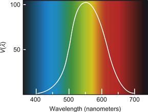
Figure 3.14 The CIE V(λ) function representing the relative sensitivity of the human eye to light of different wavelengths.
Table 3.1. V(λ) Function
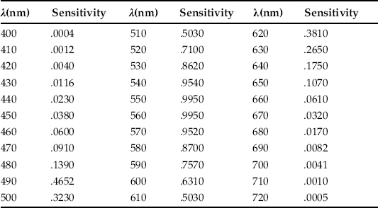
Note: Luminance sensitivity as it varies with wavelength.
The V(λ) function is extremely useful because it provides a close match to the combined sensitivities of the individual cone receptor sensitivity functions. It is reasonable to think of the V(λ) function as measuring the luminance efficiency of the first stage of an extended process that ultimately allows us to perceive useful information such as surface lightness and the shapes of surfaces. Technically, it defines how the sensitivity of the so-called luminance channel varies with wavelength.
The luminance channel is an important theoretical concept in vision research; it is held to be the basis for most pattern perception, depth perception, and motion perception. In Chapter 4, the properties of the luminance channel are discussed in more detail in comparison to the color processing chrominance channels.
Displaying Details
As the spatial modulation sensitivity function shows (see Figure 2.26 in Chapter 2), the finer the detail, the greater the contrast required.
[G3.4] Use a minimum 3:1 luminance contrast ratio between a pattern and its background whenever information is represented using fine detail, such as texture variation, small-scale patterns, or text.
This rule has been generalized from the International Standards Organization (ISO) guideline applying to text (ISO 9241, Part 3), but it is only a minimum; the ISO goes on to recommend that a 10:1 ratio is optimal for text, and the same can be said of any display of detail. Of course, this severely restricts the range of colors that can be used, but if the detail is critical this cannot be helped.
Brightness
The term brightness usually refers to the perceived amount of light coming from self-luminous sources. It relates to the perception of the brightness of indicator lights in an otherwise darkened display—for example, nighttime instrument displays in the cockpits of aircraft and on the darkened bridges of ships. Perceived brightness is a very nonlinear function of the amount of light emitted by a lamp. Stevens (1961) popularized a technique known as magnitude estimation to provide a way of measuring the perceptual impact of simple sensations. In magnitude estimation, subjects are given a stimulus, such as a patch of light viewed in isolation. They are told to assign this stimulus a standard value—for example, 10—to denote its brightness. Subsequently, they are shown other patches of light, also in isolation, and asked to assign them values relative to the standard that they have set. If a patch seems twice as bright as the reference sample, it is assigned the number 20; if it seems half as bright, it is assigned the number 5, and so on. Applying this technique, Stevens discovered that a wide range of sensations could be described by a simple power law:
 (3.3)
(3.3)
This law states that perceived sensation S is proportional to the stimulus intensity I raised to a power n. The power law has been found to apply to many types of sensations, including loudness, smell, taste, heaviness, force, and touch. The power law applies to the perceived brightness of lights viewed in the dark.
 (3.4)
(3.4)
However, the value of n depends on the size of the patch of light. For circular patches of light subtending 5 degrees of visual angle, n is 0.333, whereas for point sources of light n is close to 0.5.
These findings are really only applicable to lights viewed in relative isolation in the dark. Although they have some practical relevance to the design of control panels to be viewed in dark rooms, many other factors must be taken into account in more complex displays. Before we go on to consider these perceptual issues, it is useful to know something about the way computer monitors are designed.
Monitor Gamma
Most visualizations are produced on monitor screens. Anyone who is serious about producing such a thing as a gray scale with perceptually equal steps, or color reproductions in general, must come to grips with the properties of computer monitors. The relationship of physical luminance to the input signal on a monitor is approximated by a gamma function:
 (3.5)
(3.5)
where V is the voltage driving one of the electron guns in the monitor, L is the luminance, and γ is an empirical constant that varies widely from monitor to monitor (values can range from 1.4 to 3.0). See Cowan (1983) for a thorough treatise on monitor calibration.
This monitor nonlinearity is not accidental; it was created by early television engineers to make the most of the available signal bandwidth. They made television screens nonlinear precisely because the human visual system is nonlinear in the opposite direction, as Stevens had observed. For example, a gamma value of 2.0 will exactly cancel a brightness power function exponent of 0.5, resulting in a display that produces a linear relationship between voltage and perceived brightness. Figure 3.15 illustrates this point. Most monitors have a gamma value of around 2.0.
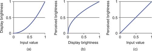
Figure 3.15 (a) On a computer display, the brightness increases faster than the input value. (b) Perceived brightness of a display varies in the opposite way. (c) The two effects cancel out.
Adaptation, Contrast, and Lightness Constancy
A major task of the visual system is to extract information about the lightness and color of objects despite a great variation in illumination and viewing conditions. It cannot be emphasized enough that luminance is completely unrelated to perceived lightness or brightness. If we lay out a piece of black paper in full sunlight on a bright day and point a photometer at it, we may easily measure a value of 1000 candelas for reflected light per square meter. A typical “black” surface reflects about 10% of the available light, so it would give a measurement of 100 candelas per square meter. If we now take our photometer into a typical office and point it at a white piece of paper, we will probably measure a value of about 50 candelas per square meter. Thus, a black object on a bright day in a beach environment may reflect to the eye much more light than white paper in an office. Even in the same environment, white paper lying under the boardwalk may reflect less light (be darker) than black paper lying in the sun. Nevertheless, we can distinguish black from white from gray (achieve lightness constancy) with ease.
Figure 3.16 illustrates the range of light levels we encounter, from bright sunlight to starlight. A normal interior will have an artificial illumination level of approximately 50 lux. (Lux is a measure of incident illumination that incorporates the V(γ) function.) On a bright day in summer, the light level can easily be 50,000 lux. Except for the brief period of adaptation that occurs when we come indoors on a bright day, we are almost totally oblivious to this huge variation. Remarkably, our visual systems can achieve lightness constancy over virtually this entire range; in bright sunlight or moonlight, we can tell whether a surface is black, white, or gray.
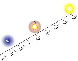
Figure 3.16 The eye/brain system is capable of functioning over a huge range of light levels. The amount of light available on a bright day at the beach is 10,000 times greater than the light available in a dimly lit room.
The first-stage mechanism of lightness constancy is adaptation. The second stage of level invariance is lateral inhibition. Both mechanisms help the visual system to factor out the effects of the amount and color of the illumination.
The role of adaptation in lightness constancy is straightforward. The changing sensitivity of the receptors and neurons in the eye helps factor out the overall level of illumination. One mechanism is the bleaching of photopigment in the receptors themselves. At high light levels, more photopigment is bleached and the receptors become less sensitive. At low light levels, photopigment is regenerated and the eyes regain their sensitivity. This regeneration can take some time, which is why we are briefly blinded when coming into a darkened room out of bright sunlight. It can take up to half an hour to develop maximum sensitivity to very dim light, such as moonlight. In addition to the change in receptor sensitivity, the iris of the eye opens and closes. This modulates the amount of light entering the pupil but is a much less significant factor than the change in receptor sensitivity. In general, adaptation allows the visual system to adjust overall sensitivity to the ambient light level.
Contrast and Constancy
Contrast mechanisms, such as the concentric opponent receptive fields discussed previously, help us achieve constancy by signaling differences in light levels, especially at the edges of objects. Consider the simple desktop environment illustrated in Figure 3.17. A desk lamp, just to the right of the picture, has created nonuniform illumination over a wooden desk that has two pieces of paper lying on it. The piece nearer the lamp is a medium gray. Because it is receiving more light, it reflects about the same amount of light as the white paper, which is farther from the light. In the original environment, it is easy for people to tell which piece of paper is gray and which is white. Simultaneous contrast can help to explain this. Because the white paper is lighter relative to its background than the gray paper is relative to its background, the same mechanism that caused contrast in Figure 3.5 is responsible for enabling an accurate judgment to be made in this example. The illumination profile across the desk and the pieces of paper is similar to that illustrated in Figure 3.5, except that, in this case, contrast does not result in an illusion; instead, it helps us to achieve lightness constancy.
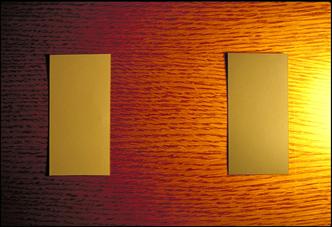
Figure 3.17 These two pieces of paper are illuminated by a desk lamp just to the right of the picture. This makes the amount of light reflected from the gray paper about the same as the light reflected from the white paper.
Contrast on Paper and on Screen
There is a subtlety here that is worth exploring. Paper reproductions of contrast and constancy effects are often less convincing than these effects are in the laboratory. Looking at Figure 3.17, the reader may well be excused for being less than convinced. The two pieces of paper may not look very different, but try the experiment with your own desk lamp and paper. Two holes punched in a piece of opaque cardboard can be used as a mask, enabling you to compare the brightness of the gray and white pieces of paper. Under these real-world viewing conditions, it is usually impossible to perceive the true relative luminance; instead, the surface lightness is perceived. But, take a photograph of the scene, like Figure 3.17, and the effect is less strong. It would be even weaker with a poorly printed gray image. Why is this? The answer lies in the dual nature of pictures. The photograph itself has a surface, and to some extent we perceive the actual gray levels of the photographic pigment, as opposed to the gray levels of what is depicted. The poorer the reproduction, the more we see the actual color printed on the paper. A related effect occurs with depth perception and perspective pictures; to some extent we can see both the surface flatness and the three-dimensional (3D) layout of a depicted environment.
Contrast illusions are generally much worse in computer displays. On most screens there is no fine texture, except for the uniform pattern of pixels. Moreover, the screen is self-luminous, which may also confound our lightness constancy mechanisms. Scientists studying simultaneous contrast in the laboratory generally use perfectly uniform textureless fields and obtain extreme contrast effects—after all, under these circumstances, the only information is the differences between patches of light. Computer-generated virtual-reality images lie somewhere between real-world surfaces and the artificial featureless patches of light used in the laboratory in allowing the accurate perception of lightness.
How lightness is judged will depend on exactly how images are designed and presented. On the one hand, a monitor can be set up in a dark room and made to display featureless gray patches of light; in this case, simple contrast effects will dominate. However, if the monitor is used to simulate a very realistic 3D model of the environment, surface lightness constancies can be obtained, depending on the degree of realism, the quality of the display, and the overall setup. To obtain true virtual reality, the screen surface should disappear; to this end, some head-mounted displays contain diffusing screens that blur out the pixels and the dot matrix of the screen.
Perception of Surface Lightness
Although both adaptation and contrast can be seen as mechanisms that act in the service of lightness constancy, they are not sufficient. Ultimately, the solution to this perceptual problem can involve every level of perception. Three additional factors seem especially important. The first is that the brain must somehow take the direction of illumination and surface orientation into account in lightness judgments. A flat white surface turned away from the light will reflect less light than one turned toward the light. Figure 3.18 illustrates two surfaces being viewed, one turned away from the light and one turned toward it. Under these circumstances, people can still make reasonably accurate lightness judgments, showing that our brains can take into account both the direction of illumination and the spatial layout (Gilchrist, 1980).
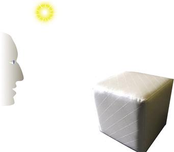
Figure 3.18 When making surface lightness judgments, the brain can take into account the fact that a surface turned away from the light receives less light than a surface turned toward the light.
The second important factor is that the brain seems to use the lightest object in the scene as a kind of reference white to determine the gray values of all other objects (Cataliotti & Gilchrist, 1995). This is discussed in the following section in the context of lightness scaling formulas, but first we must briefly mention the role of glossy highlights, something that is clearly important, though poorly understood.
The ratio of specular and nonspecular reflection can be important under certain circumstances. Figure 3.19 contains a picture of a world where everything is black and next to it a picture of a world in which everything is white. If we imagine these images as slides projected in a darkened room, it is obvious that every point on the black image is brighter than the surroundings in the room. How can we perceive something to be black when it is a bright image? In this case, the most important factor differentiating black from white is the ratio between the specular and the nonspecular reflected light. In the all-black world, the ratio between specular and nonspecular is much larger than in the all-white world.
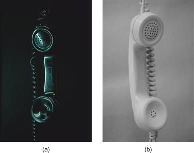
Figure 3.19 These two photographs show a scene in which everything is black and another where everything is white.
Lightness Differences and the Gray Scale
Suppose that we wish to display map information using a gray scale. We might, for example, wish to illustrate the variability in population density within a geographical region or to produce a gravity map as shown in Figure 3.8. Ideally, for this kind of application, we would like a gray scale such that equal differences in data values are displayed as perceptually equally spaced gray steps (an interval scale). Such a scale is called a uniform gray scale. As we discussed earlier the gray scale is probably not the best way of coding this kind of information because of contrast effects (chromatic scales are generally better), but the problem does merit some attention because it allows us to discuss some fundamental and quite general issues related to perceptual scales.
Leaving aside contrast effects, the perception of brightness differences depends on whether lightness differences in a scene are small or large. At one extreme, we can consider the smallest difference that can be distinguished between two gray values. In this case, one of the fundamental laws of psychophysics applies. This is called Weber’s law, after the 19th-century physicist Max Weber (Wyszecki & Stiles, 1982). Weber’s law states that if we have a background with luminance L and superimpose on it a patch that is a little bit brighter (L + δL), then the value of δ that makes this small increment just visible is independent of the overall luminance. Thus, δL/L is constant. Typically, under optimal viewing conditions, we can detect the brighter patch if δ is greater than about 0.005. In other words, we can just detect about a 0.5% change in brightness. Most computer graphics is done with just 256 gray levels (8 bits), and this is not quite sufficient to create a smooth gray sequence that varies in brightness by a factor of 100 from the darkest to the lightest with undetectable steps. Weber’s law applies only to small differences. When large differences between gray samples are judged, many other factors become significant.
A typical experimental procedure used to study large differences involves asking subjects to select a gray value midway between two other values. The CIE has produced a uniform gray-scale standard based on a synthesis of the results from large numbers of experiments of this kind. This formula includes the concept of a reference white, although many other factors are still neglected.
 (3.6)
(3.6)
where Y is the luminance of the color being judged, and Yn is the luminance of a reference white in the environment, normally the surface that reflects most light to the eye. The result, L*, is a value in a uniform gray scale. Equal measured differences on this scale approximate equal perceptual differences. It is reasonable to assume that Y/Yn > 0.01, because even the blackest inks and fabrics still reflect more than 1% of incident illumination. This standard is used by the paint and lighting industries to specify such things as color tolerances. Equation 3.6 is part of the CIE LUV uniform color space standard, which is described more fully in Chapter 4.
Uniform lightness and color scales can only provide rough approximations. Because the perception of lightness is changed radically by many factors that are not taken into account by formulas such as Equation 3.6—perceived illumination, specular reflection from glossy surfaces, and local contrast effects—the goal of obtaining a perfect gray scale is not attainable. Such formulae should be taken as no more than useful approximations.
Contrast Crispening
Another perceptual factor that distorts gray values is called contrast crispening (see Wyszecki & Stiles, 1982). Generally, differences are perceived as larger when samples are similar to the background color. Figure 3.20 shows a set of identical gray scales on a range of different gray backgrounds. Notice how the scales appear to divide perceptually at the value of the background. The term crispening refers to the way more subtle gray values can be distinguished at the point of crossover. Crispening is not taken into account by uniform gray-scale formulas.
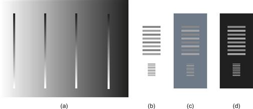
Figure 3.20 (a) All the gray strips are the same. Perceived differences between gray-scale values are enhanced where the values are close to the background gray value, an effect known as crispening. (b, c, d) The differences in the grays of the gray lattice are more evident (c) than with either the white (b) or the black (d) backgrounds, another example of crispening.
[G3.5] If subtle gray-level gradations within the bounds of a small object are important, create low-luminance contrast between the object and its background.
Monitor Illumination and Monitor Surrounds
In some visualization applications, the accurate perception of surface lightness and color is critical. One example is the use of a computer monitor to display wallpaper or fabric samples for customer selection. It is also important for graphic designers that colors be accurately perceived. To accomplish this, not only is it necessary to calibrate the monitor so that it actually displays the specified color range, but other factors affecting the state of adaptation of the user’s eyes must also be taken into account. The color and the brightness of the surround of the monitor can be very important in determining how screen objects appear. The adaptation effect produced by room lighting can be equally important.
How should the lighting surrounding a monitor be set up? A monitor used for visual displays engages only the central part of the visual field, so the overall state of adaptation of the eye is maintained at least as much by the ambient room illumination. This means that the amount of light reflected from the walls of the room and other surfaces should not be too dissimilar to the amount of light coming from the screen, especially if the screen is small. There are other reasons for maintaining a reasonably high level of illumination in a viewing room, such as the ability to take notes and see other people. When people spend lots of time in dimly lit work environments, it can cause depression and reduced job satisfaction (Rosenthal, 1993); however, a side effect of a high level of room illumination is that some light falls on the monitor screen and is scattered back to the eye, degrading the image. In fact, under normal office conditions, between 5% and 20% of the illumination coming to the eye from the monitor screen will come indirectly from the room light, not from the luminous screen pixels. With projectors the situation is worse, because the white projector screen necessarily has a high reflectance, meaning that it will reflect room illumination.
[G3.6] Ideally, when setting up a monitor for viewing data, a light neutral-colored wall behind the screen should reflect an amount of light comparable to the level of light coming from the monitor. The wall facing the screen should be of low reflectance (mid- to dark gray) to reduce reflections from the monitor screen. Lights should be placed so that they do not reflect from the monitor screen.
[G3.7] When setting up a room for a projection system, ensure that minimal room light falls on the projector screen. This can be done by means of baffles to shield the screen from direct illumination. Low-reflectance (mid- to dark gray) walls are also desirable, as the walls will scatter light, some of which inevitably reaches the screen.
Figure 3.21 shows a monitor display with a shadow lying across its face. Although this is a rather extreme example, the effects are clear. Overall contrast is much reduced where the room light falls on the display. We can model the effects of illumination on a monitor by adding a constant to Equation 3.6:
 (3.7)
(3.7)
where A is the ambient room illumination reflected from the screen, V is the voltage to the monitor, and L is the luminance output for a given gamma.
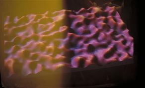
Figure 3.21 A monitor with a shadow falling across the left-hand side. Under normal viewing conditions, a significant proportion of the light coming from a screen is reflected ambient room illumination.
If we wish to create a monitor for which equal voltage steps result in equal perceptual steps under conditions where ambient light is reflected, a lower gamma value is needed. Figure 3.22 shows the effects of different gamma values, assuming that 15% of the light coming from the screen is reflected ambient light. The CIE equation (Equation 3.6) has been used to model lightness scaling. As you can see, under these assumptions, a monitor is a perceptually more linear device with a gamma of only 1.5 than with a gamma of 2.5 (although under dark viewing conditions, a higher gamma is needed).
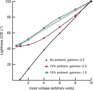
Figure 3.22 The three curves show how monitor gun voltage is transformed into lightness, according to the CIE model, with different amounts of ambient light reflected from the screen and different gamma settings.
If you cover part of your monitor screen with a sheet of white paper, under normal working conditions (when there are lights on in the room), you will probably find that the white of the paper is very different from the white of the monitor screen. The paper may look relatively blue or yellow, and it may appear darker or lighter. There are often large discrepancies between monitor colors and colors of objects in the surrounding environment.
For the creation of an environment where computer-generated colors are comparable to colors in a room, the room should have a standard light level and illuminant color. The monitor should be carefully calibrated and balanced so that the white of the monitor matches that of a sheet of white paper held up beside the screen. In addition, only a minimal amount of light should be allowed to fall on the monitor screen.
Figure 3.23 shows a computer display set up so that the lighting in the virtual environment shown on the monitor is matched with the lighting in the real environment surrounding the monitor. This was achieved by illuminating the region surrounding the monitor with a projector that contains a special mask. This mask was custom designed so that light was cast on the monitor casing and the desktop surrounding the computer, but no light at all fell on the part of the screen containing the picture. In addition, the direction and color of the light in the virtual environment were adjusted to exactly match the light from the projector. Simulated cast shadows were also created to match the cast shadows from the projector. Using this setup, it is possible to create a virtual environment whose simulated colors and other material properties can be directly compared to the colors and material properties of objects in the room. (This work was done by Justin Hickey and the author.)
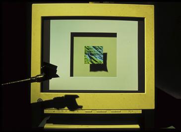
Figure 3.23 A projector was set up containing a mask specifically designed so that no light actually fell on the portion of the monitor screen containing the image. In this way, the illumination in the virtual environment displayed on the monitor was made to closely match the room illumination falling on the monitor frame and stand.
Conclusion
As a general observation, the use of gray-scale colors is not a particularly good method for categorically coding data (nominal scale). Contrast effects reduce accuracy, and the luminance channel of the visual system is fundamental to so much of perception (shape perception, in particular) that it is a waste of perceptual resources to use gray-scale encoding. Nevertheless, it is important to understand the problems of brightness and lightness perception because they point to issues that are fundamental to all perceptual systems. One of these basic problems is how perception works effectively in visual environments where the light level can vary by six orders of magnitude. The solution, arrived at over the course of evolution, is a system that essentially ignores the level of illumination. This may seem like an exaggeration—after all, we can certainly tell the difference between bright sunlight and dim room illumination—but we are barely aware of a change of light level on the order of a factor of 2. For example, in a room lit with a two-bulb fixture, it often goes unnoticed that one bulb has burned out, as long as the bulbs are hidden within a diffusing surround.
A fundamental point made in this chapter is the relative nature of low-level visual processing. As a general rule, nerve cells situated early in the visual pathway do not respond to absolute signals. Rather, they respond to differences in both space and time. At later stages in the visual system, more stable percepts such as the perception of surface lightness can emerge, but this is only because of sophisticated image analysis that takes into account such factors as the position of the light, cast shadows, and orientation of the object. The relative nature of lightness perception sometimes causes errors, but these errors are due mostly to a simplified graphical environment that confounds the brain’s attempt to achieve surface lightness constancy. The mechanism that causes contrast errors is also the reason why we can perceive subtle changes in data values and can pick out patterns despite changes in the background light level.
Luminance contrast is an especially important consideration for choosing backgrounds and surrounds for a visualization. The way a background is chosen depends on what is important. If the outline shapes of objects are critical, the background should be chosen for maximum luminance contrast with foreground objects. If it is important to see subtle gradations in gray level, the crispening effect suggests that choosing a background in the midrange of gray levels will help us to see more of the important details.
Luminance is but one dimension of color space. In Chapter 4, this one-dimensional model is expanded to a three-dimensional color perception model. The luminance channel, however, is special. We could not get by without luminance perception, but we can certainly get by without color perception. This is demonstrated by the historic success of black-and-white movies and television. Later chapters describe how information encoded in the luminance channel is fundamental to perception of fine detail, discrimination of the shapes of objects through shading, stereoscopic depth perception, motion perception, and many aspects of pattern perception.