Chapter 16
Visuals

In 2004, Wired Magazine editor Chris Anderson wrote an article called “The Long Tail,” which he adapted into a book with the same title in 2006. From the book description on Amazon.com:
The Long Tail is really about the economics of abundance. New efficiencies in distribution, manufacturing, and marketing are essentially resetting the definition of what's commercially viable across the board. If the twentieth century was about hits, the twenty-first will be equally about niches.
—Chris Anderson, The Long Tail
I read both the article and the book when they were published, and they made a big impression on me. More than anything, the idea of the long tail gave me a way to think about how the Web is changing marketing and commerce. Once the big idea was clear in my mind, it became a tool that I could use to discuss a company's marketing and distribution strategy. It was a powerful concept that explained one of the Web's biggest impacts on business strategy.
But as you can see from the previous description, words just don't do the idea justice. Let's look at what else has been written about the basic concept of the long tail.
The current Wikipedia article begins:
The Long Tail or long tail refers to the statistical property that a larger share of population rests within the tail of a probability distribution than observed under a “normal” or Gaussian distribution. A long tail distortion will arise with the inclusion of some unusually high (or low) values which increase (decrease) the mean, skewing the distribution to the right (or left).
—Wikipedia, 2012
From Anderson's article:
To get a sense of our true taste, unfiltered by the economics of scarcity, look at Rhapsody, a subscription-based streaming music service (owned by RealNetworks) that currently offers more than 735,000 tracks.
Chart Rhapsody's monthly statistics and you get a “power law” demand curve that looks much like any record store's, with huge appeal for the top tracks, tailing off quickly for less popular ones. But a really interesting thing happens once you dig below the top 40,000 tracks, which is about the amount of the fluid inventory (the albums carried that will eventually be sold) of the average real-world record store. Here, the Walmarts of the world go to zero—either they don't carry any more CDs, or the few potential local takers for such fringy fare never find it or never even enter the store.
The Rhapsody demand, however, keeps going. Not only is every one of Rhapsody's top 100,000 tracks streamed at least once each month, the same is true for its top 200,000, top 300,000, and top 400,000. As fast as Rhapsody adds tracks to its library, those songs find an audience, even if it's just a few people a month, somewhere in the country. This is the Long Tail.
—Chris Anderson, 2004
These descriptions are somewhat helpful and understandable. With no other context, many readers would find the idea interesting and useful. But the real power of the long tail is not evident until it becomes visual. Only then does the idea really come alive.
Thankfully, Anderson does provide visual aids in his book and articles, which do a great job of explaining the idea. In the following, I'll walk you through the idea using my own visuals and you'll see how the long tail becomes a simple visual tool that captures a way to communicate a powerful and transformational idea.
Let's start with the basic chart, which anyone can quickly draw. It has two axes, with a measure of volume on the vertical axis. This is a measure of information such as sales. The horizontal axis exhibits specific items such as titles or products, with the most popular on the left and least popular on the right. For our example, we'll use sales and products, respectively.
To bring it together, we draw a power law or demand curve that is steep on the left (the head) and curving down to the right, almost touching the bottom (the tail).
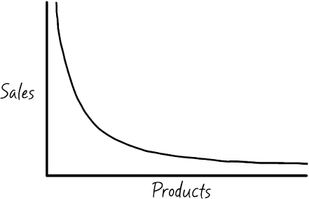
The area under the curve is the visualization of demand. A key point is that the right side of the curve—that is, products with low demand—can be very long. This is the long tail of the demand curve.
Products on the left have exponentially more demand than products on the right. For example, in the context of historic record sales, The Beatles and Michael Jackson records are on the left and the long tail of lesser-known bands are on the right.
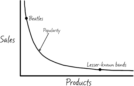
That's it. These three lines give us everything we need to visualize and explain how business has changed since the Internet spawned online retailers with unlimited shelf space.
Let's see how.
Before the Internet, retailers had to choose what products to sell. Visually, this means they had to draw a line on the demand curve and only sell products to the left of that line—those in current demand. They could not afford to offer the products with lesser demand due to shelf space constraints.
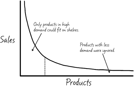
Then the Internet came along and businesses were no longer limited by shelf space, which meant they didn't have to draw a line at all. They could carry products in the long tail—those with very little demand—and offer consumers nearly unlimited choice. Of course, the question then became: will this approach work? Is there enough demand in the long tail to justify carrying so many products?
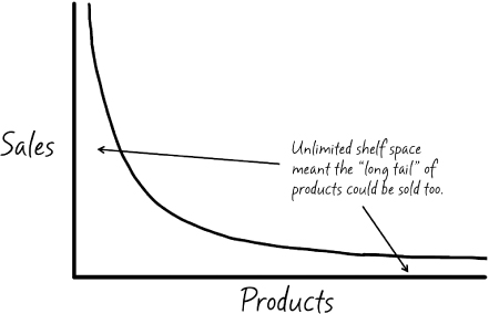
You only need to look at the examples of Amazon.com, iTunes, and Netflix to see the outcome. These retailers have built successful businesses by serving the demand in the long tail.
I use the long tail example here because it's a powerful idea that is difficult to comprehend without a visual. As we saw in the beginning of the chapter, words don't always do the trick. Only after we introduce a visual do some ideas easily make sense to the average person. The visual becomes the embodiment of the idea, something memorable and reproducible. And that is the goal of visuals in the context of explanation: they make ideas memorable and reproducible.
Once I read Anderson's article in Wired, I could walk into any classroom, spend 10 seconds drawing a simple demand curve, and explain a big way the Web is transforming business. I could plot points on the curve to illustrate case studies and examples. I could use the curve to ask questions and start discussions, and the students would have the same power. They could take the idea and draw it on a notepad at home. They could read the news and visualize how a company's strategy would look on the curve.
Keep the idea of the long tail in the back of your mind as we discuss visuals in this chapter. A simple curve, drawn without artistic expression, is all it takes to give your audience a way to understand and remember an idea that words may not be able to capture.
People's creative anxieties tend to take over when they begin to consider using visuals in explanations. They automatically say things like, “I can't draw” or “I'm not creative.” It's a normal reaction, and it's true that not everyone is an artist. But remember the demand curve and long tail: it comprises three lines—and two of them are straight! Using visuals in explanations is not about art or beauty—it is a utility, a tool for making information clear, just like our explanation scale.
As it turns out, there are simple ways to think about the proper use of visuals in explanations. Like the long tail and explanation scale, they are visual tools that require only the most basic drawing skills. As we'll see in the following, almost any challenge you have can be visualized using one of six basic types of drawings.
Dan Roam is a true luminary in the world of visual thinking, which is probably why his book Back of the Napkin is an international bestseller (Dan Roam, 2008). Your first impression may be that visual thinking is about using drawings to represent ideas. Although that's part of it, I'd say that visual thinking—Roam's work in particular—focuses not only on representing ideas but also on solving problems. Drawings are a means to an end in this context. As he says in the book: “Any problem can be made clearer with a picture and any picture can be created using the same set of tools and rules.”
According to Roam, you can classify any problem into six problem clusters:
Much of Back of the Napkin is related to solving these problems with pictures, which I've provided here as a starting point for discussing the types of visuals we can use for each situation. My hope is that you'll see the potential to create visuals that help your explanation become more understandable and memorable. Here's a graphic that relates the big ideas:
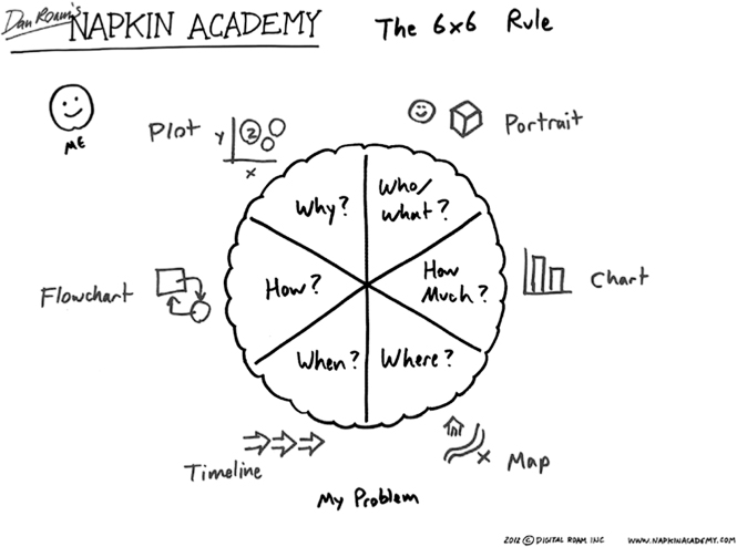
As you can see, the six problem clusters are associated with specific kinds of hand-drawn pictures that best relate that information and solve problems.
Although Roam's book goes into much greater detail, I'll use the example of a startup company that has developed a gadget that helps people track and share their fitness goals. The examples following are meant to help you 1) see the potential of using visuals in your explanations and 2) identify the right kind of visual for any challenge you encounter.
2012 Dan Roam © Digital Roam, Inc.
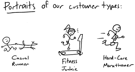
A big challenge for the company is to understand their market. Although they have basic data on the target customers and know their general characteristics, they need to define them further. By creating portraits that represent the main user types, they can point out traits and recognizable features using simple drawings. For example, a marathoner could be represented by a stick figure wearing a racing bib, a casual runner could be accompanied by a dog, and the fitness junkie could be shown on treadmill.
These types of representations provide a solid foundation for explanations by making them people- and story-oriented. Each individual uses the product differently and these portraits help highlight that difference in story form.
2012 Dan Roam © Digital Roam, Inc.
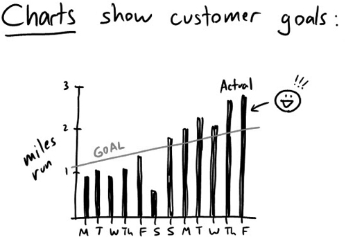
The company runs on data (pun intended). Their product provides a way for customers to track and share data about their progress toward specific goals, so it's natural for that data to be presented in chart form. Charts are perfect for quantitative data, or data that shows how much of something. In the previous image we see customer goals in terms of miles run, which is trending upward and passing the customer's goal in the last week.
Although company leaders recognize the value of charts, they don't always use them when explaining trends and progress toward goals. However, by explaining the company's growth strategy in chart form, everyone can see that the company's financial numbers are a lot like the reports their customers see—they help visually explain why the company is adopting new strategies and goals.
2012 Dan Roam © Digital Roam, Inc.
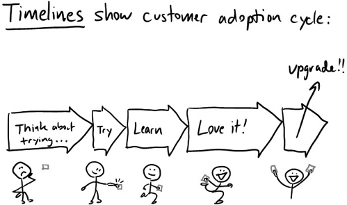
Many people inside the company know that users of the product go through phases of use. They begin by purchasing the product and then progress through a number of steps, each of which has its own characteristics. Although this progression often appears in lists and discussions, people don't often communicate it in visual timeline form.
By creating a timeline of the user's adoption progress, the company can see how the phases fit together and use visuals to explain the characteristics of each phase. For example, phases that last longer take up more of the timeline than shorter ones. In explanation, this allows the audience to see this difference immediately. In the previous example, the team can see that the longest phases are “thinking” and “loving,” whereas the phase of trying the product is short. By representing time or duration visually, we have the potential to increase understanding and reduce the words and numbers that can create clutter and cause misunderstanding.
2012 Dan Roam © Digital Roam, Inc.
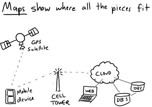
This kind of problem may sound like it's related to actual geography, such as how much gas it will take to get from Philadelphia, Pennsylvania, to Chicago, Illinois. Although that can be true, the idea is much broader because it relates to a visual representation of proximity, whether ideas, products, or people. Examples could be Venn diagrams, concept maps, and so on.
For instance, our company could create a map that highlights how the various technologies fit together to make the product work. By mapping out the various tools and hardware, and using visuals to show how they connect and relate to one other, it becomes clear how the system does or does not work. For example, the map illustrated previously shows that the databases connect to the cloud and to each other. A map, compared with text, makes it easier to see and understand how a complex system fits together. It also has the potential to show roadblocks, dead ends, and relationships in a way that brings the big picture to life.
2012 Dan Roam © Digital Roam, Inc.
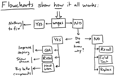
Like any company, this one is constantly trying to understand and explain why things are the way they are. Let's say we have a bug in the product's software and the cause is unknown. The core question is: how did we get here? Specifically, in this case: how did the software bug that's causing us problems get into the product? The focus of these problems is often cause and effect.
To find the answer, we can start by asking why it happened and representing the answers visually. It could be bad quality assurance (QA) practices, poor programming skills, or rushed timelines. From here, we can zoom in on one cause and dive a little deeper. Why did QA fail? Again, we list reasons. This path of cause and effect helps the company identify how it got to the current situation, and highlights what can be done to fix it.
2012 Dan Roam © Digital Roam, Inc.
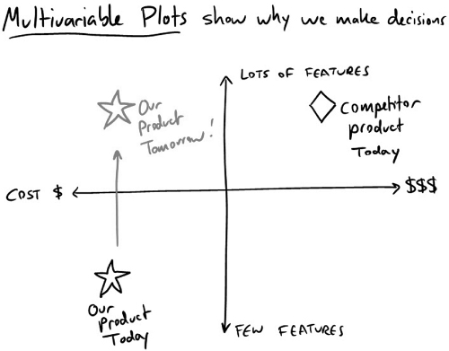
Like most, this company is not alone in their industry, and to make smart decisions, they need ways to understand and explain how they compare with competitors. They need to see the big picture across a number of different variables. We can use a multi-variable plot for this—a tool that's both powerful and complicated.
You've likely seen a bubble chart, in which companies are plotted on a diagram with their market share illustrated by the size of their bubble. These drawings are usually based on quantitative data, and are helpful in showing a snapshot of an entire industry or market.
Before heading into an all-hands meeting, the leaders need to explain how the company compares with others in the industry across two important variables. They decide to compare themselves with competitors based on features and cost. Here, the horizontal axis represents a continuum from low to high cost. The vertical axis represents features, again from low to high, which creates four quadrants. The company can then use data to show where they are on the graph compared with competitors. Although they appear in the lower left quadrant (low cost, low feature count), their biggest competitor is in the upper right quadrant (high cost, high features). This creates a big picture view of the industry and allows every employee to see where the company fits.
At first blush, Common Craft videos seem to be focused on visual thinking, which I think is a valid point. Visuals are an incredibly important part of the Common Craft experience. We do use visual thinking principles, however, our videos are more focused on the script than the visuals, as discussed in Chapter 12. The way we look at it, the visuals support the script, not the other way around. As such, our visuals are often a mix of literal representations (a person sends an e-mail) and more symbolic representations (the Web as an ocean of search results) of ideas from the script. The fact is, every second of a Common Craft video must have a visual and we use a very wide variety of them to create the experience we need.
Below are a few examples of various approaches to using visuals in our video explanations.

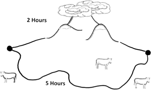
We wanted our video “Investing Money in Plain English” to illustrate the idea of risk, and we decided to show a choice between two routes to a destination. One route was less risky but took longer. The other was riskier but shorter. This helped us connect investment risk to a real world situation that everyone could understand.

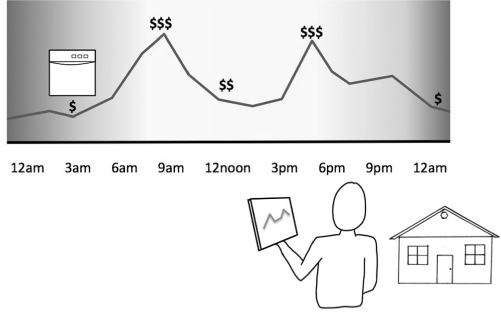
The smart grid is a big idea that frames how our electrical grid is evolving to become more efficient and reliable. Whereas the average citizen sees the grid in terms of power lines and electric meters on their homes, much of the grid's functionality remains invisible to us. Our video on the smart grid uses multiple visuals that help us show, as in the example, how the price of electricity changes over the course of a day.

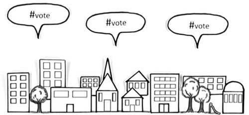
We've made a few videos explaining Twitter, for which we needed a way to symbolize tweets moving around the Web. Because this happens online, we had to find a way to represent a tweet in the real world. We used a simple talk bubble for this. When the bubble appears, a tweet has been posted to Twitter.
My hope is that you'll start to see the problems you face in the context of simple drawings. Think about the kind of problem or challenge that you're explaining when you're working on an explanation. Chances are, you'll be able to represent the problem to others more clearly by considering the options listed previously.
If we zoom in a little and look at Common Craft videos at the image level versus the idea level, it reveals another way to think about visuals. For example, here are a few examples of characters that appear in the videos:

These three figures are no different than any others we use in the video, and they have a pretty obvious feature in common: they don't have faces. We generally do not use facial features, aside from the occasional smile. This is a constraint that guides every figure we draw.
Here's another example. It's the image we use in explanations that involve web browsers:

Although it's a very simple version of a web browser, it's enough for people to recognize it immediately. These examples are a part of a strategy focused on achieving simplicity by removing noise. Faces on people, buttons on a web browser—these are noisy in the context of a Common Craft video.
Let me explain.
We may not realize it, but our brains are constantly tuning into other people's emotions and expressions. Whether it's a model's face in a magazine or an old man on a bus, we pay attention, often subconsciously. Part of our brain becomes devoted to processing that information. And it's not just faces; our brain is constantly at work in the background.
Common Craft videos are designed to be a noise-free experience. The figures don't have faces because faces would represent unneeded noise—something for your brain to perceive and understand. By not having faces, we can simply remove that from the equation. But the lack of facial features goes a little deeper.
Long before Common Craft videos, I read an amazing book titled Understanding Comics by Scott McCloud. In it, the author makes this point:
The ability of cartoons to focus our attention on an idea is, I think, an important part of their special power, both in comics and in drawing generally. Another is the universality of cartoon imagery. The more cartoony a face is, for instance, the more people it could be said to describe.
—Scott McCloud, Understanding Comics, 31.
McCloud's point is that a face drawn with a high level of definition is more likely to look like a specific individual. A photograph is clearly a specific, unique person. But a face drawn in cartoon style removes that specificity. Suddenly, the face could be anyone. By removing features to the point of becoming a smiley face, the specificity goes away completely. A smiley face could be anyone.
McCloud continues:
Thus, when you look at a photo or a realistic drawing of a face—you see it as a face of another. But when you enter the world of a cartoon—you see yourself. I believe this is the primary cause of our childhood fascination with cartoons.
The cartoon is a vacuum into which identity and awareness are pulled…an empty shell that we inhabit which enables us to travel in another realm. We don't just observe the cartoon—we become it!
And this, of course, is our goal at Common Craft: to have people see themselves in the characters we use in the videos. By eliminating faces, we can invite people to do just that.
Many of these ideas are also true for things like websites or software interfaces. We don't use realistic photos or drawings of interfaces because they are so noisy. Here are two examples of interfaces that have appeared in videos:
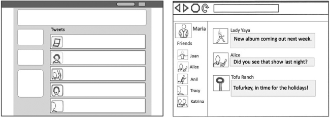
Again, these are versions that remove the noise that comes with actual screenshots. By creating our own versions, we can take out elements such as navigation links, advertising, and other features that distract, and instead keep viewers' attention on the ideas that are the focus of the explanation.
When doing so, we ask whether or not the words, faces, buttons, features, or ideas support the big idea or make it more difficult to see. This perspective illustrates what a noisy world we live in. It's so normal to us that the lack of noise is what strikes us as strange. Our challenge to you is to be that exception and work to remove noise from your message, giving people a way to experience your ideas without distractions.
The thought of visuals is likely to bring to mind a number of ideas for you. I want to be clear that the visuals at the focus of this chapter are a specific kind of visual.
In recent years, infographics have become an interesting and often useful way to present information. In most cases, infographics are poster-like visuals that bring information together in a unique and interesting way. Most are quite sophisticated and created by graphic designers or professional data visualizers. Perhaps one of the most famous is by Charles Minard, who used a visual to show Napoleon's disastrous invasion of Russia, 1812–1813.
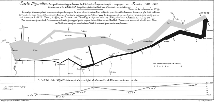
This graphic shows multiple variables at a time:
I love this visual because the simple use of line width relating to the size of the army is so powerful. However, as amazing as it is, it's not something I recommend trying to replicate for your explanations. If you can, more power to you, but this is a work of genius.
Today's infographics are more likely to be fun and to artistically represent a variety of topics such as fashion trends, technology adoption, and comparisons of data across countries. The following two examples are by a Seattle company called Killer Infographics. The first infographic represents information on the facts and benefits of recycling old cars and the second represents Nikon's history.
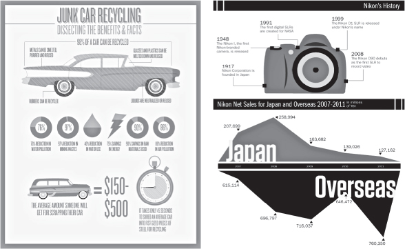
In some ways, they are like one-page explanations. These kinds of explanations can be made in-house with the right design skills. However, it can also be a good investment to hand the idea over to a design company that specializes in data visualization.
Most of the ideas in this chapter apply to drawing during a meeting or event, which could involve a whiteboard or legal pad. Although these are valuable and useful, it's sometimes a priority to include your drawings in a PowerPoint presentation, which is digital. I recommend a couple of options for this:
We're surrounded by visuals every single day, and we take most of them for granted, from watching the stock market to tracking the weather to driving from here to there. It's nearly impossible to imagine a world without visuals. When it comes to explaining our ideas, however, we fall back on what we know and use only the tools we have at our fingertips. Spreadsheets and bullet points are easy to create and have worked in the past. Things have changed, however, and we have greater potential to think about our ideas as visuals that help solve problems and make your explanations remarkable and useful. The key is to get started today. Practice, develop, play. Only by diving in and trying it will you discover the power of visuals in your explanations.