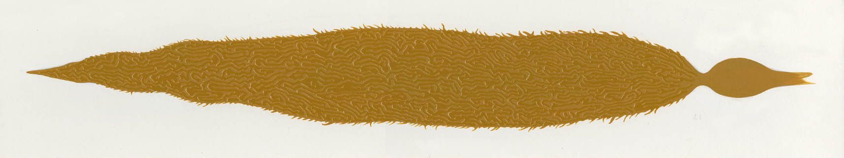
STEVE PILCHER
STEVE PILCHER Pencil and marker
Finding Nemo was a beautiful film, as well as a very difficult film to design and create. One would think a sequel would be easier—it wasn’t.
Finding Nemo has been immortalized in its success and it carries expectations that have to be respected and celebrated. To harmonize, and in some cases recreate the look of that film, as well as introduce the audience to new locations and characters was, to say the least, challenging. Finding Dory had to do this and somehow deliver even more—a gripping story, original characters, laughter, and tension. In essence, a whole new adventure in a world that needed to feel familiar, and yet fresh and different at the same time.
We had to incorporate what appeared on the surface to be straightforward design conceits from the first film, but that we soon discovered were much more complex. The way shapes, color, and light worked together to support the intent and focus of a shot became a carefully coordinated balance from sequence to sequence, shot to shot. The technological advances alone had evolved so much since Finding Nemo was made that you couldn’t simply duplicate the same results. Our work was cut out for us as we ventured into new learning curves armed with new ideas, tools, and visions.
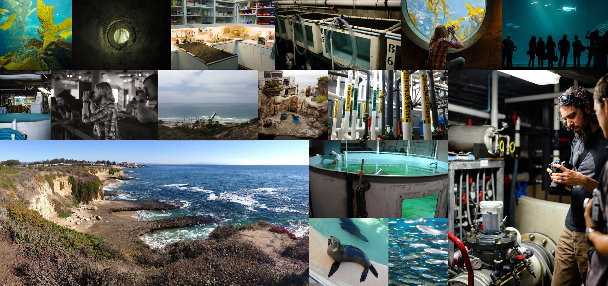
Our core art team analyzed and referenced Finding Nemo while researching new material. We visited various large aquariums across the country, observing their exhibits, aquatic tanks, and the way their world worked behind the scenes. We studied the effects of refraction and reflection under water, shallow and deep, using cameras mounted on poles.
This book is divided into three acts that mirror the plot structure of the film. This creates a chronological presentation of the art, which makes for a logical reading experience, but does not really mirror the path of production. In truth the work in this book was born out of a storm of chaos. Nothing about these productions is strictly linear. We explore, re-explore, discard, resurrect, dismantle, unwind, build up, and expand each and every one of our ideas. And like any creative endeavor, the evolution of a film carries the inevitable side effect of natural editing where a percentage of ideas and art become discarded. In Art of books we try to bring to you a collection of this material along with the art that became the look of the film. Hopefully this gives you a little more entertainment and insight into the process.
Welcome to The Art of Finding Dory.
TIA KRATTER Acrylic
The Dory production design team went on several fruitful RESEARCH TRIPS—though we didn’t have to go far. We visited the Monterey Bay, Steinhart, and Vancouver aquariums in Northern California and Canada. We got to go behind the scenes and see what the work-a-day environment was like in the rehabilitation centers, which was the foundation for the scenes with Hank in the Marine Life Institute.

All photos pages 12–15: © copyright Pixar, taken by the Dory crew.
We focused a lot of our research on HOW LIGHT WORKS in an aquarium compared with what it does in the open ocean. In the tanks, the light is clear and bright and relatively uniform—everything is manufactured. In the ocean, by comparison, the light is incredible. It’s flat and gray near the surface and then it just explodes with color as you go deeper. You see deep green and golden hues with lots of murk and particulate matter that shifts in the light as the waves and current move around you. It’s mesmerizing. We were able to place a camera a couple of feet beneath the surface to really capture what Dory’s point of view would be as she ascends through the kelp forest. The contrast when you break through the surface is stark. The real world—the human world—is bright and high contrast with a much more neutral color palette. We really tried to capture these disparate light environments in the film.
SHARON CALAHAN Digital painting
Sharon Calahan created these beautiful LIGHTING KEYS early on in the film’s development. They are explorations of how light and color might manifest in the different environments in the film. Although the story evolved significantly since they were originally created, we continued to use them for inspiration.
STEVE PILCHER
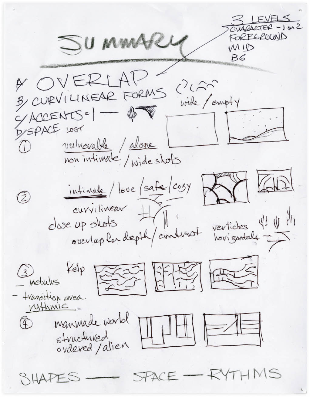
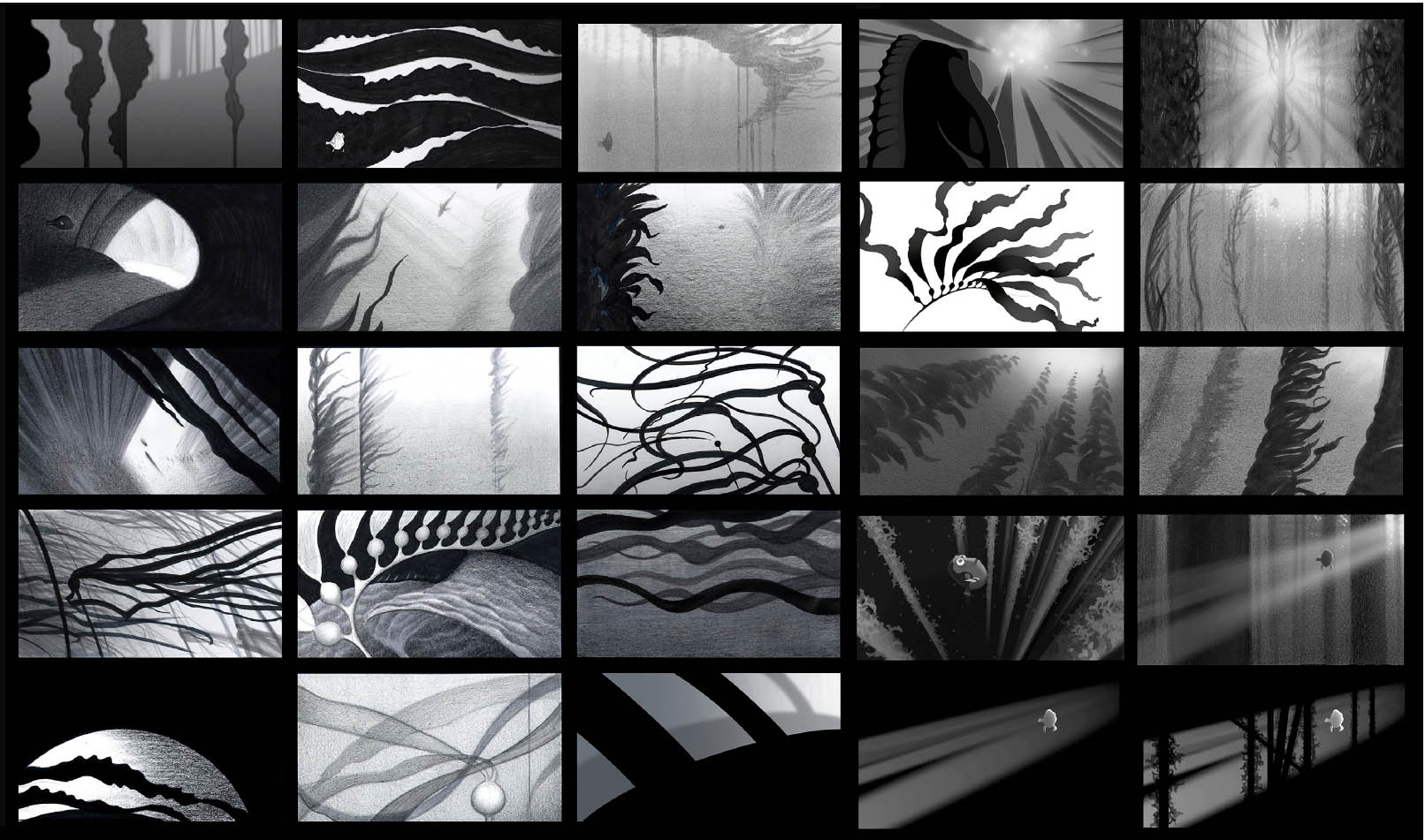
When we first started working on Finding Dory I wrote out this nutshell design overview describing the big-picture SHAPE RELATIONSHIPS in the film. In this case there were four main design themes: curvilinear, empty space, wavy lines, and structured straight lines. The curvilinear forms were used in the reef and Dory’s home with her parents. It uses pillow-like soft coral forms with lots of nooks and crannies to hide in. I included some lines and angles to accentuate the curves—different plants like fan coral and shelf coral that provide vertical and horizontal planes for the curves to play against. Then the empty space that Dory enters when she crosses the ocean underscores how alone and vulnerable she is. The kelp forest introduces the wavy, rhythmic lines of the kelp leaves paired with the straight stalks of the plant. This feels much safer after the open ocean, but it is still a foreign environment. It also represents Dory’s earliest trauma—it’s where she winds up after being sucked out of her parents’ home as a baby. When she returns she has some relief at having finally made it, but then she has to confront the confusion and chaos that she feels in the kelp. It’s hard to see and the waves of the leaves are almost hypnotic. When she finally makes it to the human world, we introduce the structured, straight-line shape language. Everything in the aquarium is made of lines, sharp corners, and angles—the opposite of the curvy forms of the reef. It should feel extremely alien from Dory’s point of view, which we underscore by having her wind up in some very foreign locations for a fish—a coffee pot, a sippy cup, fish tanks, et cetera.
The COLOR PALETTE we use in the film underscores the shape language we developed. In the curvilinear reef scenes we use a rainbow of colors. It’s a broad palette that’s childlike and fun. The sun and sand reflect the light—it should feel like your ideal tropical vacation. Once Dory hits the open ocean, the colors shift to the deep blues and grays that you would get in a part of the sea that has very little light. Things are scary and desolate in this environment and you get the feeling that she needs to keep moving in order to survive. Once she arrives at the kelp forest the color comes back, but this time it’s all murky greens, blues, and golds. It’s beautiful and lush, but also somewhat monochromatic, claustrophobic, and mysterious—not at all like the reef. The green color palette has a subliminal association with discomfort for her and hopefully the audience will feel that as well. When she reaches the Marine Life Institute, the human world has an earthy palette as it’s filled with concrete, glass, metal, and wood. It provides the starkest contrast with the idealistic soft-focus world we used in our reef scenes, or what it might be like to live as a fish under water. There are accents of green in the human world, for example the sick fish in the tank, which is one of the colors Dory associates with trauma. Using color in this way works subconsciously in the background of the film to amplify emotion.
Providing a visual awareness of this shape and color language to our different departments encourages and unifies our design approach as we’re discussing and creating our work.
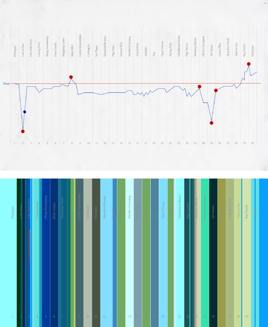
Early on in the production, to clarify and organize I sometimes create simple graphs to use as reference, both for myself and other departments. The first is an EMOTIONAL TIMELINE for Dory, the main character. I listed out all of the sequences of the film in chronological order and then drew a line down the middle—that’s her emotional baseline. Then I plotted her highest and lowest emotional moments—when she is separated from her parents, when she finds them again—as well as the main midpoints. I didn’t graph every single beat of the film, just the moments with key emotional information that needs to be communicated visually in concert with the story.
Since so much of the film is spent under water, I also developed a graph that plots how the LIGHT AND COLOR CHANGE as we go from scene to scene in water. We want to try to keep the film as interesting and rich as possible while traveling through environments that, on the surface, have a lot of similarities. It turns out that light and color have a wide variance depending on what kind of water you are in, and we were able to use that to reinforce the emotional needs of the story. In tropical water at the reef, where Dory feels safe, the colors are bright and saturated—a lot of turquoise blues. In a lonely scene, in the deep dark waters of the ocean, we desaturated the palette, using gray-blues. The water in the kelp forest, where Dory is first lost after leaving her parents, is cloudy green and murky. And so on. We didn’t use these charts on a daily basis, but it was a good reminder to find variation and mark the lowest and highest beats in the story and to reinforce that visually.
STEVE PILCHER Digital
STEVE PILCHER Marker
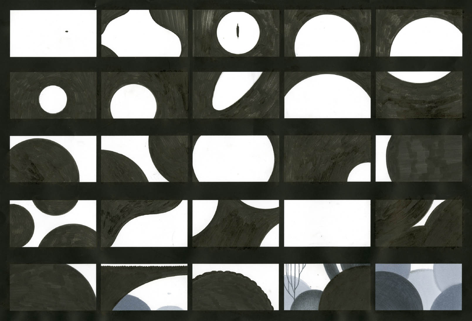
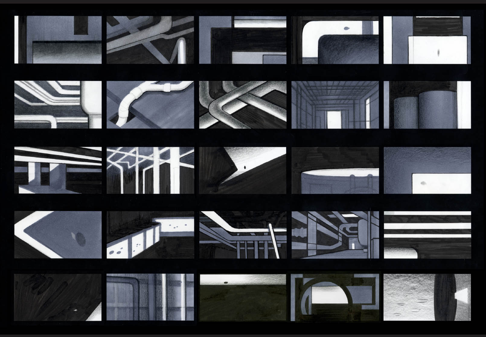
Some of the first conceptual work created on the show was to define the basic shape and space design. This simple piece illustrates a key concept that is used throughout Dory’s story—EMPTY SPACE. Much of the ocean is frighteningly empty, especially to a small creature like Dory. So how do we show that and communicate the emotional impact to the viewer? Are there levels we can play with? When we see Dory alone and small in an empty sea of water, we understand that she is vulnerable, lonely, and afraid. If we add another large fish, she is a tiny bit less lonely, but it’s still dangerous. What about a group of fish? That’s better, but she’s still alienated. If it’s a group of Blue Tangs, her own species, she seems safe and more relaxed. But the only time she seems really at home is when she is surrounded by the bright and crowded environment of the reef—the antithesis of empty space.
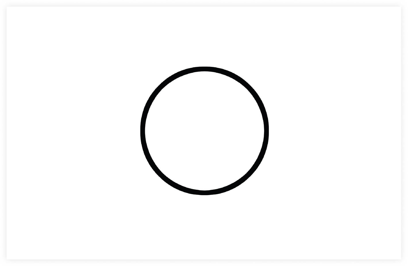
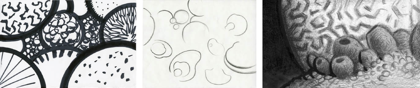
The CURVILINEAR shape language is all about comfort, security, and round, friendly shapes. It is used in the reef and Dory’s home at MLI.
STEVE PILCHER Pencil, marker, and ink
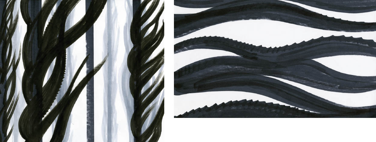
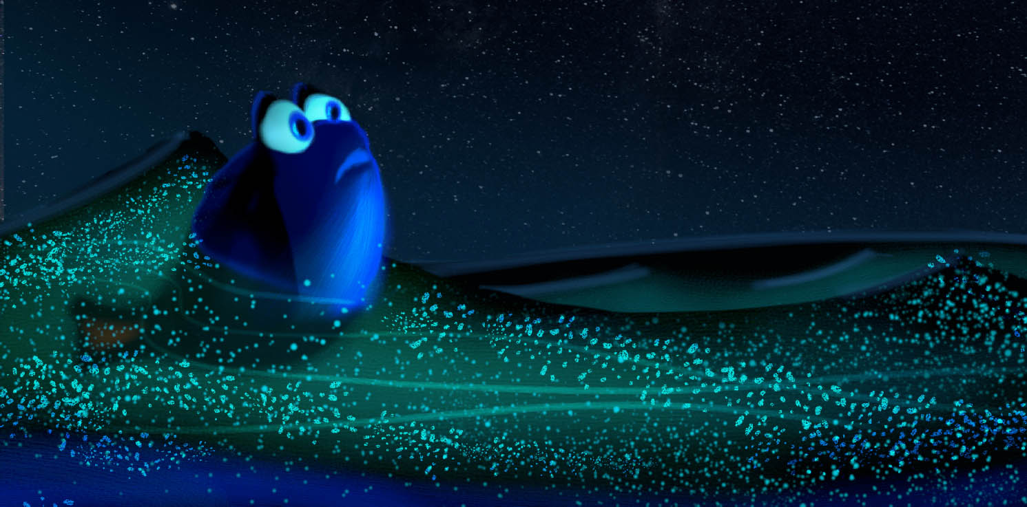
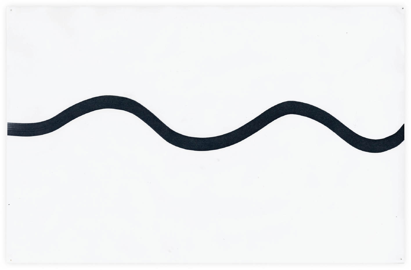
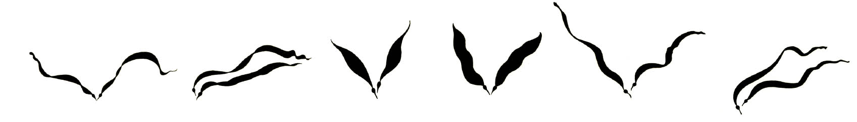
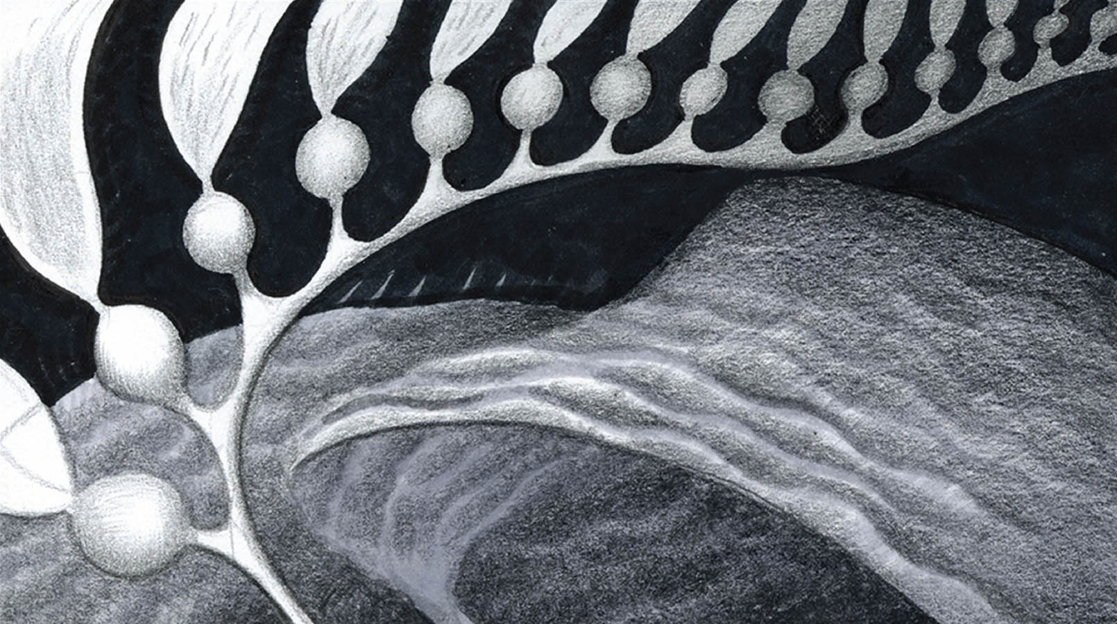
The RHYTHMIC shape language is used in the kelp forest, both in the plants and the waves and water around them. It frames a transitional period for Dory between the empty space of the open ocean and the foreign structures of the human world.
STEVE PILCHER Pencil, marker, and ink
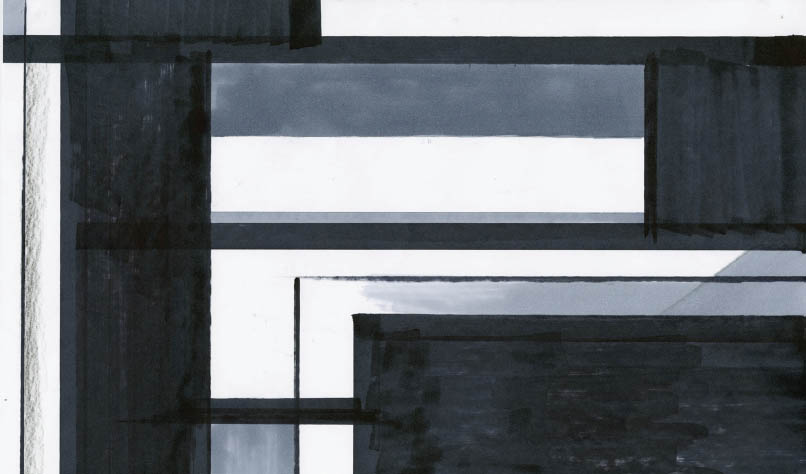
The RECTILINEAR shape language of the human world is very alien, from Dory’s point of view. It is the opposite of the curvilinear forms of the reef—structured and angular as opposed to organic, soft, and round.
STEVE PILCHER Pencil, marker, and ink