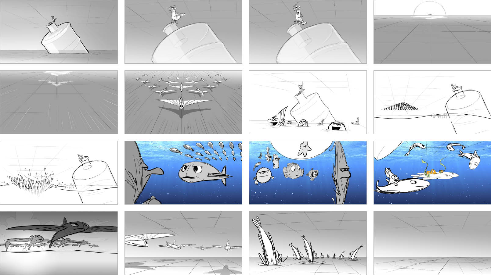
While trying to get back to Dory, Marlin and Nemo get help from the Tank Gang. In this version, they are world travelers who have made friends with a squadron of flying fish. They call on them to escort them to the Marine Life Institute in California. Marlin is anxious about flying out of water and doesn’t trust them, causing friction between him and Gil.

GLENN WILLIAMSON Digital painting
TIM EVATT Digital painting
TIM EVATT Pencil and pen
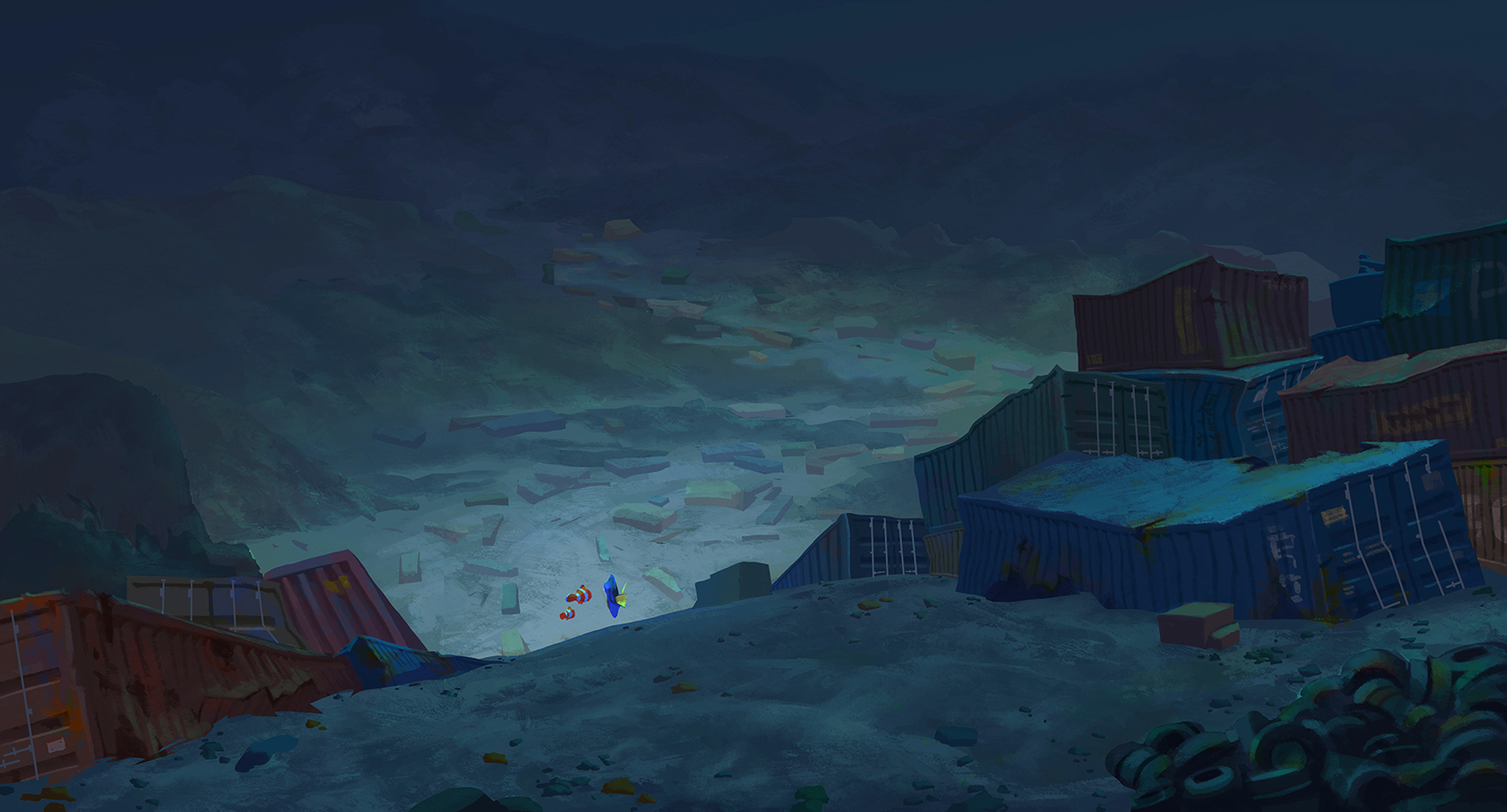
SHELLY WAN (Digital painting) and TIM EVATT (Layout)
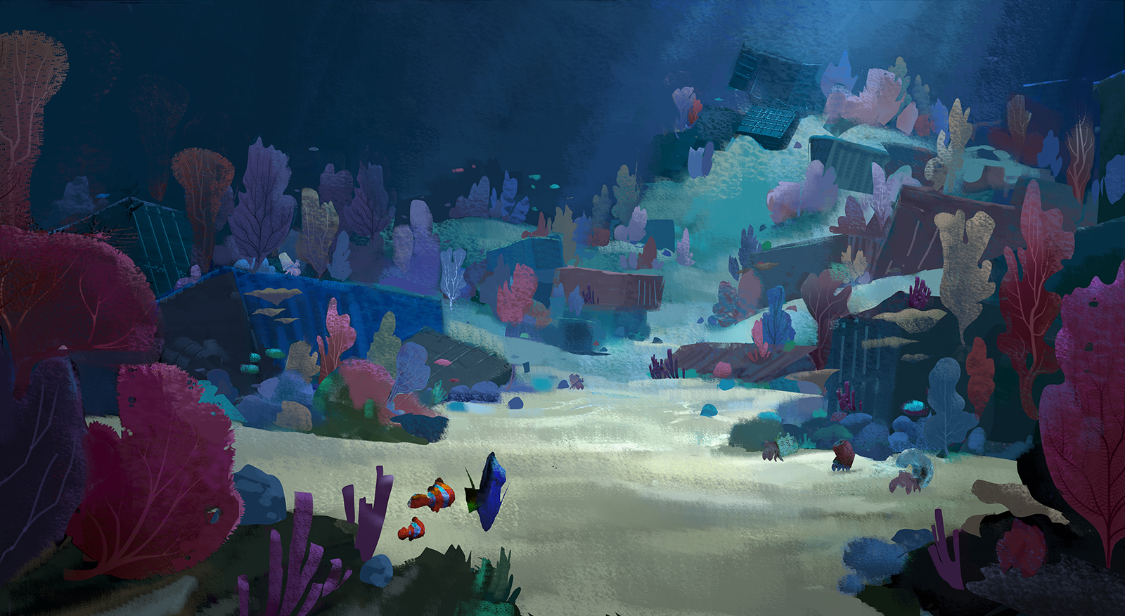
TIM EVATT Digital painting
TIM EVATT Digital painting
JASON MERCK Digital painting

JASON MERCK Pencil
JASON MERCK Digital painting
DON SHANK Colored pencil
The design for the MARINE LIFE INSTITUTE evolved significantly as the story developed. Each iteration of the set added layers of history and unique personality. It was inspired by the numerous aquariums and research centers we visited over the course of the film, though we tried to make a more progressive and idealized composite with a primary purpose to rescue, rehabilitate, and release oceanic wildlife.
— Don Shank, Environments Art Director
DON SHANK Colored pencil
TIM EVATT PreVis model
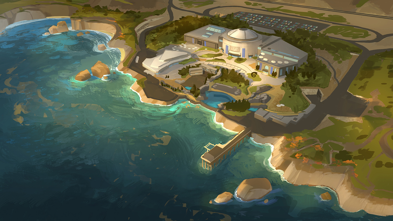
TIM EVATT Digital painting
CRAIG FOSTER Graphic design
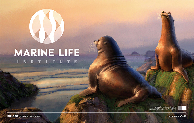
SHARON CALAHAN Digital painting, CASSANDRA SMOLCIC Graphic design

CASSANDRA SMOLCIC Graphic design
RONA LIU Digital painting
TIM EVATT Digital painting
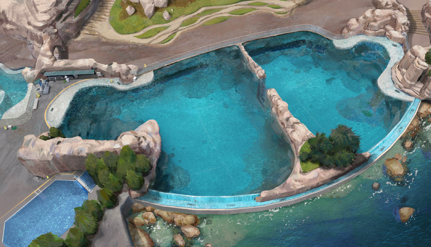
RONA LIU Digital painting
RONA LIU Digital painting
In order to make Hank and Dory feel visually out of place, we’re using a muted COLOR PALETTE for these sets. Whenever story calls for subdued colors, it’s an opportunity for us to play with texture and aging of the materials.
— Rona Liu, Production Artist
RONA LIU Digital painting

TIA KRATTER Digital painting

JASON MERCK Digital painting
By the time Finding Dory is finished, the GRAPHICS TEAM will have made thousands of signs, labels, maps, and notes for the film. When we are first looking at what graphics might be needed for a particular set or story point, we first try to view it from a point of emotional authenticity. What does it feel like to visit an aquarium in reality? What kind of graphics might I see? Then we look to the story to see what supporting role the graphics need to play. Is there information they need to clearly convey? A plot point that hinges on a particular sign? Or are they in the background, placed throughout the set as needed to make the space feel authentic—like the sticky notes and pill bottles in Quarantine. The General Zoology poster is a great example of a graphic that needed to serve a dual purpose. It’s both decorative—it plays a role in the set dressing for the scene—and serves the story. The fish has a lot of information in it, which washes over the viewer—it’s too detailed to digest without close examination. It turns out that it is the shape of the fish that matters most, though. Hank uses it to camouflage himself—he fits perfectly within the outline.
— Craig Foster, Graphics Lead

CRAIG FOSTER Graphic design
CRAIG FOSTER Graphic design
CASSANDRA SMOLCIC Graphic design
BERT BERRY Digital painting
JASON MERCK Digital painting

STEVE PILCHER Digital painting
TIM EVATT Layout and JOHN LEE Digital painting
When we were developing the concept art for the AQUARIUM in the Marine Life Institute, the director, Andrew Stanton, told us to come up with our most wild ideas for how it might be designed. The piece on the left re-creates a reef in the space that a visitor would walk through so that they would feel like they are inside a giant version of the fish’s habitat. The painting in the middle explores a similar idea using water. The fish are inside giant bubbles and tubes of water that flow around the visitors so that they are walking right next to, over, or beneath the fish. The right-hand piece is where we ended up. Larger marine mammals—whale and dolphins—surround a central tank so that the visitors feel as though they are a part of an underwater ocean environment.
— Tim Evatt, Story Artist
DON SHANK Colored pencil
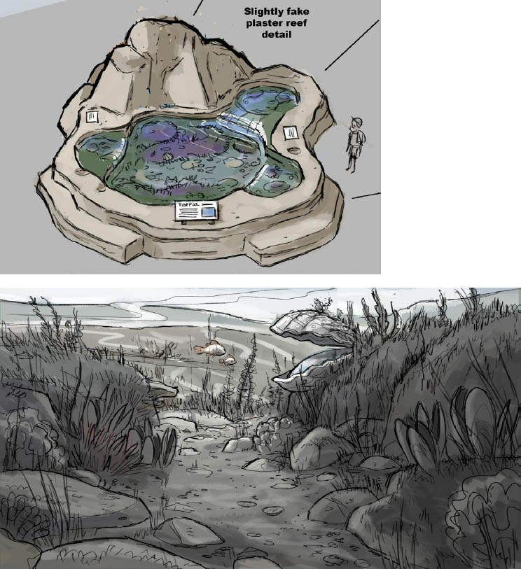
NATHANIEL MCLAUGHLIN Digital painting
MARCELINE GAGNON-TANGUAY Colored pencil
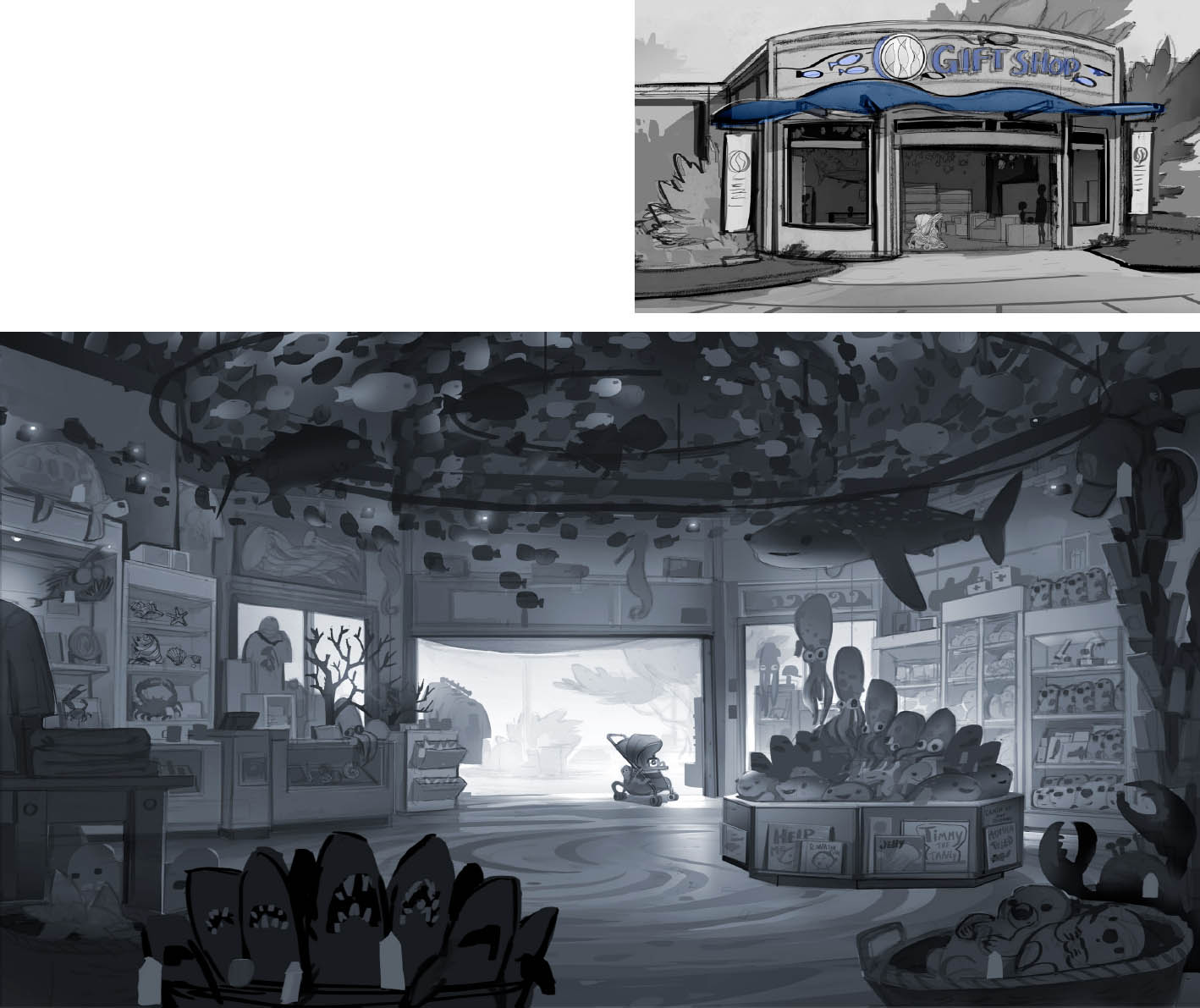
TIM EVATT Digital painting
PAUL ABADILLA Digital painting

KRISTEN LESTER Digital painting

JASON DEAMER and MARCELINE GAGNON-TANGUAY Pencil and digital painting

JASON DEAMER Digital painting
TIM EVATT Digital painting

PAUL ABADILLA Digital painting
DANIEL LÓPEZ MUÑOZ Digital painting
STEVE PILCHER Digital painting
The COLOR PALETTE of the main characters is very close to primary—Hank is red-orange, Marlin and Nemo are yellow-orange, and Dory is blue. This creates a great dynamic to play with.
— Steve Pilcher, Production Designer
KYLE MACNAUGHTON and STEVE PILCHER Digital painting
KYLE MACNAUGHTON Digital painting
STEVE PILCHER and DANIEL LÓPEZ MUÑOZ Digital painting
PAUL ABADILLA Digital painting