The goal of this chapter is to give you a comprehensive introduction to base graphics in R. By base graphics, I mean graphics created in R without the use of any additional software or contributed packages. In other words, for the time being, we are using only the default packages in R. After reading this chapter, you should be able to create some nice graphs. Therefore, in this chapter I will introduce you to the basic syntax and techniques used to create and save scatterplots and line plots, though many of the techniques here will be useful for other kinds of graph. We will begin with some basic graphs and then work our way to more complex graphs that include several lines and have axes and axis labels of your choice.
In this chapter, we will cover the following topics:
- Basic graphics methods and syntax
- Creating scatterplots and line plots
- Creating special axes
- Adding text—legends, titles, and axis labels
- Adding lines—interpolation lines, regression lines, and curves
- Graphing several variables, multiple plots, and multiple axes
- Saving your graphs as PDF, PostScript, JPG files, and so on
- Including mathematical expressions in your graphs
In R, we create graphs in steps, where each line of syntax introduces new attributes to our graph. In R, we have high-level plotting functions that create a complete graph such as a bar chart, pie chart, or histogram. We also have low-level plotting functions that add some attributes such as a title, an axis label, or a regression line. We begin with the plot() command (a high-level function), which allows us to customize our graphs through a series of arguments that you include within the parentheses. In the first example, we start by setting up a sequence of x values for the horizontal axis, running from -4 to +4, in steps of 0.2. Then, we create a quadratic function (y) which we will plot against the sequence of x values.
Enter the following syntax on the R command line by copying and pasting into R. Note the use of the assigns operator, which consists of the less than sign followed by a minus sign. In R, we tend to use this operator in preference to the equals sign, which we tend to reserve for logical equality.
x <- seq(-4, 4, 0.2)

y <- 2*x^2 + 4*x - 7
Tip
Downloading the example code
You can download the example code files for all Packt books you have purchased from your account at http://www.packtpub.com. If you purchased this book elsewhere, you can visit http://www.packtpub.com/support and register to have the files e-mailed directly to you.
You can enter x and y at the command line to see the values that R has created for us.
Now use the plot() command. This command is very powerful and provides a range of arguments that we can use to control our plot. Using this command, we can control symbol type and size, line type and thickness, color, and other attributes.
Now enter the following command:
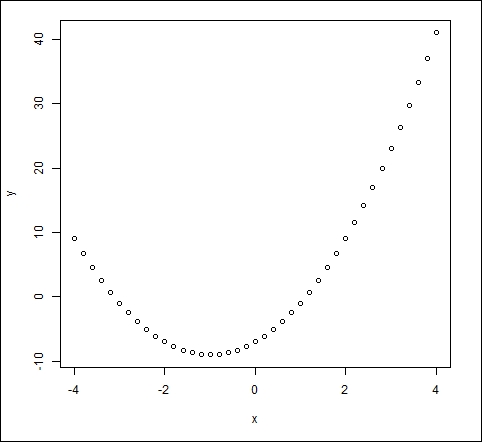
plot(x, y)
You will get the following graph:

This is a very basic plot, but we can do much better. Let's start again and build a nice plot in steps. Enter the following command, which consists of the plot() command and two arguments:
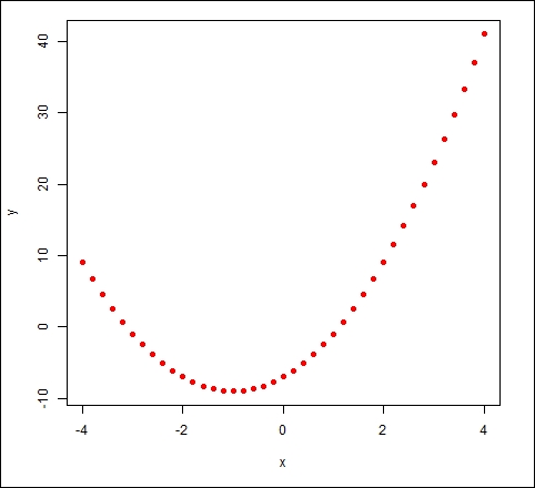
plot(x, y, pch = 16, col = "red")
The argument pch controls symbol type. The symbol type 16 gives solid dots. A very wide range of colors is available in R and are discussed later in this chapter. The list of available options for symbol type is given in many online sources, but the Quick-R website (http://www.statmethods.net/advgraphs/parameters.html) is particularly helpful. Using the previous command, you will get the following graph:

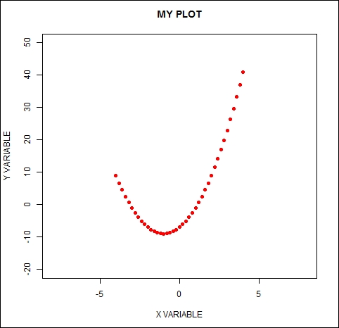
Now we use the arguments xlim, ylim, xlab, and ylab. Enter the following plotting syntax on the command line:
plot(x, y, pch = 16, col = "red", xlim = c(-8, 8), ylim = c(-20, 50),
main = "MY PLOT", xlab = "X VARIABLE" , ylab = "Y VARIABLE")
This command will produce the following graph:

The arguments xlim and ylim control the axis limits. They are used with the c operator to set up the minimum and maximum values for the axes. The arguments xlab and ylab let you create labels, but you must include your labels within quotation marks.
Now, create line segments between the points using the following command:
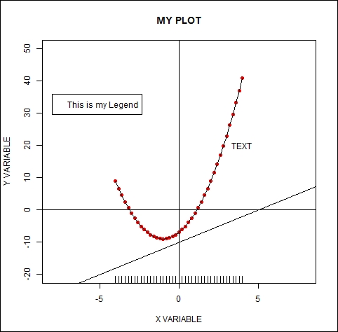
lines(x, y)
Note that the lines() command is used after the plot() command. It will run provided that the graph produced by the plot() command remains open. Next, we will use the
abline() command, where abline(a, b) draws a line of intercept a and slope b. The commands abline(h = k) and abline(v = k) draw a horizontal line at the value k and a vertical line at the value k.
We enter each of these commands on a new line as shown:
abline(h = 0)

abline(v = 0)

abline(-10, 2)      # Draws a line of intercept -10 and slope 2.

text(4, 20, "TEXT")

legend(-8,36,"This is my Legend")
Your legend begins at the point (-8, 36) and is now centered on the point (-4, 36). The text() command will be discussed in more detail in Chapter 2, Advanced Functions in Base Graphics. The legend() command is very powerful and provides many options for creating and placing legends; it is also discussed in Chapter 2, Advanced Functions in Base Graphics. For now, it is enough to know that you specify the position of your legend by entering relevant coordinates as the first two arguments, and then enter your text inside quotation marks.
Consider the following command:
rug(x)
The rug() command indicates the location of points on the horizontal axis. Here is the resulting graph:

In just a few lines of syntax, you have learned how to make a fairly complex graph and you can now use the same techniques to draw your own graphs.