The first argument in the
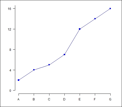
axis() command (the number 1) specifies the horizontal axis. The at argument allows you to specify where to place the axis labels. The vector called lab stores the actual labels. Now we create a y axis with horizontal labels, and ticks every four units, using the syntax at=4*0: yaxismax as shown:
axis(2, las=1, at=4*0: yaxismax)
Now what does our graph look like?

Now we have included a vertical axis. The argument las controls the orientation of the axis labels. Your labels can be either parallel (las=0) or perpendicular (las=2) to your axis. Using las=1 ensures horizontal labels, while las=3 ensures vertical labels.
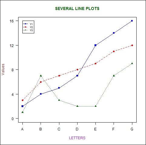
Now we create a box around the plot and then we add in the two new curves using the lines() command, using two different symbol types.
box()

lines(Y2, pch = 16, type="o", lty=2, col="red")

lines(Y3, pch = 17, type="o", lty=3, col="darkgreen")
Let's create a title using the following command:
title(main="SEVERAL LINE PLOTS", col.main="darkgreen", font.main=2)
Now we label the x and y axes using title(), along with xlab and ylab.
title(xlab=toupper("Letters"), col.lab="purple")

title(ylab="Values", col.lab="brown")
Note the toupper() command, which always ensures that text within parentheses is uppercase. The tolower() command ensures that your text is lowercase.
Finally, we create a legend at the location (1, yaxismax), though the legend() command allows us to position the legend anywhere on the graph (see Chapter 2, Advanced Functions in Base Graphics, for more detail). We include the legend keys using the c operator. We control the colors using col and ensure that the symbol types match those of the graph using pch. To do this job, we include the legend colors in the same logical order in which we created the curves:
legend(1, yaxismax, c("Y1","Y2", "Y3"), cex=0.7, col=c("blue", "red", "darkgreen"), pch=c(15, 16, 17), lty=1:3)
The following is our final plot:
