Now let's learn how to create several curves in one graph, provided that the data is arranged correctly. Read the Children dataset from the code file of this chapter. It gives the heights and ages of four children. We want to produce a graph of Height against Age for each child, including both points and lines. Enter the following command:
attach(cheight)
Let's see the first eight rows of this dataset:
head(cheight, 8)
We get the following output:
  Child  Age Height
1  John  13    165
2  John  14    172
3  John  15    174
4  John  16    177
5  John  17    179
6  John  18    181
7  Mary  13    145
8  Mary  14    153
Note that the data is arranged in columns so that several measurements for each child appear in a single column. This format is ideal for creating multiple curves simultaneously. Before we start, let's remind ourselves of the names of each child. Since Child is a categorical variable, we can see each name using the levels() command:
levels(Child)
Their names are:
[1] "Anne" "Joe" "John" "Mary"
Let's plot all curves together in the same graph, mapping color to Child with the following command:
qplot(Age, Height, data = cheight, geom = c("line","point"),
color = Child, main = "Growth Patterns of Four Children")
We get the following graph:
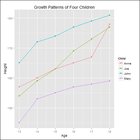
We now have a colored curve and colored points for each child.