Let's create a scatterplot relating height and weight before treatment, along with both points and a smooth curve using geom = c("point","smooth"). In qplot, the default smoother is LOWESS, and the gray band represents a standard error confidence interval. LOWESS fits models to local subsets of the variables to produce a smoothed version of the data.
You can read further about LOWESS in various texts and online sources. For this example, we set up the graph as an object (Y) and plot it by entering the object name on the command line:
Y <- qplot(HEIGHT, WEIGHT_1, data = T, xlab = "HEIGHT (cm)", ylab = "WEIGHT BEFORE TREATMENT (kg)", geom = c( "point","smooth"))

Y
Our graph now looks like this:
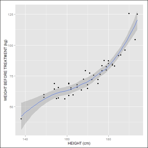
We have the smoothed curve and the confidence interval. Let's graph the same data, but map color to ethnicity. We add transparency in order to make the curves easy to interpret. The syntax is as follows:
Y <- qplot(HEIGHT, WEIGHT_1, data = T, xlab = "HEIGHT (cm)", ylab = "WEIGHT BEFORE TREATMENT (kg)" , geom = c("point","smooth"), color = factor(ETH), alpha = I(0.2))

Y
Here is the resulting graph:
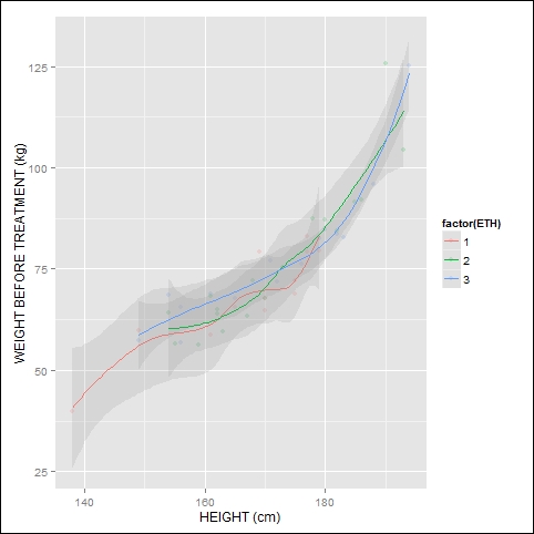
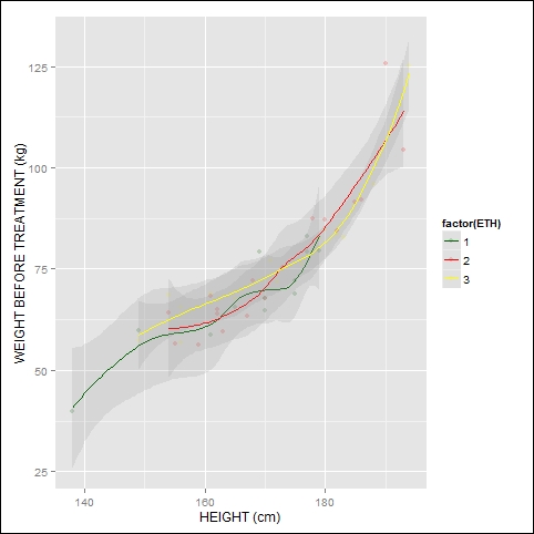
As before, to select your own colors for the smoothed curves, add the scale_color_manual() layer, for example:
Y + scale_color_manual(values = c("darkgreen", "red", "yellow"))
The graph now looks like this:
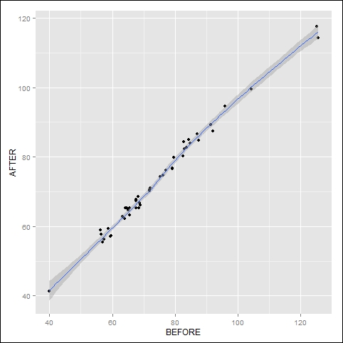
As we saw in the previous example, qplot often provides several ways of achieving the same graph. Here we set up the graph first, and then specify geom later using the plus sign. Here, we plot weight before treatment against weight after treatment using the following syntax:
qplot(WEIGHT_1, WEIGHT_2, data = T, xlab = "BEFORE", ylab = "AFTER") + geom_smooth()
The graph looks like this:
Another approach is to set up the graph as an object. The syntax is as follows:
p <- qplot(WEIGHT_1, WEIGHT_2, data = T,  geom = c("point","smooth"), xlab = "BEFORE", ylab = "AFTER")
p
Notice that these approaches produced the same graph. Now let's use a linear regression model to obtain the smooth curve (in this case, a straight line). To fit a linear regression model, use the argument method = "lm", as follows:
qplot(WEIGHT_1, WEIGHT_2, data = T, geom = c("point","smooth"), xlab = "BEFORE", ylab = "AFTER", method = "lm")
Here is the graph:
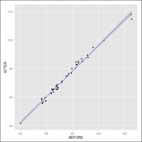
The regression shows a highly linear relationship between the two measurements, so that the standard error confidence band is very narrow.
In fact, qplot provides various smoothers, of which LOWESS is the default. Other options include OLS regression and generalized additive models. You can control the width of the smoother using the span argument. For example, span = 0.2 gives a wider band and span = 1 (the maximum value of span) gives a narrower band. You can modify the smoothed curve by varying the span value between 0 (not smooth) and 1 (smooth).