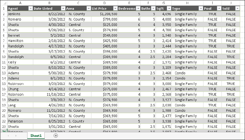
FIGURE 19.1 An Excel table
IN THIS CHAPTER
Taking advantage of tables
Understanding Excel’s conditional formatting feature
Using the graphical conditional formats
Using conditional formatting formulas
Reviewing tips for using conditional formatting
Introducing the sparkline graphics feature
Adding sparklines to a worksheet
Customizing sparklines
Making a sparkline display only the most recent data
This chapter explores some versatile formatting features for summarizing, highlighting, and presenting data. The chapter starts by introducing Excel’s table feature, which you can use to not only apply colorful formatting to a list of data, but also to filter and total the data, among other benefits.
You can apply conditional formatting to a cell so that the cell looks different, depending on its contents. Conditional formatting is a useful tool for visualizing numeric data. In some cases, conditional formatting may be a viable alternative to creating a chart.
Finally, you can create sparklines to illustrate data values within a cell. Sparklines appear like mini charts and offer a surprising amount of formatting flexibility.
A table is a rectangular range of structured data. Each row in the table corresponds to a single entity. For example, a row can contain information about a customer, a bank transaction, an employee, a product, and so on. Each column contains a specific piece of information. For example, if each row contains information about an employee, the columns can contain data such as name, employee number, hire date, salary, department, and so on. Tables typically have a header row at the top that describes the information contained in each column.
You must tell Excel to convert a range of data into an “official” table. You do this by selecting any cell within the range and then choosing Insert ⇒ Tables ⇒ Table. When you explicitly identify a range as a table, Excel can respond more intelligently to the actions you perform with that range. For example, if you create a chart from a table, the chart will expand automatically as you add new rows to the table. And if you enter a formula into a cell, Excel will propagate the formula to other rows in the table. Figure 19.1 shows a range converted to a table by choosing Insert ⇒ Tables ⇒ Table. Notice the drop-down list arrows at the top.
FIGURE 19.1 An Excel table
What’s the difference between a standard range and a table? With a table:
FIGURE 19.2 When you select a cell in a table, you can use the commands located on the Table Tools ⇒ Design tab.
Most of the time, you’ll create a table from an existing range of data. However, Excel also enables you to create a table from an empty range so that you can fill in the details later. The following instructions assume that you already have a range of data that’s suitable for a table.
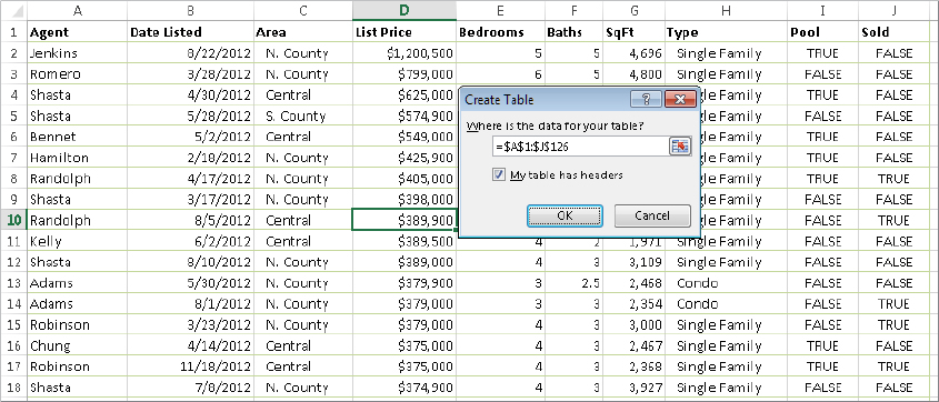
FIGURE 19.3 Use the Create Table dialog box to verify that Excel selected the table dimensions correctly.
To create a table from an empty range, just select the range and choose Insert ⇒ Tables ⇒ Table. Excel creates the table, adds generic column headers (such as Column1 and Column2), and applies table formatting to the range. Almost always, you’ll want to replace the generic column headers with more meaningful text.
When you create a table, Excel applies the default table style. The actual appearance depends on which document theme is used in the workbook (Page Layout ⇒ Themes ⇒ Themes). If you prefer a different look, you can easily change the entire look of the table.
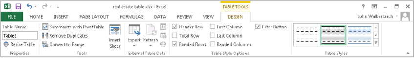
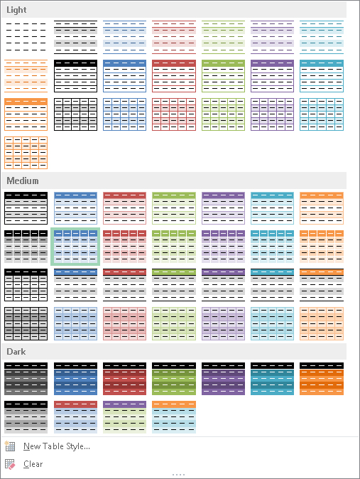
Select any cell in the table and choose Table Tools ⇒ Design ⇒ Table Styles. (At a lower screen resolution, you will need to click the Quick Styles button in the Table Styles group of the Design tab.) The Ribbon shows one row of styles, but if you click the More button at the bottom of the scroll bar to the right, the Table Styles group expands, as shown in Figure 19.4. The styles are grouped into three categories: Light, Medium, and Dark. Notice that you get a Live Preview on the table as you move your mouse among the styles. When you see one you like, just click to apply it. For a different set of table style choices, choose Page Layout ⇒ Themes ⇒ Themes to select a different document theme.
FIGURE 19.4 Excel offers many different table styles.
You can change some elements of the style by using the check box controls in the Table Tools ⇒ Design ⇒ Table Style Options group. These controls determine whether various elements of the table are displayed, and whether some formatting options are in effect:
If you’d like to create a custom table style, choose Table Tools ⇒ Design ⇒ Table Styles ⇒ New Table Style to display the New Table Style dialog box. You can customize any or all of the 12 items in the Table Element list. Select an element from the list, click Format, and specify the formatting for that element. When you’re finished, give the new style a name and click OK. Your custom table style will appear in the Table Styles gallery in the Custom category. Unfortunately, custom table styles are available only in the workbook in which they were created.
This section describes some common actions you’ll take with tables.
Selecting cells in a table works just like selecting cells in a normal range. One difference is when you use the Tab key. Pressing Tab moves to the cell to the right, but when you reach the last column, pressing Tab again moves to the first cell in the next row.
When you move your mouse around in a table, you may notice that the pointer changes shapes. These shapes help you select various parts of the table.
To add a new column to the end of a table, select a cell in the column to the right of the table and start entering the data. Excel automatically extends the table horizontally and adds a generic column name for the new column. Similarly, if you enter data in the row below a table, Excel extends the table vertically to include the new row.
To add rows or columns within the table, right-click and choose Insert from the shortcut menu. The Insert shortcut menu command displays additional menu items:
When you move your mouse to the resize handle at the bottom-right cell of a table, the mouse pointer turns into a diagonal line with two arrowheads. Drag down to add more rows to the table. Drag to the right to add more columns.
When you insert a new column, the Header Row displays a generic description, such as Column1, Column2, and so on. Typically, you’ll want to change these names to more descriptive labels. Just select the cell, type new text, and press Enter.
To delete a row (or column) in a table, select any cell in the row (or column) to be deleted. To delete multiple rows or columns, select a range of cells. Then right-click and choose Delete ⇒ Table Rows (or Delete ⇒ Table Columns).
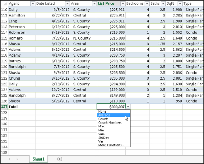
The Total Row in a table contains formulas that summarize the information in the columns. When you create a table, the Total Row isn’t turned on. To display the Total Row, choose Table Tools ⇒ Design ⇒ Table Style Options and put a check mark next to Total Row.
By default, a Total Row displays the sum of the values in a column of numbers. In some cases, you’ll want a different type of summary formula. (For more information about formulas, including the use of formulas in a table column, see Chapter 15.) When you select a cell in the Total Row, a drop-down arrow appears in the cell. Click the arrow, and you can select from a number of other summary formulas (see Figure 19.5):
FIGURE 19.5 Several types of summary formulas are available for the Total Row.
If data in a table was compiled from multiple sources, the table may contain duplicate items. Most of the time, you want to eliminate the duplicates. In the past, removing duplicate data was essentially a manual task, but it’s very easy if the data is in a table.
Start by selecting any cell in your table. Then choose Table Tools ⇒ Design ⇒ Tools ⇒ Remove Duplicates. Excel opens the Remove Duplicates dialog box shown in Figure 19.6. The dialog box lists all the columns in your table. Place a check mark next to the columns that you want to be included in the duplicate search. Most of the time, you’ll want to select all the columns, which is the default. Click OK, and Excel weeds out the duplicate rows and displays a message that tells you how many duplicates it removed.
FIGURE 19.6 Removing duplicate rows from a table is easy.
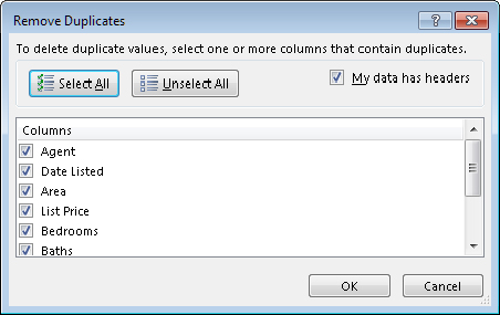
When you select all columns in the Remove Duplicates dialog box, Excel will delete a row only if the content of every column is duplicated. In some situations, you may not care about matching some columns, so you would deselect those columns in the Remove Duplicates dialog box. When duplicate rows are found, the first row is kept and subsequent duplicate rows are deleted.
Each item in the Header Row of a table contains a drop-down arrow known as a Filter Button. When clicked, the Filter Button displays sorting and filtering options (see Figure 19.7).
FIGURE 19.7 Each column in a table has sorting and filtering options.

Sorting a table rearranges the rows based on the contents of a particular column. You may want to sort a table to put names in alphabetical order. Or, maybe you want to sort your sales staff by the totals sales made.
To sort a table by a particular column, click the Filter Button in the column header and choose one of the sort commands. The exact command varies, depending on the type of data in the column. You can also select Sort by Color to sort the rows based on the background or text color of the data. This option is relevant only if you’ve overridden the table style colors with custom formatting.
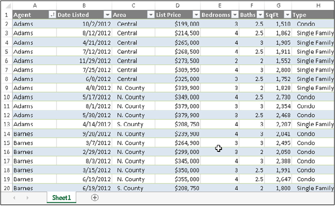
You can sort on any number of columns. The trick is to sort the least significant column first and then proceed until the most significant column is sorted last. For example, in a real estate table, you may want to sort the list by agent. And within each agent’s group, sort the rows by area. And within each area, sort the rows by list price. For this type of sort, first sort by the List Price column, then sort by the Area column, and then sort by the Agent column. Figure 19.8 shows the table sorted in this manner.
FIGURE 19.8 A table, after performing a three-column sort
Another way of performing a multiple-column sort is to use the Sort dialog box (choose Home ⇒ Editing ⇒ Sort & Filter ⇒ Custom Sort). Or right-click any cell in the table and choose Sort ⇒ Custom Sort from the shortcut menu.
In the Sort dialog box, use the drop-down lists to specify the sort specifications. In this example, you start with Agent. Then click the Add Level button to insert another set of search controls. In this new set of controls, specify the sort specifications for the Area column. Then add another level and enter the specifications for the List Price column. Click OK to apply the sort. This technique produces exactly the same sort as described in the previous paragraph.
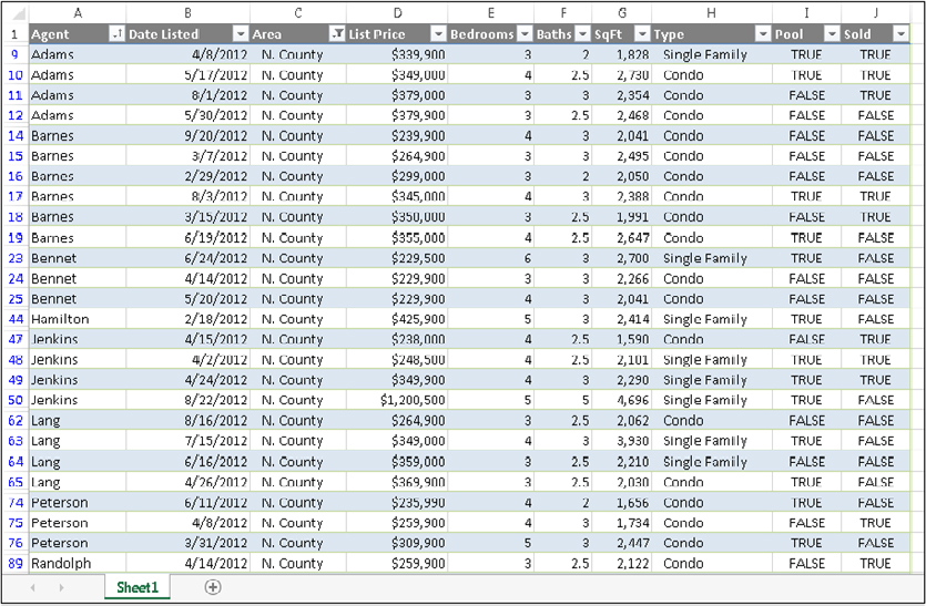
Filtering a table refers to displaying only the rows that meet certain conditions. The other rows are hidden. Note that the entire rows are hidden. Therefore, if you have other data to the left or right of your table, that information will also be hidden. If you plan to filter your list, don’t include any other data to the left or right of your table.
Using the example real estate table we’ve been discussing, assume that you’re only interested in the data for the N. County area. Click the Filter Button in the Area Row Header and remove the check mark from Select All, which unselects everything. Then, place a check mark next to N. County and click OK. The table, shown in Figure 19.9, is now filtered to display only the listings in the N. County area. Notice that some of the row numbers are missing. These rows are hidden and contain data that does not meet the specified criteria.
FIGURE 19.9 This table is filtered to show only the information for N. County.
Also notice that the Filter Button in the Area column now shows a different graphic — an icon that indicates the column is filtered.
You can filter by multiple values in a column using multiple check marks. For example, to filter the table to show only N. County and Central, place a check mark next to both values in the drop-down list in the Area Row Header.
You can filter a table using any number of columns. For example, you may want to see only the N. County listings in which the Type is Single Family. Just repeat the operation using the Type column. All tables then display only the rows in which the Area is N. County and the Type is Single Family.
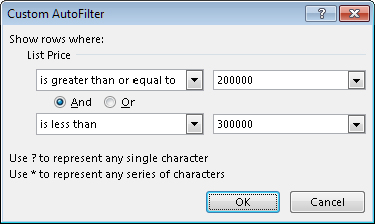
For additional filtering options, select Text Filters (or Number Filters, if the column contains values). The options are fairly self-explanatory, and you have a great deal of flexibility in displaying only the rows that you’re interested in. For example, you can display rows in which the List Price is greater than or equal to $200,000, but less than $300,000 (see Figure 19.10). Click OK to apply the filter and close the Custom AutoFilter dialog box.
FIGURE 19.10 Specifying a more complex numeric filter
In addition, you can right-click a cell and use the Filter command on the shortcut menu. This menu item leads to several additional filtering options.
When you copy data from a filtered table, only the visible data is copied. In other words, rows that are hidden by filtering don’t get copied. This filtering makes it very easy to copy a subset of a larger table and paste it to another area of your worksheet. Keep in mind, though, that the pasted data is not a table — it’s just a normal range. You can, however, convert the copied range to a table.
To remove filtering for a column, click the drop-down in the Row Header and select Clear Filter. If you’ve filtered using multiple columns, it may be faster to remove all filters by choosing Home ⇒ Editing ⇒ Sort & Filter ⇒ Clear.
If you need to convert a table back to a normal range, just select a cell in the table and choose Table Tools ⇒ Design ⇒ Tools ⇒ Convert to Range. The table style formatting remains intact, but the range no longer functions as a table.
Conditional formatting enables you to apply cell formatting selectively and automatically, based on the contents of the cells. For example, you can apply conditional formatting in such a way that all negative values in a range have a light-yellow background color. When you enter or change a value in the range, Excel examines the value and checks the conditional formatting rules for the cell. If the value is negative, the background is shaded; otherwise, no formatting is applied.
Conditional formatting is an easy way to quickly identify erroneous cell entries or cells of a particular type. You can use a format (such as bright-red cell shading) to make particular cells easy to identify.
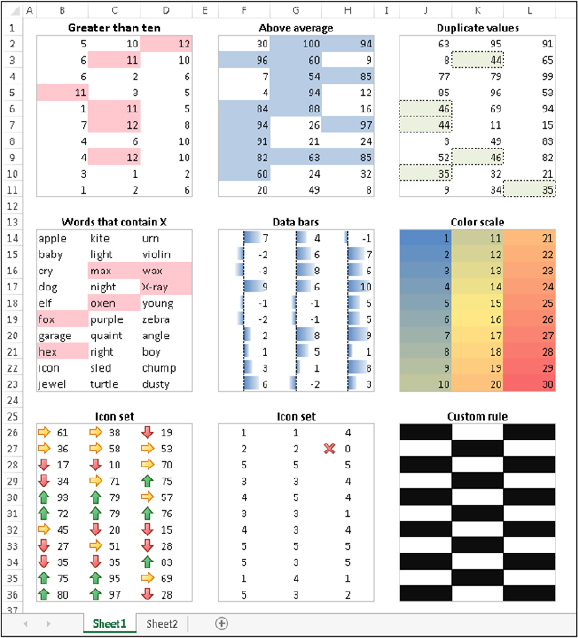
Figure 19.11 shows a worksheet with nine ranges, each with a different type of conditional formatting rule applied. Here’s a brief explanation of each:
=MOD(ROW(),2)=MOD(COLUMN(),2)FIGURE 19.11 This worksheet demonstrates a few conditional formatting rules.
To apply a conditional formatting rule to a cell or range, select the cells and then use one of the commands from the Home ⇒ Styles ⇒ Conditional Formatting drop-down list to specify a rule. The choices are:
When you select a conditional formatting rule, Excel displays a dialog box specific to that rule. These dialog boxes have one thing in a common: a drop-down list with common formatting suggestions.
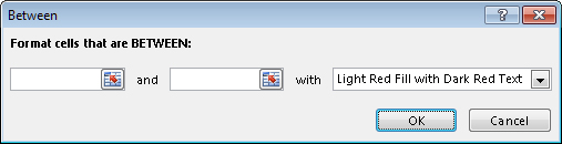
Figure 19.12 shows the dialog box that appears when you choose Home ⇒ Styles ⇒ Conditional Formatting ⇒ Highlight Cells Rules ⇒ Between. This particular rule applies the formatting if the value in the cell falls between two specified values. In this case, you enter the two values (or specify cell references), and then use choices from the drop-down list to set the type of formatting to display if the condition is met.
FIGURE 19.12 One of several different conditional formatting dialog boxes
The formatting suggestions in the drop-down list are just a few of thousands of different formatting combinations. If none of Excel’s suggestions are what you want, choose the Custom Format option to display the Format Cells dialog box. You can specify the format in any or all of the four tabs: Number, Font, Border, and Fill.
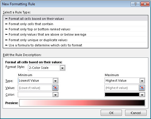
For maximum control, Excel provides the New Formatting Rule dialog box, shown in Figure 19.13. Access this dialog box by choosing Home ⇒ Styles ⇒ Conditional Formatting ⇒ New Rules.
FIGURE 19.13 Use the New Formatting Rule dialog box to create your own conditional formatting rules.
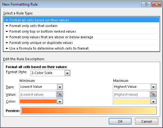
Use the New Formatting Rule dialog box to adjust any of the conditional format rules available via the Ribbon, as well as creating unique new rules. First, select a general rule type from the list at the top of the dialog box. The bottom part of the dialog box varies, depending on your selection at the top. After you specify the rule, click the Format button to specify the type of formatting to apply if the condition is met. An exception is the first rule type (Format All Cells Based on Their Values), which doesn’t have a Format button (it uses graphics rather than cell formatting).
Here is a summary of the rule types:
This section describes the three conditional formatting options that display graphics: data bars, color scales, and icon sets. These types of conditional formatting can be useful for visualizing the values in a range.
The data bars conditional format displays horizontal bars directly in the cell. The length of the bar is based on the value of the cell, relative to the other values in the range.
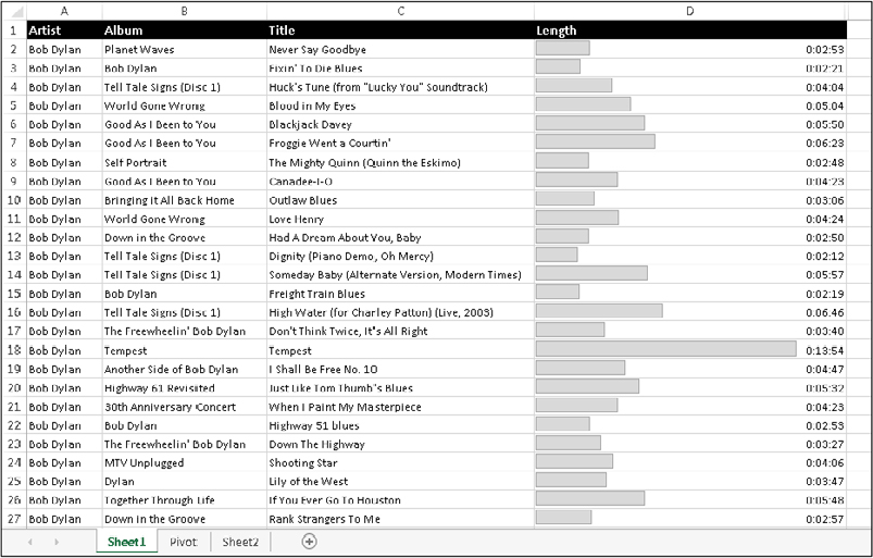
Figure 19.14 shows an example of data bars. It’s a list of tracks on 37 Bob Dylan albums, with the length of each track in column D. I applied data bar conditional formatting to the values in column D. You can tell at a glance which tracks are longer.
FIGURE 19.14 The length of the data bars is proportional to the track length in the cell in column D.
Excel provides quick access to 12 data bar styles via Home ⇒ Styles ⇒ Conditional Formatting ⇒ Data Bars. For additional choices, click the More Rules option, which displays the New Formatting Rule dialog box. Use this dialog box to:
Using the data bars conditional formatting can sometimes serve as a quick alternative to creating a chart. Figure 19.15 shows a three-column range (in B3:D14) with data bars conditional formatting in column D (column D contains references to the values in column C). The conditional formatting in column D uses the Show Bars Only option, so the values are not displayed.
FIGURE 19.15 Comparing data bars conditional formatting (top) with a bar chart.
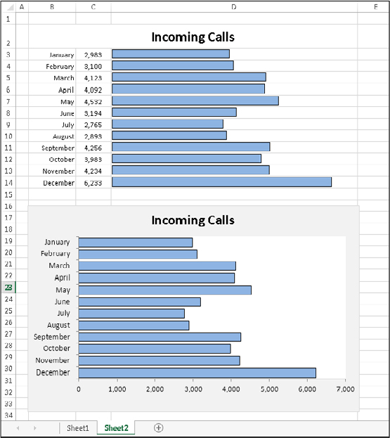
Figure 19.15 also shows an actual bar chart created from the same data. The bar chart takes about the same amount of time to create and is a lot more flexible. But for a quick-and-dirty chart, data bars may be a good option — especially when you need to create several such charts.
The color scale conditional formatting option varies the background color of a cell based on the cell’s value, relative to other cells in the range.
Figure 19.16 shows examples of color scale conditional formatting. The example on the left depicts monthly sales for three regions. Conditional formatting was applied to the range B4:D15. The conditional formatting uses a three-color scale, with red for the lowest value, yellow for the midpoint, and green for the highest value. Values in between are displayed using a color within the gradient. It’s clear that the Central region consistently has lower sales volumes, but the conditional formatting doesn’t help identify monthly difference for a particular region.
FIGURE 19.16 Two examples of color scale conditional formatting
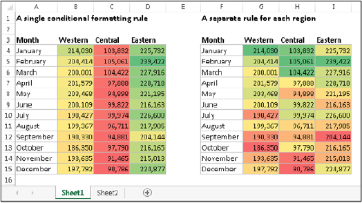
The example on the right shows the same data, but conditional formatting was applied to each region separately. This approach facilitates comparisons within a region and can also help identify high or low sales months. Neither one of these approaches is necessarily better. The way you set up conditional formatting depends entirely on what you’re trying to visualize.
Excel provides four two-color scale presets and four three-color scale presets, which you can apply to the selected range by choosing Home ⇒ Styles ⇒ Conditional Formatting ⇒ Color Scales. To customize the colors and other options, choose Home ⇒ Styles ⇒ Conditional Formatting ⇒ Color Scales ⇒ More Rules. The New Formatting Rule dialog box, shown in Figure 19.17, appears. Adjust the settings, and watch the Preview box to see the effects of your changes.
FIGURE 19.17 Use the New Formatting Rule dialog box to customize a color scale.
It’s important to understand that color scale conditional formatting uses a gradient. For example, if you format a range using a two-color scale, you’ll get a lot more than two colors. You’ll also get colors within the gradient between the two specified colors.
Figure 19.18 shows an extreme example that uses color scale conditional formatting on a range of more than 6,000 cells. The worksheet contains average daily temperatures for an 18-year period. Each row contains 365 (or 366) temperatures for the year. The columns are very narrow so the entire year can be visualized.
FIGURE 19.18 This worksheet uses color scale conditional formatting to display daily temperatures.

Yet another conditional formatting option is to display an icon in the cell. The icon displayed depends on the value of the cell.
To assign an icon set to a range, select the cells and choose Home ⇒ Styles ⇒ Conditional Formatting ⇒ Icon Sets. Excel provides 20 icon sets to choose from. The number of icons in the sets ranges from three to five. You can’t create a custom icon set.
Figure 19.19 shows an example that uses an icon set. The symbols graphically depict the status of each project, based on the value in column C.
FIGURE 19.19 Using an icon set to indicate the status of projects
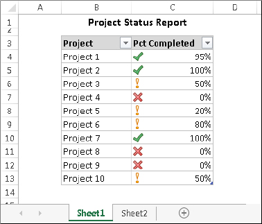
By default, the symbols are assigned using percentiles. For a three-symbol set, the items are grouped into three percentiles. For a four-symbol set, they’re grouped into four percentiles. And for a five-symbol set, the items are grouped into five percentiles.
If you would like more control over how the icons are assigned, choose Home ⇒ Styles ⇒ Conditional Formatting ⇒ Icon Sets ⇒ More Rules to display the New Formatting Rule dialog box. To modify an existing rule, choose Home ⇒ Styles ⇒ Conditional Formatting ⇒ Manage Rules. Then select the rule to modify and click the Edit Rule button.
Figure 19.20 shows how to modify the icon set rules such that only projects that are 100 percent completed get the check mark icons. Projects that are 0 percent completed get the X icon. All other projects get no icon. Click OK to apply the change.
FIGURE 19.20 Changing the icon assignment rule
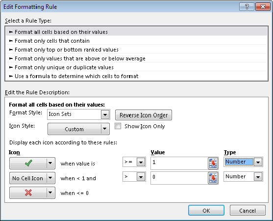
Figure 19.21 shows a table that contains two test scores for each student. The Change column contains a formula that calculates the difference between the two tests. The Trend column uses an icon set to display the trend graphically.
FIGURE 19.21 The arrows depict the trend from Test 1 to Test 2.
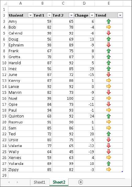
This example uses the icon set named 3 Arrows, and with the rule customized:
In other words, a difference of no more than five points in either direction is considered an even trend. An improvement of at least five points is considered a positive trend, and a decline of five points or more is considered a negative trend.
In some cases, using icon sets can cause your worksheet to look a bit cluttered. Displaying an icon for every cell in a range might result in visual overload. For the example of the test results table, you could hide the level (right pointing) arrows by clicking the down arrow beside that cell in the Edit Formatting Rule dialog box and clicking No Cell Icon in the palette that appears.
Excel’s conditional formatting feature is versatile, but sometimes it’s just not quite versatile enough. Fortunately, you can extend its versatility by writing conditional formatting formulas.
The examples later in this section describe how to create conditional formatting formulas to:
Some of these formulas may be useful to you. If not, they may inspire you to create other conditional formatting formulas.
To specify conditional formatting based on a formula, select the cells and then choose Home ⇒ Styles ⇒ Conditional Formatting ⇒ New Rule. The New Formatting Rule dialog box appears. Click the rule type Use a formula to determine which cells to format, and then specify the formula. You can type the formula directly into the box or enter a reference to a cell that contains a logical formula. As with normal Excel formulas, the formula you enter here must begin with an equal sign (=). Click OK to finish creating the rule.
If the formula that you enter into the New Formatting Rule dialog box contains a cell reference, that reference is considered a relative reference, based on the upper-left cell in the selected range.
For example, suppose that you want to set up a conditional formatting condition that applies shading to cells in range A1:B10 only if the cell contains text. None of Excel’s conditional formatting options can do this task, so you need to create a formula that will return TRUE if the cell contains text and FALSE otherwise. Follow these steps:
=ISTEXT(A1)FIGURE 19.22 Creating a conditional formatting rule based on a formula
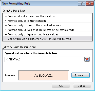
Notice that the formula entered in Step 4 contains a relative reference to the upper-left cell in the selected range.
Generally, when entering a conditional formatting formula for a range of cells, you’ll use a reference to the active cell, which is typically the upper-left cell in the selected range. One exception is when you need to refer to a specific cell. For example, suppose that you select range A1:B10, and you want to apply formatting to all cells in the range that exceed the value in cell C1. Enter this conditional formatting formula:
=A1>$C$1In this case, the reference to cell C1 is an absolute reference; it will not be adjusted for the cells in the selected range. In other words, the conditional formatting formula for cell A2 looks like this:
=A2>$C$1The relative cell reference is adjusted, but the absolute cell reference is not.
Each of these examples uses a formula entered directly into the New Formatting Rule dialog box, after selecting the Use a Formula to Determine Which Cells to Format rule type. You decide the type of formatting that you apply conditionally.
Excel provides a number of conditional formatting rules that deal with dates, but it doesn’t let you identify dates that fall on a weekend. Use this formula to identify weekend dates:
=OR(WEEKDAY(A1)=7,WEEKDAY(A1)=1)This formula assumes that a range is selected and that cell A1 is the active cell.
Figure 19.23 shows a worksheet that contains a conditional formula in the range A3:G28. If a name entered in cell B1 is found in the first column, the entire row for that name is highlighted.
FIGURE 19.23 Highlighting a row, based on a matching name
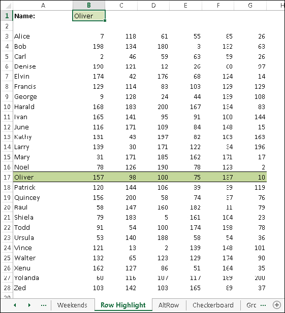
The conditional formatting formula is:
=$A3=$B$1Notice that a mixed reference is used for cell A3. Because the column part of the reference is absolute, the comparison is always done using the contents of column A.
The conditional formatting formula that follows was applied to the range A1:D18, as shown in Figure 19.24, to apply shading to alternate rows.
=MOD(ROW(),2)=0FIGURE 19.24 Using conditional formatting to apply formatting to alternate rows
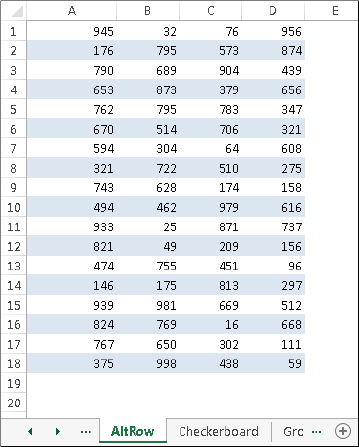
Alternate row shading can make your spreadsheets easier to read. If you add or delete rows within the conditional formatting area, the shading is updated automatically.
This formula uses the ROW function (which returns the row number) and the MOD function (which returns the remainder of its first argument divided by its second argument). For cells in even-numbered rows, the MOD function returns 0, and cells in that row are formatted.
For alternate shading of columns, use the COLUMN function instead of the ROW function.
The following formula is a variation on the example in the preceding section. It applies formatting to alternate rows and columns, creating a checkerboard effect.
=MOD(ROW(),2)=MOD(COLUMN(),2)Here’s another row shading variation. The following formula shades alternate groups of rows. It produces four shaded rows, followed by four unshaded rows, followed by four more shaded rows, and so on.
=MOD(INT((ROW()-1)/4)+1,2)=1For different sized groups, change the 4 to some other value. For example, use this formula to shade alternate groups of two rows:
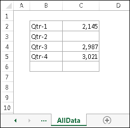
=MOD(INT((ROW()-1)/2)+1,2)=1Supppose a range has a formula that uses the SUM function in cell C6. Conditional formatting is used to display the sum only when all of the four cells above aren’t blank. The conditional formatting formula you would apply to cell C6 (and cell B6, which contains the label for the row) is:
=COUNT($C$2:$C$5)=4This formula returns TRUE only if C2:C5 contains no empty cells. The conditional formatting applied to B6:C6 is a dark background color. The text color in those cells is white, so it’s legible only when the conditional formatting rule is satisfied. Figure 19.25 shows the worksheet when one of the values is missing.
FIGURE 19.25 A missing value causes the sum to be hidden.
This section describes some additional information about conditional formatting that you may find useful.
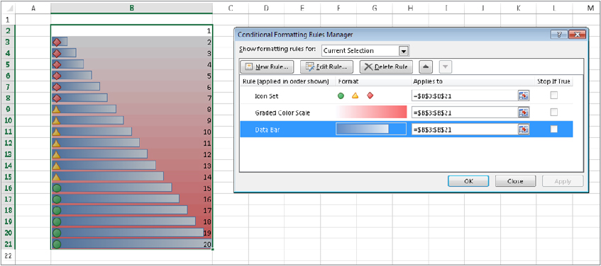
The Conditional Formatting Rules Manager dialog box is useful for checking, editing, deleting, and adding conditional formats. First select any cell in the range that contains conditional formatting. Then choose Home ⇒ Styles ⇒ Conditional Formatting ⇒ Manage Rules.
You can specify as many rules as you like by clicking the New Rule button. As you can see in Figure 19.26, cells can even use data bars, color scales, and icon sets all at the same time — if you can think of a good reason to apply all those types of formatting to one set of data.
FIGURE 19.26 This range uses data bars, color scales, and icon sets.
Conditional formatting information is stored with a cell much like standard formatting information is stored with a cell. As a result, when you copy a cell that contains conditional formatting, you also copy the conditional formatting.
If you insert rows or columns within a range that contains conditional formatting, the new cells have the same conditional formatting.
When you press Delete to delete the contents of a cell, you don’t delete the conditional formatting for the cell (if any). To remove all conditional formats (as well as all other cell formatting), select the cell and then choose Home ⇒ Editing ⇒ Clear ⇒ Clear Formats. Or choose Home ⇒ Editing ⇒ Clear ⇒ Clear All to delete the cell contents and the conditional formatting.
To remove only conditional formatting (and leave the other formatting intact), choose Home ⇒ Styles ⇒ Conditional Formatting ⇒ Clear Rules.
You can’t always tell, just by looking at a cell, whether it contains conditional formatting. You can, however, use the Go to Special dialog box to select such cells.
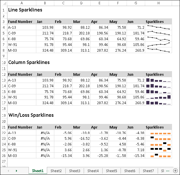
A sparkline is a small chart that’s displayed in a single cell. A sparkline allows you to quickly spot time-based trends or variations in data. Because they’re so compact, sparklines are almost always used in a group.
Although sparklines look like miniature charts (and can sometimes take the place of a chart), this feature is completely separate from the charting feature covered in Chapter 18. For example, charts are placed on a worksheet’s draw layer, and a single chart can display several series of data. A sparkline is displayed inside a cell and displays only one series of data.
This chapter introduces sparklines and presents examples that demonstrate how they can be used in your worksheets.
Excel supports three types of sparklines. Figure 19.27 shows examples of each, displayed in column H. Each sparkline depicts the six data points to the left.
FIGURE 19.27 Three groups of sparklines
Sparklines provide a great way to summarize data visually. For example, Figure 19.28 shows column sparklines summarizing precipitation data. To create sparkline graphics, follow these steps:
FIGURE 19.28 Column sparklines summarize the precipitation data for nine cities.
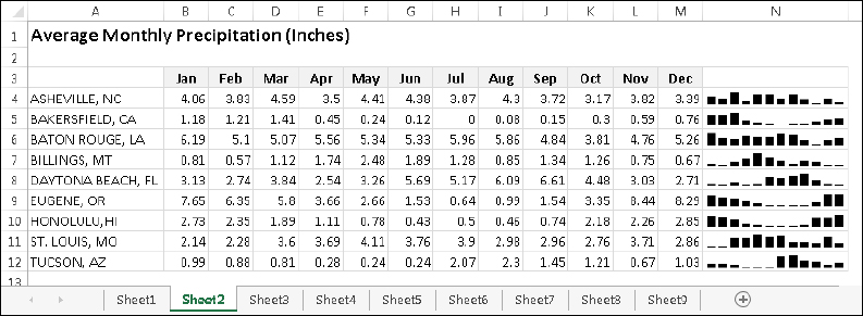
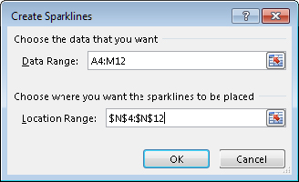
FIGURE 19.29 Use the Create Sparklines dialog box to specify the data range and the location for the Sparkline graphics.
The sparklines are linked to the data, so if you change any of the values in the data range, the sparkline graphic will update. Often, you’ll want to increase the column width or row height to improve the readability of the sparklines.
When you select a cell that contains a sparkline, Excel displays an outline around all the sparklines in its group. You can then use the commands on the Sparkline Tools ⇒ Design tab to customize the group of sparklines.
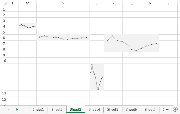
When you change the width or height of a cell that contains a sparkline, the sparkline adjusts accordingly. In addition, you can insert a sparkline into merged cells. Figure 19.30 shows the same sparkline, displayed at four sizes resulting from column width, row height, and merged cells. As you can see, the size and proportions of the cell (or merged cells) make a big difference in the appearance.
FIGURE 19.30 A sparkline at various sizes
By default, if you hide rows or columns that are used in a sparkline graphic, the hidden data does not appear in the sparkline. Also, missing data (an empty cell) is displayed as a gap in the graphic. To change these settings, choose Sparkline Tools ⇒ Design ⇒ Sparkline ⇒ Edit Data ⇒ Hidden and Empty Cells. In the Hidden and Empty Cell Settings dialog box that appears, choose Gaps, Zero, or Connect data points with line under Show empty cells as. Click to place a check beside Show data in hidden rows and columns if desired, and then click OK.
As mentioned earlier, Excel supports three sparkline types: Line, Column, and Win/Loss. After you create a sparkline or group of sparklines, you can easily change the type by selecting the sparkline and clicking one of the three icons in the Sparkline Tools ⇒ Design ⇒ Type group. If the selected sparkline is part of a group, all sparklines in the group are changed to the new type.
After you’ve created a sparkline, changing the color is easy. Use the controls in the Sparkline Tools ⇒ Design ⇒ Style group.
For Line sparklines, you can also specify the line width. Choose Sparkline Tools ⇒ Design ⇒ Style ⇒ Sparkline Color ⇒ Weight.
Use the commands in the Sparkline Tools ⇒ Design ⇒ Show group to customize the sparklines to highlight certain aspects of the data. The options are:
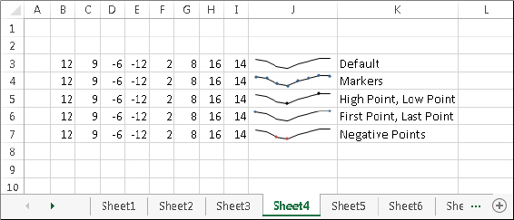
You control the color of the highlighting by using the Marker Color control in the Sparkline Tools ⇒ Design ⇒ Style group. Unfortunately, you can’t change the size of the markers in Line sparklines. Figure 19.31 shows some Line sparklines with various types of highlighting applied.
FIGURE 19.31 Highlighting options for Line Sparklines
When you create one or more sparklines, they all use (by default) automatic axis scaling. In other words, the minimum and maximum vertical axis values are determined automatically for each sparkline in the group, based on the numeric range of the data used by the sparkline.
The Sparkline Tools ⇒ Design ⇒ Group ⇒ Axis command lets you override this automatic behavior and control the minimum and maximum value for each sparkline or for a group of sparklines. For even more control, you can use the Custom Value option and specify the minimum and maximum for the sparkline group.
Figure 19.32 shows two groups of sparklines. The group at the top uses the default axis settings (Automatic for Each Sparkline). Each sparkline shows the six-month trend for the product, but there is no indication of the magnitude of the values.
FIGURE 19.32 The bottom group of sparklines shows the effect of using the same axis minimum and maximum values for all sparklines in a group.
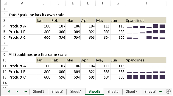
For the sparkline group at the bottom (which uses the same data), the vertical axis minimum and maximum was changed to use the Same for All Sparklines setting. With these settings in effect, the magnitude of the values across the products is apparent — but the trend across the months within a product is not apparent.
The axis scaling option you choose depends upon what aspect of the data you want to emphasize.
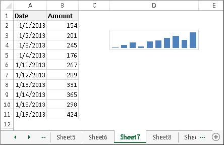
Normally, data displayed in a sparkline is assumed to be at equal intervals. For example, a sparkline might display a daily account balance, sales by month, or profits by year. But what if the data isn’t at equal intervals?
Figure 19.33 shows data, by date, along with a sparklines graphic created from column B. Notice that some dates are missing, but the sparkline shows the columns as if the values were spaced at equal intervals.
FIGURE 19.33 The sparkline displays the values as if they are at equal time intervals.
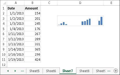
To better depict the data, the solution is to specify a date axis. Select the sparkline and choose Sparkline Tools ⇒ Design ⇒ Group ⇒ Axis ⇒ Date Axis Type. Excel displays a dialog box, asking for the range that contains the dates. In this example, specify range A2:A11. Click OK, and the sparkline displays gaps for the missing dates (see Figure 19.34).
FIGURE 19.34 After specifying a date axis, the sparkline shows the values accurately.
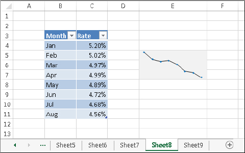
If a sparkline uses data in a normal range of cells, adding new data to the beginning or end of the range does not force the sparkline to use the new data. You need to use the Edit Sparklines dialog box to update the data range (choose Sparkline Tools ⇒ Design ⇒ Sparkline ⇒ Edit Data). But, if the sparkline data is in a column within a table (created by choosing Insert ⇒ Tables ⇒ Table), then the sparkline will use new data that’s added to the end of the table.
Figure 19.35 shows an example. The sparkline was created using the data in the Rate column of the table. When you add the new rate for September, the sparkline will automatically update its Data Range.
FIGURE 19.35 Creating a sparkline from data in a table
The example in this section describes how to create a sparkline that displays only the most recent data points in a range. Figure 19.36 shows a worksheet that tracks daily sales. The sparkline, in merged cells E4:E5, displays only the seven most recent data points in column B. When new data is added to column B, the sparkline will adjust to show only the most recent seven days of sales.
FIGURE 19.36 Using a dynamic range name to display only the last seven data points in a sparkline
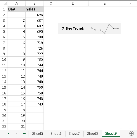
Start this process by creating a dynamic range name. Here’s how:
=OFFSET($B$2,COUNTA($B:$B)-7-1,0,7,1)In this chapter, you learned about features you can use to organize and communicate the meaning of data in a visual way. The chapter introduced tables, conditional formatting, and sparklines in Excel. Your Excel skill set now includes the ability to: