FIGURE 23.1 Open the Insert Table dialog box from either the Table menu or a content placeholder.

IN THIS CHAPTER
Creating a new table
Moving around in a table
Selecting rows, columns, and cells
Editing a table’s structure
Applying table styles
Formatting table cells
Understanding charts
Starting a new chart
Working with chart data
Chart types and chart layout presets
Working with labels
Controlling the axes
Formatting a chart
You can type tabular data — in other words, data in a grid of rows and columns — directly into a table or import it from other applications. You can also apply formatting that makes tabular data easier to read and more attractive. When you need to create a quick chart without data from another source, PowerPoint’s charting tools work perfectly. The PowerPoint 2013 charting interface is based on the one in Excel, so you can also use PowerPoint to create equally effective and professional charts.
In this chapter, you’ll learn how to create and manage PowerPoint tables and how to create charts that present numeric data in a visual format.
A table is a great way to organize little bits of data into a meaningful picture. For example, you might use a table to show sales results for several salespeople or to contain a multicolumn list of team member names. There are several ways to insert a table, and each method has its purpose. The following sections explain each of the table creation methods.
A table can be part of a content placeholder, or it can be a separate, free-floating item. If the active slide has an available placeholder that can accommodate a table, and there is not already content in that placeholder, the table is placed in it. Otherwise the table is placed as an independent object on the slide and is not part of the layout.
To create a basic table with a specified number of rows and columns, you can use the Insert Table dialog box. You can open it in either of two ways (see Figure 23.1):
FIGURE 23.1 Open the Insert Table dialog box from either the Table menu or a content placeholder.
In the Insert Table dialog box, shown in Figure 23.2, specify a number for rows and columns and click OK. The table then appears on the slide.
FIGURE 23.2 Enter the number of rows and columns to specify the size of the table that you want to create.

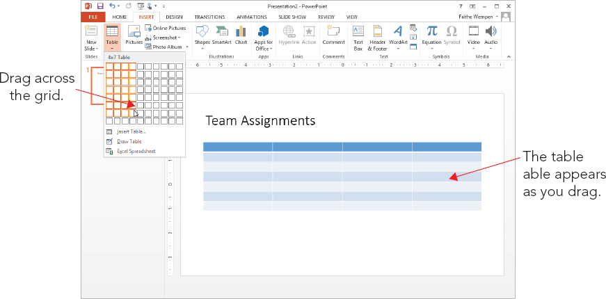
When you opened the Table button’s menu (see Figure 23.1) in the preceding section, you probably couldn’t help but notice the grid of white squares. Another way to create a table is to drag across this grid until you select the desired number of rows and columns. The table appears immediately on the slide as you drag, so you can see how it will look, as shown in Figure 23.3.
FIGURE 23.3 Drag across the grid in the Table button’s menu to specify the size of the table that you want to create.
Other than the method of specifying rows and columns, this process is identical to creating a table via the Insert Table dialog box because the same issues apply regarding placeholders versus free-floating tables. If a placeholder is available, PowerPoint uses it.
Drawing a table enables you to use your mouse pointer like a pencil to create every row and column in the table in exactly the positions you want. You can even create unequal numbers of rows and columns. This method is a good one to use whenever you want a table that is nonstandard in some way — different row heights, different column widths, different numbers of columns in some rows, and so on. To draw a table, follow these steps:
FIGURE 23.4 You can create a unique table with the Draw Table tool.

Each cell is like a little text box. To type in a cell, click in it and type. It’s pretty simple! You can also move between cells with the keyboard. Table 23.1 lists the keyboard shortcuts for moving the insertion point in a table.
TABLE 23.1 Moving the Insertion Point in a Table
| To Move To: | Press This: |
| Next cell | Tab |
| Previous cell | Shift+Tab |
| Next row | Down Arrow |
| Previous row | Up Arrow |
| Tab stop within a cell | Ctrl+Tab |
| New paragraph within the same cell | Enter |
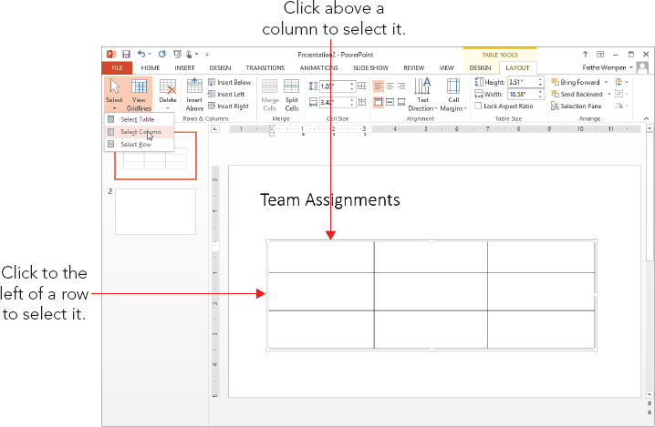
If you want to apply formatting to one or more cells or issue a command that acts upon them, such as Copy or Delete, you must first select the cells to be affected, as shown in Figure 23.5:
FIGURE 23.5 Select a row or column with the Select button’s menu, or click above or to the left of the column or row.
There are two ways to select the entire table — or rather, two senses in which the entire table can be “selected”:
Now that you’ve created a table, let’s look at some ways to modify the table’s structure, including resizing the entire table, adding and deleting rows and columns, and merging and splitting cells.
As with any other framed object in PowerPoint, dragging the table’s outer frame resizes it. Position the mouse pointer over one of the selection handles (the white squares on the sides and corners) so that the mouse pointer becomes a double-headed arrow, and drag to resize the table. See Figure 23.6.
FIGURE 23.6 To resize a table, drag a selection handle on its frame.
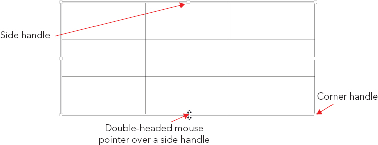
To maintain the aspect ratio (height to width ratio) for the table as you resize it, hold down the Shift key as you drag a corner of the frame. If maintaining the aspect ratio is not critical, you can drag either a corner or a side.
All of the rows and columns maintain their spacing proportionally to one another as you resize them. However, when a table contains text that would no longer fit if its row and column were shrunken proportionally with the rest of the table, the row height does not shrink fully; it shrinks as much as it can while still displaying the text. The column width does shrink proportionally, regardless of cell content.
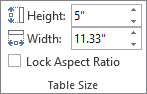
You can also specify an exact size for the overall table frame by using the Table Size group on the Table Tools ⇒ Layout tab, as shown in Figure 23.7. From there you can enter Height and Width values. To maintain the aspect ratio, select the Lock Aspect Ratio check box before you change either the Height or Width setting.
FIGURE 23.7 Set a precise height and width for the table from the Table Size group.
Here’s an easy way to create a new row at the bottom of the table: Position the insertion point in the bottom-right cell and press Tab. Need something more complicated than that? The Table Tools ⇒ Layout tab contains buttons in the Rows & Columns group for inserting rows or columns above, below, to the left, or to the right of the selected cell(s), as shown in Figure 23.8. By default, each button inserts a single row or column at a time, but if you select multiple existing ones beforehand, these commands insert as many as you’ve selected. For example, to insert three new rows, select three existing rows and then click Insert Above or Insert Below.
FIGURE 23.8 Insert rows or columns by using these buttons on the Layout tab.
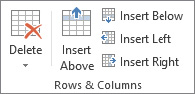
Alternatively, you can right-click any existing row or column, point to Insert, and choose one of the commands on the submenu. These commands are the same as the names of the buttons in Figure 23.8.
To delete a row or column (or more than one of each), select the row(s) or column(s) that you want to delete, and then open the Delete button’s menu on the Table Tools ⇒ Layout tab and choose Delete Rows or Delete Columns in the Delete group. At a lower screen resolution, you may need to click the Delete button first to see the choices for this group.
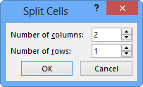
If you need more rows or columns in some spots than others, you can use the Merge Cells and Split Cells commands. Here are some ways to merge cells:
Here are some ways to split cells:
FIGURE 23.9 Specify how the split should occur.
The quickest way to format a table attractively is to apply a table style to it. When you insert a table using any method except drawing it, a table style is applied to it by default; you can change to some other style if desired, or you can remove all styles from the table, leaving it plain black and white.
When you hover the mouse pointer over a table style, a Live Preview of it appears in the active table. The style is not actually applied to the table until you click the style to select it, however.
If the style you want appears in the Table Tools ⇒ Design tab’s Table Styles group, you can click it from there without opening the gallery. If not, you can scroll row by row through the gallery by clicking the up/down arrow buttons, or you can open the gallery’s full menu, as shown in Figure 23.10.
FIGURE 23.10 Apply a table style from the gallery.
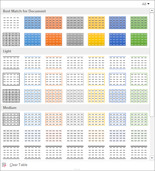
To remove all styles from the table, choose Clear Table from the bottom of the gallery. This reverts the table to default settings: no fill, and plain black 1-point borders on all sides of all cells.
The table styles use theme-based colors, so if you change to a different presentation theme or color theme, the table formatting might change. (Colors, in particular, are prone to shift.)
By default, the first row of the table (a.k.a. the header row) is formatted differently from the others, and every other row is shaded differently. (This is called banding.) You can control how different rows are treated differently (or not) from the Table Style Options group on the Table Tools Design tab. There is a check box for each of six settings:
Although table styles provide a rough cut on the formatting, you might want to fine-tune your table formatting as well. In the following sections you learn how to adjust various aspects of the table’s appearance.
You might want a row to be a different height or a column a different width than others in the table. To resize a row or column, follow these steps:
You can also specify an exact height or width measurement using the Height and Width boxes in the Cell Size group on the Table Tools ⇒ Layout tab. Select the row(s) or column(s) to affect, and then enter sizes in inches or use the spin buttons, as shown in Figure 23.11.
FIGURE 23.11 Set a precise size for a row or column.

The Distribute Rows Evenly and Distribute Columns Evenly buttons in the Cell Size group (see Figure 23.11) adjust each row or column in the selected range so that the available space is occupied evenly among them. This is handy especially if you have drawn the table yourself rather than allowed PowerPoint to create it initially. If PowerPoint creates the table, the rows and columns are already of equal height and width by default.
You can also double-click the border between two columns to size the column to the left so that the text fits exactly within the width.
Remember, PowerPoint slides do not have any margins per se; everything is in a frame. An individual cell does have internal margins, however.
You can specify the internal margins for cells using the Cell Margins button on the Table Tools ⇒ Layout tab, as follows:
FIGURE 23.12 You can set the internal margins on an individual cell basis for each side of the cell.
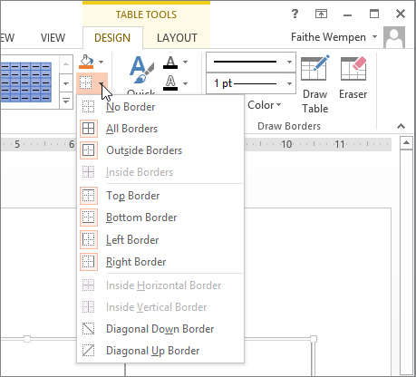
The border lines around the cells are very important because they separate the data in each cell from the data in other cells. By default (without a table style), there’s a 1-point border around each side of each cell, but you can make some or all borders thicker, a different line style (dashed, for example), or a different color, or remove them altogether to create your own effects. Here are some ideas:
When you apply a top, bottom, left, or right border, those positions refer to the entire selected block of cells if you have more than one cell selected. For example, suppose you select two adjacent cells in a row and apply a left border. The border applies only to the leftmost of the two cells. If you want the same border applied to the line between the cells too, you must apply an inside vertical border.
To apply a border, follow these steps:
FIGURE 23.13 Use the Draw Borders group’s lists to set the border’s style, thickness, and color.
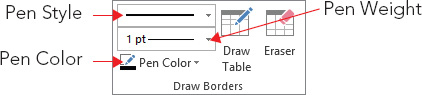
FIGURE 23.14 Select the side(s) to apply borders to for the chosen cells.
By default, table cells have a transparent background so that the color of the slide beneath shows through. When you apply a table style, as you learned earlier in the chapter, the style specifies a background color — or in some cases, multiple background colors depending on the options you choose for special treatment of certain rows or columns.
You can also manually change the fill for a table to make it either a solid color or a special fill effect. You can apply this fill to individual cells, or you can apply a background fill for the entire table.
Each individual cell has its own fill setting; in this way a table is like a collection of individual object frames, rather than a single object. To set the fill color for one or more cells, follow these steps:
FIGURE 23.15 Apply a fill effect to the selected cell(s).
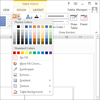
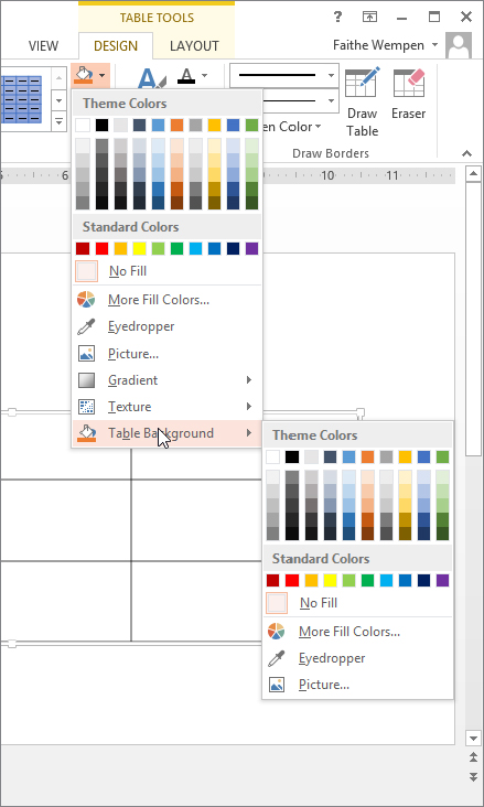
You can apply a solid color fill to the entire table that is different from the fill applied to the individual cells. The table’s fill color is visible only in cells in which the individual fill is set to No Fill (or a semitransparent fill, in which case it blends).
To apply a fill to the entire table, open the Shading button’s menu and point to Table Background, as shown in Figure 23.16, and then choose a color.
FIGURE 23.16 Apply a fill to the table’s background.
To test the new background, select some cells and choose No Fill for their fill color. The background color appears in those cells. If you want to experiment further, try applying a semitransparent fill to some cells, and see how the color of the background blends with the color of the cell’s fill.
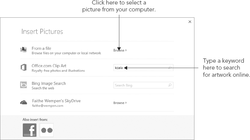
When you fill one or more cells with a picture, each cell gets its own individual copy of it. For example, if you fill a table with a picture of a koala and the table has six cells, you get six koalas, as shown in Figure 23.17.
FIGURE 23.17 When you apply a picture fill to a table, each cell gets its own copy.

If you want a single copy of the picture to fill the entire area behind the table, do the following:
FIGURE 23.18 Select a picture to use as the background of the table.
You can apply a shadow effect to a table so that it appears “raised” off the slide background. You can make it any color you like, and adjust a variety of settings for it.
Here’s a very simple way to apply a shadow to a table:
Here’s an alternative method that gives you a bit more control:
FIGURE 23.19 Apply a shadow to a table.

PowerPoint does not enable you to apply 3-D effects to tables, so you have to fudge that by creating the 3-D effect with rectangles and then overlaying a transparent table on top of the shapes. As you can see in Figure 23.20, it’s a pretty convincing facsimile.
FIGURE 23.20 This 3-D table is actually a plain table with a 3-D rectangle behind it.
You might need to read Chapter 9 first to do some of these steps, but here’s the basic procedure:
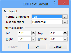
If you followed the preceding steps to create the effect shown in Figure 23.20, you probably ran into a problem: Your text probably didn’t center itself in the cells. That’s because, by default, each cell’s vertical alignment is set to Top, and its horizontal alignment is set to Left.
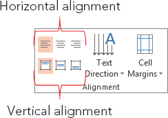
Although the vertical and horizontal alignments are both controlled from the Alignment group on the Table Tools Layout tab, they actually have two different scopes. Vertical alignment applies to the entire cell as a whole, whereas horizontal alignment can apply differently to individual paragraphs within the cell. To set vertical alignment for a cell, follow these steps:
FIGURE 23.21 Set the vertical and horizontal alignment of text from the Alignment group.
To set the horizontal alignment for a paragraph, follow these steps:
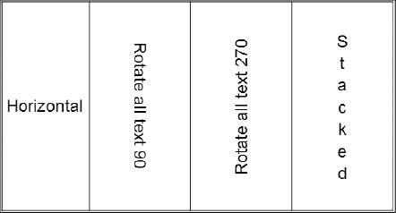
The default text direction for table cells is Horizontal, which reads from left to right (at least in countries where that’s how text is read). Figure 23.22 shows the alternatives.
FIGURE 23.22 You can set types of text direction.
To change the text direction for a cell, follow these steps:
PowerPoint’s charting feature is based upon the same Escher 2.0 graphics engine that is used for drawn objects. Consequently, most of what you have learned about formatting objects in earlier chapters (for example Chapter 9 in the part about Word) also applies to charts. For example, you can apply shape styles to the individual elements of a chart and apply WordArt styles to chart text. However, there are also many chart-specific formatting and layout options, as you will see throughout this chapter.
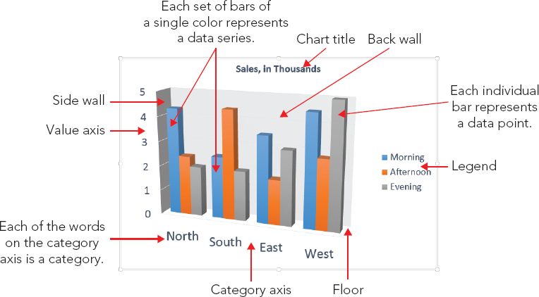
The sample chart shown in Figure 23.23 contains these elements:
FIGURE 23.23 Parts of a chart
The main difficulty with creating a chart in a non-spreadsheet application such as PowerPoint is that there is no data table from which to pull the numbers. Therefore, PowerPoint creates charts using data that you have entered in an Excel window. By default, it contains sample data, which you can replace with your own data.
You can place a new chart on a slide in two ways: You can either use a chart placeholder from a layout or place one manually. Follow these steps to place a chart:
FIGURE 23.24 Select the desired chart type.
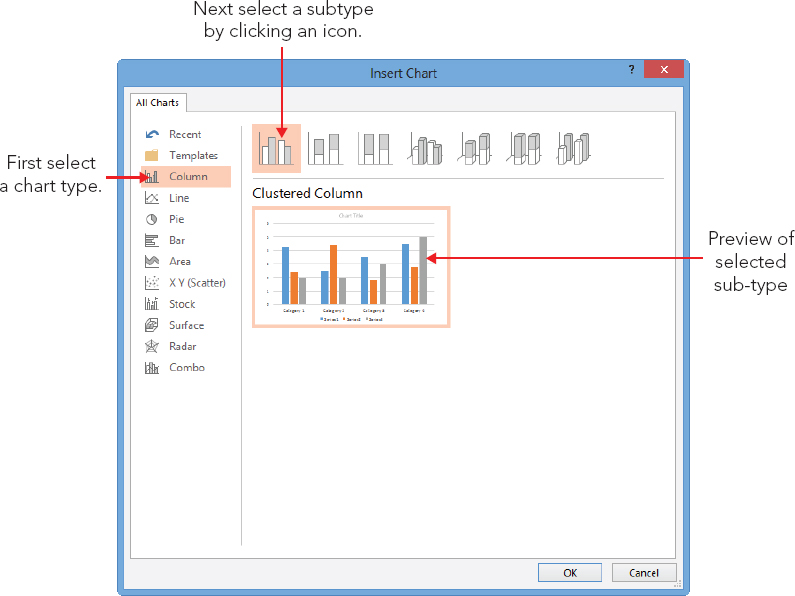
TABLE 23.2 Chart Types in PowerPoint’s Charting Tool
| Type | Description |
| Column | Vertical bars, optionally with multiple data series. Bars can be clustered, stacked, or based on a percentage and either 2-D or 3-D. |
| Line | Shows values as points, and connects the points with a line. Different series use different colors and/or line styles. |
| Pie | A circle broken into wedges to show how parts contribute to a whole. This de-emphasizes the actual numeric values. In most cases, this type is a single-series only. The donut variant is similar to a pie but with multiple concentric rings so that multiple series can be illustrated. |
| Bar | Just like a column chart, but horizontal. |
| Area | Just like a column chart, but with the spaces filled in between the bars. |
| XY (Scatter) | Shows values as points on both axes, but does not connect them with a line. However, you can add trend lines. The bubble variant uses bubbles of varying sizes to represent a third data variable rather than each data point being a fixed size. |
| Stock | A special type of chart that is used to show stock prices. |
| Surface | A 3-D sheet that is used to illustrate the highest and lowest points of the data set. |
| Radar | Shows changes of data frequency in relation to a center point. |
FIGURE 23.25 Examples of chart types, from top left, clockwise: column, line, bar, and pie

FIGURE 23.26 Examples of chart types, from top left, clockwise: area, scatter, donut, and surface

After you create a chart, you might want to change the data range on which it is based or how this data is plotted. The following sections explain how you can do this.
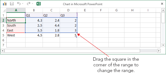
By default, the columns of the datasheet form the data series. However, if you want, you can switch the data around so that the rows form the series. Figure 23.27 and Figure 23.28 show the same chart plotted both ways so that you can see the difference. (The data for this chart appears in the next section of the chapter, in Figure 23.29, in case you want to reference it.)
FIGURE 23.27 A chart with quarters as the series
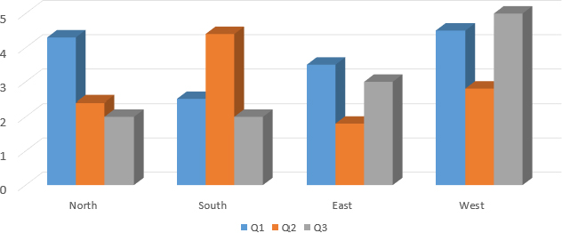
FIGURE 23.28 A chart with regions as the series
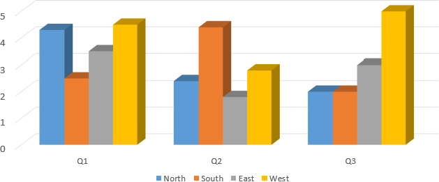
FIGURE 23.29 You can redefine the range for the chart by dragging the blue outline on the datasheet.
What does the term data series mean? Take a look at Figure 23.27 and Figure 23.28. Notice that there is a legend beneath to each chart that shows what each color (or shade of gray) represents. Each of these colors, and the label associated with it, is a series. The other variable (the one that is not the series) is plotted on the chart’s horizontal axis.
To switch back and forth between plotting by rows and by columns in the data sheet, click the Switch Row/Column button on the Chart Tools ⇒ Design tab. If the button is not available, open the data sheet by choosing Chart Tools ⇒ Design ⇒ Data ⇒ Edit Data, and then the button will become available.
A chart can carry a very different message when you arrange it by rows versus by columns. For example, in Figure 23.27, the chart compares the quarters. The message here is about improvement — or lack thereof — over time. Contrast this to Figure 23.28, where the series data is the regions. Here, you can compare one region to another. The overriding message here is about competition — which division performed the best in each quarter? It’s easy to see how the same data can convey very different messages; make sure that you pick the arrangement that tells the story that you want to tell in your presentation.
After you have created your chart, you may decide that you need to use more or less data. Perhaps you want to exclude a month or quarter of data or to add another region or salesperson. To add or remove a data series, you can simply edit the datasheet. To do so, follow these steps:
The preceding steps work well if the range that you want to include is contiguous, but what if you wanted to exclude a row or column that is in the middle of the range? To define the range more precisely, follow these steps:
FIGURE 23.30 To fine-tune the data ranges, you can use the Select Data Source dialog box.
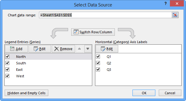
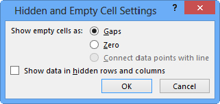
FIGURE 23.31 Specify what should happen when the data range contains blank or hidden cells.
New in PowerPoint 2013, you can use the Chart Filters feature to quickly exclude certain rows or columns from the chart. When the chart is selected on the slide, a set of three icons appears to its right: Chart Elements, Chart Styles, and Chart Filters. If you click Chart Filters, a flyout appears with check boxes for each of the series and categories, as shown in Figure 23.32. Clear the check box for anything you don’t want to see on the chart, and then click Apply. The Select Data hyperlink at the bottom of the panel opens the Select Data Source dialog box, the same as in the previous section.
FIGURE 23.32 Turn off certain series or categories from this panel if desired.

The default chart is a 2-D clustered column chart. However, there are a lot of alternative chart types to choose from. Not all of them will be appropriate for your data, of course, but you may be surprised at the different spin on the message that a different chart type presents.
You can revisit your choice of chart type at any time by following these steps:
This is the basic procedure for the overall chart type selection, but there are also many options for fine-tuning the layout. The following sections explain these options.
PowerPoint provides a limited number of preset Quick Layouts for each chart type. A layout is a combination of optional chart elements (such as legend, data table, data labels, and so on) in a particular arrangement. Quick Layouts are good starting points for creating your own layouts, which you will learn about in this chapter. To choose a Quick Layout, click Chart Tools ⇒ Design ⇒ Chart Layouts ⇒ Quick Layouts and select a layout from the gallery, as shown in Figure 23.33.
FIGURE 23.33 You can choose one of the preset Quick Layouts that fits your needs.

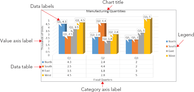
Charts are effective only if the audience understands what the data points represent. Labels and other descriptive elements on a chart can make all the difference in its usability. Figure 23.34 points out some of the various chart elements that you can use.
FIGURE 23.34 Chart elements such as labels help to make it clear to the audience what the chart represents.
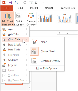
To change the setting for a particular element, choose Chart Tools ⇒ Design ⇒ Chart Layouts ⇒ Add Chart Element to open a menu of elements. Then point at a particular element to see a submenu with additional options on it. If none of the choices on the submenu meet your needs, click More Options to open a task pane with a more extensive set of options. The exact name of the More Options command varies depending on the chart element; for example, for Chart Title, it is More Title Options. Figure 23.35 shows the submenu for Chart Title.
FIGURE 23.35 Control individual chart elements from the Add Chart Element button’s menu.
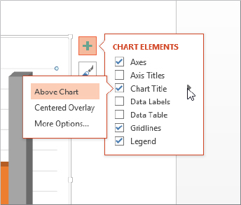
You can also quickly control chart elements by clicking the Chart Elements button that appears to the right of the chart when the chart is selected. Mark or clear the check boxes in the Chart Elements flyout to toggle a particular element on or off. For some elements, if you hover the mouse pointer over the option in the panel, a right-pointing triangle appears to its right. You can click that triangle for a submenu, as shown in Figure 23.36.
FIGURE 23.36 Click the Chart Elements icon to the right of a chart for quick access to chart elements.
You can format the text in any of the chart elements just as you format any other text. To do this, select the text and then use the controls in the Font group on the Home tab. This allows you to choose a font, size, color, alignment, and so on. To format more than one chart element at a time, select one, and then hold down Ctrl as you click on other chart elements to select them also.
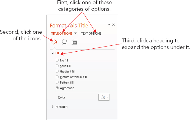
You can also format a chart element by right-clicking it and choosing Format Name, where Name is the type of element. For example, you could right-click the vertical axis title on the chart and then choose Format Axis Title. This opens a task pane with controls appropriate for the selected chart element. As with other panes, there are section names in all caps at the top, and under the chosen selection name are icons that represent pages of options. Within a page of options are smaller uppercase headings indicating collapsible/expandable sections. Figure 23.37 shows an example.
FIGURE 23.37 Pane options are organized as shown here.
In some cases, the task pane contains only standard formatting controls that you would find for any object, such as Border, Fill, Shadow, Glow, Alignment, and so on. In other cases, in addition to the standard formatting types, there is also a unique section that contains extra options that are specific to the content type. For example, there is a Legend Options section in which you can set the position of a legend.
The following sections look at each of the chart elements more closely. These sections will not dwell on the basic formatting that you can apply to them (fonts, sizes, borders, fills, and so on) because this formatting is the same for all of them, as it is with any other object. Instead, they concentrate on the options that make each chart element different.
A chart title is text that typically appears above the chart — and sometimes overlapping it — and indicates what the chart represents. Although you would usually want either a chart title or a slide title, but not both, this could vary if you have multiple charts or different content on the same slide.
You can select a basic chart title, either above the chart or overlapping it, from the Chart Title submenu from the Add Chart Element button’s menu, as shown in Figure 23.35. You can also drag the chart title around after placing it. For more options, you can choose More Title Options from the bottom of the submenu to open the Format Chart Title pane. However, in this dialog box there is nothing that specifically relates to chart titles; the available options are for formatting (Fill, Border, and so on), as for any text box.
An axis title is text that defines the category or the unit of measurement on an axis. For example, in Figure 23.34, the vertical axis title is Thousands of Units.
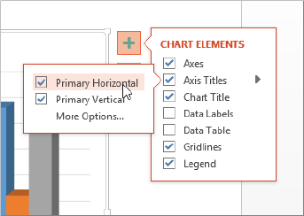
Axis titles are defined separately for the vertical and the horizontal axes. Click Chart Tools ⇒ Design ⇒ Chart Layouts ⇒ Add Chart Element ⇒ Axis Titles and then select either Primary Horizontal or Primary Vertical to toggle one or the other on or off. Alternatively, you can click the Chart Elements button to the right of the chart frame and mark the Axis Titles check box to turn both of them on at once or point to the right-pointing arrow and then mark or clear the Primary Horizontal and Primary Vertical check boxes individually, as shown in Figure 23.38. When you turn on an axis title, a text box appears containing default placeholder text, “Axis Title.” Click in this text box and type your own label to replace it.
FIGURE 23.38 Turn axis titles on or off from the Axis Titles submenu.
If you’ve plotted any data on a secondary axis, you’ll see Secondary Horizontal and Secondary Vertical Axis Title options as well on the submenu.
For more control, choose More Options from the submenu, or right-click the axis title and choose Format Axis Title, to open the Format Axis Title task pane.
Look back at Figure 23.34 and notice that the vertical axis title runs sideways from top to bottom. You can change the text’s orientation for an axis by doing the following:
FIGURE 23.39 Select a text direction from the Format Axis Title pane.
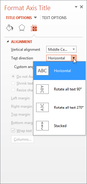
Figure 23.40 shows some examples.
FIGURE 23.40 Text direction examples. From left to right: Rotate All Text 270°, Stacked, and Horizontal.
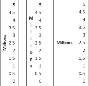
Each type of vertical axis shrinks the chart somewhat when you activate it, but the Horizontal option shrinks the chart more than the others because it requires more space to the left of the chart.
The legend is the little box that appears next to the chart (or sometimes above or below it). It provides the key that describes what the different colors or patterns mean. For some chart types and labels, you may not find the legend to be useful. If it is not useful for the chart that you are working on, you can turn it off. To turn off the legend, you can do any of the following:
To turn the legend back on, click the Chart Elements button again and mark the Legend check box; this places the legend in the default position for that chart type. If you want to choose a different legend location, click Chart Tools ⇒ Design ⇒ Chart Layouts ⇒ Add Chart Element ⇒ Legend and select the position that you want for it, as shown in Figure 23.41.
FIGURE 23.41 You can select a legend position, or turn the legend off altogether, from the Legend submenu.

To resize a legend box, you can drag one of its selection handles. The text and keys inside the box do not change in size, although they may shift in position.
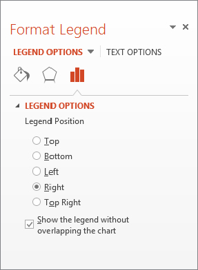
When you right-click the legend and choose Format Legend, or when you choose More Legend Options from the Legend submenu (see Figure 23.41), the Format Legend pane opens with the Legend Options controls displayed, as shown in Figure 23.42. From here, you can choose the legend’s position in relation to the chart and whether or not it should overlap the chart. If it does not overlap the chart, the plot area will be automatically reduced to accommodate the legend.
FIGURE 23.42 You can set legend options in the Format Legend pane.
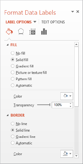
Data labels show the numeric values (or other information) that are represented by each bar or other shape on the chart. These labels are useful when the exact numbers are important or where the chart is so small that it is not clear from the axes what the data points represent.
To turn on data labels for the chart, do one of the following:
If you want additional options besides those two data label types, follow these steps:
FIGURE 23.43 Control data label options from the Format Data Labels pane.

FIGURE 23.44 Change the shape of the data label box if desired.
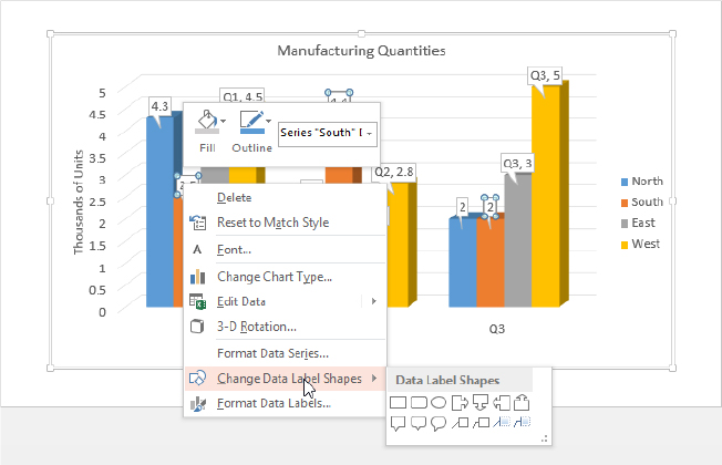
FIGURE 23.45 Change the background fill for the data label box if desired.
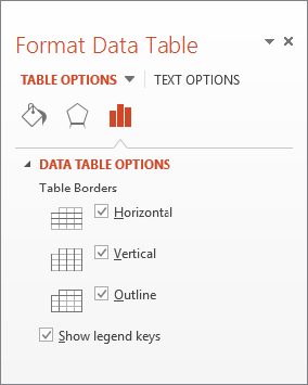
Sometimes the chart tells the full story that you want to tell, but other times the audience may benefit from seeing the actual numbers on which you have built the chart. In these cases, it is a good idea to include the data table with the chart. A data table contains the same information that appears on the datasheet.
To display the data table with a chart, click Chart Tools ⇒ Design ⇒ Chart Layouts ⇒ Add Chart Element ⇒ Data Table and choose to include a data table either with or without a legend key. See Figure 23.46.
FIGURE 23.46 Use a data table to show the audience the numbers on which the chart is based.

To format the data table, choose More Data Table Options from the Data Table submenu in Figure 23.46. In the Format Data Table pane that appears, you can set data table border options, as shown in Figure 23.47. For example, you can display or hide the horizontal, vertical, and outline borders for the table from here.
FIGURE 23.47 Use the Data Table Options controls to specify which borders should appear in the data table.
No, axes are not the tools that chop down trees. Axes is the plural of axis, and an axis is the side of the chart containing the measurements against which your data is plotted.
You can change the various axes in a chart in several ways. For example, you can make an axis run in a different direction (such as from top to bottom instead of bottom to top for a vertical axis), and you can turn the text on or off for the axis and change the axis scale.
Most of the time you will want to display all axes for a chart. However, in some special cases it may be appropriate to turn off an axis. To do so, click Chart Tools ⇒ Design ⇒ Chart Layouts ⇒ Add Chart Element ⇒ Axes and then click Primary Horizontal or Primary Vertical to toggle either of those off (or back on again). See Figure 23.48.
FIGURE 23.48 Turn axes off or on here.
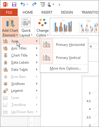
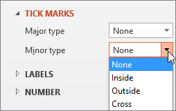
To control how an axis appears (other than just whether or not it appears at all), choose More Axis Options from the submenu. The options for axes are covered in the following sections.
The scale determines which numbers will form the start point and endpoint of the axis line. PowerPoint 2013 calls the scale the bounds of the axis because the minimum and maximum values on the scale define lower and upper boundaries for the axis.
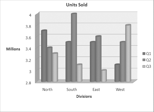
Changing the axis scale can make a big difference in how an audience perceives the same data. For example, take a look at the chart in Figure 23.49. The bars are so close to one another in value that it is difficult to see the difference between them. Compare this chart to one showing the same data in Figure 23.50, but with an adjusted scale. Because the scale is smaller, the differences now appear more dramatic.
FIGURE 23.49 This chart does not show the differences between the values very well.
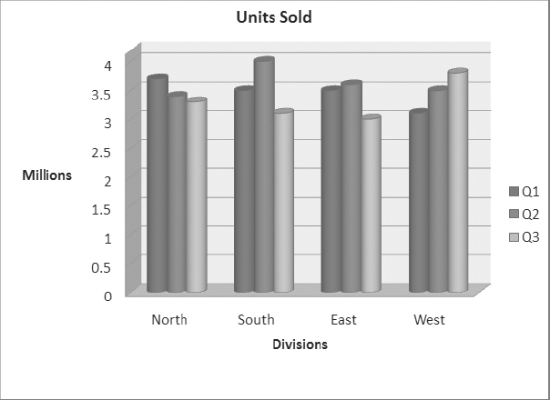
FIGURE 23.50 A change to the values of the axis scale makes it easier to see the differences between values.
To set the scale (bounds) for an axis, follow these steps:
FIGURE 23.51 You can set axis options in the Format Axis pane, including the axis scale (bounds).
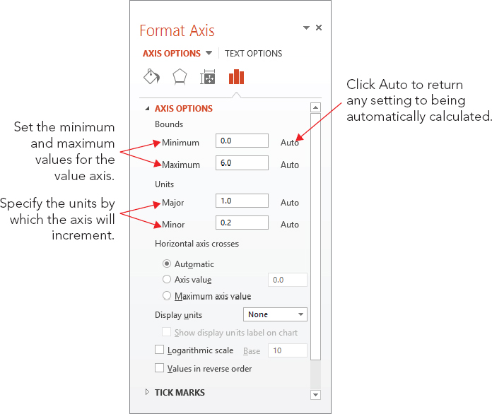
FIGURE 23.52 You can choose what tick marks to use, if any.
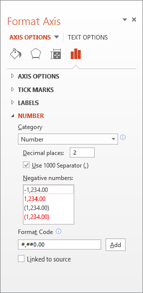
You can apply a number format to axes and data labels that show numeric data. This is similar to the number format that is used for Excel cells; you can choose a category, such as Currency or Percentage, and then fine-tune this format by choosing a number of decimal places, a method of handling negative numbers, and so on.
To set a number format, follow these steps:
FIGURE 23.53 Select a number format in the Format Axis pane.
In the following sections, you learn about chart formatting. There is so much that you can do to a chart that this subject could easily take up its own chapter! For example, just as with any other object, you can resize a chart. You can also change the fonts; change the colors and shading of bars, lines, or pie slices; use different background colors; change the 3-D angle; and much more.
There are several ways of formatting a chart’s elements. For text elements, you can use the Font group’s tools on the Home tab. The text elements on a chart use the exact same text formatting controls as any other text on a slide. You can change the font, the size, the text attributes (like bold and italic), and so on. PowerPoint treats the individual text boxes within the chart as it would treat any other text boxes.
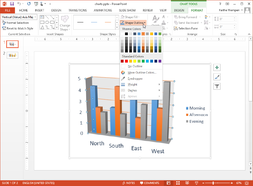
For simple formatting of a graphical element, like changing its outline or fill color, your best bet is the Chart Tools ⇒ Format tab’s controls. You can select any chart element and then choose its border and fill color from here. For example, in Figure 23.54, Vertical (Value) Axis Major Gridlines is selected, which you can see in the selection box at the far left end of the Ribbon. You could use the Shape Outline drop-down list at this point to choose a different color or thickness for the gridlines.
FIGURE 23.54 Format a chart element’s outline and fill quickly and easily from the Chart Tools ⇒ Format tab.
For more extensive or uncommon formatting, use the task pane instead. You can open the task pane for the selected chart element by right-clicking it and choosing Format Element Name from the submenu, or by choosing Chart Tools ⇒ Format ⇒ Current Selection ⇒ Format Selection.
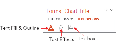
The sections in the pane vary, depending on the type of chart element you are formatting. There are generally two main sections, indicated by words at the top of the pane. For example, in the Format Chart Title pane, the two main sections are Title Options and Text Options. Beneath these main section headings are a series of icons. The icons are different depending on the main section that’s active. For example, in Figure 23.55, with Title Options selected, the three icons that appear are Fill & Line, Effects, and Size & Properties. In Figure 23.56, with Text Options selected, the icons that appear are Text Fill & Outline, Text Effects, and Textbox. This is an example of just one pane; each chart element type has its own unique combination of options in its pane.
FIGURE 23.55 When Title Options is selected for a chart title, these are the icons available.
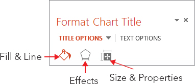
FIGURE 23.56 When Text Options is selected for a chart title, these are the icons available.
For most chart elements, the following sections are available from the Fill & Line icon:
Most chart elements include these choices with the Effects icon:
Depending on the chart element selected, the third icon may be Size & Properties, as in Figure 23.55, or something else. For example, for legends, it is Legend Options. Some elements may even have a fourth icon. For example, for data labels, there is both a Size & Position icon and a Label Options icon. If the selected element has a Size & Position icon, you can use its controls to set vertical and horizontal alignment, angle, and text direction as well as control AutoFit settings for some types of text.
From the Home tab or the Mini Toolbar, you can also choose all of the text effects that you learned about earlier in this book, such as font, size, font style, underline, color, alignment, and so on.
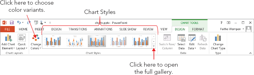
Chart styles are presets that you can apply to charts in order to add colors, backgrounds, and fill styles. The Chart Styles gallery, shown in Figure 23.57, is located on the Chart Tools ⇒ Design tab, which appears when you select a chart. Point to a sample in the gallery to see its style previewed on the chart.
FIGURE 23.57 You can apply a chart style using the Chart Styles gallery.
If you used PowerPoint 2010, it might seem at first glance that there are fewer chart styles in PowerPoint 2013. However, this is an illusion because in PowerPoint 2010, the different color variations were included in the Chart Style gallery as separate entities. By separating the color choices from the style choices, PowerPoint 2013 actually provides more choices and more flexibility.
Each of the chart styles uses whatever colors are assigned to the placeholders in your current color theme for the presentation. You can change the colors for the chart only, without having to change the colors for the whole presentation, by clicking the Change Colors button to the left of the Chart Styles gallery. However, the colors on the Change Colors button’s menu are indirectly related to the color theme in use for the whole presentation; they are various tints and shades of the theme colors, in various combinations. To change colors completely, you must change the whole presentation’s colors, as you learned to do in Chapter 22 “Working with Layouts, Themes, and Masters.”
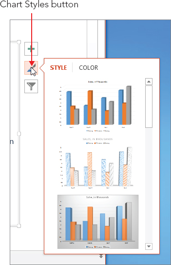
New in PowerPoint 2013, you can also apply chart styles via the Chart Styles icon that appears to the right of the chart when it is selected on the slide. Click the Chart Styles button, as shown in Figure 23.58, and then click the desired style. You can click Color at the top of the panel to select colors from there also, as you would from the Change Colors button on the Chart Tools Design tab.
FIGURE 23.58 Click the Chart Styles button to the right of the chart to quickly apply a different style or color.
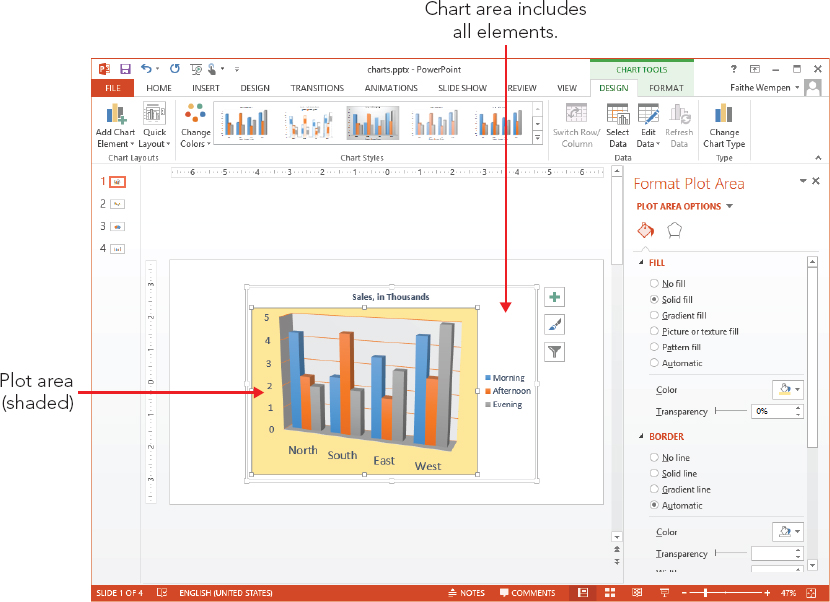
The chart area is the entire chart, everything within the big frame that contains the plotted data and all the associated elements: the legend, the data series, the data table, the titles, and so on. Right-click anywhere within the chart area (not on any specific element) and choose Format Chart Area to open the Format Chart Area pane.
The Format Chart Area pane has many of the same sections the pane for text boxes has. Under Chart Options you’ll find Fill & Line, Effects, and Size & Properties. Under Text Options are Text Fill & Outline, Text Effects, and Textbox. Any settings you apply to the chart area will apply to all the text and objects within the chart area unless a specific chart element is formatted differently to override that.
The plot area is the part of the chart where the data is plotted. It includes the data series and axes as well as any data labels, but it excludes the axis titles, the chart title, and the legend. You can choose to format the plot area differently from the chart area if you like, although it’s not common to do so. For example, you could apply a different background fill color to the plot area, as in Figure 23.59. By default the plot area’s background is transparent, so the background of the chart area shows through. If, in turn, the chart area is also transparent, then the background of the slide behind them both shows through.
FIGURE 23.59 The plot area has a different fill color than the chart area in this example.
When you use a multiseries chart, the value of the legend is obvious — it tells you which colors represent which series. Without the legend, your audience will not know what the various bars or lines mean. You can do all of the same formatting for a legend that you can for other chart elements. Just right-click the legend, choose Format Legend from the shortcut menu, and then use the Format Legend task pane to make your modifications. For example, you could apply a background fill to the legend box, place a border around it, and so on. You could also change the font and size used for the legend text from the Fonts group on the Home tab.
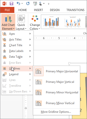
Gridlines help the reader’s eyes move across the chart. Gridlines are related to the axes, which you learned about earlier in this chapter. Although both vertical and horizontal gridlines are available, most people use only horizontal ones. To turn gridlines on or off, click Chart Tools ⇒ Design ⇒ Chart Layouts ⇒ Add Chart Element ⇒ Gridlines. See Figure 23.60.
FIGURE 23.60 Turn gridlines on and off from the Add Chart Element button’s menu.
In most cases, the default gridlines that PowerPoint adds work well. However, you may want to make the lines thicker or a different color. Apply those changes by selecting the gridlines and then using the Chart Tools ⇒ Format tab’s commands. You can select one of the Shape Styles from there, or use the Shape Outline and/or Shape Effects drop-down lists to apply formatting.
Walls are nothing more than the space between the gridlines, formatted in a different color than the plot area. You can set the walls’ fill to None to hide them. To set the wall color, right-click the wall and choose Format Wall, and then choose a fill color in the Format Wall pane.
To format a data series, just right-click the bar, slice, or chart element, and choose Format Data Series from the shortcut menu. Then, depending on your chart type, different series options appear that you can use to modify the series appearance. Here are the icons available for bar and column charts, for example:
Other chart types have very different series options available. For example, a line chart has Line and Marker Options, including marker Fill, line Color, line Style, marker outline Color, and marker type.
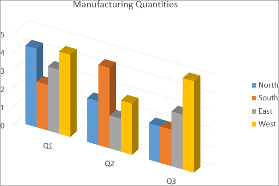
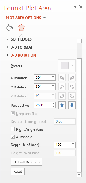
3-D charts can be rotated in one or more directions: X (side to side), Y (top to bottom), and Perspective (the angle from which you view it). There is also a Z rotation (pivoting around a center point), but it is inactive for most chart types.
The Right Angle Axes check box (in the Format Plot Area task pane) is very important when setting chart rotation for most chart types. If the Right Angle Axes option is enabled, the chart axes do not rotate — only the data bars (or other shapes) rotate. If Right Angle Axes is disabled, the entire content of the plot area rotates together as a whole, including the axes. Figure 23.61 shows a rotated chart where Right Angle Axes is turned off.
FIGURE 23.61 Right Angle Axes is disabled, and both X Rotation and Y Rotation are set to 30°.
To set a chart’s rotation, follow these steps:
FIGURE 23.62 Set the 3-D Rotation options for the chart in its Format Plot Area pane.
In this chapter, you learned the ins and outs of creating and formatting tables and charts in PowerPoint, including how to: