Chapter 12. Pivot Tables: Hardcore grouping

Pivot tables are among Excel’s most powerful features.
But what are they? And why should we care? For Excel newbies, pivot tables can also be among Excel’s most intimidating features. But their purpose is quite simple: to group data quickly so that you can analyze it. And as you’re about to see, grouping and summarizing data using pivot tables is much faster than creating the same groupings using formulas alone. By the time you finish this chapter, you’ll be slicing and dicing your data in Excel faster than you’d ever thought possible.
Head First Automotive Weekly needs an analysis for their annual car review issue
Head First Automotive Weekly has signed you on to help them create some table visualizations out of their annual car test data.
The magazine’s readers are serious data junkies; they just love looking at stats on all the cars available. On the one hand, it’s great that you have such passionate readers, but on the other hand, it’s kind of a drag that you have to slice and dice the car data in so many ways in order to satisfy them.

You’ve been asked to do a lot of repetitive operations
There is complexity in these data summaries that you’ve envisioned. You can slice the data in a million different ways, and it could take forever.
But there’s simplicity as well. These summaries basically have you doing the same sort of operation over and over again: applying formulas to various groups and subgroups of data.

Pivot tables are an incredibly powerful tool for summarizing data
How do you group data in a bunch of different ways and summarize the groupings with formulas? The best approach is to use Excel’s pivot tables. Pivot tables are an extraordinarily powerful feature of Excel that let you quickly and visually run these operations. Here’s the basic idea behind how to make them.

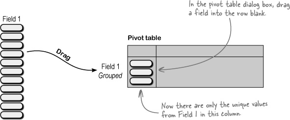
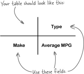
What you want to do is take your data and put the different fields together into a new summary table.

Drag one of your fields to the row blank. This will show unique values from that field as row elements. That is the sort of grouping that takes place in pivot tables.
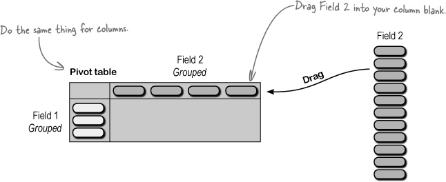
Next, you do the same thing for the element you want to represent in your column. Drag the field name into the column blanks on the pivot table.
Finally, pick the quantitative field that you’d like to see summarized and pick the function you want to use. Generally (but not always), your rows and columns will be categories, and your data blank will be the numerical thing you want to group and summarize by the row and column categories.

Pivot table construction is all about previsualizing where your fields should go
Pivot tables are their own little universe inside Excel, and people get intimidated at first by all the options. The thing you need to remember is this: stay focused on your analytical objectives, and try to create tables that help you understand your data better.

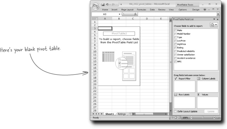
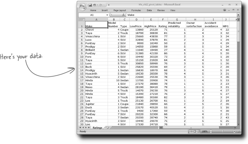
Try out creating your first pivot table from the summary you envisioned in the first exercise of this chapter.

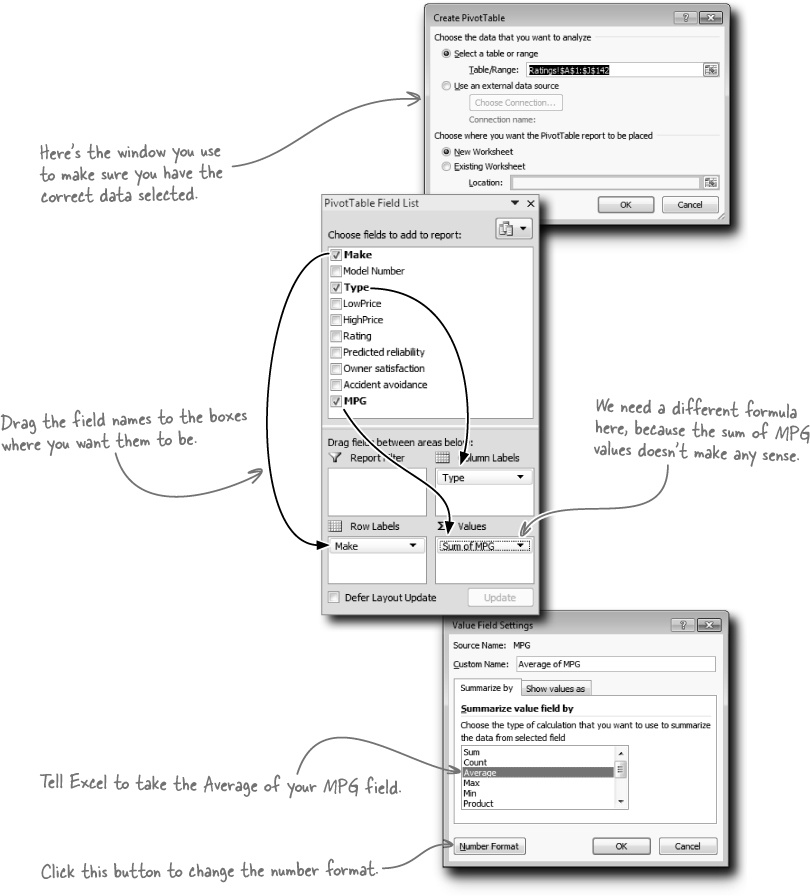
Select a cell in your data, and click Insert > Pivot Table.
Drag fields from the Field List to the column, row, and data blanks.
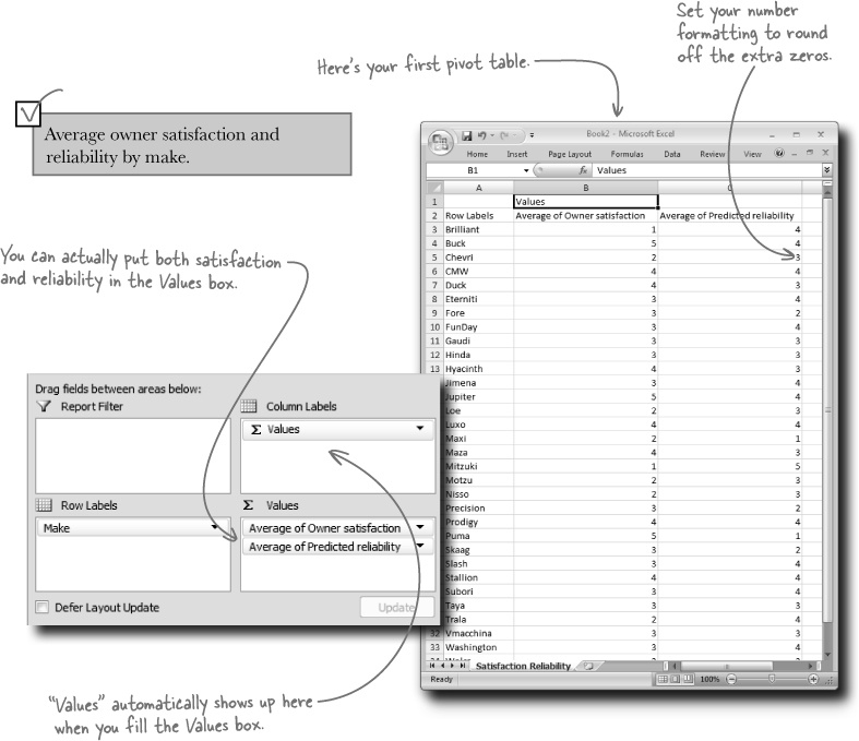
Click the “Sum of MPG” drop box, and change the Value Field Settings so that you’re taking the Average. Also, tweak the Number Format so that you don’t end up with a bunch of decimal zeros.
You just created your first pivot table, summarizing average MPG by Make and Type. How did it go?
Select a cell in your data, and click Insert > Pivot Table.
Drag fields from the Field List to the column, row, and data blanks.
Click the “Sum of MPG” drop box, and change the Value Field Settings so that you’re taking the Average. Also, tweak the Number Format so that you don’t end up with a bunch of decimal zeros.
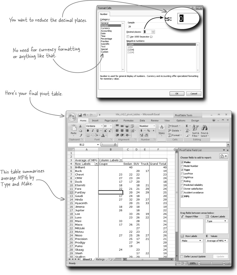
The pivot table summarized your data way faster than formulas would have
The steps to create a pivot table are pretty simple. Just select your data and drag your fields where you want them to be.

The steps to create this table using formulas are more complicated.
Using formulas to create something like a pivot table
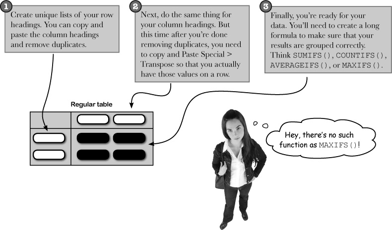
That’s true. In order to create the functionality of a MAXIFS() formula you’d need to write a long array formula, and those are beyond the scope of this book. Aren’t pivot tables just easier?
Your editor is impressed!

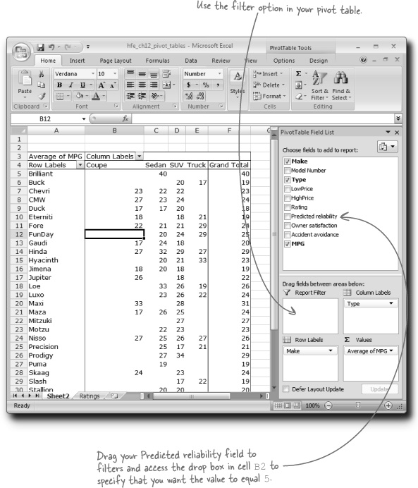
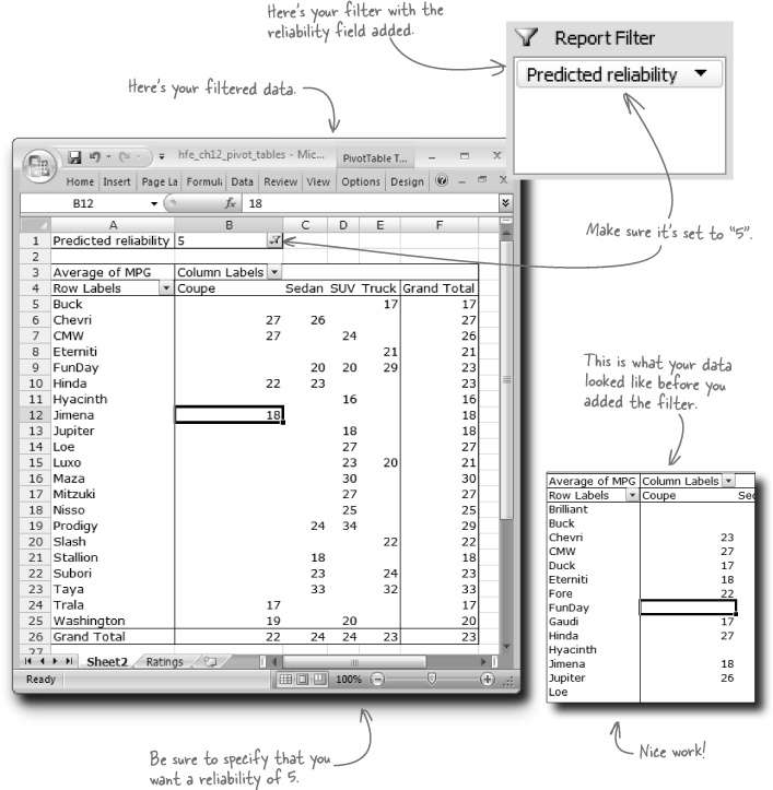
Pivot tables have yet another dimension: filtering. Filters allow you to take the elements you’ve assigned to your Values box and calculate only the ones that meet your criteria. In this case, you want to look at average MPG only for cars with a reliability of 5. Let’s take filters for a spin....
You’re ready to finish the magazine’s data tables

Time to wrap this analysis up and execute the pivot tables your client needs.