
Answers
1. Labor: Your efforts in doing the research and typing the paper
2. Capital: The library or Internet site in which you found research; the computer on which you typed the paper
3. Natural resources: The electricity used to operate the computer and printer; the paper on which you printed the research paper
4. Entrepreneurial ability: Your know-how and creativity in bringing all of the other resources together to create a high-quality final product
Note: the following numbers are hypothetical but give you an idea of how to compute your actual opportunity cost.
1. I selected a movie and a pizza, and I would offer to pay for the entire date. The local price of a movie ticket is $10 and a pizza for two people is $15.
2. I will buy two drinks during the movie, and this will cost about another $6.
3. The nearest cinema is 6 miles away, the pizza place is another 1 mile away, and my date lives ½ mile from my house, so I would drive 15 total miles. My car gets about 30 miles per gallon, so I would use ½ gallon of gas. Local prices are about $2.50 per gallon so my driving costs are about $1.25.
4. The movie lasts 122 minutes, eating a pizza takes another 60 minutes, and the drive is estimated to be 15 minutes each way, for a total of 212 minutes, or 3.53 hours. If I could make a wage of $10 per hour, I could have earned $35.33 (ignoring taxes) during the movie.
5. Total opportunity cost of this movie = ($10 × 2) + $15 + $6 + $1.25 + $35.33 = $77.58.
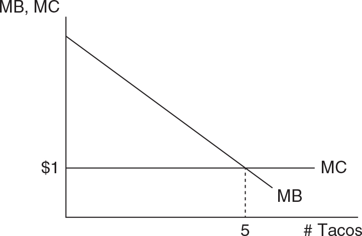
Since each taco costs $1, the marginal cost curve should be drawn horizontal at $1. The marginal benefit curve is drawn downward sloping because the next taco provides less additional benefit. After all, your hunger is partially satisfied with each taco, so the next taco isn’t quite as great as the one that came before.
So if your hypothetical number of tacos was 5, the graph should look something like this:
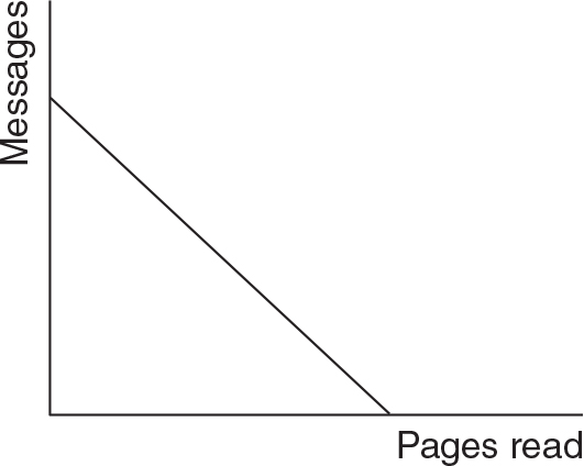
a. A PPC with constant opportunity costs should be drawn as a straight line.
b. Since the Internet speed is cut in half, the PPC should move inward along the y-axis but not along the x-axis.
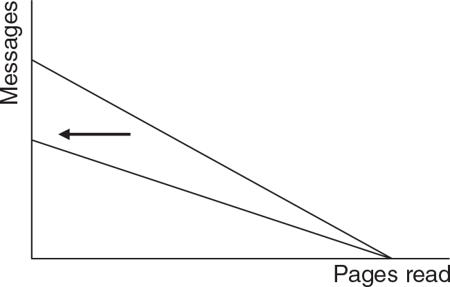
c. The opportunity cost of studying has now decreased. Remember that the opportunity cost of an activity, studying in this case, is what you have given up to engage in that activity. Now that your Internet speed has been cut in half, every hour spent studying comes at a smaller sacrifice in the number of messages you could have been sending and reading.
a. Yes. Eli has an absolute advantage in both tasks because he can outproduce Theodore in both folding towels and washing plates.
b. If Eli splits his time equally, he can fold 8 towels and wash 4 plates.
If Theodore does the same, he can fold 3 towels and wash 3 plates.
Total output: 11 towels + 7 plates = 18
c. A person is said to have a comparative advantage in a task if he or she can perform that task at a lower opportunity cost.
For every plate that Eli washes, he gives up 2 towels folded, so that is his opportunity cost of washing plates. On the other hand, for every towel that he folds, he gives up washing half of a plate.
For every plate that Theodore washes, he gives up 1 towel folded. And for every towel he folds, he gives up 1 washed plate.
So we can see that Theodore has a lower opportunity cost of washing plates (1 towel) when compared to Eli’s opportunity cost of washing plates (2 towels). Theodore has a comparative advantage in washing plates. On the other hand, Eli has the comparative advantage in folding towels because he gives up ½ washed plate while Theodore gives up 1 washed plate.
If they specialize based on comparative advantage, Eli should spend all of his time folding towels, and Theodore should spend all of his time washing plates.
Total output with specialization: 16 towels + 6 plates = 22.
1. Productive efficiency is achieved when you produce the maximum amount of output for a given level of technology and resources. If the pizza makers were inefficient in the kitchen, they might use the correct quantity of ingredients, but only a smaller pizza with eight slices. Another way of being productively inefficient would be to produce a perfectly sized (and tasty) pizza, but waste some of the ingredients in the process (like dropping a handful of cheese on the floor or spilling some sauce).
2. Most people, if equity was the goal, would give each person four slices. Of course this outcome depends upon how you define “equitable”. Rather than this egalitarian outcome, another might define equitable by giving the most slices to the person with the highest GPA or other arbitrary measure of merit. This is similar to saying that the highest wages should be paid to those who are most productive.
3. Allocative efficiency would be achieved if the slices were distributed to maximize the happiness of the four people eating them. One way to do this would be to give the most slices to the person who most desired them (or was the hungriest) and the fewest slices to the person who had the least desire for pizza. Alternatively, you could give each person four slices and then allow them to trade slices amongst themselves. When there are no more trades to be made, it’s likely you have found an efficient allocation.
a.
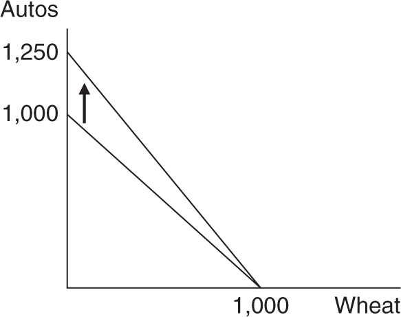
A 25% increase in maximum automobile production moves the vertical intercept up to 1,250 autos. Remember that the slope of the PPC gives us the opportunity cost of wheat. Prior to the technology, 1 unit of wheat cost 1 automobile, but now 1 unit of wheat costs 1.25 automobiles. Because automobile-producing technology has improved, devoting resources to wheat costs society more automobiles that could have been produced.
b.
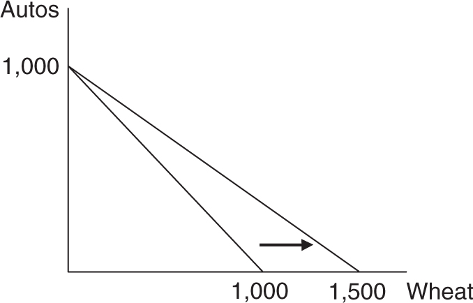
A 50 percent increase in maximum wheat production moves the horizontal intercept out to 1,500 units of wheat. Remember that the inverse of the slope of the PPC gives us the opportunity cost of automobiles. Prior to the drought-resistant seeds, 1 automobile cost 1 unit of wheat, but now 1 automobile costs 1.5 units of wheat. Because of the improved wheat production, devoting resources to automobiles costs society more units of wheat that could have been produced.
c.
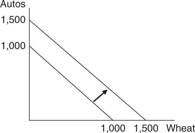
Better technology has improved production of both goods by the same degree. The new opportunity cost of wheat is still 1 auto, and the opportunity cost of 1 auto is still 1 unit of wheat.
To measure the benefit of an activity that has no price tag, economists can try to create a hypothetical auction.
Ask this person, “How much money would I need to pay you to stop watching TV and forgo the enjoyment (utility) you are receiving from it? Would you take $1, $5, $10?” Keep increasing the bid until this person accepts a hypothetical compensation to give up doing something he or she enjoys: watching TV. Once you reach this number, you know how much economic value (money) this person places on watching TV. After all, if the person would accept $20 to turn off the TV, watching the TV must be worth $20 to them.
We can do a similar exercise to try to measure the opportunity cost of not doing a second-best use of our time. You have asked a person to tell you what he or she would be doing if the TV signal suddenly ended and he or she could not watch TV during this time. Of course, this person could give you any of dozens of possible activities, but suppose the person tells you that he or she would be playing a game on his or her smartphone. Now ask this person, “If you were playing a game on your smartphone, how much money would I need to pay you to stop?” Begin the auction at $1 and gradually raise the hypothetical price until the person accepts a value that would compensate for turning off the game.
If the person would need to be paid $10 to turn off the game, this is the value the person places on playing the game. Because the person is watching TV at the moment, and not playing the game, then missing the game means the person is sacrificing $10 of potential enjoyment. This is the opportunity cost of watching TV.
If your friends or family members are acting like economists predict, the dollar value they give you for the benefit of watching TV should exceed the dollar value they give you for giving up the second-best activity. If they do not, it opens the door for an interesting conversation about why they would choose to watch TV if the costs exceed the benefit.
In the video, Beth sees an increase in her productivity when she learns how to make better birdhouses more quickly. Her productivity is measured as an increase in her output for the same number of inputs. We can also see productivity if she makes the same number of birdhouses with fewer inputs.
If you can think of a task around the house or at school that you can complete now more quickly than when you first attempted it, then you have increased your productivity.
a. This is an increase in tastes and preferences, so demand for coffee shifts to the right.
b. This will not cause a shift in the demand for coffee; it will cause the quantity of coffee to increase downward along the demand curve.
c. This is an increase in income; so because coffee is a normal good, demand shifts to the right.
d. This is an increase in the price of a substitute good, so demand for coffee shifts to the right.
e. This is an increase in the price of a complementary good, so the demand for coffee shifts to the left.
a. Faster-production technology will increase the supply (shift it to the right) of oak tables.
b. Oak lumber is a critical input, so a lower price of the lumber will shift the supply of oak tables to the right.
c. Tables made of maple are production substitutes for tables made of oak. If the price of maple tables is rising, producers will decrease the supply of oak tables (shift to the left).
d. As more producers of oak tables enter the market, the supply of oak tables will shift to the right.
e. Tricky one! This is not a shift in the supply of oak tables; it is a movement downward along the supply curve. A lower price decreases the quantity of tables supplied, but does not shift the curve.
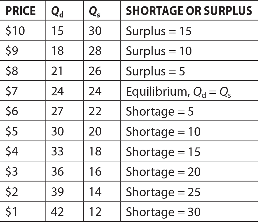
A surplus exists when quantity supplied exceeds quantity demanded, and these are seen at all prices above $7. The size of the surplus is equal to Qs minus Qd.
A shortage exists when quantity demanded exceeds quantity supplied, and these are seen at all prices below $7. The size of the shortage is equal to Qd minus Qs.
The only price where there is neither a shortage nor a surplus is $7, and this is the market equilibrium price.
a. The price of a key input is rising, so this would shift the supply of oranges to the left, causing a decrease in the quantity and increase in price.
b. A health benefit (longer life span) would increase tastes and preferences for oranges, causing an increase in the demand and eventual increase in both price and quantity.
c. The price of a substitute good is decreasing, so demand for oranges will decrease, causing a decrease in both price and quantity.
d. When we combine a decrease in the supply with an increase in the demand for oranges, the price will certainly rise, but the change in market quantity will depend on which shift is larger. If the supply shift is larger, quantity will fall. If the demand shift is larger, quantity will rise.
a. A tax on the production of peanut butter will act like a higher input cost and decrease the supply. A decrease in the supply will increase the price of peanut butter and decrease equilibrium quantity.
b. Strawberry jelly is likely a complementary product, so a lower price will increase the demand for peanut butter, increasing both the price and quantity in the market.
c. A lower price of raw peanuts is a lower input price for making peanut butter. The supply of peanut butter will increase, causing a lower market price and higher market quantity.
d. When we combine an increase in demand with an increase in supply, we know for certain that equilibrium quantity will increase. However, the change in the equilibrium price is uncertain and depends on which shift is larger. If the demand shift is larger, the price will increase. If the supply shift is larger, the price will decrease.
a. If better farming technology increases the harvest of coffee beans, the price of this key ingredient will decrease, thus shifting the supply of coffee to the right. When the supply of coffee shifts to the right, the market price will fall and the market quantity will rise.
b. A coffee-making machine is a complementary product to the coffee itself. When the price of these complementary goods is rising, the demand for coffee begins to fall. A decrease in the demand for coffee will cause the price and quantity in the market to also fall.
c. When consumers expect prices to rise in the future, they will increase current demand for coffee. The increase in demand will increase the price and quantity of coffee in the market.
d. When an increase in supply is combined with a decrease in demand, we know for sure that the price of coffee will fall, but the change in market quantity is ambiguous. If the increase in supply is larger than the decrease in demand, the market quantity will rise. However if the decrease in demand is larger than the increase in supply, the market quantity will fall.
a. Included. Because these carrots were grown within the nation’s borders, Max’s purchase of carrots would be counted as consumer spending in official GDP calculations.
b. Excluded. The purchase of the used couch is not counted, even if the couch was originally produced in Theodoria. The value of the new couch would have been included in GDP in the year in which it was produced.
c. Excluded. Although Melanie has purchased dog walking services from Eliza, this sort of informal cash transaction would not be included in GDP calculations. On the other hand, if Melanie had hired a professional dog walking service to do the job, it would have been included.
d. Included. When a company like Dodgerburger opens new restaurants, it would be officially counted as investment spending in GDP calculations.
a. Included. The purchase of new, domestically produced, delivery trucks would be counted as government spending in Theodorian GDP.
b. Excluded. The value of the boxes of nails will eventually be included in GDP when the new houses are produced. The nails are referred to as “intermediary goods” used to produce the final good of the house.
c. Excluded. The bread and buns are treated as imported goods because, although they were purchased by a domestic consumer, they were produced in another nation. Gross Domestic Product calculates the value of goods and services produced within the nation’s borders.
d. Excluded. Barter style transactions, while productive to both parties, are not a part of official GDP calculations. If Eli has hired a professional tutoring service for help studying French, it would be included.
• The Bureau of Economic Analysis, an office within the Department of Commerce, produces the GDP numbers in the United States. Website: http://www.bea.gov/
• Under the heading of “U.S. National Accounts,” you should be able to find downloadable data for real GDP. Website: https://www.bea.gov/national/index.htm#gdp The following table shows annual real GDP from 2011 to 2015. Notice that the dollars are presented in billions of 2009 dollars. That means that the base year being used is 2009, so the output in each of these years was valued using prices that existed in 2009.
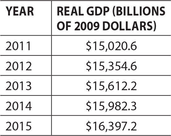
The percentage change between the two most recent years in this table is calculated by:

To compute the value of production, multiply the quantity produced by the price. Then sum up the quantity column and the value of production column.
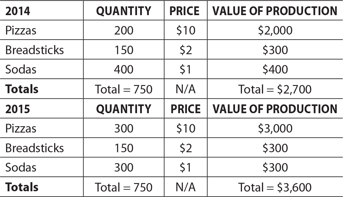
Notice that the total number of products sold is the same in each year (750), but the value of production has risen. This has happened because the mix of the products has changed and now the economy is producing more pizzas, the most valuable product, and fewer sodas, the least valuable product.
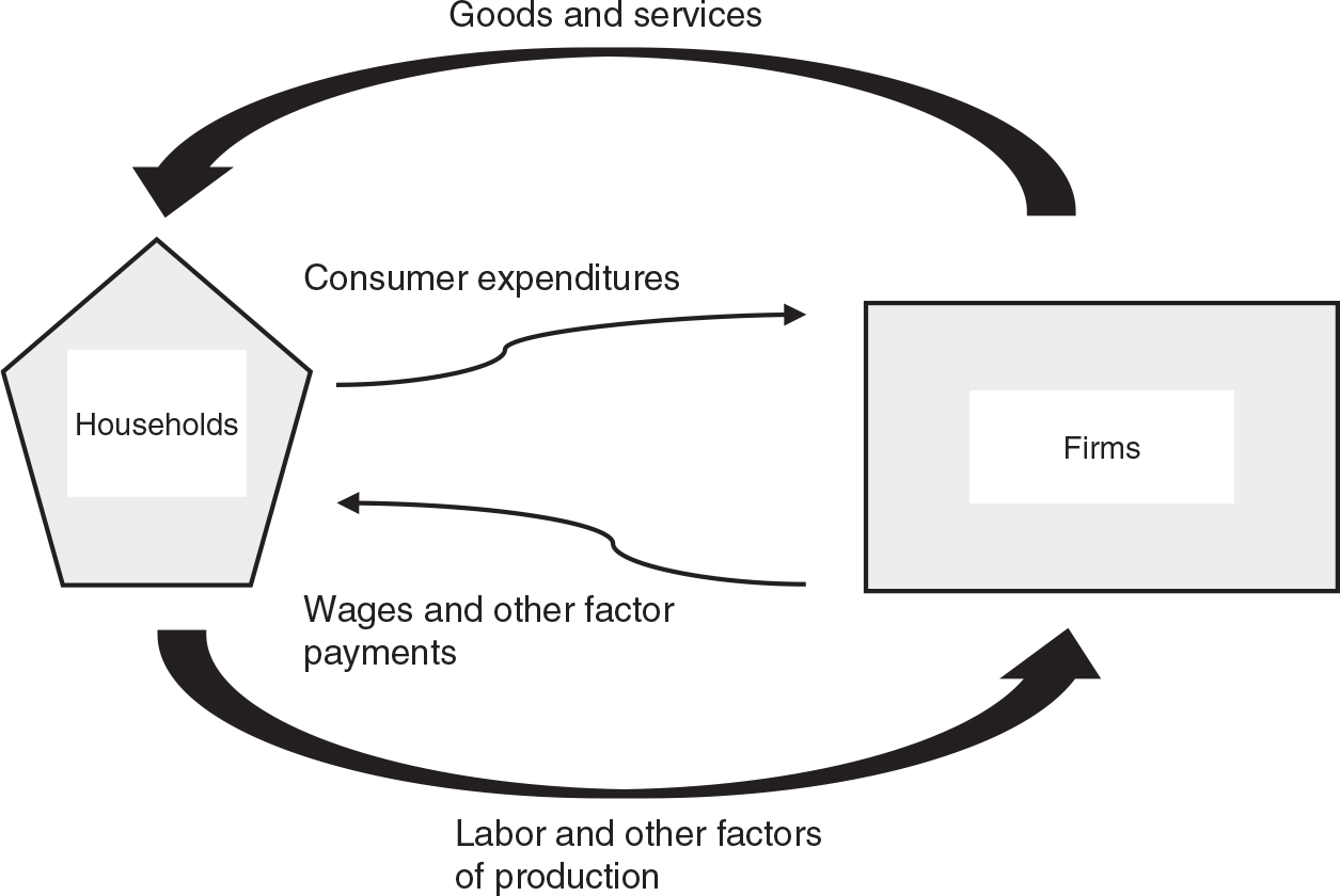
Households and firms are connected in two ways:
• Households supply factors of production (e.g., labor) in exchange for payments (e.g., wages).
• Firms supply goods and services to households in exchange for expenditures.
At this writing, the most recent quarterly release was the third quarter of 2016. You will find these released reports here:
http://www.bea.gov/national/index.htm#gdp
Here is the link to the full release and tables from November 2016:
http://www.bea.gov/newsreleases/national/gdp/2016/pdf/gdp3q16_2nd.pdf
Table 3 of this report has the relevant information.
In the column for the third quarter of 2016, GDP (in billions of seasonally adjusted dollars) is broken down into the components. If you add the four components, the total is likely going to be slightly different due to rounding.
Third Quarter 2016
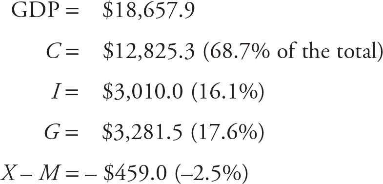
While your numbers will be different than these, you will probably find that consumption spending is nearly 70% of all spending in the economy.
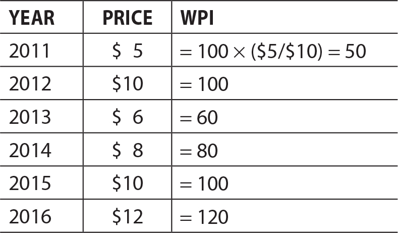
Using the following formula for the WPI, the table should look like this.

A price index is always equal to 100 in the base year.
• The Bureau of Labor Statistics (BLS) computes and reports the CPI every month. The BLS website is found here: https://www.bls.gov/
• Near the top of the page you will find a drop-down menu for “Subjects” and you should see “Consumer Price Index.” There are several ways to find recent values of the CPI. One way is to explore the section of “CPI Databases.” Look for the option of “All Urban Consumers” and “Top Picks” here: https://www.bls.gov/cpi/data.htm Check the top box that says “U.S. All items, 1982–1984 = 100,” and then select the button for “Retrieve data.” You should now see about 10 years of monthly data for the CPI that uses the period of 1982–1984 as the base year.
• To calculate the monthly inflation rate between two consecutive months (October to November 2016 as an example), we do this:

You might see along the right-hand side of the main page some little subheadings for inflation and the CPI. These should be accompanied by a little icon that looks like a graph. Look for something that says “CPI-U, U.S. City Average, All Items,” as this is the broadest measurement of inflation. You might find a page similar to this:
https://data.bls.gov/timeseries/CUUR0000SA0?output_view=pct_12mths
To deflate nominal salaries into real salaries, we use this formula:

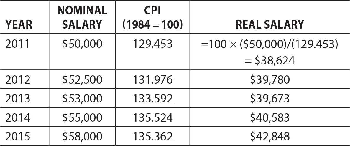
We can now see that this person’s salary, after adjusting for inflation, did gradually rise from 2011 to 2015, but actually took a small decrease between 2012 and 2013.
The National Bureau of Economic Research (NBER) is a professional organization of economists that does empirical research across many fields in economics. One aspect of the NBER is the Business Cycle Dating Committee. This is the group of economists that determines when recessions begin and end. Here is the website:
http://www.nber.org/cycles/cyclesmain.html
The most recent recession began in December 2007 (the peak of the cycle) and ended in June 2009 (the trough of the cycle). This duration of 18 months is much longer than the average of 11.1 months in the business cycles since 1945, which tells us that the “Great Recession” was noteworthy for how long it lasted.
Clearly there are no correct answers for this exercise. If you speak with enough people, you might hear stories that involve:
• A lost job
• Wages and/or benefits either declined, or pay raises that were canceled
• A lost home due to foreclosure
• A nearby business that closed
• Personal savings that were exhausted
• A vacation or other large purchase that was given up
With a little bit of searching on the FRED, you probably found a graph like this one:
https://fred.stlouisfed.org/series/FPCPITOTLZGUSA
• The highest rate of inflation in this graph was 13.5% in 1980.
• The ups and downs of the inflation graph appears to be more stable as we get into the 1990s and 2000s. You can see this in fewer dramatic spikes and valleys in the graph. Yes, there are ups and downs in the last 15 years, but they aren’t as high or as low.
• The inflation rate almost always declines in the recessionary period. You can really see this in the most recent Great Recession. In fact the inflation rate in 2009 was actually negative 0.36% in 2009. The logical explanation is that recessions are associated with less spending throughout the economy. When there is less spending on goods and services, there is little pressure on prices to rise; in fact they usually fall.
a. Nobody below the age of 16 is considered part of the labor force. The labor force consists of all those above the age of 16 who are employed (working at least 1 hour a week) plus those who are unemployed (without work but seeking a job). If a person does not have a job and has chosen to not seek a job, they are out of the labor force.

The unemployment rate (UR) is the ratio of the number of unemployed (U) divided by the labor force (LF).

b. When 1 million of the unemployed stop looking for work, the ranks of the unemployed and the total labor force is 1 million people smaller. The new unemployment rate is:

The unemployment rate has significantly fallen because the “discouraged” workers are no longer counted amongst the unemployed; they are considered out of the labor force.
1. Theo is younger than 16, so he is not counted as a member of the labor force, even though he is actually working as a lawn mower in the neighborhood.
2. Eli does not have a job right now, but he is not in the labor force because he is not actively seeking a job.
3. Melanie is employed and is working full-time.
4. Max is employed and is working part-time.
5. Tommy is considered employed. He has a job, but has not been working due to a labor dispute. Although he is not working and is actively searching for work as a guitar player, his status as employed (although on strike) supersedes what would normally qualify him as unemployed.
6. Gina is considered unemployed. She has lost her job and is actively seeking a new job. We can only presume that she is living on a prayer.
You probably found a graph similar to this one:
https://fred.stlouisfed.org/series/UNRATE
• The highest unemployment rate was 10.8% in December 1982.
• It might be a little difficult to see, but the unemployment rate has become slightly more stable since the early 1980s. Before about 1980 there were wider increases and decreases, and after 1980 there were fewer and they were not rising as high or dropping as low. The exception, of course, is the most recent recession when unemployment rates increased steeply.
• In all of the recessionary periods, unemployment was rising. The explanation is simple and relates to the circular flow diagram. When it feels like the economy is weakening, people reduce their spending. When households spend less on goods and services, firms employ fewer factors of production, and this reduces household income. And when household income falls, households spend less, and the downward cycle continues.
At the time of this writing, the most recent CPS was the November 2016 report. A portion of the table of unemployment measures is replicated as follows.

If you have done a little digging and read the fine print in the footnotes of Table A-15, you might have discovered the following:
Marginally attached: This refers to a person who is currently not working and was not searching for work last month, but indicates that he or she would like to work and had searched for work at some point in the last year.
The official rate of U-3 would not include these people, because they were not currently looking for work. However, they are interested in working and have searched for work in the last year, so they have not completely given up and permanently left the labor force.
Discouraged worker: This is a subset of the marginally attached people. They have not been searching for work because they don’t believe there is anything available to them. They might feel like they don’t have sufficient skills, or that they are too young/old for any work, or that they are discriminated against for any number of reasons.
We can see that in November 2016 that the inclusion of discouraged workers would increase the unemployment rate from the official 4.6% to 5% (U-4).
If we included all of the marginally attached workers, the unemployment rate would rise again to 5.8% (U-5).
Working part-time for economic reasons: This definition describes people working 1–34 hours per week (part time) but would rather be working more than 35 hours a week (full time). They are working part time because they cannot find a full-time position or their employer has cut back their hours due to weak demand for the firm’s products. Since these people are not unemployed, we might think of them as underemployed.
In November 2016 if this final group of the underemployed is added, the unemployment rate rises to 9.3%.
In any month that you choose, you will find the same pattern of an increasing rate of unemployment as we move from U-3 to U-6. This is simply a result of how the BLS for many decades has decided to draw the line on what constitutes an unemployed person. If you have been searching for work in the last month, you’re unemployed; if not, you’re out of the labor force.
Since Pam consumes $900 for every additional $1,000 of disposable income, the column of C rises by $900 each time. In a similar way, the column for S rises by $100 every time DI increases by $1000.
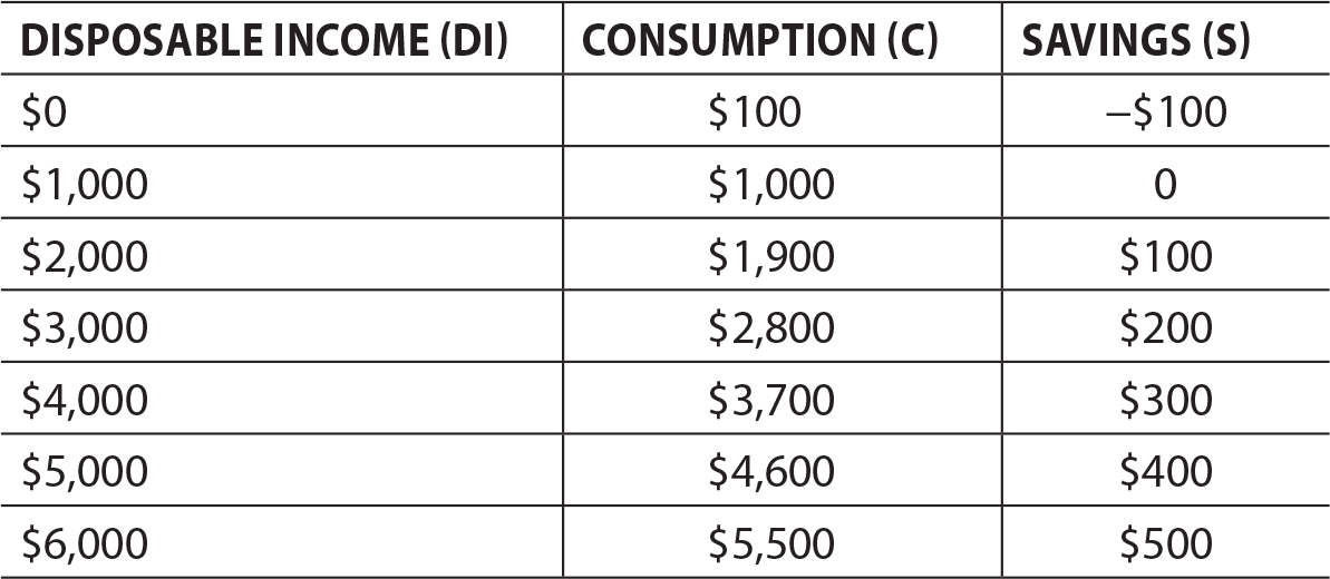
Once again, the equation of a line is y = mx + b.
In the consumption equation, the vertical intercept (b) is the value of consumption when disposable income is zero. This is called autonomous consumption. The slope (m) is the change in consumption divided by the change in disposable income. This is called the marginal propensity to consume (MPC).
We can see from the tables that both Pam’s and Gram’s autonomous consumptions are $100.
Pam’s consumption rises by $900 when her disposable income rises by $1000, so her MPC is 0.90.
On the other hand, Gram’s consumption rises by only $600 when her disposable income rises by $1,000, so her MPC is 0.60.
This gives us enough information to construct the consumption equations.

In the savings equation, the vertical intercept (b) is the value of savings when disposable income is zero. This is called autonomous savings. The slope (m) is the change in savings divided by the change in disposable income. This is called the marginal propensity to save (MPS).
We can see from the tables that both Pam’s and Gram’s autonomous savings are –$100.
Pam’s savings rises by $100 when her disposable income rises by $1,000, so her MPS is 0.10.
On the other hand, Gram’s savings rises by $400 when her disposable income rises by $1,000, so her MPS is 0.40.
This gives us enough information to construct the savings equations.

You might have found a graph like this one:
https://fred.stlouisfed.org/series/GPDIC1
Even after holding prices constant (2009 dollars), it is clear that investment spending has dramatically increased since the 1950s. A closer look at the actual numbers shows that real investment spending in 2016 is more than 10 times greater than it was in 1947.
It is also clear that investment spending drops during economic recessions. This isn’t surprising, because recessions are associated with less spending across the board. However, if you take a look at when investment spending begins to decline, it is usually at least two quarters before the recession officially begins. Because of this, economists use changes in investment spending as an important “economic indicator” of a potential change in the business cycle.
The market for loanable funds has a downward sloping demand and an upward sloping supply curve. The real interest rate is on the vertical axis. Hint: Make sure that you label your vertical axis as the real rate (or r%).
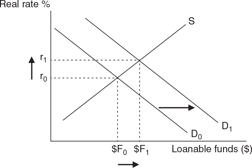
Increased business optimism would likely mean more capital investment and an increase in the demand for loanable funds. A shift to the right would increase the equilibrium interest rate and the quantity of funds borrowed and lent.
Once again, you should draw the market for loanable funds with a downward sloping demand and an upward sloping supply curve. The real interest rate is on the vertical axis.
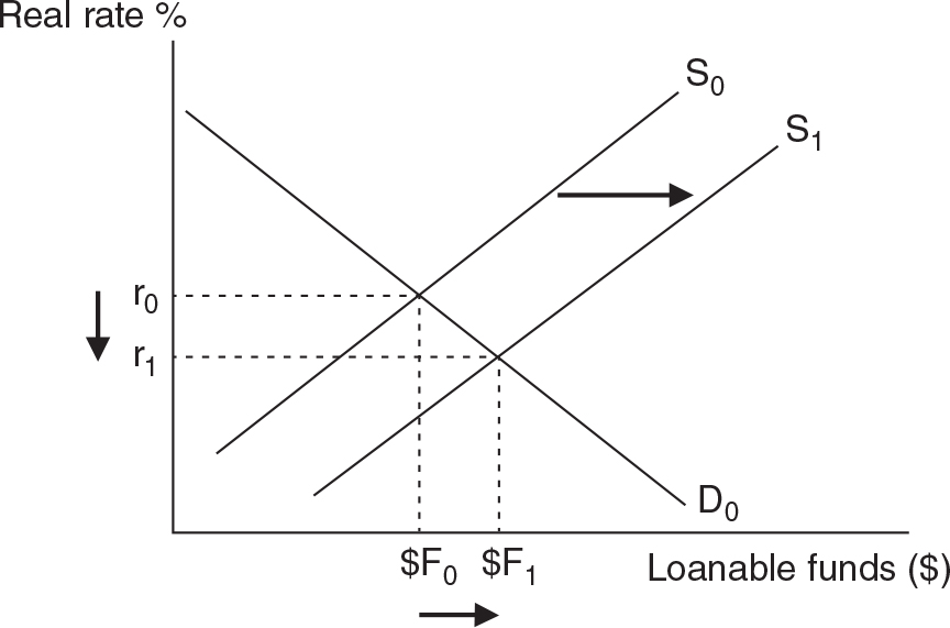
When households and firms show increased saving in American banks, the supply of loanable funds shifts to the right. A supply shift to the right would decrease the equilibrium interest rate and increase the quantity of funds borrowed and lent.
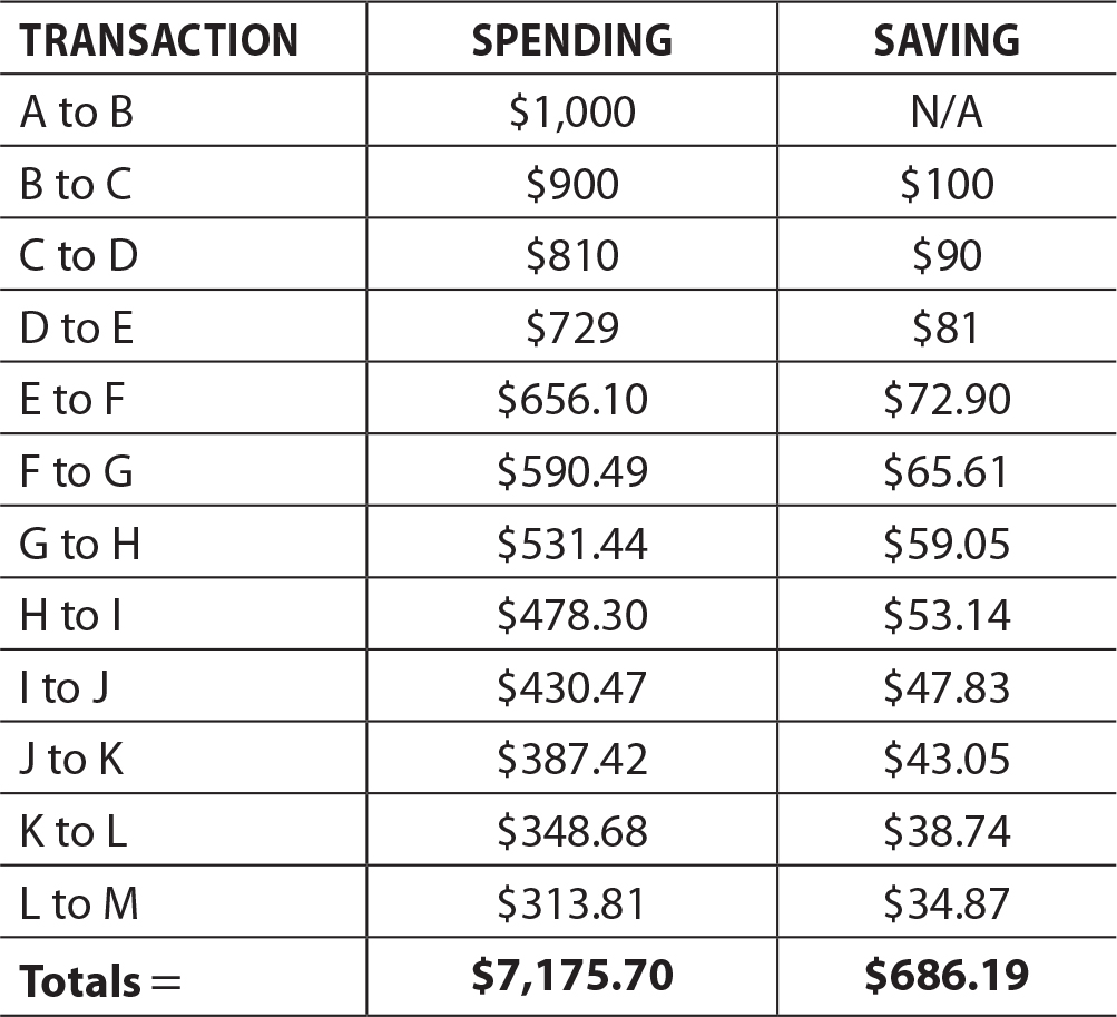
After 10 more rounds of spending the initial $1,000 has generated a total of $7,175.70. In other words, it has multiplied by more than seven times the initial amount of spending. This is the spending multiplier at work.
Technically you cannot compute M when the MPC is 1 and the MPS is zero, but if you imagine dividing by something very close to zero, we would get a spending multiplier that is very, very big.
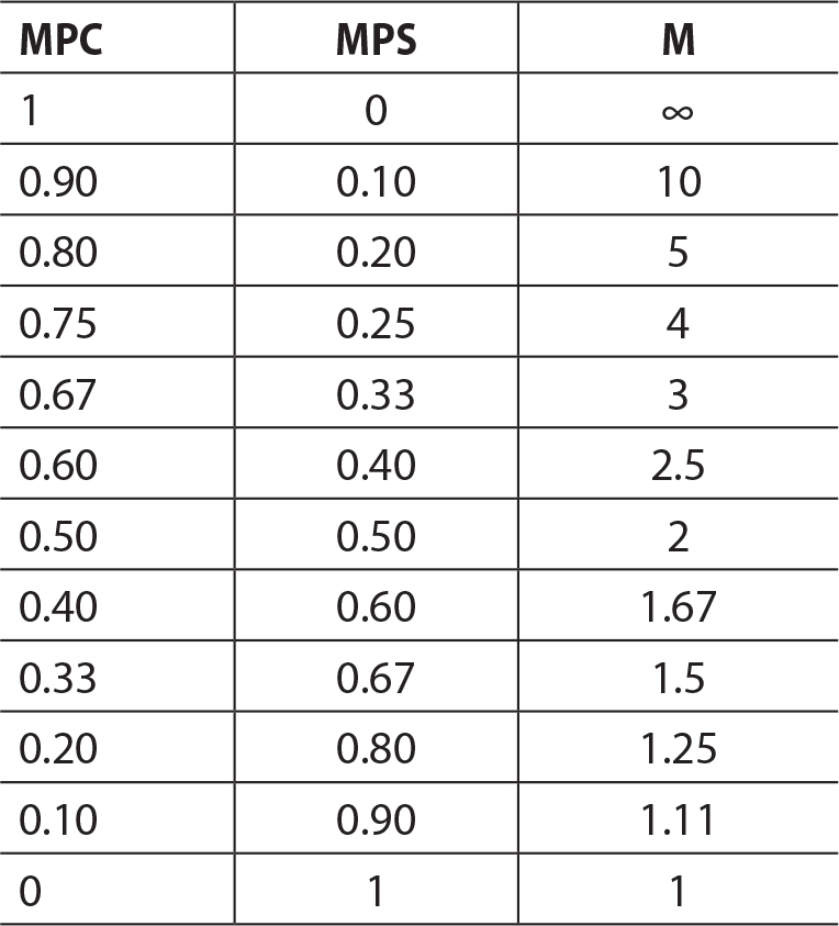
The table makes it clear that if the MPC is quite high (or MPS quite low), an injection of spending from any sector will eventually multiply to a much greater amount.
For each scenario you must first compute the spending multiplier and then determine whether GDP would increase or decrease by a magnitude equal to that of the multiplier.
• A nation with an MPC = 0.80 experiences an increase in autonomous investment spending of $10 billion.
M = 1/0.20 = 5. If I increases by $10 billion, this should eventually cause an increase of $50 billion in GDP.
• A nation with an MPC = 0.75 experiences a decrease in autonomous net exports of $6.5 billion.
M = 1/0.25 = 4. If (X−M) decreases by $6.5 billion, this should eventually cause a decrease of $26 billion in GDP.
• A nation with an MPC = 0.50 experiences an increase in autonomous government spending of $15 billion.
M = 1/0.5 = 2. If G increases by $15 billion, this should eventually cause an increase of $30 billion in GDP.
• A nation with an MPC = 0.90 experiences a decrease in autonomous consumption spending of $5 billion.
M = 1/0.9 = 10. If C decreases by $5 billion, this should eventually cause a decrease of $50 billion in GDP.
After 12 rounds of spending, the $1,000 tax rebate created $6,458.13 of new spending. The tax rebate generated more than 6 times the amount of money circulating in the economy than the initial rebate. This is the tax multiplier at work.

Again, we see that the tax multiplier falls as the MPC falls. The Tm is always smaller than the spending multiplier because a change in autonomous spending (G) immediately impacts the circular flow of spending, while a change in taxes (or transfer payments) must first go through a consumer’s consumption function, and in that function a fraction will be saved, not spent.
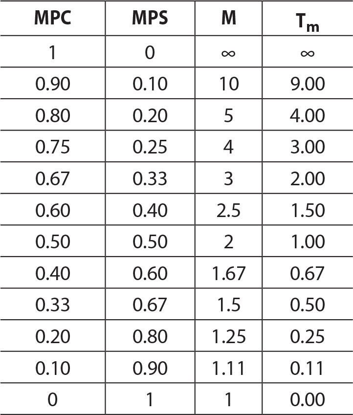
Notice that if the MPC is quite small in an economy, a change in taxes or transfers will have a negligible multiplied impact on GDP.
For each scenario you must first compute the tax multiplier and then determine the eventual impact of the tax or transfer change on GDP.
• A nation with an MPC = 0.80 experiences an increase in transfer payments of $10 billion.
Tm = 0.8/0.2 = 4, so an increase in transfer payments of $10 billion will multiply to a $40 billion increase in GDP.
• A nation with an MPC = 0.75 experiences a decrease in taxes of $6.5 billion.
Tm = 0.75/0.25 = 3, so a decrease in taxes of $6.5 billion will multiply to a $19.5 billion increase in GDP.
• A nation with an MPC = 0.50 experiences an increase in taxes of $15 billion.
Tm = 0.5/0.5 = 1, so an increase in taxes of $15 billion will multiply to a $15 billion decrease in GDP.
• A nation with an MPC = 0.90 experiences a decrease in transfer payments of $5 billion.
Tm = 0.9/0.1 = 9, so a decrease in transfer payments of $5 billion will multiply to a $45 billion decrease in GDP.
a. The spending multiplier M = 1/0.25 = 4, so an increase in G = $3 billion will multiply to a $12 billion increase in GDP.
b. The tax multiplier Tm = 0.75/0.25 = 3, so an increase in taxes of $3 billion will multiply to a $9 billion decrease in GDP.
c. Net impact of this balanced-budget project = $12 billion − $9 billion = $3 billion
• Foreign sector substitution effect
If the aggregate price level in the United States is falling relative to that of other nations, consumers in other nations will wish to purchase more goods from the United States. At the same time, American consumers would wish fewer products from foreign nations. As a result, net exports would rise and GDP increases downward along the AD curve.
• Interest rate effect
If the aggregate price level is falling in the United States, there will need to be less borrowing to afford big-ticket items. This puts downward pressure on interest rates and with lower interest rates current spending increases. This creates a downward movement along the AD curve.
• Wealth effect
If the aggregate price level falls in the United States, the purchasing power of accumulated wealth will rise, and current spending rises. This also creates a downward movement along the AD curve.
a. Pessimistic households will decrease consumption (C) and decrease AD (shift to the left).
b. Low interest rates will increase investment (I) and also consumption (C) and increase AD (shift to the right).
c. More military spending is an increase in government spending (G) and increases AD.
d. Recessions in Asia make it more difficult to export to those nations, so net exports (X − M) decreases and decreases AD.
a. When firms are more optimistic about profitability, investment rises (I) and AD increases.
b. More household wealth increases consumption (C) and increases AD.
c. Higher income taxes decreases consumption (C) and decreases AD.
d. Stronger foreign preference of domestic products increases net exports (X − M) and increases AD.
The reason the SRAS is believed to be upward sloping is that input prices are thought to rise more slowly than the aggregate price level. So when the price level rises, firms can increase output, and with input prices lagging behind, firms are more profitable in the short run.
a. Policies like tax rebates for research and development allow companies to increase production and increases SRAS. Note: This kind of policy can also increase the long-run AS (LRAS) curve over a longer time period.
b. Widespread increases in input (or factor) prices causes the SRAS to shift to the left.
c. The elimination of redundant business regulation should increase the SRAS.
d. An environmental disaster, like a drought, would decrease the SRAS. Note: If a short-term lack of water turns into a permanent situation, the LRAS might also shift to the left.
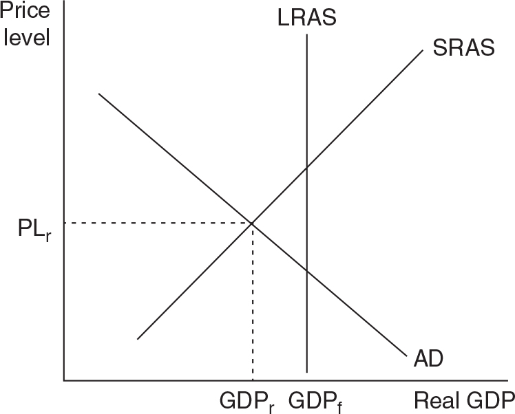
A recessionary gap means that current GDP falls below full-employment (or potential) GDP so you want to draw your intersection of AD and SRAS to the left of the vertical LRAS line.
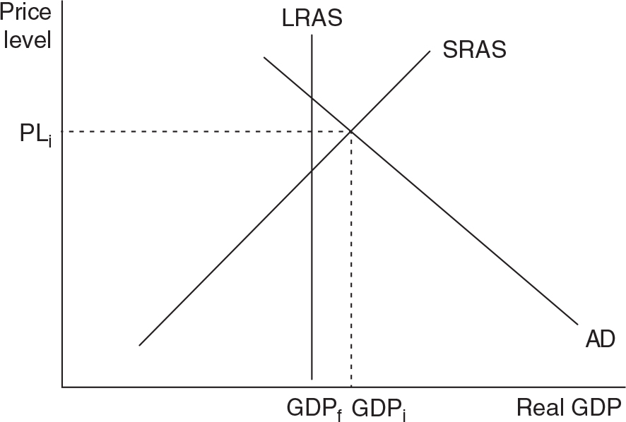
An inflationary gap means that current GDP lies above full-employment (or potential) GDP so you want to draw your intersection of AD and SRAS to the right of the vertical LRAS line.
a. Firms with less optimistic expectations will decrease investment spending, and AD decreases. The price level and real GDP will both fall.
b. When foreign consumers have more income, they will buy more domestic-made products, increasing next exports. The increase in AD will increase both price level and real GDP.
c. More household wealth causes consumption spending to rise, increasing AD. The increased AD causes both the price level and real GDP to increase.
d. Input prices that are rising will cause the SRAS to decrease, causing the price level to rise and real GDP to fall.
e. Policies designed to increase productivity should increase the SRAS, causing the price level to fall and real GDP to rise.
If you were successful in combining both data series in one graph, it probably looks a lot like this.

When you zoom in on recessionary periods, the real GDP dips significantly below potential GDP. This is a classic recessionary gap that we see in the AD/AS model as a decrease in AD. There are some periods where actual real GDP exceeds the potential GDP, the most recent being the quarters between 2005 and 2007, right before the Great Recession. If you look back, there are several instances where a period like this (actual exceeding potential) ended with a recession. There are many years when the economy is not officially in a recession, yet real GDP is below potential GDP. This illustrates the difference between simply producing below potential and really producing below potential. The recovery that began in the middle of 2009 caused the economy to emerge from the Great Recession, but real GDP has not yet caught up to potential GDP.
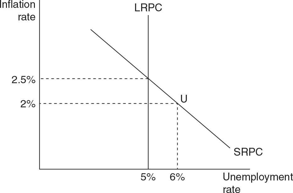
The LRPC is always drawn as a vertical line at the NAIRU, and the SRPC is downward sloping to reflect the trade-off between lower unemployment rates and higher inflation rates.
In the AD/AS model, this is explained by a decrease in the AD curve. Such a shift would decrease real GDP, increasing the unemployment rate, and decrease the price level, reducing inflation.
There are no answers for this activity. 
The graph shows a recessionary gap as indicated by real GDP currently below full employment GDP. With output down and unemployment up, your fiscal policy options should include:
• Increasing government spending (G)
• Decreasing income taxes
• Increasing transfer payments
One could also combine these last two options by stating that net taxes must fall: Net taxes = (Tax revenue – Transfer payments)
If these policies are to be effective, they must shift the AD curve to the right, increasing real GDP and decreasing the unemployment rate. There are two potential downsides: a higher price level and a larger budget deficit.
The graph shows an inflationary gap as indicated by real GDP currently above full employment GDP. While output is quite high, so is inflation, so your fiscal policy options should include:
• Decreasing government spending (G)
• Increasing income taxes
• Decreasing transfer payments
Again, you could also combine these last two options by stating that net taxes must rise: Net taxes = (Tax revenue – Transfer payments)
If these policies are to be effective, they must shift the AD curve to the left, decreasing real GDP and decreasing the price level. There is one clear downside in that unemployment will rise.
When the government engages in expansionary fiscal policy, the usual plan is to increase spending and decrease taxes; this creates a budget deficit. The typical way of paying for the deficit is to borrow money from the public and financial institutions in the form of issuing bonds. When the government borrows a lot of money, there is pressure on interest rates to rise. Higher interest rates reduce private investment that would have, if interest rates had remained lower, otherwise been done. In other words, the government borrowing “crowds out” private investment.
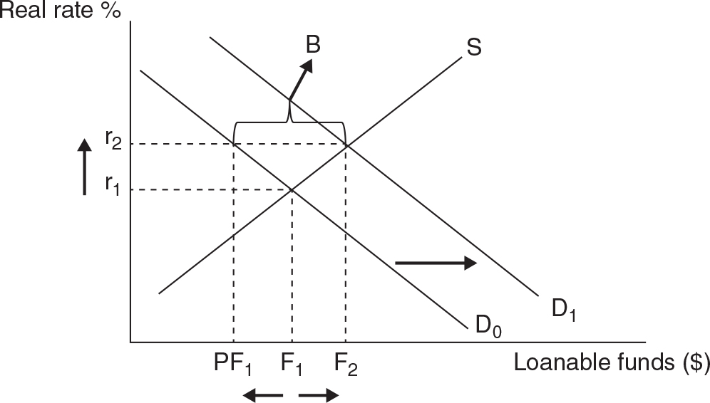
The borrowing increases the demand curve to D1 and this increases equilibrium interest rates. However, the quantity of private borrowing/investment falls from F1 (no deficit) to PF1 (deficit spending). The difference between the private borrowing/investing and the total is the amount of government borrowing (B). The decrease from F1 to PF1 is the crowding out of private investment.
Searching around the FRED you might have found a graph that looks like this.

This graph clearly shows that the national debt, as a percentage of the GDP has been rising since about 1980. Although this graph doesn’t go back as far as World War II, this ratio was about 120% in 1946 as the government spending was ramped up to support the military. More recently, we can see there was a steady increase in the 1980s, then a modest decline in the late 1990s, a slow increase in the early 2000s, and then a precipitous increase during and after the Great Recession.
On an annual basis, the OMB table tells us that the annual deficit, as a size of the GDP, was largest during the WWII years. Since the end of WWII, this ratio has dropped and stayed under 10% of GDP. During and immediately after the Great Recession, this ratio was almost 10% due to the dramatic decrease in tax revenue and sizable spending in an attempt to put the brakes on the worst recession since 1929.
More government borrowing increases interest rates in the United States. When foreign citizens and firms see that they can earn higher interest in the United States, they deposit more of their currency in American banks. This increases the demand for the U.S. dollar, which increases the value of the dollar in currency markets. Finally, a more expensive dollar makes American-made goods more expensive to foreign consumers, so exports fall. It also makes foreign goods less expensive for American consumers, so imports rise. The combination of these effects is a decrease in (or a crowding out of) net exports.
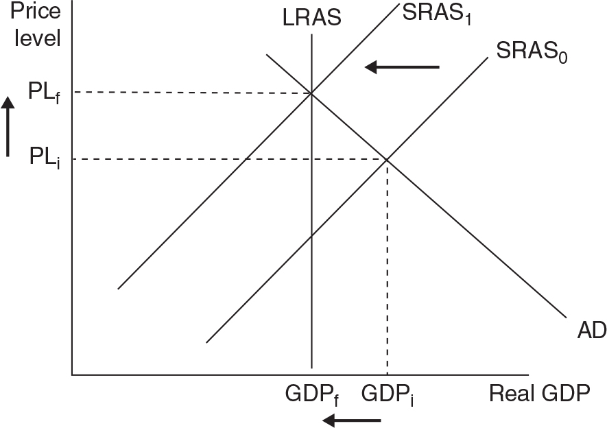
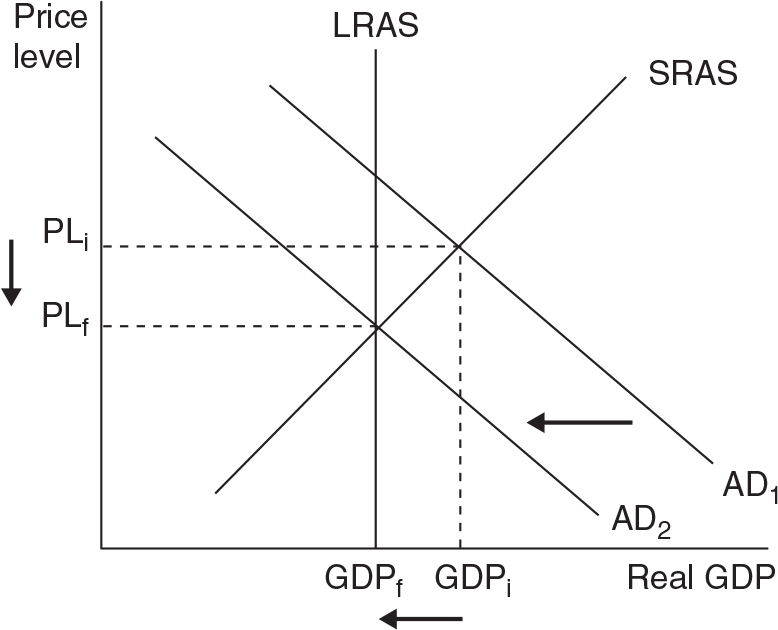
The recession reduces the demand for labor and other inputs, putting pressure on those input prices to fall. As the input prices fall, the SRAS curve gradually shifts to the right. The long-run equilibrium returns to GDPf and a lower price level PLf.
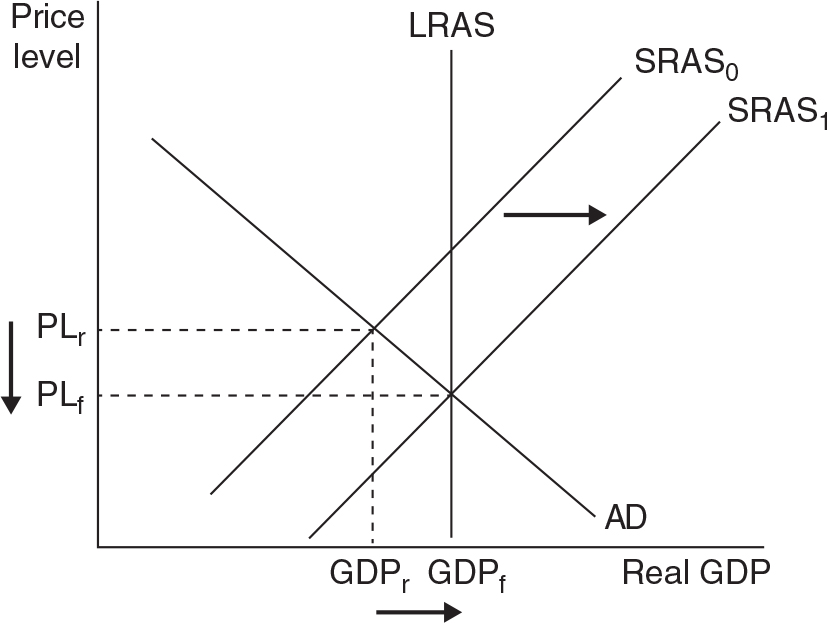
The inflationary gap increases the demand for labor and other inputs, putting pressure on those input prices to rise. As the input prices rise, the SRAS curve gradually shifts to the left. The long-run equilibrium returns to GDPf and a higher price level PLf.
Productivity has certainly risen since 1947. According to the blog post, “Compared to 1947, we now produce 330 percent more goods and services per hour of work. On average, thanks to advances in technology, education, management, and so on, you can do in 15 minutes what your grandparents or great grandparents needed more than an hour to do in 1947.”
Since 2007, productivity has risen only 1% each year, which is much lower than the long-term average of 2.2% each year.
The graph that compares productivity to real hourly wages shows almost a perfect match before about 1970. Since then, the productivity line has risen at a faster rate than the real hourly wage line, creating a widening gap.
According to data presented in the Census report (and Figure 1 in the report), in 1940 only about 25% of people above the age of 25 had completed high school, but by 2009 that had increased to 85%. In 1940 about 5% of people had a bachelor’s degree or more, but in 2009 that number was up to 30%. Clearly the American workforce has more educational attainment today than it did after World War II.
Table 1 in the report provides data that shows that a greater percentage of women have completed a high school degree or more (85.9% to 84.5%), but a greater percentage of men have completed a bachelor’s degree or higher (28.4% to 27.4%).
There are also some differences in educational attainment across the races. For example Asians have the highest percentage of having a bachelor’s degree or higher (49.7%), while Hispanics had the lowest rate at (12.6%).
The report also identifies clear financial advantages to higher levels of education. According to one section, “Median earnings for a worker with a bachelor’s degree were 77 percent higher than median earnings for a worker with a regular high school diploma, and median earnings for an advanced degree were 31 percent higher than earnings for a bachelor’s degree.”
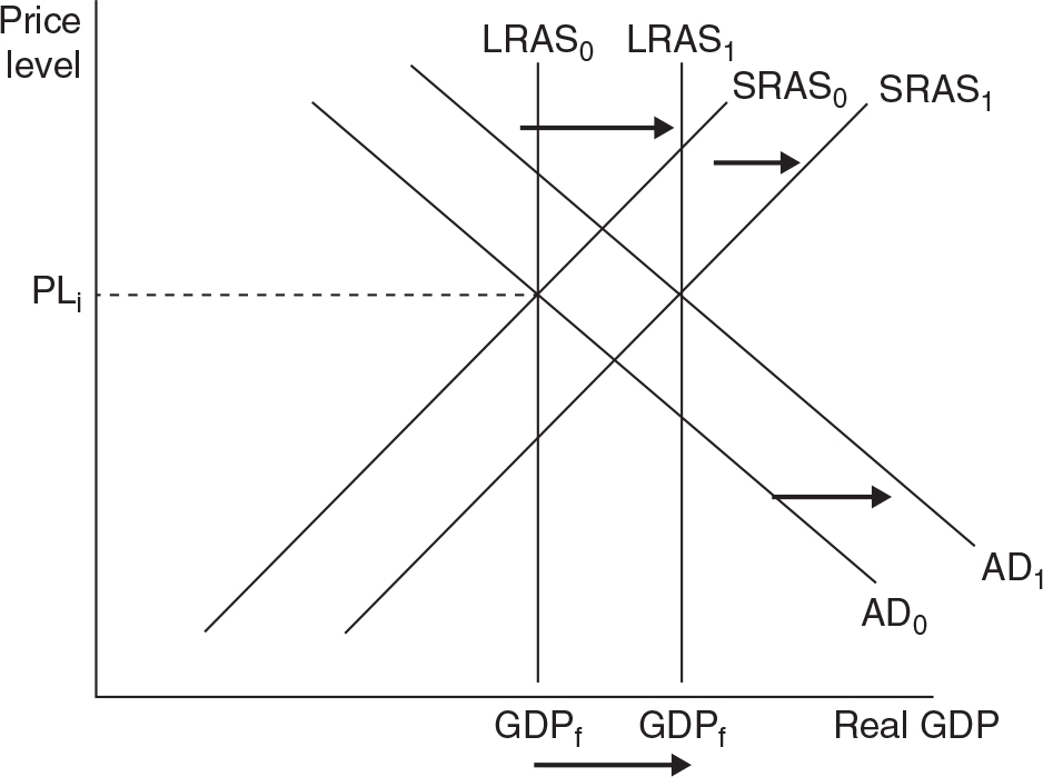
Long-run growth is shown as a rightward shift of the LRAS curve. When the economy comes to a new long-run equilibrium, the new level of full employment GDP will be higher. The new price level could be higher or lower, or the same, depending upon the magnitude of the AD and SRAS shifts that will eventually accompany the LRAS shift.
When the babysitting co-op was floundering and members were not spending often enough, the committee running it pumped more money (tokens) into the system. This is akin to a tax cut or rebate in our study of fiscal policy. When the members had more tokens in their accounts, they spent them and the co-op flourished.
Dr. Harford describes the “shock” as an unexpected hit to the economic system from something outside the system. Unlike the early struggles of the babysitting co-op, the POW camp’s economy was running smoothly, with sophisticated features like a futures market for bread and coffee exports to Germans on the outside of the fence. The external shock was that the Red Cross shipments were prevented from delivering the goods. This caused the economy to collapse. In the babysitting co-op, there was no external shock, the economy just needed a stimulus to accelerate the rate of spending.
A share of stock represents a claim on the ownership of a firm. A firm issues shares of stock to raise money (equity financing), but in exchange relinquishes a small degree of control over management and profits of the firm.
A bond is a certificate of indebtedness (an IOU). A firm issues a bond to raise money (debt financing), but in exchange commits the firm to repaying the principle of the bond, plus interest.
The big difficulty with the barter system is the “double coincidence of wants.” If I am an egg farmer, and I want to go shopping, I must find other merchants who want my eggs in exchange for the goods they produce. This is a pretty inefficient way to conduct commerce.
The three functions of any kind of money are:
• Medium of exchange
• Unit of account
• Store of value
Fiat money (cash) is a good medium of exchange because it circumvents the double coincidence of wants. If I need horseshoes, I don’t need to find a blacksmith who also wants eggs. I sell my eggs to those who want eggs and collect the money. Then I take the money to the blacksmith and pay him for the horseshoes. This is far superior to using eggs as money.
Fiat money is also a good unit of account. We simply measure the value of all things, like horseshoes and eggs, in a unit everyone understands, money. And if there was a price of 0.50 units of money, we could divide our money and pay that price. If we tried to use eggs as our money, all things would be measured in how many eggs it would cost to purchase them. Since not all people want eggs, and since 0.50 eggs isn’t going to work very well, this isn’t going to be a good pricing system.
Fiat money is a good store of value as it can last a long time. Eggs will go bad in a few days, making them worthless as money. Fiat money does lose value if inflation is rampant, so it is important for the central bank to maintain the value of the money.
To solve these problems we must use the present value formula:
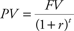
where FV is some dollar amount received or paid t years into the future, and r is the interest rate (or discount rate). Or we can solve the equation for future value and we have:

a. The present value of your loan is $50, the interest rate is 4% and you agree to repay the loan in 1 year.

b. The future value of the gift is $100, the interest rate is 5%, and you have to wait 1 year to receive it.

c. There are two ways to make this comparison. The first is to compute the present value of $5,000 received in two years.

Since the present value of these winnings is less than $4,500, you should take the $4,500 now.
The second way to make the comparison is to compute the future value of $4,500 today, if you put it in the bank for 2 years.

Since this future value is greater than the winnings of $5,000, you should still take the $4,500 now and put it in the bank for two years.
You probably found a graph that looks like this.
The stock of M1 has risen slowly since the 1980s, was fairly constant in the late 1990s and early 2000s, and then increased more rapidly since the Great Recession. Of course, the reason for the rapid increase was to combat, along with the government’s aggressive fiscal policy, this very deep recession and the slow recovery from it.
The completed table is below.
The table shows how money is created by simply holding a fraction in reserve (10%) and lending the rest to new borrowing customers. If we subtract the initial $1,000 deposit (because it was already in circulation), the loans and deposits from persons B through G amount to $4,217.03 that did not previously exist. Think of this as new money circulating in the economy.
The money market graph has the nominal interest rate on the vertical axis, and the quantity of money demanded rises as the nominal interest rate falls. The reason is that money is another type of financial asset. When it is held (demanded) in your pocket, it is very useful for making transactions, but it doesn’t earn any interest as an asset. As the interest rate rises, you could earn more interest income, so you will put that money back into another financial asset, like the purchase of a Treasury bond, and demand less of it in your pocket. The nominal interest rate is simply the opportunity cost of holding money in your pocket, and as we already know, when opportunity cost of something rises, we demand less of it.
In the first case, you will earn $100 when the bond matures ($1000 − $900) and since you paid $900 for the bond, you have earned an interest rate of 11.1% ($100/$900). In the second case, you will earn $50 when the bond matures ($1,000 − $950), so the interest rate is now 5.26% ($50/$950). As you can see from this quick example, when the price of a bond rises, the effective interest rate is going to fall.
The demand for bonds can rise for many different reasons. One reason might be that the rate of return on other financial assets is not very high. For example, if the stock market is slumping, people might put more money into bonds, thus increasing the demand for bonds and their prices. Another reason for an increase in demand for bonds is uncertainty. The U.S. Treasury bond is deemed one of the safest, if not the safest, financial asset available. Relative to other parts of the world, the U.S. government is stable and always repays the bonds that have been issued. So if financial markets in Europe or Asia are in turmoil, or if there is widespread geopolitical unrest, investors might return to U.S. Treasury bonds, increasing their demand. Another reason for higher demand for bonds is that there is a surplus of money in the money market. With a surplus of money in circulation, households and firms are going to look for a place to put this money, and the market for U.S. Treasury bonds is one such place.
Be sure to draw your money supply curve as vertical and money demand as downward sloping. Also be sure to label the vertical axis as the nominal interest rate (or “nir”).
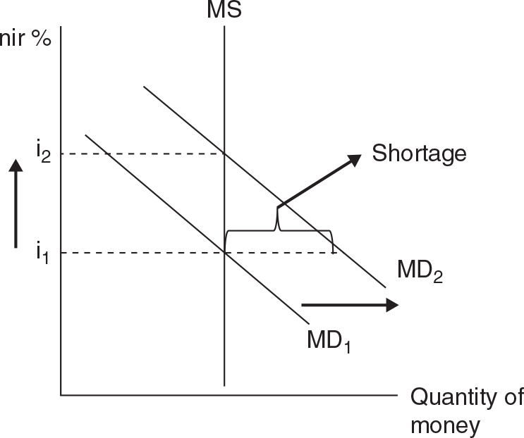
The initial equilibrium in the money market is at an interest rate of i1. A stronger economy and increased nominal GDP will increase the demand for money, as people are making more transactions. The shift to the right of MD creates a shortage of money at the original interest rate. With not enough money in circulation, people will sell their bonds and this increases the supply of bonds, decreasing the price, and increasing interest rates.
Use the formula for the money multiplier:

The completed table follows.
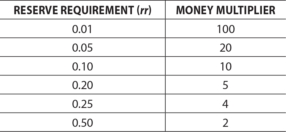
If (a big IF) the reserve requirement was 0.01, banks would need to hold only 1% of deposits in reserve and could lend out the remaining 99%. This could dramatically increase the multiplication of any deposits but would also put the bank at risk. What if many depositors showed up and wanted to withdraw all of their money (aka, a bank run) on the same day? With only 1% of all deposits being held, this could wipe out the bank. To lessen this risk, the Fed has chosen an rr = 10% and allows banks that find their reserves to be insufficient on any given day to borrow from either other banks or the Fed itself.
1. Change the reserve requirement. If the Fed wanted to increase the money supply, they could decrease the reserve requirement, allowing banks to lend a larger percentage of all deposits and increasing the money multiplier.
2. Change the discount rate. The discount rate is the rate the Fed charges banks that wish to borrow money. To increase the money supply, the Fed could lower the discount rate, making these loans more affordable to the banks. Banks borrow from the Fed, increasing excess reserves, and increasing lending to customers, thus increasing the supply of money.
3. Execute open market operations (OMO). The Fed buys and sells Treasury securities in the open market to affect the amount of money banks have in reserve. If the Fed wanted to increase the money supply, they would buy bonds from large banks. These banks would now have more money in excess reserves, they would start the lending process, and more money would be created.
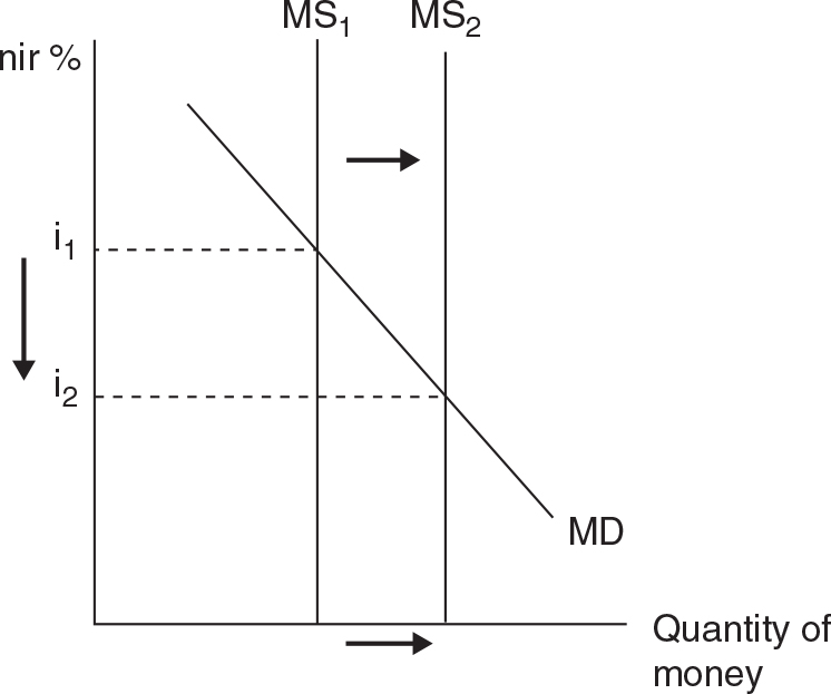
To fight a recessionary gap, you should propose an OMO whereupon you are buying securities from banks. These purchases will inject money into the banks and the money multiplier effect will increase the money supply.
The graph should show the vertical money supply curve shifting to the right, decreasing the nominal interest rate.
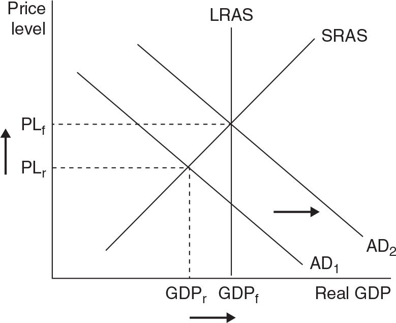
The AD/AS graph should show AD shifting to the right as lower interest rates will boost investment spending (I) and consumption spending (C). This increase in AD should get real GDP closer to potential GDP and reduce the unemployment rate.
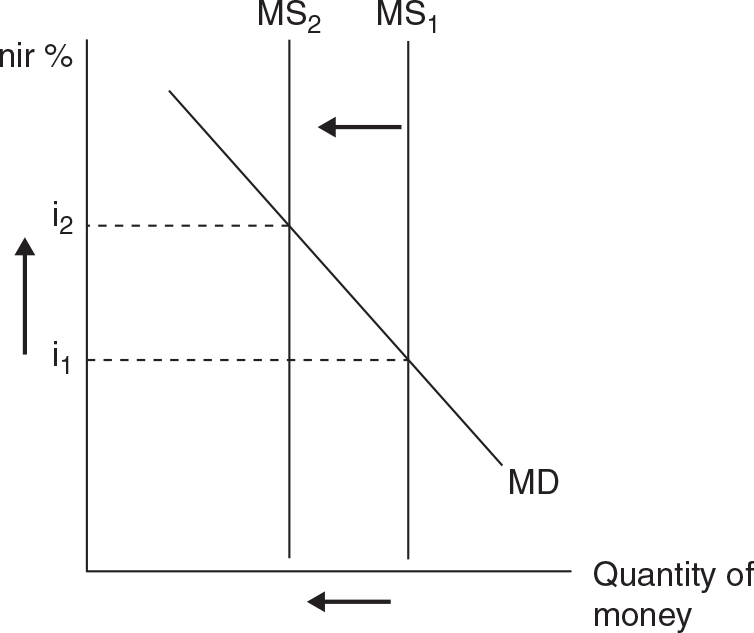
To fight an inflationary gap, you should propose an OMO whereupon you are selling securities to banks. These sales will withdraw money from the banks, and the money multiplier effect will decrease the money supply.
The graph should show the vertical money supply curve shifting to the left, increasing the nominal interest rate.
The AD/AS graph should show AD shifting to the left as higher interest rates will reduce investment spending (I) and consumption spending (C). This decrease in AD should get real GDP closer to potential GDP and reduce the price level and inflation.
A liquidity trap occurs when interest rates are pushed down to zero. Unlike other economic variables (like net exports), interest rates cannot be negative values. So if the money supply is increased to the point where interest rates hit zero, there is no further benefit to expansionary monetary policy.
In the essay from the Fed, when the author refers to the “effective lower bound” of interest rates, he is describing the liquidity trap. With the economy continuing to languish, the Fed was forced to look for nontraditional methods of sparking the economy.
The first thing that is discussed in the article is the Fed’s use of key language in their reports to the banking industry and general public. The Fed wanted to reassure banks that the nearly zero percent interest rates were going to last for a while. They hoped that this would allow banks to begin lending again and plan for a more certain future.
The Fed also began to purchase certain financial assets from banks and financial institutions. Part of the reason that banks were not lending was because they were saddled with billions of dollars of nearly worthless mortgages and a popular investment called “mortgage-backed securities.” The thinking was that if the Fed took those nearly worthless investments out of the banks, it would free them to return to normal business.
Of course we know now that recovery from the Great Recession, despite the combined efforts of fiscal and monetary policy, continues to be slow.
There really are no solutions to this activity, but it does provide food for thought and some hard-to-answer questions. Is a weak economy like a dead car battery that just needs a spark of spending? Should the government bail out firms that are failing? What would we do with the people who are unemployed if we waited for the economy to self-correct?
Many economists agree that there are valid points to be made by both sides of this philosophical divide. And all economists agree that the real-world is much more complex than the theoretical models presented in textbooks. However, these models, imperfect as they are, provide us with a baseline for understanding how the economy works and how policies might have effective impacts on it.
a. To find comparative advantage, we must compute the opportunity cost of producing each commodity.
Nation A:
Producing 1W costs 4T
Producing 1T costs 1/4W
Nation B:
Producing 1W costs 6T
Producing 1T costs 1/6W
Nation A produces wheat at a lower cost than can nation B, so nation A has comparative advantage in W. Nation B produces textiles at a lower cost than can nation A, so nation B has comparative advantage in T.
b. Nation B is going to specialize in T, but they want some W. If they produced their own W, it would cost 6T, so they need a lower price for W from a trading partner. Maybe they try to get 1W for a price of 5T.
Would nation A go for this?
They are specializing in W. If they gave up 1W on their own, they would gain 4T, but nation B is offering them 5T.
So both nations would agree to a deal that involves 1W exchanging for 5T, or 1T exchanging for 0.20W.
a. Low interest rates will deter savers from depositing money in American banks, and they will keep their money in European banks where the return is higher. This will decrease the demand for the dollar.
b. If American products are more popular, demand for those products rises and the demand for the dollar rises with it.
c. A recession in Europe decreases the demand for imported goods from the United States, so demand for the dollar falls.
d. If European prices are rising and prices in the United States are not, American products are going to be more affordable and demand for the dollar will rise.
a. The Fed should increase the money supply, probably with an open market purchase of bonds from large banks. An increase in the money supply will cause interest rates to fall, boosting AD and lessening the recessionary gap.
b. Lower interest rates make foreign saving in U.S. financial institutions less attractive, so the demand for the dollar will decrease, causing the value of the dollar to fall. Another way to say this is that the dollar is depreciating (or weakening) against other currencies. If the dollar is less expensive to foreigners, it makes American-made products less expensive to foreign consumers, so the United States will export more products. At the same time, a weaker dollar means that Americans find foreign goods to be more expensive, so imports in the U.S. economy fall. With exports rising and imports falling, net exports (X − M) increase.
I found a Hilton Doubletree hotel in Madrid, Spain, that had a room in April 2017 priced at 209 euros. At the date of this writing, $1 could get you 1.05415 euros, or 1 euro could get you $0.94863, so to pay for the room in euros I would need:

One year ago, the exchange rate was 1 euro equal to $0.94829, so the room a year ago would have cost:

Since this hotel room is basically the same price (in U.S. dollars), I will assume that my European vacation today would cost about the same as it would have cost a year ago.
The tricky part of drawing currency markets is getting the vertical axis labeled correctly. We are drawing the market for the euro (€), so the vertical axis needs to be labeled as the price of a euro. Since we are going to price it in U.S. dollars, we should label the vertical axis as “dollars per euro” or the “dollar price of a euro” or simply “$/€”.
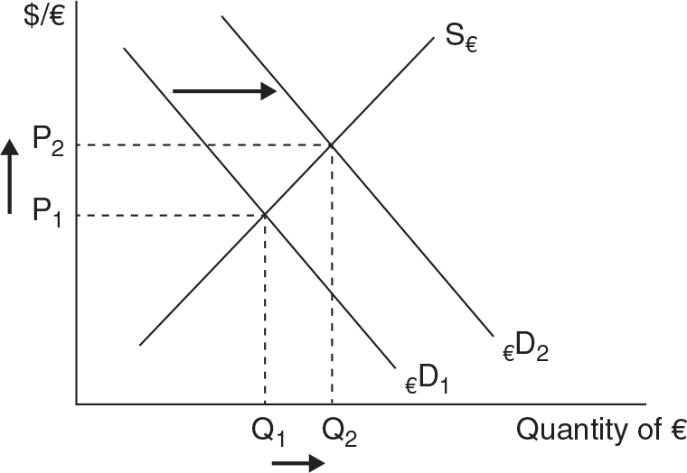
Higher interest rates in Europe will attract savers from the United States, and this increases the demand for the euro, causing the euro to appreciate in value. It would now cost more dollars to acquire more euros or products made in the European Union.
We are drawing the market for the U.S. dollar, and so the vertical axis needs to be labeled as the price of a dollar. Since we are going to price it in euros, we should label the vertical axis as “euros per dollar” or the “euro price of a dollar” or simply “€/$”.
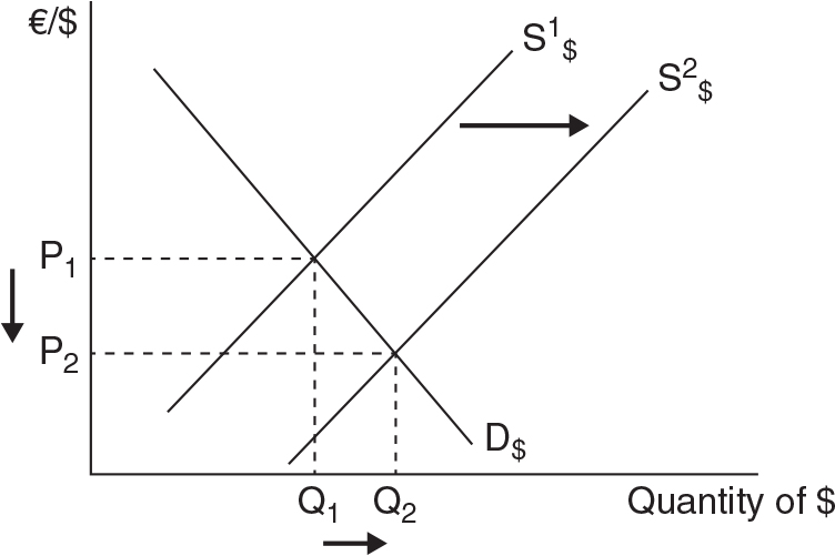
Higher interest rates in Europe will attract savers from the United States, and this increases the demand for the euro, causing the euro to appreciate in value. At the same time, the supply of dollars is increasing. Think of it this way: If Americans are demanding more euros, they must offer more dollars in exchange. The graph shows that the price of a dollar is falling; the dollar is depreciating. It would now cost fewer euros to acquire more dollars or products made in the United States.
There are several trends that support the assertion that trade benefits the U.S. economy. For example, the very first chart shows that U.S. exports have risen sharply over the same period of time that U.S. real GDP has risen gradually. Trade in the U.S. economy is now about 30% of total GDP. The video also describes how the “made in America” slogan is no longer true, as firms often import raw materials to produce a final product. The video also discusses the fact that trade does reduce employment in some sectors and some regions of the country, but that trade creates other jobs. In fact, labor-saving technology (like robotics) is the primary cause of lost manufacturing job losses, not trade.
At this writing, the most recent news release from the BEA was for the third quarter of 2016. From the report, we see that:
Exports of goods and services = $564.1 billion
Imports of goods and services = $680.5 billion
So there was a trade deficit in goods and services of $116.4 billion
We need to determine opportunity costs to figure out which nation has comparative advantage in steel and food.
Theodoria:
The opportunity cost of 1 food is 1 steel.
The opportunity cost of 1 steel is 1 food.
Elijastan:
The opportunity cost of 1 food is 0.25 steel.
The opportunity cost of 1 steel is 4 food.
Comparative Advantage and Specialization:
Since Theodoria can produce steel at a lower cost than Elijastan (1 food compared to 4 food), Theodoria should specialize in steel production. Likewise, Elijastan should specialize in food production because they produce it at a lower cost (0.25 steel compared to 1 steel) than Theodoria.
Terms of Trade:
One possibility that would benefit both nations is if they exchanged 1 steel for 2 food. To see how this would work, suppose Elijastan sent 40 food to Theodoria in exchange for 20 steel.
Would Elijastan find this acceptable? Without trade, if Elijastan wanted 20 steel they would need to sacrifice 80 food. With trade, they need to give up only 40 food. So definitely Elijastan is happy with this arrangement.
Would Theodoria benefit from this trade? Without trade, if Theodoria wanted 40 food they would need to sacrifice 40 steel. With trade, they have to give up only 20 steel. Theodoria is also pleased with this arrangement.