Chapter 8
Telling Powerful Stories with Data
IN THIS CHAPTER
 Laying out the basics of data visualization and storytelling
 Choosing the perfect data visualization type for the needs of your audience
 Picking the perfect design style
 Crafting clear and powerful visual messages with the right data graphic
 Adding context
Any standard definition of data science will specify that its purpose is to help you extract meaning and value from raw data. Finding and deriving insights from raw data is at the crux of data science, but these insights mean nothing if you don’t know how to communicate your findings to others. Data visualization and storytelling are excellent means by which you can visually communicate your data’s meaning. To design effective data visualizations and stories, however, you must know and truly understand the target audience and the core purpose for which you’re communicating with members of that audience. You must also understand the main types of data graphics that are available to you, as well as the significant benefits and drawbacks of each one. In this chapter, I present you with the core principles of data visualization and data storytelling design.
A data visualization is a visual representation that’s designed for the purpose of conveying the meaning and significance of data and data insights. Because data visualizations are designed for a whole spectrum of different audiences, different purposes, and different skill levels, the first step to designing an effective data visualization is to know your audience. Audiences come in all shapes, forms, and sizes. You might design a data visualization for the young-and-edgy readers of Wired magazine or convey scientific findings to a research group. Your audience might consist of board members and organizational decision makers or a local grassroots organization.
The one thing that’s consistent across all audiences, however, is the process you should follow when creating your data visualization, as spelled out here:
- Determine the type of data visualization you will create, based on your audience and the purpose of your visualization.
- Decide on a design style for your data visualization.
- Choose which graphics make the most sense for your audience.
- Test out different types of data graphics with the data, and then pick the ones that display the most clear and obvious answers.
- Arrange your data graphics within the data visualization.
- Where appropriate, add context to enhance the meaning of the visualization.
In this chapter, I walk you through each and every step in sequential order.
Data Visualizations: The Big Three
Every audience is composed of a unique class of consumers, each with unique data visualization needs, so you have to clarify for whom you’re designing. (See Table 8-1.) I first want to introduce the three main types of data visualizations, and then I explain how to pick the one that best meets the needs of your audience.
TABLE 8-1: Types of Data Visualization, by Audience
Audience |
Data Storytelling |
Data Showcasing |
Data Art |
|
Less-technical business decision-makers |
Data implementers, analysts, engineers, scientists, or statisticians |
Idealists, dreamers, and social change-makers |
Data storytelling for decision makers
Sometimes, you have to design data visualizations for a less technical-minded audience, perhaps in order to help members of this audience make better-informed business decisions. The purpose of this type of visualization is to tell your audience the story behind the data. In data storytelling, the audience depends on you to make sense of the data behind the visualization and then turn useful insights into visual stories that they can easily understand.
With data storytelling, your goal should be to use data visualization, words, and presentation skills to create a narrative that tells the story — the meaning, in other words — of the data insights you seek to convey. With respect to the data visualization you use within a data story, you want it to be a clutter-free, highly focused visualization that enables your audience members to quickly extract meaning without having to make much effort. These visualizations are best delivered in the form of static images, but more adept decision makers may prefer to have an interactive dashboard that they can use to do a bit of exploration and what-if modeling.
Data storytelling involves more than just data visualization design, though. You need to use words and presentation skills to communicate the data story as well. You’ll want to use words sparingly within annotations on the data visualization itself. Maybe you present the data story with an accompanying slideshow, or maybe not — but you should present it with effective presentation skills.
In Chapter 1, I talk about the three main data superhero archetypes: data implementer, data leader, and data entrepreneur. Data storytelling falls within the data leader suite of skill sets. I could write a whole book on the data leader skill set, but to keep it brief, your presentation design should be part of the broader work you’re doing with respect to stakeholder management — the process of developing and maintaining the trust of those key stakeholders whom your data work is meant to support, so that you can bring your data insights to life by ensuring that they’re seen, heard, and heeded in decision-making across your company.
Data showcasing for analysts
If you’re designing for a crowd of data implementers, or other logical, calculating analysts, you can create data visualizations that are rather open-ended. The purpose of this type of visualization is to help audience members visually explore the data and draw their own conclusions.
When using data showcasing techniques, your goal should be to display a lot of contextual information that supports audience members as they make their own interpretations. These visualizations should include more contextual data and less conclusive focus so that people can get in, analyze the data for themselves, and then draw their own conclusions. These visualizations are best delivered as static images or dynamic, interactive dashboards.
Designing data art for activists
You might design for an audience of idealists, dreamers, and change-makers. When designing for this particular audience, you want your data visualization to make a point! You can assume that typical audience members aren’t overly analytical. What they lack in math skills, however, they more than compensate for in solid convictions.
These people look to your data visualization as a vehicle by which to make a statement. When designing for this audience, data art is the way to go. The main goal in using data art is to entertain, to provoke, to annoy, or to do whatever it takes to make a loud, clear, attention-demanding statement. Data art has little to no narrative and offers no room for viewers to form their own interpretations.
Designing to Meet the Needs of Your Target Audience
To make a functional data visualization, you must get to know your target audience and then design precisely for their needs. But to make every design decision with your target audience in mind, you need to take a few steps to make sure that you truly understand your data visualization’s target consumers.
To gain the insights you need about your audience and your purpose, follow this process:
-
Brainstorm.
Think about a specific member of your audience and make as many educated guesses as you can about that person’s motivations.
 Give this (imaginary) audience member a name and a few other identifying characteristics. I always imagine a 45-year-old divorced mother of two named Eve.
 -
Define the purpose of your visualization.
Narrow the purpose of the visualization by deciding exactly what action or outcome you want audience members to make as a result of the visualization.
-
Choose a functional design.
Review the three main data visualization types (discussed earlier in this chapter) and decide which type can best help you achieve your intended outcome.
The following sections spell out this process in detail.
Step 1: Brainstorm (All about Eve)
To brainstorm properly, pull out a sheet of paper and picture an imaginary audience member — “Eve,” for example. Let’s practice together in creating a more functional and effective data visualization. You’d want to start by answering the more important questions we could ask about Eve in order to better understand her and thus better understand and design for your target audience.
Start by forming a picture of what Eve’s average day looks like — what she does when she gets out of bed in the morning, what she does over her lunch hour, and what her workplace is like. Also consider how Eve will use your visualization. These things tell you a little bit about her psychographics — the psychological characteristics that drive her high-level needs and wants.
To form a more comprehensive view of who Eve is and how you can best meet her needs, you can pull from the following question bank:
- Where does Eve work? What does she do for a living?
- What kind of technical education or experience, if any, does she have?
- How old is Eve? Is she married? Does she have children? What does she look like? Where does she live?
- What social, political, cause-based, or professional issues are important to Eve? What does she think of herself?
- What problems and issues does Eve have to deal with every day?
- How does your data visualization help solve Eve’s work problems or her family problems? How does it improve her self-esteem?
- Through what avenue will you present the visualization to Eve — for example, over the Internet or in a staff meeting?
- What does Eve need to be able to do with your data visualization?
Because we’re doing this together, I’ll answer these questions for you by telling you that Eve is the manager of the zoning department in Irvine County. She is 45 years old and a single divorcee with two children who are about to start college. She is deeply interested in local politics and eventually wants to be on the county’s board of commissioners. To achieve that position, she has to get some major “oomph” on her county management résumé. Eve derives most of her feelings of self-worth from her job and her keen ability to make good management decisions for her department.
Until now, Eve has been forced to manage her department according to her gut-level intuition, backed by a few disparate business systems reports. She isn’t extraordinarily analytical, but she knows enough to understand what she sees. The problem is that Eve lacks the visualization tools she needs in order to display all the relevant data she should consider. Because she has neither the time nor the skill to code something herself, she’s been waiting in the lurch. Eve is excited that you’ll attend next Monday’s staff meeting to present data insights you’ve discovered that she hopes will enable her to make more effective data-driven management decisions.
Step 2: Define the purpose
After you brainstorm about the typical audience member (see the preceding section), you can much more easily pinpoint exactly what you’re trying to achieve with your data visualization. Are you attempting to get consumers to feel a certain way about themselves or the world around them? Are you trying to make a statement? Are you seeking to influence organizational decision makers to make good business decisions? Or do you simply want to lay all the data out there, for all viewers to make sense of, and deduce from it what they will?
Returning to the hypothetical Eve: What decisions or processes are you trying to help her achieve? Well, you’d first need to make sense of her data and uncover relevant data insights. Then you’d need to present those data insights to her in a way that she can clearly understand and use for improved decision-making. So, looking at the data — what do you see that’s happening within the inner mechanics of her department? Once you’ve discovered some clear trends and predictions, it’d be time to use data visualization skills to guide Eve into making the most prudent and effective management choices.
Step 3: Choose the most functional visualization type for your purpose
Keep in mind that you have three main types of visualization from which to choose: data storytelling, data art, and data showcasing. Remember that, if you’re designing for organizational decision makers, you’ll most likely use data storytelling to directly tell your audience what their data means with respect to their line of business. If you’re designing for a social justice organization or a political campaign, data art can best make a dramatic and effective statement with your data. Lastly, if you’re designing for analysts, engineers, scientists, or statisticians, stick with data showcasing so that these analytical types have plenty of room to figure things out on their own.
Back to Eve — because she’s not extraordinarily analytical and because she’s depending on you to help her make excellent data-driven decisions, you need to employ data storytelling techniques. Create either a static or interactive data visualization with some, but not too much, context. The visual elements of the design should tell a clear story about her business unit, such that Eve doesn’t have to work through tons of complexity to get the point of what you’re trying to tell her about her department.
Picking the Most Appropriate Design Style
If you’re the analytical type, you might say that the only purpose of a data visualization is to convey numbers and facts via charts and graphs — no beauty or design is needed. But if you’re a more artistic-minded person, you may insist that you have to feel something in order to truly understand it. Truth be told, a good data visualization is neither artless and dry nor completely abstract in its artistry. Rather, its beauty and design lie somewhere on the spectrum between these two extremes.
To choose the most appropriate design style, you must first consider your audience (discussed earlier in this chapter) and then decide how you want them to respond to your visualization. If you’re looking to entice the audience into taking a deeper, more analytical dive into the visualization, employ a design style that induces a calculating and exacting response in its viewers. But if you want your data visualization to fuel your audience’s passion, use an emotionally compelling design style instead.
Inducing a calculating, exacting response
If you’re designing a data visualization for corporate types, engineers, scientists, or organizational decision makers, keep the design simple and sleek, using the data showcasing or data storytelling visualization. To induce a logical, calculating feel in your audience, include a lot of bar charts, scatterplots, and line charts. Color choices here should be rather traditional and conservative. The look and feel should scream “corporate chic.” (See Figure 8-1.) Visualizations of this style are meant to quickly and clearly communicate what’s happening in the data — direct, concise, and to the point. The best data visualizations of this style convey an elegant look and feel.
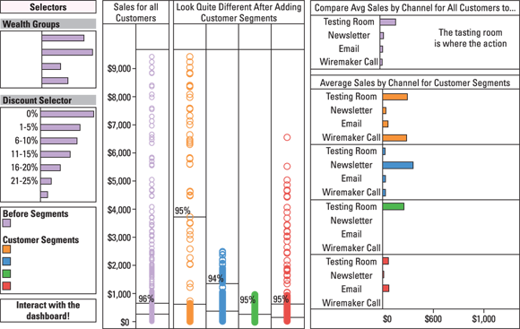
FIGURE 8-1: This design style conveys a calculating and exacting feel.
Eliciting a strong emotional response
If you’re designing a data visualization to influence or persuade people, incorporate design artistry that invokes an emotional response in your target audience. These visualizations usually fall under the data art category, but an extremely creative data storytelling piece can also inspire this sort of strong emotional response. Emotionally provocative data visualizations often support the stance of one side of a social, political, or environmental issue. These data visualizations include fluid, artistic design elements that flow and meander, as shown in Figure 8-2. Additionally, rich, dramatic color choices can influence the emotions of the viewer. This style of data visualization leaves a lot of room for artistic creativity and experimentation.
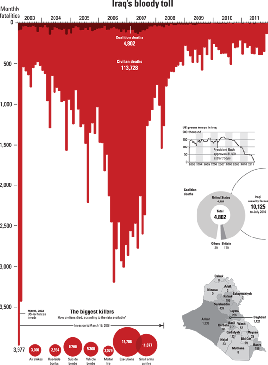
FIGURE 8-2: This design style is intended to evoke an emotional response.
Selecting the Appropriate Data Graphic Type
Your choice of data graphic type can make or break a data visualization. In case it’s unclear, a data graphic is the graphical element that depicts your data insight in visual format. (See Figure 8-3.) Most data visualizations have more than one data graphic within them.
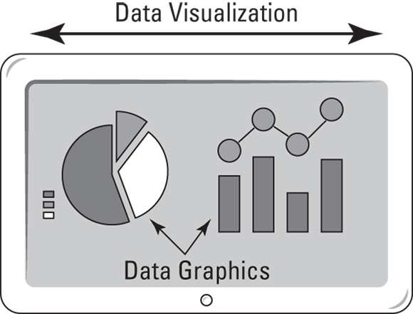
FIGURE 8-3: Data visualization versus data graphics.
Because you probably need to represent many different facets of your data, you can mix-and-match among the different graphical classes and types. Even among the same class, certain graphic types perform better than others; therefore, it’s a good idea to create several different mockups to see which graphic type conveys the clearest and most obvious message.
Among the most useful types of data graphics are standard chart graphics, comparative graphics, statistical plots, topology structures, and spatial plots and maps. The next few sections take a look at each type in turn.

FIGURE 8-4: Types of data graphics, broken down by audience and data visualization type.
Standard chart graphics
When making data visualizations for an audience of non-analytical people, stick to standard chart graphics. The more complex your graphics, the harder it is for non-analytical people to understand them. And not all standard chart types are boring — you have quite a variety to choose from, as the following list makes clear:
- Area: An area chart (shown in Figure 8-5) is a fun-yet-simple way to visually compare and contrast attribute values. You can use this type to effectively tell a visual story when you’ve chosen data storytelling and data showcasing. Not all area charts are 3-D like the one shown in Figure 8-5, but they all represent numerical values by the proportion of area those values consume visually on the chart.
- Bar: Bar charts (see Figure 8-6) are a simple way to visually compare and contrast values of parameters in the same category. Bar charts are best for data storytelling and data showcasing.

Source: Lynda.com, Python for DS
FIGURE 8-5: An area chart in three dimensions.
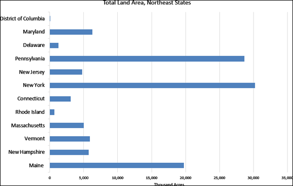
FIGURE 8-6: A bar chart showing the area of US states by their acreage, in thousand acres.
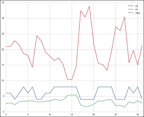
- Line: Line charts (see Figure 8-7) most commonly show changes in time-series data, but they can also plot relationships between two, or even three, parameters. Line charts are so versatile that you can use them in all data visualization design types.
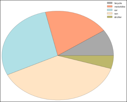
- Pie: Pie chart graphics (see Figure 8-8), which are among the most commonly used, provide a simple way to compare values of parameters in the same category. Their simplicity, however, can be a double-edged sword; deeply analytical people tend to scoff at them, precisely because they seem so simple, so you may want to consider omitting them from data-showcasing visualizations.
Source: Lynda.com, Python for DS
FIGURE 8-7: A line chart.
Comparative graphics
A comparative graphic displays the relative value of multiple parameters in a shared category or the relatedness of parameters within multiple shared categories. The core difference between comparative graphics and standard graphics is that comparative graphics offer you a way to simultaneously compare more than one parameter and category. Standard graphics, on the other hand, provide a way to view and compare only the difference between one parameter of any single category. Comparative graphics are geared for an audience that’s at least slightly analytical, so you can easily use these graphics in either data storytelling or data showcasing. Visually speaking, comparative graphics are more complex than standard graphics.
Source: Lynda.com, Python for DS
FIGURE 8-8: A pie chart.
This list shows a few different types of popular comparative graphics:
- Bubble plots (see Figure 8-9) use bubble size and color to demonstrate the relationship between three parameters of the same category.
- Packed circle diagrams (see Figure 8-10) use both circle size and clustering to visualize the relationships between categories, parameters, and relative parameter values.
-
Gantt charts (see Figure 8-11) are bar charts that use horizontal bars to visualize scheduling requirements for project management purposes. This type of chart is useful when you’re developing a plan for project delivery. It’s also helpful in determining the sequence in which tasks must be completed in order to meet delivery timelines.
 Choose Gantt charts for project management and scheduling.
 - Stacked charts (see Figure 8-12) are used to compare multiple attributes of parameters in the same category. To ensure that it doesn’t become difficult to make a visual comparison, resist the urge to include too many parameters.
- Tree maps aggregate parameters of like categories and then use area to show the relative size of each category compared to the whole, as shown in Figure 8-13.
- Word clouds use size and color to show the relative difference in frequency of words used in a body of text, as shown in Figure 8-14. Colors are generally employed to indicate classifications of words by usage type.
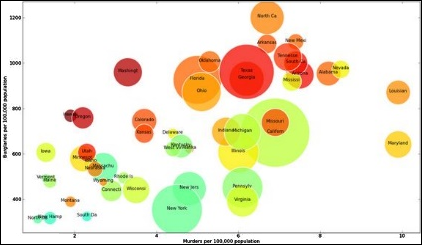
FIGURE 8-9: A bubble chart.
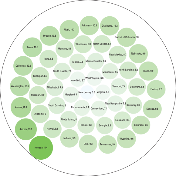
FIGURE 8-10: A packed circle diagram.
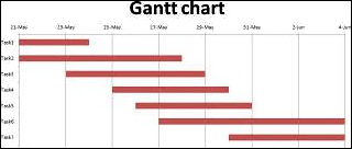
FIGURE 8-11: A Gantt chart.
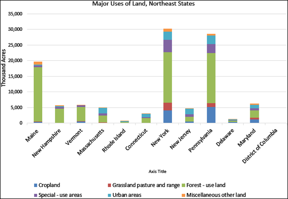
FIGURE 8-12: A stacked chart.
Statistical plots
Statistical plots, which show the results of statistical analyses, are usually useful only to a deeply analytical audience (and aren’t useful for making data art). Your statistical-plot choices are described in this list:
-
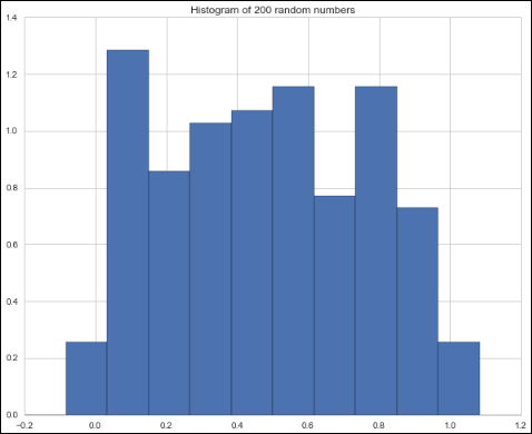
Histogram: A diagram that plots a variable’s frequency and distribution as rectangles on a chart, a histogram (see Figure 8-15) can help you quickly get a handle on the distribution and frequency of data in a dataset.
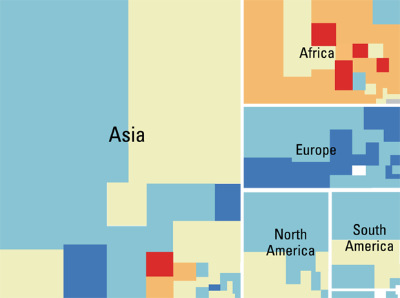
FIGURE 8-13: A tree map.

FIGURE 8-14: A simple word cloud.
 Get comfortable with histograms. You’ll see a lot of them in the course of making statistical analyses.
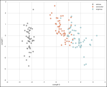
 - Scatterplot: A terrific way to quickly uncover significant trends and outliers in a dataset, a scatterplot plots data points according to their x- and y-values in order to visually reveal any significant patterns. (See Figure 8-16.) If you use data storytelling or data showcasing, start by generating a quick scatterplot to get a feel for areas in the dataset that may be interesting — areas that can potentially uncover significant relationships or yield persuasive stories.
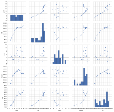
- Scatterplot matrix: A good choice when you want to explore the relationships between several variables, a scatterplot matrix places a number of related scatterplots in a visual series that shows correlations between multiple variables, as shown in Figure 8-17. Discovering and verifying relationships between variables can help you to identify clusters among variables and identify oddball outliers in your dataset.
Source: Lynda.com, Python for DS
FIGURE 8-15: A histogram.
Source: Lynda.com, Python for DS
FIGURE 8-16: A scatterplot.
Source: Lynda.com, Python for DS
FIGURE 8-17: A scatterplot matrix.
Topology structures
Topology is the practice of using geometric structures to describe and model the relationships and connectedness between entities and variables in a dataset. You need to understand basic topology structures so that you can accurately structure your visual display to match the fundamental underlying structure of the concepts you’re representing.
The following list describes a series of topological structures that are popular in data science:
- Linear topological structures: Representing a pure one-to-one relationship, linear topological structures are often used in data visualizations that depict time-series flow patterns. Any process that can occur only by way of a sequential series of dependent events is linear (see Figure 8-18), and you can effectively represent it by using this underlying topological structure.

FIGURE 8-18: A linear topology.
-
Graph models: These kinds of models underlie group communication networks and traffic flow patterns. You can use graph topology to represent many-to-many relationships (see Figure 8-19), like those that form the basis of social media platforms.
 In a many-to-many relationship structure, each variable or entity has more than one link to the other variables or entities in that same dataset.
 - Tree network topology: This topology represents a hierarchical classification, where a network is distributed in top-down order — nodes act as receivers and distributors of connections, and lines represent the connections between nodes. End nodes act only as receivers and not as distributors. (See Figure 8-20.) Hierarchical classification underlies clustering and machine learning methodologies in data science. Tree network structures can represent one-to-many relationships, such as the ones that underlie a family tree or a taxonomy structure.

FIGURE 8-19: A graph mesh network topology.
Spatial plots and maps
Spatial plots and maps are two different ways of visualizing spatial data. A map is just a plain figure that represents the location, shape, and size of features on the face of the earth. A spatial plot, which is visually more complex than a map, shows the values for — and location distribution of — a spatial feature’s attributes.

FIGURE 8-20: A hierarchical tree topology.
The following list describes a few types of spatial plots and maps that are commonly used in data visualization:
- Cloropleth: Despite its fancy name, a Cloropleth map is really just spatial data plotted out according to area boundary polygons rather than by point, line, or raster coverage. To better understand what I mean, look at Figure 8-21. On this map, each state boundary represents an area boundary polygon. The color and shade of the area within each boundary represents the relative value of the attribute for that state — where red areas have a higher attribute value and blue areas have a smaller attribute value.
- Point: Composed of spatial data that is plotted out according to specific point locations, a point map presents data in a graphical point form (see Figure 8-22) rather than in a polygon, line, or raster surface format.
- Raster surface: This spatial map can be anything from a satellite image map to a surface coverage with values that have been interpolated from underlying spatial data points. (See Figure 8-23.)

Source: Lynda.com, Python for DS
FIGURE 8-21: A Cloropleth map.
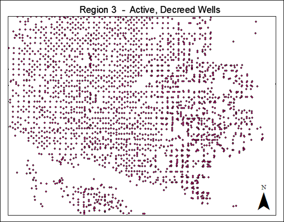
FIGURE 8-22: A point map.
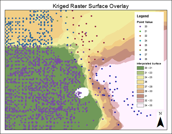
FIGURE 8-23: A raster surface map.
Testing Data Graphics
Your data visualizations must convey clear and powerful visual messages. To make that happen, you have to test various data graphics and select only the most effective ones to include in the final data visualization. For example, the two data graphics shown in Figure 8-24 represent exactly the same statistic.
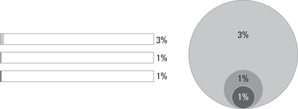
FIGURE 8-24: Here you see the importance of selecting effective data graphics.
Notice how the data graphic on the right does a much better job of visually emphasizing the difference in numeric values? You should always test different data graphics, to make sure that you use the one that most clearly and effectively displays your data. The graphic on the left is not effective. To choose only the most effective data graphics for inclusion in your data visualization, simply follow these four steps:
- Make a list of the questions that your data is meant to answer.
- Determine the data visualization type: data storytelling, data showcasing, or data art.
- Select options from among appropriate data graphic types for that type of data visualization.
- Test those data graphics with your data — see for yourself which graphic type displays the most clear and obvious answers to your questions.
Adding Context
Once you know exactly which data graphics you’ll use, you need to decide whether and how you’ll create the necessary context to add more meaning to the data visualization. Adding context helps people understand the value and relative significance of the information your data visualization conveys. Adding context to calculating, exacting data visualization styles helps to create a sense of relative perspective, but in pure data art you may consider omitting additional context. That’s because, with data art, you’re only trying to make a single point and you don’t want to add information that would distract from that point.
Creating context with data
In data showcasing, you should include relevant contextual data for the key metrics shown in your data visualization — in a situation where you’re creating a data visualization that describes conversion rates for e-commerce sales, for example. The key metric would be represented by the percentage of users who convert to customers by making a purchase. Contextual data that’s relevant to this metric might include shopping cart abandonment rates, average number of sessions before a user makes a purchase, average number of pages visited before making a purchase, or specific pages that are visited before a customer decides to convert. This sort of contextual information helps viewers understand the “why and how” behind sales conversions.
Creating context with annotations
Sometimes, you can more appropriately create context by including annotations that provide a header and a small description of the context of the data that’s shown. (See Figure 8-25.) This method of creating context is most appropriate for data storytelling or data showcasing. Good annotation is helpful to both analytical and non-analytical audiences alike.

Source: Lynda.com, Python for DS
FIGURE 8-25: Using annotation to create context.
Creating context with graphical elements
Another effective way to create context in a data visualization is to include graphical elements that convey the relative significance of the data. Such graphical elements include moving average trend lines, single-value alerts, target trend lines (as shown in Figure 8-26), and predictive benchmarks.
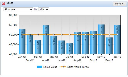
FIGURE 8-26: Using graphical elements to create context.
 This book introduces only the most commonly used graphic types (among hundreds that are available). Don’t wander too far off the beaten path. The further you stray from familiar graphics, the harder it becomes for people to understand the information you’re trying to convey.