Chapter 1
Learning Basic Data-Analysis Techniques
IN THIS CHAPTER
 Learning about data analysis
Analyzing data by applying conditional formatting
Adding subtotals to summarize data
Grouping related data
Combining data from multiple worksheets
You are awash in data. Information multiplies around you so fast that you wonder how to make sense of it all. I know, you say, I can paste the data into Excel. That way, you’ve at least got the data nicely arranged in the worksheet cells, and you can add a little formatting to make things somewhat palatable. That’s a fine start, but you’re often called upon to do more with your data than make it merely presentable. Your boss, your customer, or perhaps just your curiosity requires you to divine some inner meaning from the jumble of numbers and text that litter your workbooks. In other words, you need to analyze your data to see what nuggets of understanding you can unearth.
This chapter gets you started down that data-analysis path by exploring a few straightforward but very useful analytic techniques. After discovering what data analysis entails, you investigate a number of Excel data-analysis techniques, including conditional formatting, data bars, color scales, and icon sets. From there, you dive into some useful methods for summarizing your data, including subtotals, grouping, and consolidation. Before you know it, that untamed wilderness of a worksheet will be nicely groomed and landscaped.
What Is Data Analysis, Anyway?
That’s an excellent question! Here’s an answer that I unpack for you as I go along: Data analysis is the application of tools and techniques to organize, study, reach conclusions and sometimes also make predictions about a specific collection of information.
For example, a sales manager might use data analysis to study the sales history of a product, determine the overall trend, and produce a forecast of future sales. A scientist might use data analysis to study experimental findings and determine the statistical significance of the results. A family might use data analysis to find the maximum mortgage it can afford or how much it must put aside each month to finance retirement or the kids’ education.
Cooking raw data
The point of data analysis is to understand information on some deeper, more meaningful level. By definition, raw data is a mere collection of facts that by themselves tell you little or nothing of any importance. To gain some understanding of the data, you must manipulate the data in some meaningful way. The purpose of manipulating data can be something as simple as finding the sum or average of a column of numbers or as complex as employing a full-scale regression analysis to determine the underlying trend of a range of values. Both are examples of data analysis, and Excel offers a number of tools — from the straightforward to the sophisticated — to meet even the most demanding needs.
Dealing with data
The “data” part of data analysis is a collection of numbers, dates, and text that represents the raw information you have to work with. In Excel, this data resides inside a worksheet, which makes the data available for you to apply Excel’s satisfyingly large array of data-analysis tools.
Most data-analysis projects involve large amounts of data, and the fastest and most accurate way to get that data onto a worksheet is to import it from a non-Excel data source. In the simplest scenario, you can copy the data — from a text file, a Word table, or an Access datasheet — and then paste it into a worksheet. However, most business and scientific data is stored in large databases, and Excel offers tools to import the data you need into your worksheet. I talk about all this in more detail later in the book.
After you have your data in the worksheet, you can leave it as a regular range and still apply many data-analysis techniques to the data. However, if you convert the range into a table, Excel treats the data as a simple database and enables you to apply a number of database-specific analysis techniques to the table.
Building data models
In many cases, you perform data analysis on worksheet values by organizing those values into a data model, a collection of cells designed as a worksheet version of some real-world concept or scenario. The model includes not only the raw data but also one or more cells that represent some analysis of the data. For example, a mortgage amortization model would have the mortgage data — interest rate, principal, and term — and cells that calculate the payment, principal, and interest over the term. For such calculations, you use formulas and Excel’s built-in worksheet functions.
Performing what-if analysis
One of the most common data-analysis techniques is what-if analysis, for which you set up worksheet models to analyze hypothetical situations. The “what-if” part means that these situations usually come in the form of a question: “What happens to the monthly payment if the interest rate goes up by 2 percent?” “What will the sales be if you increase the advertising budget by 10 percent?” Excel offers four what-if analysis tools: data tables, Goal Seek, Solver, and scenarios, all of which I cover in this book.
Analyzing Data with Conditional Formatting
Many Excel worksheets contain hundreds of data values. You could try to make sense of such largish sets of data by creating complex formulas and wielding Excel’s powerful data-analysis tools. However, just as you wouldn’t use a steamroller to crush a tin can, sometimes these sophisticated techniques are too much tool for the job. For example, what if all you want are answers to simple questions such as the following:
- Which cell values are less than 0?
- What are the top 10 values?
- Which cell values are above average, and which are below average?
These simple questions aren’t easy to answer just by glancing at the worksheet, and the more numbers you’re dealing with, the harder it gets. To help you “eyeball” your worksheets and answer these and similar questions, Excel lets you apply conditional formatting to the cells. This is a special format that Excel applies only to cells that satisfy some condition, which Excel calls a rule. For example, you could apply formatting to show all the negative values in a red font, or you could apply a filter to show only the top 10 values.
Highlighting cells that meet some criteria
A conditional format is formatting that Excel applies only to cells that meet the criteria you specify. For example, you can tell Excel to apply the formatting only if a cell’s value is greater or less than some specified amount, between two specified values, or equal to some value. You can also look for cells that contain specified text, dates that occur during a specified time frame, and more.
When you set up your conditional format, you can specify the font, border, and background pattern. This formatting helps to ensure that the cells that meet your criteria stand out from the other cells in the range. Here are the steps to follow:
-
Select the range you want to work with.
Just select the data values you want to format. You don’t have to (in fact, you shouldn’t) select any surrounding data.
- Choose Home ⇒ Conditional Formatting.
-
Choose Highlight Cells Rules and then select the rule you want to use for the condition.
You have six rules to play around with:
- Greater than: Applies the conditional format to cells that have a value larger than a value that you specify.
- Less than: Applies the conditional format to cells that have a value smaller than a value that you specify.
- Between: Applies the conditional format to cells that have a value that is greater than or equal to a minimum value that you specify and less than or equal to a maximum value that you specify.
- Equal To: Applies the conditional format to cells that have a value that is the same as a value that you specify.
- Text that Contains: Applies the conditional format to cells that include the text that you specify.
- A Date Occurring: Applies the conditional format to cells that have a date value that meets the condition that you specify (such as Yesterday, Last Week, or Next Month).
(There’s a seventh rule here — Duplicate Values — that I cover later in this chapter.) A dialog box appears, the name of which depends on the rule you click in Step 3. For example, Figure 1-1 shows the dialog box for the Greater Than rule.
-
Type the value to use for the condition.
You can also click the button that appears to the right of the text box and then select a worksheet cell that contains the value. Also, depending on the operator, you might need to specify two values.
-
Use the drop-down list to select the formatting to apply to cells that match your condition.
If you’re feeling creative, you can make up your own format by selecting the Custom Format command.
-
Click OK.
Excel applies the formatting to cells that meet the condition you specified.
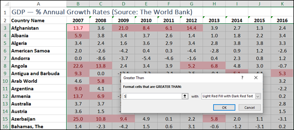
FIGURE 1-1: The Greater Than dialog box with some highlighted values.
 Excel enables you to specify multiple conditional formats. For example, you can set up one condition for cells that are greater than some value, and a separate condition for cells that are less than some other value. You can apply unique formats to each condition. Follow the same steps to configure the new condition.
Showing pesky duplicate values
You use conditional formatting mostly to highlight numbers greater than or less than some value, or dates occurring within some range. However, you can also use conditional formatting to look for duplicate values in a range. Why would you want to do that? The main reason is that many range or table columns require unique values. For example, a column of student IDs or part numbers shouldn’t have duplicates.
Unfortunately, scanning such numbers and picking out the repeat values is hard. Not to worry! With conditional formatting, you can specify a font, border, and background pattern that ensures that any duplicate cells in a range or table stand out from the other cells. Here’s what you do:
- Select the range that you want to check for duplicates.
- Choose Home ⇒ Conditional Formatting.
-
Choose Highlight Cells Rules ⇒ Duplicate Values.
The Duplicate Values dialog box appears. The left drop-down list has Duplicates selected by default, as shown in Figure 1-2. However, if you want to highlight all the unique values instead of the duplicates, select Unique from this list.
-
Use the right drop-down list to select the formatting to apply to the cells with duplicate values.
You can create your own format by choosing the Custom Format command.
-
Click OK.
Excel applies the formatting to any cells that have duplicate values in the range.
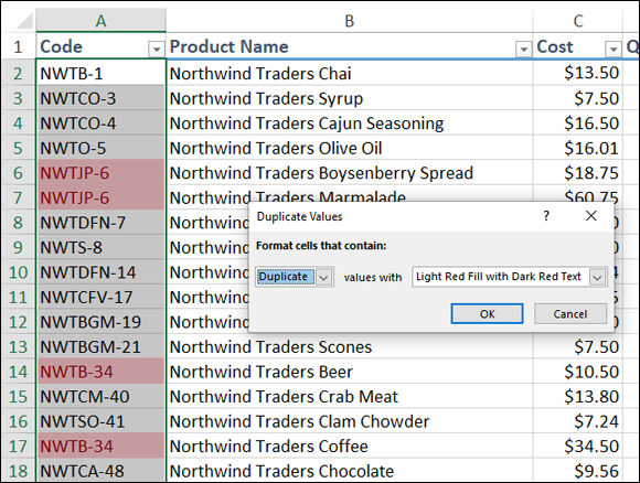
FIGURE 1-2: Use the Duplicate Values rule to highlight worksheet duplicates.
Highlighting the top or bottom values in a range
When analyzing worksheet data, looking for items that stand out from the norm is often useful. For example, you might want to know which sales reps sold the most last year, or which departments had the lowest gross margins. To quickly and easily view the extreme values in a range, you can apply a conditional format to the top or bottom values of that range.
You can apply such a format by setting up a top/bottom rule, in which Excel applies a conditional format to those items that are at the top or bottom of a range of values. For the top or bottom values, you can specify a number, such as the top 5 or 10, or a percentage, such as the bottom 20 percent. Here’s how it works:
- Select the range you want to work with.
- Choose Home ⇒ Conditional Formatting.
-
Choose Top/Bottom Rules and then select the type of rule you want to create.
You have six rules to mess with:
- Top 10 Items: Applies the conditional format to cells that rank in the top X, where X is a number that you specify (the default is 10).
- Top 10 %: Applies the conditional format to cells that rank in the top X %, where X is a number that you specify (the default is 10).
- Bottom 10 Items: Applies the conditional format to cells that rank in the bottom X, where X is a number that you specify (the default is 10).
- Bottom 10 %: Applies the conditional format to cells that rank in the bottom X %, where X is a number that you specify (the default is 10).
- Above Average: Applies the conditional format to cells that rank above the average value of the range.
- Below Average: Applies the conditional format to cells that rank below the average value of the range.
A dialog box appears, the name of which depends on the rule that you selected in Step 3. For example, Figure 1-3 shows the dialog box for the Top Ten Items rule.
-
Type the value to use for the condition.
You can also click the button that appears to the right of the text box and then select a worksheet cell that contains the value. Note that you don’t need to enter a value for the Above Average and Below Average rules.
- Use the drop-down list to select the formatting to apply to cells that match your condition.
-
Click OK.
Excel applies the formatting to cells that meet the condition you specified.
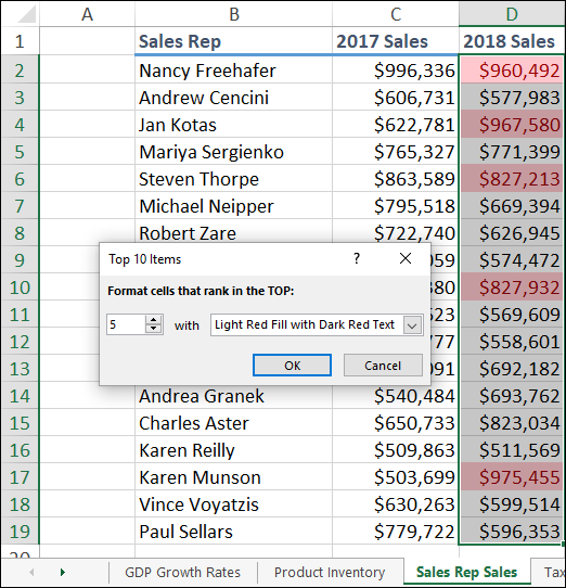
FIGURE 1-3: The Top 10 Items dialog box with the top 5 values highlighted.
 When you set up your top/bottom rule, select a format that ensures that the cells that meet your criteria stand out from the other cells in the range. If none of the predefined formats suits your needs, you can always choose Custom Format and then use the Format Cells dialog box to create a suitable formatting combination. Use the Font, Border, and Fill tabs to specify the formatting you want to apply, and then click OK.
Analyzing cell values with data bars
In some data-analysis scenarios, you might be interested more in the relative values within a range than the absolute values. For example, if you have a table of products that includes a column showing unit sales, you might want to compare the relative sales of all the products.
Comparing relative values is often easiest if you visualize the values, and one of the easiest ways to visualize data in Excel is to use data bars, a data visualization feature that applies colored, horizontal bars to each cell in a range of values; these bars appear “behind” (that is, in the background of) the values in the range. The length of the data bar that appears in each cell depends on the value in that cell: the larger the value, the longer the data bar.
Follow these steps to apply data bars to a range:
- Select the range you want to work with.
- Choose Home ⇒ Conditional Formatting.
-
Choose Data Bars and then select the fill type of data bars you want to create.
You can apply two type of data bars:
- Gradient fill: The data bars begin with a solid color and then gradually fade to a lighter color.
- Solid fill: The data bars are a solid color.
Excel applies the data bars to each cell in the range. Figure 1-4 shows an example in the Units column.
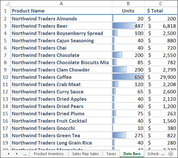
FIGURE 1-4: The higher the value, the longer the data bar.
If your range includes right-aligned values, the gradient-fill data bars are a better choice than the solid-fill data bars because even the longest gradient-fill bars fade to white toward the right edge of the cell, so your range values should mostly appear on a white background, making them easier to read.
Analyzing cell values with color scales
Getting some idea about the overall distribution of values in a range is often useful. For example, you might want to know whether a range has many low values and just a few high values. Color scales can help you analyze your data in this way. A color scale compares the relative values in a range by applying shading to each cell, where the color reflects each cell’s value.
Color scales can also tell you whether your data includes outliers: values that are much higher or lower than the others. Similarly, color scales can help you make value judgments about your data. For example, high sales and low numbers of product defects are good, whereas low margins and high employee turnover rates are bad.
- Select the range you want to format.
- Choose Home ⇒ Conditional Formatting.
-
Choose Color Scales and then select the color scale that has the color scheme you want to apply.
The color scales come in two varieties: three-color scales and two-color scales. If your goal is to look for outliers, go with a three-color scale because it helps the outliers stand out more. A three-color scale is also useful if you want to make value judgments about your data, because you can assign your own values to the colors (such as positive, neutral, and negative). Use a two-color scale when you want to look for patterns in the data, because a two-color scale offers less contrast.
Excel applies the color scale to each cell in your selected range.
Analyzing cell values with icon sets
Symbols that have common or well-known associations are often useful for analyzing large amounts of data. For example, a check mark usually means that something is good or finished or acceptable, whereas an X means that something is bad or unfinished or unacceptable. Similarly, a green circle is positive, whereas a red circle is negative (think traffic lights). Excel puts these and other symbolic associations to good use with the icon sets feature. You use icon sets to visualize the relative values of cells in a range.
With icon sets, Excel adds a particular icon to each cell in the range, and that icon tells you something about the cell’s value relative to the rest of the range. For example, the highest values might be assigned an upward-pointing arrow, the lowest values a downward-pointing arrow, and the values in between a horizontal arrow.
Here’s how you apply an icon set to a range:
- Select the range you want to format with an icon set.
- Choose Home ⇒ Conditional Formatting.
-
Choose Icon Sets and then select the type of icon set you want to apply.
The icon sets come in four categories:
- Directional: Indicate trends and data movement
- Shapes: Point out the high (green) and low (red) values in the range
- Indicators: Add value judgments
- Ratings: Show where each cell resides in the overall range of data values
Excel applies the icons to each cell in the range, as shown in Figure 1-5.
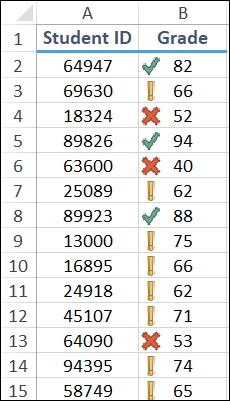
FIGURE 1-5: Excel applies an icon based on the each cell’s value.
Creating a custom conditional formatting rule
The conditional formatting rules in Excel — highlight cells rules, top/bottom rules, data bars, color scales, and icon sets — offer an easy way to analyze data through visualization. However, you can also tailor your formatting-based data analysis by creating a custom conditional formatting rule that suits how you want to analyze and present the data.
Custom conditional formatting rules are ideal for situations in which the normal value judgments — that is, that higher values are good and lower values are bad — don’t apply. For example, although the icon sets assume that higher values are more positive than lower values, that’s not always true. In a database of product defects, for example, lower values are better than higher ones. Similarly, data bars are based on the relative numeric values in a range, but you might prefer to base them on the relative percentages or on percentile rankings.
To get the type of data analysis you prefer, follow these steps to create a custom conditional formatting rule and apply it to your range:
- Select the range you want to analyze with a custom conditional formatting rule.
-
Choose Home ⇒ Conditional Formatting ⇒ New Rule.
The New Formatting Rule dialog box appears.
- In the Select a Rule Type box, select the type of rule you want to create.
-
Use the controls in the Edit the Rule Description box to edit the rule’s style and formatting.
The controls you see depend on the rule type you selected in Step 3. For example, if you select Icon Sets, you see the controls shown in Figure 1-6.
With Icon Sets, select Reverse Icon Order if you want to reverse the normal icon assignments, as shown in Figure 1-6. -
Click OK.
Excel applies the conditional formatting to each cell in the range.
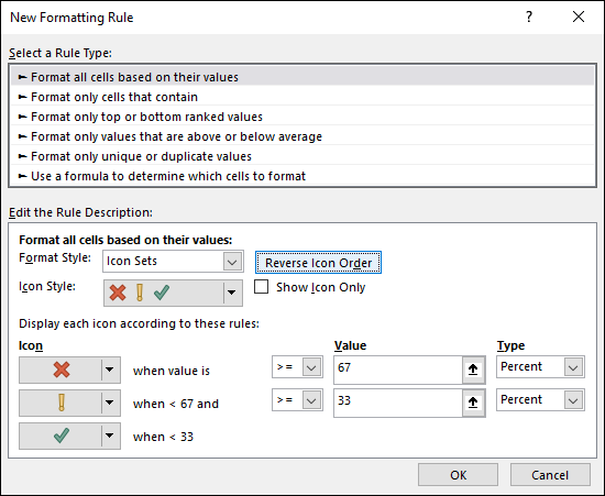
FIGURE 1-6: Use the New Formatting Rule dialog box to create a custom rule.
Editing a conditional formatting rule
Conditional formatting rules are excellent data visualization tools that can make analyzing your data easier and faster. Whether you're highlighting cells based on criteria, showing cells that are in the top or bottom of the range, or using features such as data bars, color scales, and icon sets, conditional formatting enables you to interpret your data quickly.
But it doesn't follow that all your conditional formatting experiments will be successful ones. For example, you might find that the conditional formatting you used just isn’t working out because it doesn’t let you visualize your data the way you’d hoped. Similarly, a change in data might require a change in the condition you used. Whatever the reason, you can edit your conditional formatting rules to ensure that you get the best visualization for your data. Here’s how:
-
Select a cell in the range that includes the conditional formatting rule you want to edit.
You can select a single cell, multiple cells, or the entire range.
-
Choose Home ⇒ Conditional Formatting ⇒ Manage Rules.
The Conditional Formatting Rules Manager dialog box appears, as shown in Figure 1-7.
-
Select the rule you want to modify.
If you don’t see the rule, click the Show Formatting Rules For drop-down list and then select This Worksheet. The list that appears shows you every conditional formatting rule that you’ve applied in the current worksheet.
-
Choose Edit Rule.
The Edit Formatting Rule dialog box appears.
- Make your changes to the rule.
-
Click OK.
Excel returns you to the Conditional Formatting Rules Manager dialog box.
-
Select OK.
Excel updates the conditional formatting.
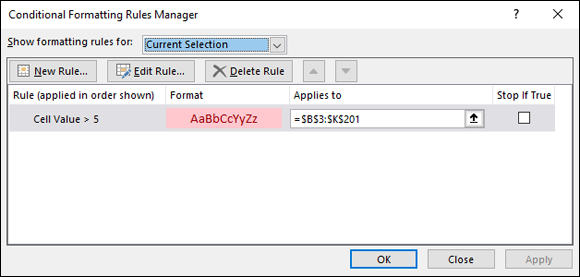
FIGURE 1-7: Use the Conditional Formatting Rules Manager to edit your rules.
 If you have multiple conditional formatting rules applied to a range, the visualization is affected by the order in which Excel applies the rules. Specifically, if a cell already has a conditional format applied, Excel does not overwrite that format with a new one. For example, suppose that you have two conditional formatting rules applied to a list of student grades: one for grades over 90 and one for grades over 80. If you apply the over-80 conditional format first, Excel will never apply the over-90 format because those values are already covered by the over-80 format. The solution is to change the order of the rule. In the Conditional Formatting Rules Manager dialog box, select the rule that you want to modify and then click the Move Up and Move Down button to set the order you want. If you want Excel to stop processing the rest of the rules after it has applied a particular rule, select that rule’s Stop If True check box.
Removing conditional formatting rules
Conditional formatting rules are useful critters, but they don’t work in all scenarios. For example, if your data is essentially random, conditional formatting rules won’t magically produce patterns in that data. You might also find that conditional formatting isn’t helpful for certain collections of data or certain types of data. Or, you might find conditional formatting useful for getting a handle on your data set but then prefer to remove the formatting.
Similarly, although the data visualization aspect of conditional formatting rules is part of the appeal of this Excel feature, as with all things visual, you can overdo it. That is, you might end up with a worksheet that has multiple conditional formatting rules and therefore some unattractive and confusing combinations of highlighted cells, data bars, color scales, and icon sets.
If, for whatever reason, you find that a range’s conditional formatting isn’t helpful or no longer required, you can remove the conditional formatting from that range by following these steps:
-
Select a cell in the range that includes the conditional formatting rule you want to trash.
You can select a single cell, multiple cells, or the entire range.
-
Choose Home ⇒ Conditional Formatting ⇒ Manage Rules.
The Conditional Formatting Rules Manager dialog box appears.
-
Select the rule you want to remove.
If you don’t see the rule, use the Show Formatting Rules For list to select This Worksheet, which tells Excel to display every conditional formatting rule that you’ve applied in the current worksheet.
-
Choose Delete Rule.
Excel removes the rule from the range.
- Click OK.
If you have multiple rules defined and want to remove them all, click the Home tab, choose Conditional Formatting, choose Clear Rules, and then select either Clear Rules from Selected Cells or Clear Rules from Entire Sheet.
Summarizing Data with Subtotals
Although you can use formulas and worksheet functions to summarize your data in various ways — including sums, averages, counts, maximums, and minimums — if you’re in a hurry, or if you just need a quick summary of your data, you can get Excel to do the work for you. The secret here is a feature called automatic subtotals, which are formulas that Excel adds to a worksheet automatically.
Excel sets up automatic subtotals based on data groupings in a selected field. For example, if you ask for subtotals based on the Customer field, Excel runs down the Customer column and creates a new subtotal each time the name changes. To get useful summaries, you should sort the range on the field containing the data groupings you’re interested in.
Follow these steps to summarize your data with subtotals:
- Select a cell within the range you want to subtotal.
-
Choose Data ⇒ Subtotal.
If you don’t see the Subtotal command, choose Outline ⇒ Subtotal. The Subtotal dialog box appears.
- Use the At Each Change In list to select the column you want to use to group the subtotals.
- In the Use Function list, select Sum.
-
In the Add Subtotal To list, select the check box for the column you want to summarize.
Figure 1-8 shows an example where at each change in the Customer field, the sum of that customer’s Total cells is displayed.
-
Click OK.
Excel calculates the subtotals and adds them into the range. Note, too, that Excel also adds outline symbols to the range. I talk about outlining in a bit more detail in the next section.
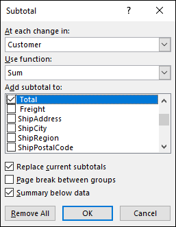
FIGURE 1-8: Use the Subtotal dialog box to apply subtotals to a range.
Figure 1-9 shows some subtotals applied to a range.
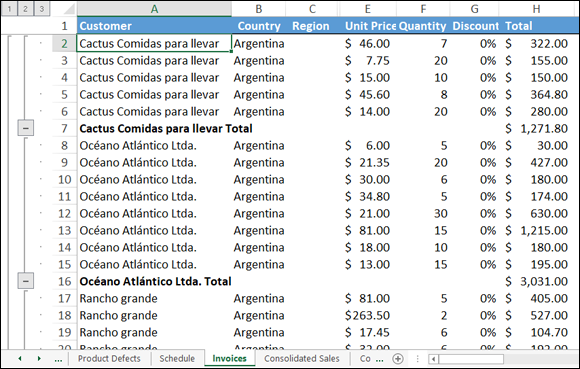
FIGURE 1-9: Some subtotals applied to the Total column for each customer.
Note that in the phrase, automatic subtotals, the word subtotals is misleading because it implies that you can only summarize your data with totals. Not even close! Using “subtotals,” you can also count the values (all the values or just the numeric values), calculate the average of the values, determine the maximum or minimum value, and calculate the product of the values. For statistical analysis, you can also calculate the standard deviation and variance, both of a sample and of a population. To change the summary calculation, follow Steps 1 to 3, open the Use Function drop-down list, and then select the function you want to use for the summary.
Grouping Related Data
To help you analyze a worksheet, you can control a worksheet range display by grouping the data based on the worksheet formulas and data. Grouping the data creates a worksheet outline, which works similarly to the outline feature in Microsoft Word. In a worksheet outline, you can collapse sections of the sheet to display only summary cells (such as quarterly or regional totals), or expand hidden sections to show the underlying detail. Note that when you add subtotals to a range, as I describe in the previous section, Excel automatically groups the data and displays the outline tools.
Not all worksheets can be grouped, so you need to make sure that your worksheet is a candidate for outlining:
- The worksheet must contain formulas that reference cells or ranges directly adjacent to the formula cell. Worksheets with
SUMfunctions that subtotal cells above or to the left are particularly good candidates for outlining. - There must be a consistent pattern to the direction of the formula references. For example, a worksheet with formulas that always reference cells above or to the left can be outlined. Excel won’t outline a worksheet with, say,
SUMfunctions where some of the range references are above the formula cell and some are below.
Here are the steps to follow group-related data:
- Display the worksheet you want to outline.
-
Choose Data ⇒ Group ⇒ Auto Outline.
If you don’t see the Group command, choose Outline ⇒ Group. Excel outlines the worksheet data.
As pointed out in Figure 1-10, Excel uses level bars to indicate the grouped ranges and level numbers to indicate the various levels of the underlying data available in the outline.

FIGURE 1-10: When you group a range, Excel displays its outlining tools.
Here are some ways you can use the outline to control the range display:
- Click a Collapse button to hide the range indicated by the level bar.
- Select a level number to collapse multiple ranges that are on the same outline level.
- Click an Expand button to view a collapsed range again.
- Select a level number to show multiple collapsed ranges that are on the same outline level.
Consolidating Data from Multiple Worksheets
Companies often distribute similar worksheets to multiple departments to capture budget numbers, inventory values, survey data, and so on. Those worksheets must then be combined into a summary report showing company-wide totals. Combining multiple worksheets into a summary report is called consolidating the data.
Sounds like a lot of work, right? It sure is, if you do it manually, so forget that. Instead, Excel can consolidate your data automatically. You can use the Consolidate feature to consolidate the data in either of two ways:
- By position: Excel consolidates the data from two or more worksheets, using the same range coordinates on each sheet. This is the method to use if the worksheets you’re consolidating have an identical layout.
- By category: Excel consolidates the data from two or more worksheets by looking for identical row and column labels in each sheet. This is the method to reach for if the worksheets you’re consolidating have different layouts but common labels.
In both cases, you specify one or more source ranges (the ranges that contain the data you want to consolidate) and a destination range (the range where the consolidated data will appear).
Consolidating by position
Here are the steps to trudge through if you want to consolidate multiple worksheets by position:
-
Create a new worksheet that uses the same layout — including row and column labels — as the sheets you want to consolidate.
The identical layout in this new worksheet is your destination range.
-
If necessary, open the workbooks that contain the worksheets you want to consolidate.
If the worksheets you want to consolidate are in the current workbook, you can skip this step.
- In the new worksheet from Step 1, select the upper-left corner of the destination range.
-
Choose Data ⇒ Consolidate.
The Consolidate dialog box appears.
- Use the Function list to select the summary function you want to use.
- In the Reference text box, select one of the ranges you want to consolidate.
-
Click Add.
Excel adds the range to the All References list, as shown in Figure 1-11.
- Repeat Steps 6 and 7 to add all the consolidation ranges.
-
Click OK.
Excel consolidates the data from the source ranges and displays the summary in the destination range.
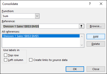
FIGURE 1-11: Consolidate multiple worksheets by adding a range from each one.
If the source data changes, you probably want to reflect those changes in the consolidation worksheet. Rather than run the entire consolidation over again, a much easier solution is to select the Create Links to Source Data check box in the Consolidate dialog box. You can then update the consolidation worksheet by choosing Data ⇒ Refresh All.
Consolidating by category
Here are the steps to follow to consolidate multiple worksheets by category:
-
Create a new worksheet for the consolidation.
You use this worksheet to specify your destination range.
-
If necessary, open the workbooks that contain the worksheets you want to consolidate.
If the worksheets you want to consolidate are in the current workbook, you can skip this step.
- In the new worksheet from Step 1, select the upper-left corner of the destination range.
-
Choose Data ⇒ Consolidate.
The Consolidate dialog box appears.
- In the Function list, select the summary function you want to use.
-
In the Reference text box, select one of the ranges you want to consolidate.
When you’re selecting the range, be sure to include the row and column labels in the range.
-
Click Add.
Excel adds the range to the All References list.
- Repeat Steps 6 and 7 to add all the consolidation ranges.
- If you have labels in the top row of each range, select the Top Row check box.
-
If you have labels in the left-column row of each range, select the Left Column check box.
Figure 1-12 shows a completed version of the Consolidate dialog box.
-
Click OK.
Excel consolidates the data from the source ranges and displays the summary in the destination range.
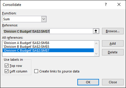
FIGURE 1-12: When consolidating by category, tell Excel where your labels are located.