1 Avengers #4

DAVE GIBBONS
Most of these covers made me buy the issues off the stands at the time, and the ones I didn’t see, I studied and fantasized about until I did manage to trade or buy them, years later. When I say fantasized, I mean that I imagined what the story inside might be like. As we all know, that fantasy could sometimes prove better than the reality. Happily, with all of these images, that was not the case. Not only are they great covers but they all covered great comics.
In that case, let me tell you what excited the child in me then and still thrills the elder statesman of comics I have become.
1 Avengers #4
Marvel had an abortive attempt at reviving Cap in an issue of Strange Tales, so we were all primed for his real reappearance. The Avengers title was still fresh enough that every issue was novel and exciting, which made the addition of Cap front and center almost too much to bear. Penciler Jack Kirby takes a viewpoint that makes Cap dwarf all his fellow Avengers—even Giant-Man—and gives us a glimpse of his fellow Golden Age stablemate the Sub-Mariner. Paul Reinman’s jagged ink line adds grit, and whatever unsung colorist opted for a white background adds the final oomph to an irresistible design.
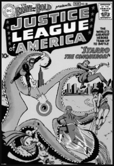
I’ve referred to the appearance of house ads featuring this cover as being the “Big Bang” moment of comics. This was the instant when the individual DC characters coalesced into creatures of the same universe. This almost diagrammatic design is a kind of reverse explosion, with Starro’s markings and the tiny heroes pointing inward toward a bull’s-eye, literally Ground Zero for all the multiverses and crises to come. Penciler Mike Sekowsky looks like he might have been working over a Carmine Infantino layout and his impressionistic tendencies are gorgeously reined in and sharpened by Murphy Anderson’s inks.
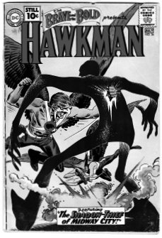
3 Brave and the Bold #36
This and the JLA cover were the only issues I didn’t buy off the stand at the time, due to the vagaries of importation into the UK. I lusted after it for years, admiring artist Joe Kubert’s dynamic design and gutsy inking style, which always stood out from the calmer renderings of most of editor Julius Schwartz’s stable. I was also fascinated by the technical innovation, as it was then, of the Shadow Thief being printed without a black line—an early example of what I came to know later professionally as a “color hold.” I finally got the issue in a trade for some old Detective Comics, I believe; whilst I eventually, and improbably, bought the JLA issue at a convention in France.
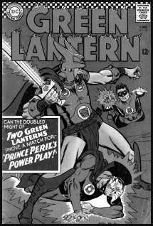
I’d stopped buying comics a few years before this issue appeared, preferring to spend my money on drinks, girls, and scooters. I was standing in line to buy some cigarettes when this cover jumped out at me. Things had clearly moved on since I last saw a Green Lantern comic; Gil Kane’s figures leaped into action in a way they never had in the staid early sixties and even Sid Greene’s fussy inking and a dark gray background couldn’t sap the primal energy. When I noticed the Golden Age Lantern was in the issue, too, I was sold. To my shame, I think I mumbled something about it being for a nonexistent kid brother. If I hadn’t seen this cover, I might never have gotten back into comics and my life would today be very different.
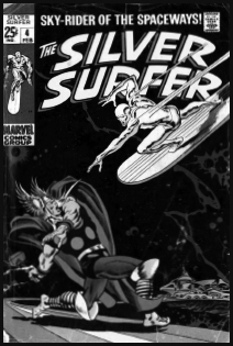
As always, penciler John Buscema makes it all look so easy. His wonderful grasp of human anatomy aside, it’s the simplicity and directness of the composition that makes this so powerful. The Surfer’s ar-rowing in on a diagonal, which continues through Thor’s arms, then curves off along the Rainbow Bridge to Asgard, where an impressionistic zigzag of space stuff returns the eye to the Surfer once more. The curved logo adds an echo of the bridge and its warm colors repeat Thor’s costume while setting off the Surfer’s cold metal skin. Add Sal Buscema’s crisp inking and Stan Lee’s tasteful restraint in not dropping captions onto it and you have as perfect a cover as you’ll ever see.
6 X-Men #1
If the Surfer cover showcases Buscema’s classic draftsmanship and composition, this relatively cluttered image exemplifies penciler Jack Kirby’s exuberance and invention. His instinctive sense of design ties the figures together with the background element of the Angel’s wing and the abstract diagonal line that the unknown colorist has seen as the edge of some kind of red carpet. The captions are distracting but cannot overwhelm the strength of Kirby’s vision.

Dave Gibbons has been playing a major role in the world of comics for more than thirty years. He began his comics career in 1973, when he started to contribute to the magazine 2000 AD. Since then he has drawn and written for all the major publishers in North America and his home country of Great Britain. He has depicted the adventures of Superman, Batman, Dr. Who, Dan Dare, and Green Lantern, among many others. His greatest success came when he collaborated with Alan Moore on the famous Watchmen series for DC Comics in 1986 and 1987, for which he got a Hugo Award. Among his many, many other works are the continuing, award-winning saga of Martha Washington with Frank Miller, Batman versus Predator with Andy Kubert, and World’s Finest with Steve Rude. Recently he released his own graphic novel, The Originals, and wrote the Green Lantern Corps relaunch.