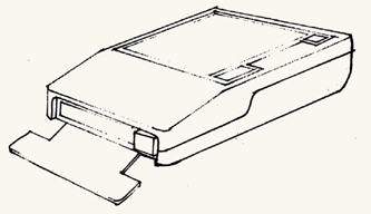
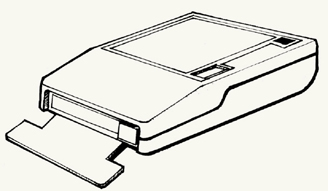
WELCOME TO DRAWING BOOT CAMP. WHETHER YOU ARE JUST STARTING out and learning to sketch for the first time (or since you were a child) or you are more advanced, the approaches presented here will help you develop your basic drawing skills. In this chapter, we will explore fundamental approaches to seeing and sketching elements, forms, and objects, and emphasizing structure. We introduce techniques, methods, and themes that break down the physical world into identifiable form typologies. We’ll start with straight lines and build toward rectangular elements, planes, and cubic forms. This sequence, working from flat graphic marks to complex volumetric representations in space, is essential in building sketching proficiency.
We have included some typologies of visual forms that will help you to use drawing to break down the complexity of the visual/physical world to see inherent structures, patterns, and organization. This is an important skill for designers who must be able to make representations based on what they know about the world and to visualize ideas based on new and creative thought.
These forms are the basis for more complex drawing of objects, environments, symbols, figures, and more. Building a proficiency in these basic forms will enable you to broaden your application of your sketching, working from simple two-dimensional shapes toward constructing the appearance of three-dimensional space.
Our sequence here is intentional; freehand straight lines serve as the structure for cubic forms drawn in perspective, which in turn serve as primitive building blocks for more advanced drawing.
STRAIGHT LINES, SQUARES, planes, and cubes are the primitive building blocks for most drawings. We use straight lines to set boundaries, to establish proportions, and to form all rectilinear shapes. They are also the easiest to draw and the easiest to judge for correctness. Being able to sketch a straight line by hand without the assistance of a ruler or straightedge takes a bit of practice, but once accomplished, you may find new confidence in your drawings. On a sheet of paper, you can practice drawing lines at varying lengths, paying careful attention to deliberately make lines of particular lengths, densities, and thicknesses. This exercise serves as a great way to build muscle memory, the physical memory of the motion involved for drawing a line.
The easiest, most effective way to draw straight horizontal or vertical lines is to draw or “pull” the line toward your body’s center, using your belly button as an imagined end point. Body position and posture are important. The farther away your arm is from your body’s core, the less muscle control you have to maintain accuracy. Pulling toward you—as opposed to pushing away—uses stronger muscle groups within your arm and core to help keep your line straight. Consistent speed and pressure ensure that the line remains uniform in thickness and density from start to finish. Drawing from your shoulder, rather than your wrist, will enable you to engage larger muscle groups to better control your lines. In general, it is best to engage your whole arm while drawing, as this will help you overcome the body’s tendency to move in arcs.
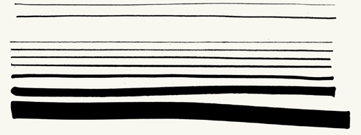
Variation of line weight can be effective in delineating details and surfaces. A thin line weight provides a solid base for a drawing, because a thin line can then be enhanced with thicker pens. The goal of line weight is to define the form in a direct manner with few strokes; scratchy, stuttered lines should be avoided for smooth, controlled line work. Lines should start and end at very specific points to appear clean and descriptive.
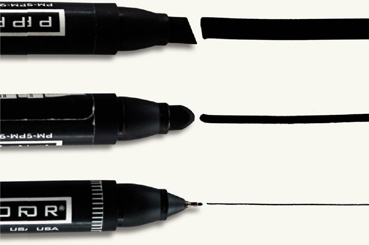
For sketching, .01 and .03 nylon-tip pens will serve as a basis. A .08 pen and a black Prismacolor marker can then be used to offset lines with thickness and density. When drawing, consider the viewing distance of the audience and your drawings’ potential methods of reproduction (scanner, copier, fax, digital camera). Thin lines may read effectively up close (at arm’s length), but heavier, bolder line weights may be necessary if you are presenting drawings to a group at a distance. Similarly, many photocopiers, scanners, and printers have trouble capturing the subtleties in thin line work, thus, enhancement with additional line thickness may ensure a more consistent translation from original drawing to electronic form to printed form.

Scratchy/inconsistent
Stuttered/inconsistent
Offset line weights
Vignette for emphasis

Tonal enhancement
Rendered
 How do I get my lines to stay straight and not wiggle, wobble, arc, or bend?
 Try to relax, and don’t overthink drawing each line. After all, they’re just simple lines. Before you put pen to paper, look at the page and envision a stopping point. Stay focused on that spot, and pull the line toward it; you should end the line right there. Draw from your shoulder, engaging your elbow and keeping your wrist straight.
Once you can draw straight lines of specific lengths, practice making squares and rectangles. These are essential shapes for making frames, callout boxes, screens, and thumbnails for page layouts. Draw them with four distinct lines, lifting the pen off the page at the end of each stroke. To build better muscle memory, alternate between vertical and horizontal strokes, aiming for 90-degree relationships at the corners to avoid “squarecles” (squares with rounded corners) and “L7s” (squares constructed from two drawn strokes that tend to look incomplete).
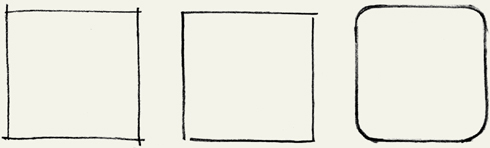
From left to right: square from four lines; L7 (square from two L-shaped lines); squarecle
A good exercise for building proficiency with squares and rectangles is to make a composition of elements on a page in one thin line weight. Play with positioning, composition, overlap, and proximity, but pay careful attention to proportions. Squares must demonstrate square proportions. Next, enhance certain areas with a thicker stroke to visually pull some objects forward and create a sense of depth. Now you can experiment with visual hierarchy, making some forms more apparent than others. You can then use a variety of pens, pencils, and markers to add tone by hatching with parallel lines to practice making quick, confident, and consistent strokes. When hatching, pay careful attention to evenly spacing each hatch line to maintain a uniform tone. Hatching can run horizontally, vertically, or at a slight angle. Avoid cross-hatching that will create open white shapes between the strokes, as this will appear more like a pattern than a consistent tone. This exercise is applicable when creating screens, wireframes, and basic rectilinear shapes. Building proficiency in sketching simple boxes greatly increases speed, improves form, and makes your sketches look crisper.
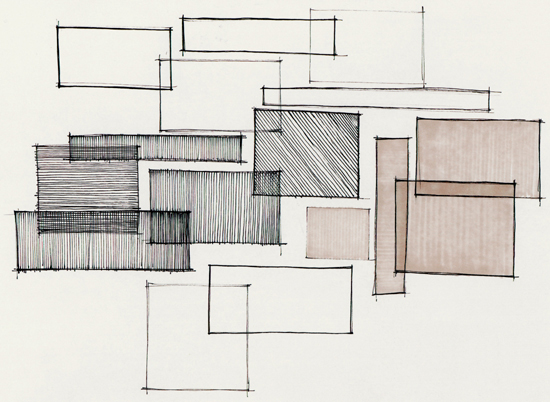
When hatching, pay careful attention to evenly spacing each hatch line to maintain a uniform tone. Hatching can run horizontally, vertically, or at a slight angle.

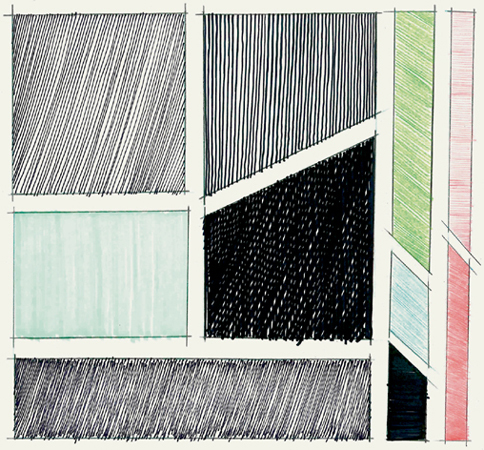
Enhanced line weight
Enhanced line weight with tone
Why do my drawings look “hairy”? How can I make more confident lines and forms?
Over-drawing lines to describe objects makes a drawing look scratchy or “hairy.” If you misdraw a line, go over it once more to correct it. You need not go over numerous times to correct a mistake, as you’ll only draw more attention to it.
What does “wonky” mean, and how do I recognize if my rectilinear forms are wonky?
“Wonky” describes a state of poor or inaccurate construction where 90-degree corners appear to be misshaped and parallel lines appear more divergent than intended. When the intent of the drawing comes into question due to the inaccuracy and someone asks, “You mean, this is a cube?” then chances are you’re drawing is “wonked-out.”
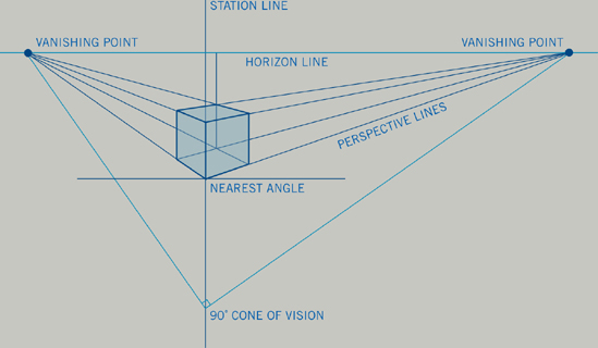
Many designers have the need to sketch three-dimensional objects and to employ conventions of two-point perspective (using vanishing points to create the illusion of three-dimensional space on the page). Building from straight lines and rectilinear forms, you can easily create the illusion of space. We typically use two-point perspective systems to draw objects and to create the illusion of space, because we can more easily craft these abstractions to appear more in sync with the way we perceive the world.
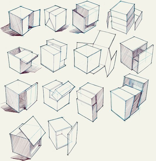
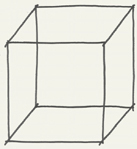
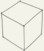
The cube is the fundamental building block for any geometric form in perspective drawing. Knowing how a cube exists in space in proportion makes perspective drawing easier to understand and practice. Basically, a cube is constructed of six sides or planar faces. As previously described, drawing all of these faces will help ensure an accurate cube; this is called “drawing through” to show the hidden lines and structure. In the following text of this section, we will show examples of how planar and cubic construction are used to create a variety of shapes, from complex rectilinear forms to derivative cylindrical and curvilinear ones.
Knowing how to draw a cube will enable you to construct more complex drawings in two-point perspective and use the cube as a unit of measure to scale the subject matter in your drawings appropriately.

Isometric/parallel lines
Two-point perspective
Derivative primitives

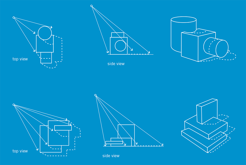
FOLLOW THESE SIMPLE steps for sketching a cube and creating the illusion of three-dimensional space. Once proficient, you should be able to envision a cube before putting pencil to paper and freehand draw a cube at any angle or in any position.
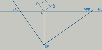
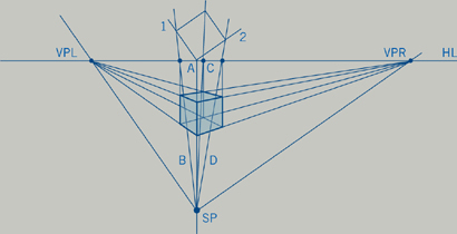
STEP 1: Lay out a horizontal line. This will serve as the horizon line (HL) or the farthest distance you can see on the perceived surface plane within the page space.

STEP 2: Construct a square that touches one corner to horizon line at Point A. This is a mechanical way to establish cubic proportions when you translate this flat form into two-point perspective. Changing the angle of the square to the horizon line will change the angle of the cube to the viewer.

STEP 3: Drop a vertical line from Point A where the square touches the horizon line. Set the station point (SP) on line A; this establishes the limits of the viewing plane. Run lines from the station point to the horizon line to mark vanishing points right and left (VPR and VPL) and establish the field within which you will draw. These lines run parallel to the sides of the square above and set the vanishing points.
STEP 4: Draw lines (B, C, D) from the corners of the square to the station point. These will help determine the proportions for the cube’s sides in step 6.
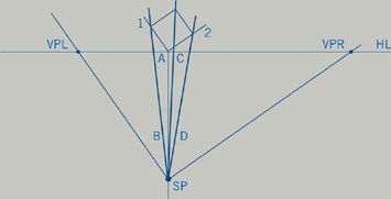
STEP 5: Establish the height and position of the cube in the viewing plane by drawing a vertical line on line A, between the horizon line and the station point. This is the leading edge of the cube and determines its size. From the bottom of that line, draw lines back to the vanishing points to establish the cube’s lower edges.
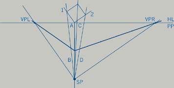
STEP 6: Draw lines from the top of the leading edge back to the vanishing points. Drop vertical lines from the intersection points of lines B, C, and D with the horizon line to establish the vertical edges of the cube. Where these lines intersect the perspective lines, draw lines back to the opposite vanishing points to establish the back edges. Define the bounding line of the cube with a heavier stroke weight (as in the second image that follows).

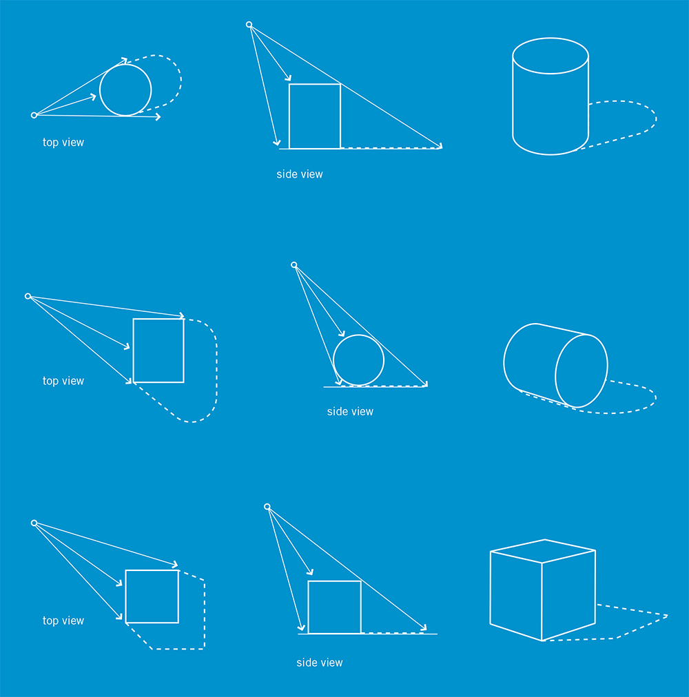
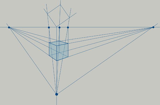
The lower a cube is set on the page from the horizon line, the more of the top you will see. Imagine that the cube is moving toward you in space and is sitting lower in the viewing plane. As it moves closer to you, your vantage will change to have more of a top view. If the cube sits too low on the station line, you’ll notice it will begin to distort.
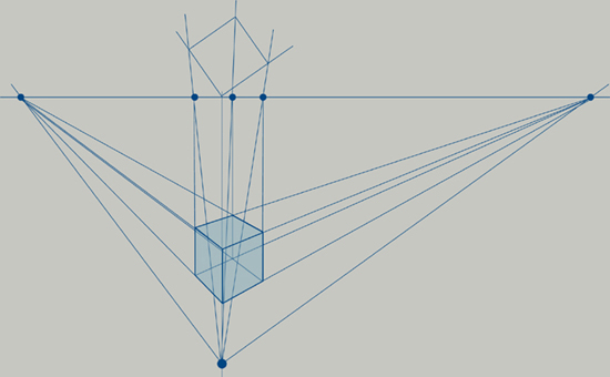
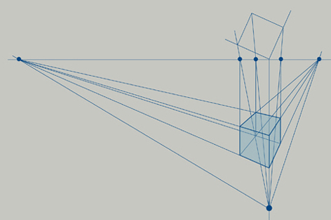
Changing the angle of the square in relation to the horizon line positions the cube differently in space. As you rotate the square on the point at which it touches the horizon line, envision that you are moving the cube around an axis at its leading edge. Notice how the position of the square relative to the horizon line enables you to see more or less of the faces of the cube.

Imagine that the cube is really the plan view of a space or a building. You can project this plan view into perspective using the same method described in the two-point perspective demonstration. Instead of a simple square, map the floor plan of a hypothetical building touching the horizon line. Continue with the same sequence of establishing vanishing points, field of vision, and height for the form. With the addition of more points, lines, and planes in this complex shape, try using tracing paper overlays to construct each step on a different layer. You will be able to see through each layer to the layer below but also slide in an opaque sheet of paper to mask out previous steps to add clarity in the drawing as you go through each step.
As mentioned earlier, the cube is the fundamental building block for any geometric form drawn in perspective; the plane is the primary component of all cubic forms. To practice working in freehand two-point perspective, sketch planes from a variety of angles. Remember to keep the side edges vertical and the horizontally oriented edges converging back in space toward the vanishing points.
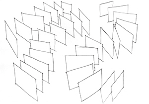
Shown in the following image is a warm-up exercise of sketching planes in space. Note how each plane converges back to a different vanishing point because they are situated in a varied fashion on the imaginary ground plane. Also look carefully to see some poorly constructed planes that tend to diverge when their lines should be converging. The quickest way to check for proper convergence is to measure the back vertical line with a ruler from the bottom corner to the top—it should always be shorter in length than the front most vertical line, or leading edge.
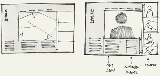
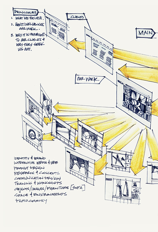
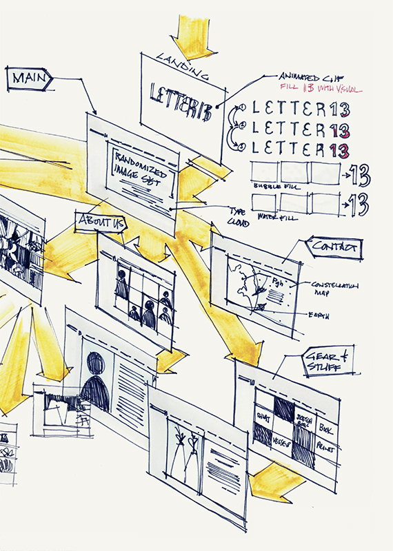
Planes, arrows, and notations are enhancement features in wireframe layouts and information architecture flowcharts that make schematic drawings more visually appealing. Simply sketching each screen from a website or software concept as a plane on an invisible surface using two-point perspective can make for a dynamic sketch that will improve visual impact and enhance overall understanding of the system. When you sketch a digital system (like a website, software, or application), consider where the visual focus should be and build from there. Moving across and into the page space to bring elements closer to the viewer provides emphasis for more important information. This is where two-point perspective adds greater visual interest to a sketch over a flat schematic.
In the following chapters, we’ll be covering arrows and notation that enhance schematic drawing with clarity, focus, and dynamic details.
This sketch of a basic website platform details the number of pages and highlights pathways. Seeing the website in this format enables a different perception of its size, scale, and complexity.
Drawing product concepts in perspective can be challenging, as you are thinking through the formal qualities at the same time you are trying to portray it in space. When drawing product forms, it may be easiest to begin with an orthographic projection of the object to understand shape and proportions. An orthographic projection is a way to represent a three-dimensional object in two dimensions by depicting the form from a perpendicular viewpoint to each face or side. These views can be mapped onto a rectilinear volume to position the form in space; this is the forming process. Think of this as drawing each of the six views of an object—front, sides, back, top, and bottom—and mapping them onto a flattened cube. Projecting through the rectilinear volume will enable you to section and draw the form in proportional ways during the dividing process. Now that the structure is in place, details like features, curved surfaces, tone, color, enhanced line work, and notation can be added. Once you understand the object form, you can try different viewing angles—moving parts in and out, exploding an assembly into components—or show how to construct it, thereby “animating” it.
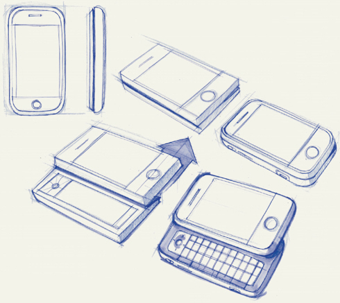
Draft an object (like your cellphone) as an orthographic sketch to show front and side views to establish proportions. Next, simplify it into basic geometric shapes to form it using two-point perspective and divide it along its parting lines. Redraw it with details and features; then animate it to show how it might work, move, or operate.

Forming simple cubes, drawing division lines, and envisioning how each cube might open or move is an effective exercise for practicing form-divide-detail-animate. You might use orthographic projections to first plan division lines, features, and moving parts.
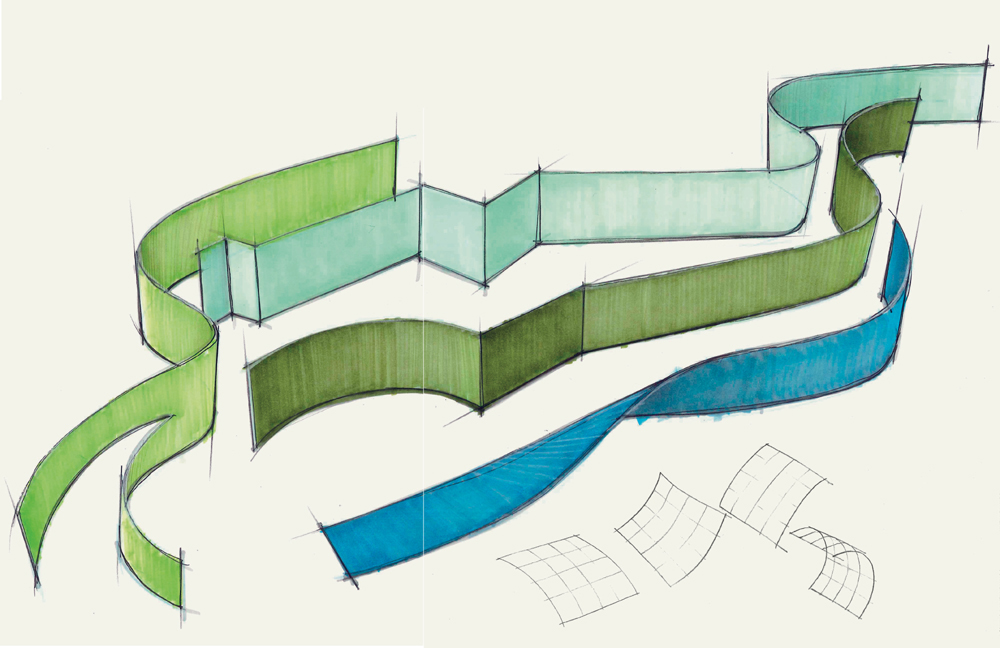
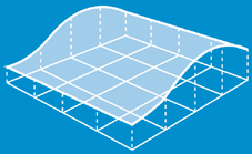
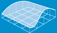
CURVILINEAR LINES SHOULD also be pulled toward your body and stop at an envisioned point on the page. Aim to draw these lines with a uniform thickness and density, as they may tend to trail off toward the end. The most pleasing curved lines are called fair curves—those that run across the page and do not loop back over themselves. Avoid squiggly lines when practicing curved lines, and consider using fair curves to develop a greater sensitivity to the perceived speed, pitch, amplitude, and spacing. Notice that when two curved lines come in proximity to each other the negative (white) space diminishes, and you perceive greater tension between the two lines.
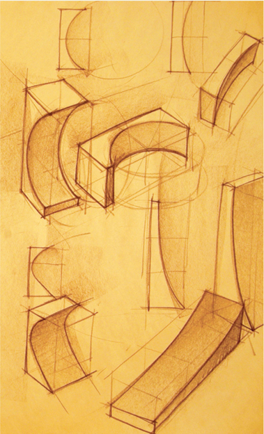
Curved planes are similar in structure to rectilinear planes when drawn in two-point perspective but can easily appear misshapen or distorted. The most readable curved planes exhibit three qualities: (1) they are composed of fair curves; (2) they have minimal distortion among their curved edges; and (3) they only curve along two edges, not all four. When you draw a curved plane, think about the physical effect gravity would have on this plane, and then try drawing an assortment of planes falling from the sky to test curves, position, and angle. Try drawing simple curved planes that move in both horizontal and vertical directions. Use varying line weights to distinguish between the object line (outer edge) and the contour lines that describe the surface. The use of contour lines will aid the communication of the undulations of the surface and provide some visual depth for your drawing. Contour lines provide surface information that communicates more detail about shape, character, and form. When adding contour lines, envision the curvature of the plane in space, and draw a contour that appears similar to the curved edges on either side of it. Sometimes we call this the “goldilocks theorem of contour lines,” as the back edge may be a more active curve and the leading edge may be more static—therefore the contour lines in between must share features or appear similar to both, creating a “just right” transition.
When drawing planes in space, use lighter interior lines to show the contour of the distorted surface.
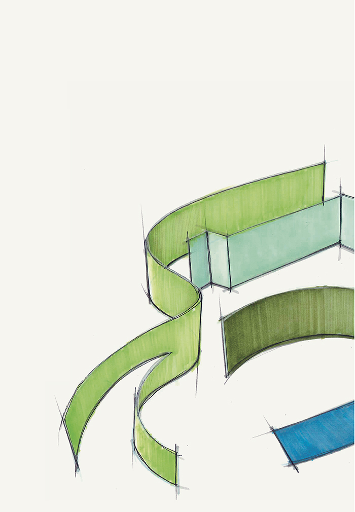
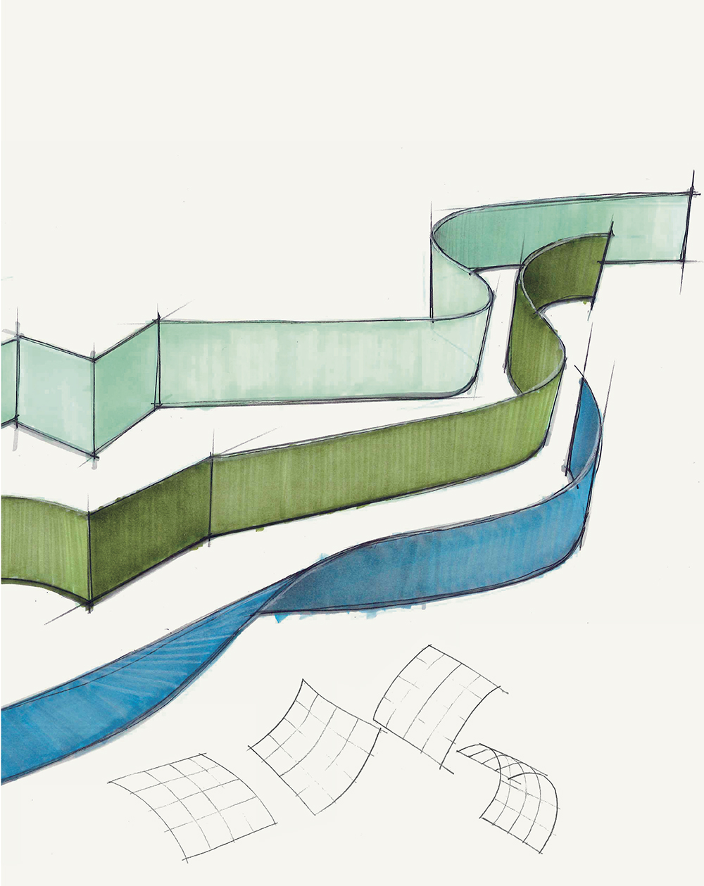
Curvilinear planes can easily become distorted and confusing. If the surface is too warped or wrinkled, details and information may be obscured by the complexity of the lines. In general, try to use simple curves/sweeps as a basis; then move on to compound curves. You might try planar faces that have both simple and compound curves to create transitional surfaces. The more complex the curves, the more you may need additional contour lines to delineate the surface transitions. Notice that the curves in these examples are all fair curves—those that do not loop back on themselves and create simple directional surfaces. Try some complex wrinkled, faceted, or wavy surfaces by projecting vertical lines from the intersections of the grid lines on the flat plane. Use varying line weights so that the complex plane stands apart from the construction lines.

Simple curves
Compound curves
Simple and compound curves

Wrinkled planes
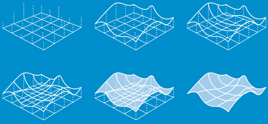
Wavy planes
Once you draw a good curved plane, you can apply a grid to define its surface and project an outline to give thickness. This is the easiest way to draw curved surfaces with features on them, such as falling leaves. Try using curved planes as cutting planes through the surfaces of cubes to make simple cuts and transform simple shapes into more complex object forms.
Practicing simple forms like this will enable you to sketch more complex curvilinear forms like mobile phones, car bodies, and furniture.

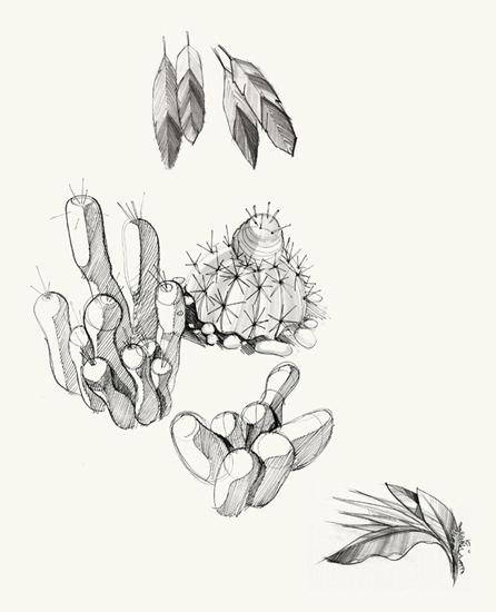
You can use drawing to improve your understanding of the natural world by translating plants and leaves into planar geometry. Aim to capture the essence of your subject by first stripping away the details to create a gestural structure. Details can be added with a denser line weight; tone can be added through hatching.
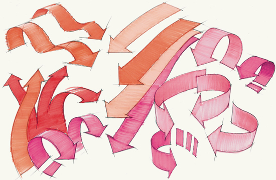
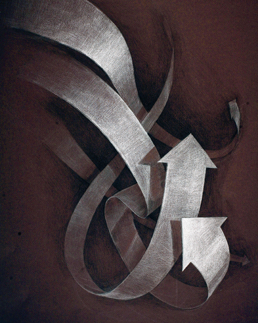
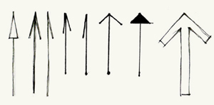
There are three basic types of arrows: detail arrows, directional arrows, and action arrows. Detail arrows are used to make notation and to call out specific features and components. These are most often seen in technical drawing and orthographic projection and are distinguished by their ultrathin line with a triangular leader (proportion 1:3). Directional arrows are used to indicate desired movement and orientation, such as those in maps or navigation signs. Their stroke and shape are usually bolder for enhanced legibility at a distance. Both directional and action arrows can also be used as graphic elements to help the viewer move between sketches or to make linkage between sequential ideas. Often these arrows appear in the background as vignettes with thin line weight and no tone or color. Action arrows are most commonly used to show movement of components and have an appearance akin to a length of masking tape with a wide flat triangular leader. They are often seen colored orange with no thickness and casting no shadow—used to help the viewer understand direction, duration, and qualities in movement. Typically we use orange because action arrows depict movement and imply a transfer of energy, so the association of the bright color orange seems to fit and has become the convention.
Detail arrows, directional arrow
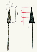
Detail arrows, proportion 1:3
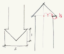
Action arrows, proportion 2:1

Rendered action arrows, using white and black pencil on gray paper
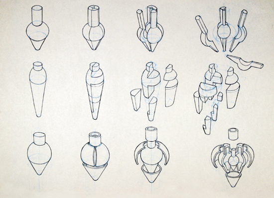
ROTATIONAL FORMS ARE any three-dimensional objects that have a profile and a center point axis from which the profile is rotated. Think of a can of soda or a paper coffee cup. When looking at them from above, they appear circular, and we can see that they have a shape defined by a profile that revolves around a center point. Essentially these are cylindrical forms—geometric figures with straight parallel sides and a circular section. More complex rotational forms include chess pieces (bishops, castles, and pawns), water bottles, wineglasses, and the like with sides that may not be straight and parallel but rather angled, curved, and detailed with features.
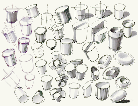
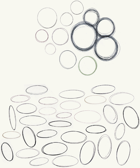
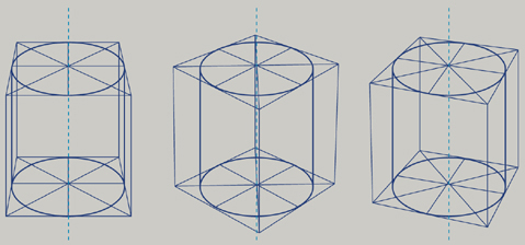
When we look directly down on a coffee cup, the opening appears as a circle, but if we hold that coffee cup in front of us, that circle turns into an ellipse. Moving the cup from left to right, high to low, perpendicular to askew to the floor changes our view of the circle to a foreshortened circle or ellipse. Thus, an ellipse is a circle viewed from an oblique angle in space. The key to drawing cylindrical forms is that the circular surface closer to the eye (the ellipse defining the top) must appear narrower than the circular surface farther from the eye (the ellipse defining the bottom). Put another way, as a cylinder recedes farther away from you in space (up, down, or back), the ellipse farther away from you appears to be more circular. Keep this in mind as you work through the following circle, ellipse, and cylinder constructions.

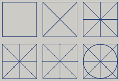
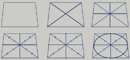
First construct a square and find the center by drawing lines from the corners. Then bisect each bounding edge with perpendicular lines through the center of the square. Divide each of the four angled lines into thirds, measuring from the center toward the corners of the square. Draw a circle that runs tangent to the sides of the square at the bisection points and intersects the angled lines two-thirds from the center.
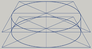
Now take that square plane and lay it down into two-point perspective to create the illusion of a plane sitting in space. Follow the previous steps to draw an ellipse into this square plane. Try inserting a parallel plane directly beneath the ellipse you just drew to create a basic cylinder (as in the first image in this section). Note that the vertical sides of the cylinder flow into the top and bottom ellipses and do not create corners.
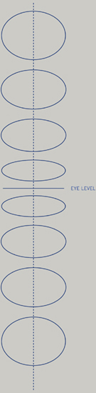
As a circular form moves above or below eye level in space, the ellipse will appear rounder and less foreshortened. The farther from eye level the circular form is, the rounder it will be. Consider that if you drop a quarter on the floor and look directly over it, it will appear to be a circle. All other views will involve some foreshortening and cause the ellipse to appear narrower. At eye level, circular forms will appear as a line. In other words, at eye level, you’ll be looking at the side of the circle.
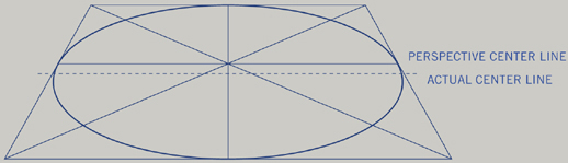
The solid line depicting the perspective center is positioned slightly behind the actual dimensional center line. You can find the perspective center line in any ellipse by constructing a square plane around it and drawing intersecting lines from the corners. The actual center line describes the longest dimensional section that bisects an oval.

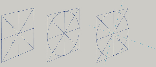
When projecting an ellipse into a cylinder, follow the direction of the minor axis to extend the path of projection. Not only does the minor axis connect the two closest points on the two-dimensional ellipse passing through the center but it also provides the axis through the middle of the three-dimensional cylinder. Shown here, a cone is aligned in perspective to point at the center of the cylinder—note how the cone follows the minor axis. Also note how the cone pierces the cylinder at the center following the minor axis.
Constructing cylinders from ellipses is easy. Remember, the sides of the projected volume standing vertically must be parallel to each other in both one-point perspective (below, left) and two-point perspective (below, center, and right). Note that despite rotating the box around the cylinder, the ellipses remain the same. This is due to the fact that as the orientation of the cylinder stays vertical, the minor axis remains the same.
The same is true for horizontally situated cylinders. Rotating the box around the minor axis or axis of rotation will not change the ellipse; however, changing the viewing angle or moving the construction box will change the ellipses in the cylinder accordingly.
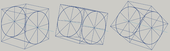
Similarly, if a cylinder is kept in position but spun/turned on its horizontal axis, the ellipse does not change. Only when you move the position of the cylindrical form in space (left, right, up, or down) will the ellipse change.

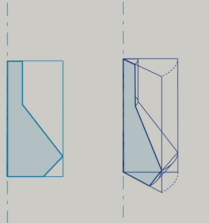
Working from an orthographic side view or profile of an intended rotational form will enable you to delineate the proportions and features to maintain when transforming into a perspective drawing. Note that this process can be reversed. You may try drawing a segmented rotational form first and then draw a plane through it to map out its profile.
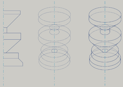
First establish a profile on a planar surface that scribes half of the proposed rotational form. A profile is the traced edge of the object that delineates its silhouette. Add a center line that will be used as the axis of rotation. This demonstration shows a segmented rotational form that is vertically oriented to the ground plane. This same methodology applies to rotational forms that are horizontally oriented to the ground plane.
Next, rotate this plane in succession around the center line. Typically, we use eight planes rotated around the center to provide enough reference points for an accurate drawing. You may choose to use fewer planes than demonstrated here should your form be easy to envision and sketch from your head. As you rotate the plane around the center line, try to maintain proportions and features of the profile as they foreshorten in space.
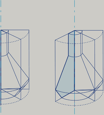
Continue to rotate these planes through the form to establish the volumetric object. Use the points at which the segments connect in your original profile to guide ellipse placement. Remember that as the plane rotates around the center line, its vertical edges will remain perpendicular to the ground plane while its horizontal edges will converge toward vanishing points on the horizon line.
These drawings show various profiles revolved around an axis to make volumetric forms. Working from profile toward perspective drawing may help you to see proportions and maintain structure.
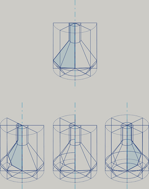
You can apply the “form-divide-detail-animate” method that we covered with cubic forms to slice, dice, add to, subtract from, explode, and recombine a volumetric form. This activity works well in helping you to better understand the structure within rotational forms and is particularly useful in sketching product concepts for which you are designing the form and considering manufacturing issues such as wall thickness, dimensions, and internal components.
You can practice form-divide-detail-animate by first constructing basic volumetric cylinders—this is the forming process. On these cylinders, draw contour lines across surfaces to further describe their volume and hint at potential division lines. Turn these contours into parting lines or separation lines to divide these objects into individual pieces. Then move and shift these pieces in space to animate your sketches. Consider removing pieces or adding components to make more complex forms. The goal is to build proficiency with cylindrical forms by engaging your mind through playing with these forms, so the more inventive you can be with adding and subtracting, the more fun you’ll have and the more adept you’ll become with rotational object forms.
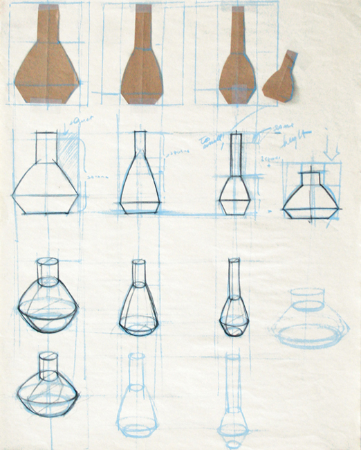
Once you are confident in your cylinder construction, move on to more complex forms, like cones, or objects that are constructed as assemblies of rotational forms. In the first image that follows, designer Jason May practices basic rotational form-making by moving a vessel-shaped object through space. In the second image that follows, Caryn Audenried makes cuts and separates objects into pieces to explore and practice rotational forms.
When sketching rotational forms, consider first forming a basic volume such as a cylinder or another simple rotational volume to work with. Once you draw division lines across the surface to plan movements, separations, or subtractions of parts, you can add further detail features to enhance the form.
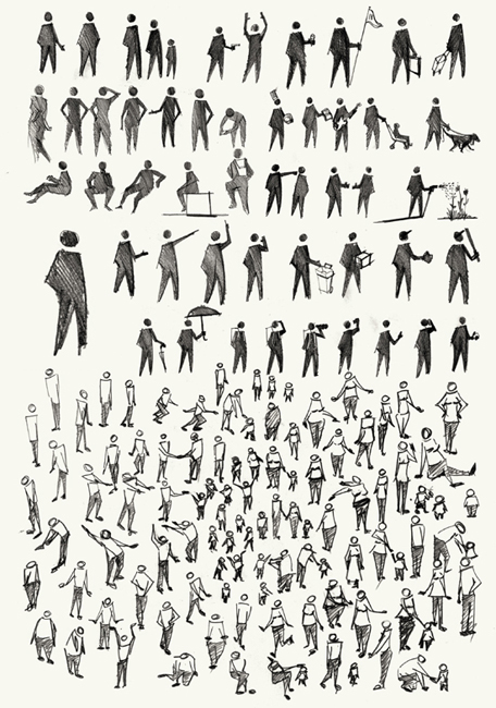
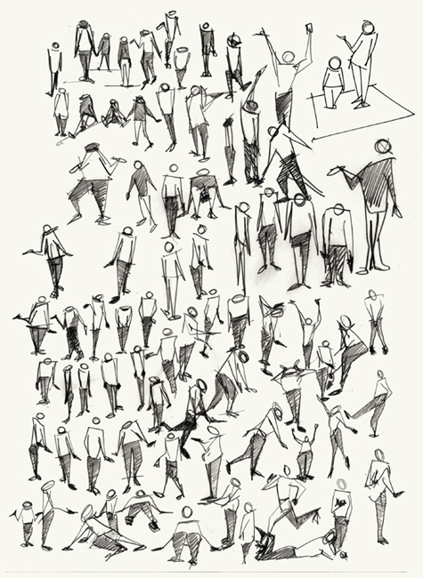
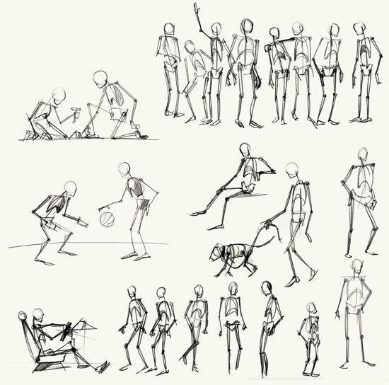
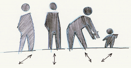
INTEGRATING THE HUMAN FIGURE into sketches provides a sense of scale and context that reinforce the concept of human-centered design. These figures do not require a lot of detail; in fact, the more simplified they are, the less they distract from the design itself (where you want the viewer to focus). There is a balance between too detailed and too simplified that conveys the figures as embodying accurate proportions and conveying some gestural quality yet remaining abstract. Stick figures and “starfish men” are quick solutions for representing figures, but their amateur appearance doesn’t effectively communicate action. To visualize, persuade, and earn respect for their ideas and ability, designers must employ a higher level of sophistication in sketches than their nondrawing clients.
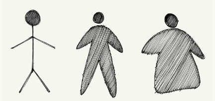
From left to right: stick figure; starfish man; blobular figure
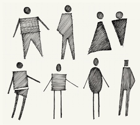
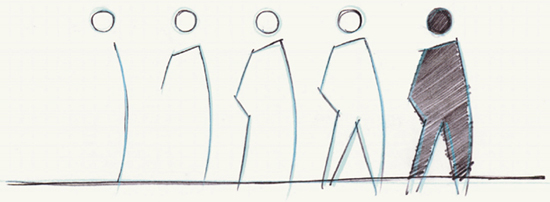
An easy (and quick) way to sketch people is to simplify them into silhouette figures with a primary action or gesture. Think of the human figures you see on roadwork signage but with more accurate proportions and a bit more detail—yet still abstract representations of the human form. By simplifying these figures, you emphasize the role they are playing to demonstrate activity, action, or behavior with regard to your concept.
Start with a gestural line to delineate the curvature of the spine or the front curve of a body in motion. This line captures the essence of a figure’s pose (bent, crouched, straight at attention, reclined at rest, and so on) and defines the height, orientation, and direction of the figure. Simplifying the head to a disembodied circle keeps the sketch abstract and emphasizes the gesture of the integral body. Adding consistent tone to figures can be done with a black marker or with a thin pen. Regardless of the medium, orienting strokes in the direction of the movement of the figure’s body will help to emphasize the action. These simplified figures serve as a designer’s shorthand and are quick and easy to produce. Gestural figures add more character to your sketches over stick figures, which can appear lifeless.
Steps for drawing a simple figure
Strokes that enhance direction and movement
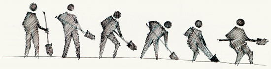
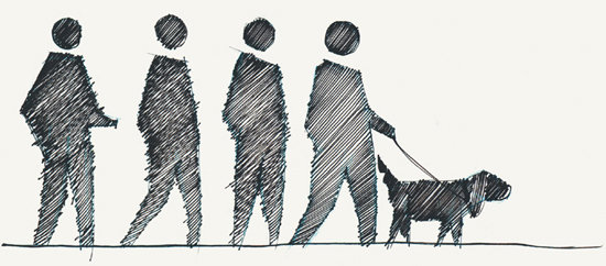
Time-based sequence of silhouettes
In the following pages, you will find more examples of figures to reference. As you build proficiency with gestures and silhouettes, try more gestural figures engaged in more complex actions.
Wireframe figures enable you to work quickly in establishing proportions, stance, and action.
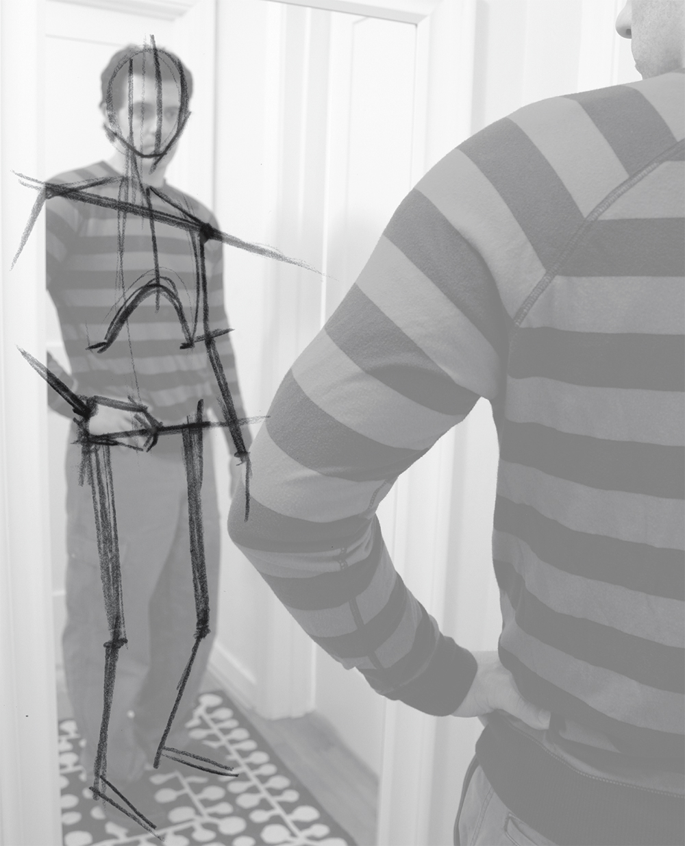
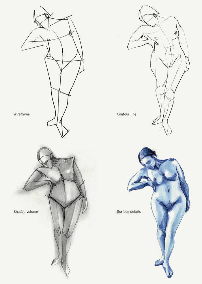
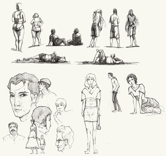
Drawing the human figure in a higher degree of reality can be challenging. Gestural studies or bodies in movement or stasis help you to understand the proportions of the human figure and how it moves through space. Creating substructural drawings in fine line or nonphoto blue pencil to capture the underlying architecture will help you progressively build up the sketch and help you draw the form.
Remember to focus on the orientation of the shoulders to the hips. This angle provides the most information for the pose, so getting this relationship right makes the drawing believable. Other considerations for advanced human forms include the position of the head relative to the shoulders; the amount of face that is revealed with each head position; orientation of arms, legs, and feet to enhance action or interaction; and facial expression. Of course clothing, hairstyle, shoes, and other details also aid in communication.
Context/field studies

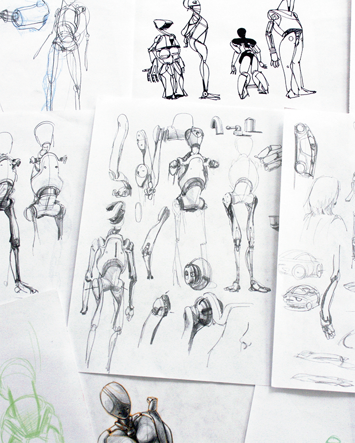
Human figures provide great subject matter for abstracting natural forms into geometric or mechanical forms. The act of interpreting the human form through an artful composition of geometric shapes builds competency in active looking, projecting/imagining, and experimenting. Seeing beyond the shrink-wrapped packaging (skin) of the human figure to envision the skeletal and muscular systems as mechanical systems leverages basic knowledge of rectilinear, cylindrical, and curvilinear forms. Simplifying organic forms into mechanical forms allows you to quickly depict complex natural structures but also serves to engage your eyes, hand, and mind in advanced study of the human figure. The act of transforming the human figure into an imaginative robotic form enables you to consciously consider the proportions, joints, angles, structures, and features of the human body. Imaginative practice like this pulls from what you understand about the real world but enables you to envision new formal relationships—great practice for designers who are charged with developing novel forms.

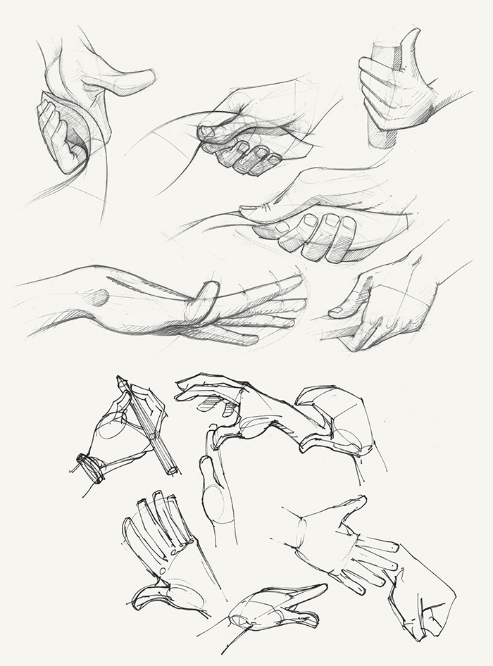
INTEGRATING HANDS INTO sketches shows multiple states of movement, grip, position, and manipulation during product or system interaction. Hands also provide a sense of scale and can be very suggestive of interaction; they are our primary tactile link between an object and our will to do something with it. Similar to the abstraction and simplification of the human figure described earlier, hands can also be treated the same way to emphasize action or interaction. After all, most of design sketching is not about photo-realistic representation of life but rather a focused message about an idea.
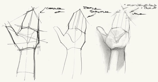
Since you bring your hands with you wherever you go, they are great subjects to sketch to build skills in seeing, representing, and abstracting. Knowing the proportions of your hands and how they appear from a variety of angles and poses will help you to draw generic hands without having to find reference images. With practice, you will gain competency in drawing hands in a variety of poses and positions. When sketching hands, you must first decide how much detail is necessary: how many fingers will be visible and what position best describes the interaction one might have with the object. Blocking in the volume of the palm and general curvature of the fingers as a wireframe will set the sketch in position. Then all you need to do is add volume and detail to the fingers. Simplified mittens or white glove–like hands usually suffice in most idea sketches or at the white board, but in concept sketches, you may need more detail and enhanced line work. Always consider how much a hand’s presence will improve or detract from the communication of the idea in order to determine the appropriate level of detail.
Like human figures, hands can be drawn with varying fidelity to their actual appearance, from abstract and blocky geometric to photo-realistic. When using hands in design sketches to communicate movement, interaction, and behavior, you must consider the amount of emphasis you want to place on the hand itself. Is the hand communicating attributes of a product or system, or is the hand the subject itself? Knowing the role that that hand is to play in a sketch will determine its visual form. In most circumstances, the subject of the sketch is the designed object or system; the hand serves as a basis to illustrate scale and behavior, and is a placeholder for the user/human subject. Hands are the expressive modifiers in sketches that show the presence of a human and the actions being taken.
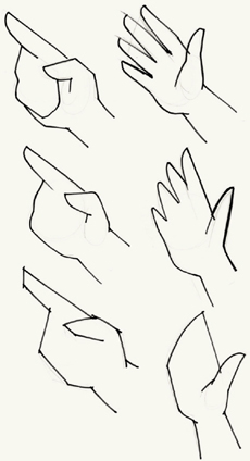
Various types of simplified hands
Before animating hands in some form of action using two-point perspective, first establish proportional relationships from one or two orthographic views.
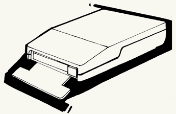
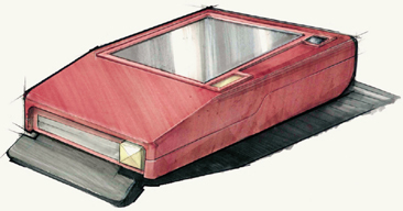
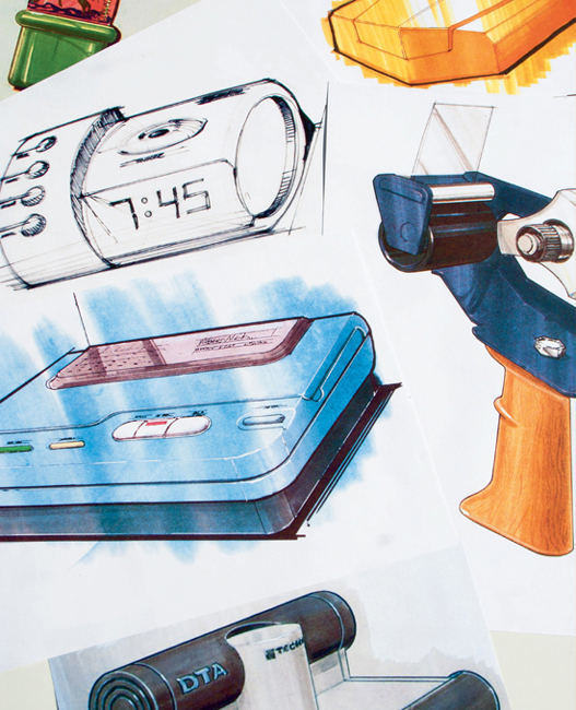
RENDERING IS THE PROCESS of representing objects of a specific material as they appear under specific lighting conditions. It is a way to provide detailed information about the surface of an object or its shape with greater accuracy and realism.
Rendering focuses on interpreting an image from your mind rather than literally representing something from life. So, in a sense you must edit out certain details to focus on highlighting specific qualities. Rendering represents the ultimate idealized depiction of an object, and as such, often incorporates impossibilities with light and shadow. Consider concept renderings of cars that are publicized to build public interest. Quite often, you may see proportions exaggerated, parts missing (like mirrors and signals), and multiple highlights from many different light sources to make the car seem shinier. Renderings often suggest what a product could be, not always what it actually is. In this respect, renderings can serve as idealized representations that capture the “spirit” of a subject or idea, but they can also be used to simply represent the application of a material.
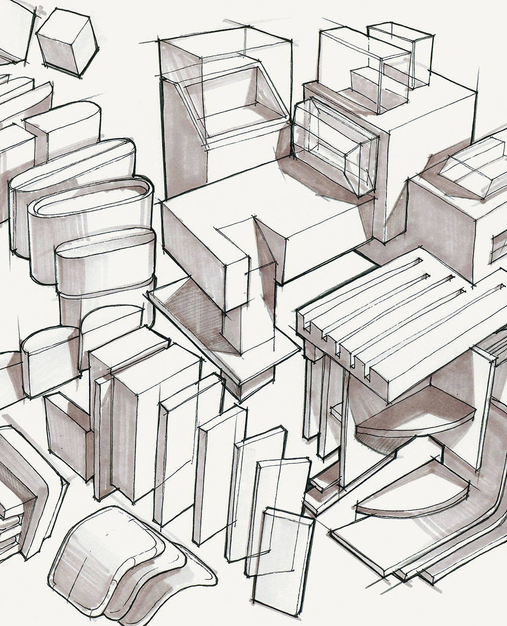
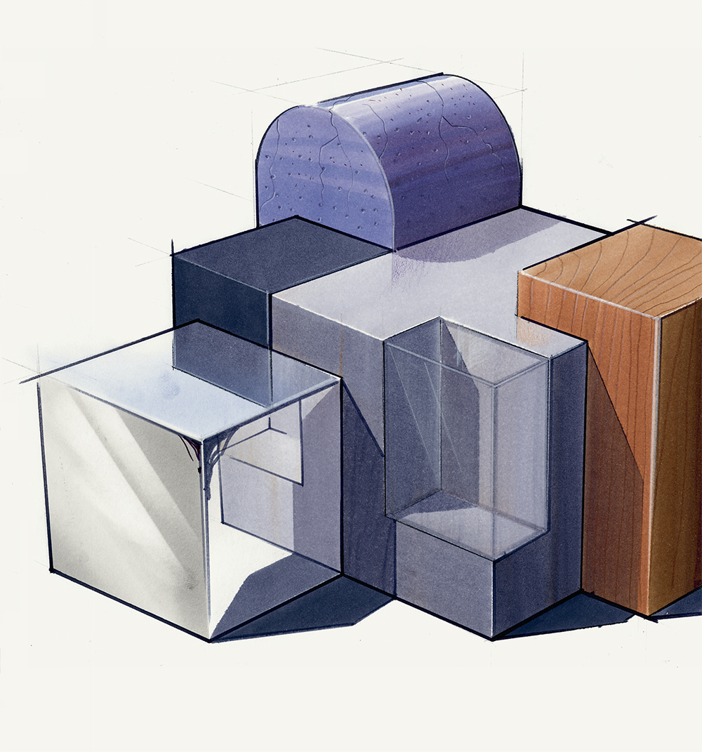
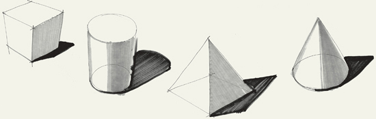
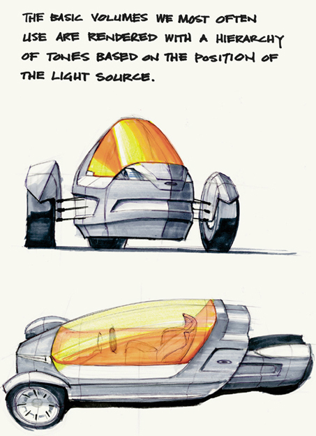
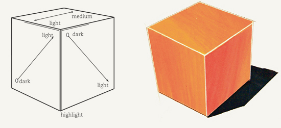
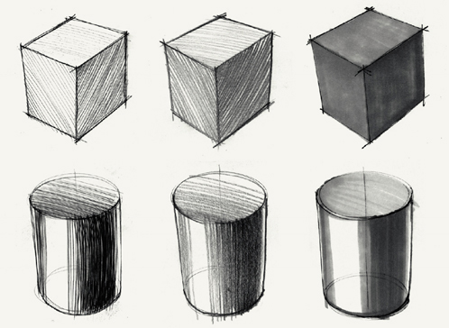
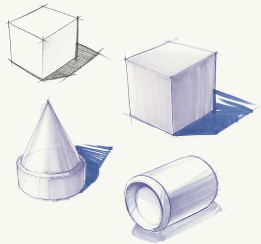
When rendering a product, it is helpful to dissect the form into primitive components—cubes, cylinders, cones, and spheres—to render the whole with more ease and effectiveness. By understanding basic volumes, you can isolate objects into components to render them more effectively. The basic volumes we most often use—cube, cone, cylinder, and sphere—are rendered with a hierarchy of tones based on the position of the light source. Typically, we position the light above the object to shine down on it, making the top surfaces brighter than any sides; however, we limit the range of contrast within the form so that the form remains coherent. Consider using markers that are the equivalent intensity of 10% to 60% gray with one drawing, unless the form is intended to be much darker, in which case you might shift the markers toward a range equivalent to 40% to 80% gray. This may take some trial and error to figure out; however, the examples of marker line weights that follow are intended to get you started blocking in tone with markers to define basic volumes. Remember, renderings are stylized, so you have a lot of freedom to be creative; the key is that tone is used to enhance the form.
Typical drawing markers provide for a variety of line weights.
Establish the light source to create the shading on each plane, considering the top surface as the lightest, and the variation between medium and dark side surfaces. Blend the markers horizontally across the top surface to create a matte appearance by leaving no exposed white areas.
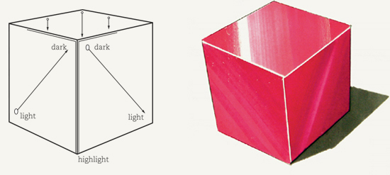
Establish the light source to create the shading on each plane. Draw streaks of lighter tone that move straight up and down if the cube is centered on the page. Leave some white areas for highlights to show great contrast. The illusion created appears to be a reflected or glossy surface with highlights moving toward the viewer’s eye.
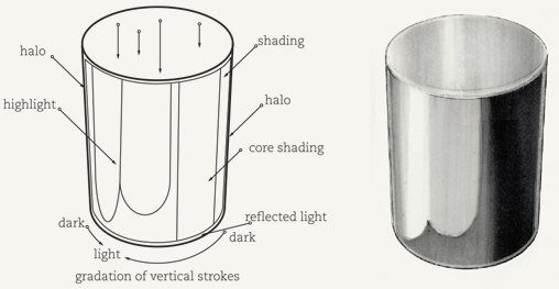
Run all strokes vertically with less contrast than the glossy cylinder. On the top surface, blend strokes horizontally to create a matte appearance. Again, halos provide reflected light from the environment.

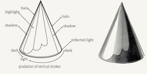
Similar to glossy cylinders, glossy cones exhibit the same qualities except that all strokes converge toward the cone’s point. In these examples of glossy cones and cylinders, the reflection areas (dark pointed shapes) are formed by envisioning that the objects are sitting on a darker, square-shaped ground plane. The points are reference to the corners of the ground plane surface and serve to emphasize the curvature of the cylinder and cone forms. You can try drawing both cylinders and cones, with and without this reflected element.
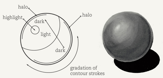
Curve your strokes to match the outside circular shape. A curved core with value gradation will appear more accurate.
Run all strokes vertically to enhance the volume. The core contains the darkest color; the highlight is the lightest. Halos provide the illusion of reflected light that has passed around the object and is bouncing back from the environment. Glossy surfaces appear streakier than matte surfaces, which are blended.
Rendering a specific material type is another way to add specific information and reality to a sketch. This style of rendering can be fun, but it is also more time-consuming, so you must have real purpose to sketch in this way. When used judiciously, this extra bit of reality and emphasis can make a drawing more dynamic and therefore more engaging. The risk, of course, is that your audience may see material choice as the sign of a “final” drawing. If your structural form is still a work in progress, material information might distract and invite premature feedback in unwanted areas.
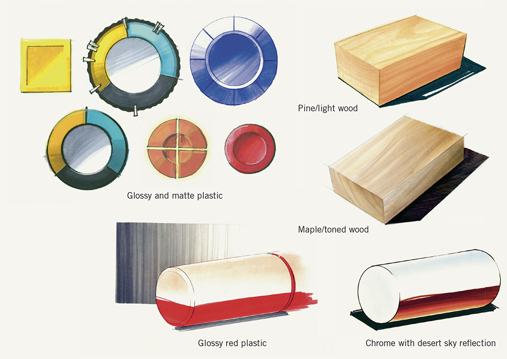
We have included some examples of common materials often used in product-rendering for reference. Obtaining physical samples for reference can be especially helpful in understanding how orientation and light affect the appearance and interaction of different surfaces. We recommend looking for flat sheets, blocks, and cylindrical tubes. The drawings that follow include metal, rubber, aluminum, glass, chrome, wood, concrete, and glossy red plastic. By employing the rendering techniques discussed earlier, you can develop your own approach for these materials.
Renderings can take an hour, a week, or longer to complete. Chances are that you will have to create a number of renderings in a short amount of time to present concepts to your team or client. The following four techniques can help you create presentation-quality renderings quickly. Chalk pastels are versatile and quick; they complement markers nicely and can be used on any paper surface. Partially rendering drawings to emphasize key information is a conventional shortcut that can create a dynamic presentation. Using colored paper can be dramatic; pick a paper in the middle value of the product and create highlights, shading, and shadows with chalk pastels and markers. Orthographic renderings are quicker to develop than a perspective sketch, as they don’t requiring foreshortening.

This (one-hour) partial rendering of a lighting device incorporates chalk pastel, colored paper, and an orthographic view to communicate the essential information of the concept.
Tone and color can enhance communication and make sketches more dynamic; the more tone and color assigned to a drawing, the more information it may communicate. For simple sketching, a couple of gray markers and two accent colors can define volume and depth of field. Alternatively, you can use a medium such as watercolor to apply a quick, loose color wash for a sketchy yet soft feel.
Where necessary, small touches of accent color can call attention to essential parts or activity. This “muted” strategy yields a more communicative drawing with a clearly constructed hierarchy of information. In addition, using cast shadows can provide a needed degree of reality and context to drawings. Shadows are rendered in black or dark gray and are, in many instances, used to visually lift the object from the page like a vignette.
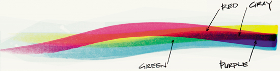
Blending cyan, magenta, and yellow markers enables you to custom mix a variety of primary colors (red, yellow, and blue) and secondary colors (orange, green, and purple).
Shading gives form to objects and makes sketches more realistic. Aim to sketch objects using four degrees of value: white, light gray, dark gray, and black. These values simplify the many degrees of value that can be seen on an object in real life. Bolder, higher contrast areas tend to attract more attention and provide greater emphasis.
Shading on a curved surface gradually changes from light to dark; this is called a gradation or gradient. Curved surfaces do not have a distinct edge to separate the values of shading; therefore you must transition from a white highlight to gray shading with a gradual transition in tone.
With all shading, the key is to provide for transition between highlight and shaded surface so that the sketch clearly communicates the light source. These transitions, however, can be smooth, harsh, blended, or streaky depending on the intended visual impact or how harsh you intend the light source to be. Shadows cast by objects can also be smooth or harsh and serve to blend the object into the page or visually lift it from the page surface. We’ll cover shadows in the following section.
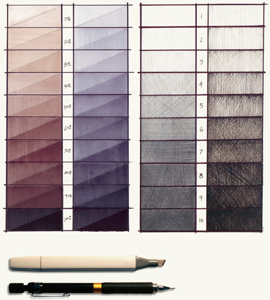
Creating a value chart for pencils, pens, and markers will enable you to test how your solid and liquid mediums will perform on various papers. To create a value chart for pens and pencil, use hatching techniques to establish solid and open-filled sections. Changing graphite density (not diameter) and adjusting pressure will provide a broader range for pencils. For pens, you will want to change diameter of nylon-tip pens to achieve thin and thick strokes. When testing your markers, apply a fill in each frame of the chart; then after that has dried, go back again and try a second coat over half of the frame. The second coat shows the paper at full saturation with ink.
Primitive geometric forms drawn in pen, pencil, and marker
A value key is useful to better understand the performance of your markers, pens, and pencils. Using single- and double-hit (marking over an area more than once to add more tone) tests will show if a tool is capable of providing various tonal values.
A vignette provides a middle ground against which to view a concept sketch by differentiating it from the background. Vignettes can be washed, straight-lined, or patterned; however, they must serve as background elements, meaning they do not visually advance in front of the subject and dominate the sketch. Use tape to create a rectangular area that you want to color. Masking the areas that you do not want to color will enable you to work quickly and more expressively within the vignette area. Start and end your marker strokes on the tape to generate consistent tone. If you are new to marker-rendering, making a series of vignettes will help build proficiency.
Vertical-line vignette
Accurate shadows provide reality and context to drawings. They also make a drawing look more dynamic, as the increased contrast helps to emphasize the form. Shadows that are mostly hidden behind the object form may not be read clearly as shadows and may appear as features; those that are too exaggerated may visually dominate the drawing, so you’ll have to experiment a bit with your shadow placement, density, and scale to find the best way to enhance the communication.
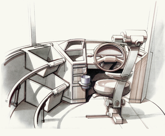
Mail truck interior concept rendered using gray markers, chalk pastels, and black pencil. Note the use of shadows to create distinction within the form of the dashboard elements and seating.
Complex forms cast complex shadows onto themselves as well as the ground plane. Shadows cast onto other objects can serve to add clarity and visual interest. A projected shadow can also serve as a vignette to provide a visual transition between the object and the page space.
As you wrap shadows over cylindrical and rectilinear forms, you’ll discover that the shadow lines act as contour lines to enhance the readability of surfaces. Remember that when you project shadows onto other objects, their proximity to the light source and to the shadow-casting object will affect how much (or little) will catch the shadow.
In these shading and shadow studies of three-dimensional objects, note how the shadows serve as vignettes to visually lift the forms from the perceived ground plane.
Using frisket film or tape to mask areas of the drawing allows you to be generous with marker coverage and free with stroke patterns while protecting certain areas. Masks stop the ink from bleeding into unintended areas and generally help keep the drawing clean. Always start and end the path of a marker on the mask. Try not to let the ink pool along the edges of the mask, and use a paper towel to absorb the extra ink.
When creating vignettes and covering large areas, begin running the marker on the mask and continue across to end on the other mask. Overlap each stroke by 50 percent to create even coverage. Use a straightedge, ruler, or piece of illustration board to make each stroke consistent.
When masking watercolor, note that the medium is difficult to control. You have to work with the mistakes, especially when trying to get a gradual tone. This forces you to be quick and rough. Slowly applying or reworking watercolor washes often yields bad results.
Masking while rendering can be a tedious process that involves using many supplies and includes a lengthy setup and typically a hefty cleanup, but establishing a good work flow can save time. Using frisket film to mask areas for chalk pastel and marker application can improve the quality of your drawing and enable you to work quickly and more fluidly to improve your work flow. Frisket film typically is sticky enough to adhere to the paper, providing a good barrier between mediums, yet is repositionable, so you can use the same pieces multiple times. When rendering, we usually apply chalk pastel first to block in the shapes using the masking film and then apply markers for tonal adjustments, like shading and shadows, and finally use black pens or pencils for detail line work.

Drawings are created in service of ideas—crafted to express and embody your ideas in compelling ways. A good sketch provides information and prompts a response. The various themes in this section break down the complexity of drawing and sketching into component parts. You can practice each theme to build competency and depth of skills and understanding. How you employ your skills is up to you. Knowing how to draw cubes is good, but knowing how to draw cubic forms and work from orthographic to perspective views to explore design ideas is better. The subsequent sections of this book demonstrate methods for applying your understanding of drawing primitive geometries, figures, volumes, and elements to the areas of notational sketching, exploratory sketching and ideation, explanatory sketching, diagramming, and visual narratives. As a bridge to becoming a more competent sketcher, practice combining techniques across the various themes using a variety of mediums. Try making up exercises for yourself or daily tasks to draw at least one idea. Daily practice will build muscle memory and visual understanding.
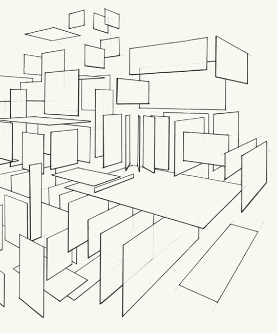
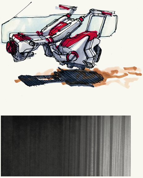
Practicing perspective drawing with repetitious sketching of cylinders and cubes is boring and, well, repetitious. Combining these elements into complex forms by moving into, out from, and across the page space can yield some interesting compositions and lead to discovery. Without a prescriptive plan, try sketching a cubic form to set the perspective/viewing angle, and work from there to create a complex assembly. Since many of these geometric forms often look like robots, make up a fancy yet descriptive name for what this machine does or how it behaves. For instance, how about a quasihydraulic electrosymphonic transmogrimatron?