Data visualization has become more important with the recent ability to easily access massive amounts of data. Good visuals combined with numbers provide insights that numbers in a slide presentation can’t deliver.
Following are some tips on working with Excel graphs and going a little beyond out-of-the-box graphing. Making graphs in Excel is fairly straightforward, but there can be some tricky situations. The first example addresses how to handle a simple graph when your source data makes the graph less than useful.
For this example, you’ll use the data in the following figure to create a column graph:
On the Insert tab, select the 2-D Column chart icon. In Excel 2013 you get a preview of the chart by hovering over any of the choices in the dropdown menu. Click the first one, as shown here:

You can see that the range between the highest and lowest numbers is vast. The numbers for Hong Kong are almost invisible.
Here’s what you can do to fix this chart:
1.Double-click the values on the vertical axis.
2.In the Format Axis window that appears, scroll down and select the Logarithmic Scale check box:

The next figure shows the result. The smallest numbers are now much easier to see because the vertical axis has been modified for log base 10.

TIP
In a log scale, the distance from 1 to 10 is the same as the distance from 100 to 1000. These charts will not work with negative or zero values.
Using Combo Charts and Dual-Axis Graphing
The following figure shows a worksheet that contains 242 rows of data representing daily website activity for my blog. I’ve had a suspicion that it’s not good to post on Fridays, if I’m only going to post weekly or biweekly. On Fridays, people seem to have other things to do instead of read about Excel and data. So you’ll help me create a graph to see what light it sheds.

First, you have to make a Pivot Table, like this:

Next, you make the graph: With your cursor in the Pivot Table, go to Insert on the ribbon and select the 2-D clustered column graph icon. Based on the result shown in the next figure, it looks like my suspicion is correct: Friday isn’t a good day for posting to my blog. And Saturdays and Sundays are even worse.

The graph shows info on the average number of pages per session, but those bars are so small that you can’t see if there’s any noticeable difference in activity from day to day. In the previous section, you used the logarithmic scale to get a better view of similar miniscule numbers. You’re not going to do that now. Instead, follow these steps:
1.Get rid of the gray buttons on the chart by right-clicking one and selecting Hide All Value Field Buttons.
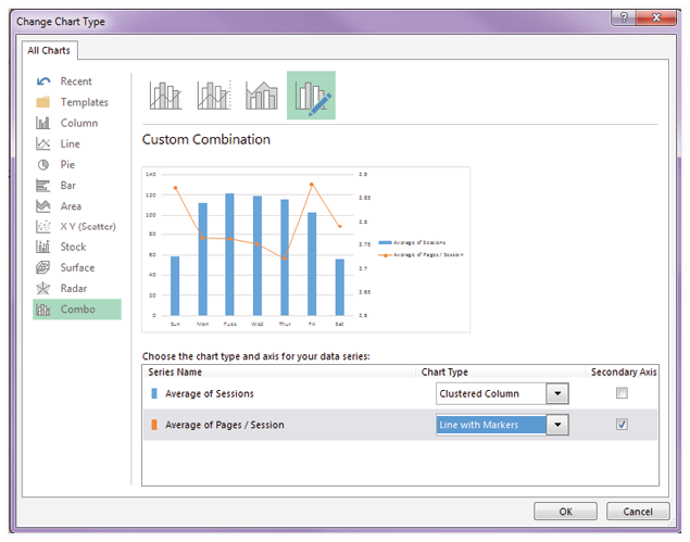
2.Next, right-click the chart and select Change Chart Type.
3.In the Change Chart Type dialog that pops up (see the next figure), select Combo from the list on the left. Keep Average of Sessions set to Clustered Column. Change Average of Pages/Session to Line with Markers. Check the Secondary Axis box for Average of Pages/Session. Click OK.
Now you can really see something:
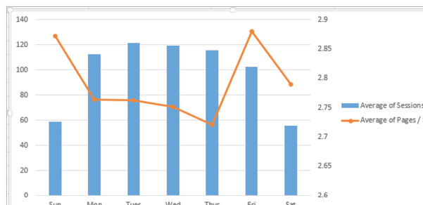
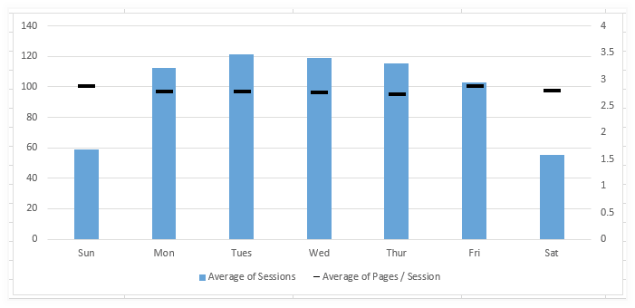
It looks like there’s a wide swing in the Average of Pages/Session line, but it really only swings between 2.7 on Thursdays and 2.87 on Fridays, and a range of 0.17 pages isn’t much. So one preliminary conclusion you can draw is that people look at the same number of pages, but there are a lot fewer people visiting on the weekends, and Friday brings the fewest visitors of all the ts.
|
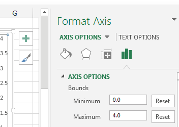
The wide swings suggest more drama than there really is. Here is one way that the level of drama can be presented appropriately. Highlight the secondary (right-side) axis, right-click, and select Format Axis. In the Format Axis window that appears, adjust the Bounds so that Minimum is set to 0.0 and Maximum is set to 4.0. Click OK. |
|
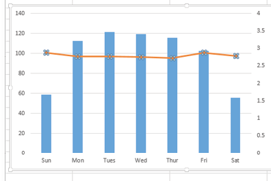
Now the Average of Pages/Session doesn’t look so wild and alarming.
NOTE
If you were measuring something more critical, 0.17 could be a big deal. Keep in mind that you need to modify a visualization to fit the purpose. If you were measuring fatalities or something with a lot more at stake, you might choose to leave the original more dramatic zig-zagged line.
Choices like these are really where data analysis happens because the information we compile has to be communicated in an appropriate context. Here are some things to think about:
You might want to make a graph rather than use a list of numbers. In some cases, it’s helpful to provide both.
You may need to decide whether to use a single- or dual-axis graph.
You need to be sure to modify the secondary axis so that the graph doesn’t communicate a story that’s bigger than it really is or minimize a story that need immediate attention.
|
You can modify the current graph even further by clicking the Average of Pages/Session line, right-clicking, and selecting Format Data Series. In the Format Data Series window that appears change the Line setting to No Line. Use the Marker tab in the Format Data Series window to set the marker to a dash, change the size to 14, change the color to black, and get rid of the border. Here’s the result of these changes: |
|

NOTE
You’ve probably noticed that when working with charts, you can generally change a chart element by right-clicking it and selecting from the list of choices that pop up. In the figure above, notice that the legend now appears at the bottom of the chart. To make that happen easily, you use the right-click method.
In addition to using the right-click method, you can accomplish lots via the ribbon. It’s worth exploring to find out what works best for your style.
Continuing to work with the chart from the previous section, click on any of the columns that represent the days of the week. Ensure that all seven of them are highlighted. Right-click and choose Add Data Labels.
The figure below shows options selected to place the data label in the base of the column and show only two decimal places:

NOTE
This is where you would change the visualization if you were working with money, percentages, or other values where the value needs to be presented in a certain way (e.g., showing $, %, etc.).
You can also use the regular text formatting method in the Home tab of the ribbon to bold the text and make it larger.
The final version of the chart is shown below. I invite you to replicate this graph or explore the options on your own. These are some of the modifications I made:
- Added data labels for Average of Pages/Session values.
- Placed the data labels to the left and at a custom angle.
- Made the columns a lighter color to increase the contrast between the text and the columns.
- Deleted the gridlines.

Remember that you built this on a Pivot Chart. However, everything you did will work on a standard chart that’s built on a table or a range of data.
CAUTION
Excel offers 3D features that can make a chart look super impressive. But be warned: 3D features use a lot of memory. I learned this the hard way. I built a beautiful 3D-heavy worksheet. Because of the 3D graphics, it took several seconds just to scroll a few cells left or right. Sometimes Excel would completely crash. Some people that I sent the workbook to couldn’t get it to open.
After I eliminated the 3D graphics, the sheet worked as it should.
There’s another problem with 3D charts: They can look great but not be accurate. If you are putting 3D charts in a presentation, make sure Edward Tufte, Stephen Few, Mynda Treacy, or Jon Peltier will not be sitting in your meeting.
Go ahead and use the 3D effects for spice, but don’t overdo it.
One horror with Pivot Charts: automatic refresh to default settings
I have to warn you about putting this kind of effort into a Pivot Chart: If you make a change to the underlying Pivot Table, everything in the Pivot Chart will change. The secondary axis will go away, axis boundaries will revert back to default values,…it can be maddening.
This is fine for something that’s going to remain static—like this example. You aren’t likely to want to filter to show only Thursday and Saturday. For more elaborate data sets where you’d want a dynamic interface, a solution would be to make multiple graphs and avoid using chart elements that will disappear when you change the underlying data.