Armand Baltazar, Digital, 2010.
Armand Baltazar, Digital, 2010.
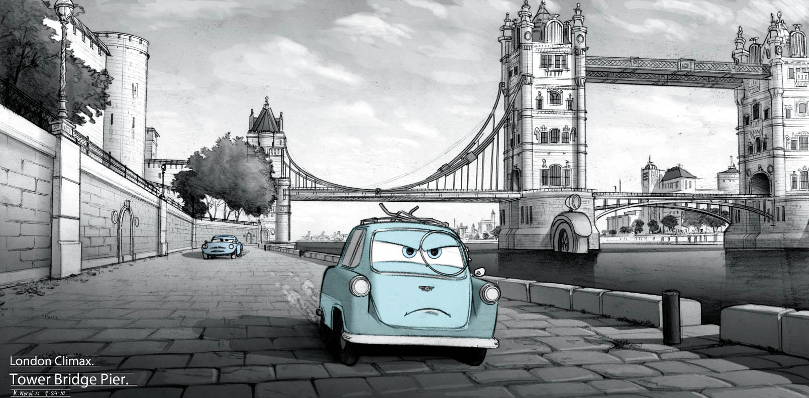
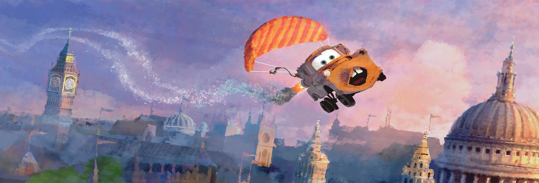
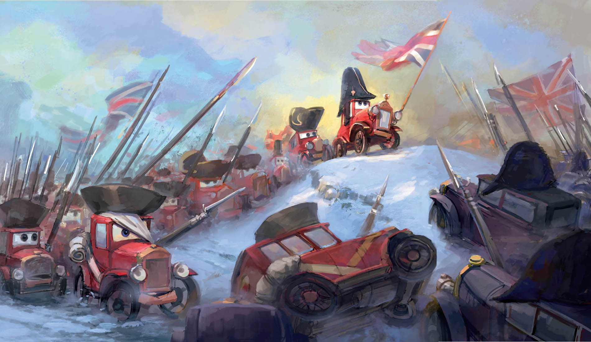
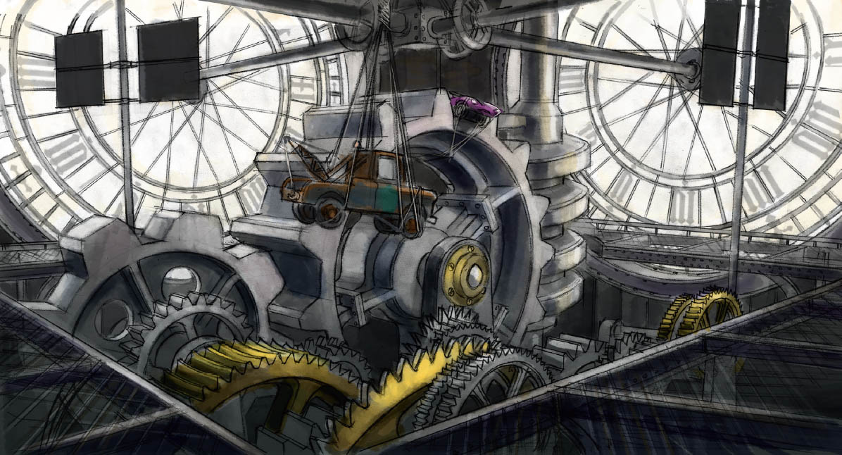
The London climax of Cars 2 includes a clockwork death trap, a gun battle by the Thames, chases through the city’s streets, and a final confrontation at Buckingham Palace. The challenge for the art and technical departments: creating a setting for all this action that actually represents over twenty square miles of London and literally thousands of uniquely car-styled period buildings. “It was exciting and a little scary to plan the London city set,” says Harley Jessup. “We’re not only racing through the city, but we’re flying above it. When the chase breaks out of the race course, the whole city of London becomes the stage for this epic battle.”
Yet even with a boiled-down approach to designing London, the eclectic nature of the city’s urban landscape proved challenging. “London was the toughest set for us to create,” says Jessup. “We had to design miles of complex city streets showing a huge variety of architectural styles. There are antique Georgian, Victorian, Queen Anne, and Edwardian style buildings that all have been given a Cars-world twist.”
Much like the opening action on the oil platform, when this final sequence was conceived, the filmmakers knew it was strong enough to withstand the numerous subsequent script changes. Says Lasseter, “A voice-activated bomb is planted on Mater, and it can only be deactivated by the person who set it. When Mater accuses the benevolent philanthropist who’s sponsoring the race of being the bad guy, everybody thinks he’s completely off his rocker. But just as it’s about to count down to zero, the bad guy says, ‘deactivate,’ and the bomb is defused. Right then and there, Mater goes from seeming like a complete idiot to being one of the most brilliant guys on the planet. That moment became a stake in the ground as soon as we got it—we immediately went back to the beginning of the movie to make sure everything in the film was working to set that up.”
Also, much like the spy opening, London’s Big Bentley sequence brought the art and story departments together. “Nick [Sung] was boarding it, and art was doing SketchUp models at the same time,” says story manager Kate Ranson-Walsh. “Production-wise, we were constantly bringing boards over to story from the art department. We were just so on top of each other on this movie.”
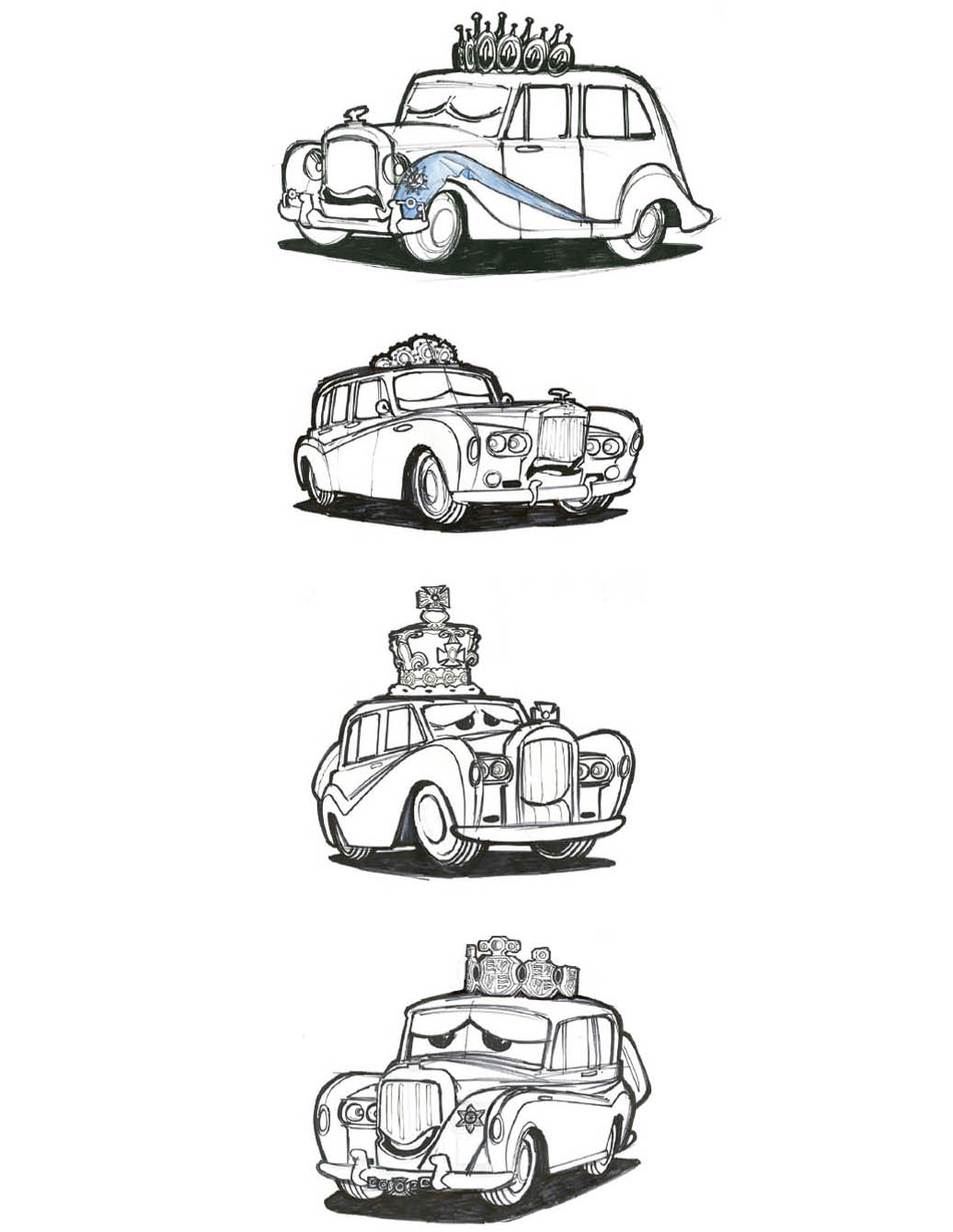
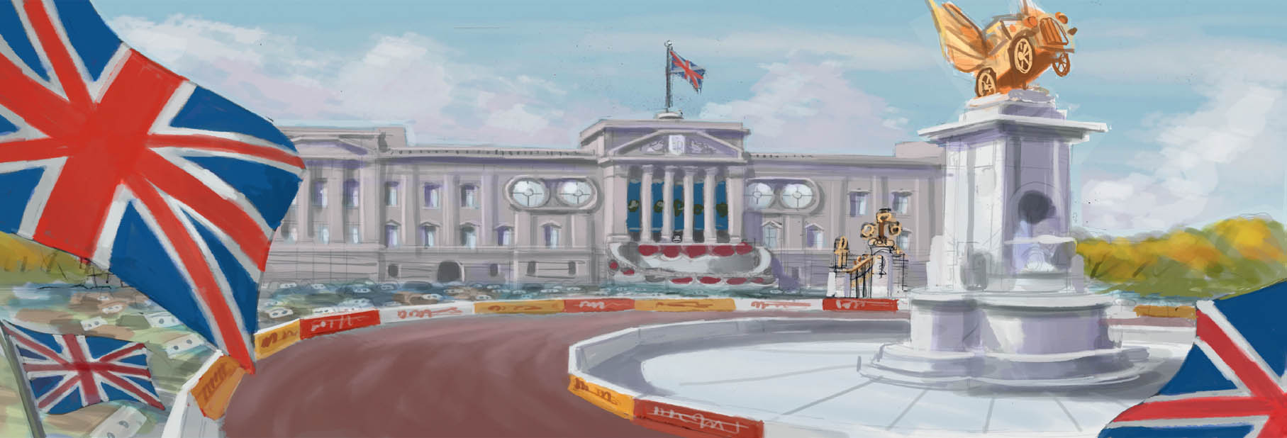
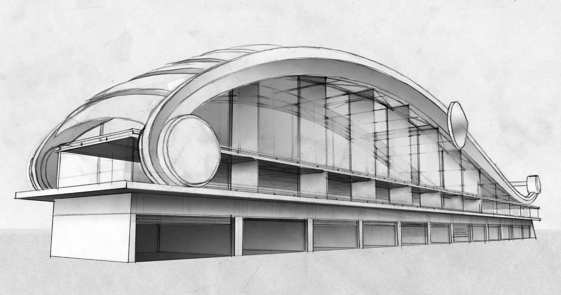
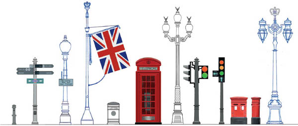
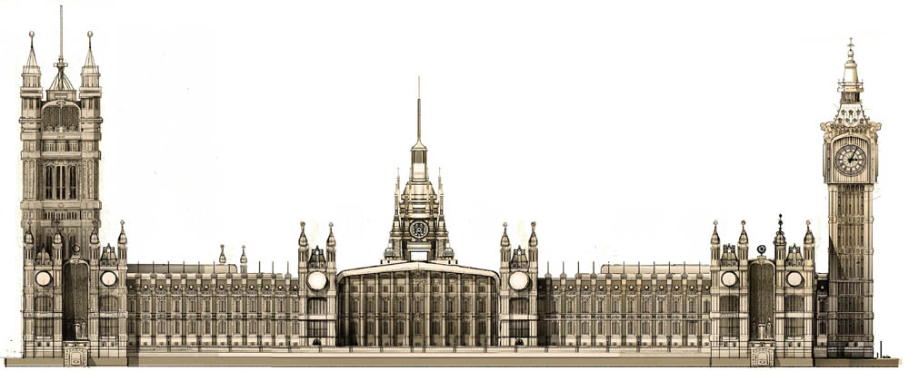
The art department worked on multiple scale levels. There was a team designing the car-themed London skyline showing a car-ified take on Westminster Cathedral, the London Eye, St. Paul’s, the Houses of Parliament, and dozens of other famous landmarks, while Nat McLaughlin focused on Buckingham Palace, the race pit buildings, and Big Bentley. Jay Shuster and the character team created designs for the most classic British car characters, including London double-decker buses, taxis, Range Rovers, Jaguars, and Minis. The graphics group worked on the hundreds of street level advertising and traffic signs while the art interns were working on street props like phone booths, lamp posts, and mailboxes.
Jessup believes that the crew’s collaboration is the key to creative success: “We wanted Cars 2 to be as richly layered as the first film, but capturing the variety of architectural styles and detail over miles of London streets has been a big challenge. To solve the problem, we needed everyone to put their heads together and offer their best ideas.” Denise Ream agrees: “The dedication to authenticity has been terrific. We’ve talked to real auto manufacturers, real racecar drivers, even real spies!”
Storyboard, Nick Sung, Digital, 2010.
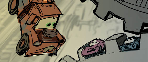
Storyboard, Derek Thompson, Digital, 2010.
“In London, we decided to go for overcast skies. It’s a look we aren’t using anywhere else in the film, and since we’ll have just come from the sunny Riviera, you want to have a big enough change to feel like you’re somewhere new. Plus, even on an overcast day, London is just absolutely beautiful. There’s something about it that just looks good with overcast white light.”
—SHARON CALAHAN
Nat McLaughlin, Pencil/Digital, 2010.
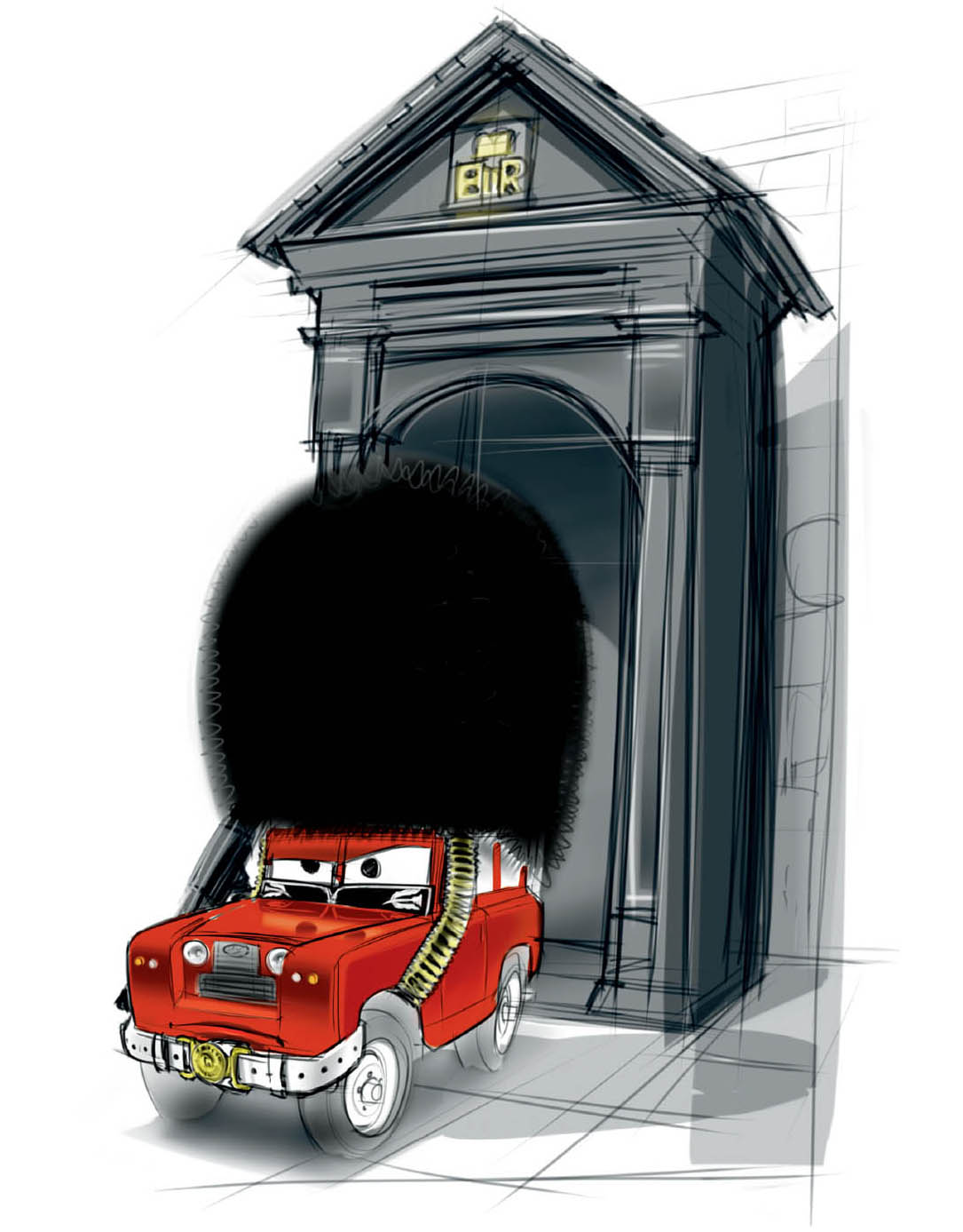
“In London the characters break out of the race track and charge into rush hour traffic. It gave us an opportunity to show crowds of red double-decker buses and black taxis, all as British characters. The color red kept coming up in our palette for London. Besides the buses, the uniforms of the royal guard, the telephone booths and mailboxes and even the Union Jack all add bright bursts of red to the cool gray palette of the city.”
—HARLEY JESSUP
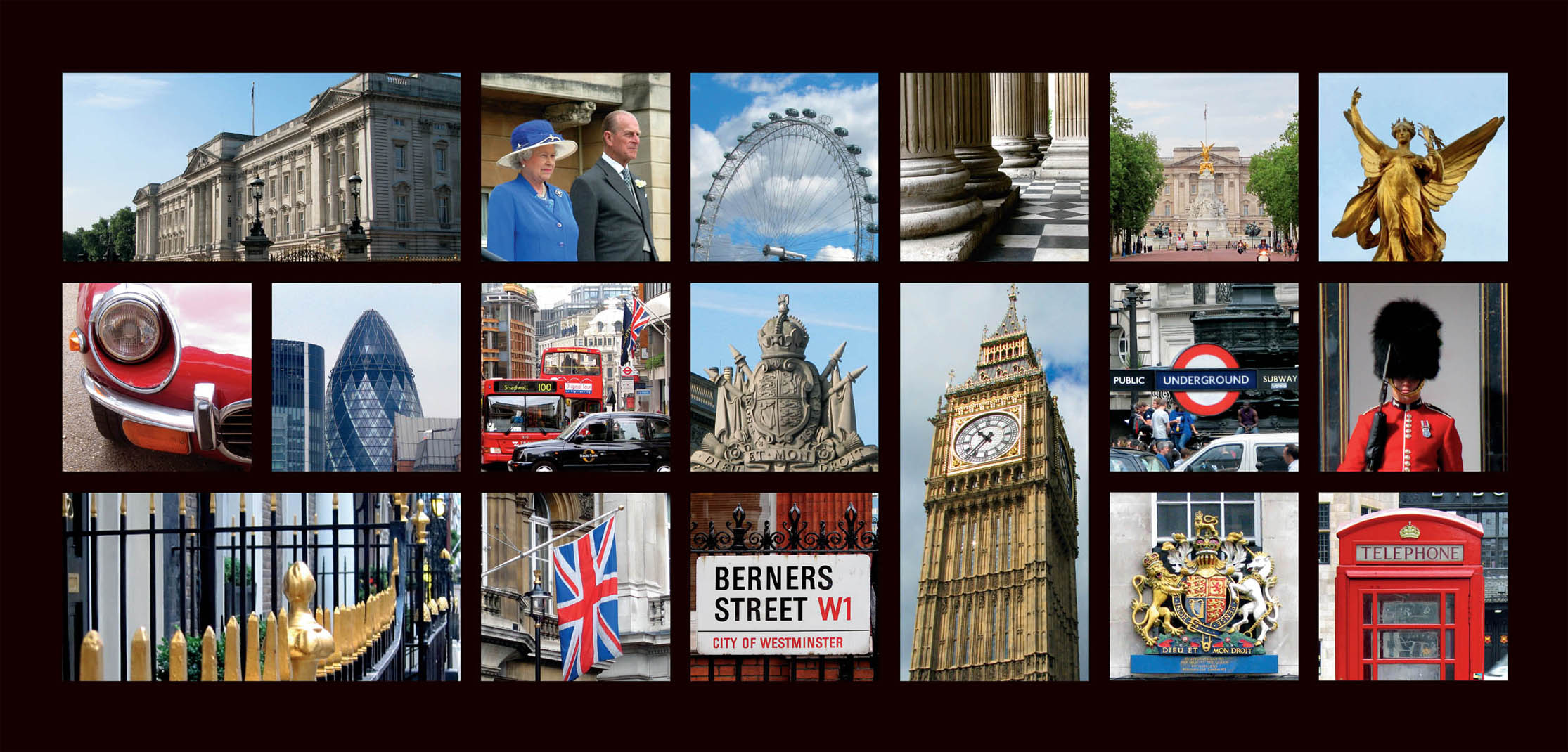
Harley Jessup, Photographs, 2009. top middle: The Queen and The Duke of Edinburgh arrive on the West Terrace of Buckingham Palace to attend a Garden Party © Buckingham Palace Press Office.
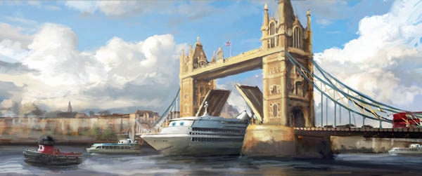
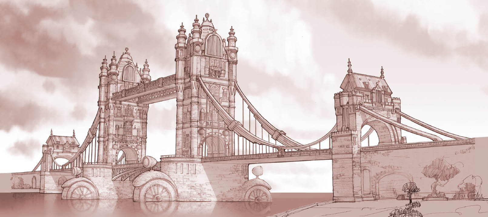
“Designing the different environments for the film was a long process of refinement. We started very broad, keeping things rough at first and then working with the story department to figure out exactly what needed to be designed and built. We knew, though, that there were certain things each city just had to have—in London, the classic red British phone booths, the elaborate gambrel roofs, landmarks like Tower Bridge—all those accents that give a place its characteristic flavor.”
—NAT McLAUGHLIN
Model Packet, Armand Baltazar, Pencil/Digital, 2010.
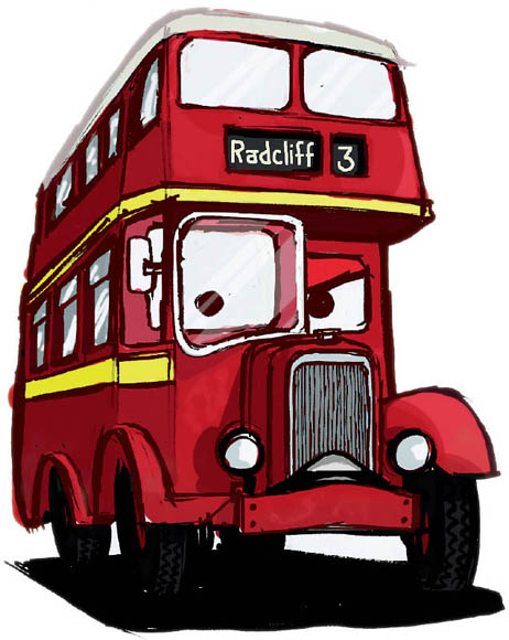
“One of my favorite character designs in the film is Dan Holland’s London bus. A classic London bus has an asymmetrical cab, with a window that pushes out farther on one side than the other. Dan’s solution was so clever—he turned that leading-edge window into a monocle, adding this great grille mustache to make the bus into a dignified British gentleman.”
—JOHN LASSETER
London Street Prop Model Packet, Alejandro Leon, Digital, 2009.
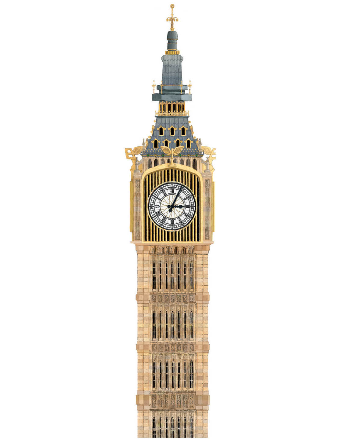
PARLIAMENT
Model Packet, Tim Evatt, Digital, 2010.
Jay Shuster, Digital, 2009.

Queen’s Emblem, John Lee, Digital, 2010.
Shader Packet, Bryn Imagire, Digital over Model Packet, Nat McLaughlin, Digital, 2010.
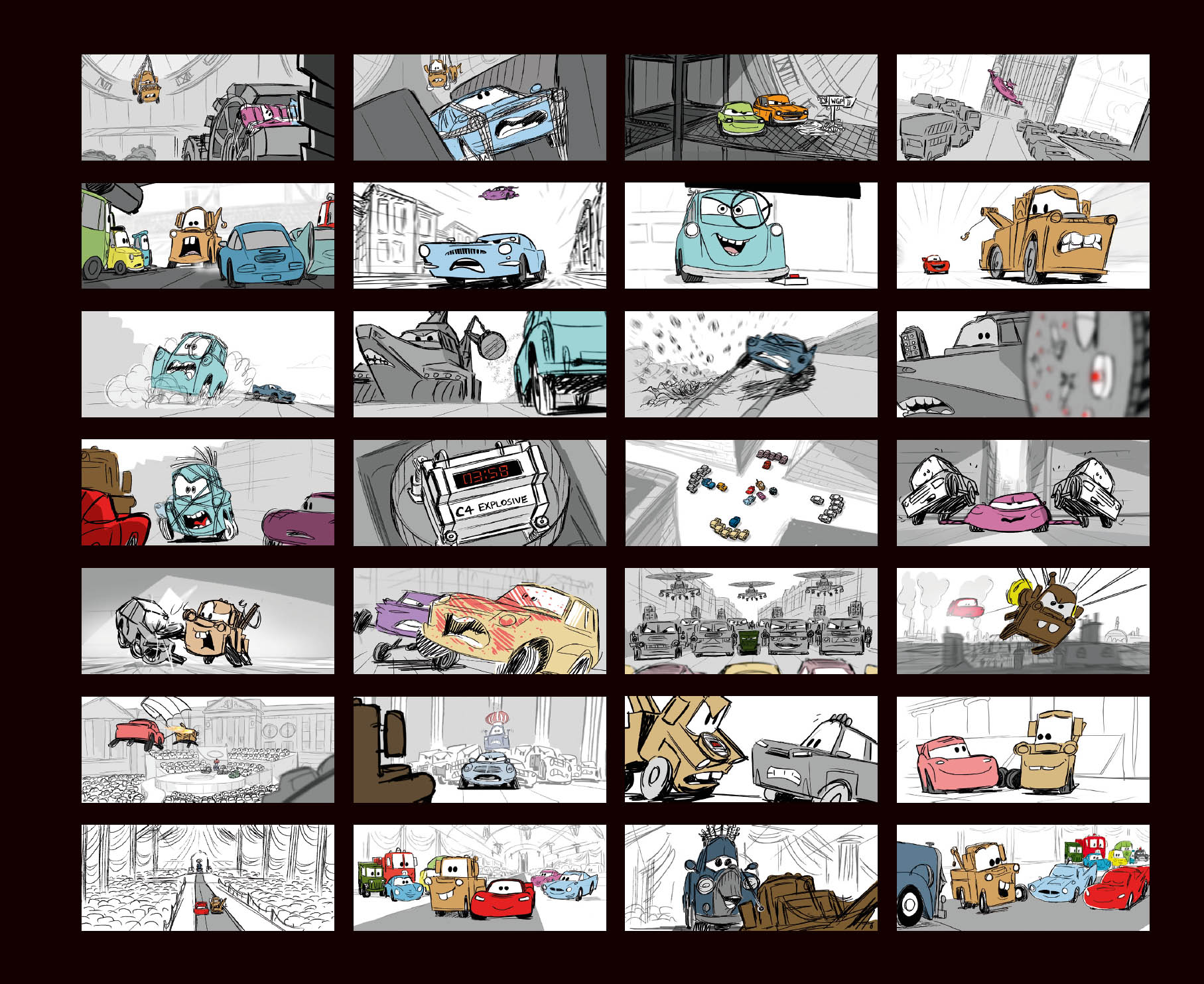
Storyboards, Erik Benson, Josh Cooley, Brian Fee, Scott Morse, Bill Presing, Tony Rosenast, Alex Woo, Digital, 2010.
Nat McLaughlin, Pencil/Digital, 2010.
“Each designer put their own stamp on the stylization of the London landmarks. We tried to be respectful of the rules of classical architecture as we were weaving automotive shapes into the facades of the buildings. It’s fun that, at second glance, you might notice that the dome of St. Paul’s is actually a differential gear case.”
—HARLEY JESSUP
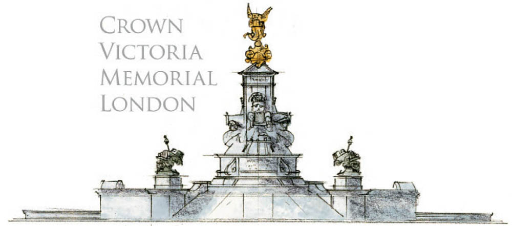
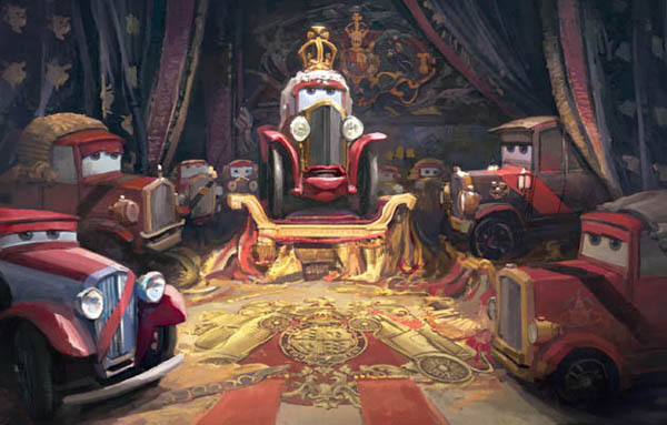
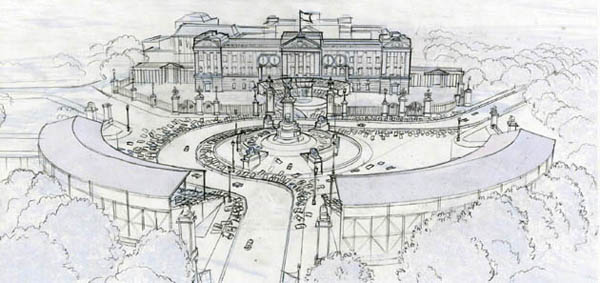
BUCKINGHAM PALACE

Model Packet, Nat McLaughlin, Pencil/Digital, 2010.
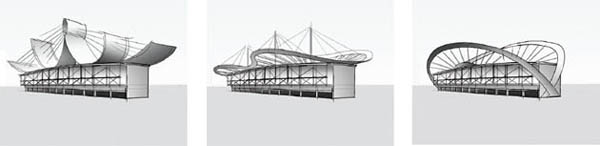
“We were originally going to have a twenty-four-hour race in Paris, and the track had these really cool pit buildings. We liked them so much that when the story evolved and we ended up cutting the Paris race, we just took that design and used it in London.”
—JOHN LASSETER
Nat McLaughlin, Digital, 2009.
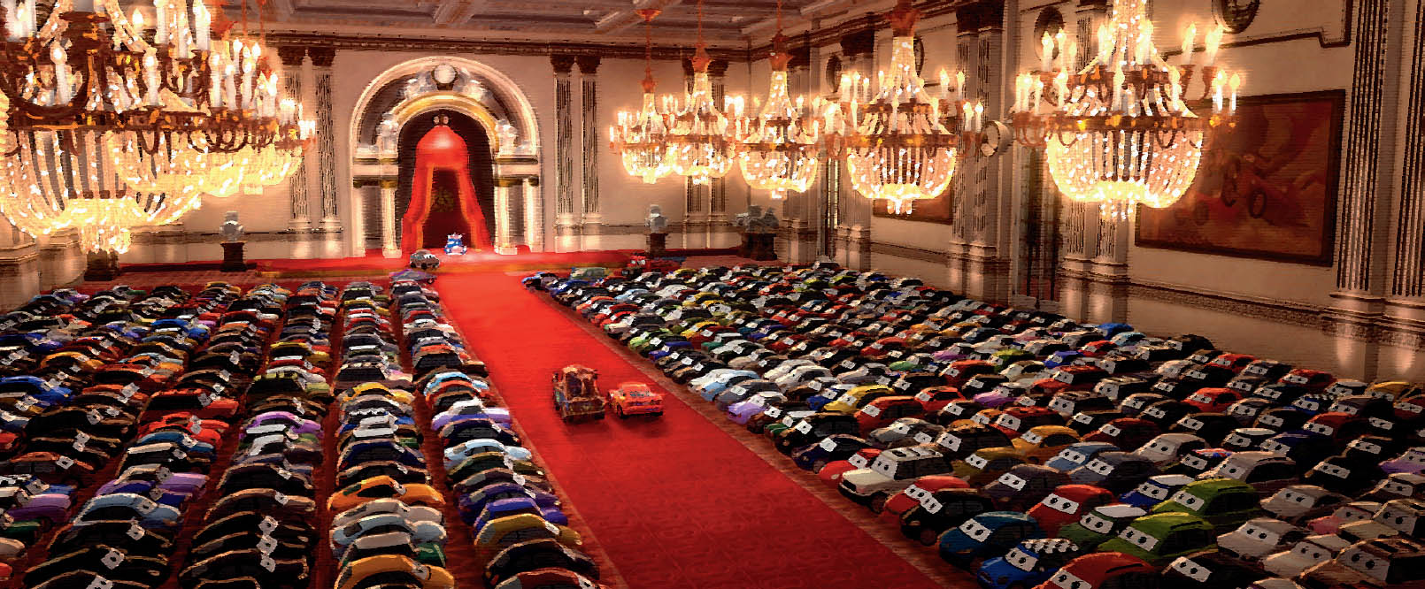
Knighting Room Mural, Jason Merck, Digital, 2010.
Jay Shuster, Color by Bill Zahn, Digital, 2010.
“For me, the best bad guys are the ones where you understand why they’re doing what they’re doing—you see their logic. You don’t have to agree with it, of course, but you understand it. Otherwise, they’re just a generic villain doing evil for evil’s sake.”
—JOHN LASSETER
Storyboard, Tony Rosenast, Digital, 2010.
Jay Shuster, Digital, 2009.
Jay Shuster, Ellen Moon Lee, Digital, 2010.
Jay Shuster, Ellen Moon Lee, Digital, 2010.