11
Designing Labels
251
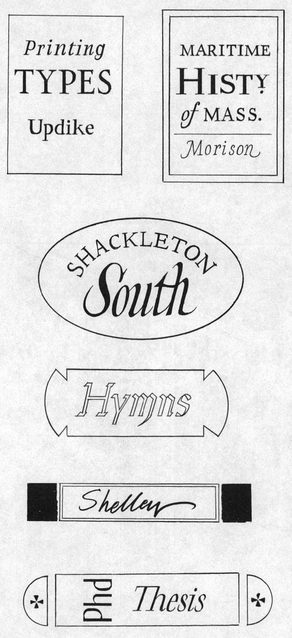
Order of Work
MAKE ROUGH TRIALS
MAKE FINISHED LAYOUT
EXECUTE FINAL LETTERING
LET DRY
CLEAN OFF PENCIL LINES
APPLY SEALER
CUT OUT AND ATTACH LABEL
PRESS
Titling is a necessary detail of bookbinding and should be planned in conjunction with the selection and color of cover material, headband twist, and cover paper and cloth for slipcases and boxes. Whether a dust jacket, folio, manuscript, or music, the contents should be identified with the essential information.
Books covered with cloth or paper can be fitted with paper labels pasted to the backbone or front cover, as was once quite customary. Labels are relatively simple to produce if you have a printing press, but hand-lettered ones are just as professional when designed and executed with care.
The label should be legible and in harmony with the character, size, and general appearance of the binding. The sizes of the title elements are usually ranked in descending order by title, author, and publisher, although this is not a hard-and-fast rule. More often it is the available space—for example the width of the backbone—that chiefly determines the size and extent of the lettering. Keep in mind also that capital letters take up more space than lowercase, while italics and cursive lettering are more compact.
In the case of long titles and authors’ names, it is accepted practice to make abbreviations and omissions, using only the author’s last name and a shortened title, eliminating subtitles altogether (251). For example, Printing Types: their History, Forms, and Use, by Daniel Berkeley Updike, can be condensed to read simply Printing Types, Updike. The shorter word Types might conceivably occupy the full width of the label with Printing done in smaller italics. Contrast can also be introduced by lettering Types not in black but in a color that harmonizes with those of the binding itself. In the case of music, the essential information would include the composer’s last name, the title of the work, and possibly the opus number.
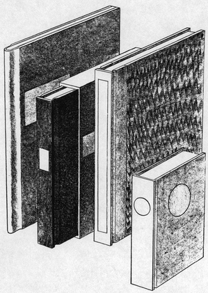
It is important to make a few experimental label sketches to work out the general design, the relative sizes of the lettering, and the spacing and color. These can be made in pencil on cheap paper, cut to size and laid on the binding for study (252). Try different shapes and sizes with the lettering sketched in black and colored pencil. In a case where the lettering is to be done directly on the binding, trials can be made in ink or chinese white on clear acetate. A slender volume of poetry may require only the simplest rectangular label on the front cover. In fact, its backbone may be so thin that any other solution is out of the question. For a bulkier book of larger dimensions, the author and title can be run up the full height of the backbone. In designing any label, remember that hand-lettered titles invariably take up more space than printed ones and that the smaller the lettering, the more exacting it is to execute.
The same principles apply to printed labels. The typeface and point size should be chosen with the character of the book and binding in mind. The letterspacing should be worked out on rough pencil sketches before setting the type. Careful makeready is of course important. When you are ready to print the finished job, make a dozen proofs and then select the one that is the most uniformly black and crisp. And, of course, allow the ink to dry thoroughly before attaching the label to the binding.
252
When these preliminaries have been completed, make a finished pencil layout on good quality paper. Single-ply pen-and-ink paper is ideal for even the finest pen lettering and has good opacity. Avoid rough or soft papers, as the fibers clog the pen point and spread the ink or color, making it nearly impossible to get the crispness that distinguishes good lettering. Heavy, stiff paper is generally out of scale for most books and is particularly tedious and difficult to paste down successfully.
Execute the final lettering on a piece of paper generously larger than the label (253).
253
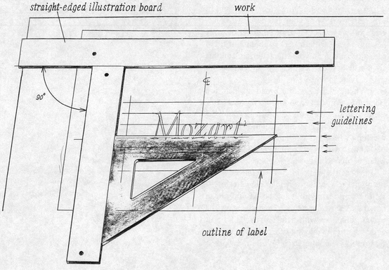
Tack straight-edged strips of illustration board over the work on a drawing board with the corner an exact 90-degree right angle. Use a triangle to lay out the outline of the label, a vertical center line, and horizontal guidelines for the height of the lettering—both lowercase and capitals—carrying all these horizontal lines out well beyond the label area.
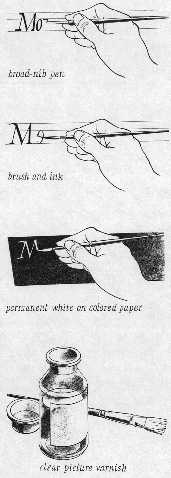
Jet black waterproof india ink is one of the most permanent lettering fluids and works exceptionally well with either pen or brush. If you plan to use a second or third color, water soluble designer’s gouache colors and permanent white are ideal for brush lettering. They have high opacity, brush on smoothly, and, when sealed with a thin coat of clear picture varnish, are very durable (254). Aerosol workable fixatif applied as two lightly sprayed coats is another satisfactory sealer. In either case, the lettering must be thoroughly dry before the sealer is applied—dried for at least twenty-four hours. And because inks, pigments, varnishes, and sealers are chemical compounds, they should be tested in advance on scraps of the same materials you are using.
To avoid smudging the lettering in progress, work with your hands resting on a clean rubbing sheet taped or laid over the area just under the label area. The slight moisture of the skin is enough to blur the lettering, and this should be approached as a one-shot execution with no retouching.
When lettering with a broad-nib pen, use clean, incisive strokes. Avoid going back over them. If you make a mistake, discard the label and begin again. However expertly done, retouching with white can never be made invisible, and it will in all probability turn yellow when varnished.
When the lettering is completed—and proofread to catch any typographical errors—set the work aside, drawing board and all, to dry for at least overnight. Then clean off the pencil guidelines with gentle strokes of a soft eraser, naturally making sure to leave the lines that outline the label itself. While the work is still tacked down flat, apply a very thin coat of varnish or fixatif over the entire label and well past its edges. Allow the label to dry untouched overnight.
254
255
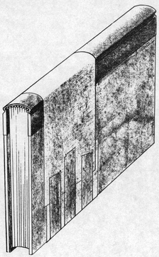
To cut out the label, remove the tacks or pins and lay the whole sheet of paper on a smooth piece of cardboard. Use a sharp X-Acto knife and the steel ruler aligned with the pencil outlines. Hold the ruler down firmly and use enough pressure on the knife to cut the paper completely on the first stroke.
Attach the label. Lay it on a clean sheet of wastepaper, and use a small brush to spread a thin coat of paste, working from the center of the label toward the edges. Hold the label securely to prevent its slipping, so that no paste is transferred to its face. To paste the corners where your fingers have been holding the label steady, pick up the label on the end of the brush and transfer it paste-side up to clean wastepaper. Lay the label down, then hold it there with a fingernail while you touch paste on those two last corners. Pick up the label with the brush again and lay it in position on the binding. Cover it with waxed paper. Hold the waxed paper from slipping and rub the label down gently but thoroughly. Discard the waxed paper. Replace it with a clean sheet and put the work under weights to dry thoroughly. If the label is to be attached to the backbone, clamp it down firmly with a band of paper drawn tight around the book and fastened with tape (255).